Thumbnails are the first visual element potential viewers see, and they play a crucial role in whether a video is watched or not. In this guide, we show you how to quickly and efficiently create appealing thumbnails with Microsoft Designer that are guaranteed to generate clicks.
Main Insights
- Funny and eye-catching designs attract viewers' attention.
- Choosing the right size for thumbnails is crucial for image quality.
- Simple and clear text elements improve the understandability of the thumbnail.
- Using images with emotional expression can significantly increase the click-through rate.
- The background should be supportive, but not distracting.
Step-by-Step Guide
Step 1: Gain Inspiration from Other Thumbnails
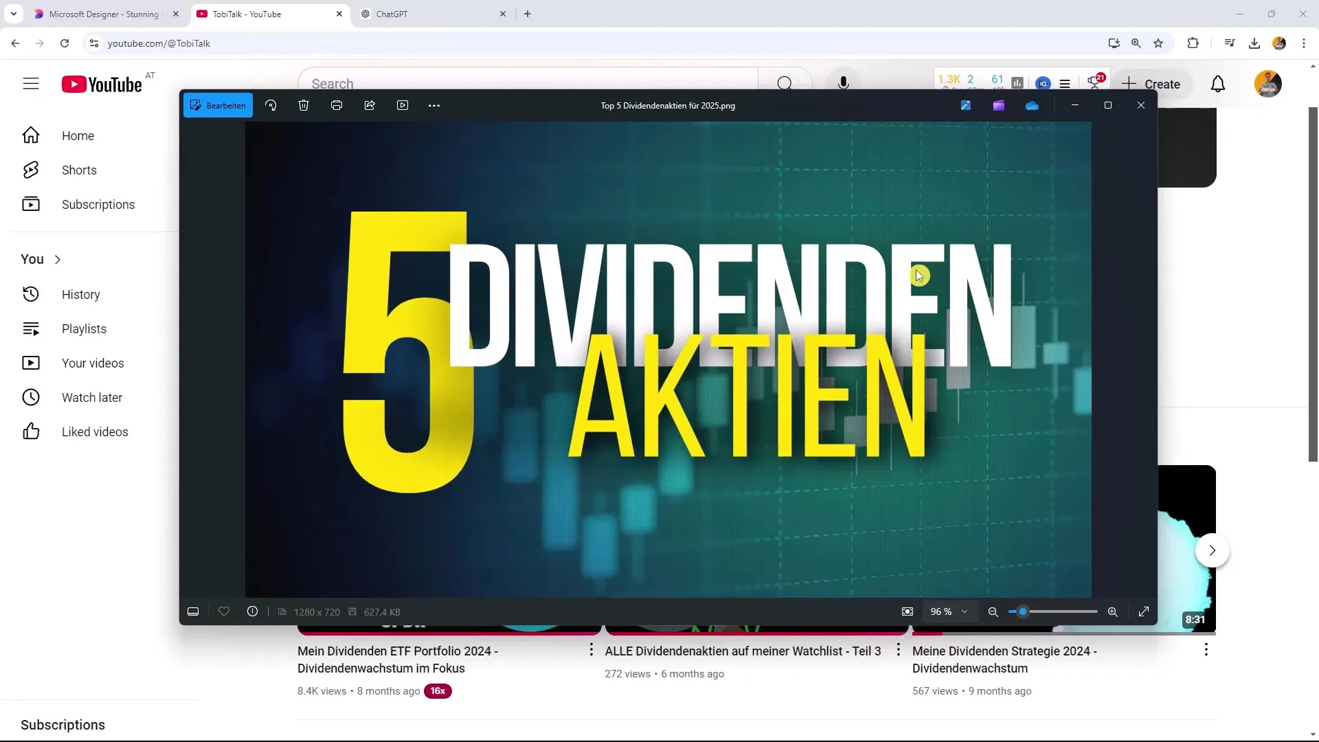
Before creating your own thumbnail, it's helpful to look at examples. Go to YouTube and search for the term "dog." You will soon notice that some thumbnails are far more appealing in design than others. Funny or unusual images attract attention more strongly than boring ones. Make sure each thumbnail has a certain level of creativity and humor to stand out from the rest.
Step 2: Choose the Right Template
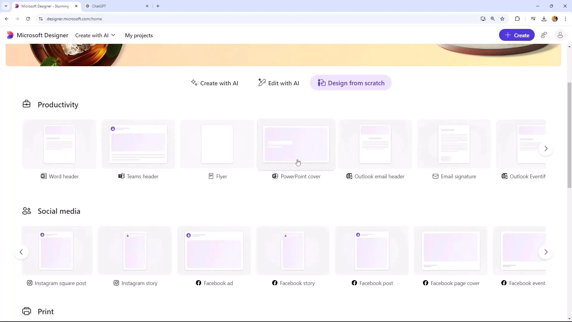
When working with Microsoft Designer, there are many templates to choose from. However, there isn't a preset template specifically for YouTube thumbnails. As an alternative, I recommend using a PowerPoint template that you then reformat. The recommended thumbnail size is 1280 x 720 pixels, but you achieve maximum quality with 1920 x 1080 pixels.
Step 3: Customize Your Thumbnail Design
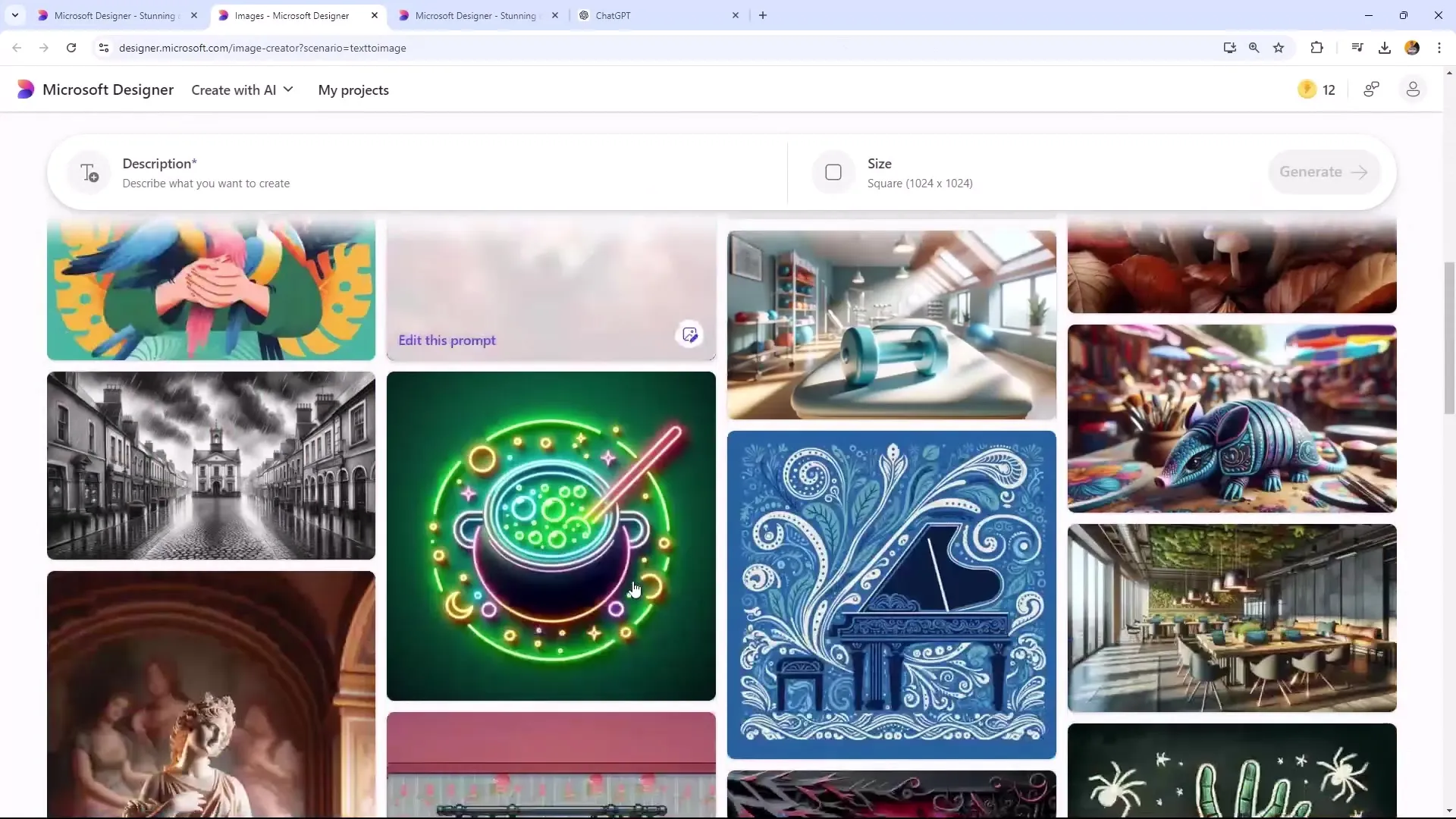
To generate an image for your thumbnail, it's important to find a suitable image of a dog. You can either select an existing image or generate a new one. Use a style that you like and ensure the image is displayed as a portrait, as this often looks better.
Step 4: Add Text
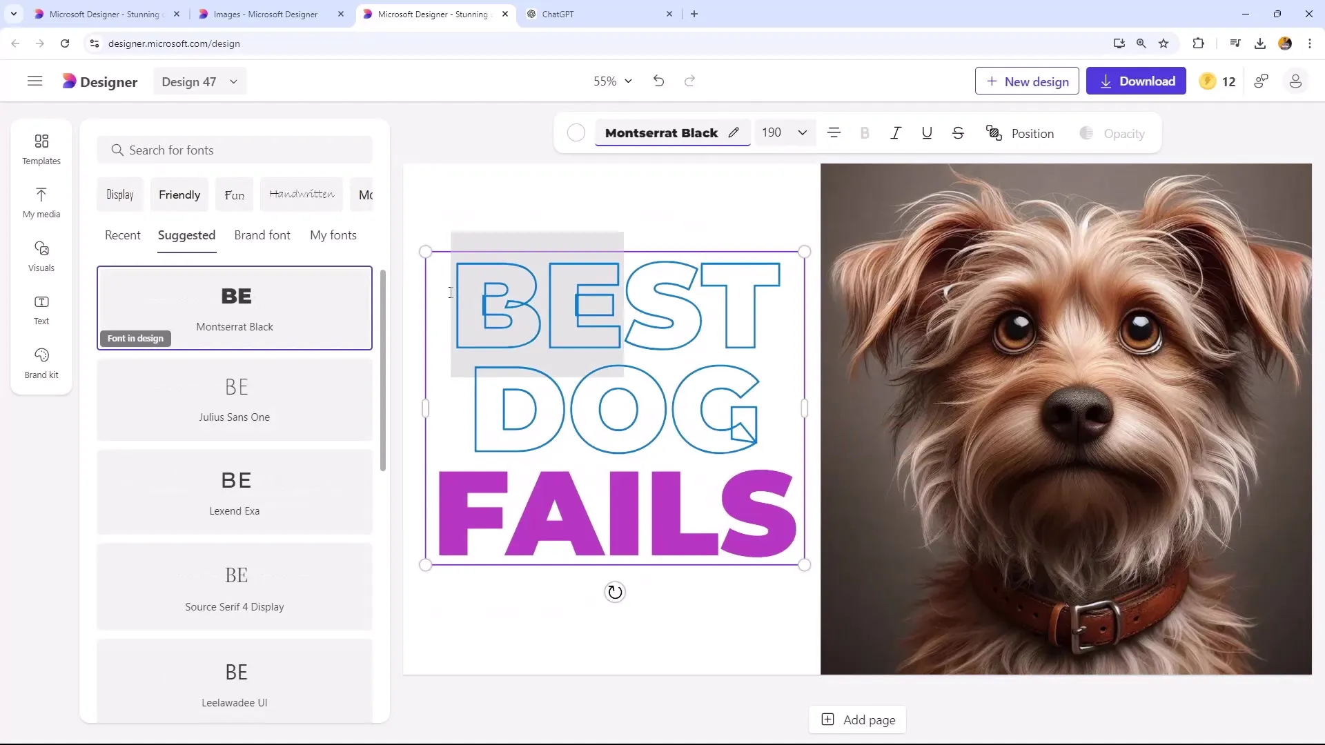
A thumbnail is often reinforced by the text on it. Think of a short and concise message that piques viewers' curiosity. Use legible fonts and pay attention to color choice so the text is clearly visible on the background. For example, if you write "Top Dog" or "Best Dog," make sure the colors provide a good contrast to the background.
Step 5: Add Visuals and Enhancements
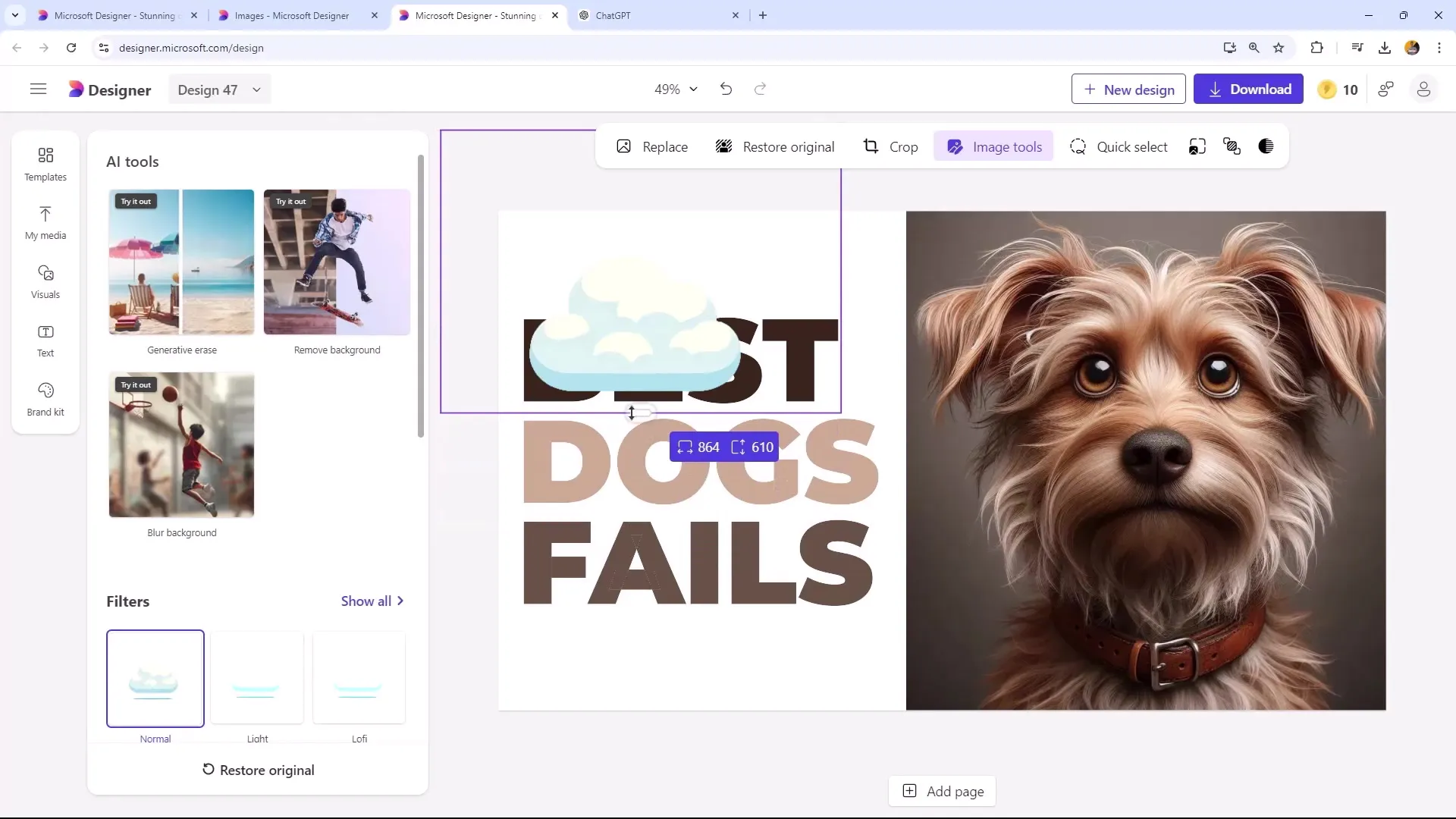
To make your thumbnail more appealing, you can add additional visual elements. For example, you can generate background images or insert graphic elements, such as clouds, that enhance the mood of the thumbnail. Ensure these elements do not distract from the main focus but work harmoniously with the image and text.
Step 6: Ensure Image Quality
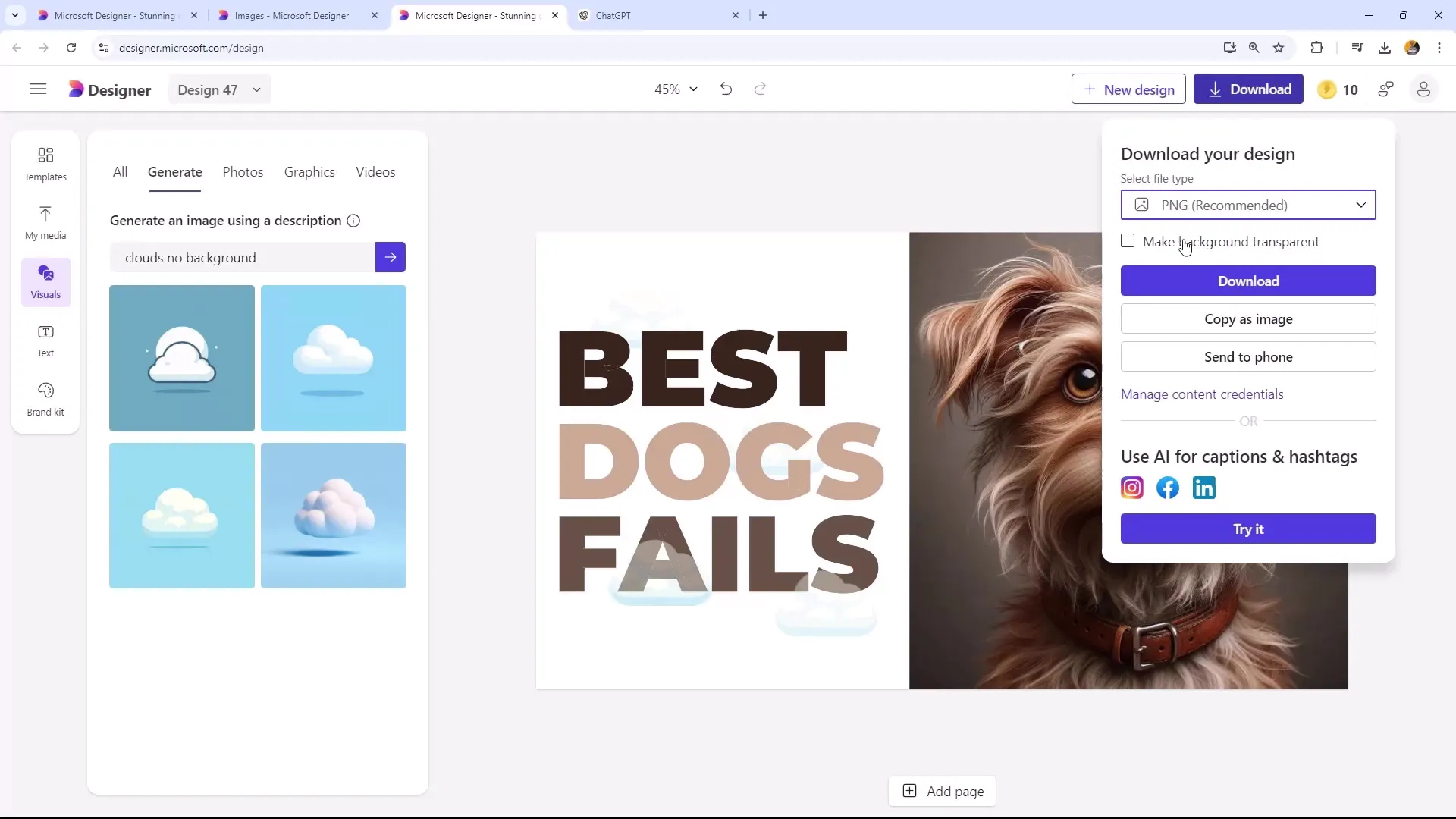
After creating your thumbnail, remember to download it as a PNG file. This ensures high image quality, which is important for online applications. JPEG files could compromise sharpness and clarity, making the choice of the right file format crucial.
Step 7: Review and Download Thumbnail
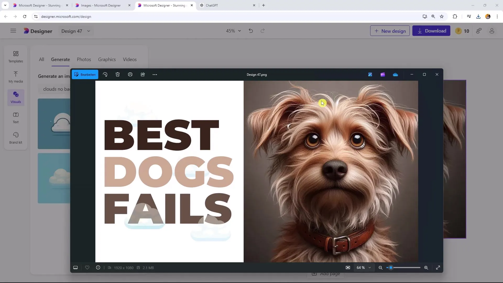
Review your thumbnail to ensure everything looks good. If you are satisfied with the result, download the design and save it in a suitable location for future use.
Summary
Creating appealing thumbnails for YouTube and social media requires creativity and a keen eye for design. With Microsoft Designer, you can effectively combine these creative elements. By choosing the right sizes, inspiring templates, thoughtful text elements, as well as visual accents, you can create thumbnails that capture the attention of your target audience.
Frequently Asked Questions
What is the recommended size for YouTube thumbnails?The recommended size is 1280 x 720 pixels, but for the best quality, you should use 1920 x 1080 pixels.
How can I make sure my thumbnail stands out?Opt for humorous and eye-catching designs that immediately catch the eye, and use contrasting colors.
Should I add text to my thumbnail?Yes, clear and bold text can help summarize the message of your video and spark interest.
What file format should I choose for my thumbnail?Download your thumbnail as a PNG to ensure the best image quality.
How important is the design of a thumbnail for the click-through rate?The design of a thumbnail is crucial as it is the first visual connection viewers have with your video.
