The Candy Effect is a timeless style that gives texts and shapes a shiny, sugary look. Whether classic with realistic highlights or illustrative with creative details - this look makes every design irresistible. In this tutorial, I'll show you how to create two variations of the Candy Effect in Photoshop: a classic style for an elegant shine and an illustrative version for playful designs. Let's get started and enhance your projects with this sweet effect!
The Classic Look
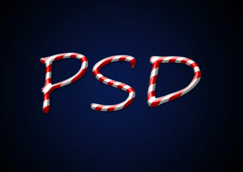
The classic look of the candy cane font is a color-changing sugar glaze that ideally adapts to the text's plasticity.
Step 1: Create Background
The document size is 800x600 px. Settings in the Fill Options and in the Filters must be adjusted according to the document and text size.
Using the Gradient Tool (G), I create a radial gradient from the center to a corner point. The colors of the gradient are Dark Blue (#09194c) to Black.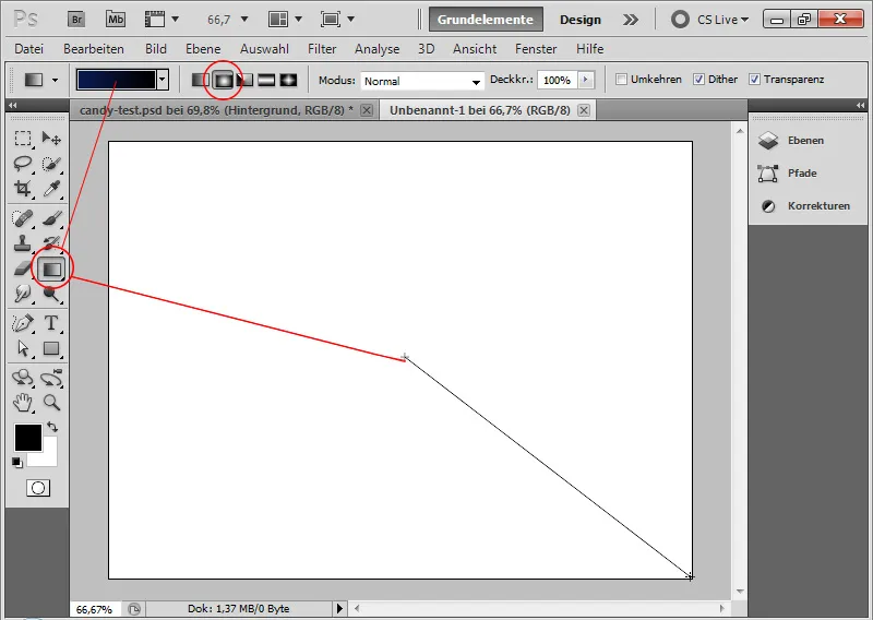
Step 2: Place Text
For the effect to look as authentic as possible, it is recommended to choose a very round font. For this tutorial, I choose the Segoe Script font in the Regular style.
At the 250-point size, I write the letters PSD in white color into the document.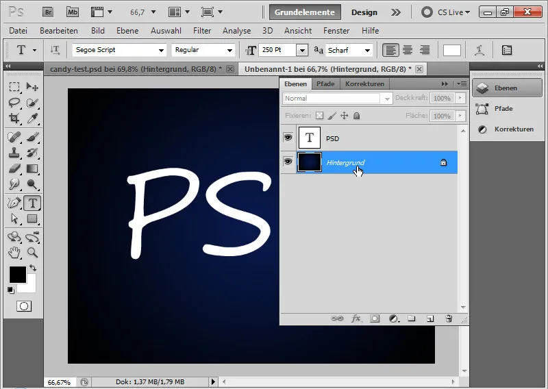
Step 3: Create Candy Stripes as Pattern
The candy cane font is defined by a recurring colorful sugar glaze layer placed within the text.
I create a new document (Ctrl+N) sized 30 x 30 pixels. At high zoom level, I can precisely create the red sugar glaze as a pattern.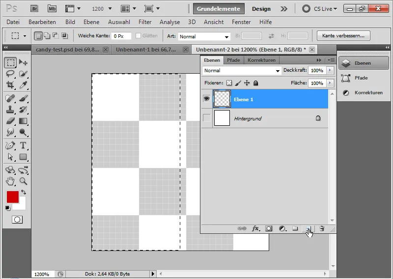
To do this, I simply fill the left half of my document with red color. This is done easiest by selecting the left half based on the pixel grid using the Selection Tool and filling it with red color. The pixel grid automatically appears at high zoom levels.
Next, I create a pattern from my red-and-white area via Menu>Edit>Define Pattern.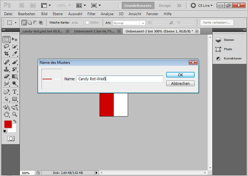
Step 4: Apply Pattern
I select the Fill Options for my text layer and assign the pattern I just created to the text in the Pattern Overlay.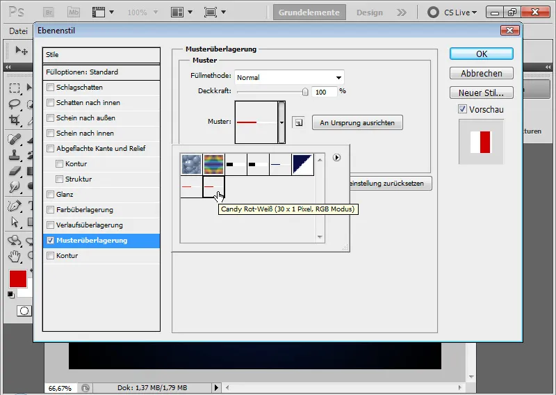
Step 5: Release Pattern
The pattern is currently vertical.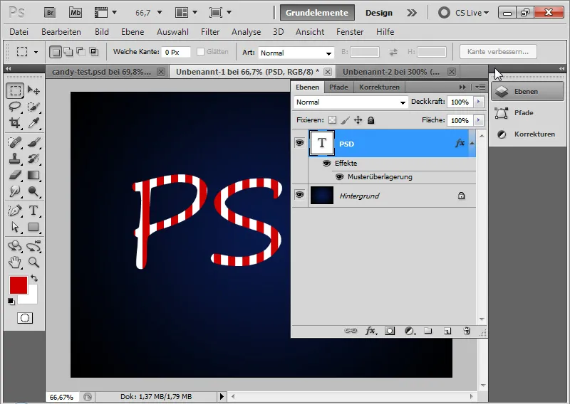
It looks more pleasing when it is horizontally striped within the text. To do this, I right-click on the Pattern Overlay>Create Layer.
Now, I have placed my pattern as a fill option in a separate layer, which is then used as a Clipping Mask to my text layer.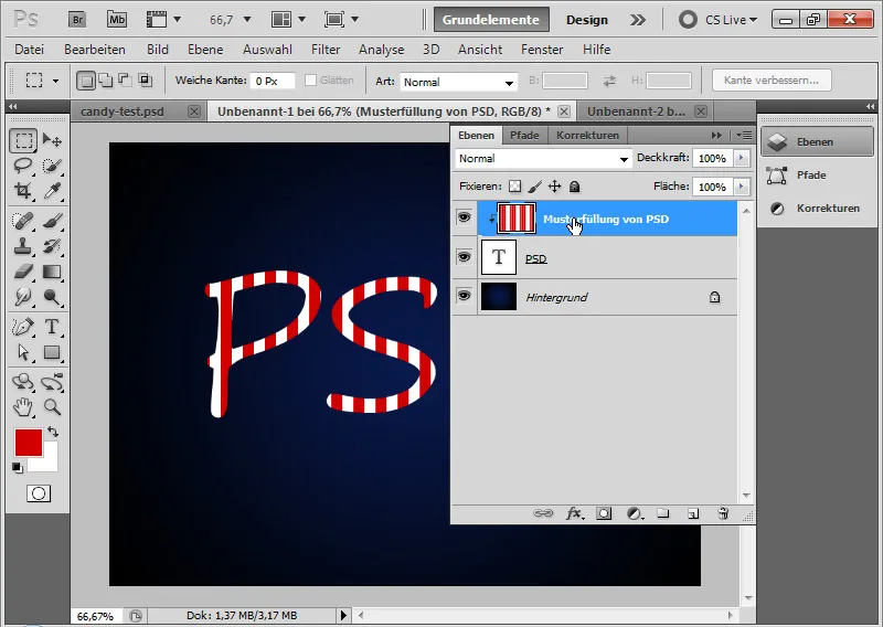
Step 6: Rotate Pattern
I select the pattern layer and rotate it using the Move Tool (V) by going through the corner points, where my cursor becomes a double arrow. Now, I can rotate my pattern as desired. To set an exact angle, I can also enter 45 degrees numerically in the Menu Bar.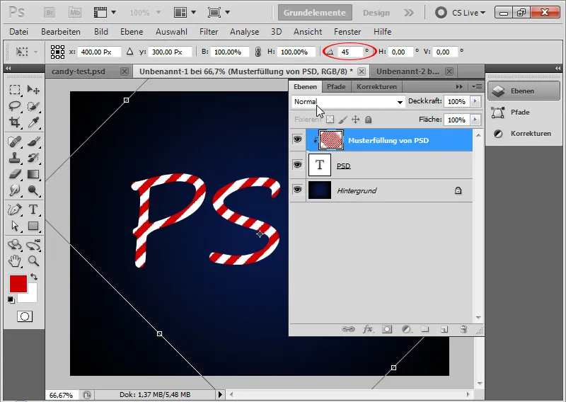
Step 7: Expand Pattern to Entire Document Size
By releasing the Clipping Mask with Ctrl+Alt+G, I see that not all areas of my document are covered by the pattern. Therefore, I can quickly move the pattern layer using Alt and the Move Tool to fill in the gaps, ensuring the entire document is covered by the pattern.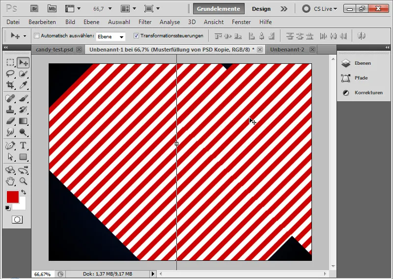
After that, I can merge the pattern layers together by selecting them and using Ctrl+E.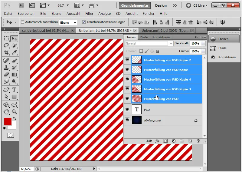
It is recommended to limit the pattern, which now extends beyond the document size, to the document size using the Crop Tool C. This is important because the Offset Filter will be applied later, which calculates based on the layer size.
Afterwards, I can reapply my pattern layer with Ctrl+Alt+G as a Clipping Mask to the text layer.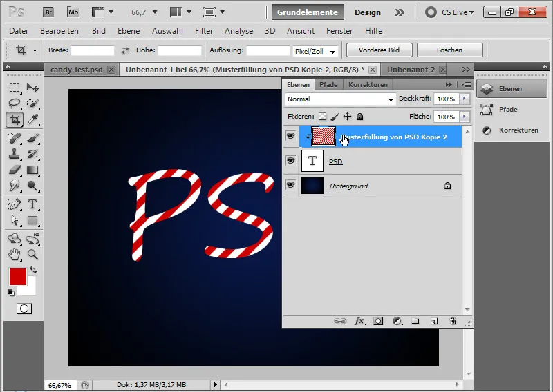
Step 8: Fill options for the text
In order to give the text more dimension, I adjust several fill options.
- Drop shadow
• Opacity: 40 percent
• Distance: 6 pixels
• Size: 5 pixels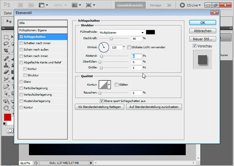
Intermediate step with drop shadow: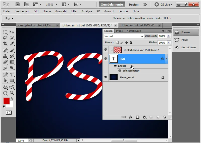
- Inner shadow
• Opacity: 50 percent
• Distance: 5 pixels
• Size: 5 pixels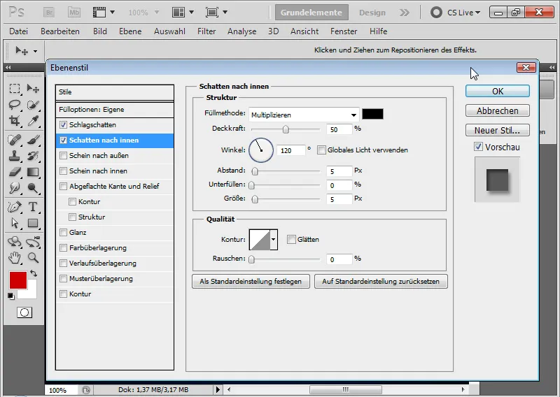
Intermediate step with inner shadow: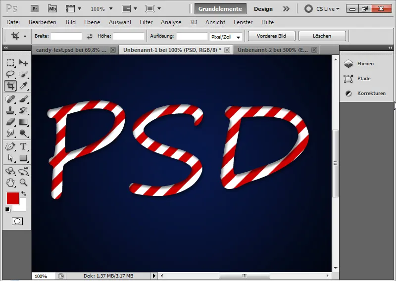
- Bevel and emboss
• Style: Inner bevel
• Technique: Round
• Depth: 520 percent
• Size: 16 pixels
• Soften: 4 pixels
• Angle: 111 degrees
• Altitude: 42 degrees
• no global light!
• Smoothed half-round highlight contour
• Highlights mode 75 percent opacity white in Negate Multiply mode
• Shadows mode 50 percent opacity black in Multiply mode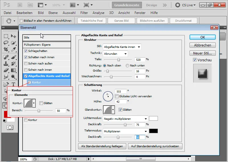
- Stroke
• Rounded stroke with 50 percent opacity.
Intermediate step with bevel and emboss as well as a rounded stroke: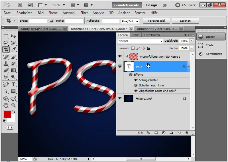
Step 9: Create displacement matrix
The sugar stripes run exactly diagonal along the text. To make the candy effect look more realistic, the sugar stripes need to adapt to the text dimension as well. The best way to achieve this is by applying the Displace filter. For that, I need to create a displacement matrix that will displace the diagonal stripes based on the shape of the text.
First, I duplicate my text layer into a new document by right-clicking on the text layer; Layer duplicate> New document.
By using Ctrl and Click on the new layer, I can create a new layer below my text layer in the newly created document. I fill this layer with black color. Then, I convert this layer into a background layer via the Menu> Layer> New> Background from layer option.
I select the text layer and apply the Gaussian Blur filter via the Menu> Filter> Blur filter> Gaussian Blur.
The text layer can be rasterized. The Radius of the blur is approximately 6.5 pixels. I confirm the settings with OK. Then, I create an adjustment layer Brightness/Contrast and increase the Brightness to 90. I have deactivated the Inner shadow.
Note: The displacement matrix can be designed differently and does not have to follow the above-mentioned settings. The important part is certain brightness differences that will be used for calculation in the Displace filter. These brightness differences are achieved very well through the Blur filter and by brightening or darkening image areas.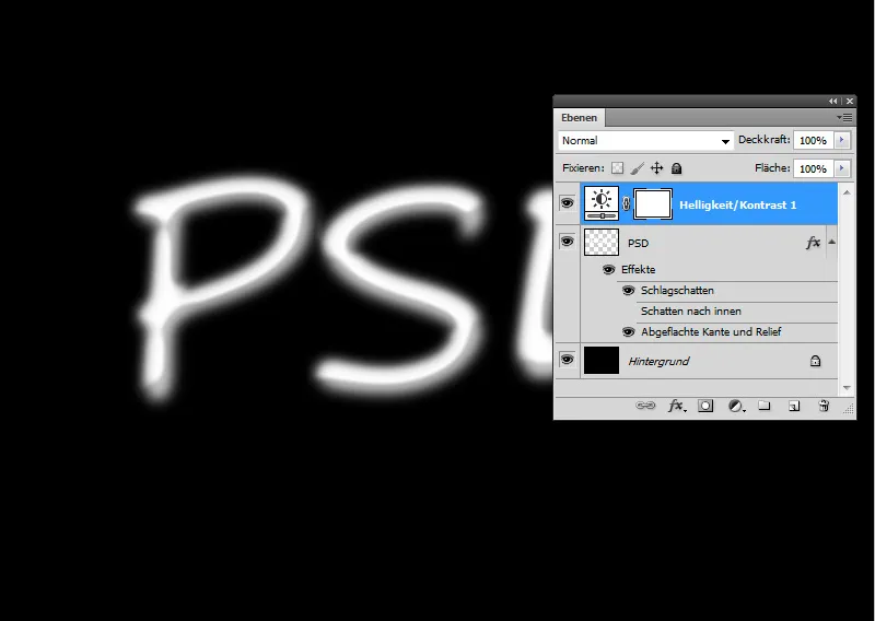
My displacement matrix is now ready, and I save it as a .PSD file.
Step 10: Apply Displace Filter
Now it's time for the Displace Filter. The Displace Filter is unfortunately not as intuitive to use as other Photoshop filters. Nonetheless, by applying a displacement matrix, I can achieve great effects, especially useful for surfaces with elevations and depressions.
With the displacement matrix, the sugar stripe pattern is distorted by shifting image parts based on brightness differences in the text layer. Therefore, I first created the displacement matrix and adjusted it for the displacement effect in brightness with the Gaussian Blur accordingly.
I convert the pattern layer into a Smart Object before applying the filter, so I can apply the filter as a Smart Filter.
I apply the Displace Filter with the following settings:
• Horizontal displacement: 3
• Vertical displacement: 3
Checkboxes:
• Scale to fit
• Repeat edge pixels
The displacement input can go up to 100 percent. 100 has the effect of a displacement of 128 pixels.
I confirm with OK and assign my displacement matrix in the opening file browser to the filter.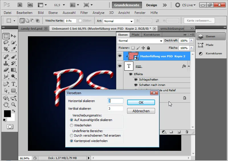
Step 11: Fine-tune the pattern layer
When I lift the clipping mask, I see what happened. The stripes have oscillations that align with the letters "PSD".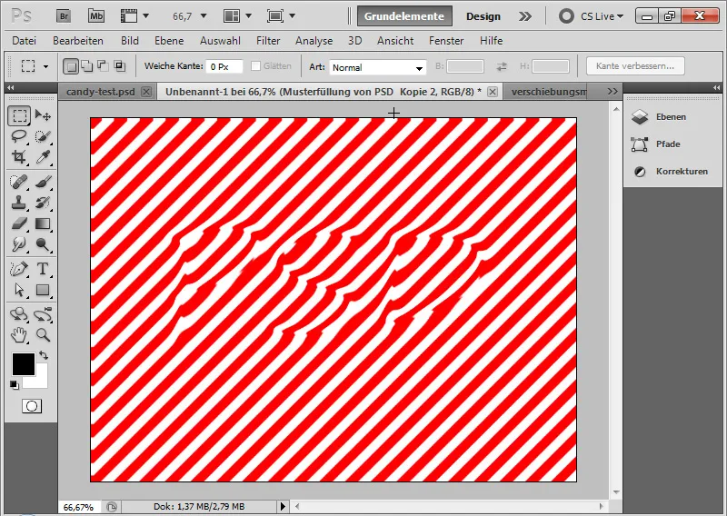
Now I can move the pattern plane with the Move tool to the correct position, provided it has not already been taken after applying the filter.
The effect is that the sugar stripes adapt to the roundness of the text and thus to the plasticity of the text.
My classic candy effect is complete.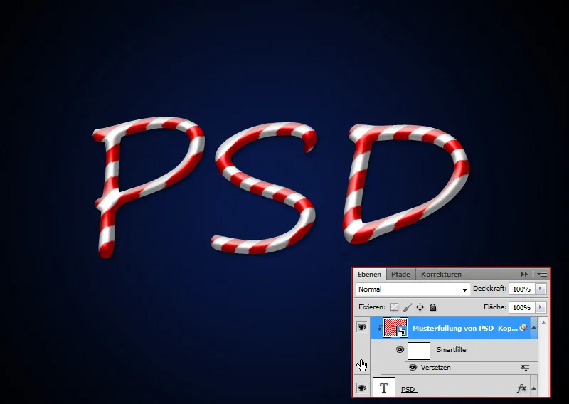
The illustrative look
The classic candy effect shown here is not really very innovative. There are some similar tutorials on the Internet that more or less achieve the classic effect shown above. In the classic effect, the stripes always follow the template of the diagonal stripe pattern. The candy effect would not actually exist in reality like this, or it would only be achievable through punching out.
For these reasons, I have decided to make the candy effect a bit more illustrative in the second part of the tutorial and to take a different approach, especially with the view of the sugar stripes. While the stripes in the classic effect adapt to the "3D shape" of the text using the shift matrix, in the illustrative look the stripes will rather follow the movement of the text; like how a master baker would spray a sugar text through his tube onto the tray.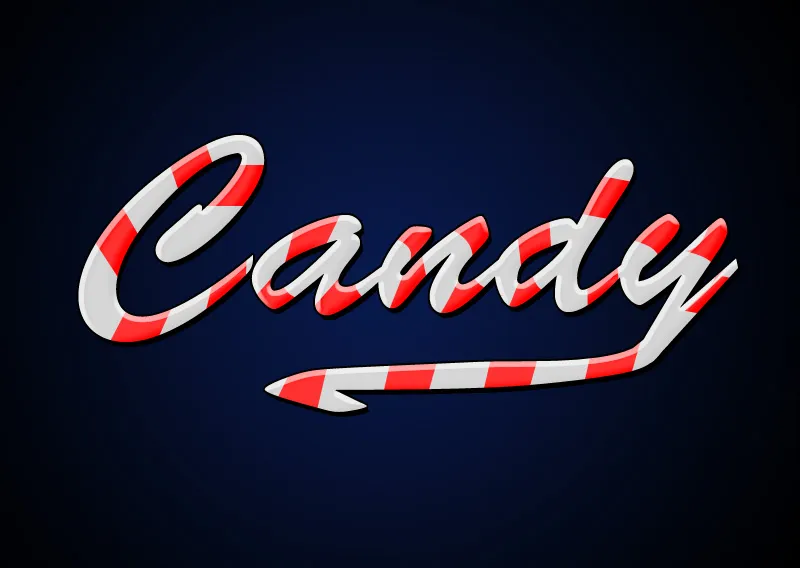
Step 1: Placing the text
Using a 250-point Brush Script Std, I write the word "Candy" in my document. The font color is a very light gray with 80 percent brightness (cccccc). I continue to use the background I previously created.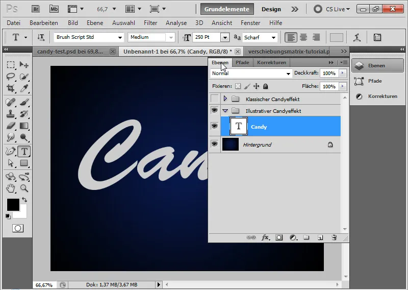
Step 2: Adding the text line
I create another text layer and write the number 1 in the same font color.
I convert the text layer to a shape by right-clicking on the text layer in the Layers panel: Convert to Shape.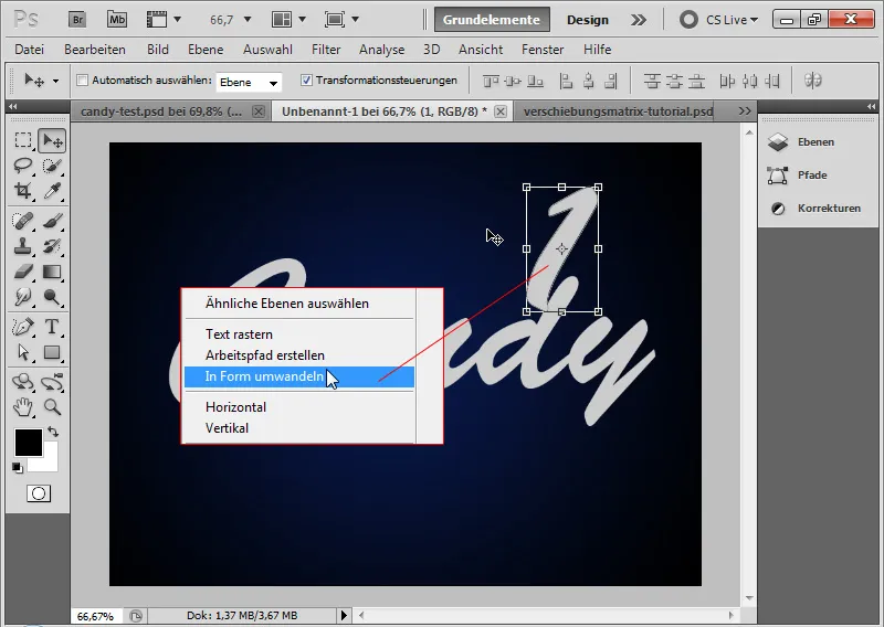
Using the Move tool (Ctrl+T/Transform) and the path points, I can now scale the shape in such a way that it can be used as a further text underline.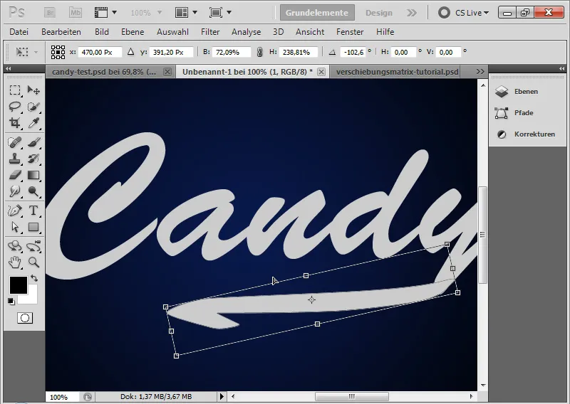
Step 3: Convert to Smart Object
I select both layers and convert them into a Smart Object. This way, I can edit both layers as a unit with fill options.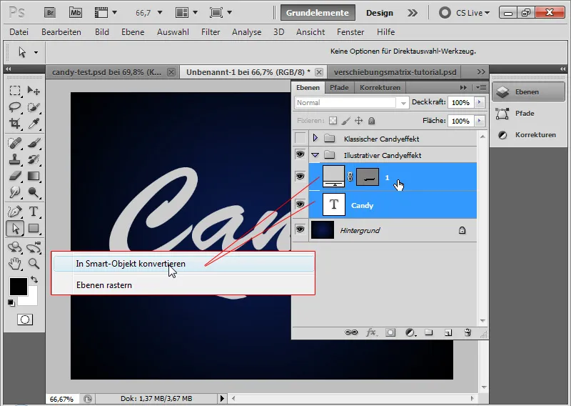
Step 4: Fill Options
The illustrative candy effect should not look as soft as the classic one. Therefore, the shadows and highlights will be harder. I make the following settings in the Fill Options:
- Drop Shadow – for the hard shadow to the bottom right
• 100 percent Opacity
• Distance 6 pixels
• Size 0 pixels (!)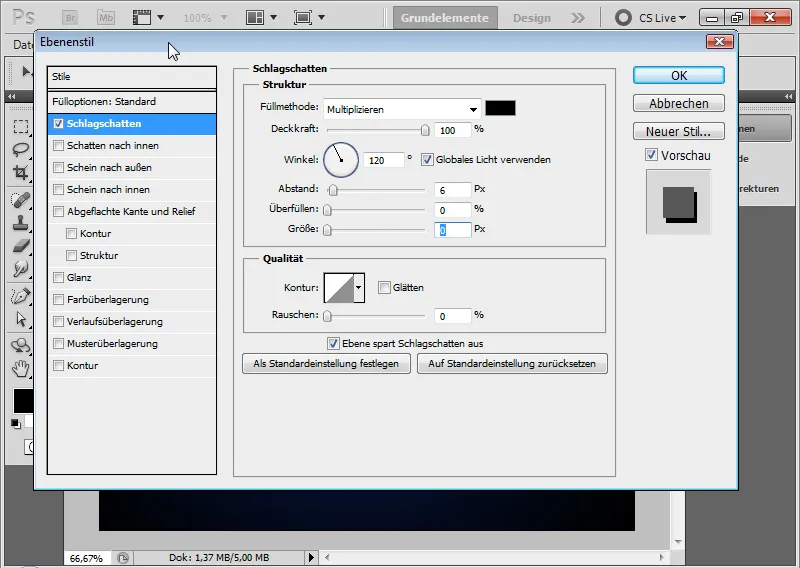
The interim step with Drop Shadow: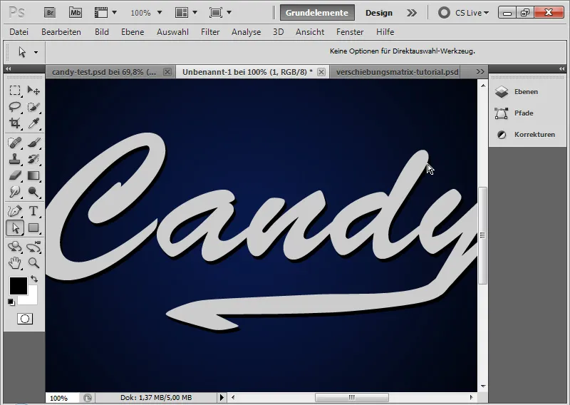
- Stroke – for a light, illustrative outline of the text
• Black Outer Stroke
• Size: 2 pixels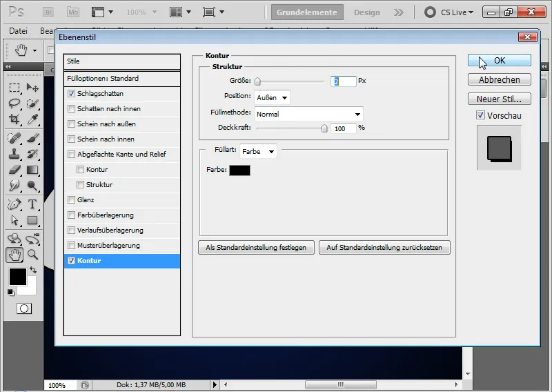
The interim step with a 2-pixel thick Stroke: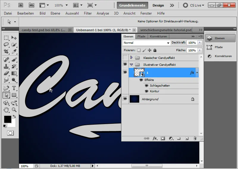
- Rounded Edge and Emboss - for the highlights
• Style: Inner Rounded Edge
• Technique: Round
• Depth: 1000 percent
• Size: 6 pixels
• Blur: 0 pixels
• Shadow Angle: -60 degrees
• Shadow Altitude: 40 degrees
• no global light!
• Highlight Contour smoothed in Gaussian Normal Distribution
• Light Mode 0 percent Opacity white in Negative Multiply Mode
• Shadow Mode 60 percent Opacity white in Negative Multiply Mode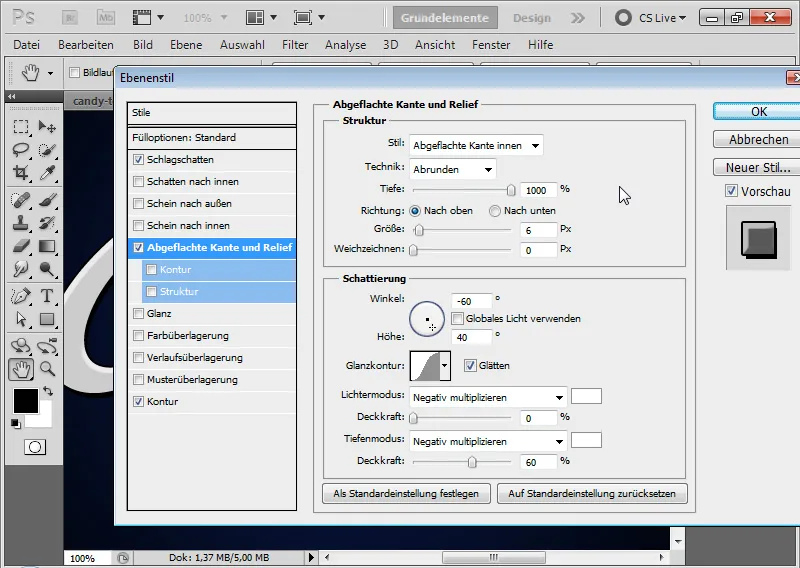
Trick: Since I cannot easily achieve these hard, lateral highlights with the common shading settings, I simply use the Shadow Mode with white color and a negative Shadow Angle as an alternative.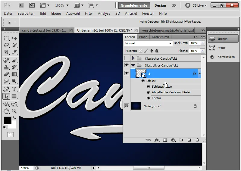
- Gloss – for a light minimal gloss gradient on the text, which will have a particular effect in the colored glaze stripes later in the result:
• Mode: Negative Multiply
• Opacity: 20 percent
• Angle: 160 degrees
• Distance: 9 pixels
• Size 12 pixels
• Contour: Gaussian Normal Distribution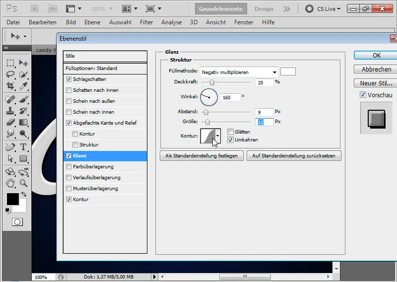
Step 5: Inserting glaze stripes
With the rectangle tool, I insert a rectangle into a new layer. The color of the rectangle is sky blue. I transform the rectangle into a rhombus using Ctrl+T.
I link the rhombus to my smart object layer by creating a clipping mask with Ctrl+Alt+G. Now I position the rhombus as the first icing strip.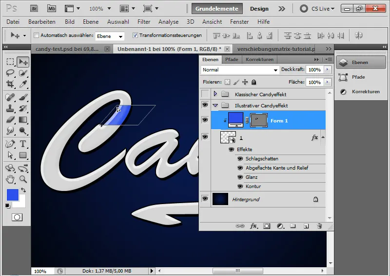
Using the move tool and Alt, I duplicate the rhombus and place the duplicate in other parts of the text. Occasionally, I need to adjust the shape of the rhombus. The best way to do this is with Ctrl+T>Warp.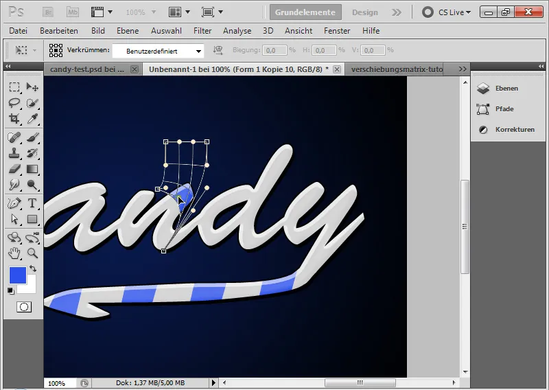
It's useful to select all icing strips and place them in a smart object. This allows me to quickly make color changes, etc. using the fill options – as shown in the example above with a red color overlay.
My illustrative candy effect is complete, which is definitely cooler than the classic one.
One last tip: There are candy fonts that already include simplified versions of the candy effect. These include:
- Candy Cane
- Candy Time.
