In this guide, we delve into the world of forms in React, focusing on the usage of select and textarea elements. Forms are an essential part of any web application as they allow users to input data and interact with the application. In React, we provide the ability to efficiently utilize these elements and work with the Component State. Here you will learn how to handle these form elements to create an interactive user experience.
Key Takeaways
- Using select and textarea in React is similar to conventional HTML.
- You need to pay attention to whether your input elements are "controlled" or "uncontrolled."
- Handling onChange events allows for dynamic interaction with the input fields.
- Validating input values and their lengths can provide useful hints to the user.
Step-by-Step Guide
Start by defining a simple React component. Here, you will use a form that contains a select element for the favorite color and a textarea element for entering a comment.
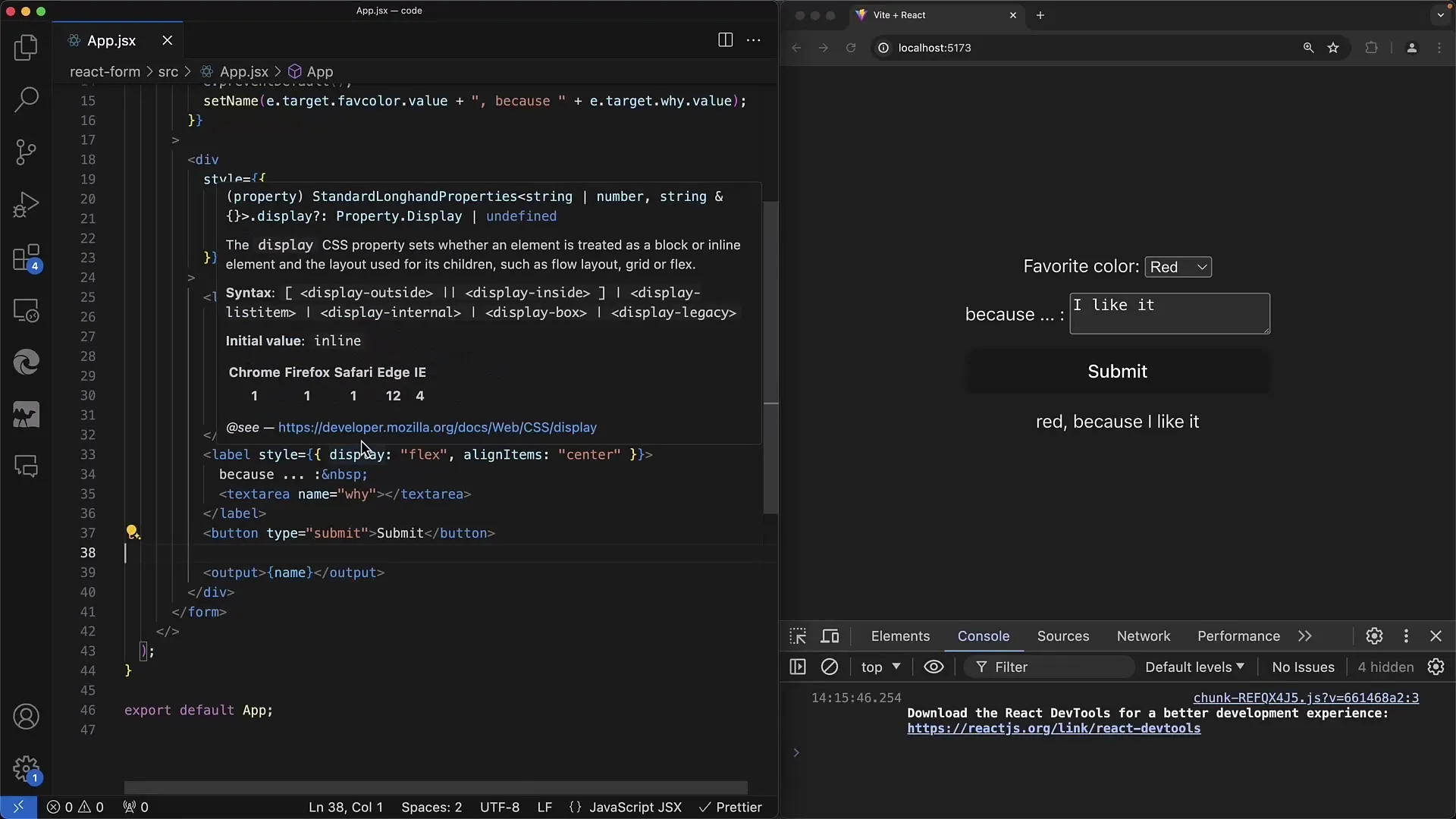
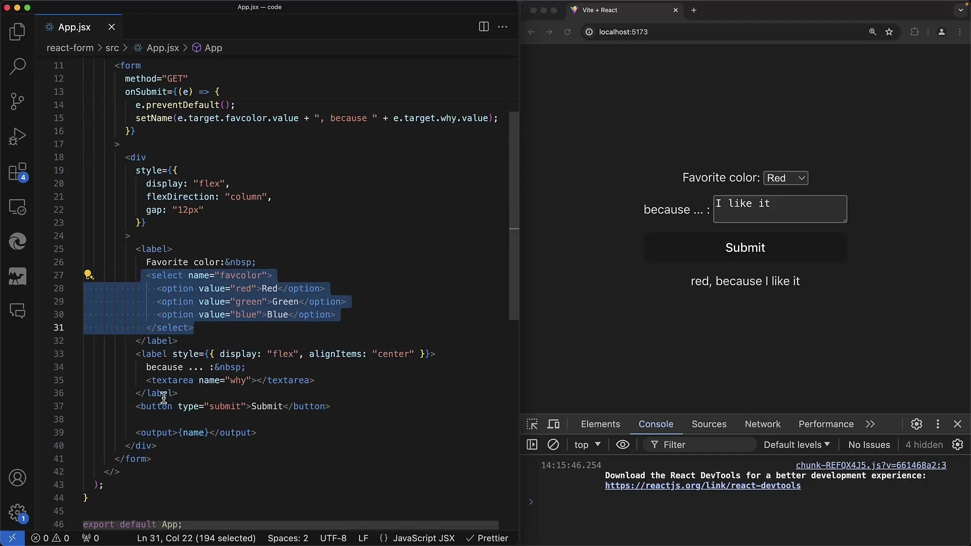
In the first step, create the basic structure of the form. The select tag includes options for the colors Red, Green, and Blue. Below that, there is a textarea where the user can input the reason why they like the selected color.
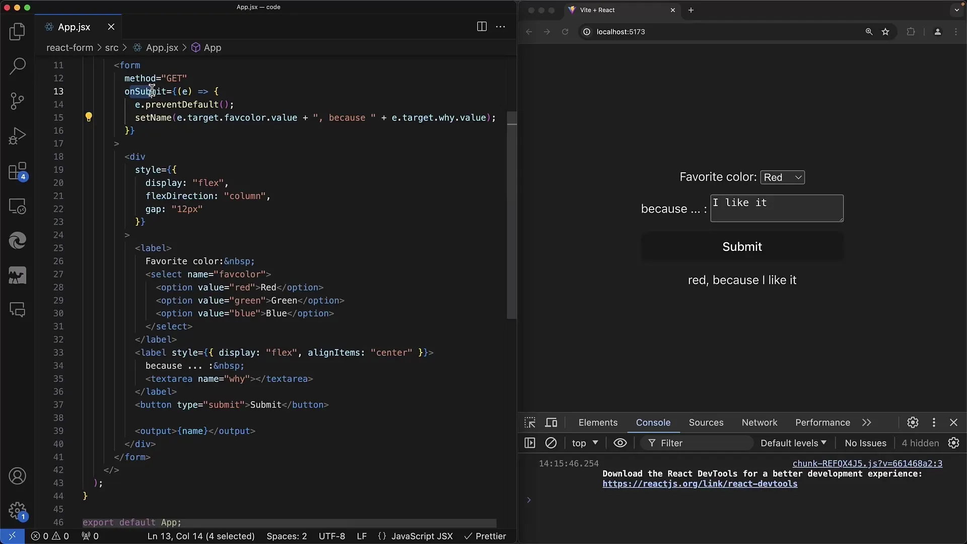
For the onSubmit event, ensure that you capture the input values. Use the event parameter to access the used form elements. You can use the name "favorite color" for the select element and "comment" for the textarea to store the respective values.
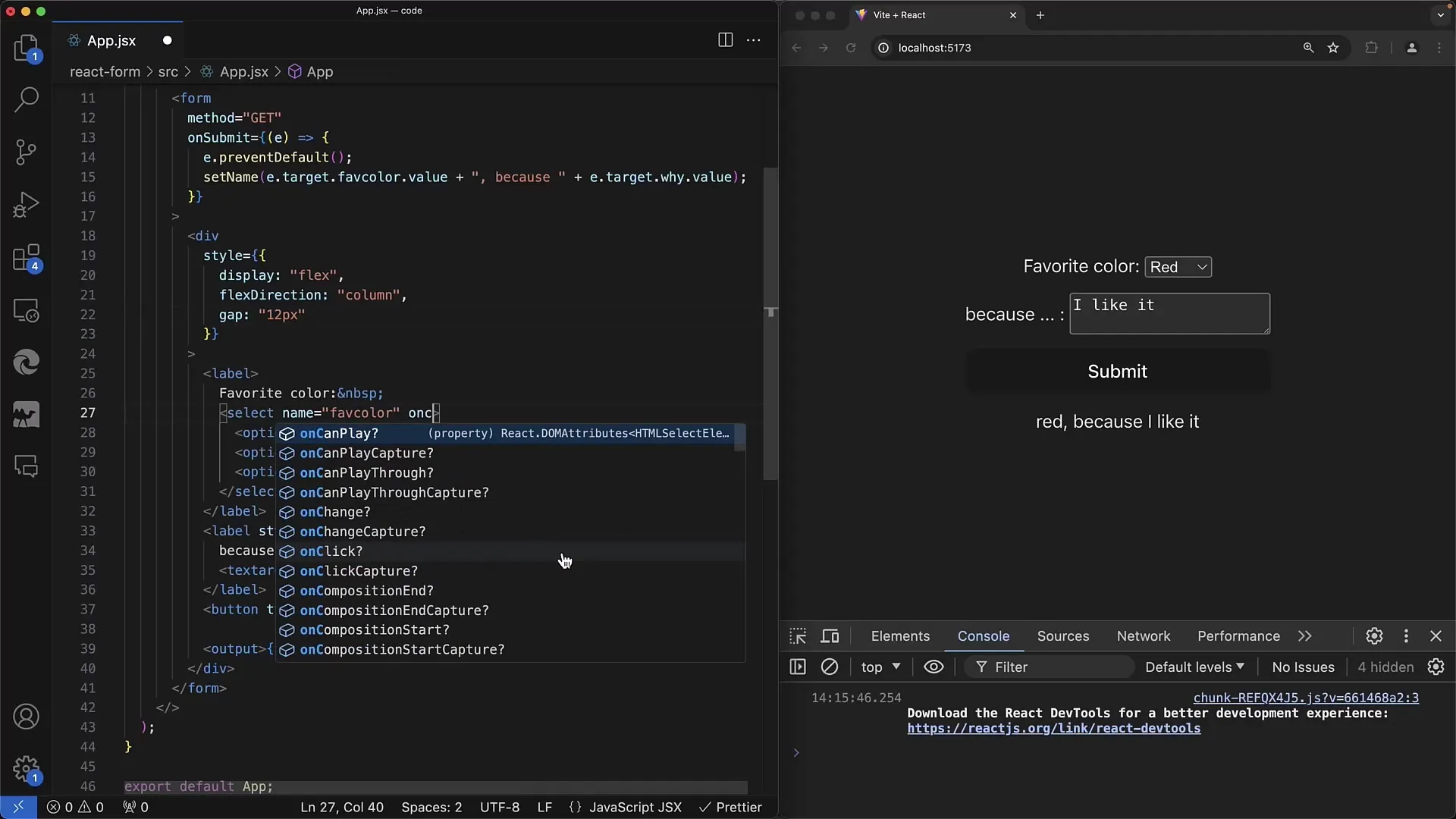
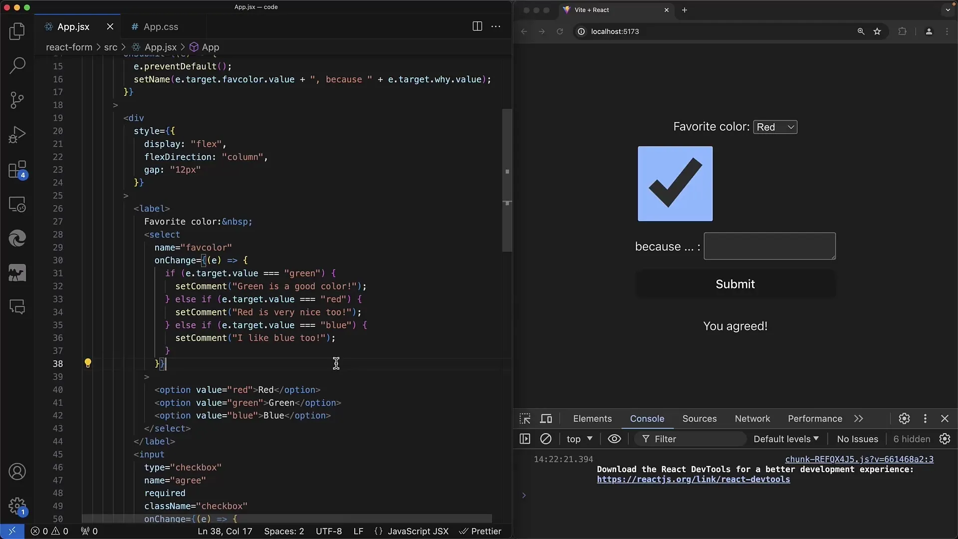
To react immediately to changes, implement the onChange method for the select element. Here, you check which color was selected. The value of event.target indicates whether Red, Green, or Blue was selected.
If you select the color Green, you could generate an output like "Green is a good color" by storing a comment in the state based on the selected color. It is advisable to handle potential errors in a way that provides immediate feedback to the user.
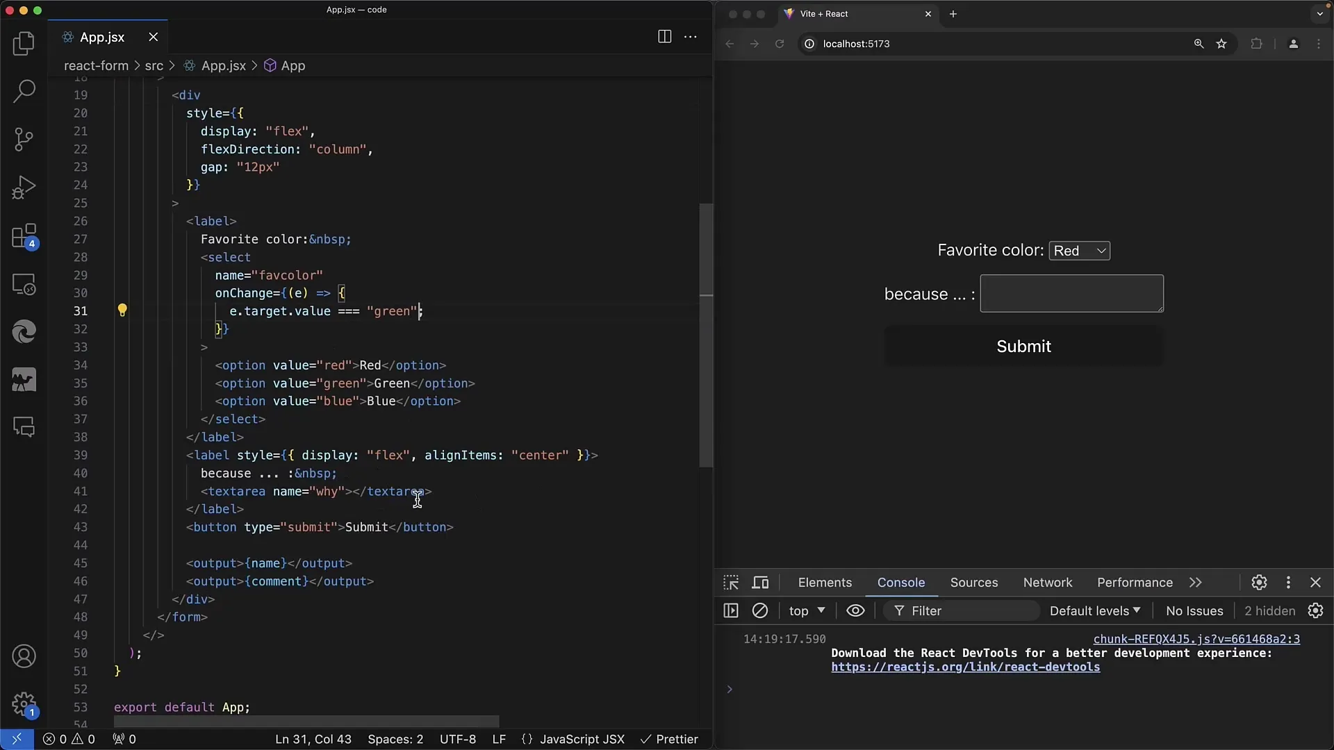
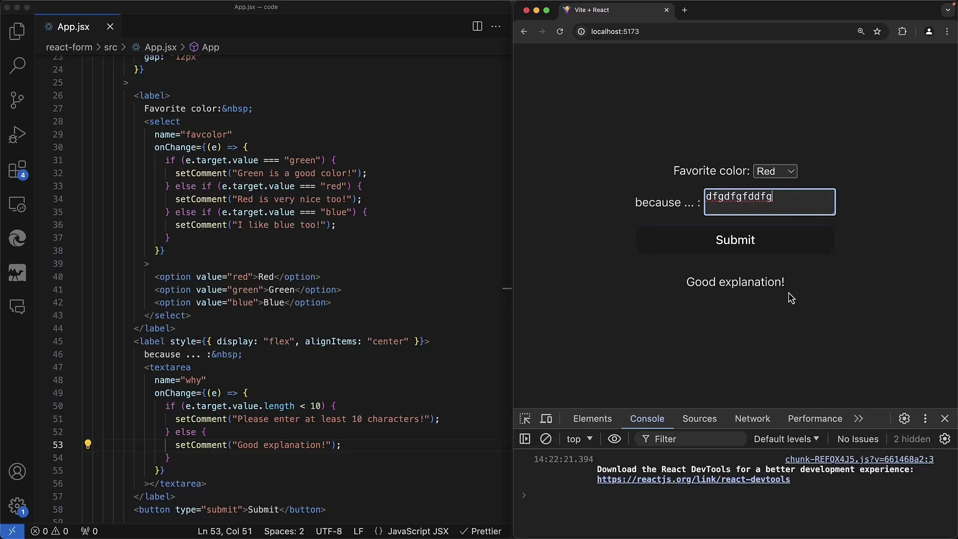
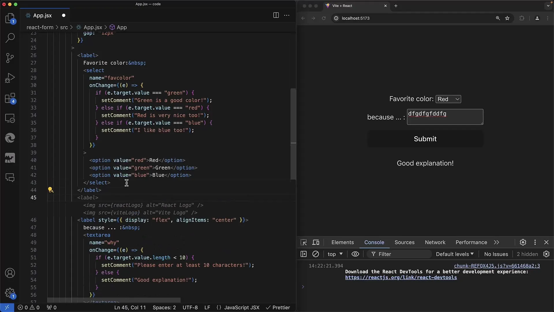
Now, it's time for the textarea. Here, you can also use the onChange method and check the length of the user input. If the text length is less than 10 characters, display a prompt asking the user to write more.
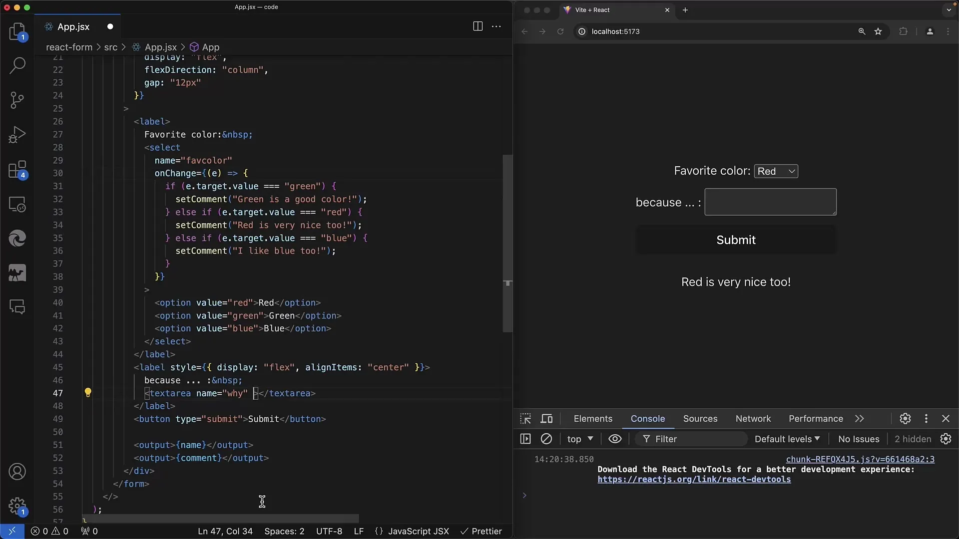
Otherwise, provide positive feedback if the length exceeds 10 characters. This is a simple form of validation that helps the user input complete information.
If your application uses checkboxes, you can handle them similarly. Implement a checkbox with a simple onChange to determine whether the user has agreed or not. This interaction follows the same principle as the elements described earlier.
An important point is using className instead of class to apply styling with CSS - this is a typical difference in React. You can also apply CSS classes to your checkboxes to make them more user-friendly.
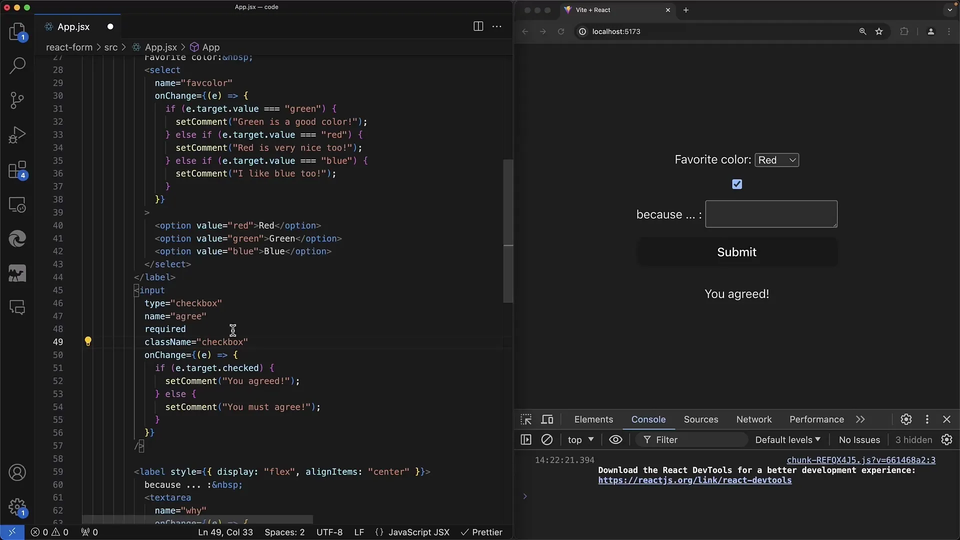
In summary, when dealing with forms in React, you follow a similar approach to traditional HTML but need to consider some specifics. Clearly differentiate between "controlled" and "uncontrolled" components, and ensure you never switch from "undefined" to a value.
Summary - Creating Web Forms: Select and Textarea Elements in React
In this tutorial, you have learned how to implement select and textarea elements in React and process their values. You have also learned how to validate input values and display interactions to the user.
Frequently Asked Questions
How can I use a -Element in React?The -Element works in React similar to HTML, you can bind it with onChange to react to changes.
How do I validate the input in a?You can use the onChange method to check the length of the input and provide feedback if the conditions are not met.
What is the difference between "controlled" and "uncontrolled" components in React?Controlled components store their value in React's state, while uncontrolled components access the DOM directly.
How do I apply CSS to React components?In React, you must use className instead of class. This way you can access all standard CSS styles.


