Let's take a closer look at the story. You can see a kitchen utensil and a sugar cube.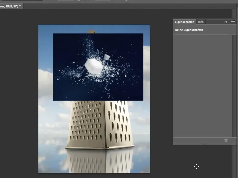
Here we go: Steps 1-12
Step 1
The assembly should look as if the sugar cube is hitting the edge of the kitchen utensil. This is not terribly difficult.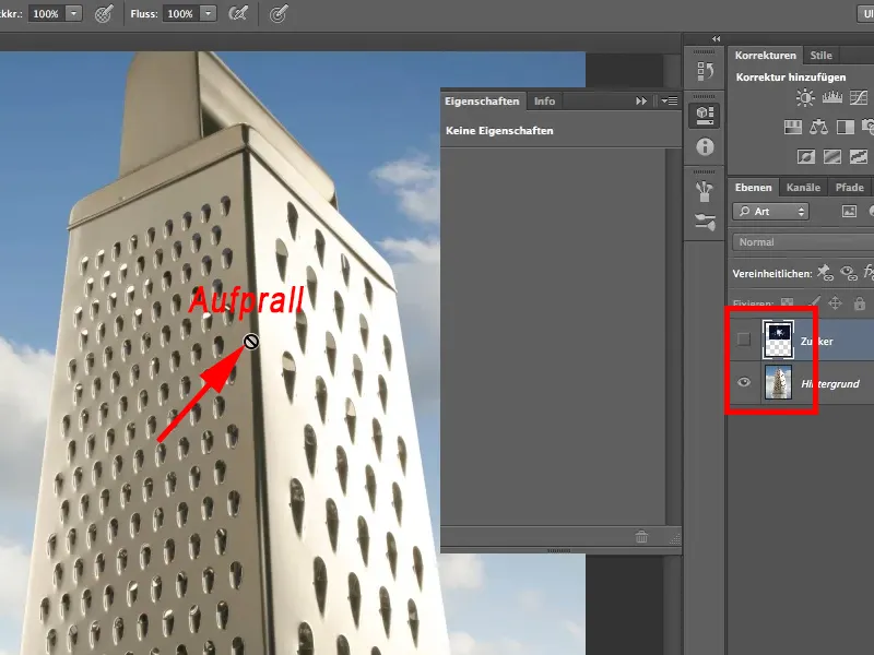
Step 2
However, we need to get rid of the black background on which I crumbled the sugar cube. Just a brief explanation of how the whole thing was created: I took sugar cubes and scraped off pieces of them with a box cutter. In this case, there were certainly two cubes because there was a bit more lying around than could have come from just one cube. I then swept everything together a little so that it looked a bit more like an explosion and a bang. I then photographed it with relatively simple lighting. Not such a complicated story.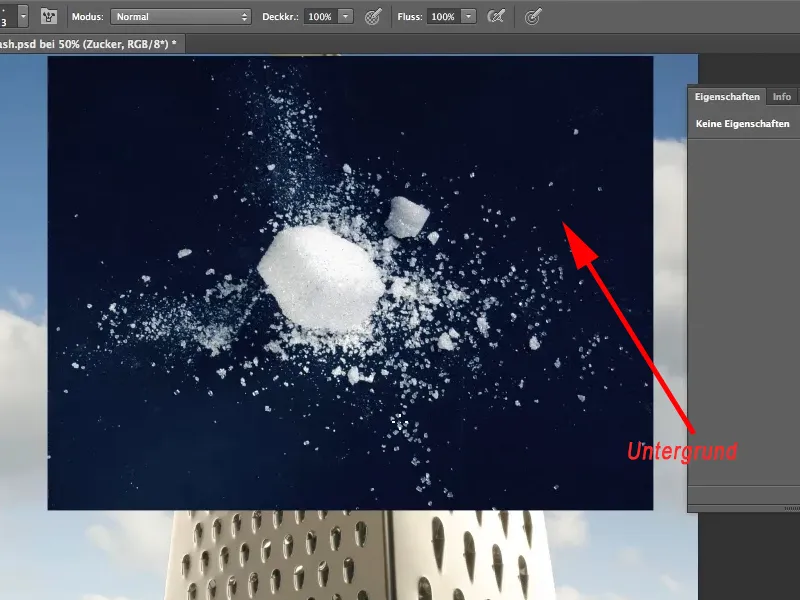
Step 3
The whole thing only gets complicated when we want to remove the black background. The first tool that comes to mind is the magic wand. We activate it in the tool palette, set a tolerance of 19 % and uncheck the Adjacent option. Now click on the black background.
Adjacent must therefore be deactivated so that all enclosed black parts of the image can also be removed.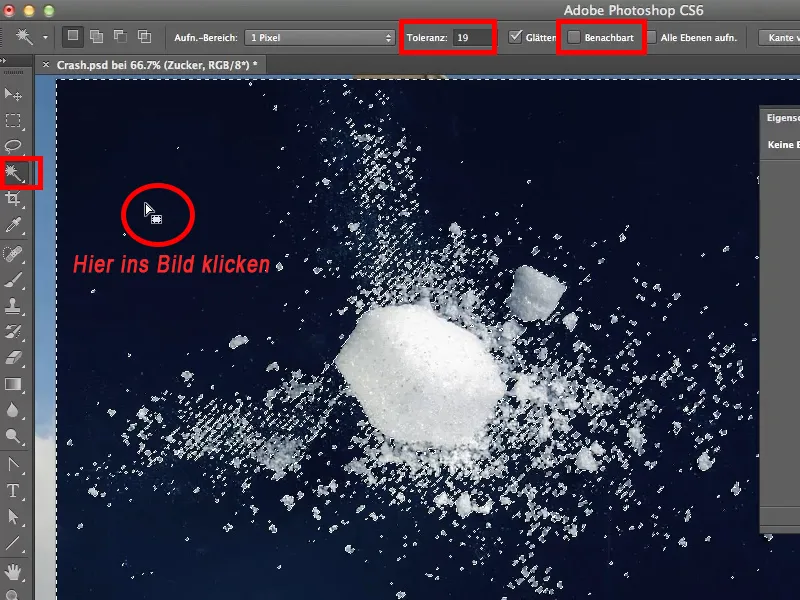
Step 4
If I now delete the selected background with Del, I have got rid of the entire black background, ...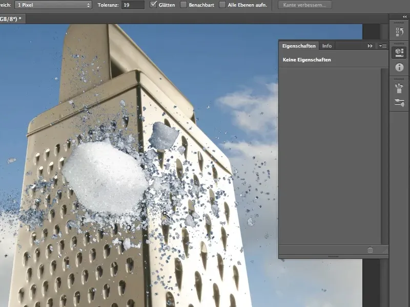
Step 5
... but on closer inspection you can see that we have ugly edges. These are not easy to get rid of. So this is not the best clipping method.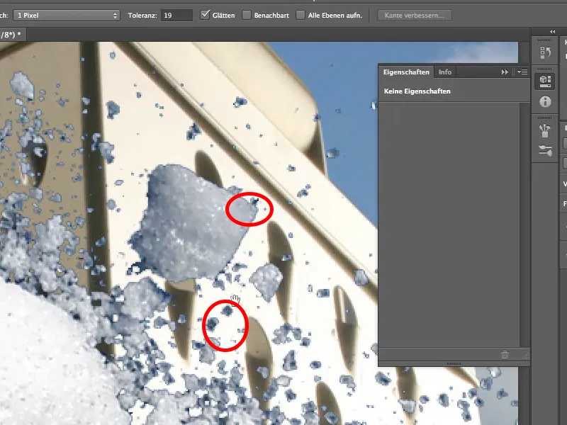
Step 6
So let's take a look at another method. The Layer>Layer Style>Fill Options menu item opens the Layer Style dialog box. I'm sure you're all familiar with this. The quicker way is to double-click on the layer.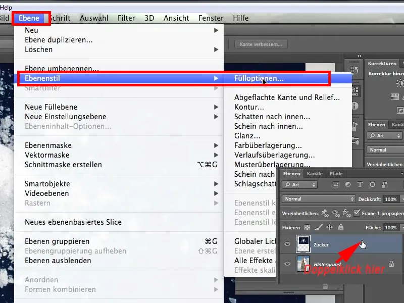
Step 7
I'm sure everyone has seen this tool. You wonder what's in there. I can only advise you: Try it out a bit.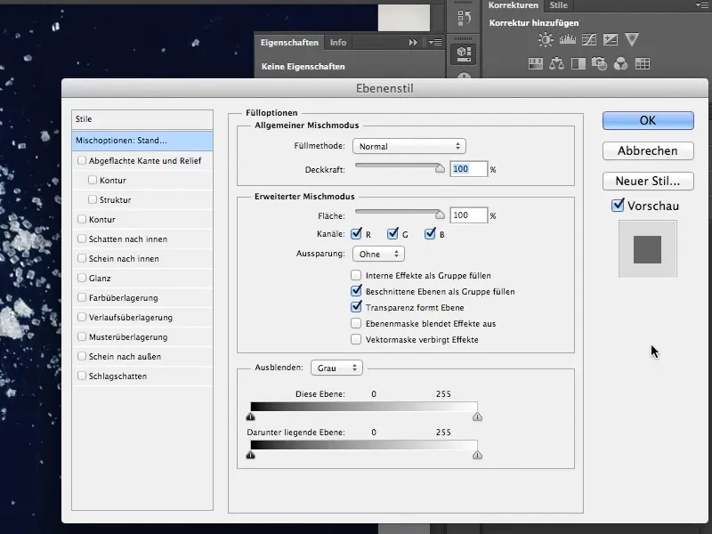
Step 8
With this tool, we will now try to remove the sugar layer. We have various sliders in the lower area. The first is This layer, which is the currently active sugar layer, and the second is the Layer below slider. We have nothing to do with the layer below, it remains as it is.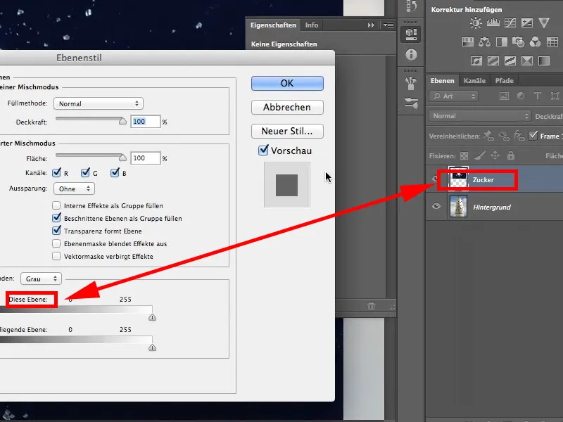
Step 9
I take the black slider on the left of This layer and drag it to the right. You can see that the entire black background is faded out. This is a Schick thing, but we haven't gained much from it yet. As you can see, the ugly black edges are still there. Of course, these still have to disappear in one way or another.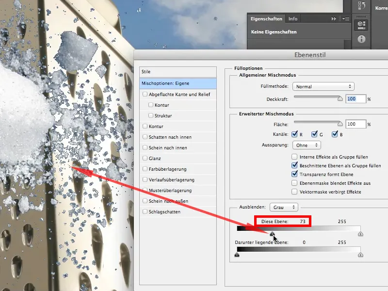
Step 10
To do this, we now need to press the Alt key, click on the slider and move it further to the right. Holding down the Altkey splits the slider and creates a kind of transition.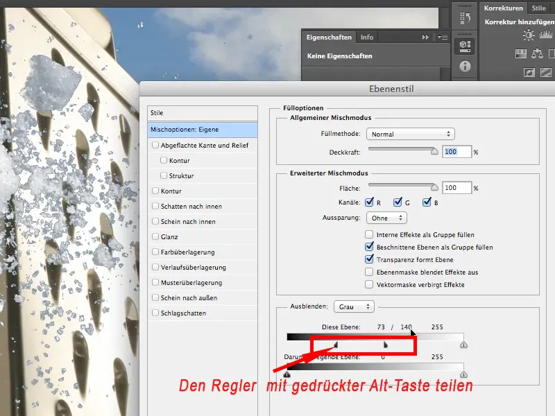
Step 11
Now let's interpret the values. We have the values 73/140 and 255 above the sliders, which means:
- From 0 to 73, all tonal values are completely faded out.
- From 73 to 140 there is a smooth transition.
- And from 140 to 255, all tonal values are visible.
That's a great thing, especially as the tool is very old. It's been around forever - I don't even know how long, probably since PS4 or PS5, not CS4, but really PS4. It's an old tool that keeps proving its worth.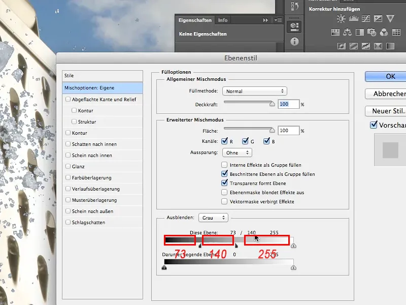
Step 12
We still have one small thing to do, however, because we can't be completely satisfied with the result yet. There are still a lot of relatively dark sugar crystals. If you think about where the light is coming from, namely from the right, as you can see from the cube, the sugar crystals are really still too dark. This is due to the transparency of the crystals and the fact that this makes the black background visible again.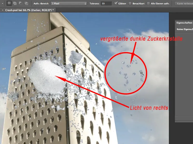
Let's continue: Steps 13-25
Step 13
No big problem for us, we only need to lighten them. The inexperienced take the dodge tool and zoom in closer. I definitely want to get rid of the low tonal values. In the top bar under Area, I set the depths to dodge (lighten) them and set the exposure to approx. 30 %.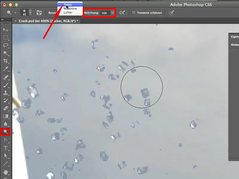
Step 14
It works at first, the sugar crystals become lighter, but unfortunately the background is also dodged and shines through. Even if we get a nice white sugar, we get the ugly black background back into the picture. This is because the Layer Style dialog is live, so it is still active and can be called up again at any time. Everything that happens on the layer is included in this dialog. This is why you can now also see the lightened background.
We don't want that at this point and therefore have to come up with something else. We undo the last steps with Ctrl+Alt+Z.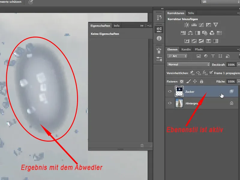
Step 15
It is always a good idea to take a kind of snapshot and edit it further. This is called a smart object. This means that the sugar layer, as it is now, i.e. with the background hidden, is saved as a snapshot/smart object in Photoshop.
I create such a smart object via Layer>Smart objects>Convert to smart object.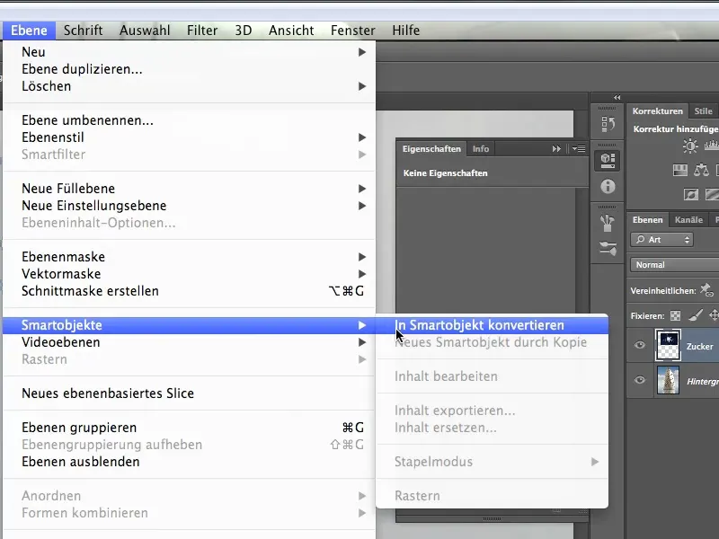
Step 16
You can see from the small box on the sugar layer thumbnail that this layer is now a smart object. At the moment you can't see a black background, which is why it is not present in the smart object. Of course, as you can see from the "No parking" sign, I can no longer access my sugar crystals. So I'm forced to work "non-destructively", which is the better option anyway.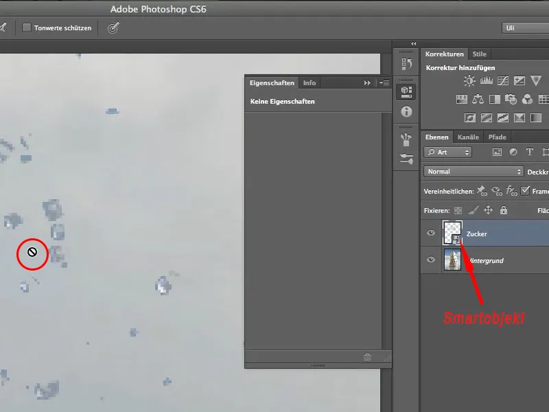
Step 17
To do this, I create a new layer using the icon at the bottom of the layer palette.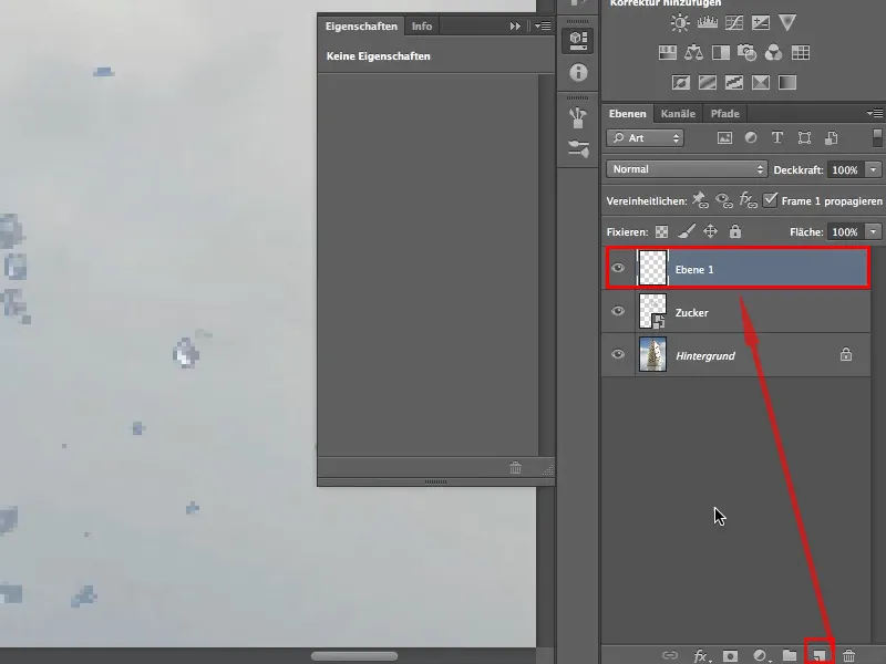
Step 18
So that this layer can also be used for dodging, I fill it with 50% gray via Edit>Fill Area.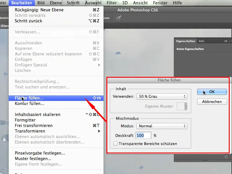
Step 19
I then blend the layer in Radiant Light mode. This layer mode is a relatively aggressive method of lightening shadows, so you should be careful to work with low opacity.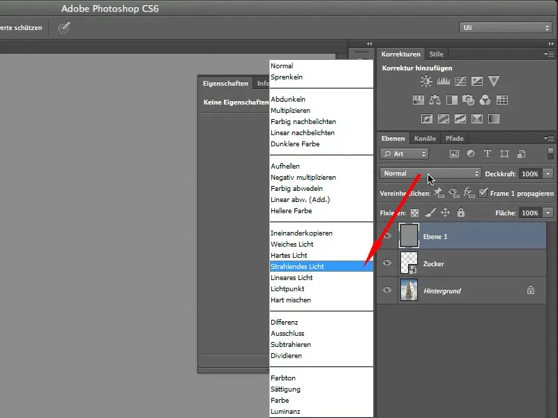
Step 20
To ensure that the whole thing only affects my sugar layer, I create a clipping mask via Edit>Create Clipping Mask. Otherwise I would also lighten my background, which I definitely don't want to do.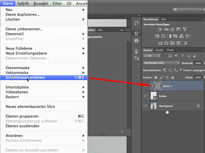
Step 21
Either continue working with the dodge tool or take the brush and set the foreground color to white. With an opacity of 10%, I start to lighten the background carefully. It works, but the light pixels are lightened particularly strongly - that's what I mean by aggressively.
So this is a good way to bring out the contrast of the sugar grains, but to make them brighter overall, we're just using the wrong blending mode.
I like it when we add light accents like this, but I want to brighten up the rest as well..webp?tutkfid=64290)
Step 22
We want to brighten up the blue-grey shimmering here. This means I create a new layer, fill it with 50% gray and add a clipping mask.
In the image below, you can see how the gray layer is simply superimposed.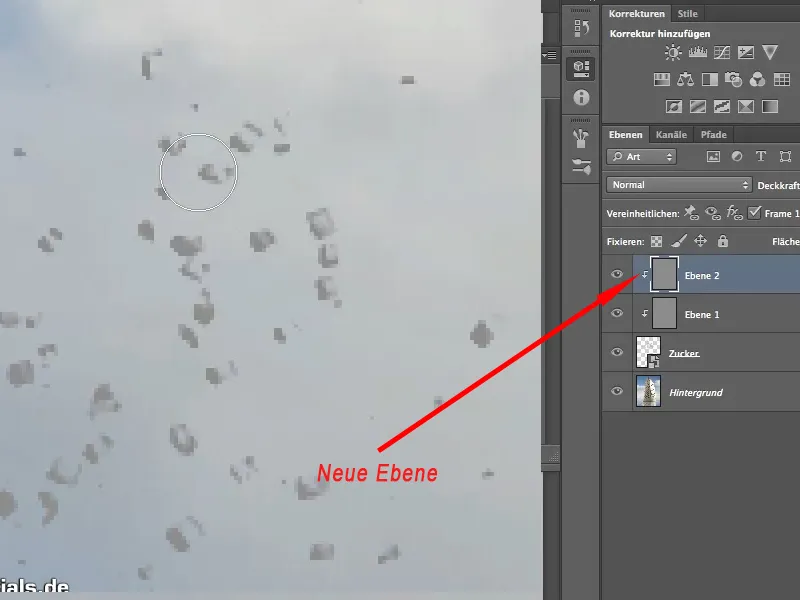
Step 23
I now blend the layer in Hard Light mode. This layer mode should be very suitable for this, even if it sounds a bit strange. The hard light leaves the highlights where they are and only brightens the mid tones.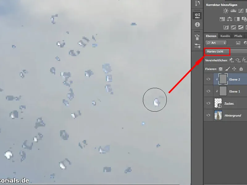
Step 24
If you paint over it long enough, you'll get nice white grains of sugar, just as expected. We can go up with the brush opacity as this blending mode is far less aggressive. You can definitely work with 30% here, while the radiant light should be used at a very low intensity.
Accordingly, I can also brighten the rest of the sugar grains so that the light is also adjusted after cropping..webp?tutkfid=64293)
Step 25
To summarize once again: With the sugar layer activated, we used the blending options to hide the black, then split the slider to create a smooth transition. With the two layers Radiant Light and Hard Light, each filled with gray - this is important - we then adjusted the highlights.
You can also adjust the shadows on the other side of the cube in the same way.
These are a few little things that are worth knowing after you have cropped, as cropping alone is often not enough.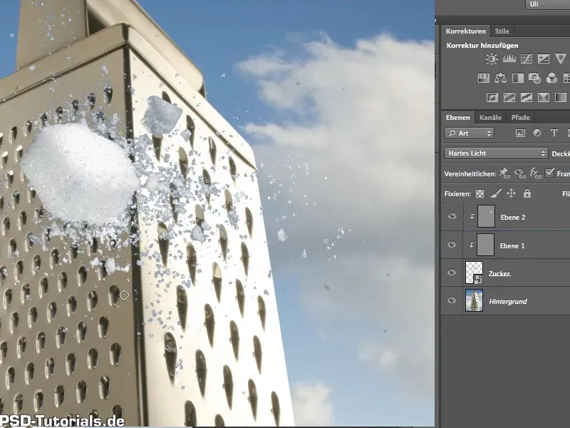
I hope you enjoyed the technique and that you can try it out.


