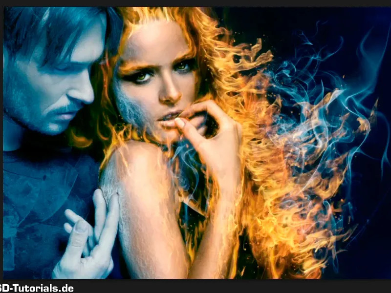
Note: The tutorial "The icy look of men" is a text version of the accompanying video training by Marco Kolditz. The texts may therefore have a colloquial style.
Here we go: Steps 1-10
Step 1
In the meantime, Marco has already combined all the levels and groups relating to women into one super-group and called it "woman".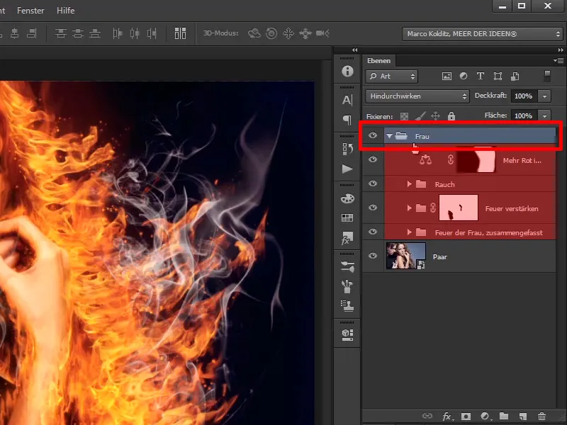
Step 2
If you deactivate this group, you will see the original image, and ...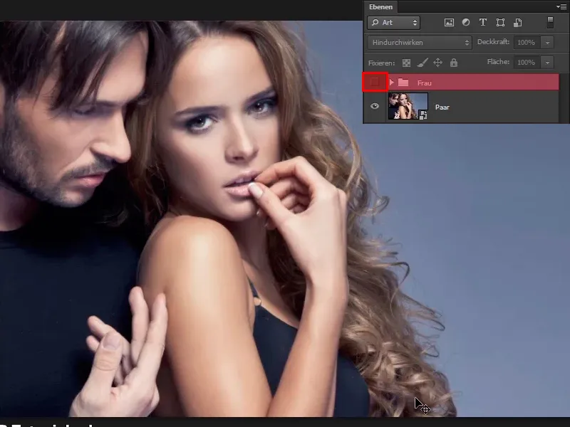
... when you activate the image as it is, with the fire, the smoke, the sparks and everything else, exactly as it should be.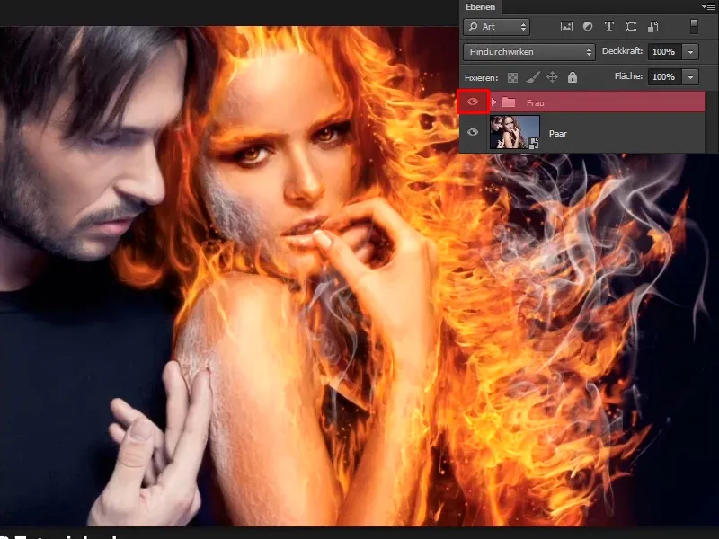
Step 3
Now take care of the little man on the left and turn him into a block of ice. To do this, you need to change the color look of the whole picture and then apply it to the man only.
To do this, start with a New Color Balance adjustment layer.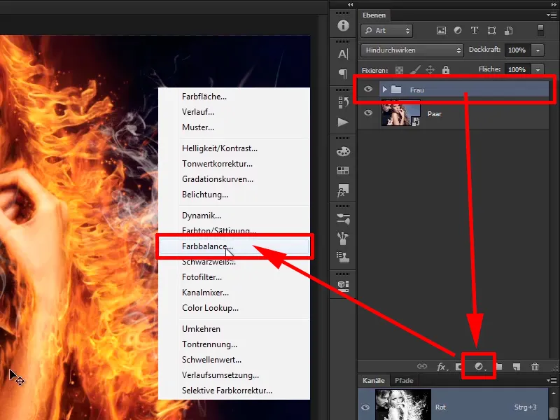
Step 4
Select a value of Cyan -44, Green +8 and Yellow 0 for Shadows.
Then switch to the mid tones, i.e. you will affect the mid tones, not the black and not the white, but all the tones in between. You also go into cyan -46, green +38 and blue +75, which already looks really icy.
For the highlights, leave everything at the default values of 0.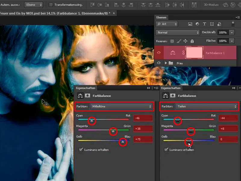
Step 5
You have now created an icy look and renamed it "Blue look" accordingly.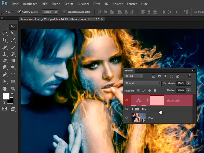
Of course, you will only apply this to the man later, i.e. you put it into a group with Ctrl+G and call it "Man of Ice".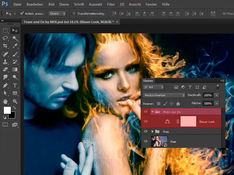
Step 6
You will now use a technique that you used at the very beginning of the tutorial, namely to create the contours of the woman.
You will use this technique to give the man a frosty look. To do this, briefly hide the "Blender look" layer and click on the next visible layer, in your case "Woman".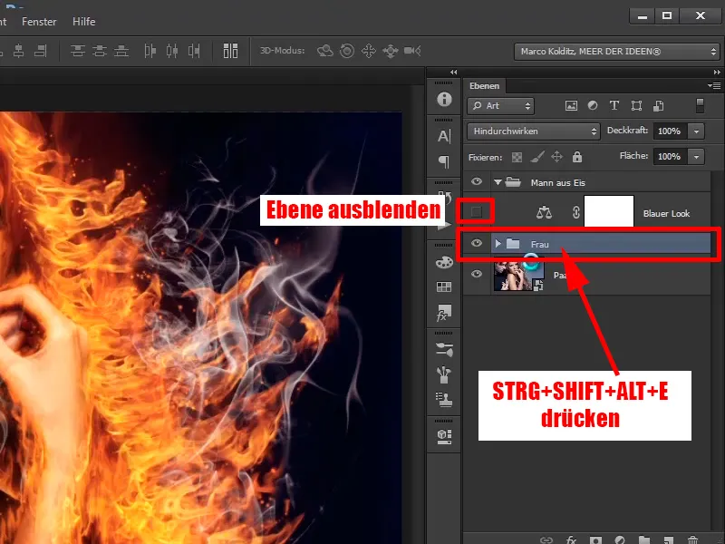
Press Ctrl+Shift+Alt+E at the same time and you will have created a layer that really combines all the layers below it, and you can now call this layer "Frosty look".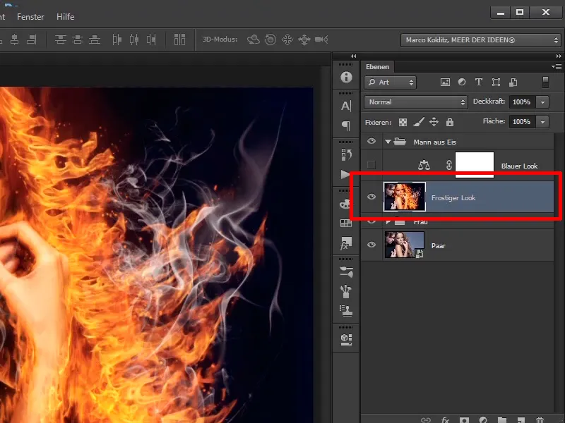
Step 7
First convert this layer into a smart object.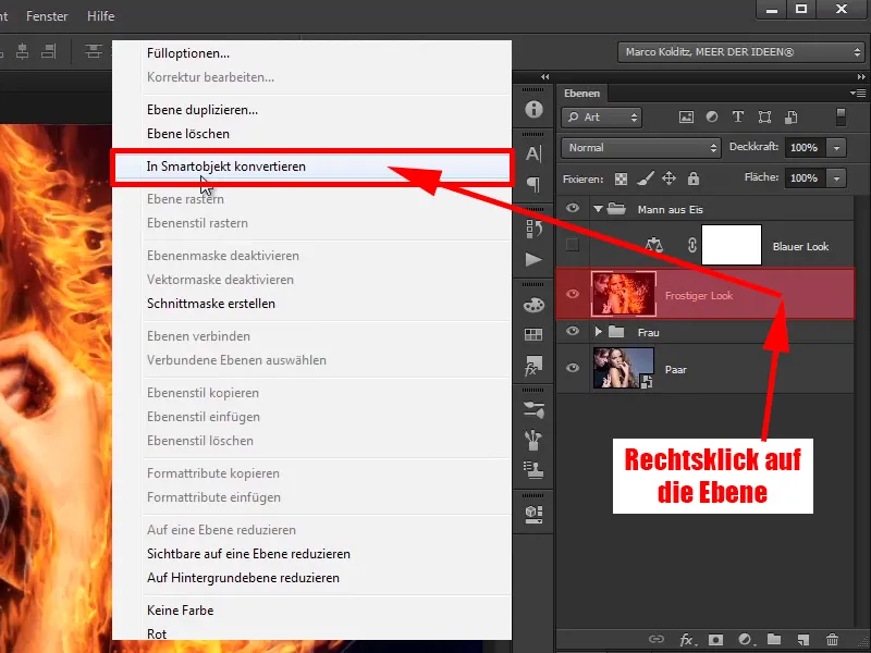
Step 8
Now click on Filter>Filter gallery as at the beginning of the tutorial.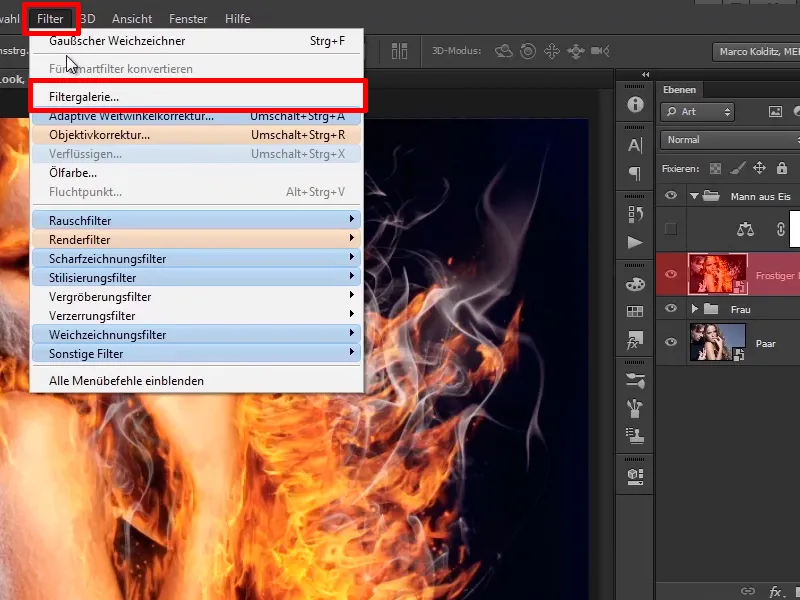
Step 9
And here you set the edge width to 4, the edge brightness to 18 and the smoothing to 12.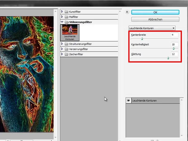
In the end, the image will look like this, with the lines a little finer than before, and you confirm with OK.
Step 10
Now apply a new Hue/Saturation adjustment layer and ...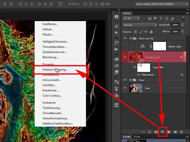
Steps 11-20
Step 11
... drag the saturation slider all the way to the left.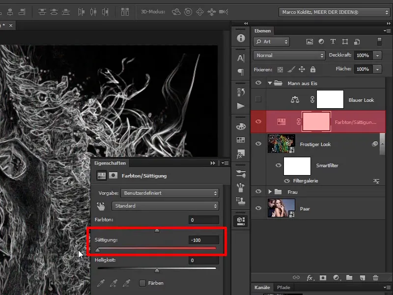
Step 12
Apply this layer as a clipping mask to your "Frosty look" layer and ...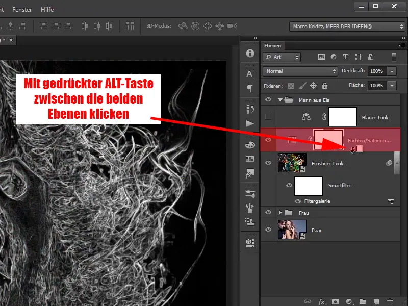
... call it "Desaturate".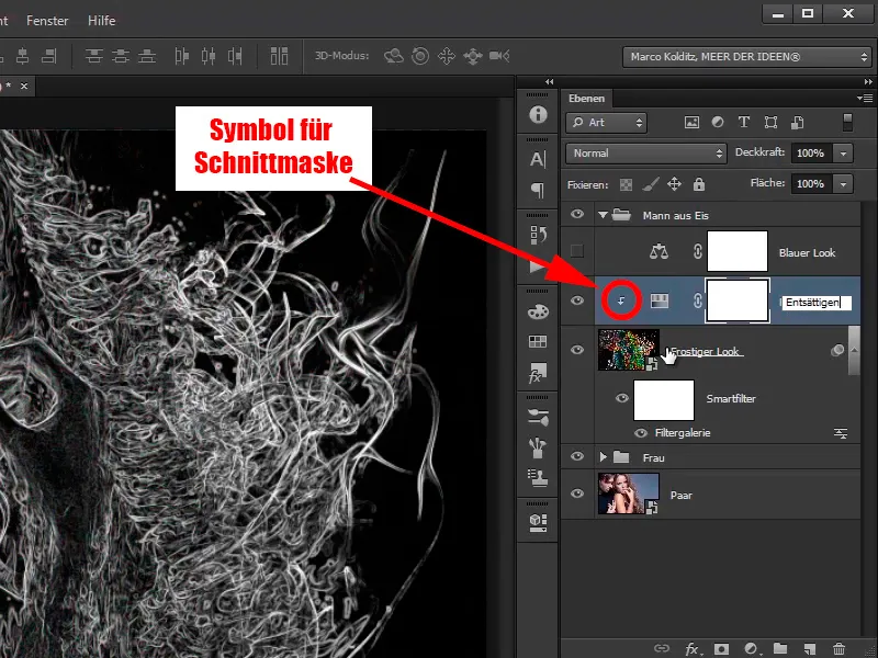
Step 13
Set this layer to the Multiply negative layer mode.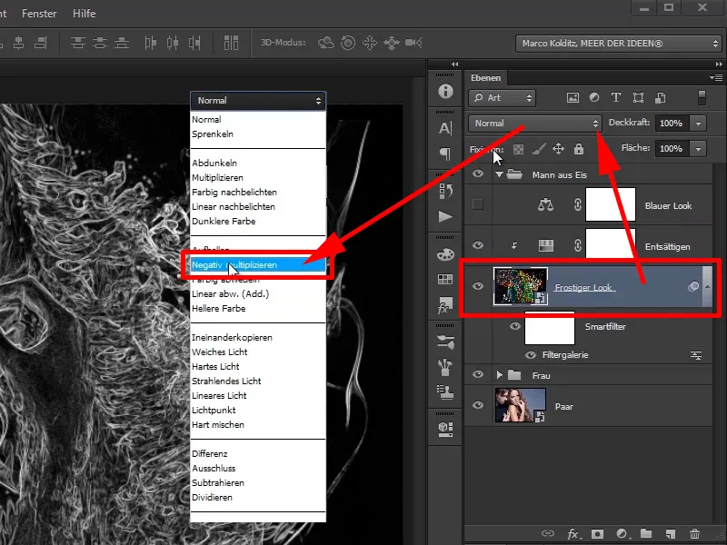
Step 14
This is what it looks like now: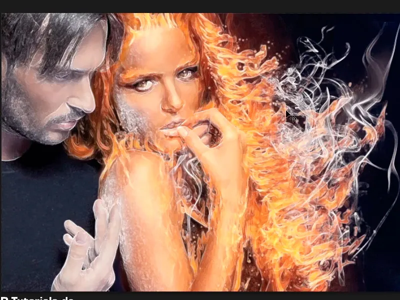
Step 15
Activate your "Blue look" layer again and zoom in a little on the image.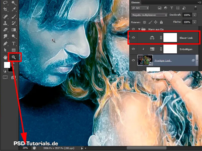
Step 16
Take a closer look at the man: It already looks a lot frostier. If you do the before and after comparison, ...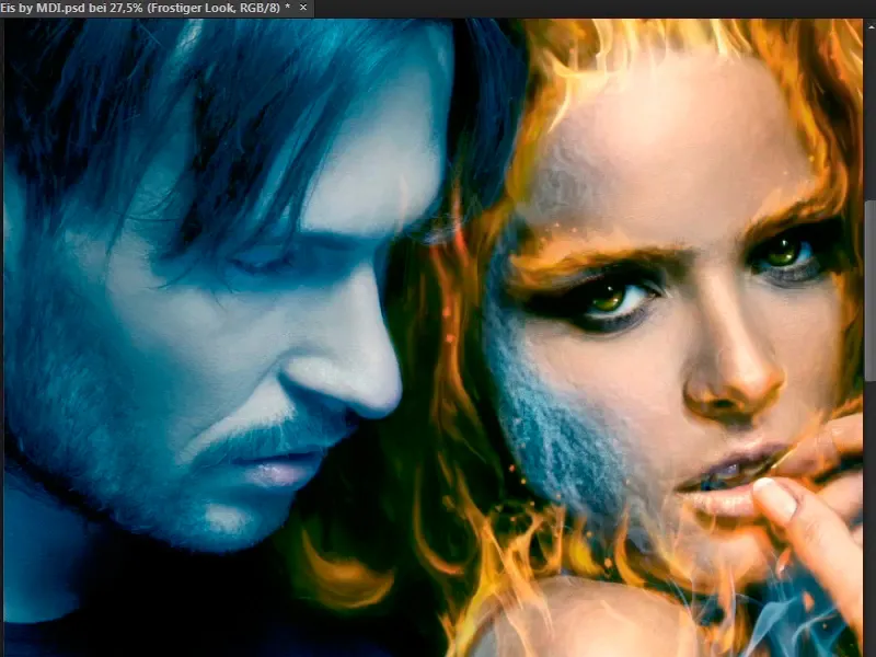
... it already looks pretty great.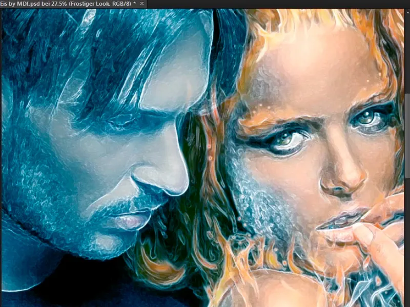
Step 17
Reduce the opacity of the "Frosty look" layer to 40%. What I particularly like here are the beard areas, it really looks like there's a bit of frost on the face.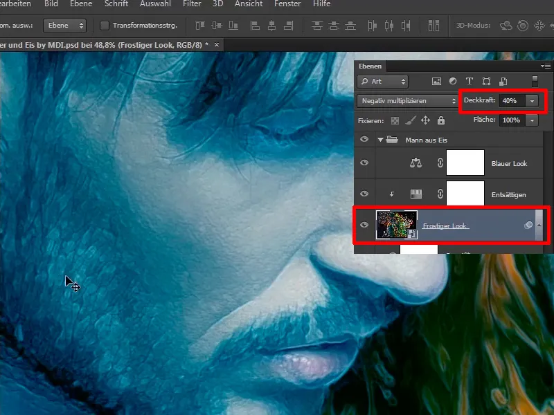
Step 18
You only want to apply this effect partially, i.e. you create a mask and invert it again with Ctrl+I,...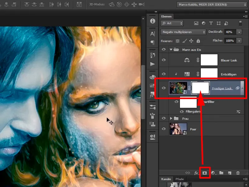
... so that the layer is completely hidden.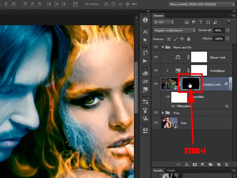
Step 19
Paint again with a white foreground color on the layer mask and really only paint in the areas where you want them, i.e. on the cheek, not so directly on the eyes, i.e. the eyelashes don't have to look so frosty, the forehead too, of course, and along the nose.
You have to be careful with the contours of the nose: You don't want to create so-called halos, which means that the contours are unattractively broken up.
It looks quite good like this.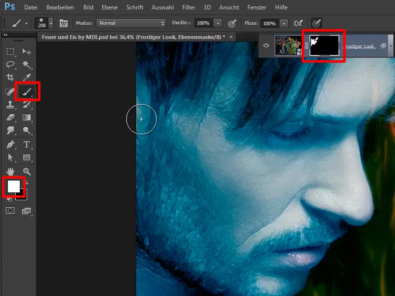
Step 20
Go over the hair again with less opacity (37%). You can also go over it several times if you like it.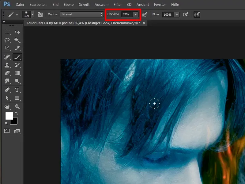
Just carry on: Steps 21 to 30
Step 21
For the eyes, you can go over the edges with 21% opacity 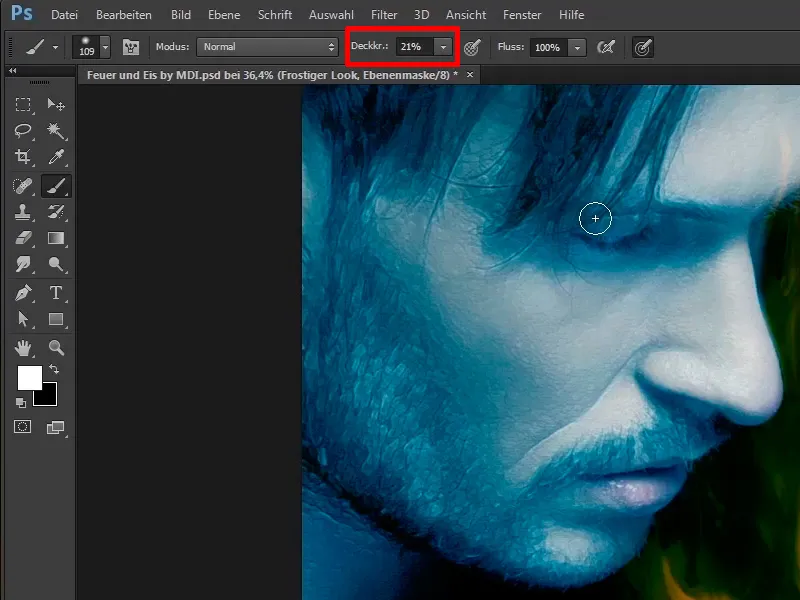
Step 22
Do the same on the hand with full opacity 100%. Be careful here too and simply lighten the hand a little so that it looks a little frostier. It also looks great on the edge when you draw along the shadows on the fingers. No wonder the woman has to freeze when he touches her.
It looks quite good like this.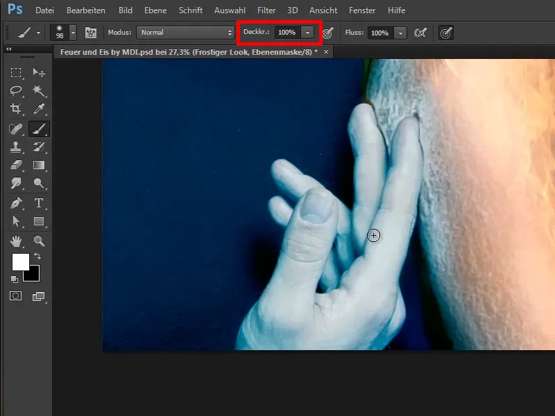
Step 23
A before and after comparison ...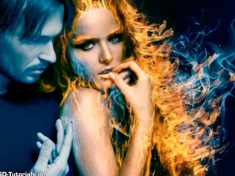
... it looks much frostier.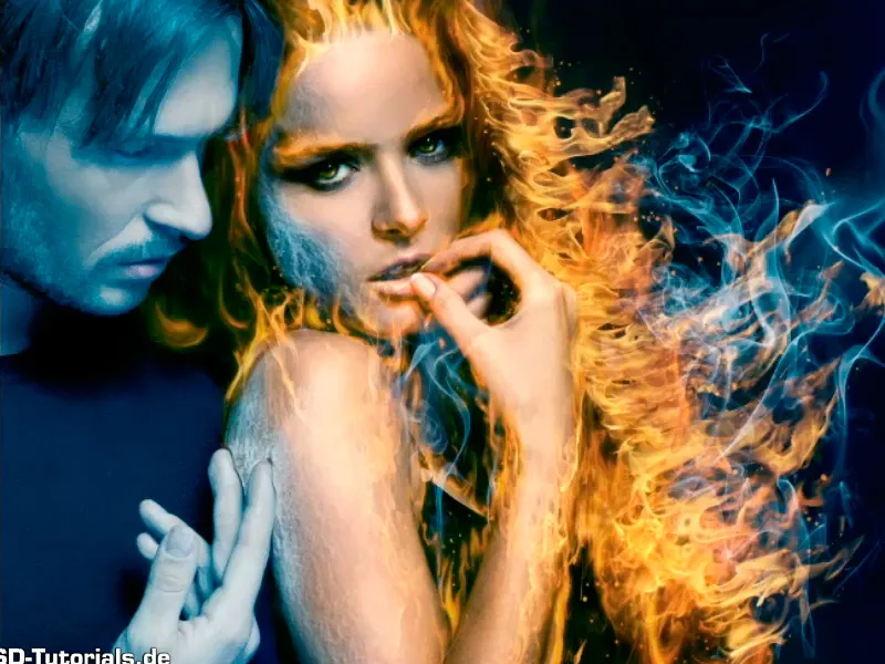
Step 24
Now you want to make the man's sweater icier and give it the texture of ice floes. To do this, Marco selects File>Open and ...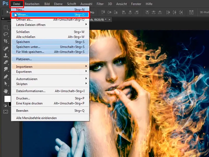
... selects the file "Ice 1.jpg".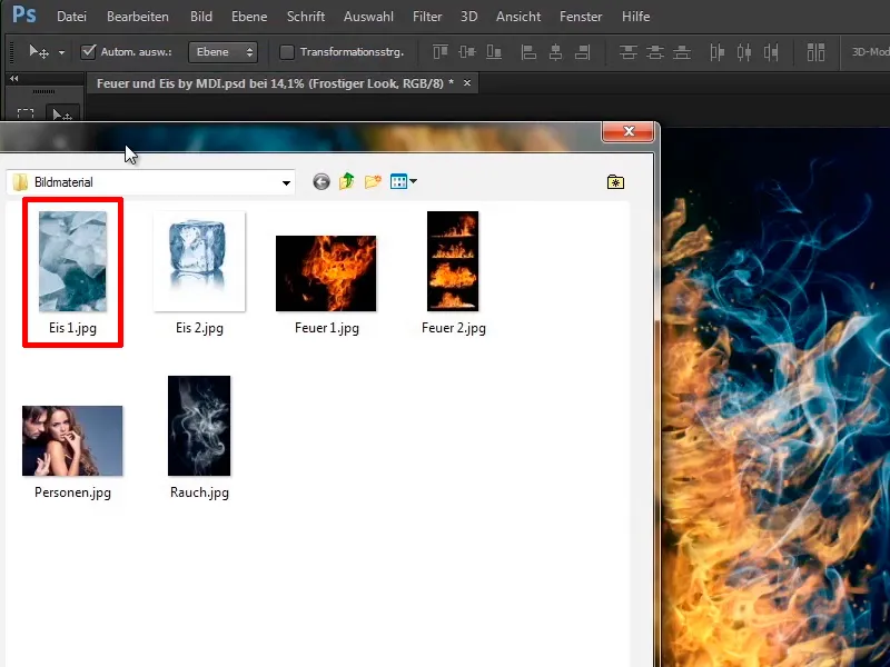
Step 25
The image shows a few ice floes and the first step is to desaturate the image, as the blue tone in the image is not needed in this case. What is the keyboard shortcut for desaturating an image? Exactly: Ctrl+Shift+U, and the image is converted to grayscale.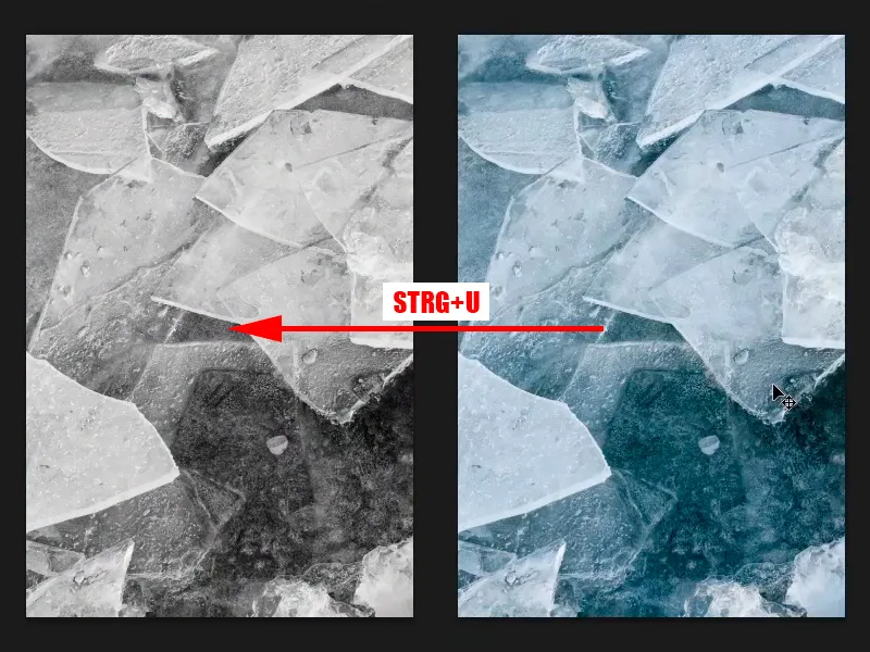
Step 26
Now you want to increase the contrast a little, press Ctrl+L and call up the tone value correction. Here you can see a histogram, and as you can see, there are actually no real white tones in this image. This means that no tonal values are shown on the right-hand side of the histogram. That's why you drag the white slider a little to the left to make the image brighter.
Step 27
By the way, a general note: if you move the white slider even further to the left, the white will be eaten out. This means that there is no more drawing in the white.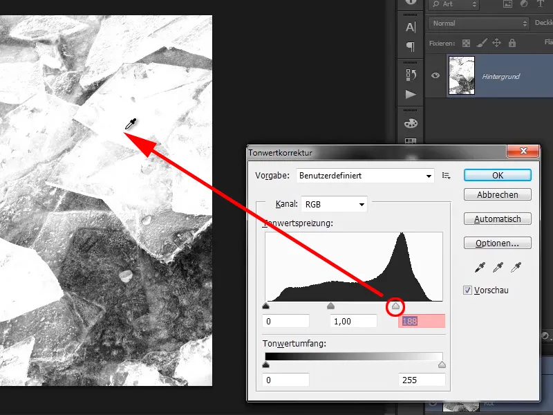
You can see that if you undo this, you will still see beautiful details.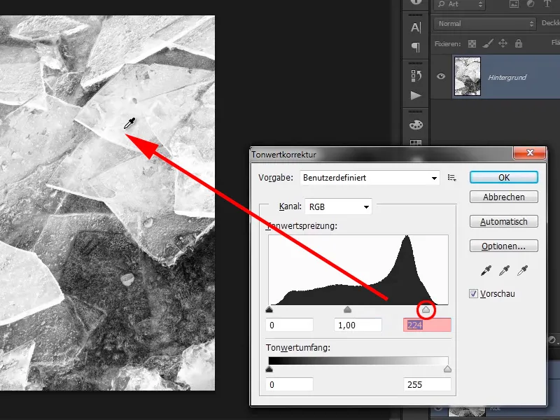
Step 28
Why is it like this? Imagine a vertical line here. All the tonal values, i.e. all the image information on the right is simply cut out ...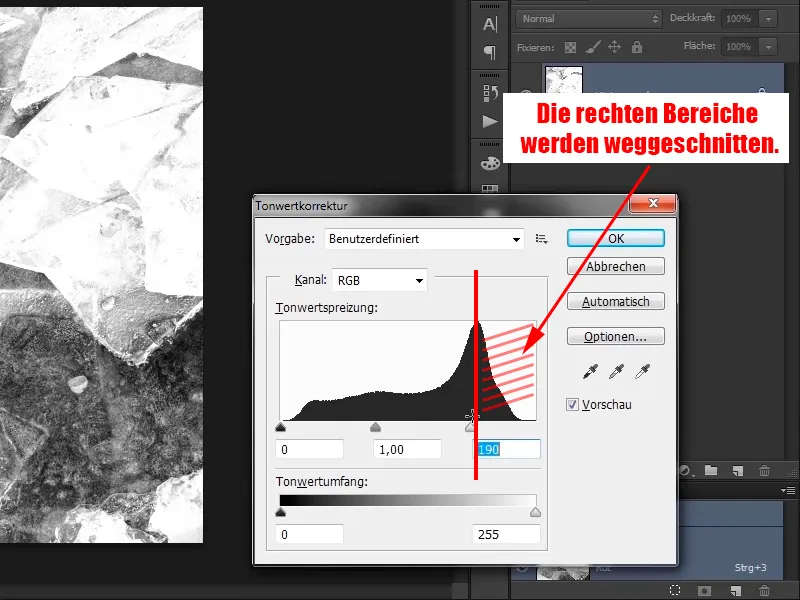
... i.e. the more you move to the left, the less detail the image shows, because all these areas are no longer present in the image, only the areas to the left of the line.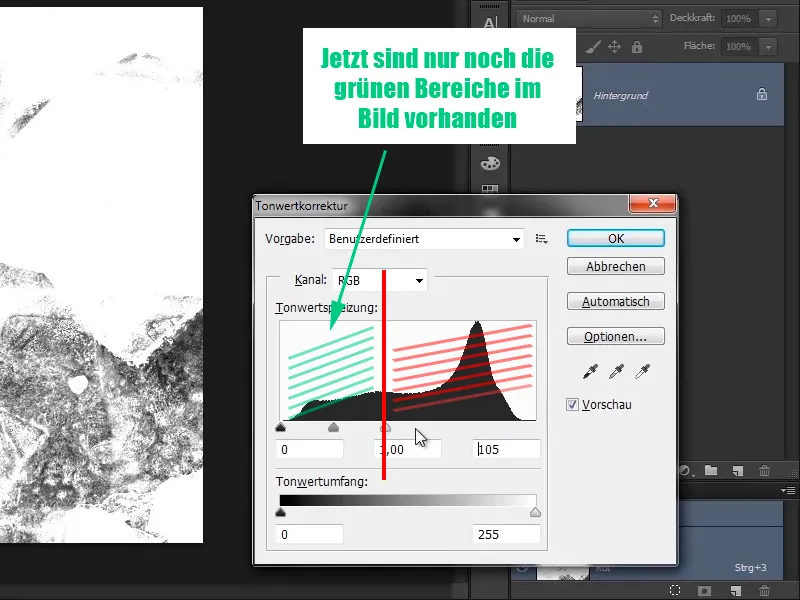
Step 29
In your case, you are going into the range of 237, because as soon as you get into these tonal values, something is cut out of the image and in most images this leads to tonal value tear-offs, the so-called fraying. This is a common mistake that you should not make.
Step 30
The same with the black. If you now drag it all the way to the right, everything will be pitch black and no details will be visible. You don't want that either. However, you can do this a little in this picture because you want to increase the contrast considerably.
We like it quite well like this.
- Black: 63
- Gray: 0.95
- White: 233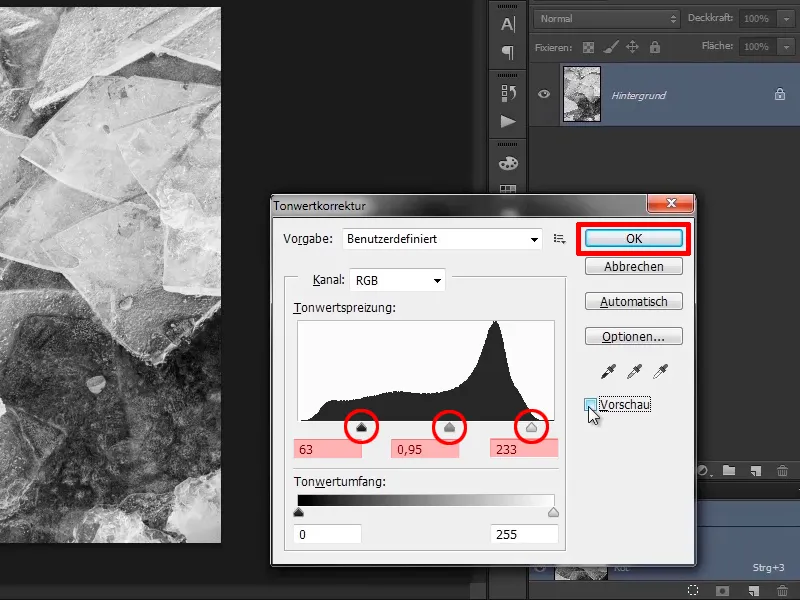
Steps 31-40 follow
Step 31
Now simply drag the image onto your picture.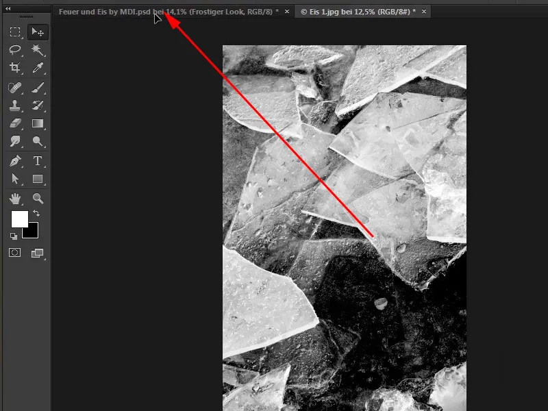
Step 32
Unfortunately, you have the image in the wrong position, so drag it upwards, ...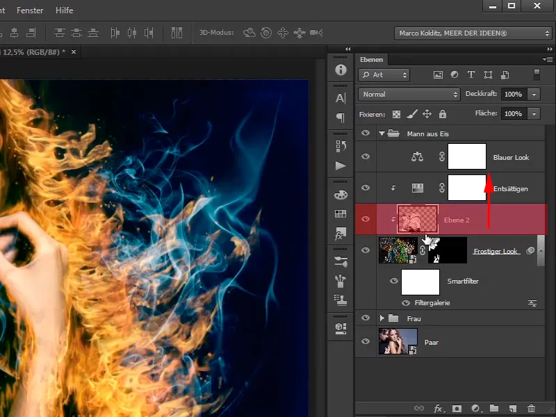
... press the Alt key between the two layers and convert this layer back into a normal layer.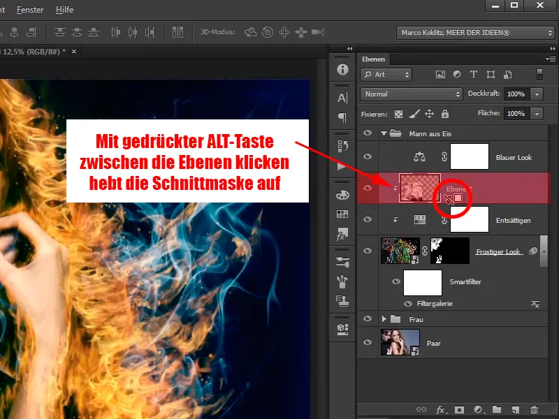
Step 33
Name this layer "frosty sweater".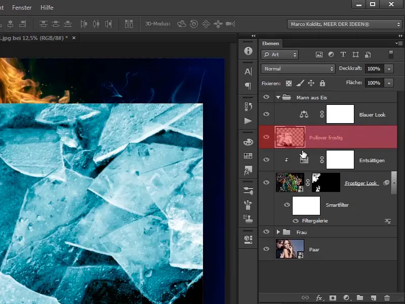
Step 34
Convert this layer directly into a smart object so that you can scale it again without any problems.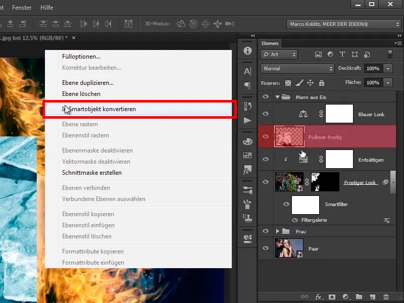
Step 35
Set this layer to the Multiply negative layer mode. This will make the black in the image disappear, which is exactly why you have just increased the contrast, as this will make the bright areas in the image stand out particularly well.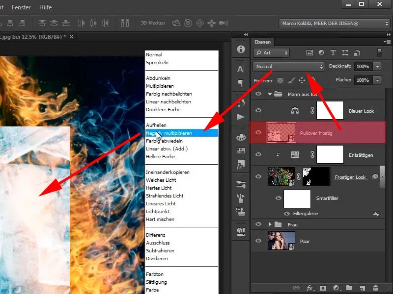
Step 36
In your case, you can place these clods however you like. First, mirror the image, i.e. Edit>Transform>Mirror horizontally.
Step 37
You have now tilted the image from right to left. You place the image at the bottom left, ...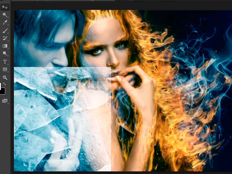
... go to the layer styles and take care of the black slider. This means that you want to bring out the dark areas of the sweater a little. First, drag the slider a little to the right and you will see that the clods disappear immediately, i.e. you shouldn't go that far.
Step 38
Drag it just a little and hold down the Alt key to make it blend in a little more smoothly: Black 2 / 36, move the white slider to 75 / 168 and confirm with OK.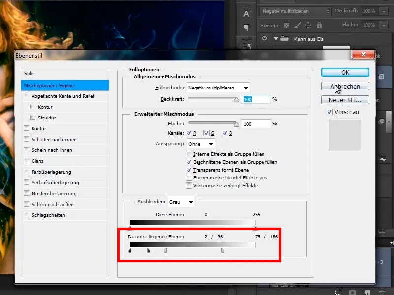
Step 39
Of course, you only want to show the floes on the sweater, which means you will create a mask and paint on this mask with black foreground color.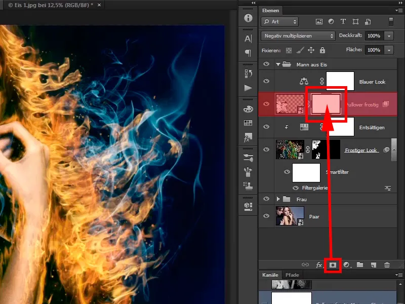
But now white is the foreground color; what was the shortcut to change it? Exactly, the X key.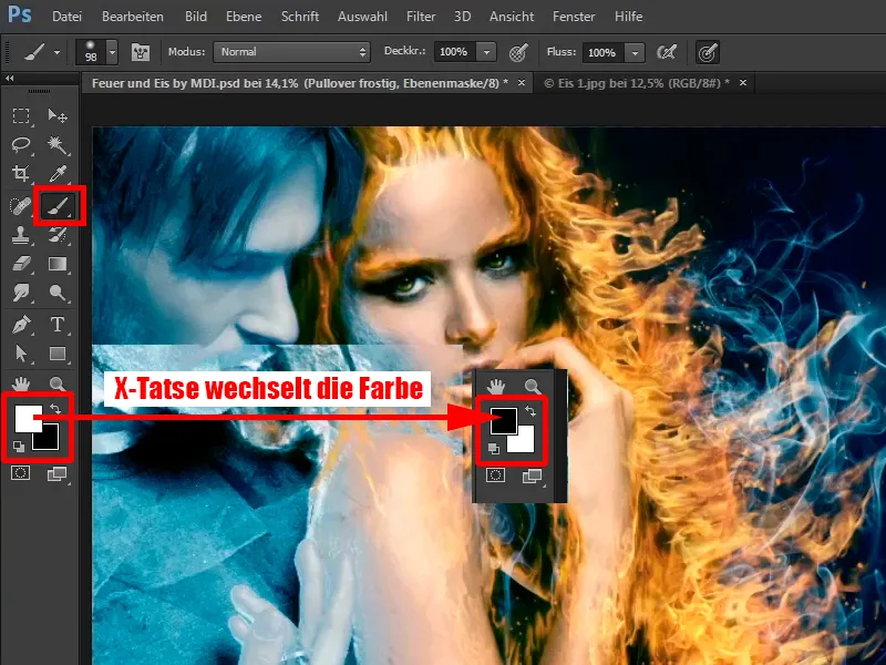
Step 40
Now, with full opacity of 100%, you will first retouch out everything that is not a sweater. If you retouch out a little too much, that's no problem, you can change the foreground and background color again with the X key and then simply paint the area back into the picture.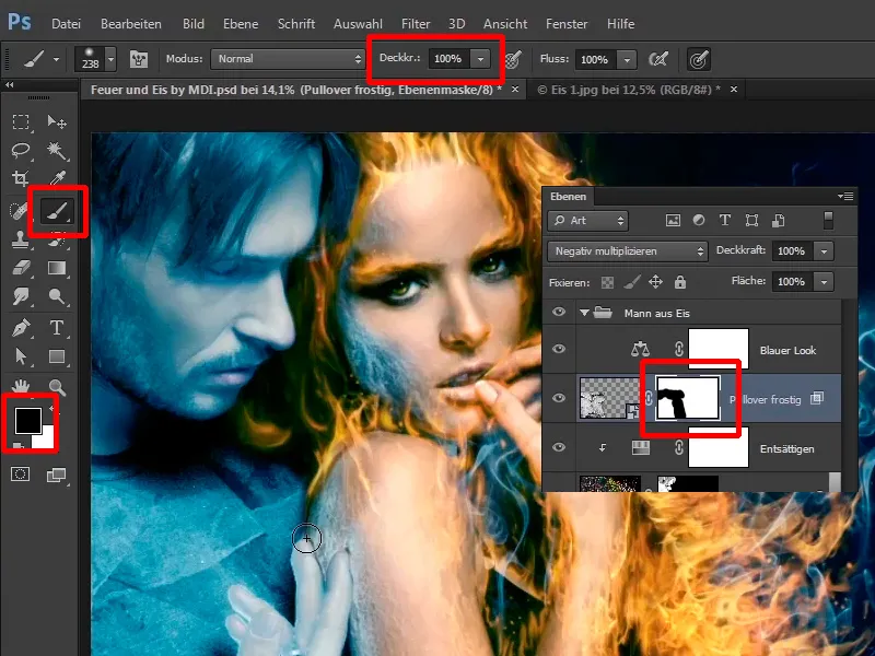
The last steps of this tutorial
Step 41
Do this first with your fingers and paint roughly over it. It's easier this way if you paint the picture in first.
Then make the opacity a little lower at 45%, change the foreground and background colors and paint along the fingers into the picture. This is another one of those things where you can take more time to paint it in much more harmoniously.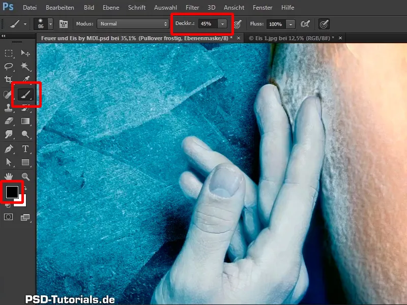
Step 42
Take a look at this: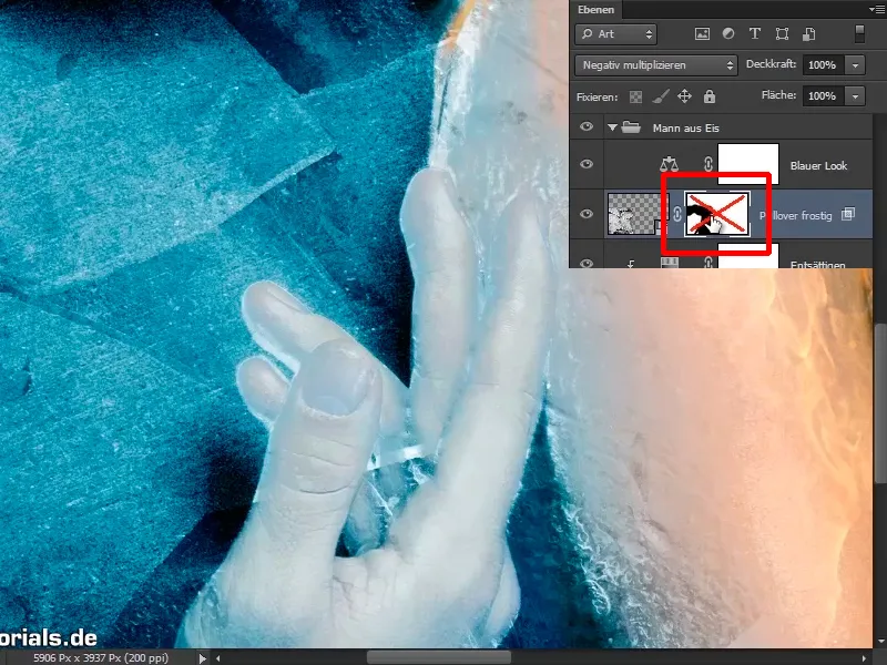
Step 43
You can also do something else at the bottom.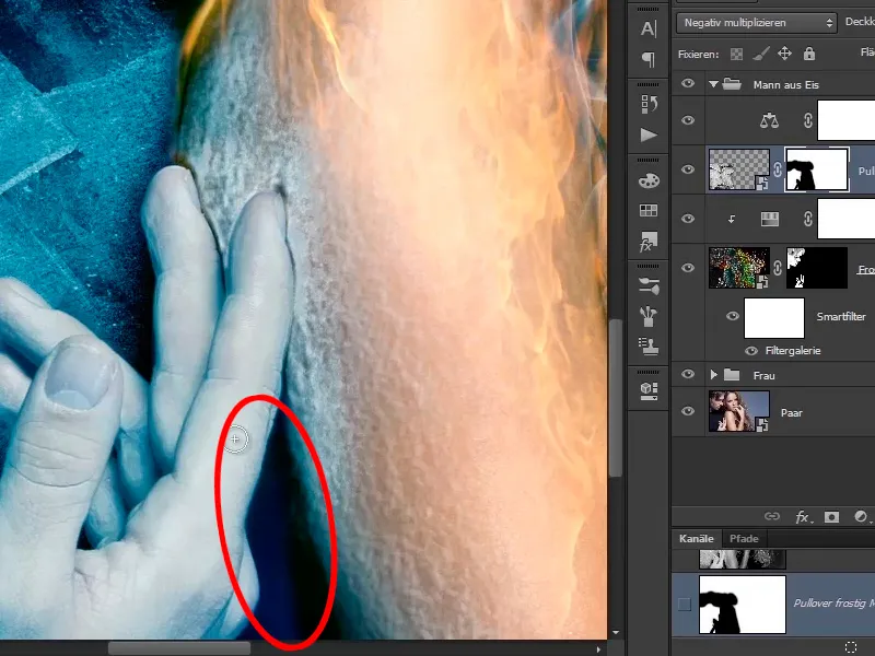
Draw something in with an even lower opacity of 13%.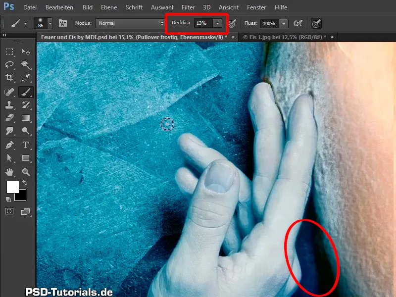
Step 44
Take a look at this ...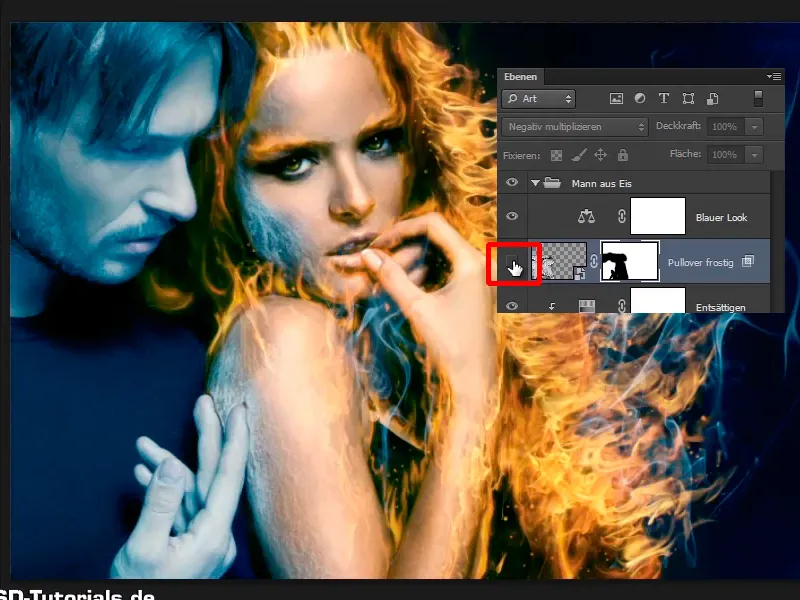
... in the before and after comparison: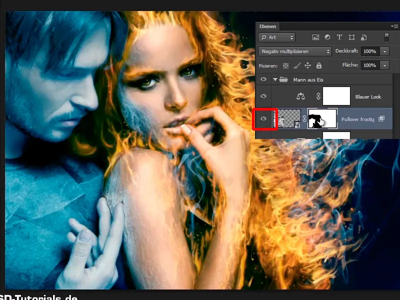
Step 45
You will take back the edges a little, perhaps make the whole thing a little shadier in general. First reduce the opacity of the "Frosty sweater" layer to 0 and then carefully feel your way towards the result. With an opacity of 45%, the whole thing already looks very good.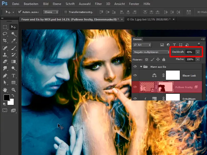
Step 46
And now you can transform it a little along the shirt, how? Via Edit>Transform>Shape.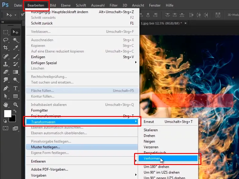
OK, that doesn't work right now. Why not? You can only transform if you decouple the mask from the image plane; to do this, click on this symbol.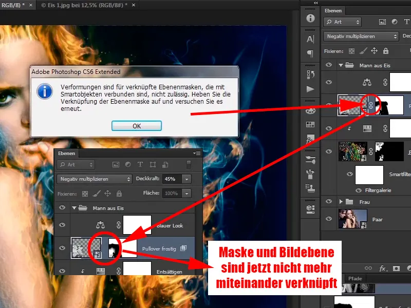
Step 47
Now click on the image layer again and go back to Edit>Transform>Deform, and now you can warp it a little so that it fits the sweater better.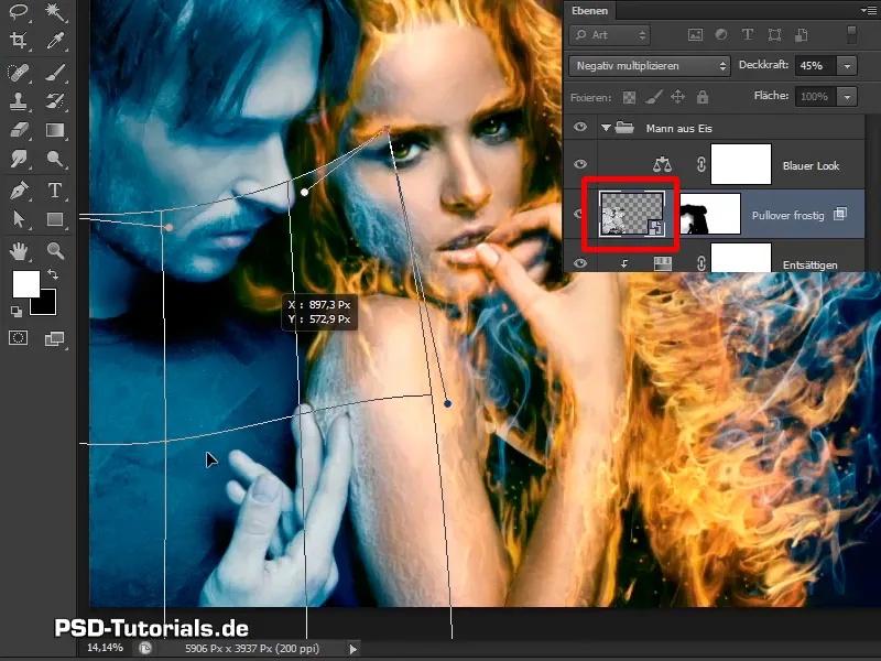
Step 48
It now looks a little different; confirm with OK.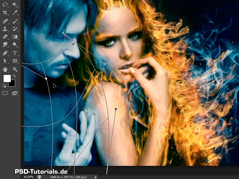
The clods are now positioned correctly.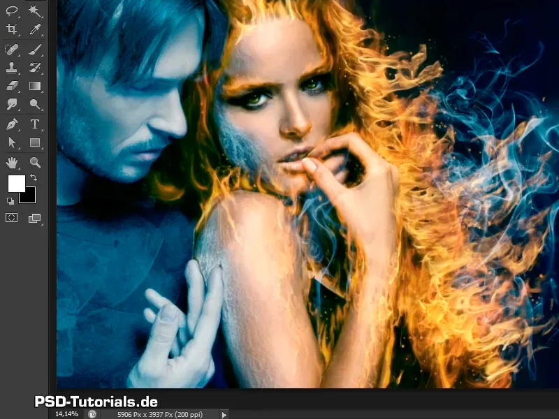
Step 49
Take another quick look: You are currently in the Multiply negative layer mode.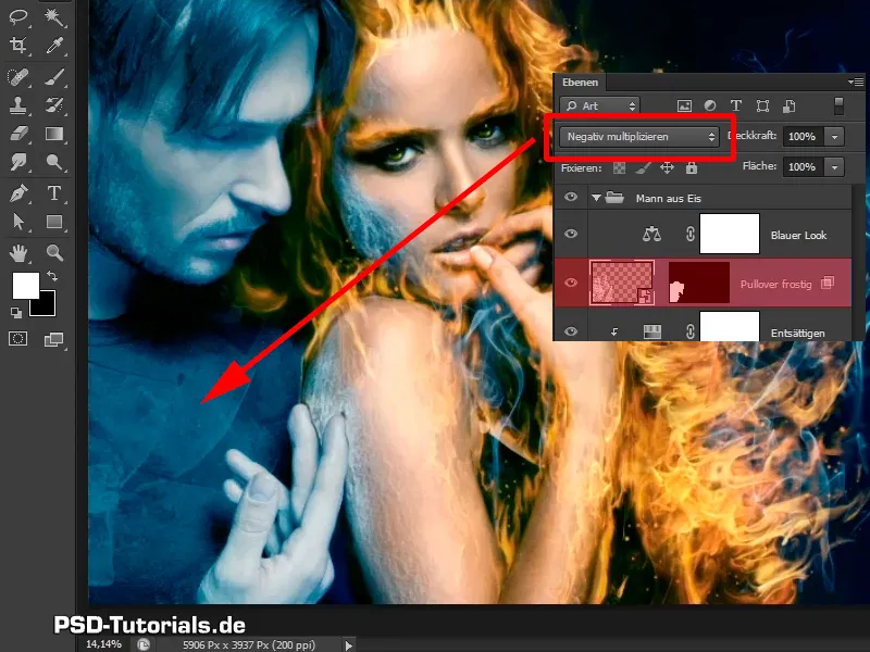
Step 50
Take a look at what Linear light looks like here.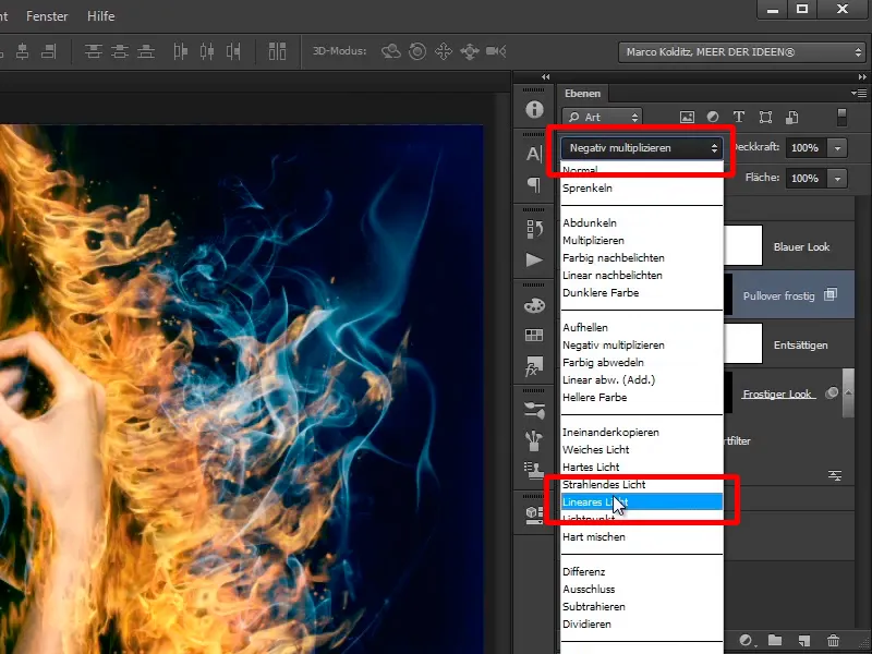
Linear light looks better in this case because it's a bit more contrasty, so leave it as it is.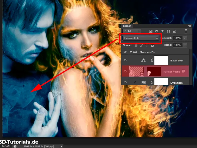
Step 51
In the next tutorial, you want to add a few blocks of ice to the man's face using an ice cube.