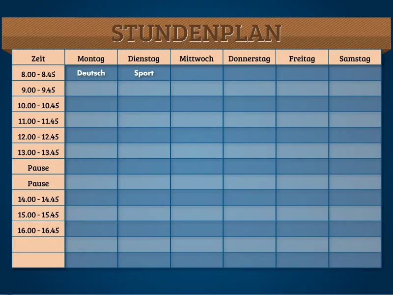
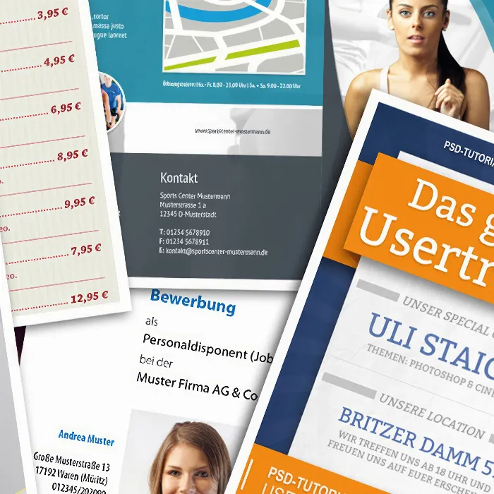
To create the timetable, you first need an empty InDesign document. To do this, create a new A4 document in landscape format via File>New.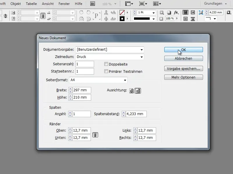
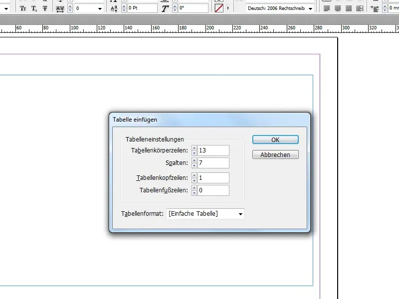
First create a table in the empty document. To do this, use the text tool to draw a text field in the desired size. Under Table>Insert table... you can then convert this into a table.
In the example shown here, the table has 7 columns and 13 rows (+ 1 header row). You can of course freely select these values and adapt the timetable to your needs.
The use of a table header row is not absolutely necessary here, as the timetable is no longer than one page. For tables that extend over several pages, the function offers the advantage that each table section automatically receives the same table header (e.g. Monday, Tuesday, ...).
To correct the height of the cells, you can move to the bottom of the table with the text tool selected until a small double arrow appears instead of the mouse pointer. By holding down the Shift key and left mouse button, you can now drag the cells up or down. The Shift keycauses the cells to behave proportionally to each other and all columns are resized at once.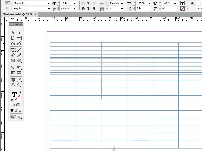
You can already enter the unformatted text such as days of the week and time in the header.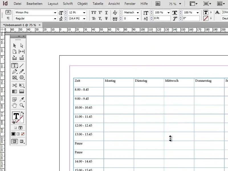
Now it's time to format the text in the header. The best way to do this is to use the paragraph formats. Of course, you could format the entire text by hand, but the paragraph formats offer the decisive advantage that all formatting changes are automatically applied to all text sections that are provided with the corresponding paragraph format.
To create a new paragraph style, click on the New buttonin the Paragraph styles panel.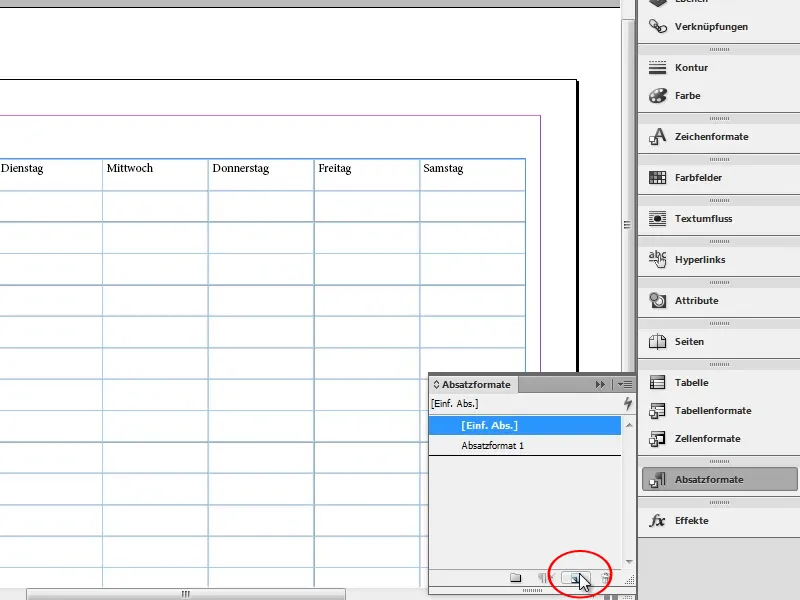
Double-click on the newly created paragraph style to open the paragraph style options. To make it easier to recognize the paragraph style later, it is best to give it a name.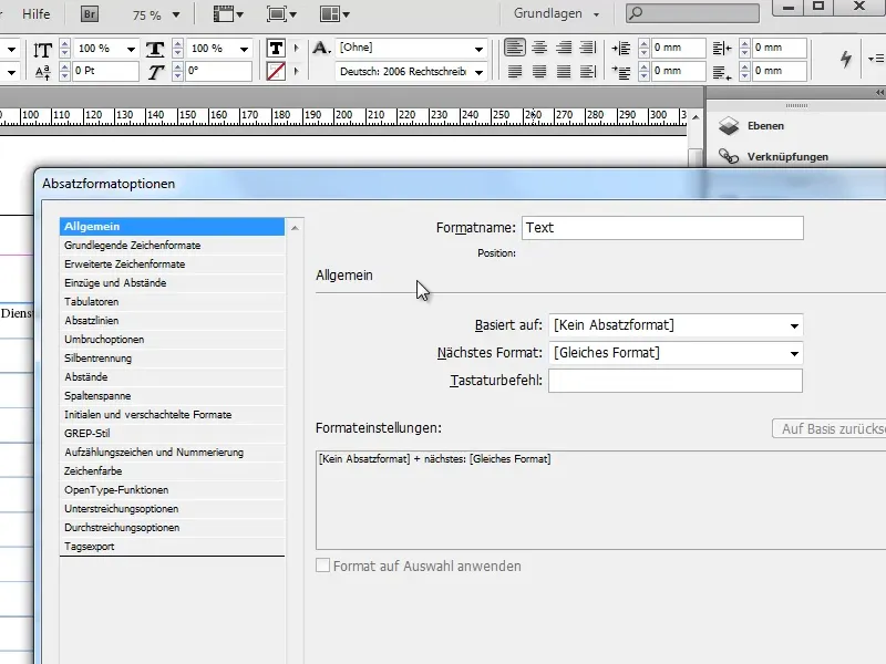
In the Basic character formats tab, you can set the font, font size and similar settings. Make sure that the Preview checkbox (bottom left) is activated and a cell with text to be formatted is selected so that you can see the effect of the changes in real time.
I have used the font Bree Serif with a font size of 16pt.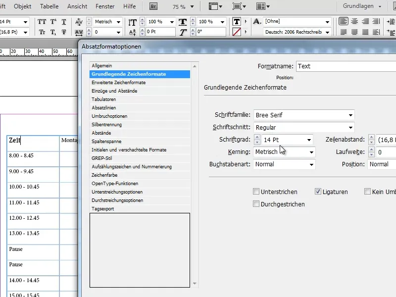
Of course, you can use any font you like. If you're looking for more fonts, the site dafont.com is a hot tip.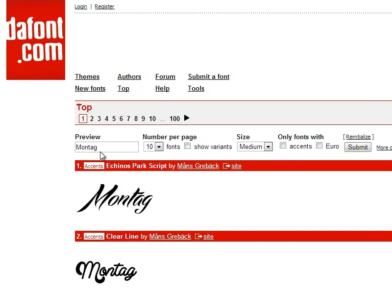
In the Indents and Spacing tab, set the alignment to Center to center the text horizontally.
Now select all the cells that are to receive the paragraph format (in this case the header and the first column) and click on the paragraph format to apply it. To select an entire row, move the selected text tool to the edge of the corresponding row until an arrow appears in the direction of the row instead of the mouse pointer. You can now select the entire line with a single click.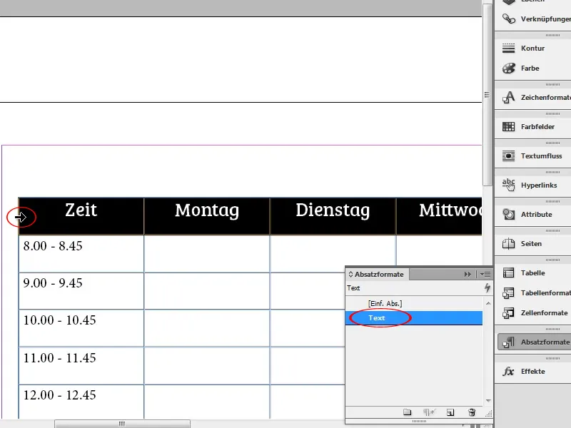
To center the font vertically, click on the Center buttonmarked in the screenshot in the options bar of the text tool.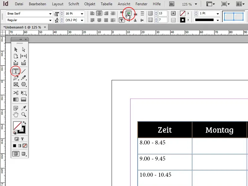
Now that the timetable is available in its outline form and the text has been given its basic formatting, it's time to add some color.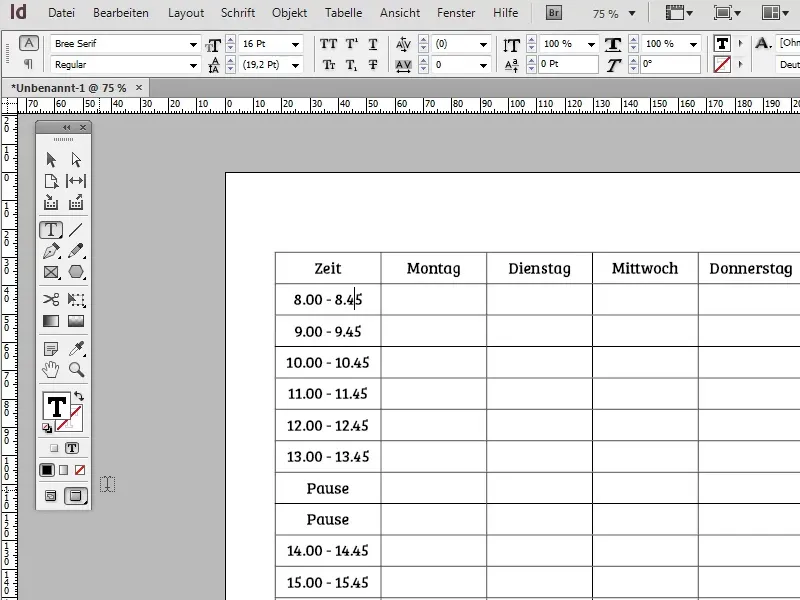
The first step is to color the individual lines alternately light and dark blue. To do this, first create a new color field with a dark blue. (You can of course also use any other color).
For example: C=100, M=42, Y=0, K=34;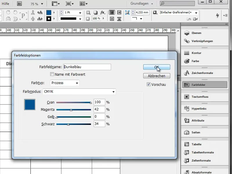
Next, double-click on the table to return to table editing, open the menu item Table>Table options>Tablesetup... and navigate to the Areas tab.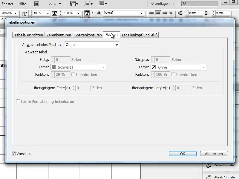
Now set the Alternating pattern option to After each row and select your dark blue color for both variants. You can control the brightness using the Hue option (e.g. 40% for dark blue and 10% for light blue).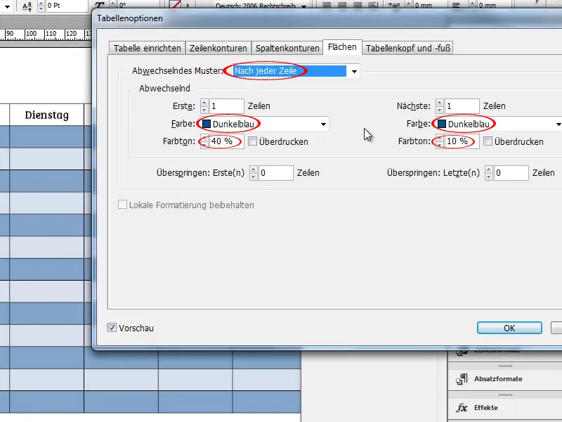
Now navigate to the Set up table tab and set the color of the table frame to dark blue as well. If you wish, you can also vary the thickness of the outline.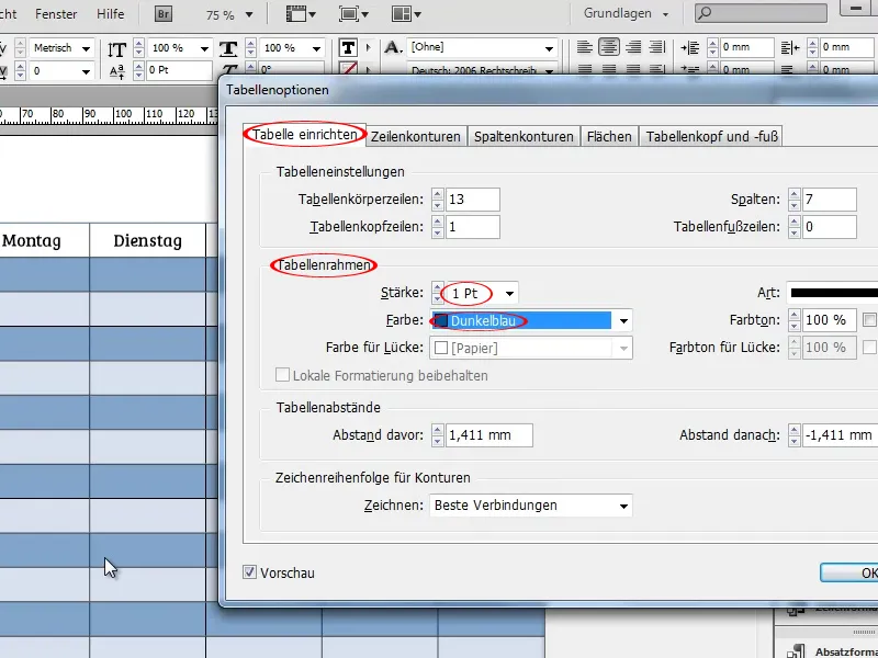
In the Row outline and Column outline tabs, you have the option of setting alternating row and column outlines and varying their color, type, thickness and much more. However, I will not be using these functions in this example.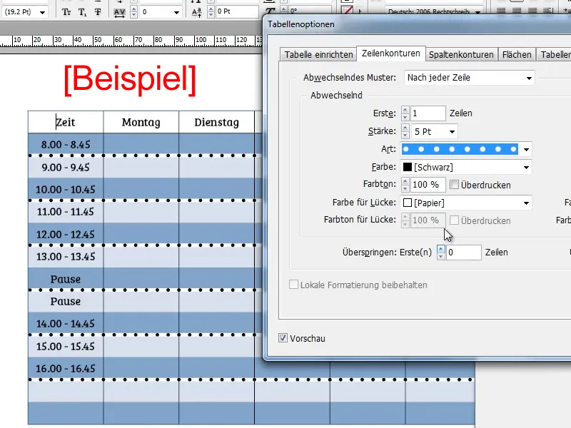
The next step is to color the header row and the first column. To do this, create a color field with a light orange-brown.
Example: C=2, M=48, Y=70, K=0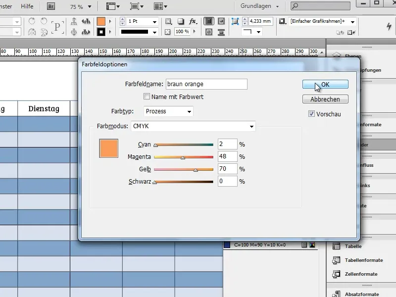
Now select the header row and color it by clicking on the orange-brown color field and repeat the process with the first column. Make sure that the area and not the outline is activated.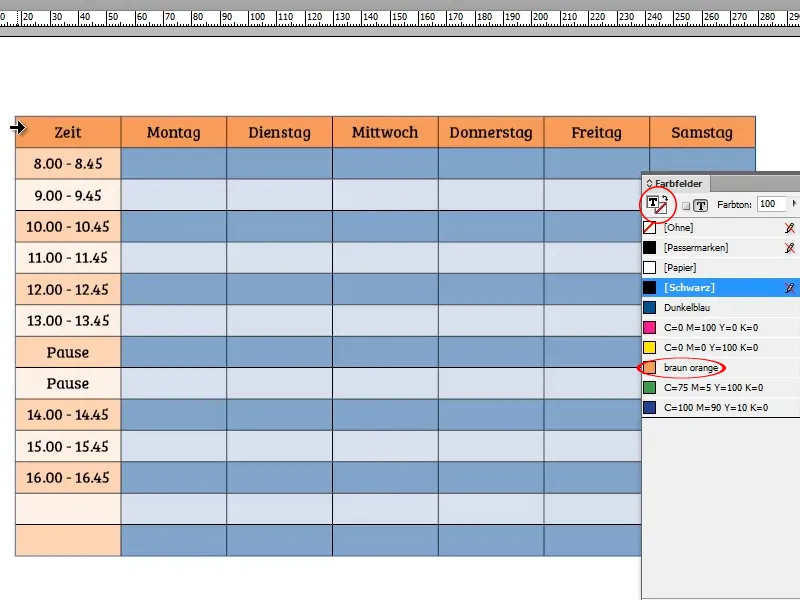
By default, InDesign takes the alternation of light and dark blue and applies it to the orange. If you want to remove this effect, simply select the first column and click on the orange color field again. The column should now be colored the same orange as the header.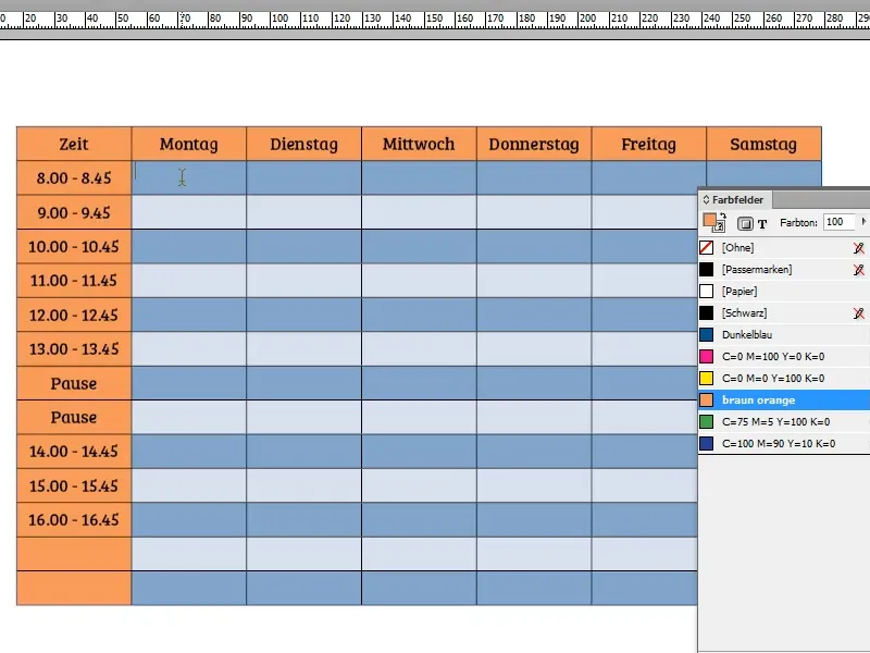
If you have not yet colored the outlines blue, you can do this by selecting the entire table and clicking on the blue color field with the outline selected.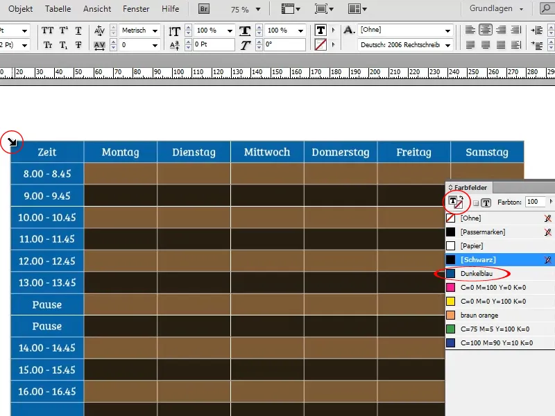
It may happen that not all contours are colored blue. If this is the case, it is a sign that not all contours are active. You can check this by selecting the table again and looking at the symbol marked in the screenshot in the options bar:
A gray line means that the respective contours are not selected and are therefore not affected by changes to contours.
A blue line means that the respective contours are selected and are therefore affected by changes to contours. In the screenshot, the contours between the individual columns are not selected. The "problem" can be solved by simply clicking on the gray line.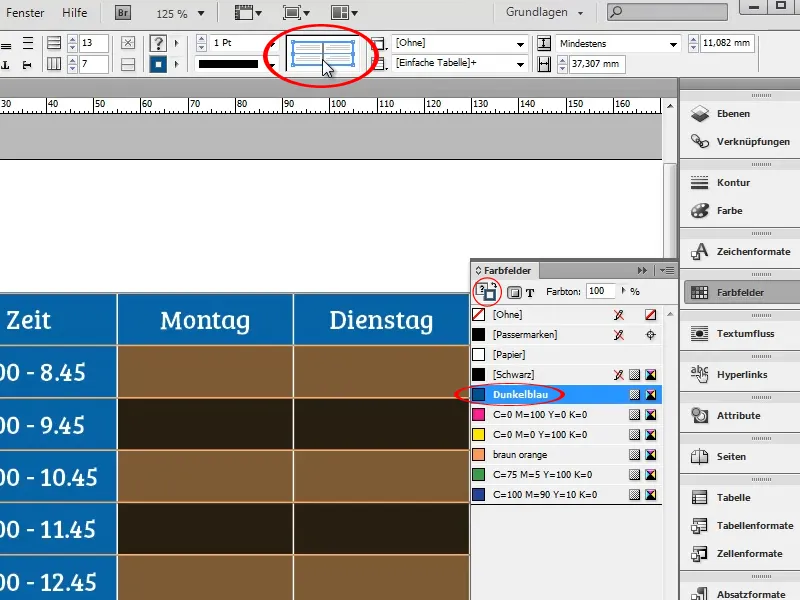
A very practical function is that InDesign intelligently expands tables. If you add a new row, the alternation between dark and light blue rows is automatically continued.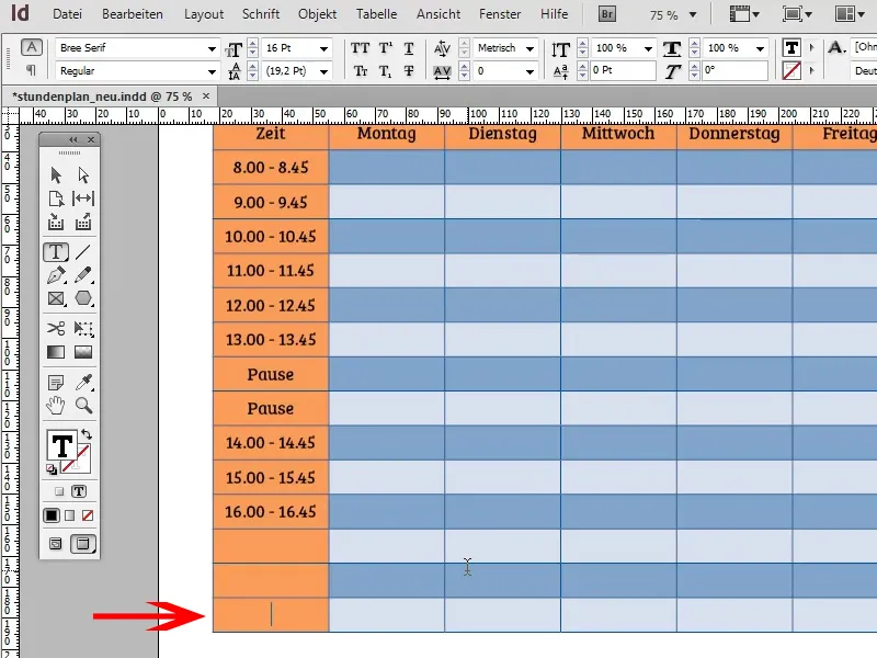
To give the table a little more pep, you could add a drop shadow under Object>Effects> Drop Shadow. So that it doesn't stand out too much, but remains discreetly in the background, you should reduce the opacity to approx. 30% and the offset to approx. 1 mm.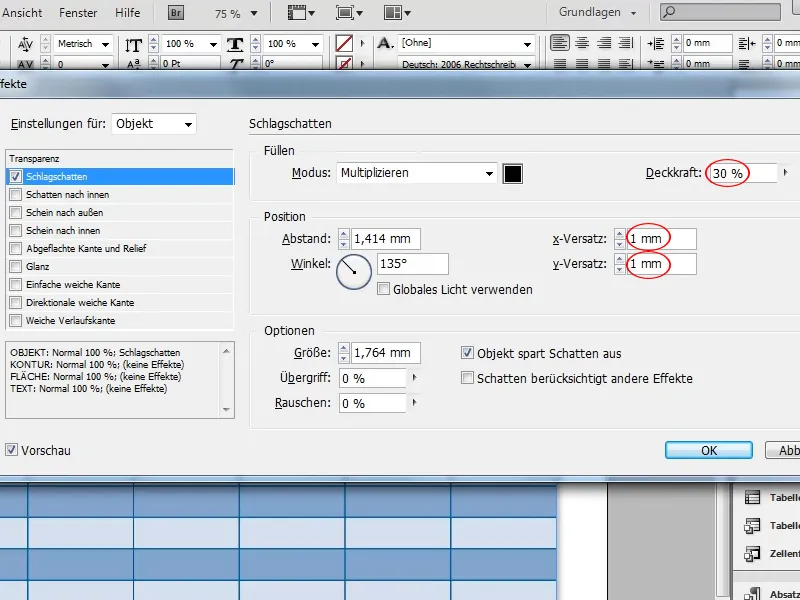
Now it's time for the heading. Of course, you could simply write "Timetable" above the table, but that would look rather boring. A much more elegant solution would be to place a banner over the timetable.
Start by drawing a rectangle over the table. It should extend slightly beyond the edge of the table so that we can make the banner a little more three-dimensional later on.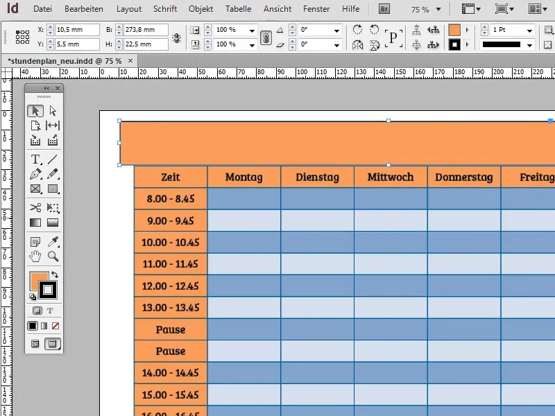
The banner should of course stand out a little from the header and therefore have a slightly darker color. It is best to use the orange-brown color as a starting point. First copy the orange-brown color field so as not to overwrite it. The easiest way to do this is to drag the corresponding color field in the color field control panel onto the new symbol.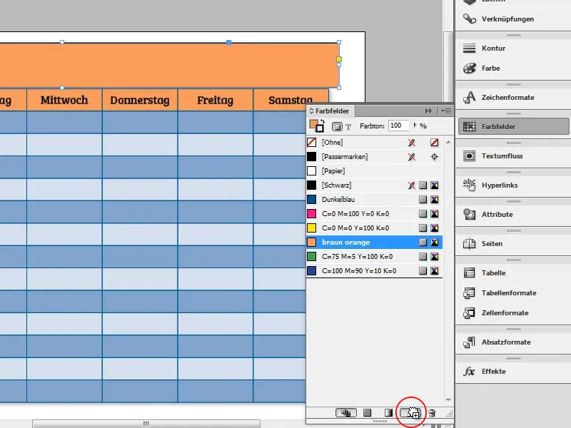
Now open the copy of the swatch, rename it and darken the color slightly by adding some black.
Example: C=2, M=48, Y=70, K=36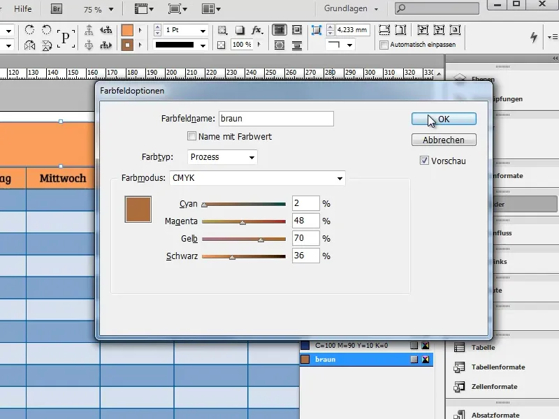
A single-colored banner would of course also be boring. Therefore, repeat the process with the newly created color field to obtain a second, even darker brown.
Example: C=2,M=48, Y=70, K=54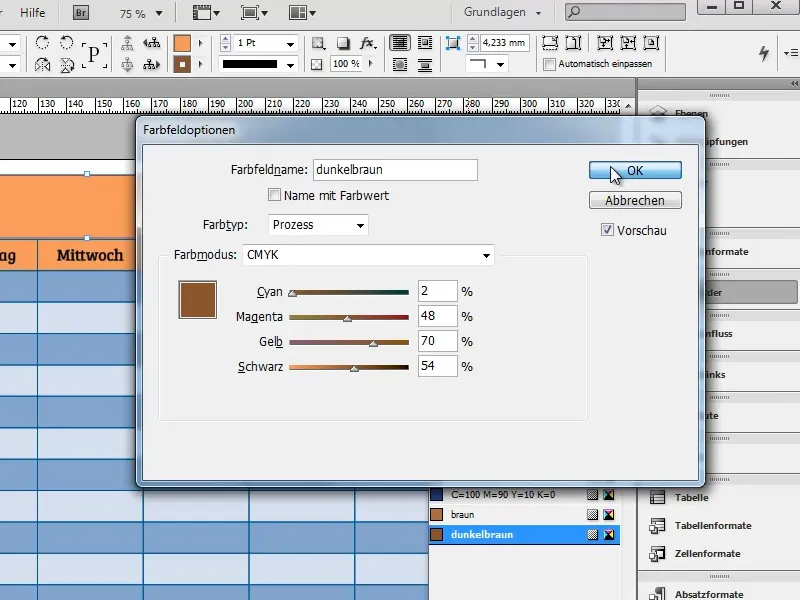
Now we need a gradient between the two colors. To do this, create a new gradient swatch by selecting the New gradient swatch... function in the advanced options menu of the swatches panel.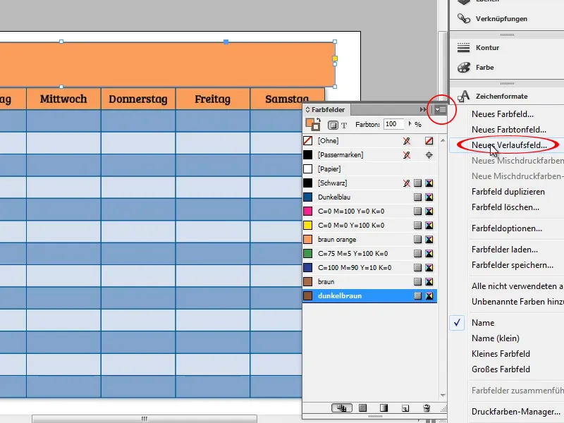
In the window that appears, set the type of gradient to Linear and the slider color to Swatches. Then select the two previously created brown tones as gradient colors.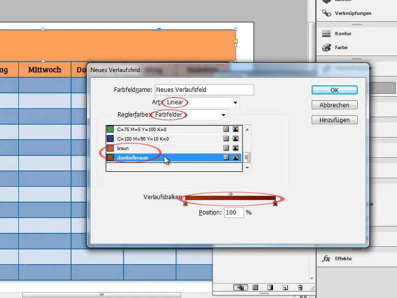
Now duplicate the "color buckets" in the gradient bar by clicking just next to the respective "bucket" and move the duplicates close together approximately in the middle. This will create a slightly harder edge, which will later give the banner a slightly 3D look.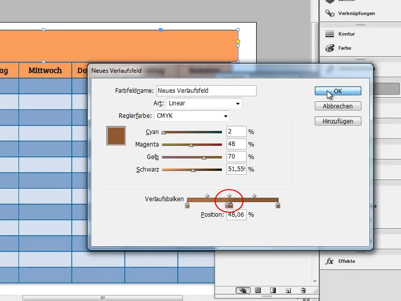
Now color the rectangle above the table with the gradient. Make sure that the area and not the contour is activated. Use the gradient tool to determine the direction of the gradient.
To get an exactly horizontal edge, you can hold down the Shift keywhile using the gradient tool. The Shift keycauses the tool to snap in 45° increments (45°, 90°, 135°, 180°, ...).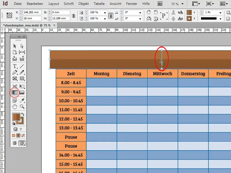
The next step is to make the banner look as if it has been folded over at both ends. To do this, first create a triangle with the polygon tool and deactivate the outline.
You can set the number of sides for the polygon tool (6 by default) by double-clicking on the tool and entering the corresponding value (3) in the window that appears.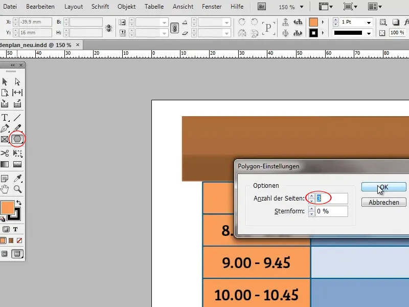
Now deactivate the outline of the triangle and scale and rotate it so that it lies against the table as shown in the screenshot.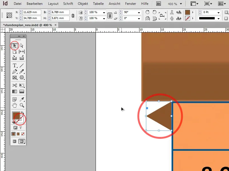
Switch to the direct selection tool, select the outer corner point of the triangle and drag it to the bottom corner of the banner so that the triangle fits seamlessly with the rectangle and table.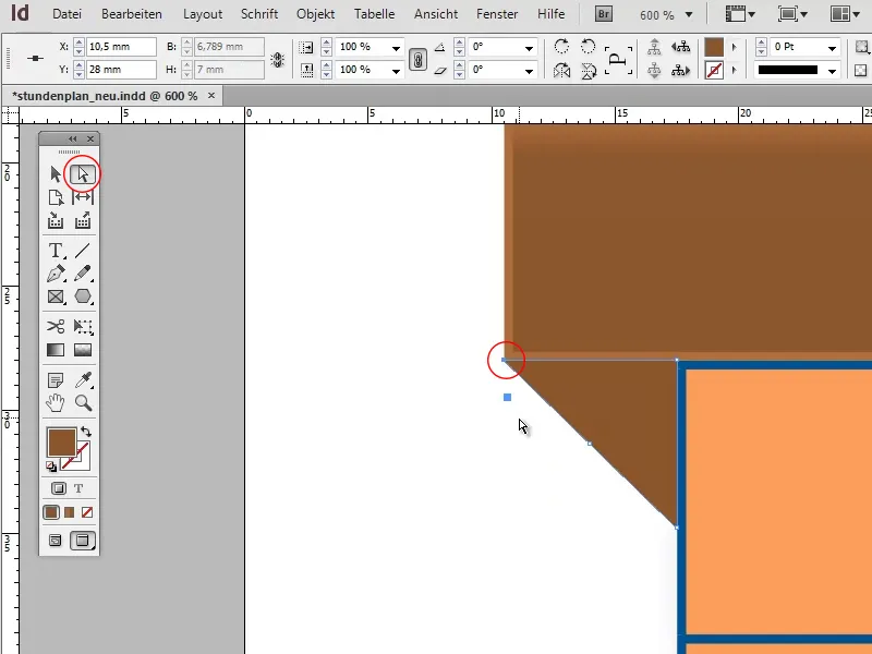
To make it clear that the triangle is in the shadow of the banner, you should copy your dark brown color field, darken the color slightly and apply it to the triangle.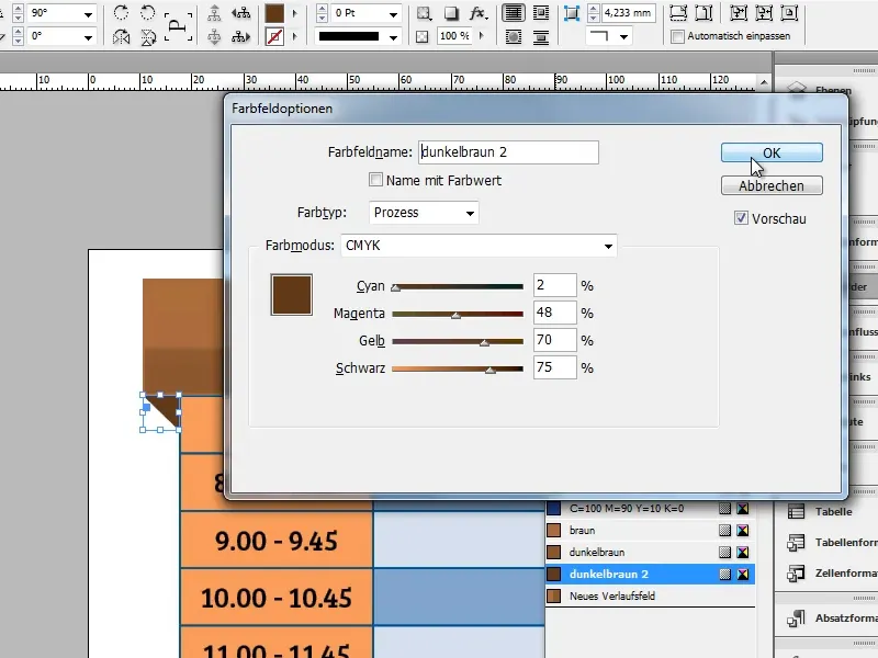
Copy the triangle, flip it horizontally (Object>Transform>Flip Horizontal) and move the copy to the opposite side of the table.
If the triangle does not fit one hundred percent, as in the screenshot, extend the rectangle by the missing piece.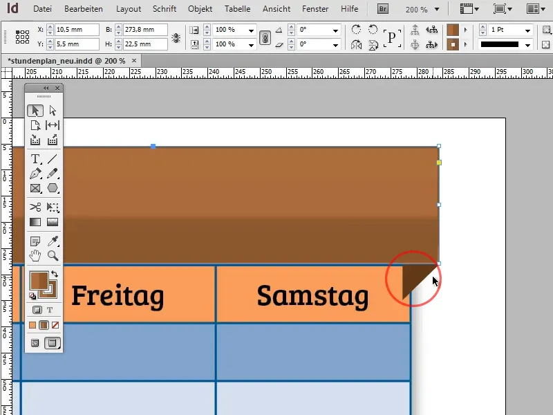
If the angle seems too steep or too flat, you can change it at any time by moving the lower point of the triangle up or down using the direct selection tool.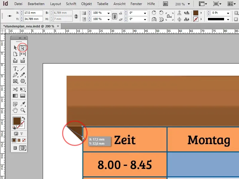
The banner is now in its basic form: Now the text is still missing.
If you simply click on the rectangle with the text tool, it will automatically turn into a text field. Write your headline (e.g. "Timetable") in the text field and format the text using, for example, the font Bree Serif, 50pt and centered.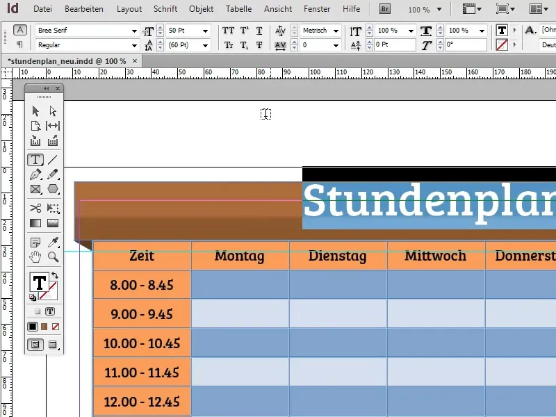
To prevent the text from sticking to the upper edge of the text field, you can define the distance to the upper edge in the text frame options (Object>Text frame options). 2-3 mm should be enough to center the text vertically.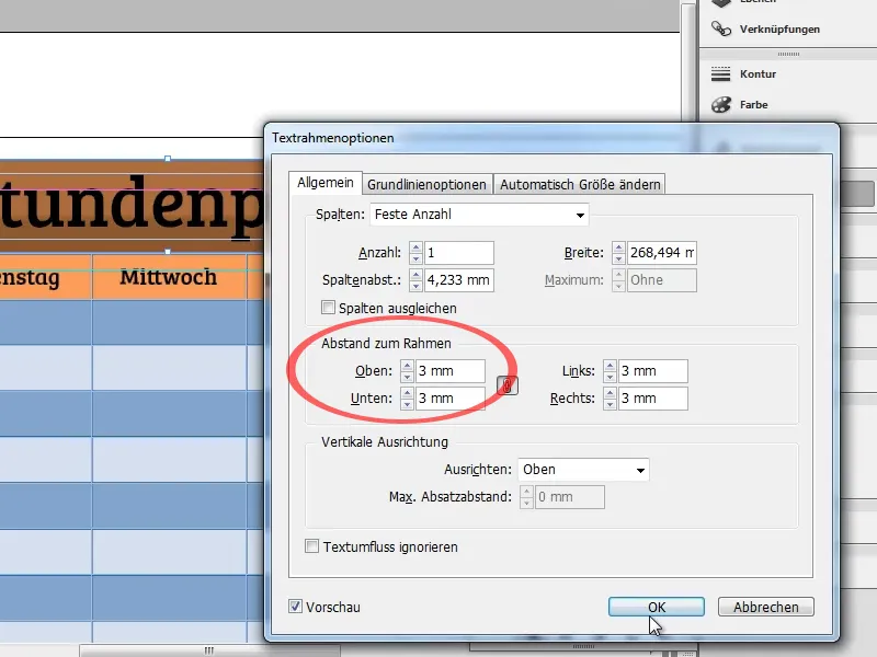
You can use the button marked in the screenshot to display the text in capital letters. To make the text match the banner a little better, you should color it in a similar color. In this case, a dark brown would be a good choice. However, make sure that the text does not blend in with the banner.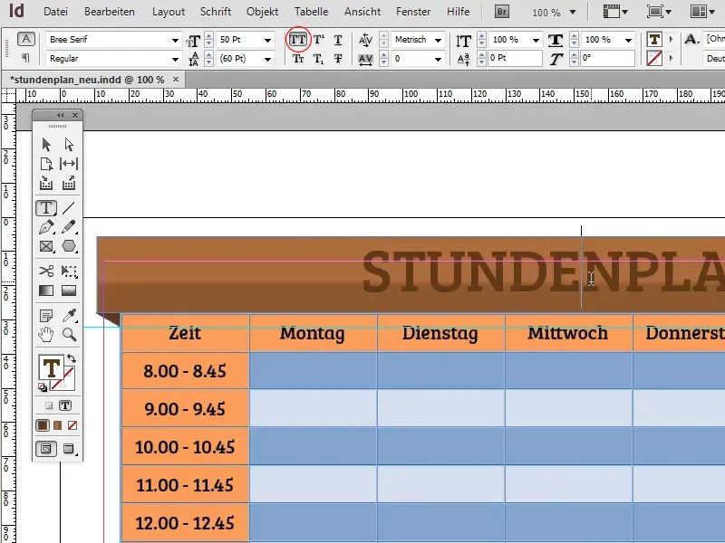
Under Object>Effects> Drop Shadow, you can add a drop shadow to the text to make it stand out a little more from the banner. However, you must make sure that you set the Settings for: (top left) to Text, otherwise the drop shadow will be applied to the rectangle.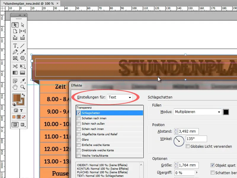
The default values are a little too extreme. Here I have used a white drop shadow in Normal fill mode with an opacity of 80%, an offset of 0.25 mm and a blur of 0.1 mm. These values are of course variable.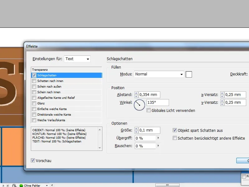
Now that the timetable is mostly finished, let's move on to the background. Add a large rectangle and fill it with a radial gradient. You can achieve a very nice effect if you use a gradient from dark blue to an even darker blue.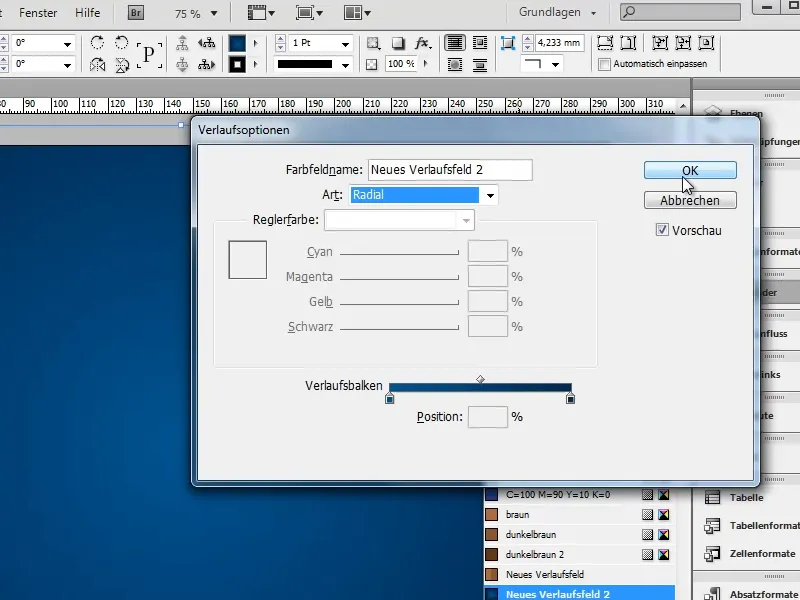
With Object>Arrange>Into background (Ctrl+Shift+O) you can move the rectangle into the background. Basically, the timetable is now finished: Now comes the fine-tuning.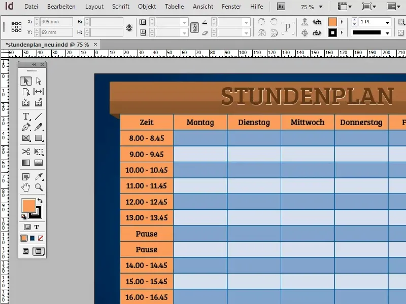
If you only want to use the timetable as a blank print template, the following step is pointless. However, if you want to fill it out directly on the computer, it would make sense to create a paragraph format for the table.
For example, the Futura LT font in bold with 14pt in white would be a suitable variant.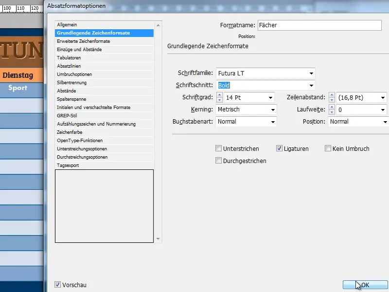
The next step is to let the gradient in the background shine through a little. Of course, you could simply reduce the opacity of the table slightly, but this would also make the text in the table transparent and therefore more difficult to read.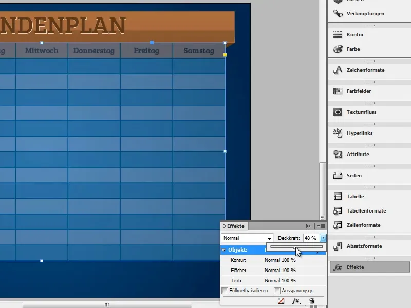
There is a simple trick to get around this: Duplicate the table and deactivate the fill in the first table in the places where the background should show through. To do this, select the relevant areas and click on the icon marked in the screenshot. Make sure that the area is activated!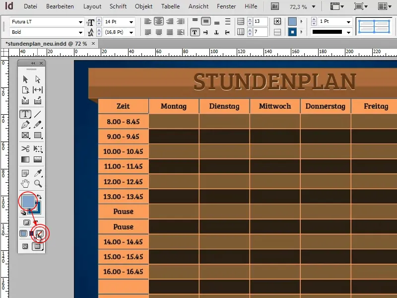
Now place the second table congruently under the first one. If you now reduce the opacity of the rear table, the corresponding areas will become transparent. However, as long as you enter the text in the front table without filling, the text retains its full opacity.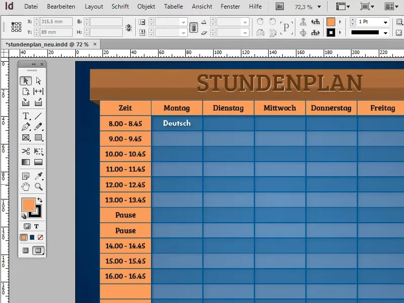
By using color and gradient fields, you can change the colors of the timetable quickly and efficiently by simply editing the color fields. InDesign then transfers the new color value to all areas where the color field was applied.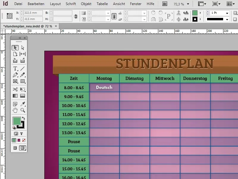
You also have various options for adding effects to the banner. One option would be to add fine, diagonal strokes to the banner to create a special look:
To do this, first create a new page (Layout>Pages>Add page) and insert a diagonal stroke.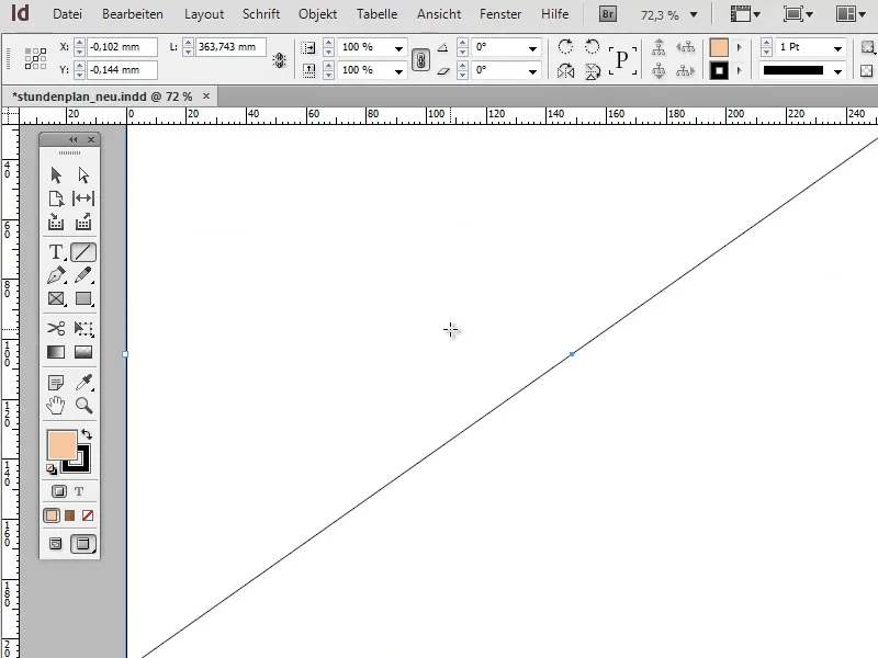
Now copy the stroke with the function Edit>Duplicate and paste offset... around 200 times with an offset of 1 mm. Confirm with OK and group the strokes with Ctrl+G.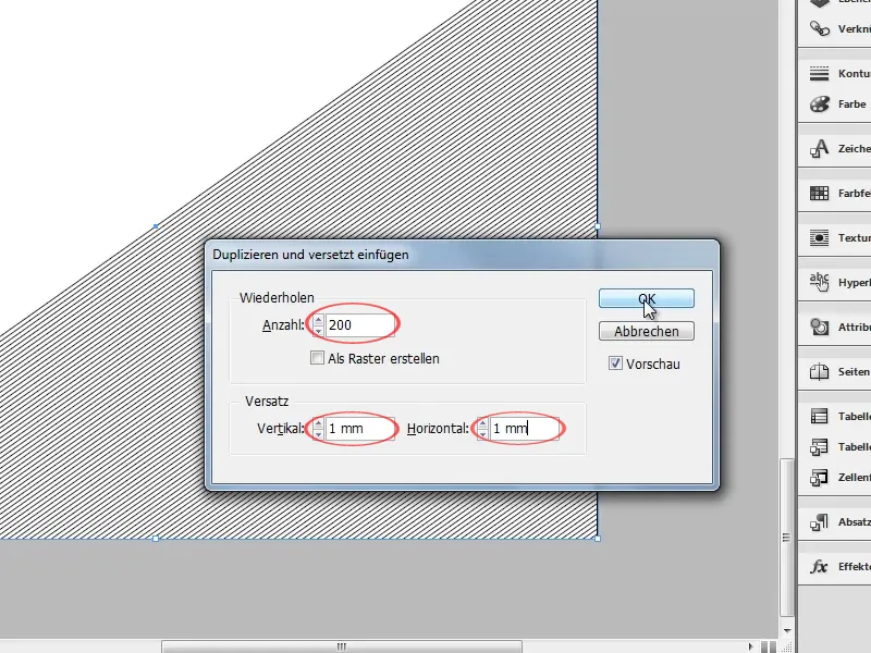
Now select the group, copy it and switch back to the timetable. Insert an empty rectangle that is congruent with the banner and fill it with the strokes using the Edit>Paste into selection function.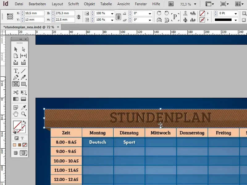
Reduce the opacity of the rectangle to approx. 25% to make the lines appear transparent.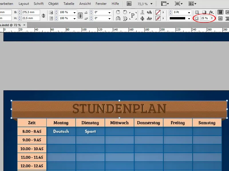
As the banner was previously converted to a text field and the heading was entered directly in it, you cannot place the lines between the text and the banner in this state, but only in front of it.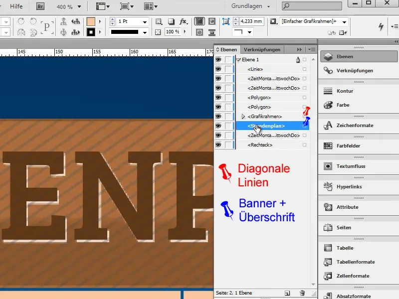
To place the text in front of the lines and thus exclude it from the effect, you must copy it from the banner and paste it into a new text field. You can then place this in the foreground without any problems.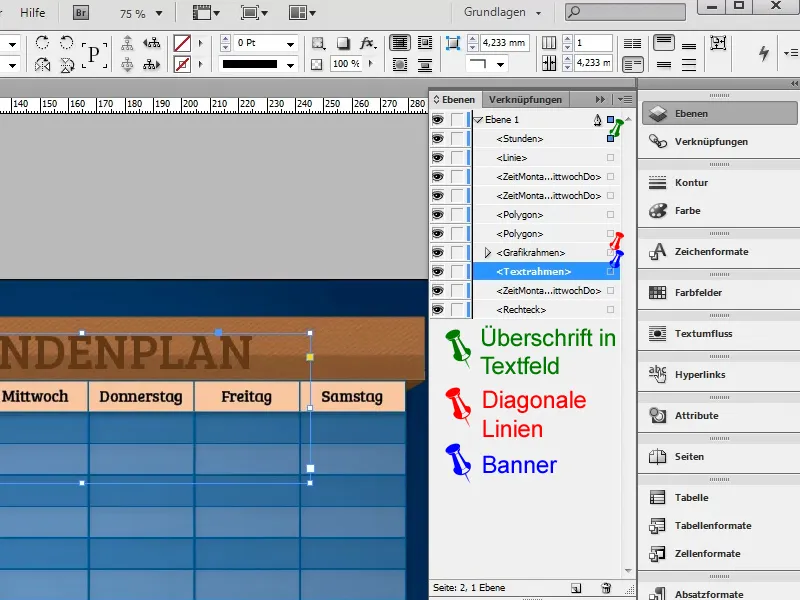
If you use this method, the drop shadow may be lost when copying and must be recreated.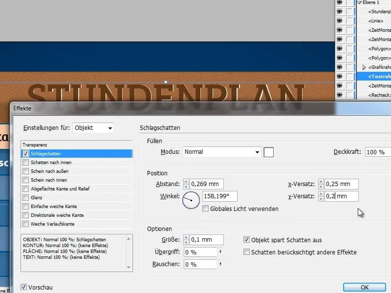
Alternatively, you can simply copy the banner, deactivate the fill in the copy and place it congruently over the original banner. All effects should be retained.