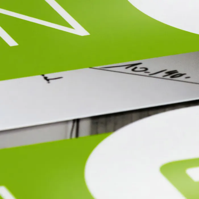
Hello, dear friends, Stefan Riedl here at PSD-Tutorials.de, and today we're going to fall into the dark side together and collectively, because today we're going to be tackling a very special product in terms of design, and that's a ticket, as you can see here, with a black light effect. This means that we will be using elements that are only visible under UV light, and what could be better than an invitation to "Dinner in the Dark"?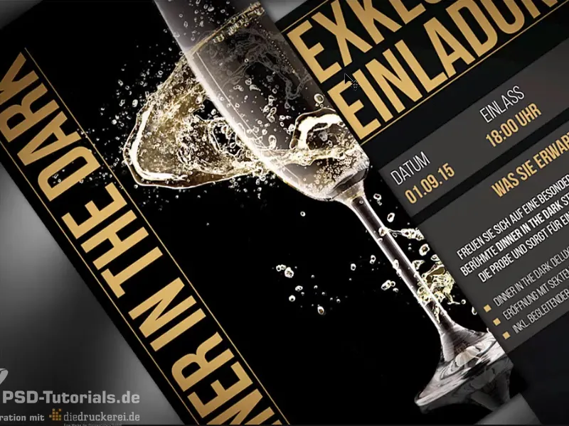
Here we go: Steps 1-15
Step 1
I'll show you what a fantastic effect such a black light produces by showing you this photo. Here we already have an invitation card like this, and you can already see the matching black light.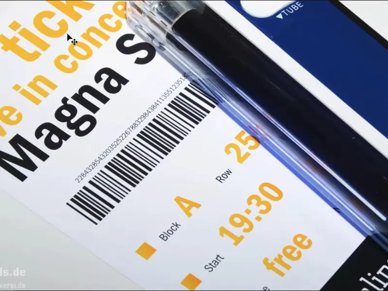
At the moment it's still switched off, which means we have a wonderfully illuminated photo, but if I switch off the light now, for all those of you who are afraid of the dark: Look away now or grab a quick cup of coffee, because we're drawing the curtains.
Take a look: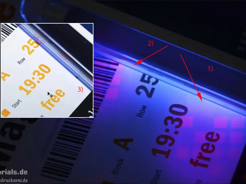
This is what it looks like. We then have this effect. Here you can see here (1) and here (2): This is now the logo of our printing partner, diedruckerei.de or onlineprinters. And these little cubes are not visible at all, as you can see (3). And that's exactly what we want to use on our admission ticket. So you can be excited and let's get started. Let's start right away with a look at InDesign.
Step 2
Here it is, our glamorous admission ticket: stylish, elegant and definitely aimed at high society. The format is a DIN-long format, we can see the front here (left), this (right) will be the back, and now I would like to show you where this black light effect is used here, namely on the back.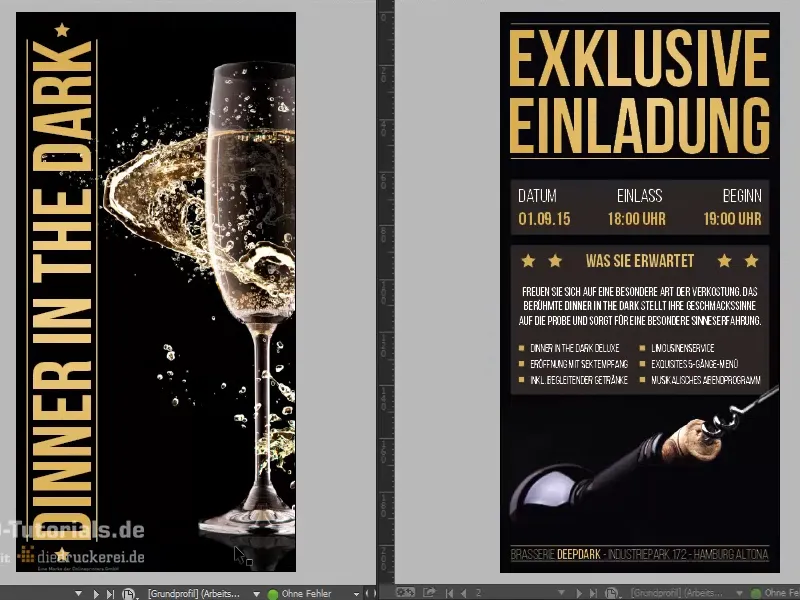
Step 3
If I show the appropriate layer ("UV") in the layer control panel, you can see here: This will be our black light effect that we are going to use. But before we get to that point, let's first take a look at what is important for such a strange ticket.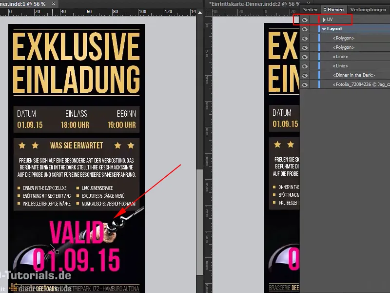
Step 4
As I don't have the technical equipment to print such a UV-coated admission ticket at home in the basement, I turn to our competent printing partner on the Internet, where we can scroll down the homepage: Here are the tickets>Admission tickets (black light color). This is exactly what we need.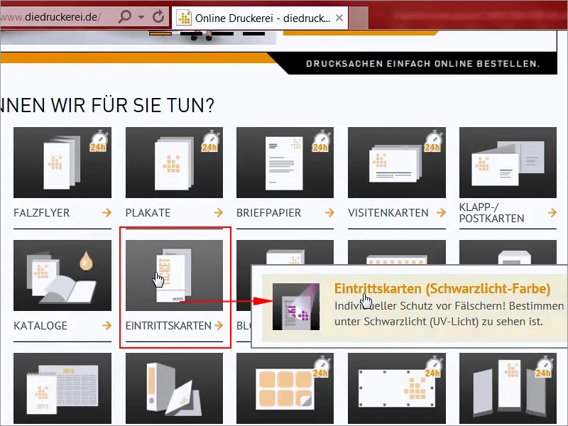
Step 5
Format: We have opted for the DIN-long format (1), and there we can see the different parameters (2): printed in four colors (4/4) on both sides, 300g/m² picture printing paper with a matt surface and a high grammage. We also want to create a really classy look, which we definitely agree with, forgery-proof thanks to security ink that is only visible under black light (UV light), individual black light motif, which we can therefore design ourselves, up to 30 % surface coverage.
Here we have to create a full-tone special color and in the details we also find the final format: 10.5 by 21 cm (3). I advise you to always use the predefined format. Of course, this cannot be guaranteed in general, sometimes you have to design your print products a little more individually, but I would like to use an example to explain why these standard formats exist.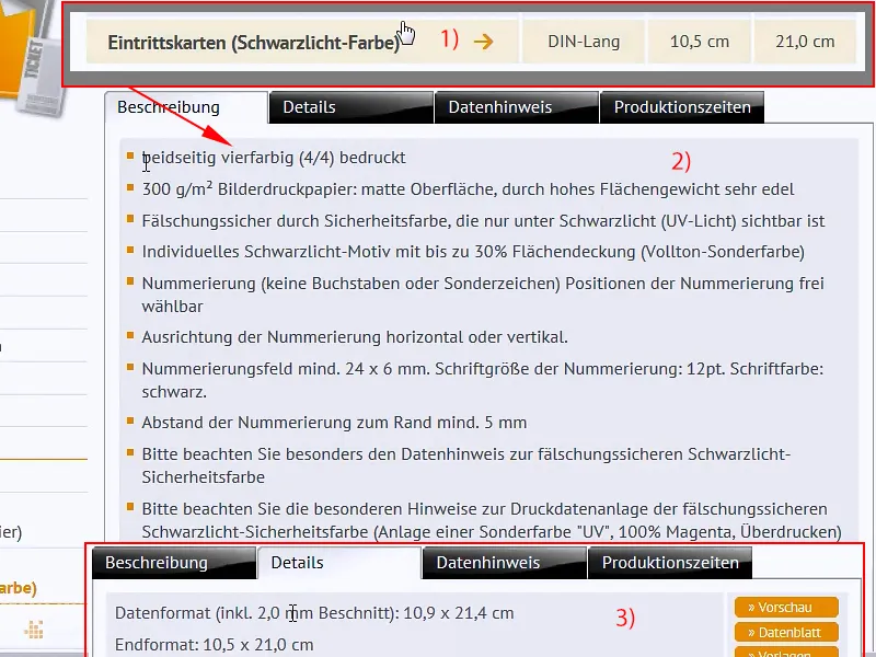
Step 6
Let's open Photoshop, and here I have brought you a print sheet. Of course, there is a lot of space for printing on such a print sheet, of course, we see the DIN A4 format here, smaller is the DIN A5 format, DIN A6, double DIN A4, up to DIN A3, double DIN A2 and double DIN A1. So we really have a lot of space here.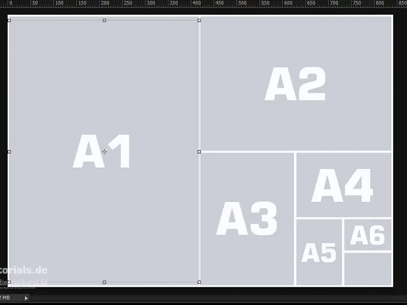
I'll open my control panels and zoom out a bit, so now you can see everything here. If we stay with the standardized format, then we get three so-called panels on the surface of a DIN A4 format, i.e. three pages can be printed on it, and this effective output is called a panel.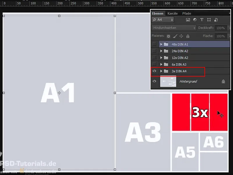
As a designer, you don't have to worry about the distribution on such a print sheet. The print shop takes care of that. If we go one step further and Blender in the next group, then we get six benefits on twice the area. One more: we get twelve copies on a quarter of the area of the printed sheet. Another one, and then we're already at 24 panels and then we have 50% occupied, and if we exhaust the entire print sheet, then we are at 48 pages, 48 panels, which are virtually available for our admission ticket.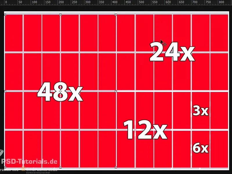
And now imagine you have a format other than DIN-long. Maybe it's only 5 cm wider or 5 cm longer at the bottom, then the logical consequence is that you won't get 48 panels on the printed sheet, but significantly fewer. This will of course be expensive, as the print sheet cannot be fully utilized and a lot of surplus is produced. And it also becomes really expensive if, for example, you use a very special paper for your print product. The surplus that remains naturally eats up the money, which is why it really pays to work with the standard formats. And if this can't be arranged, then be sure to talk to the print shop - often just one or two centimetres can make all the difference, so that an extra row is available.
Step 7
Once in InDesign, we will now create a new document, throw out the double page (1), we don't need it, and define the format in width to 105 mm and in height to 210 mm (2). Let's move on: We definitely need margins, namely 4 mm (3). This is a safety margin that we will set up for the final format so that nothing is too close to the edge, and then we move on to the bleed and info area, and add 2 mm bleed once there (4), and so we have now defined the working area.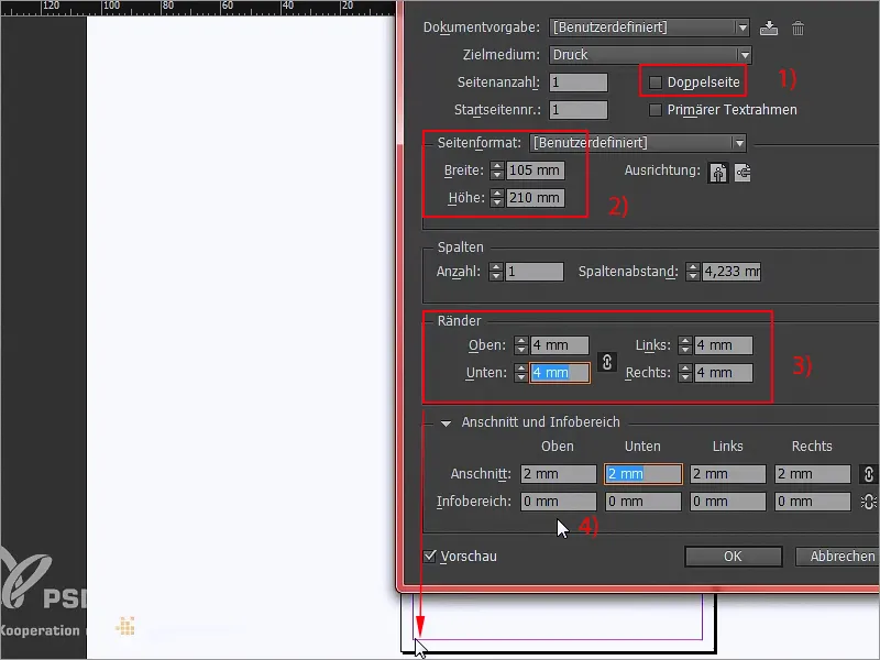
Step 8
Sometimes you might ask the question: portrait or landscape format? At this point I would like to tell you: the slimmer the format, the more elegant it looks. We could also have created this ticket in landscape format, but that would perhaps have more the character of a ticket to the next soccer stadium.
We'll stick with portrait format, because portrait format is elegant, portrait format is glamorous, and that's exactly the effect we need here. I will open the place dialogonce with Ctrl+D...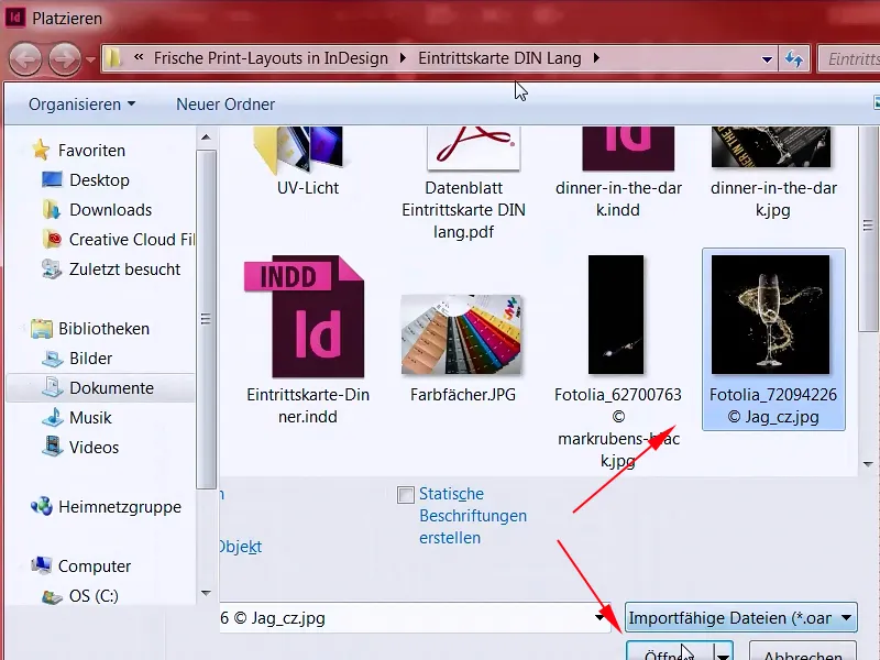
Step 9
... and find the right image for the background and then enlarge it once (1+2). Always make sure that you include the bleed, i.e. everywhere up to the red line (3). Now I will zoom out (4) and then right-click on the option Customize>Fill frame proportionally (5).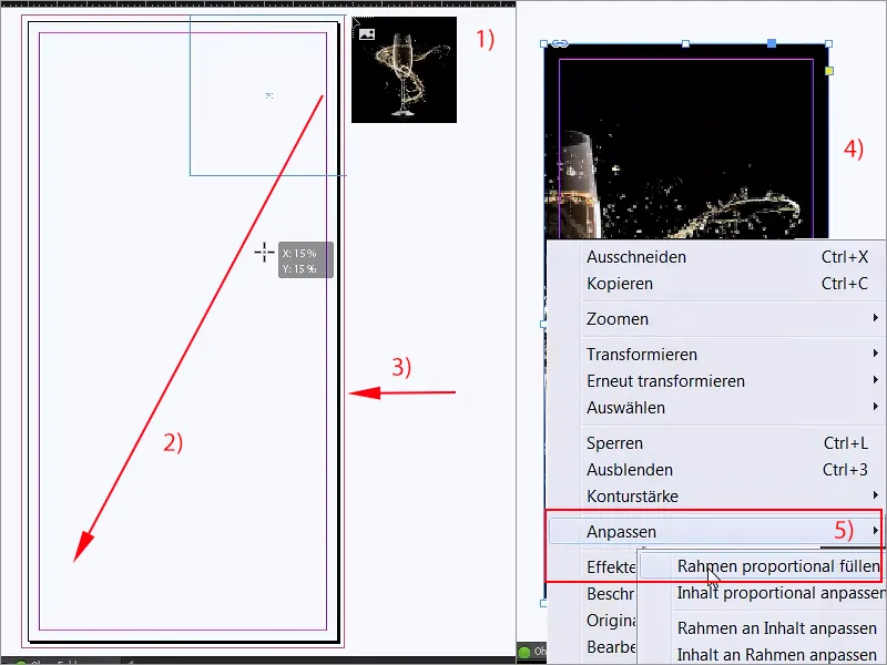
Step 10
The glass is now naturally centered, which is actually a nice thing, but not suitable for us, because we need the space on the left. I'll now simply move the image content to the right (1) and make it even bigger (2), of course you have to be careful with the reflection down here (3) so that it doesn't get cut off.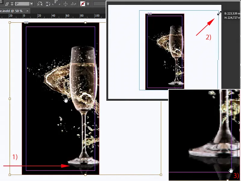
Step 11
This is how I could imagine it for now. If it also looks this pixelated, you can increase the display performance by simply right-clicking at the top, at the bottom you will find the display performance, which unfortunately jumps out of the window, but of course you will find it, and then you select display with high quality.
Step 12
Now I will lock this image once with Ctrl+L like "lock" and then nothing will happen here anymore. Let's continue with the appropriate headline, which we still need, of course. So pick up the text tool (1), draw it huge (2), and whenever you have doubts about the popular Helvetica, just use the Bebas. Bebas is a great font, it just rocks, it's really strong, and we'll use it in Bold in a font size of no less than 88 pt (3).
We don't even have to switch on the capitals, because this font is only available in capitals, and then we're off: "Dinner in the Dark". This will be the title, the color doesn't quite fit yet, I'll just set it to magenta for now (4), because we need to do a little fine-tuning here.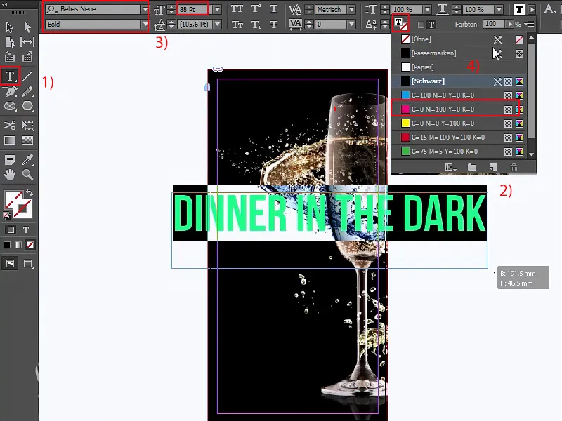
Step 13
So, I'm going to rotate this text field by 90° (1) and then move it here, once in the middle, that's right, and then we can zoom in a bit here and move the whole thing to the left once by holding down the Shift and left arrow keys, and for the glamorous character we'll now simply draw a line downwards from the top using the line tool (2). If it wiggles back and forth like a cow's tail (3), just press the Shift key and it will be very, very straight (4).
So, let's print that again in magenta, 1 pt wide (5), that's fine, we agree. With the line, we have to make sure that we always end with the font at the top and bottom. Guide lines help enormously with something like this.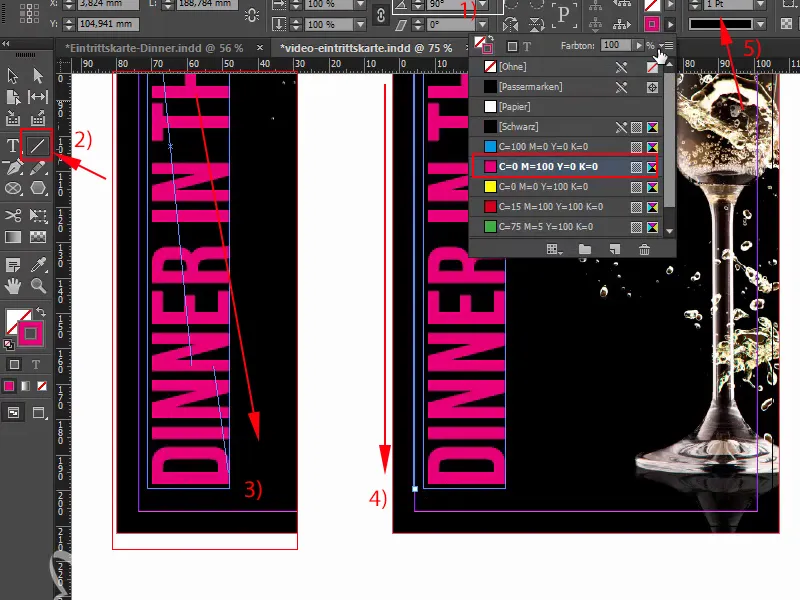
Step 14
Then I'll create a copy of it by holding down the Alt and Shift keys, dock it directly here and Shift left once (1). If the distance between the text and the black areas on the right and left is different (arrows above), this is simply because we have a bit of excess here (2). We can compensate for this manually by simply placing it roughly in the middle.
There are still a few asterisks missing at the top and bottom, so we'll just add them manually: Welcome to the polygon party! You will find the polygon tool (3) in your toolbar on the left.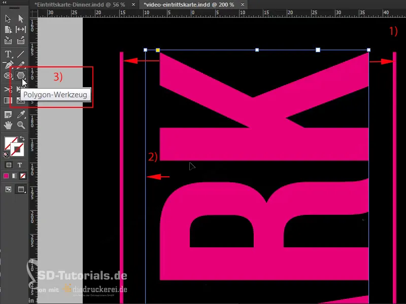
Step 15
You can use it to simply draw (1), and before you let go, here's a little tip: If you now move the arrow keys on your keyboard to the left or right, you will see that you can vary the number of your polygons (2). However, if you now want a star, which we don't have here, I will simply press the space bar once, and if you have now pressed the space bar, then simply use the arrow keys again: We will now change the shape by adding more corners. 1,2,3,4 ... 5 corners (3). But it doesn't really look like a star yet, does it?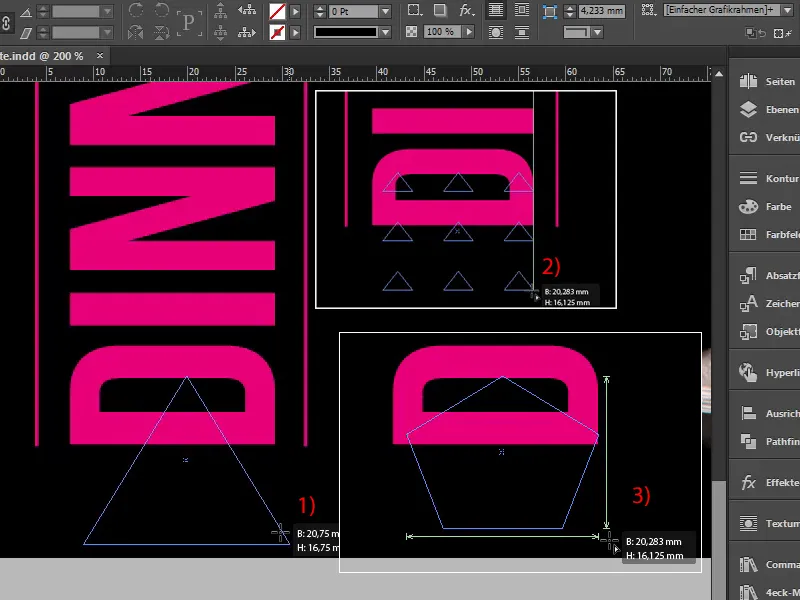
Let's continue: Steps 16-25
Step 16
What do you think? But if you now move the arrow keys to the left and right, you can define the star shape (1). I'm going to move it to the right now ... I like it quite a bit like this. And now I can let go and apply a color to it (2-3).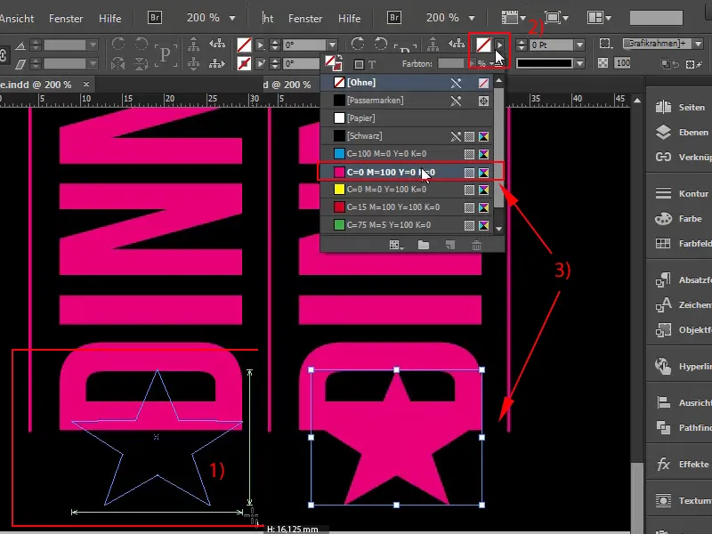
Of course, our star is still a little big, so we'll make it smaller and then center it. Make sure that we keep the distance here, so make it a little smaller and center it again. By holding down the Alt key, you can stretch it a little in width, and now we'll make a copy of it, Ctrl+C, go all the way up to the K and Ctrl+V. Centered, it fits.
Step 17
Now we have all the asterisks, the front is almost finished, you would think, but of course something is wrong (1). Sure, so let's change the color in any case, and that brings us directly to the next problem, namely the gold problem. In order to achieve a reasonable shade of gold, we would actually have to use a solid colorfrom the Pantone or HKS color system.
Although the Pantone color system has established itself as the standard in German-speaking countries, I'll show you an HKS color fan and what a gold tone looks like. I'll open Photoshop for this; here: This is an HKS color fan, and here on the left we can already see 98 K, that's gold! (2)And we should then work with this value.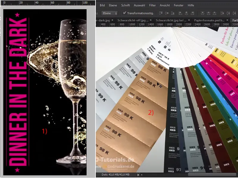
Step 18
So let's go back to InDesign, 98 K, and delete all unused color fields (1) and now create a new one via New color field (2),...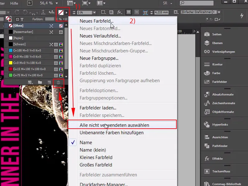
Step 19
... not as a process color, but as a solid color(1). I have the color mode HKS K here (2), and once scrolled all the way down we find 98 K, which I will now add, and since we are not printing with solid colors, but in the 4C process, it is possible to convert something like this to the CMYK color modein InDesign with just one click. This is what the distribution looks like (3), but let's be honest: I'm going to delete this color tone and then change everything to HKS, which looks pretty brown, doesn't it (4)? What do you say? So you definitely shouldn't expect this value to match what you've just seen on the fan..webp?tutkfid=65105)
Quite the opposite in fact! We get a brown tone here in print that really has nothing to do with gold, and that's simply because the CMYK color space is much smaller and can't display strong colors as brilliantly as the HKS or Pantone color space anyway. For our product, we opted for four-color printing anyway, so you will definitely get better results if you arm yourself with a color fan and then choose the best possible approximation.
Step 20
So a new color field (1), I've already chosen one, not solid color, but process color, namely: 18, 34,80 and the additional number 0. But we can do name with color value (2), OK. This is a shade of gold that I now consider to be reasonably acceptable, but it still doesn't cut it.
If I remove this HKS color tone from my list and replace it with the one I just created, it looks like this (3):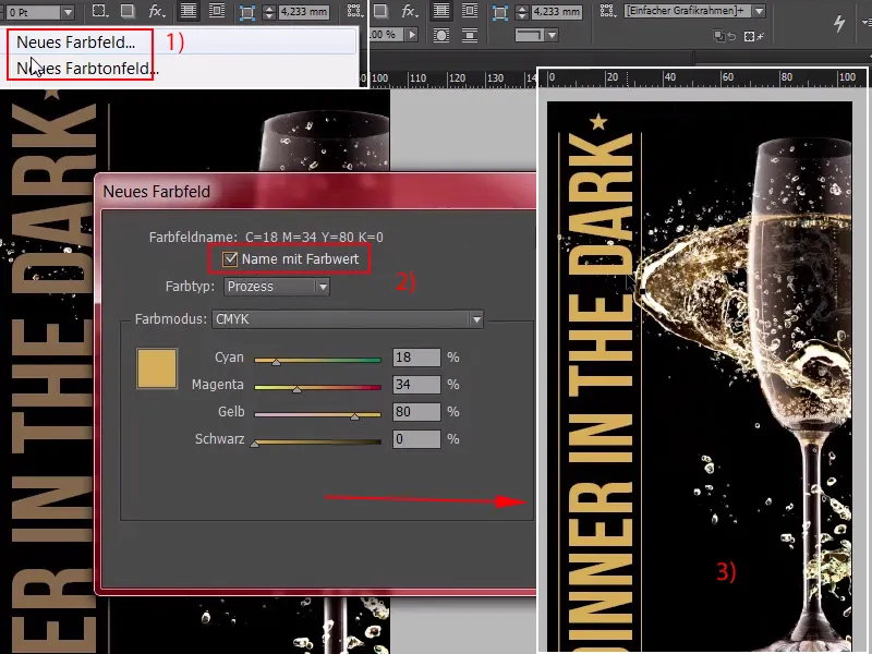
You might think that's okay in itself, but gold is not necessarily visually recognizable by the color, but rather by the entire play of colours from the shadows to the highlights that are reflected in the material, and to represent something like this graphically on paper is really only possible if you create such a play of colours artificially.
Step 21
And you can do this very easily with color gradients. I will now create a new color field (1), which is a little lighter: 7.21, 56.0 approximately, Add (2) OK (3). Once confirmed, ...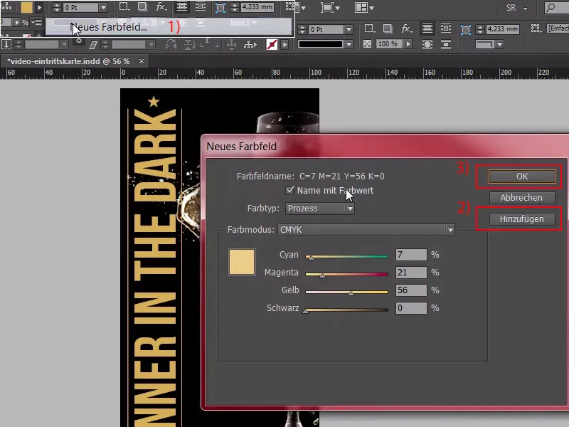
Step 22
... so now we have two color swatches (1), and I'm going to create a gradient swatch for us. Look here: Up here (2), once New gradient field, which I call "Gold gradient" (3), and once clicked on the white color bucket here (4); you could now enter this again manually, but that's totally boring, we don't want that, so let's pick out the color fields up here (5).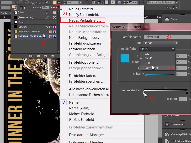
Step 23
This is the first color field (1) and here we select the second color field (2). Now it's time to determine the position, you can click on it here (3), ...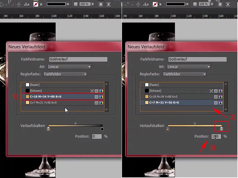
Step 24
... this is now at 50%, which is actually quite okay, but I think we need to swap the colors here once (1). This is roughly how it should be, 50% (2), you can then adjust this once afterwards, you just have to choose a radial gradient for the type above here (3).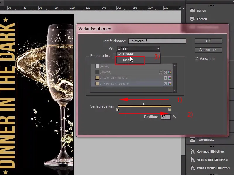
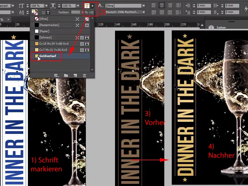
Step 25
I confirm this, and now take a look at what happens to the lettering "Dinner in the Dark" (1) if I now set it to a gold gradient (2). Now we have a shimmering light effect. I'll now do the same with the two contour lines; Here we also take the gold gradient, we leave out the stars at the bottom, otherwise they have a white dot in the middle and will move into this deep dark gold on the outside, but this effect would be illogical, because the light radiates from the center, and here we can now clearly see the serious difference between what we had before, what we had before (3) and what we have after (4), which means you simply have to recreate the plasticity and this glamorous glow of gold manually, and I think we've managed that quite well and can continue directly with the second side.