Google Sheets offers you excellent opportunities to create various types of charts. In this tutorial, I will show you how to create both column and bar charts in Google Sheets. These types of charts are widely used in business practice, whether in controlling, procurement, or logistics. Let's get started and find out how you can visually present your data.
Key Insights
- You can easily and quickly create column and bar charts in Google Sheets.
- Visualizing data allows for deeper insights and better decision-making.
- Customization options help you tailor your charts to your needs.
Step 1: Select Data
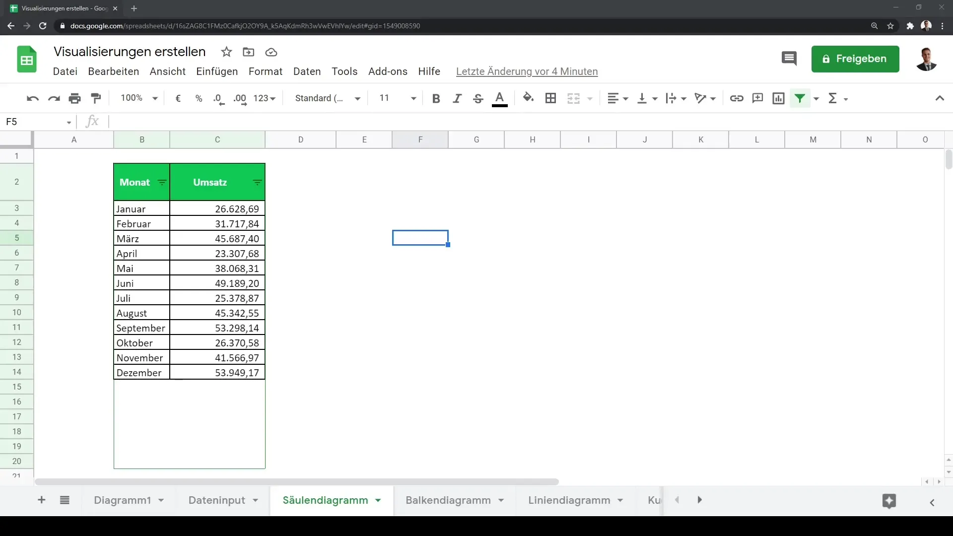
Before you start creating a chart, you need to select the data to be visualized. Open your Google Sheets document and highlight the entire range with the data you want to use.
Step 2: Create Chart
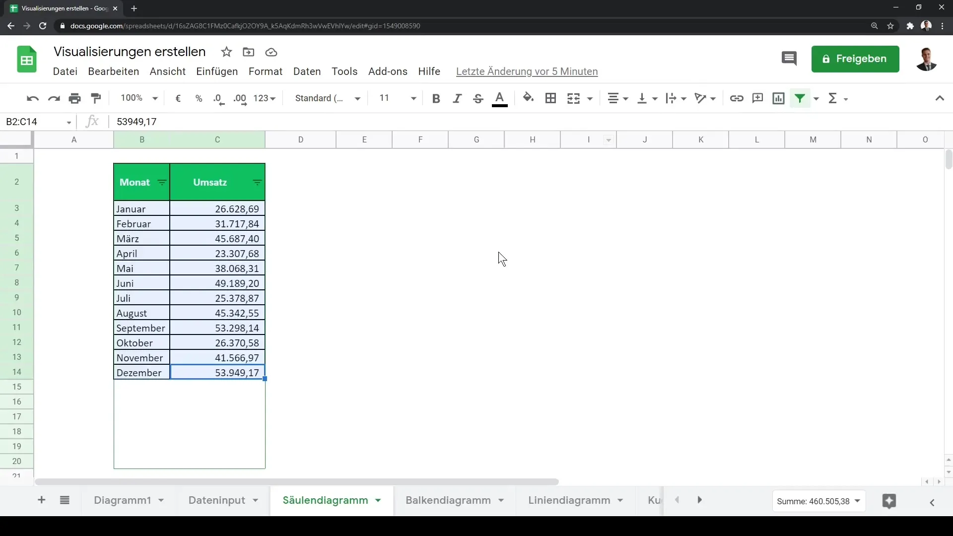
After selecting the data, click on "Chart" in the menu. You will notice that Google Sheets automatically suggests a chart type. In most cases, this will be a line chart.

Step 3: Change Chart Type
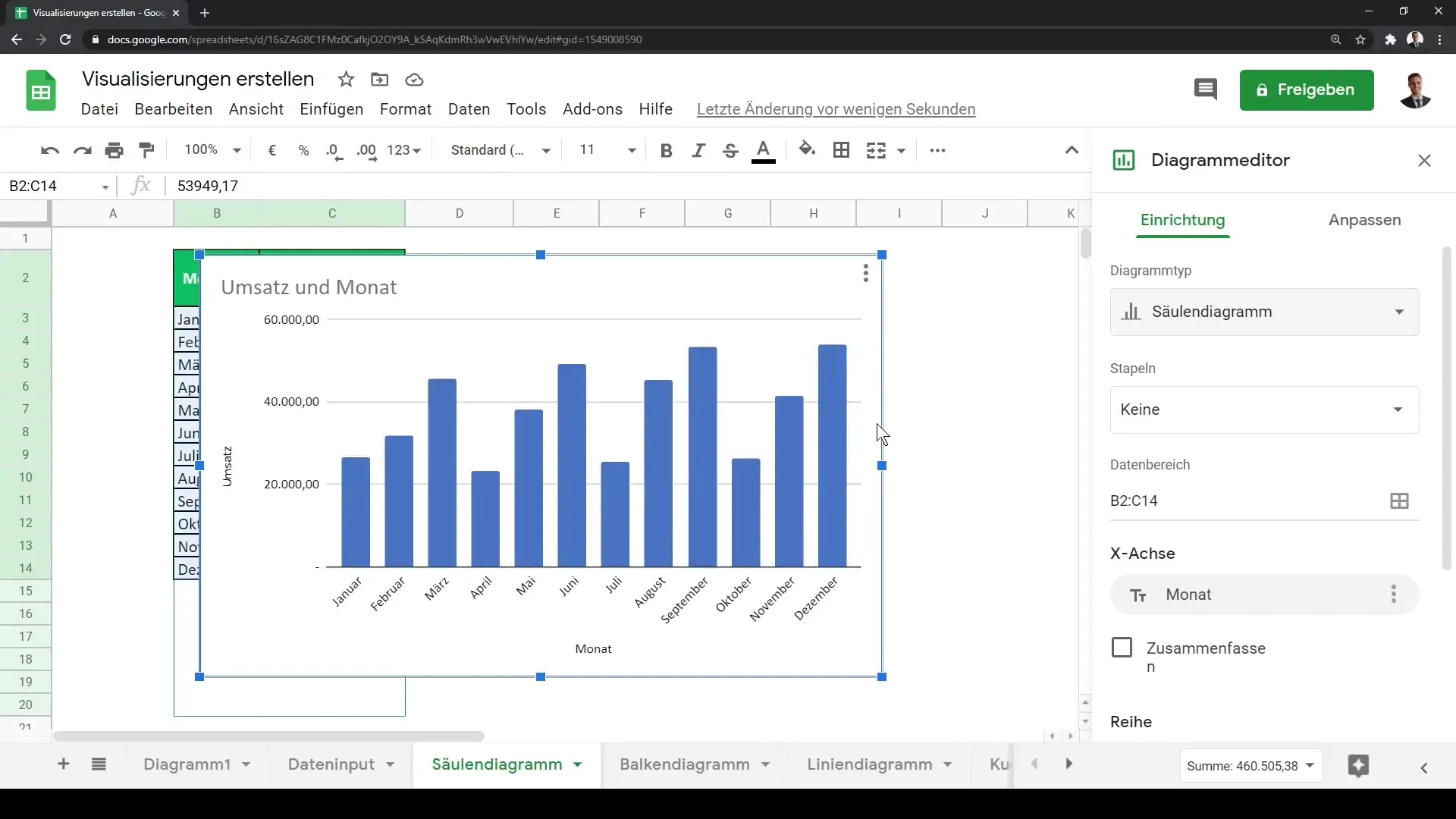
To change the chart to a column chart, go to the chart settings. Within these settings, look for the option to change the chart type. Select "Column Chart" here. The chart will now update and display your data in column form.
Step 4: Visualize Data
With the column chart, you can now visualize revenues on a monthly basis. This is particularly useful for identifying trends and making comparisons. In business practice, the column chart is one of the most commonly used visualization tools.
Step 5: Add Different Data Series
If you want to visualize additional information, you have the option to add different data series. For example, you can visualize profit alongside revenue. Click on the addition option to add a new data series.
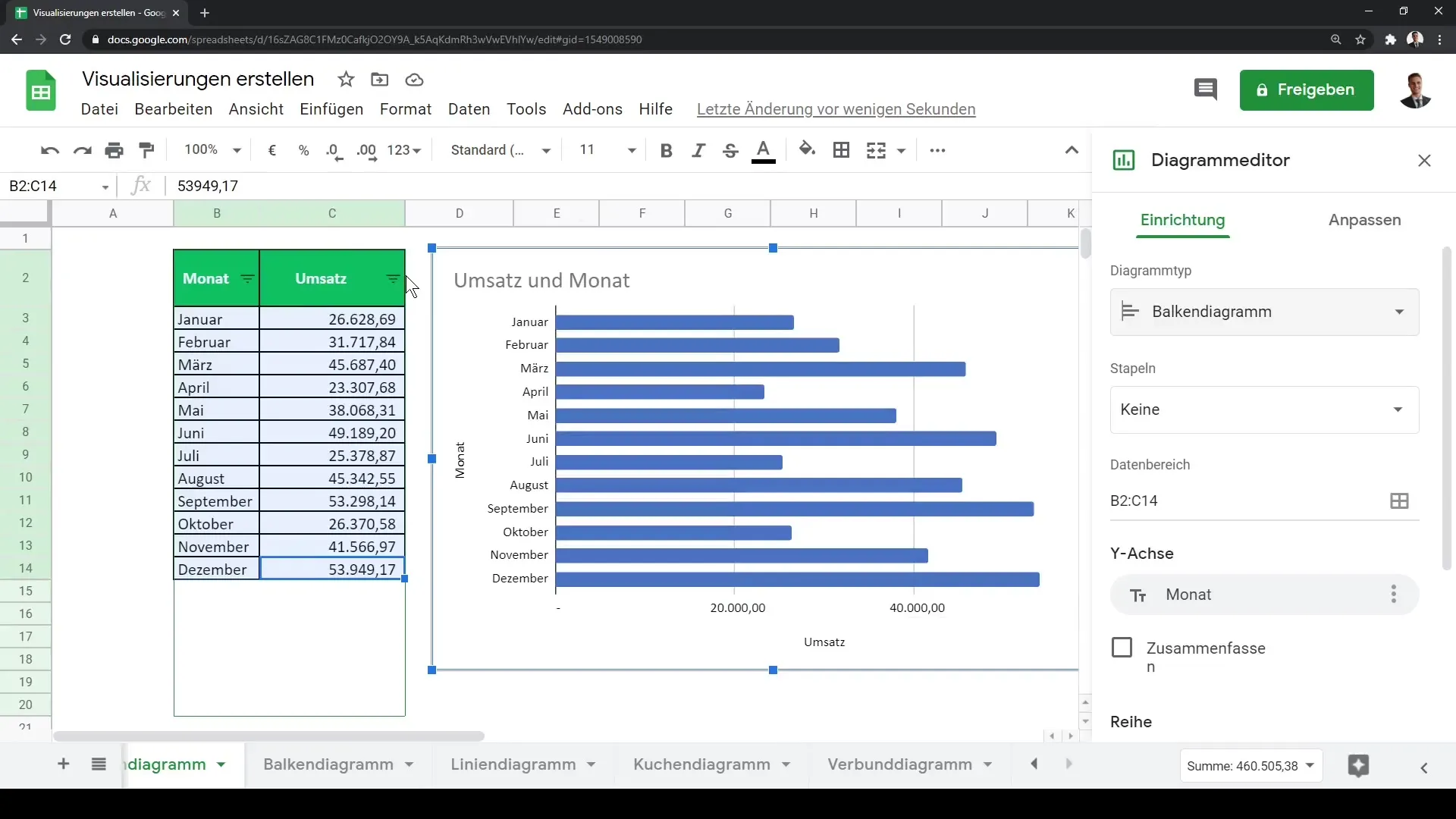
Step 6: Utilize Customization Options
Google Sheets offers extensive customization options for your charts. You can adjust the data labels, change colors, and make other visual settings to make your chart more appealing. Experiment with the various options to achieve the best result.
Summary
In this tutorial, you have learned how to create both column and bar charts in Google Sheets. These types of charts are not only effective for data visualization, but they also enable you to present your information clearly and understandably. Use the customization options to personalize the design of your charts and appear professional in presenting your data.
Frequently Asked Questions
How do I create a column chart in Google Sheets?Select your data, click on "Chart," and change the chart type to "Column Chart."
Can I display multiple data series in one chart?Yes, you can add as many data series as you want to make different metrics visible.
How can I customize the colors of my chart?Go to the chart settings and use the customization options to change the colors according to your preferences.
