In this tutorial, we will focus on the creation and customization of pie and doughnut charts in Google Sheets. These charts are particularly useful when you want to visualize proportions or percentages. They provide a simple way to represent data ratios and interpret them quickly. In the following sections, you will learn how to transform your data into appealing charts and what customization options are available to you.
Key Insights
- Pie and doughnut charts are ideal for visualizing proportions.
- Google Sheets offers various chart options and customization possibilities.
- You can customize the font, size, colors, and spacing of chart elements individually.
- It is possible to highlight specific data points to clarify their significance.
Step-by-Step Guide
To create a pie or doughnut chart, follow these simple steps.
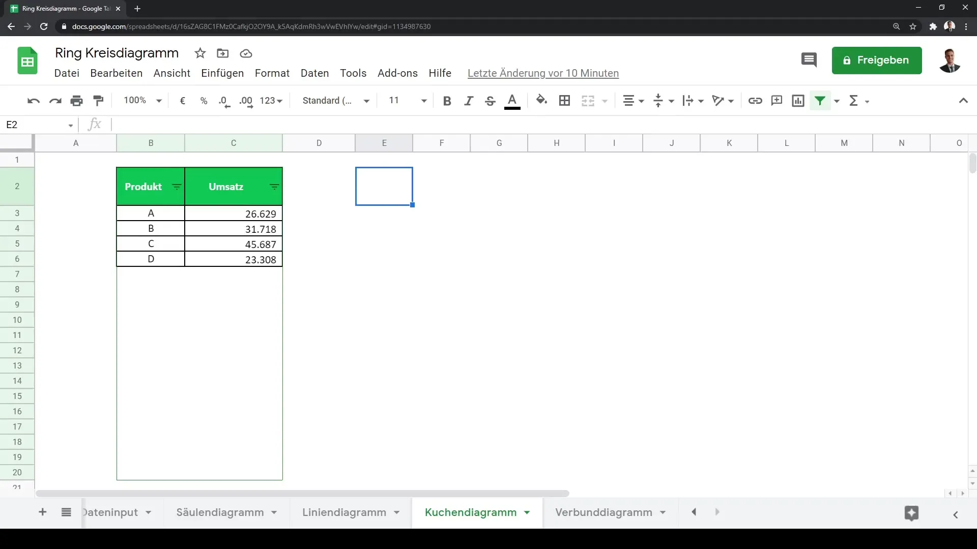
First, you need to enter your data into Google Sheets. Make sure you have a clear structure where the data is sorted. Often, one uses a column for categories and another for values to represent proportions. Once your data is prepared, you can start creating the chart.
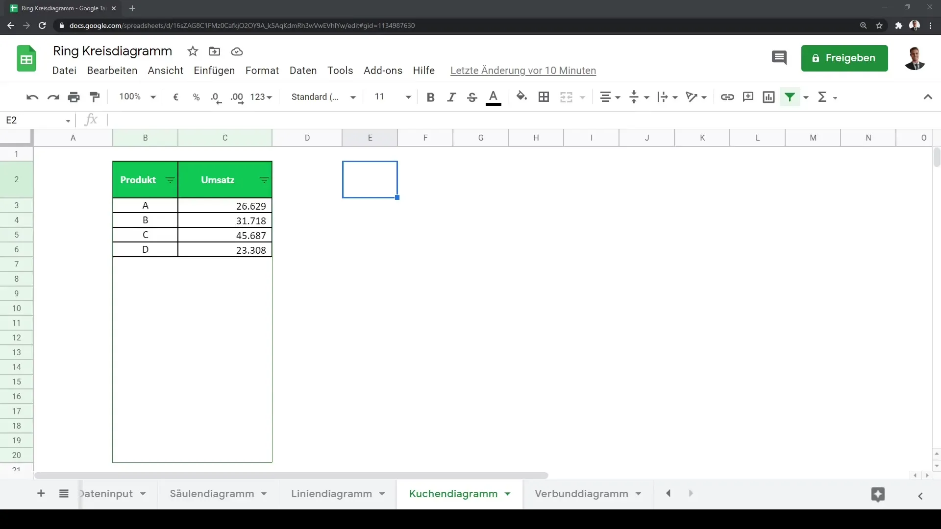
In your Google Sheets document, navigate to select the data you want to visualize. This means you have to mark the cells that contain both the categories and the respective values.
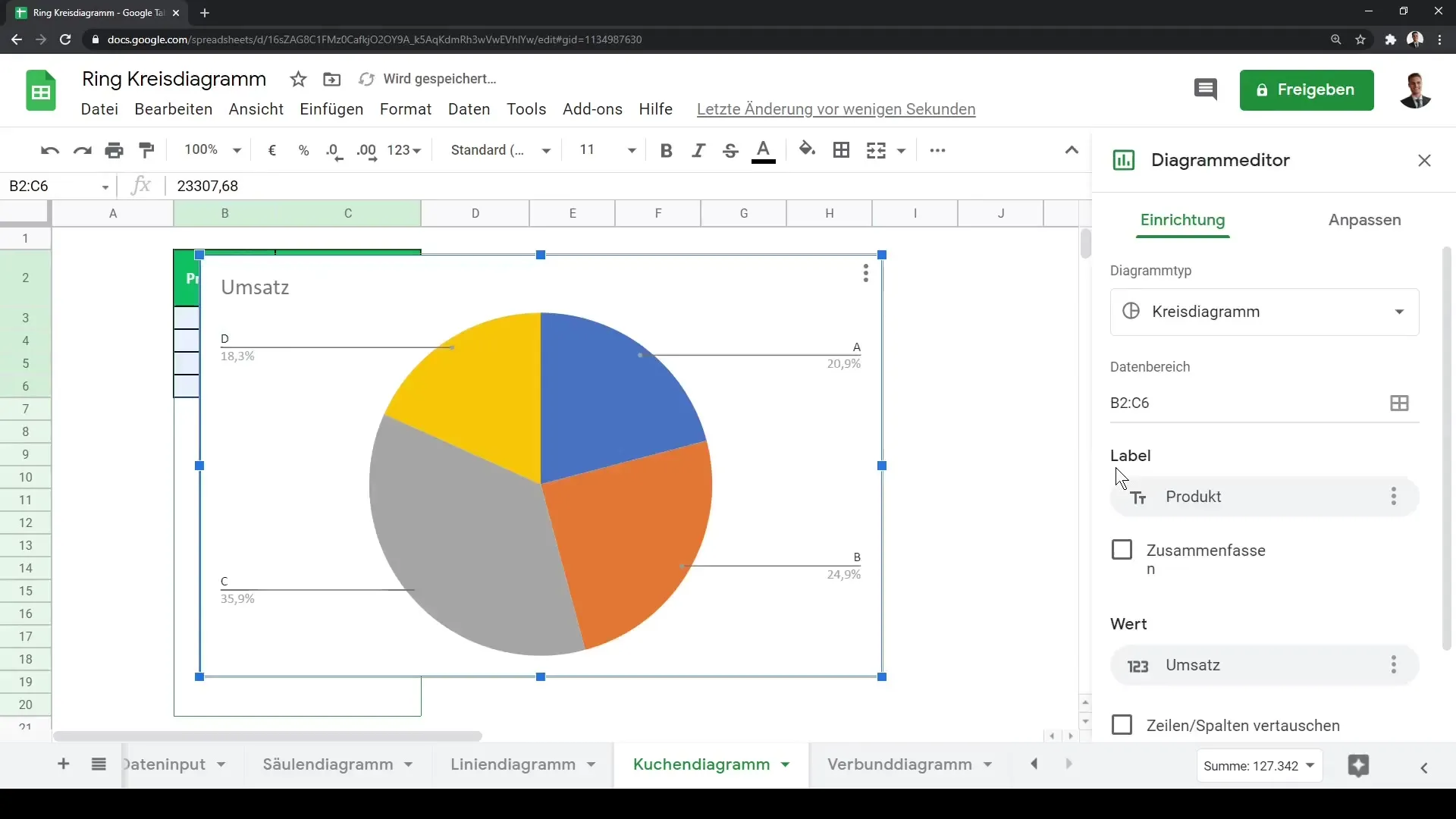
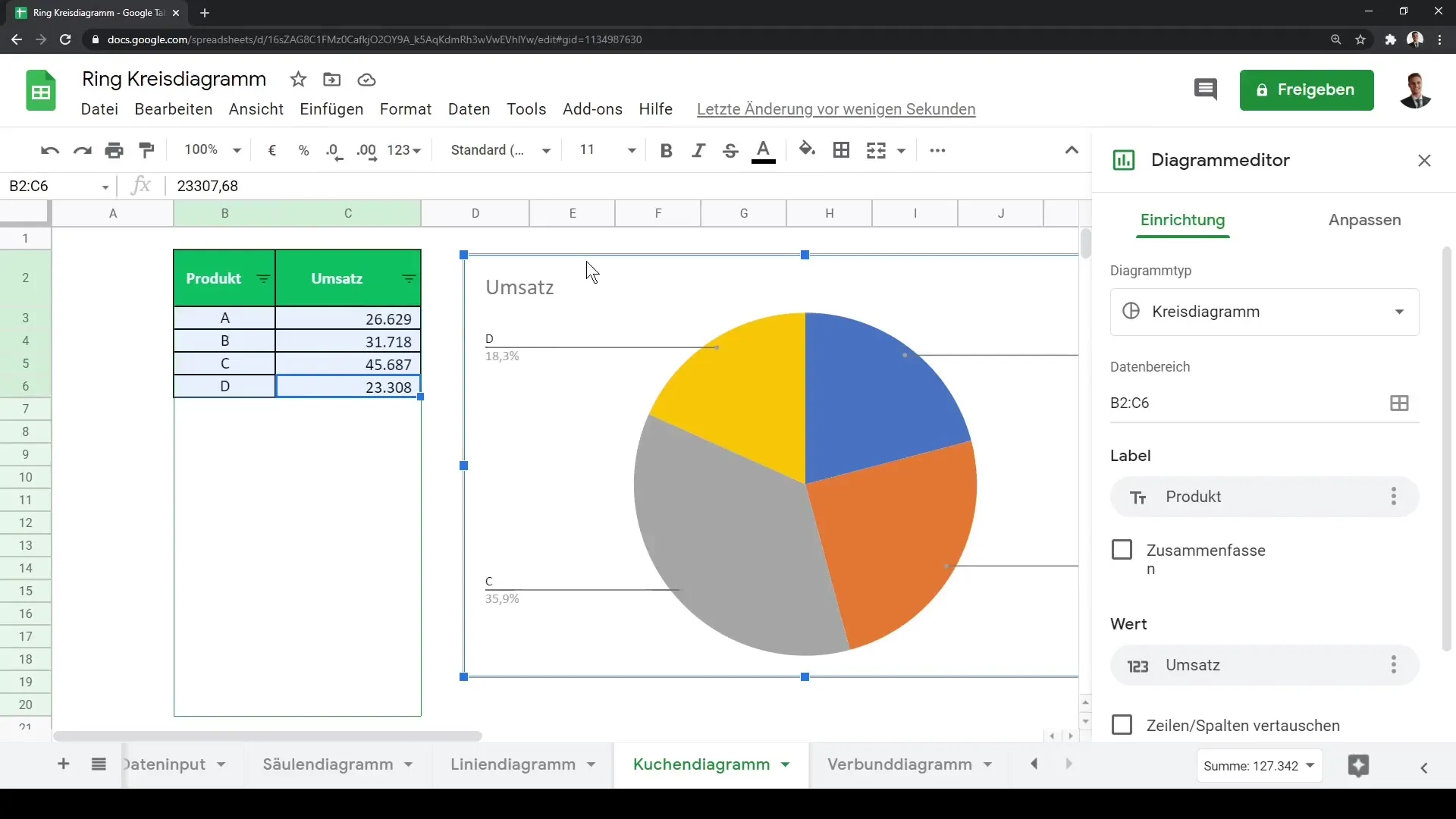
Once you have selected the data, click on the "Chart" button in the top menu bar. This will open the chart editor where you can choose different chart types. Google Sheets will automatically suggest a pie chart if it detects that your data is suitable for it.
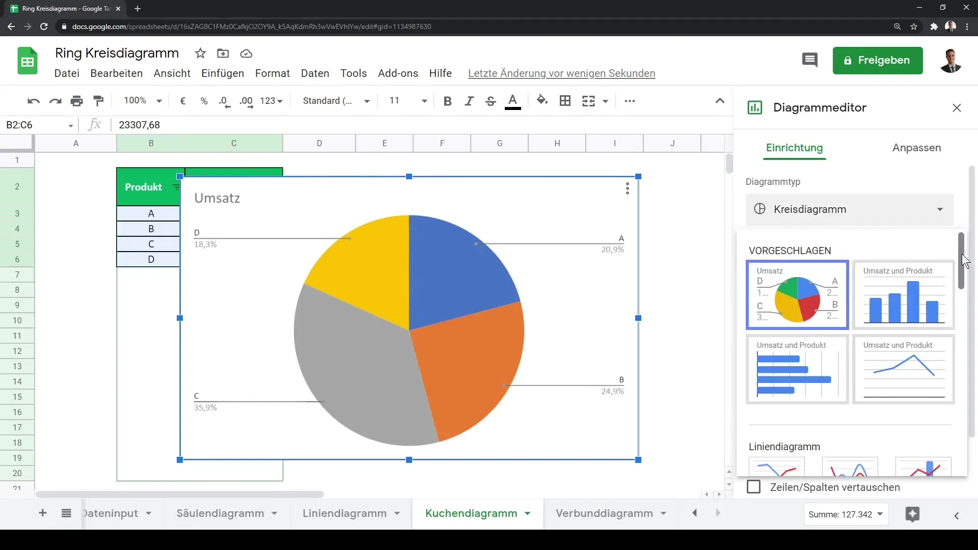
In the chart editor, you will see that the default chart is already displayed. Here you can also choose other chart types, such as doughnut charts or 3D pie charts. You can scroll down to see the different options.
If you opt for a doughnut chart, you will immediately see a change in the representation. Both chart types have their own advantages but serve the same purpose: visualizing proportions.
One of the important customization options is the ability to modify the inner circle of the chart. Here, you can adjust the size of the inner circle, for example, setting it to 50%. This helps tailor the visualization to your needs.
Additionally, you can configure the data labels, including font and size, to ensure they are easily readable. It is important that the labels clearly distinguish which segments they belong to.
If you want to highlight a specific data point, you can adjust the distance to the center. For example, you could increase the distance for the product category D to emphasize its significance during a presentation.
Furthermore, you can edit the titles of the chart and axes at any time. Give the chart a clear title, such as "Pie Chart for Our Revenue," and again adjust the font and size to look professional.
Another useful function is customizing the legend. You can change the font and size of the legend to ensure that the designations of the individual product categories are clearly identifiable.
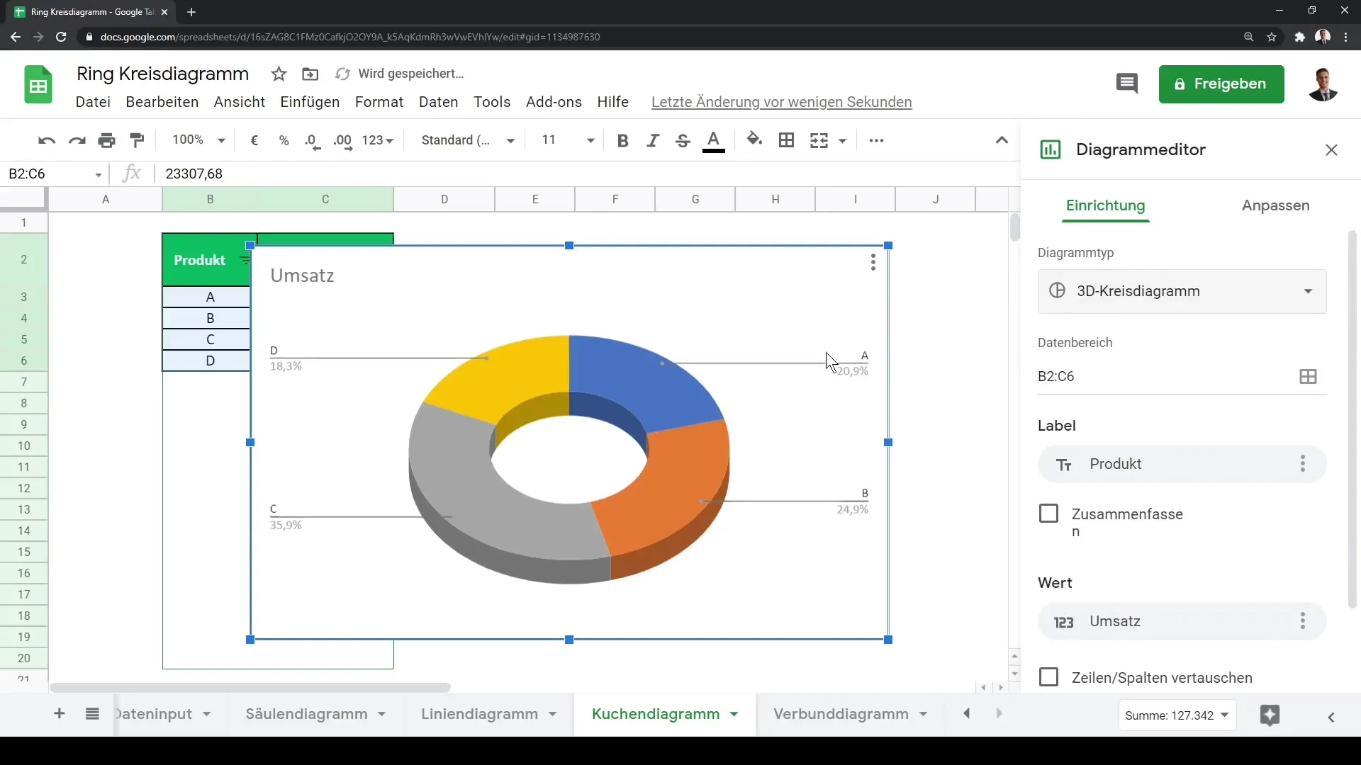
It is worth mentioning that you can easily change the formatting of the legend, for example by bolding, italicizing, and changing the font color.
So now you have gone through all the necessary steps to create and customize appealing pie and ring charts in Google Sheets. These functions will help you present your data in a clear and understandable way.
Summary
In this guide, you have learned how to create and customize pie and ring charts in Google Sheets. From selecting the data to choosing the chart type to various customization options – now you are able to create meaningful charts for your data.
Frequently Asked Questions
How do I create a pie chart in Google Sheets?To create a pie chart, select your data and click on "Chart" in the menu bar.
How can I customize the colors of my charts?You can customize the colors of each segment in the chart editor by clicking on the respective segment and selecting the color.
Can I change the data labels in the chart?Yes, you can customize the font, size, and formatting of the data labels in the chart editor.
Are there different types of charts to choose from?Yes, Google Sheets offers various types such as pie, ring, and 3D pie charts.
How can I emphasize a specific data point?You can increase the distance from the center for specific segments to highlight them during a presentation.
