In this tutorial, I would like to show you how to create combo or composite charts in Google Sheets. These types of charts allow you to combine two different visualization forms within one representation. For example, you can depict your company's sales development as a column chart and the number of phone calls as a line chart. To make it more clear and meaningful, here you will learn the necessary steps to create and customize such charts.
Key Takeaways
- Combo charts can combine different chart types.
- Proper axis text formatting aids in data analysis.
- Chart customizations can be made through simple steps within Google Sheets.
Step-by-Step Guide
First, you should select the data you want to visualize in your combo chart. Click on the desired cells with your data in the Google Sheets document before creating the chart.
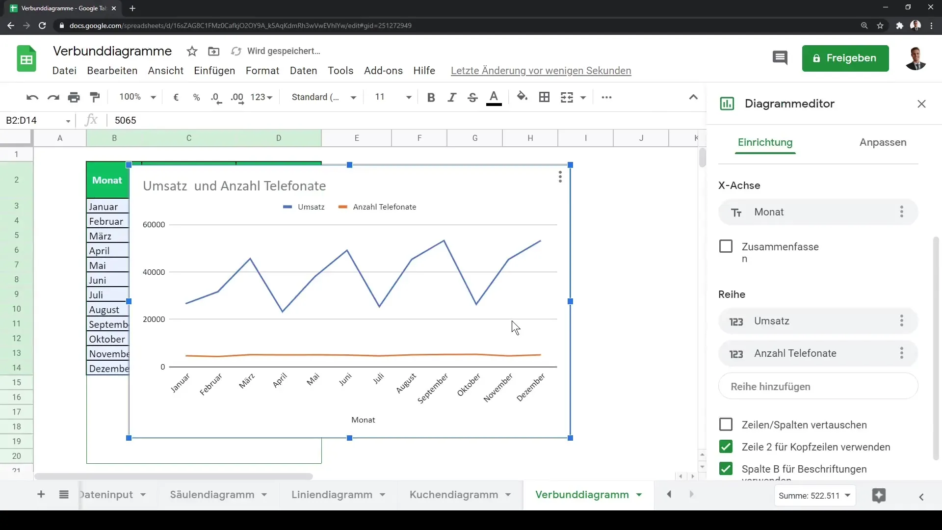
After selecting your data, click on the "Create Chart" button. This will automatically generate a chart in Google Sheets. You will notice that the default chart in this case is already a combination of two line charts. You can read the values on the y-axis while the x-axis represents the monthly level.
An important point is that the two data sets you have in the chart can vary significantly in their scale. In our example, the revenue ranges between 25,000 and 50,000, while the number of phone calls is displayed in a much smaller range. To optimally represent these differences, it is advisable to use two vertical axes. This feature can be set through the chart type options for combo charts.
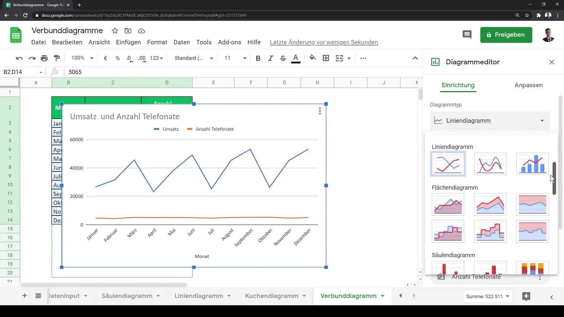
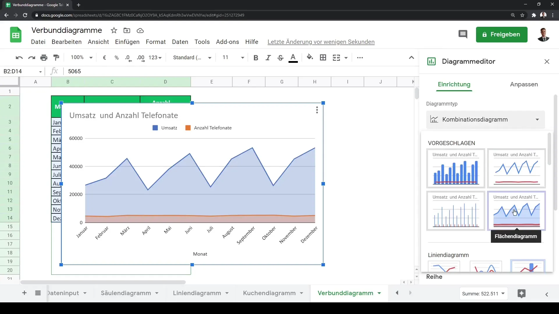
To create a combo chart, after initializing your chart, go to the chart settings and scroll down to the various chart options. Here you can select the combo chart, also known as a composite chart. This allows you to combine different visualizations in one view. Typically, a column chart is suitable for revenue data, and a line chart for phone calls.
If you want to customize your chart options, click on the "Customize" section and select "Series." Here you can choose the chart type for each series individually. For example, you can set a line chart for phone calls while continuing to display revenues as column chart.
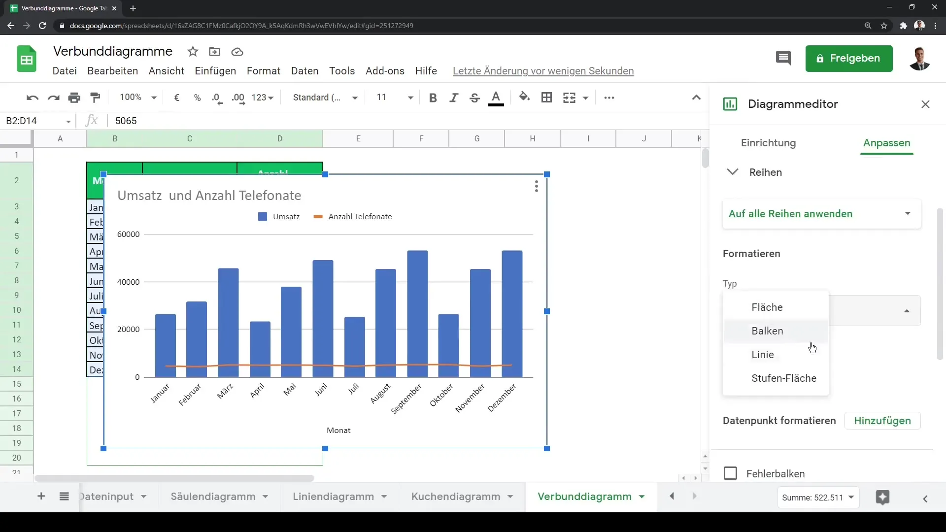
There is also the option to combine different chart types, such as area charts with line charts or bar charts. You can further customize this and configure your visualizations according to your preferences.
With these simple steps, you can create and customize powerful and informative combo charts in Google Sheets to effectively display your data.
Summary
In this guide, you have learned how to create combo charts in Google Sheets. You have learned how to select your data, create an initial chart, and customize the various chart types. With these skills, you can visualize your data more effectively and gain deeper insights.
Frequently Asked Questions
How do I create a combo chart in Google Sheets?Select your data, click on "Create Chart," and then choose the chart type "Combo Chart."
Can I combine different chart types in a combo chart?Yes, you can combine different chart types like column, line, or area charts.
How can I adjust the axes in my chart?Go to the chart settings and use the "Customize" section for axis adjustments.
