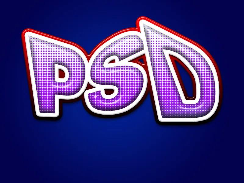
A logo is the eye-catcher of every design – so why not stand out with extravagant effects? With Photoshop, you can make your logo shine with gloss, glitter, metallic accents, or light reflections. In this tutorial, I will show you how to enhance your logo with various striking effects to create a unique and luxurious look. Whether you want a glamorous branding or a striking design – with these techniques, your logo is guaranteed to be an eye-catcher!
Step 1:
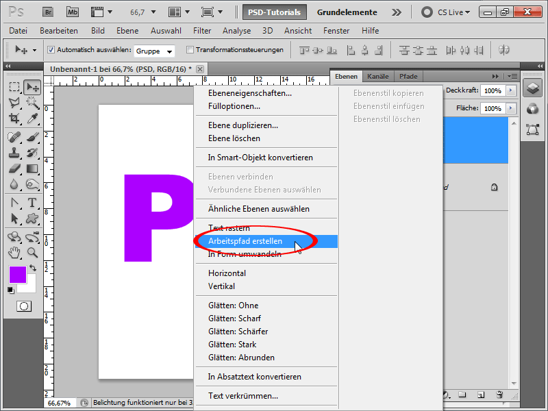
I create a document with the size of 800x600 pixels, although the size is actually unimportant. Now I create a few letters. I write PSD in the Arial Black font. The font color doesn't matter. Then, with the text layer active in the Layers panel, I right-click and select Create Work Path. After that, I hide the layer.
Step 2:
Next, I use the Direct Selection Tool to select the letter P and transform it with Ctrl+T. I move a handle from a corner of my choice while holding the Ctrl key, to distort the letter perfectly.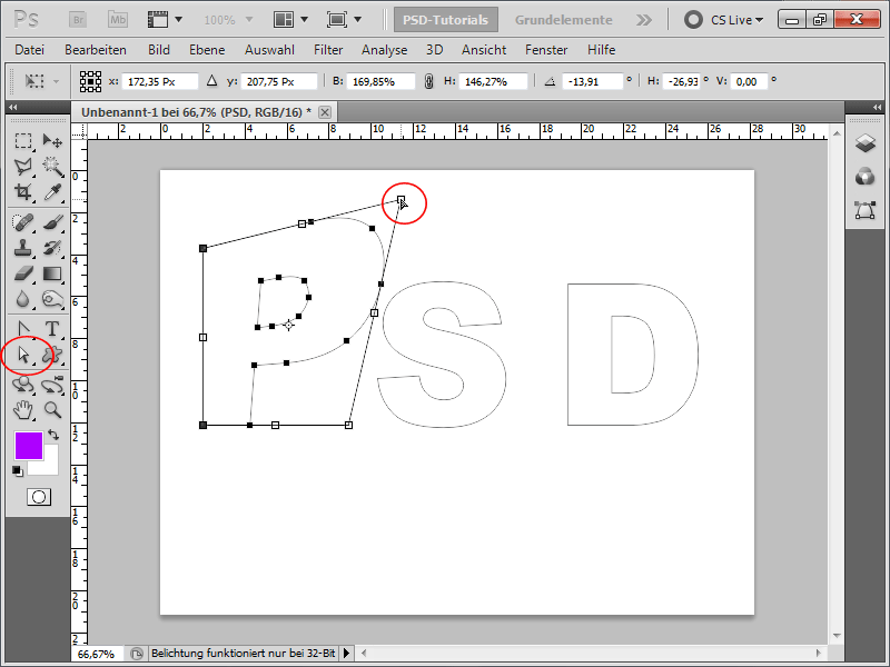
Step 3:
Now I do the same with the letters S and D.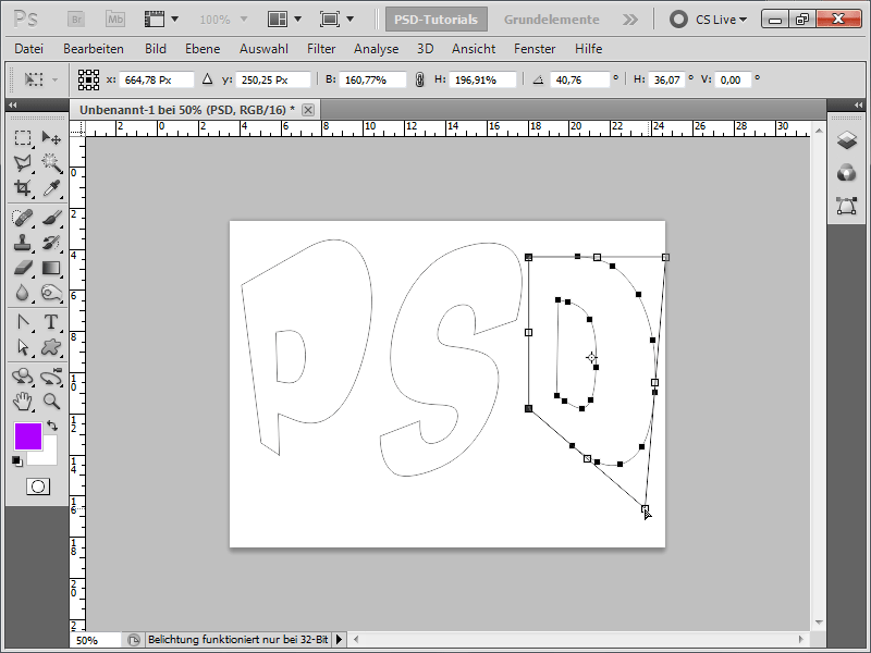
Step 4:
Next, I save the letters as Custom Shape.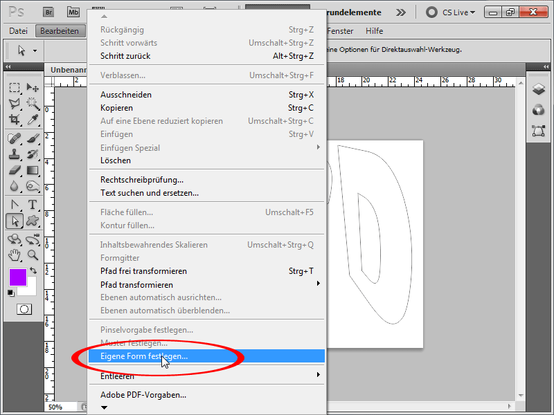
Step 5:
I now find the shape under Custom Shapes and can then drag it accordingly: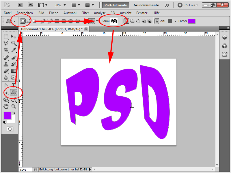
Step 6:
Next, on the shape layer, I set a nice bold red Stroke.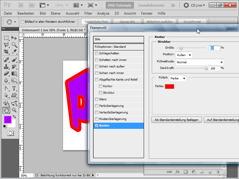
Step 7:
Then I change the color from purple to blue. Now, with a right-click on my shape layer, I convert it to a Smart Object.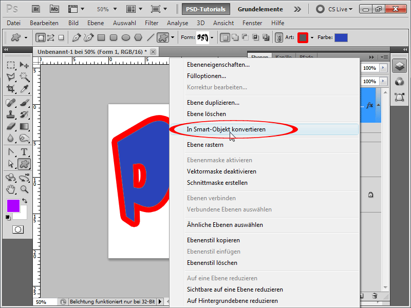
Step 8:
I will now duplicate the new Smart Object again. Important: Do not use Ctrl+J or drag to the New Symbol, but use the right-click> New Smart Object via Copy, so that all changes do not affect each Smart Object. I want an independent Smart Object.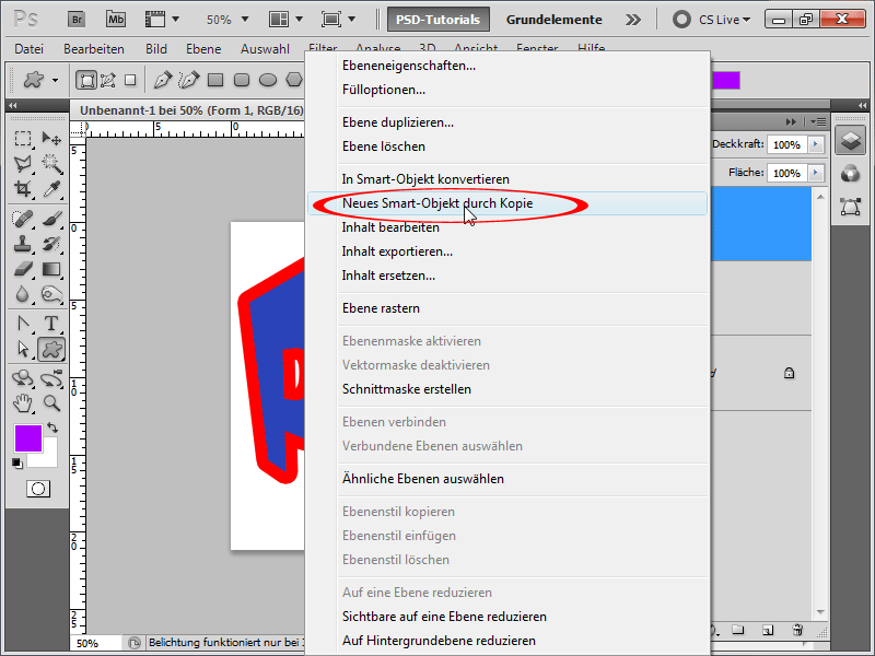
Step 9:
My two Smart Objects now look like this in the Layers panel: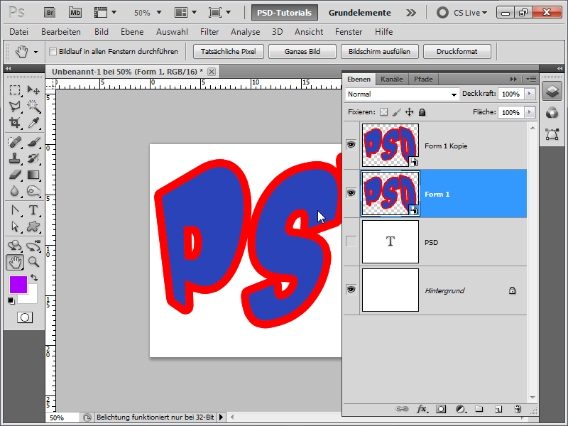
Step 10:
Next, I hide the upper Smart Object and set a Drop Shadow on the one below. Tip: I can move it directly on my workspace.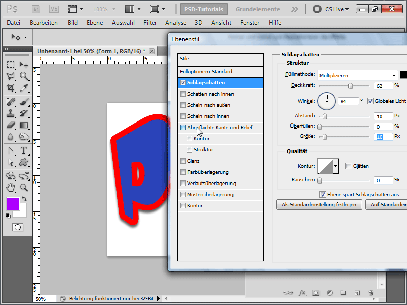
Step 11:
Now quickly activate the Bevel and Emboss and adjust the sliders until you like the result.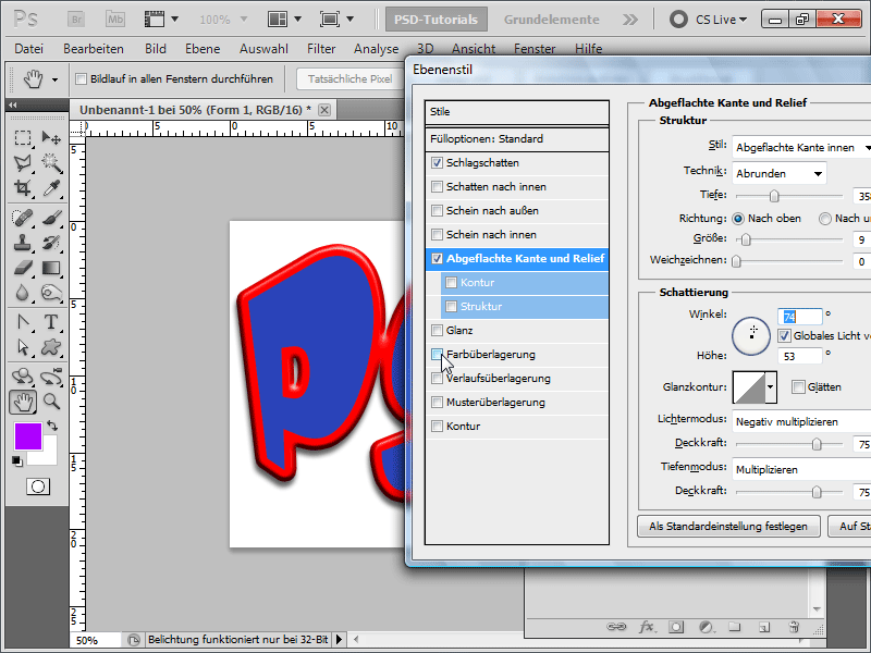
Step 12:
An Overlay Gradient with an Opacity of about 50-60% also works quite well.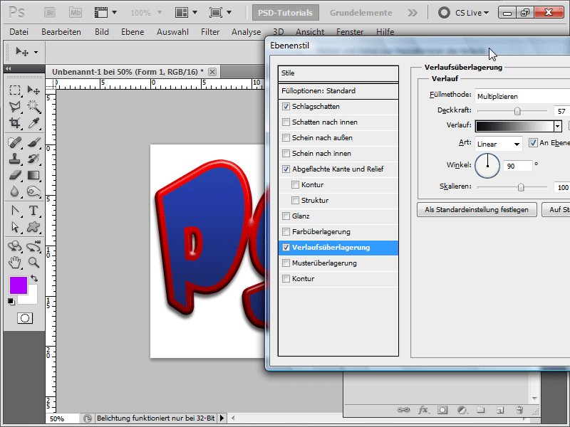
Step 13:
Now I show my upper Smart Object again and double-click on it to enter editing mode.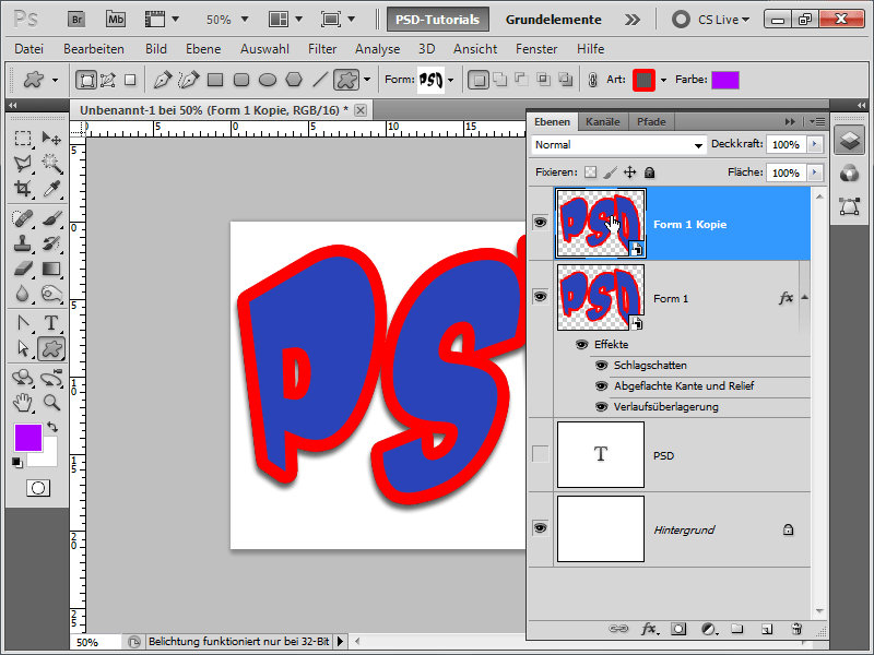
Step 14:
Inside, I change the existing red Stroke to a white one with a slightly smaller Size.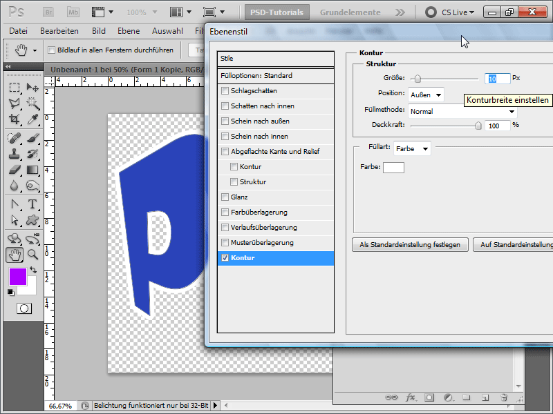
Step 15:
I can change the color by double-clicking on the shape layer color in the Layers panel. I opt for Lisa/Pink.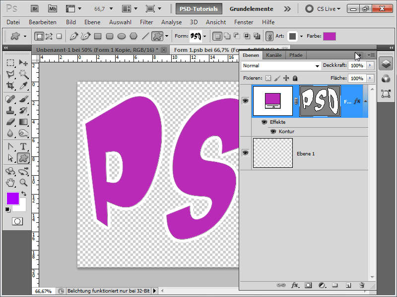
Step 16:
I will also set the flattened edge and relief right away.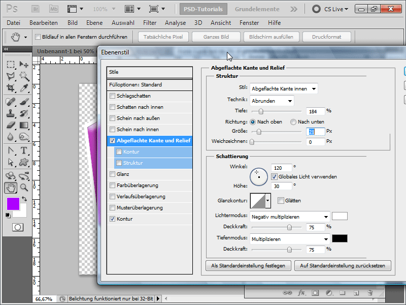
Step 17:
I close the Smart Object editing, and my result already looks quite good: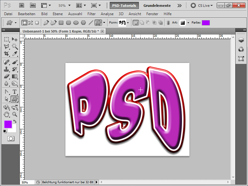
Step 18:
To make my effect look even cooler, I create a new document in e.g. 800x600 pixel size. Now inserted a linear black and white gradient, and then I go to Filter>Blur Filter>Color Grid. I set the following values: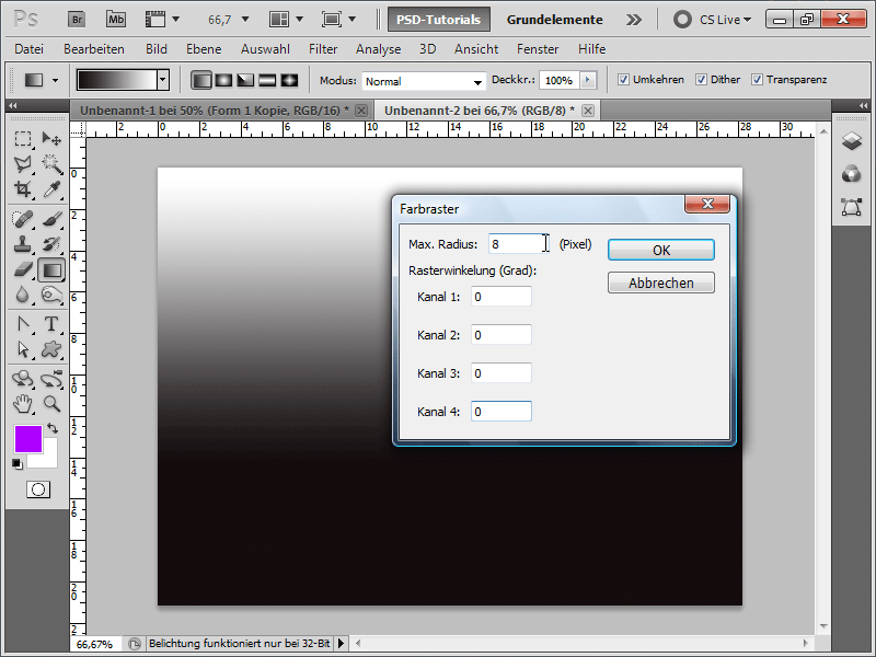
Step 19:
Next, I try to hit a white pixel with the magic wand; then all white pixels are selected. Now with F7 I show my Layers panel and double-click on my background layer so it becomes a normal layer.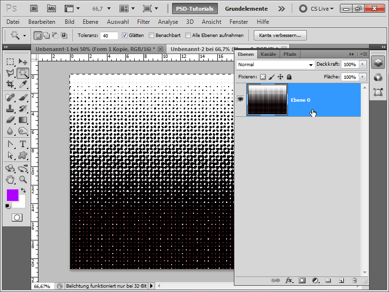
Step 20:
Now with Ctrl+Shift+I invert the selection and press the Delete key to remove the black pixels. Now I select everything with Ctrl+A and save everything as a pattern under Edit>Define Pattern.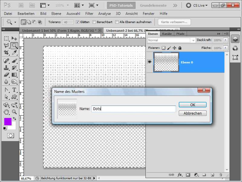
Step 21:
Now I go back to my logo document, double-click on the first Smart Object and go to the Fill options. There I activate the Pattern Overlay and choose my new pattern. I can also move this directly on my workspace.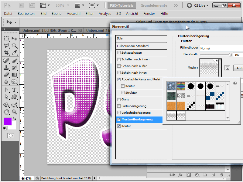
Step 22:
In my opinion, the result looks pretty good. I also tried to further enhance the flattened edge.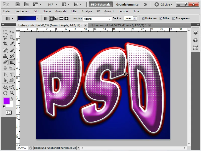
Step 23:
The great thing is, that I can change the color of the letters and also the outline color with just a few clicks. With a different background, the whole story looks completely different.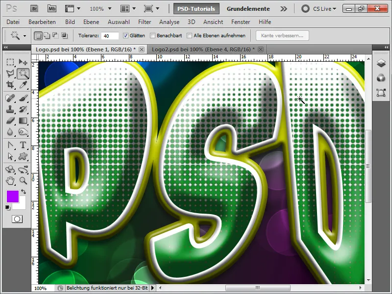
Step 24:
Tip: If I don't like the arrangement of the dots 100%, I can also completely extract them as effects by right-clicking on the effect and then going to Create layers.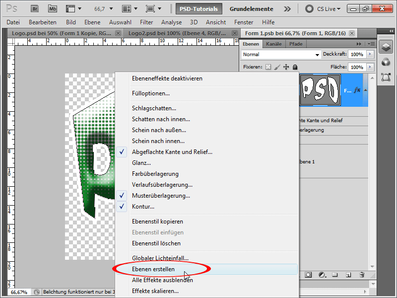
Step 25:
Now I can also completely recolor the dots that were not 100% white because I probably did not cut them out perfectly at the beginning, by setting the Brightness to 100% with Ctrl+U.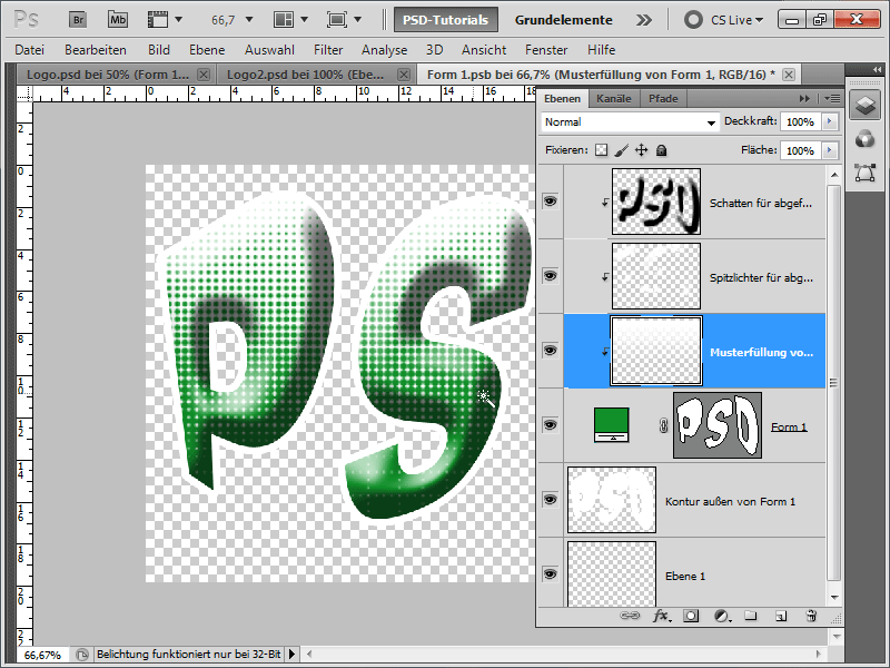
Step 26:
Now I add a layer mask to the dots and apply a black and white gradient; it already looks much smoother.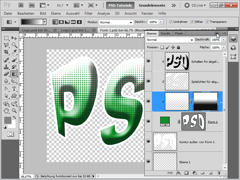
Step 27:
With a purple outline, it looks even better. And this is my final result: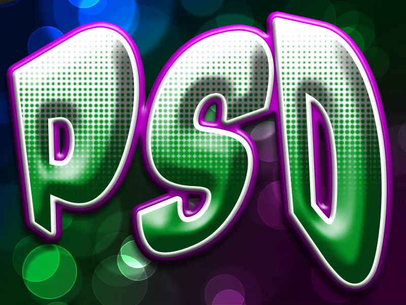
Step 28:
Or, if I transform and bend the letters even more at the beginning, the result could look like this: