In Google Sheets, there are a variety of types of charts that you can use. But which option is the right one for your project? The choice of the suitable chart depends on your data and the message you want to convey. In this tutorial, I will highlight the various types of charts you can use in Google Sheets and explain when it is best to use them.
Main Takeaways
There is no universal best type of chart; the choice of the right type depends on the specific data and the desired statement. You need to analyze your data and clarify your storytelling strategy before you begin visualization.
Step-by-Step Guide
Overview of Different Types of Charts
First, you should familiarize yourself with the different types of charts offered by Google Sheets. These include bar charts, column charts, pie charts, line charts, and many more. Each type of chart has specific strengths and weaknesses, depending on the information you want to convey.

Bar and Column Charts: The Classics
Bar and column charts are excellent for comparing quantitative data across different groups. For example, in a column chart, you can represent revenues from January to December. These charts are intuitive and easily understood by most people.
However, it can quickly become confusing with very large amounts of data. So if you're working with many different groups, a scatter plot might be more suitable.
Scatter Plots: Focusing on Larger Datasets
If you have many data points, scatter plots are a good choice. They allow you to clearly display equivalent variables and identify trends. Scatter plots are particularly useful for visualizing different groups with different colors.

One drawback is that with a high number of data points at one position, the evaluation becomes difficult. Therefore, you should use this type of chart wisely.
Pie Charts: Keeping an Eye on Shares
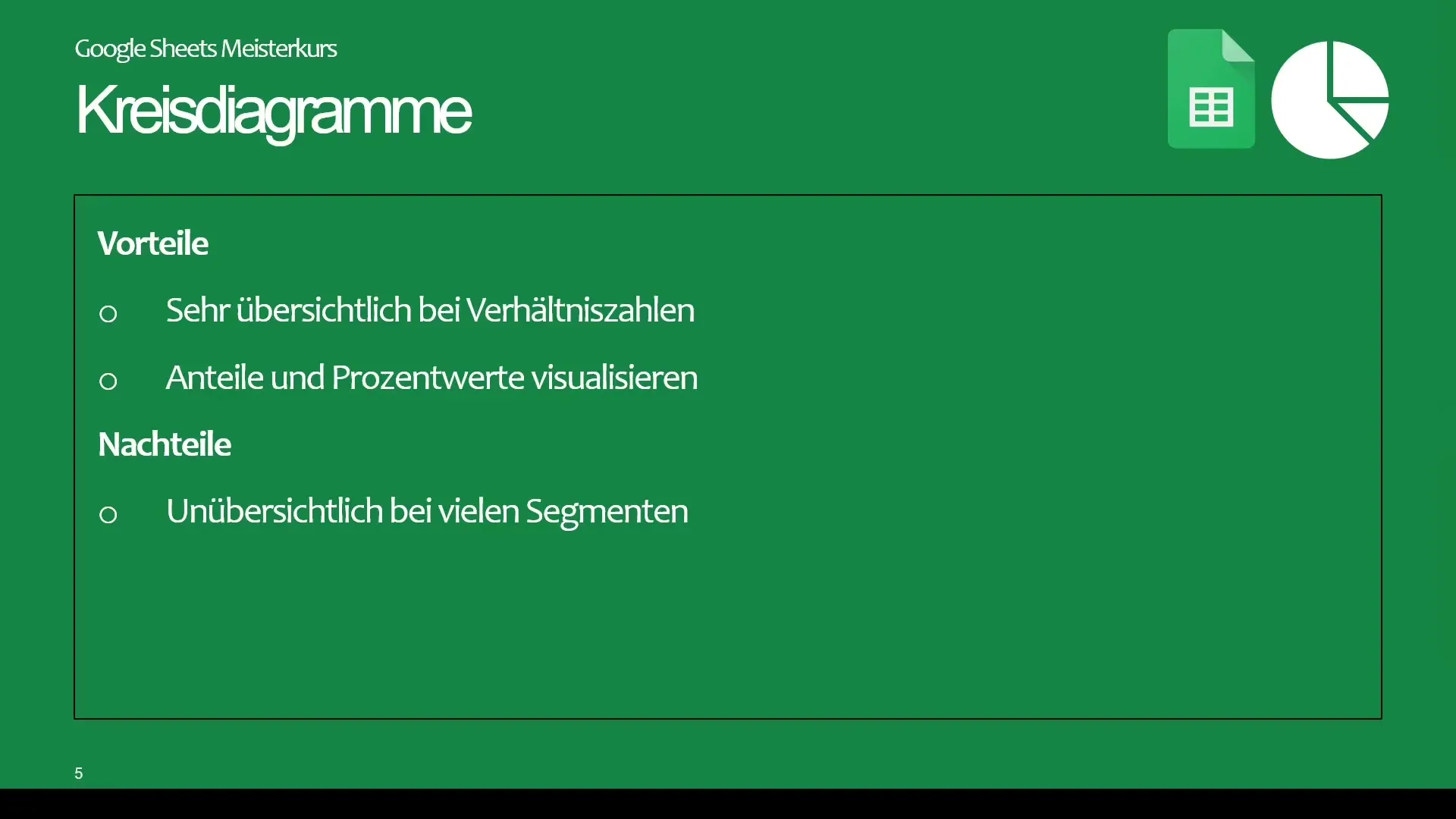
Pie charts are excellent for representing proportions and shares. They are ideal for data with few categories. However, with many categories, the representation becomes confusing. Imagine you want to represent the largest cities in Germany in a pie chart – that would quickly become unclear.
In such cases, a treemap would be a better option as it allows for clearer allocation.
Line Charts: Visualizing Trends over Time Periods
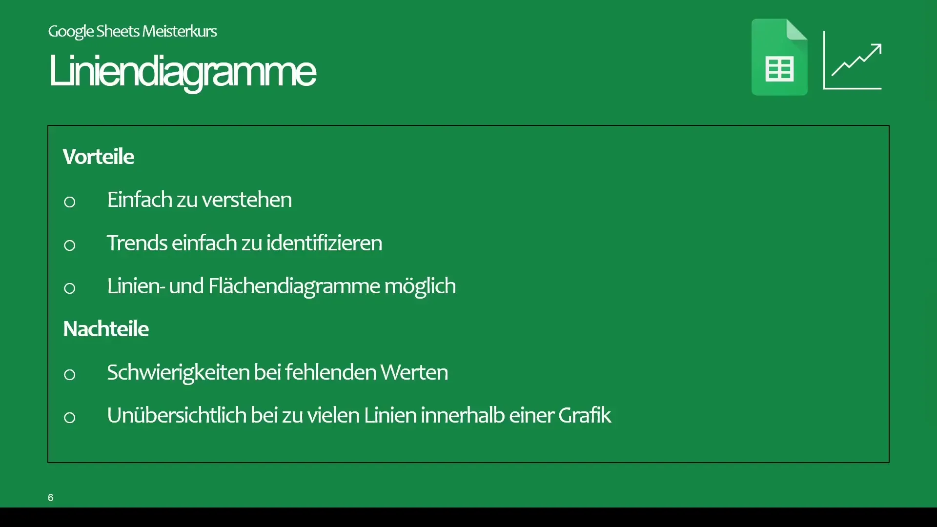
Line charts are also very popular for visualizing trends over periods of time. You can use them to visualize the development of your revenues over months or to analyze data over time.
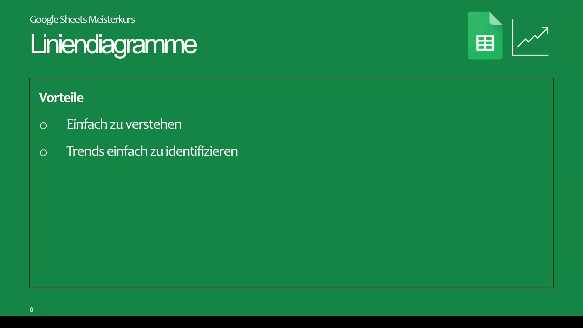
A small disadvantage is that missing data points can create gaps in the chart, which can affect interpretability.
Area Charts: From Lines to Areas
Area charts are a variant of line charts that are well suited for visualizing developments. If you fill the area under a line, you get an illustrative chart that presents the data in a broader context.
However, it is important to keep an eye on the number of lines displayed, as too many lines can quickly make the chart confusing.
Summary
In order to choose the right charts for your data in Google Sheets, you have to consider which data you are analyzing and what statement you want to make. Experiment with different types of charts and identify which one is best suited for your specific data.
Frequently Asked Questions
Why is it important to choose the right type of chart?Choosing the right type of chart helps you present your data clearly and comprehensibly.
When should I use a scatter plot?A scatter plot is useful when you have many data points and want to analyze trends between two variables.
Which types of charts are suitable for comparative data?Bar and column charts are ideal for comparing data from different groups.
How can I avoid clutter in my charts?Limit the number of categories or data points displayed to ensure clarity.
When is a pie chart useful?Pie charts are useful when you want to represent the shares of a few categories.
