In this guide, I will show you how to effectively use interactive data filters, also known as data slicers, in Google Sheets. Data slicers provide a simple and visual way to control the representation of data in your charts by selectively choosing the information you want to view. This is especially useful when you have large data sets and want to quickly switch between different views. Let's now delve into the details and go through the steps for creating and utilizing data slicers.
Key Takeaways
- Data slicers enable interactive selection of data in charts.
- You can create multiple data slicers for different attributes.
- The function provides enhanced visualization of analysis results.
Step-by-Step Guide
To use data slicers in Google Sheets, follow these steps:
Preparing the Data
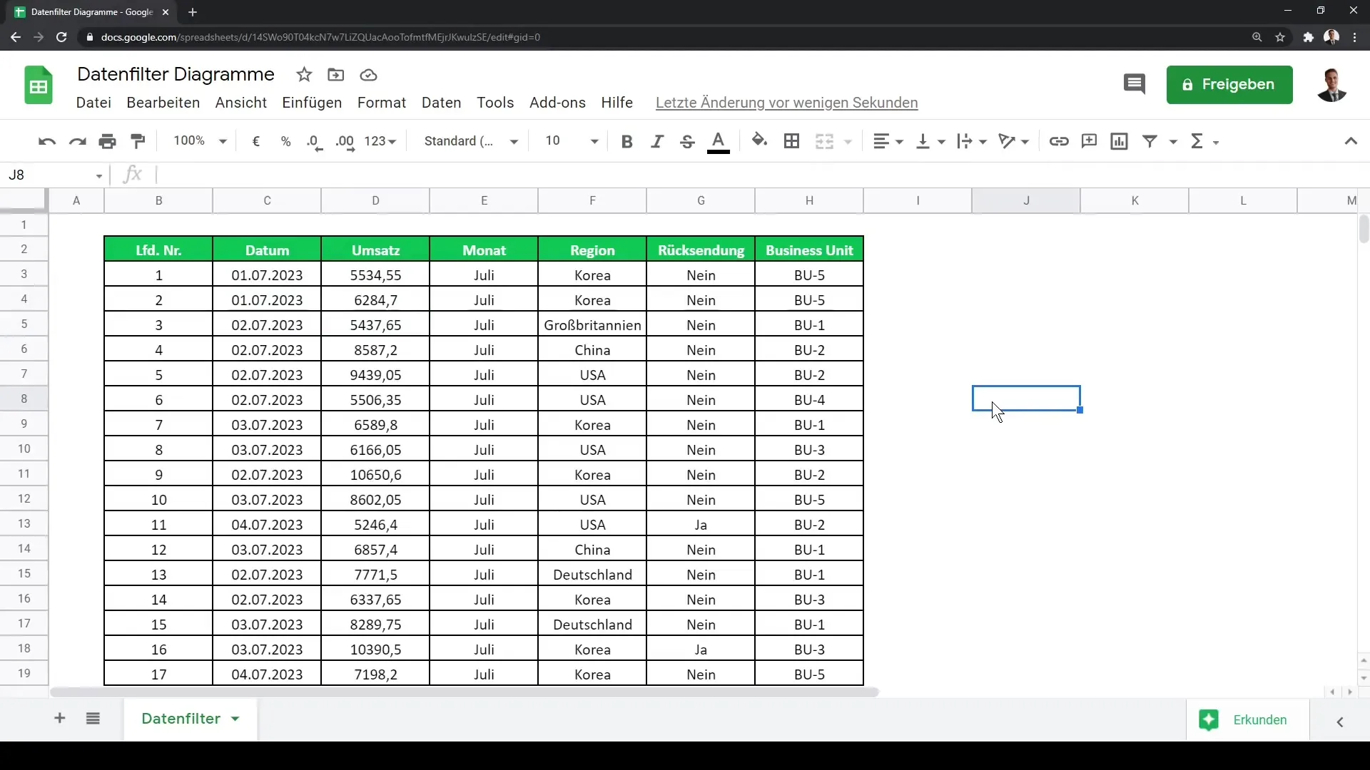
Before you can start with the data slicers, you need a clearly structured dataset. In this tutorial, I am using the revenue data of a logistics company broken down by region. Make sure your data is well organized in a table.
Creating a Chart
First, you need to create a chart to visually represent the data. Click on the table and navigate to the menu bar. Select "Insert" and then "Chart". Google Sheets will show you a recommended chart option.
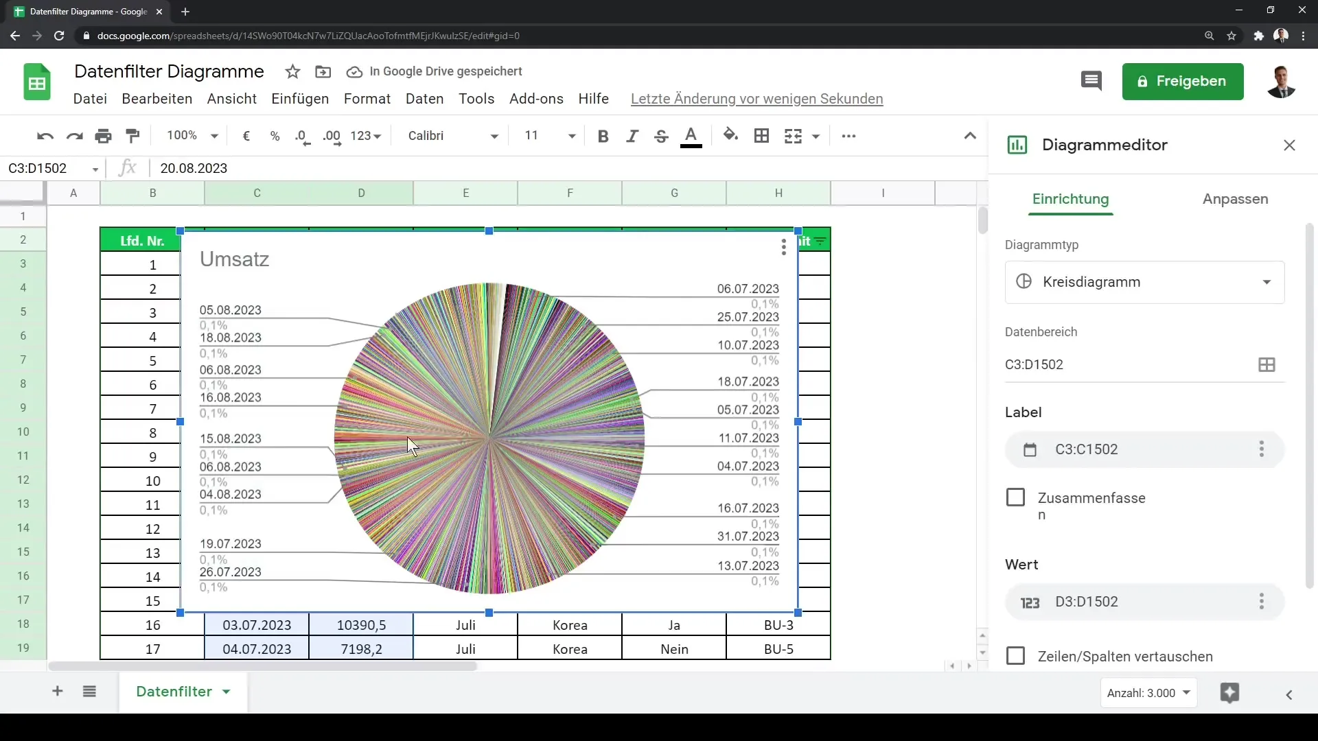
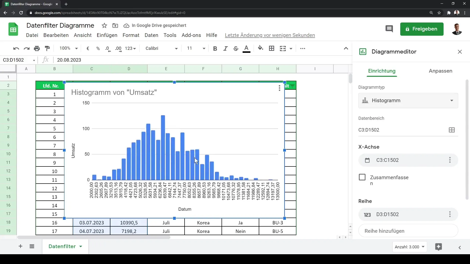
It's worth browsing through the types of charts and possibly switching to a histogram if your data contains many different values. A histogram is excellent for displaying the frequency distribution of revenue classes.
Adding a Data Slicer
Now comes the exciting part – adding a data slicer. Click on the "Data" menu and select the "Slicer" option.
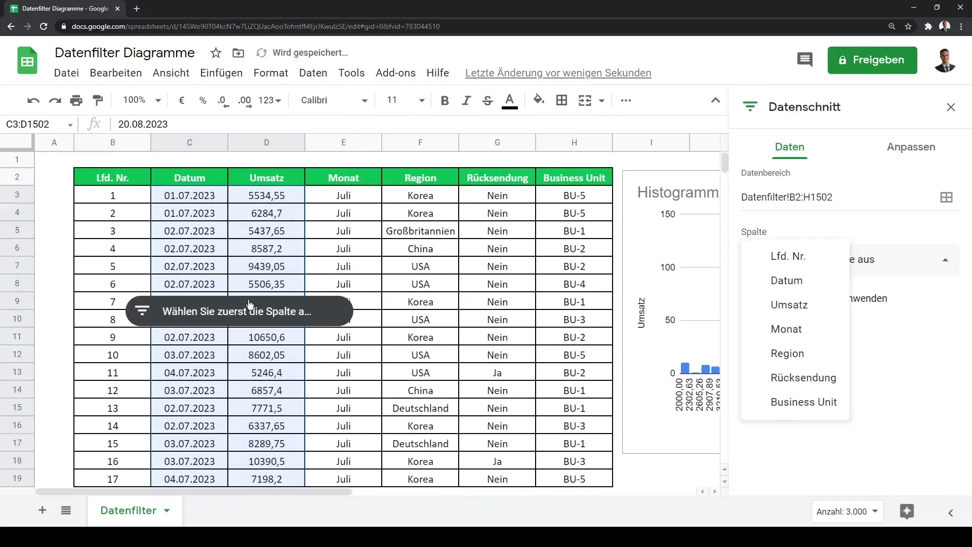
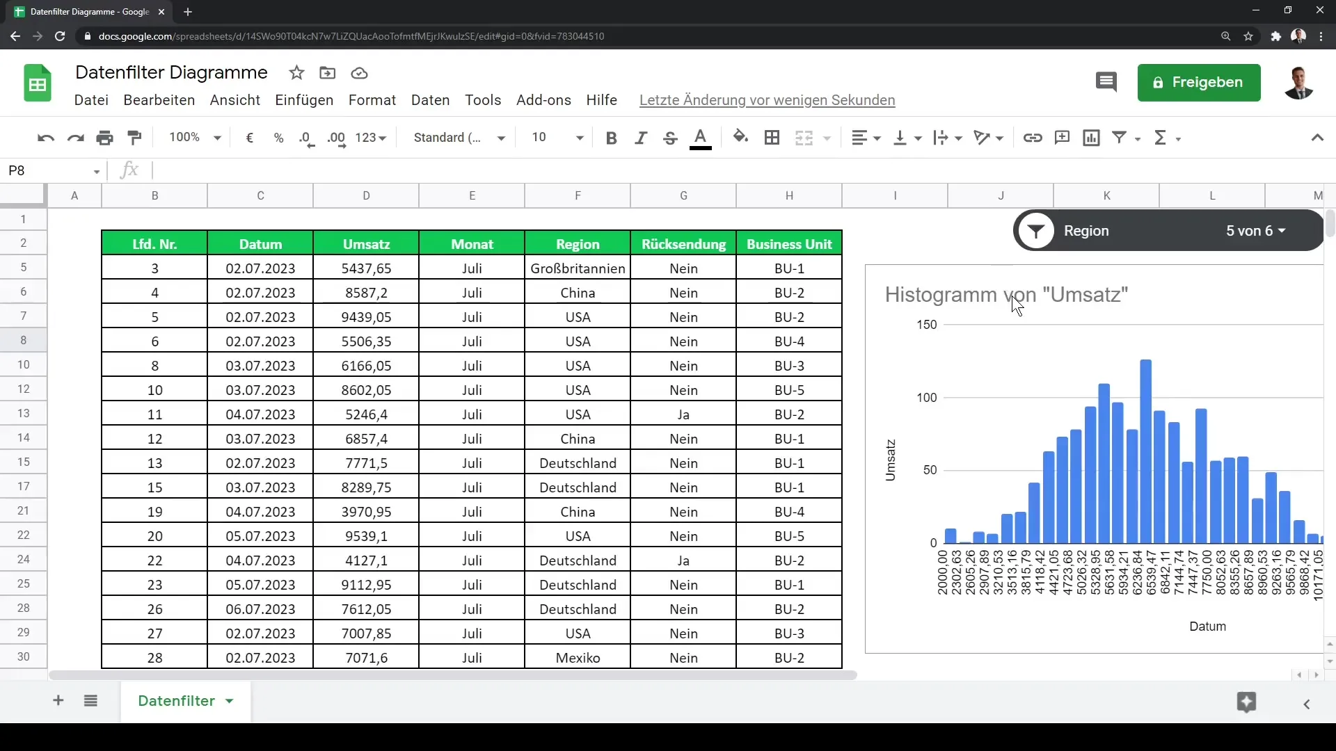
Here you will be prompted to specify the data range you want to filter. In my example, I choose the region for which I want to display the data and define the range from F2 to F1502.
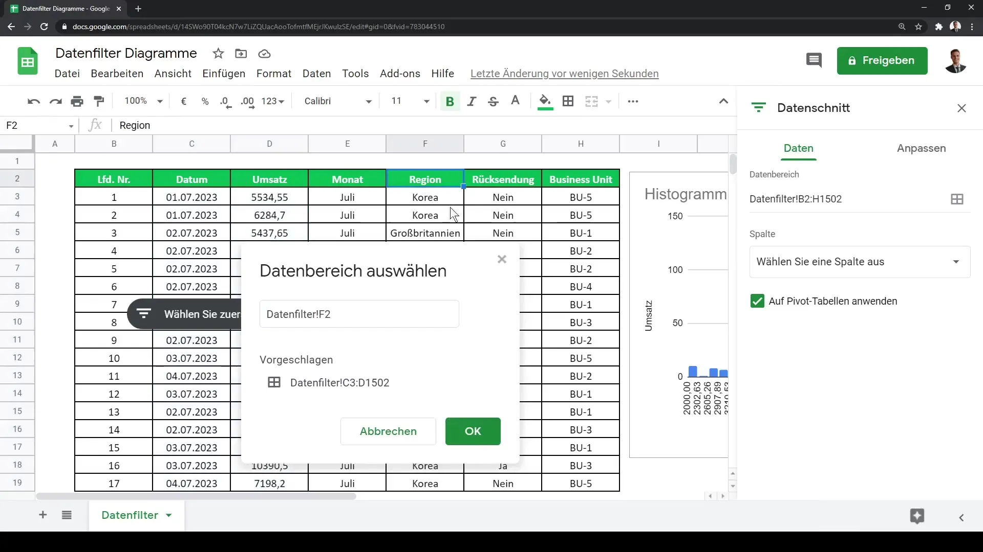
Clicking "OK" will add the data slicer, giving you an interactive area that you can place over your chart.
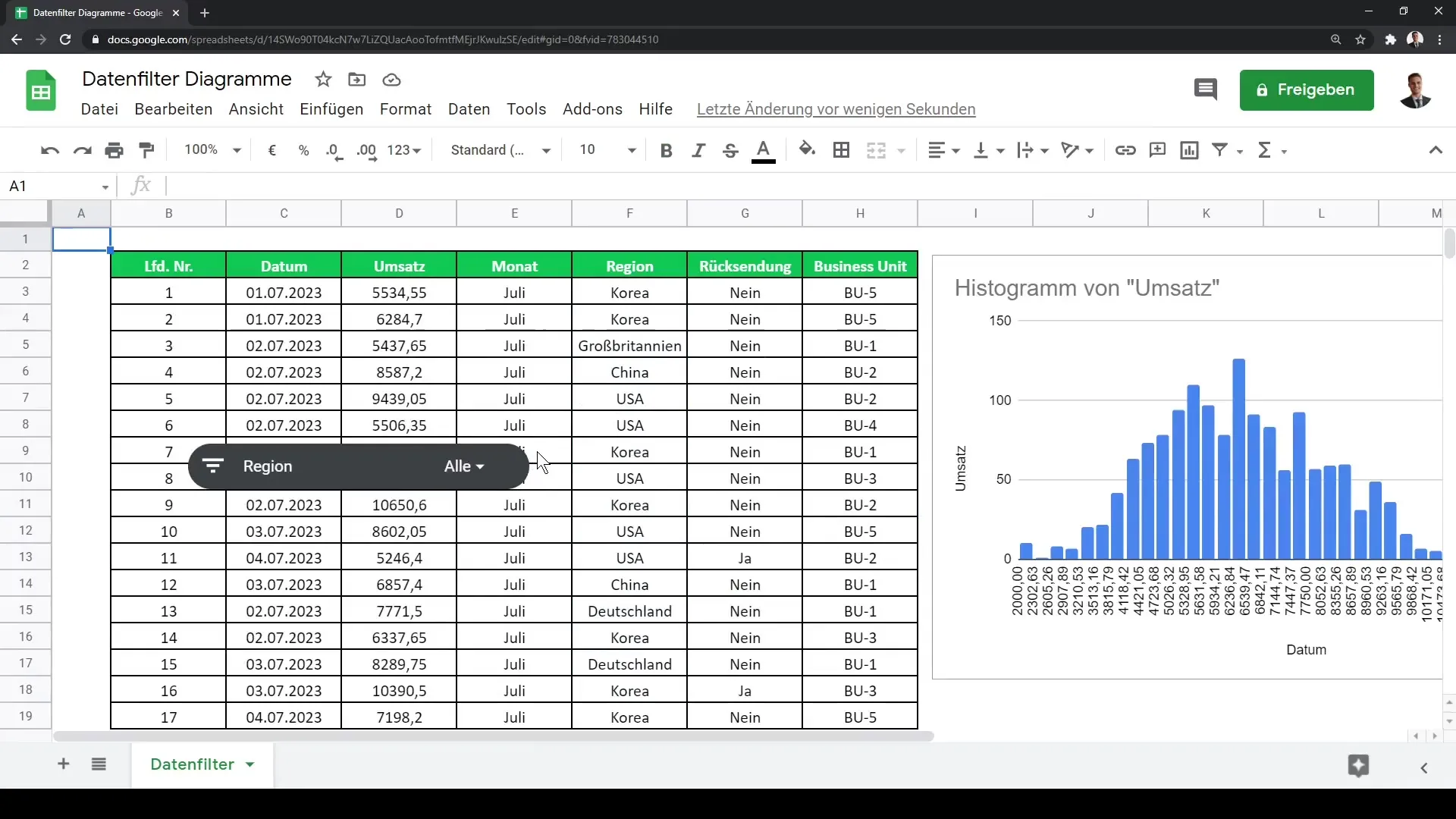
Using the Data Slicer
Now you can use the data slicer to control the visualization of your data. Simply click on the individual options in the data slicer to select or deselect different regions. For example, if you want to remove Korea from your analysis, just click on that selection, and you will see the chart adjust accordingly.
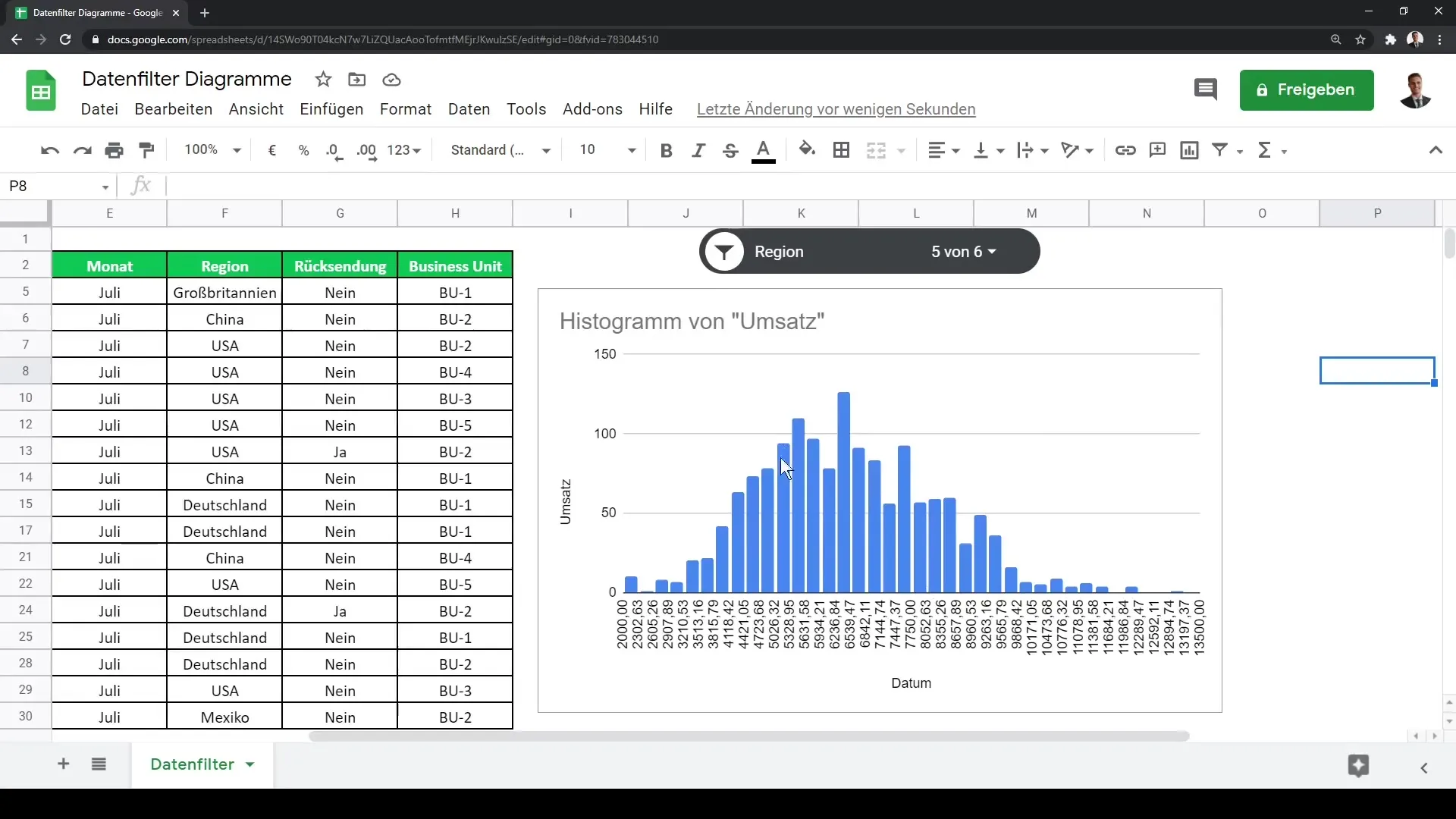
The beauty of data slicers is that you can create multiple ones to filter different attributes simultaneously. This allows you to conduct a comprehensive and detailed analysis of your data.
Summary
In this guide, you have learned how to insert and use data slicers in Google Sheets to visually and interactively filter your data. This is a valuable tool for anyone who needs to manage and analyze large amounts of data.
Frequently Asked Questions
What is a data slicer in Google Sheets?A data slicer is an interactive filtering element that helps visually control data in charts.
How do I add a data slicer to my chart?Go to "Data" and select "Slicer" to then choose the desired data range.
Can I use multiple data slicers simultaneously?Yes, you can create multiple data slicers for different criteria in your visualization.
