In this tutorial, you will learn about the exciting possibilities that Google Sheets offers when working with pivot tables. Specifically, you will learn how to create and use calculated fields within Pivot analysis. This gives your analyses a whole new dimension and allows you to perform customized calculations based on your specific data.
Key Takeaways
- Calculated fields in Google Sheets significantly enhance the analytical capabilities of pivot tables.
- You will learn how to add calculated fields to perform specific calculations such as revenue and gross sales.
- Understanding and correctly naming the fields is crucial for successful utilization of this feature.
Step-by-Step Guide
Step 1: Prepare the Pivot Table
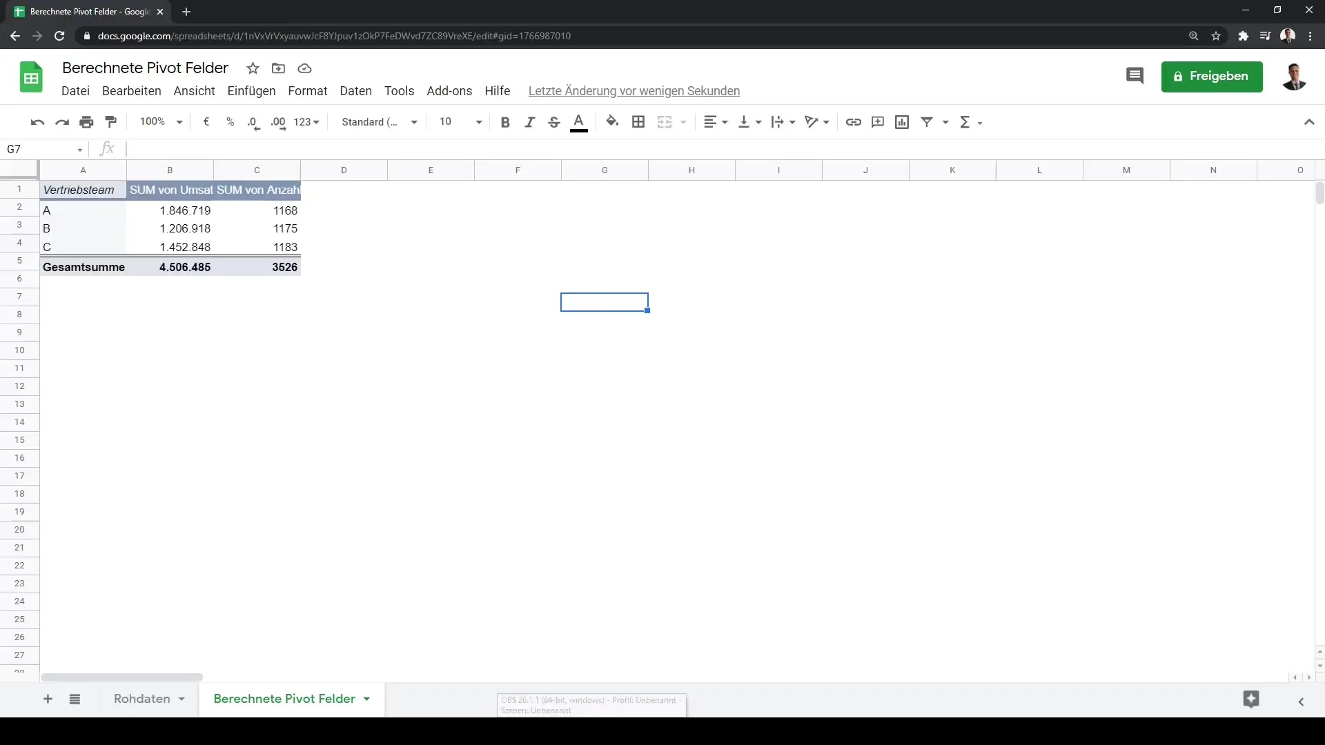
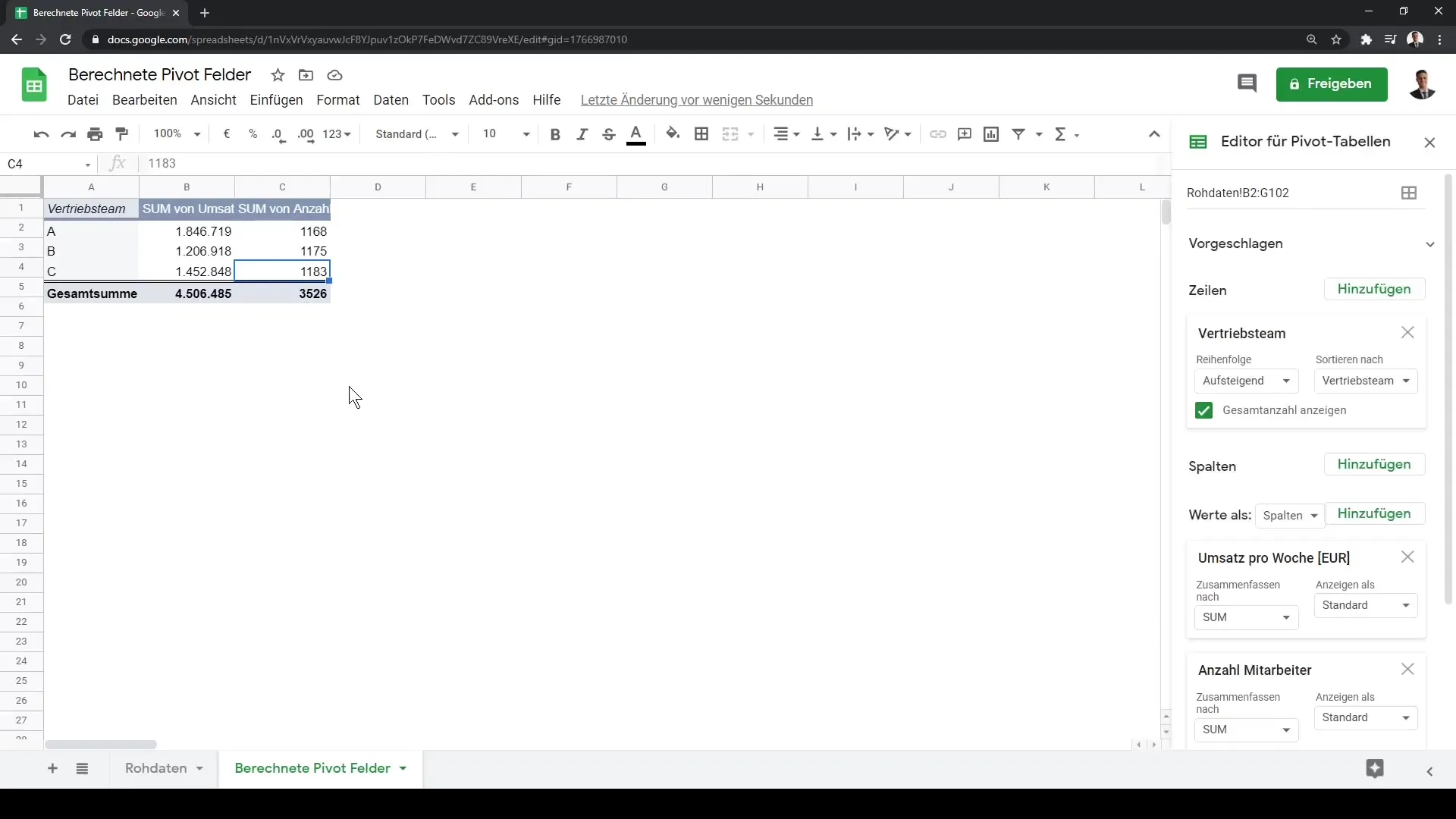
First, make sure you have created a pivot table in Google Sheets. If you already have data in your table, first convert the sales team to a row. You can also remove the sales team again to clarify the analysis.

Step 2: Add Calendar Weeks
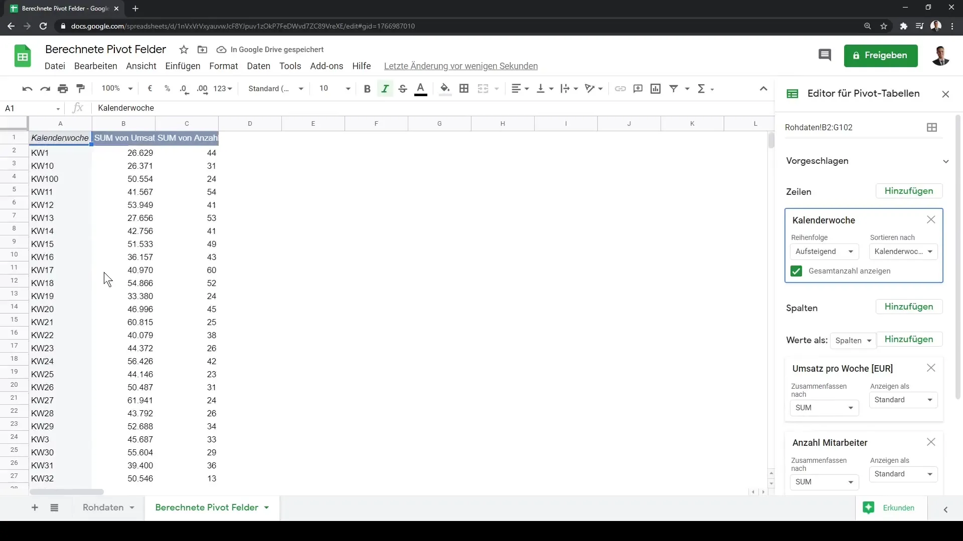
To make the data more comprehensible, you can add a new column for calendar weeks. This allows you to view and analyze the data by calendar weeks.
Step 3: Sort the Data
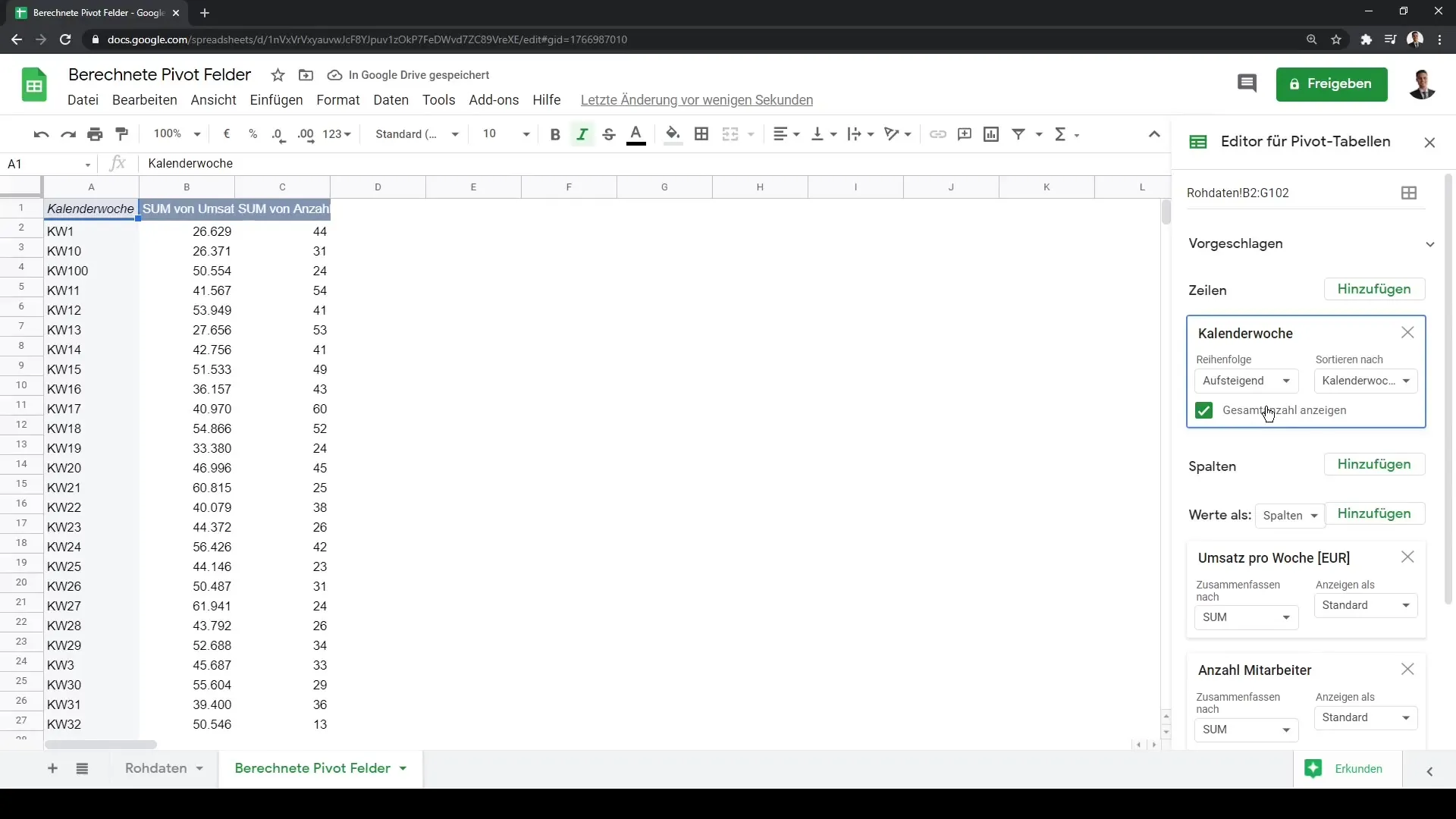
Once you have added the calendar weeks, you can sort the data in ascending or descending order, providing a better overview of the periodic sales.

Step 4: Incorporate Values and Base Elements
Within your pivot table, there are four main areas: columns, rows, values, and filters. In the values section, you can now insert specific data such as revenue per week or number of employees.
Step 5: Add a Calculated Field
Now comes the exciting part: Add a calculated field. Click on the option to add a new field and start defining the calculation you want to perform.

Step 6: Rename the Calculated Field
Let's name our new calculated field. In this example, you will name it "Gross Sales." Naming is important to keep track of your fields.
Step 7: Calculate Gross Sales
To calculate gross sales, you will access the regular revenue and then multiply it by 1.19, which represents the 19% value-added tax. Be prepared that correct field naming is crucial here.

Step 8: Handling Errors
If you receive an error message because the field name is not recognized, check for spaces and use the correct quotation marks around the field name.
Step 9: Performing the Calculation
Once you have correctly named the field, you can perform the multiplication: revenue times 1.19. This will immediately show you the calculated number in your pivot report.

Step 10: Advanced Calculations
Consider adding more calculations, such as through division or other complex calculations, like revenue minus costs, to quantify your profit.
Step 11: Visualizing the Data
Use the newly obtained values to create interactive charts or visualizations in your pivot table. This allows you to present your data visually and communicate more effectively.
Summary
In this guide, you have learned how to effectively utilize calculated fields in Google Sheets to enhance your pivot analyses. You can now calculate important measures like gross sales and visually represent them, making your data analyses more in-depth and informative. By being able to create calculated fields, you gain valuable insights that can lead to data-driven decisions.
Frequently Asked Questions
What are calculated fields in Google Sheets?Calculated fields are custom fields within Pivot Tables that are based on specific calculations.
How do I add a calculated field?Click on "Add Calculated Field" in your Pivot Table and define the desired calculation.
Why am I receiving an error message?Error messages can occur if the field name is not correctly named or contains spaces that cause issues.
Can calculated fields be used in charts?Yes, the results from calculated fields can be visualized in charts to support data analysis.


