In this tutorial, you will learn how to create scatter plots (also known as scatter diagrams or XY graphs) in Google Sheets. This type of visualization allows you to graphically represent two variables and identify their relationships. Scatter plots are particularly useful for visualizing correlations and trends within your data. Simply follow the steps below to create your own scatter plot.
Main Takeaways
- Scatter plots are ideal tools for visualizing relationships between two variables.
- You can easily create and edit scatter plots in Google Sheets.
- Interactive visualizations offer deeper insights into your data and its trends.
Step-by-Step Guide
Start by preparing your data. To create a scatter plot, you need two variables that you want to plot – typically one on the X-axis and one on the Y-axis. A common example would be the sales figures and prices of a product.
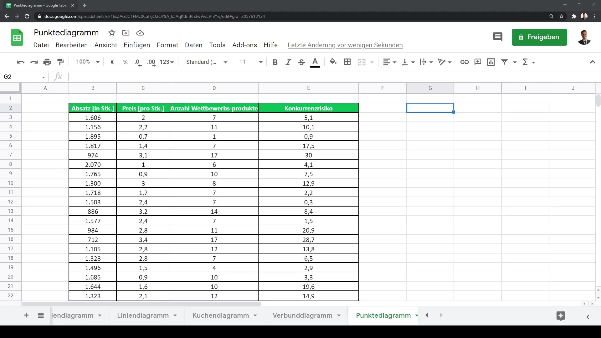
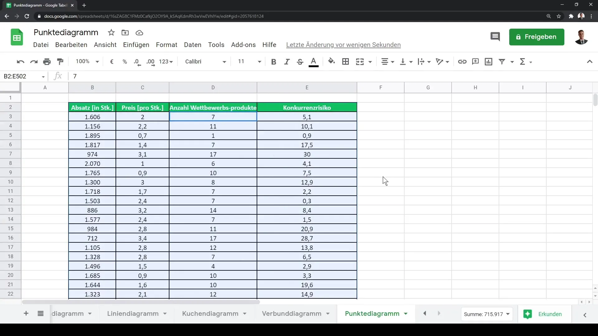
Now, select your data. You can either manually highlight the data or use the Ctrl + A keyboard shortcut to select all the data in your worksheet.
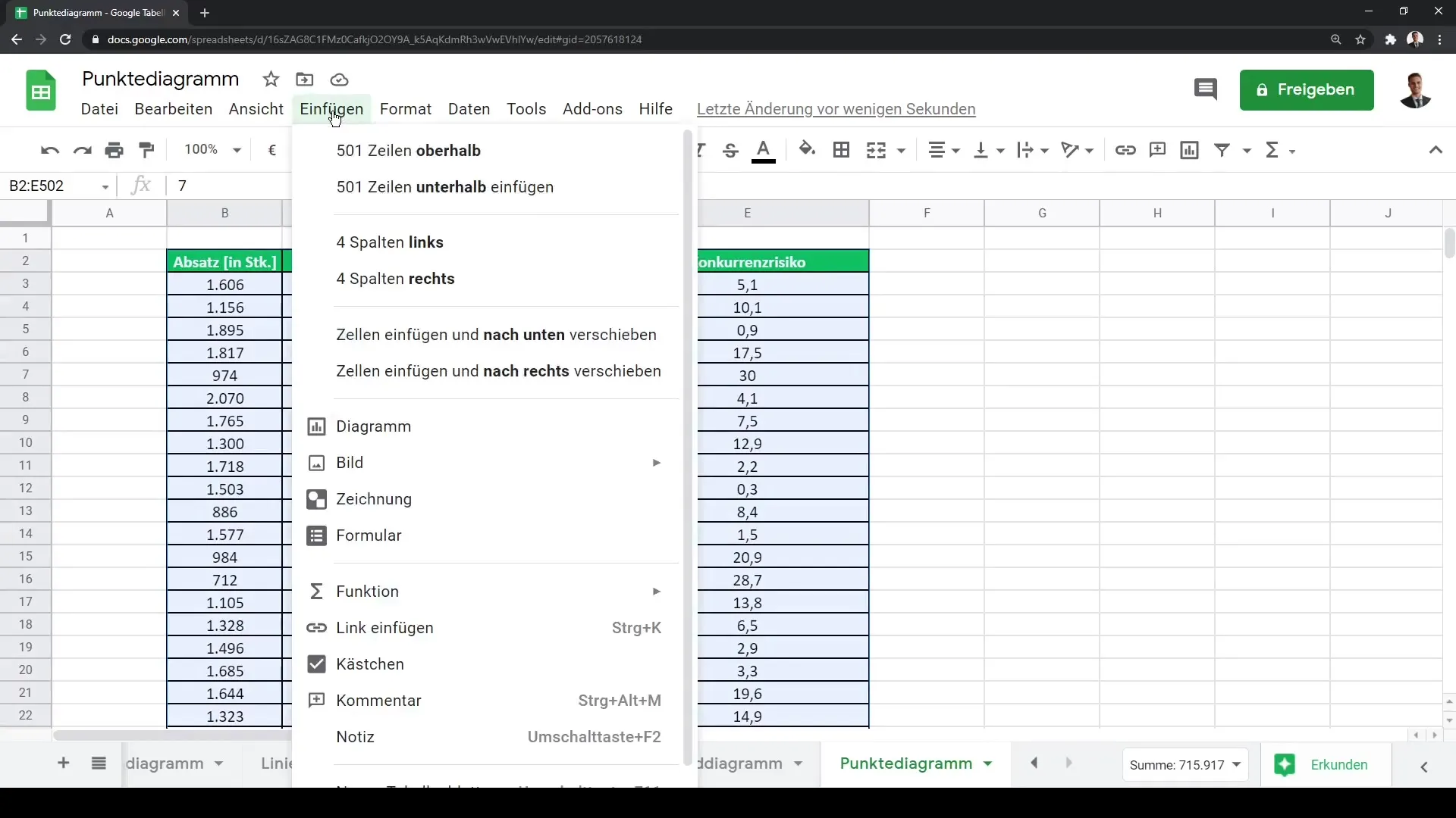
After selecting your data, go to the menu and click on "Insert." In the menu that opens, there is the "Chart" option. Click on it to open the chart wizard.
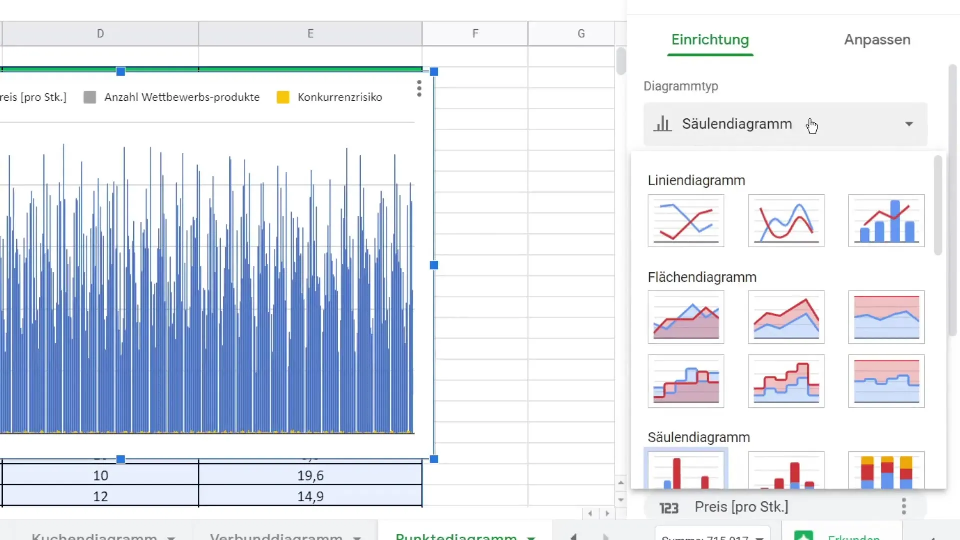
By default, Google Sheets will try to display the chart as a bar chart, which may not be advantageous for your purpose. To change this, go to the chart settings and select the scatter plot.
You should now see a basic framework of your scatter plot. You have the option to customize the data series. Make sure to use only the relevant data for your analysis. For example, you can remove the price data so that only the sales figures and the number of competitor products are displayed.
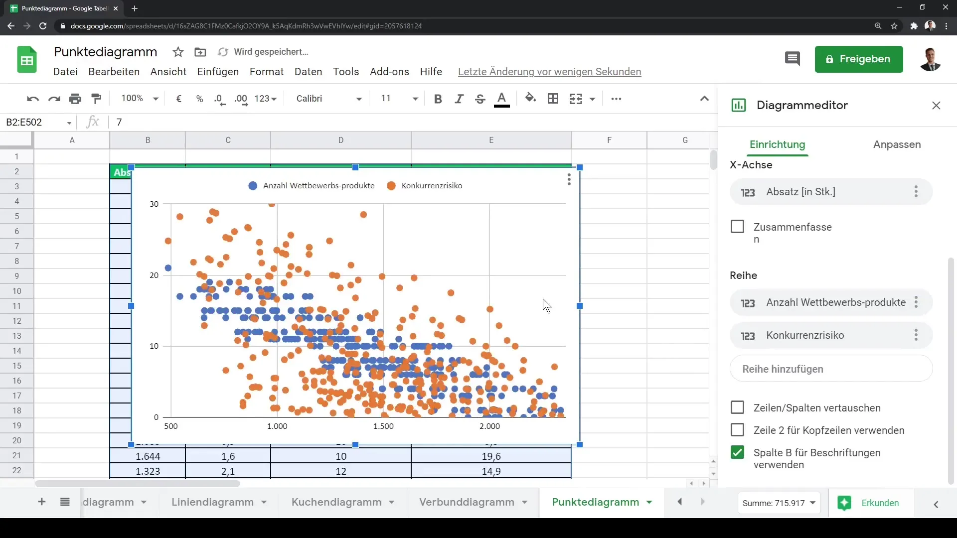
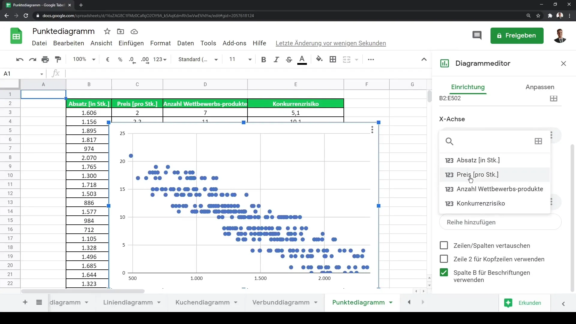
Observing the chart now, you will see that the individual observation values are displayed as points in your chart. Hovering over the points will show the exact values, giving you a clear idea of your data sets.
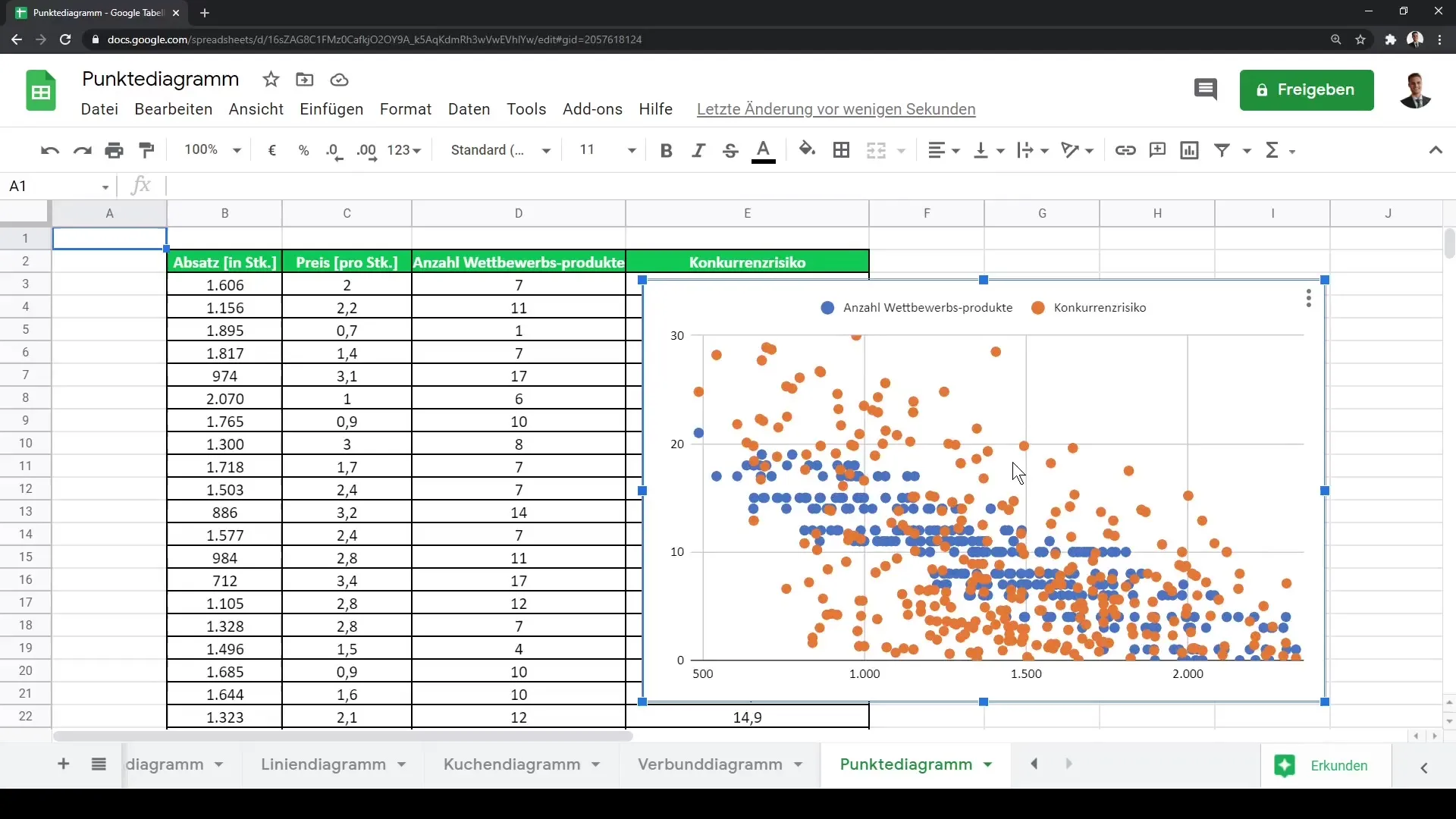
Furthermore, you can edit the representation of the data. Simply click on the "Edit Chart" button. Here, you have the option to add or remove data series.
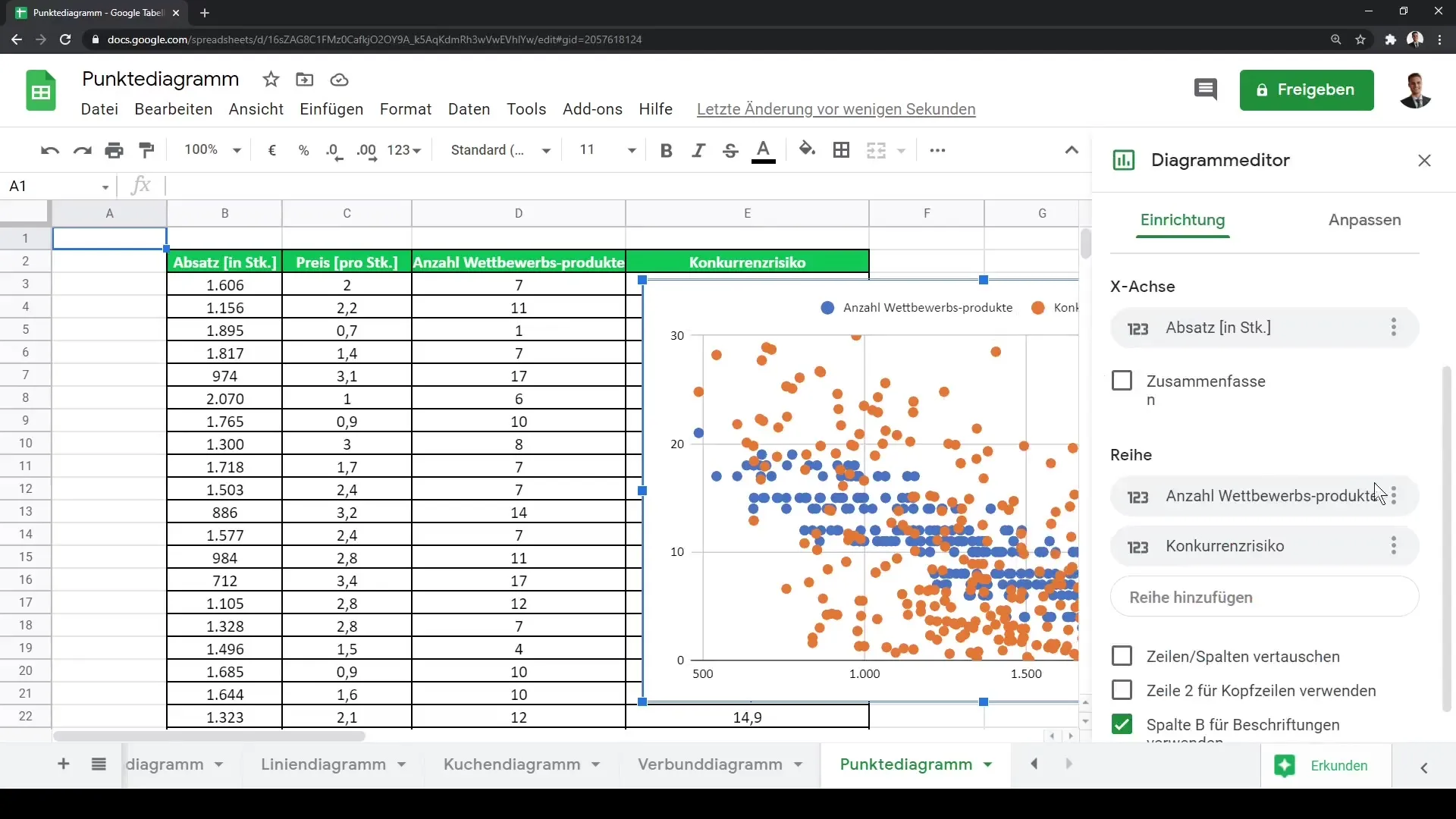
If you only want to represent one data series, remove the additional one and adjust the remaining series. In our example, this would be the number of competitor products. Now, you can better visualize the directional trends in your scatter plot.
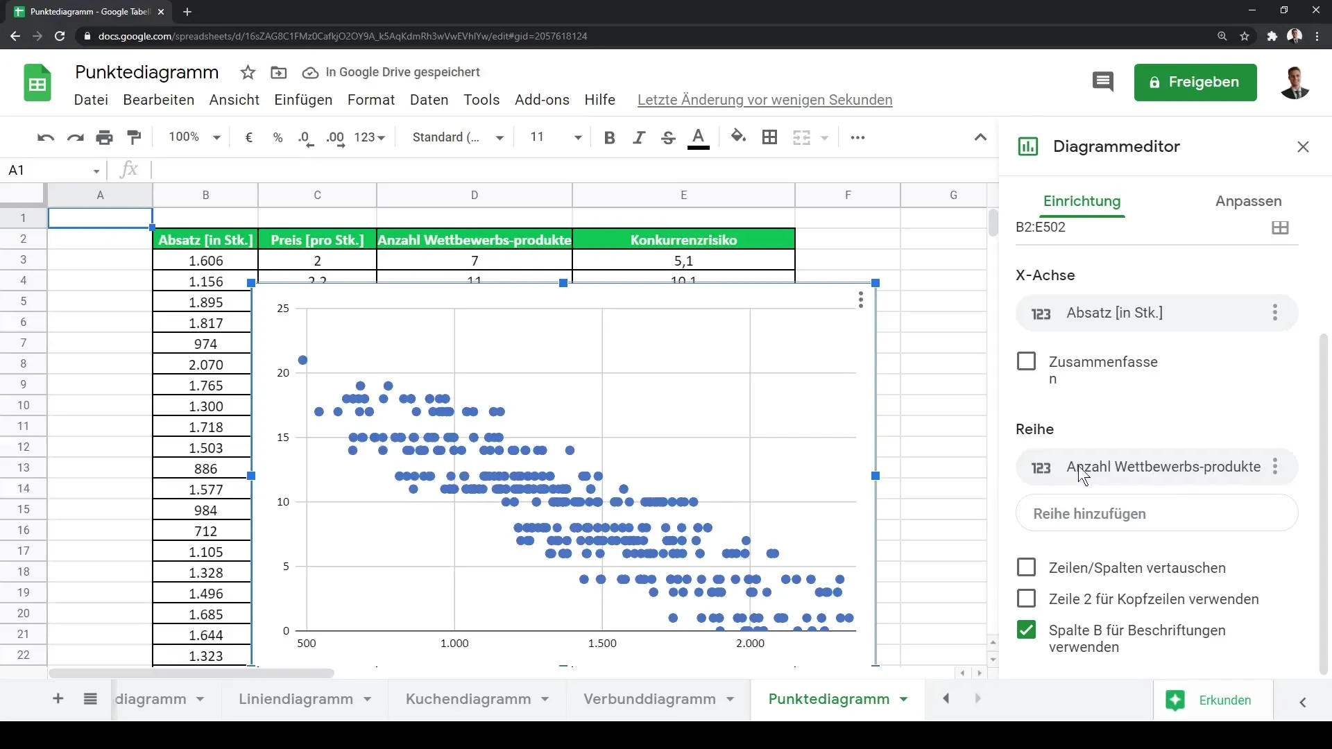
An important aspect of analysis is examining the correlations between your variables. Determine whether an increase in competitor products correlates with an increase in sales or a change in price. You can read this information directly from the scatter plot.
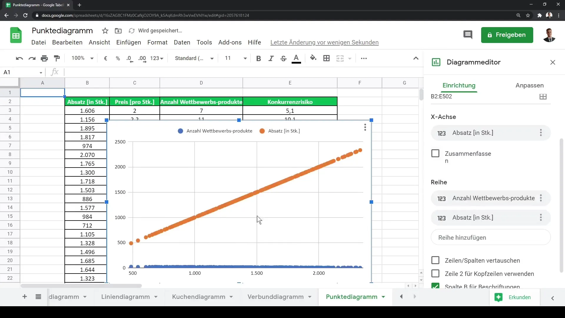
Now that you have created your scatter plot and adjusted the data, you can further customize the chart if desired. You can add additional data series to expand your analysis or make the chart more visually appealing.
Summary
In this guide, you have learned how to create a scatter plot in Google Sheets and what steps to consider. By experimenting with different data sets and visualizing them, you can gain deeper insights into your data and identify complex relationships.
Frequently Asked Questions
How do I create a scatter plot in Google Sheets?Select your data, go to "Insert" and choose "Chart", then change the chart type to "Scatter plot".
Can I customize data series in my chart?Yes, you can add or remove data series by clicking on "Edit chart" and making the desired customizations.
How can I identify correlations in my scatter plot?Observe the distribution of points on the chart; steep lines or patterns may indicate a correlation.
