In this tutorial, you will learn how to create your first pivot table in Google Sheets. Pivot tables are an extremely powerful tool for summarizing, analyzing, and making informed decisions on data. Whether you want to analyze sales figures, employee performance, or other KPIs, pivot tables help you process the relevant information quickly and concisely. Let's get started!
Key Takeaways
- Pivot tables help to present extensive data compactly.
- You can choose whether you want to create the pivot table in a new sheet or in the existing dataset.
- By adjusting rows, columns, and values, you can perform versatile analyses.
- There are ways to add additional metrics such as averages, minima, and medians.
Step-by-Step Guide to Creating Your First Pivot Table
Step 1: Prepare Data Sheet and Insert Pivot Table
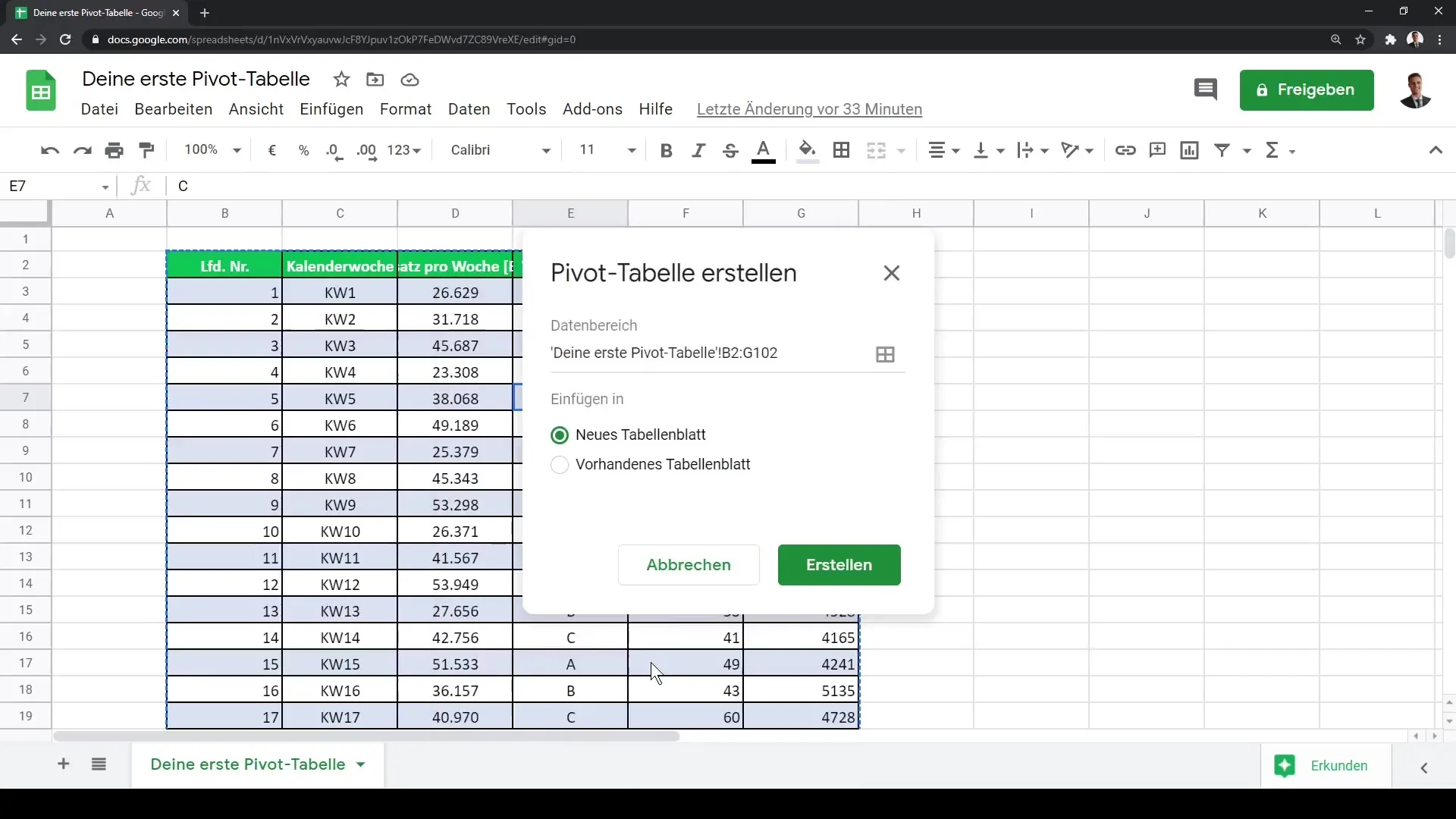
Start Google Sheets and open your existing data sheet. If your data is already prepared, click on the "Data" tab in the top menu bar. In the dropdown menu, select "Pivot Table." In this step, a dialog box will open where you can decide where to place the pivot table – either on a new sheet or the current one. I recommend creating the pivot table on a new sheet to maintain clarity.
Step 2: Create Pivot Table and Enter Data
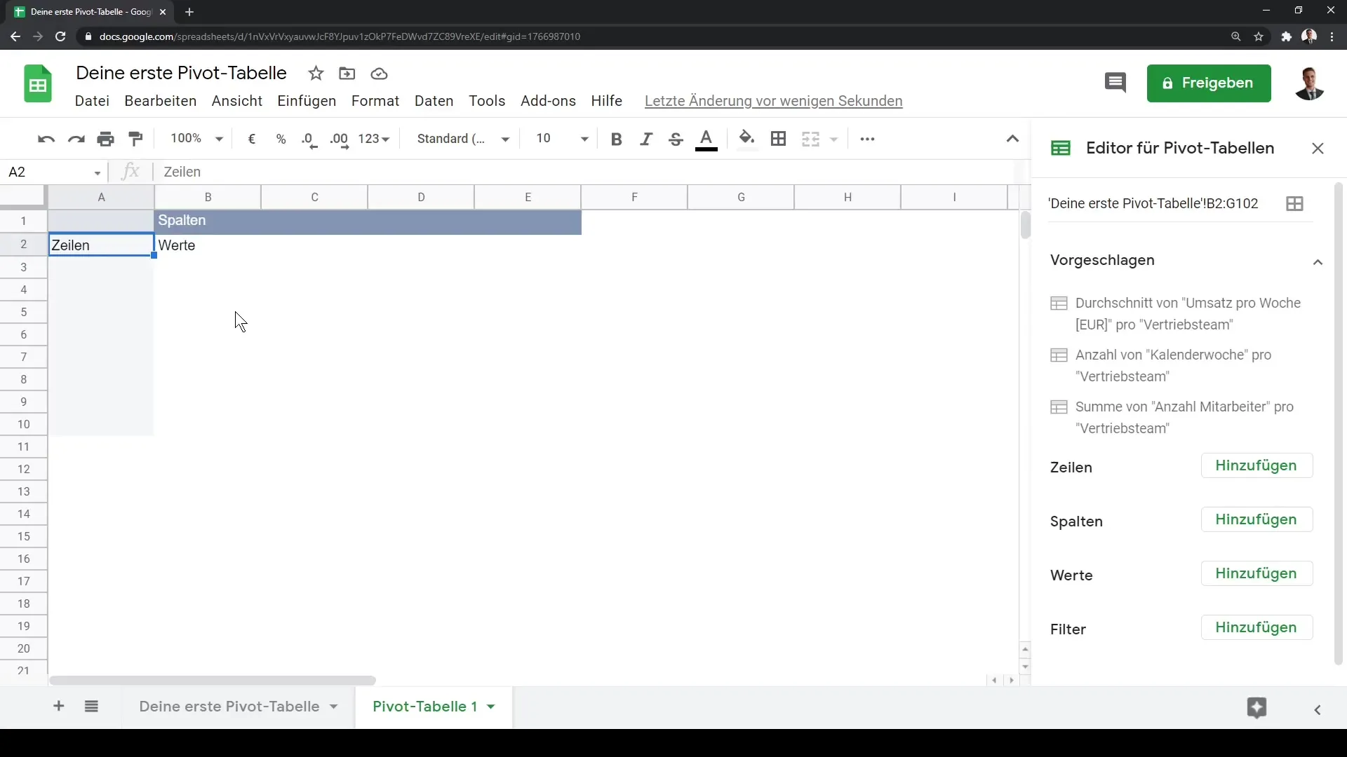
After choosing the desired location, the new sheet will be created. On the left side, you will now see the editor area for your pivot table. In this area, you can adjust the structure of the pivot table. At the top left of the cells, you will already see an empty pivot table ready to be filled with data. You can now add the relevant columns for rows, columns, and values.
Step 3: Adjust Rows and Columns
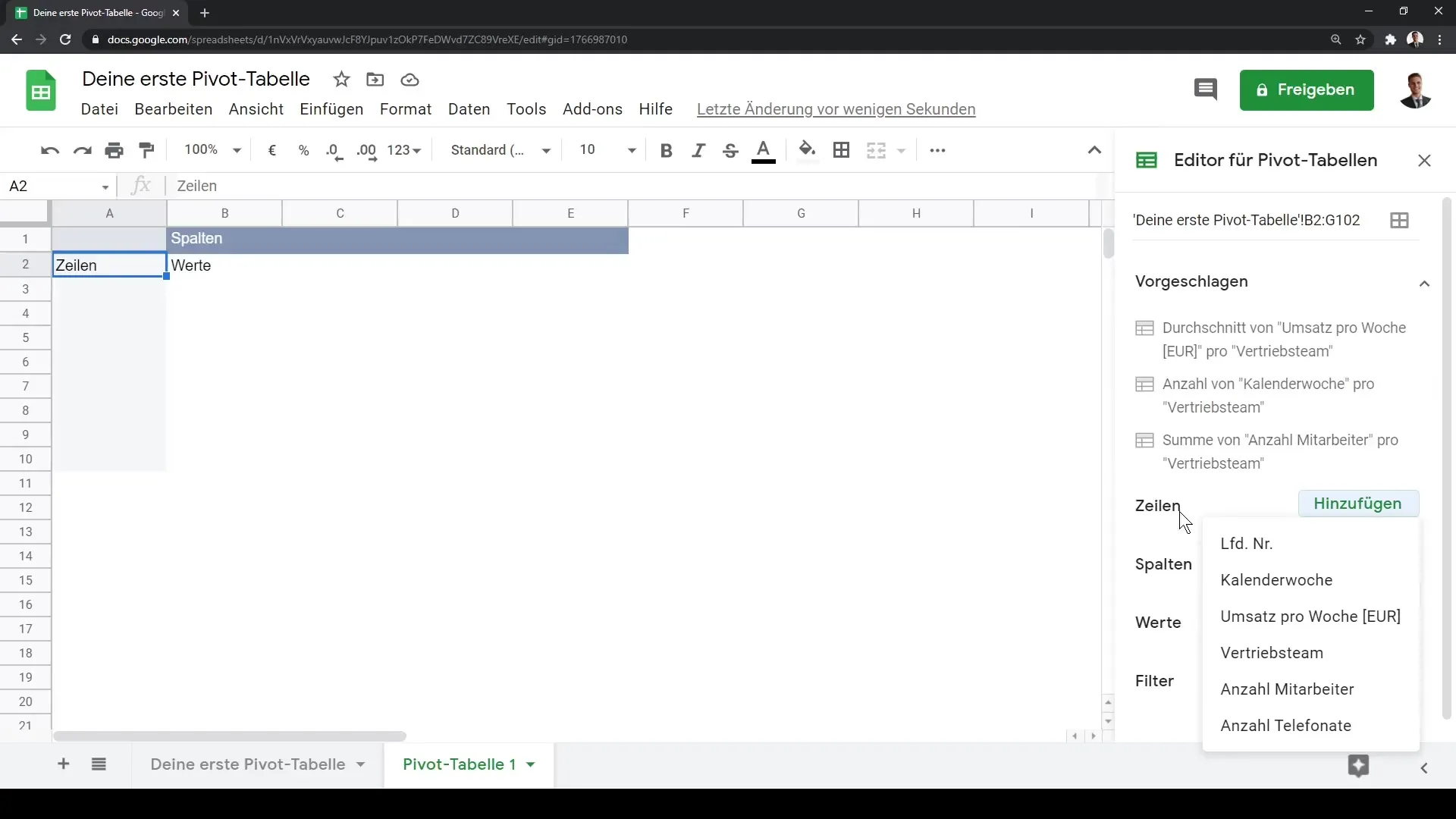
To add rows to your pivot table, go to the editor area and click on "Rows." Here, you can select the desired data. For example, if you want to select the sales teams, add them to the "Rows" section. It is important to choose a clear structure for your data to enable precise analysis.
Step 4: Add Values
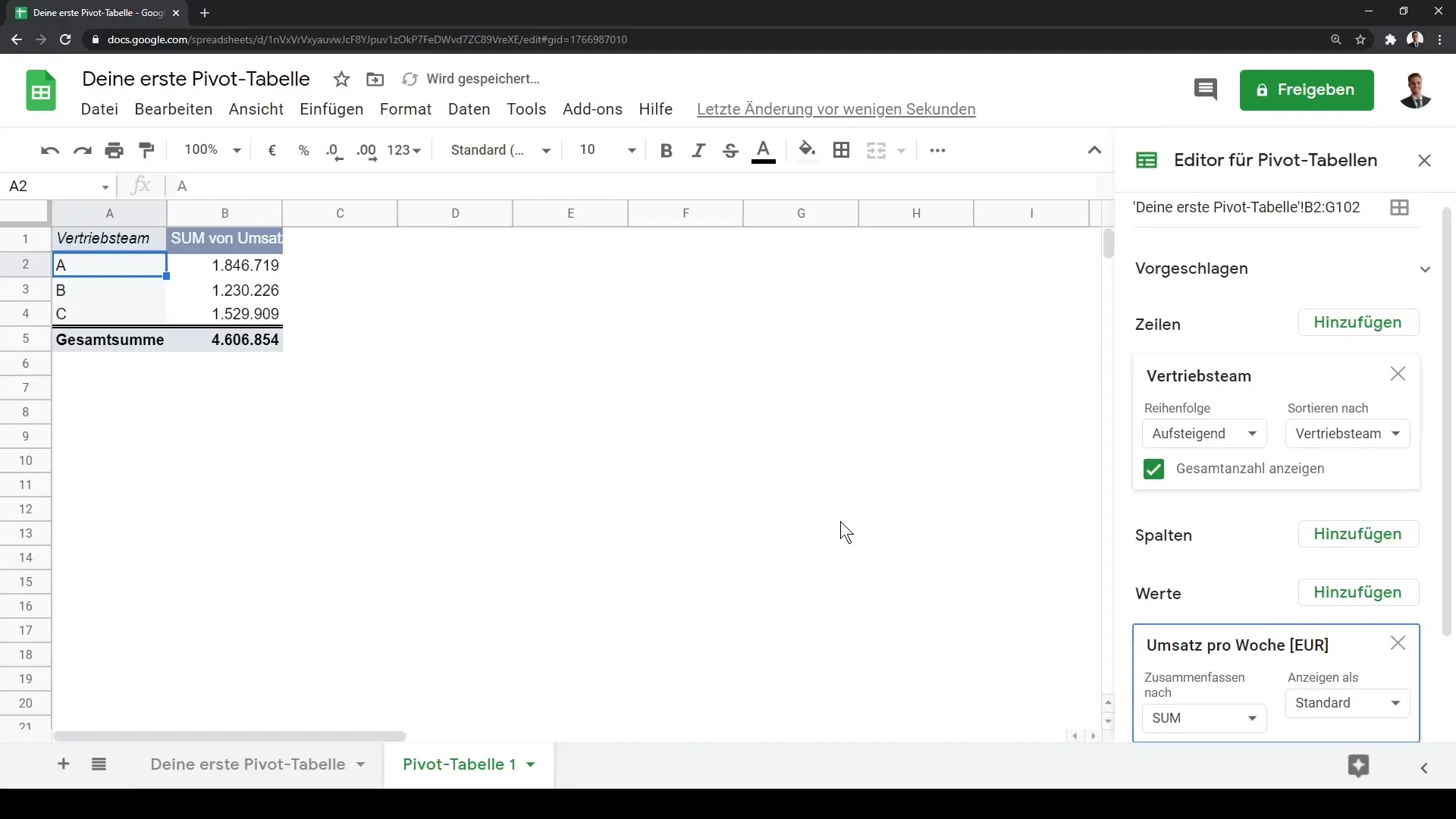
After adding the rows, the next step is to determine the values you want to analyze. In the editor area, select "Values" and add a metric – for example, the weekly revenue. This chosen metric will then be displayed in your pivot table as a numerical value, making it easy to analyze.
Step 5: Customize and Display Pivot Table
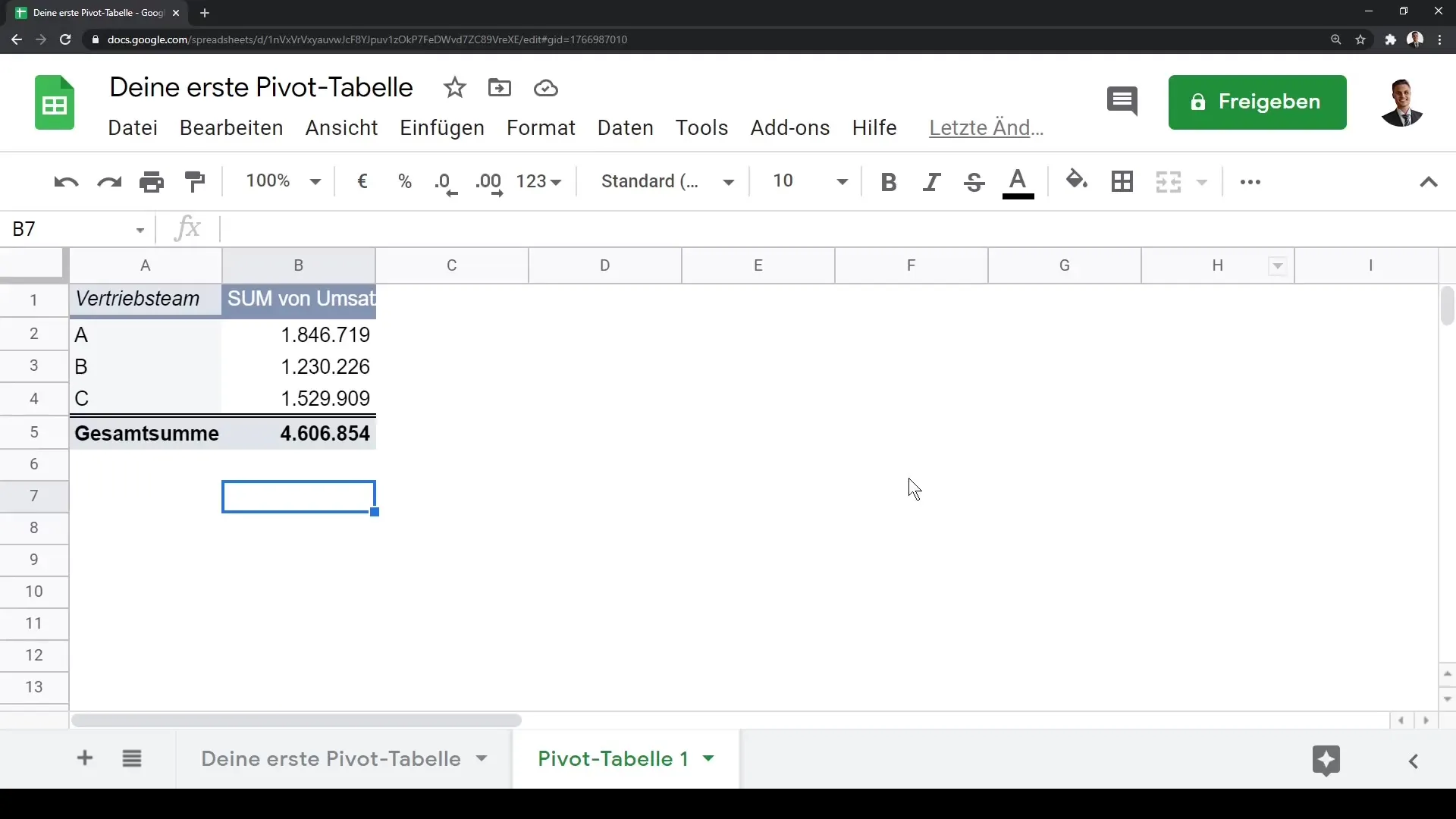
You can enlarge the view of your pivot table for better clarity by pressing Control + Plus. Note that clicking outside the pivot table will make the editing area disappear. Therefore, it is advisable to click back into the table to make adjustments. You can further customize the pivot table by adding additional analyses, such as averages or other statistical metrics.
Step 6: Add More Analyses
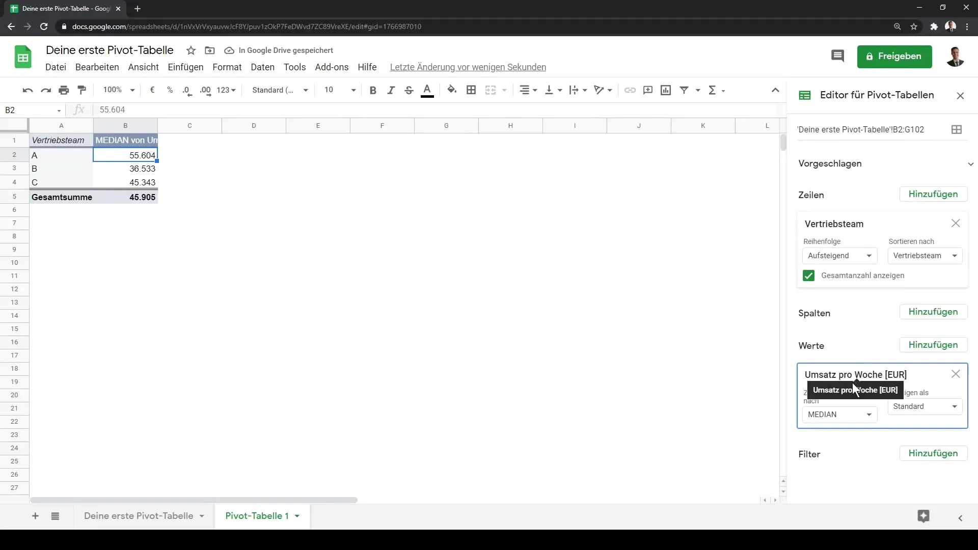
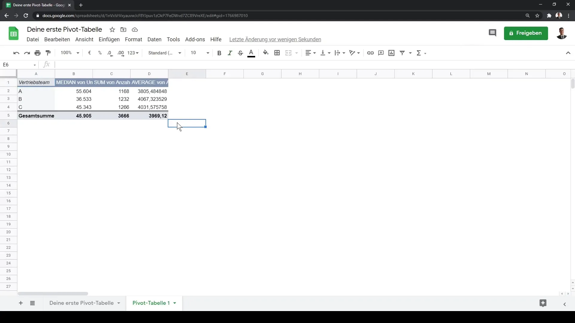
In addition to basic metrics, you can also expand to include other statistical metrics. Go back to the "Values" section for this. Here, you can add the average, minimum, or median values. To analyze the data more creatively, you can also present percentage results, allowing you to easily recognize the shares per row or column.
Step 7: Utilize Filter Options
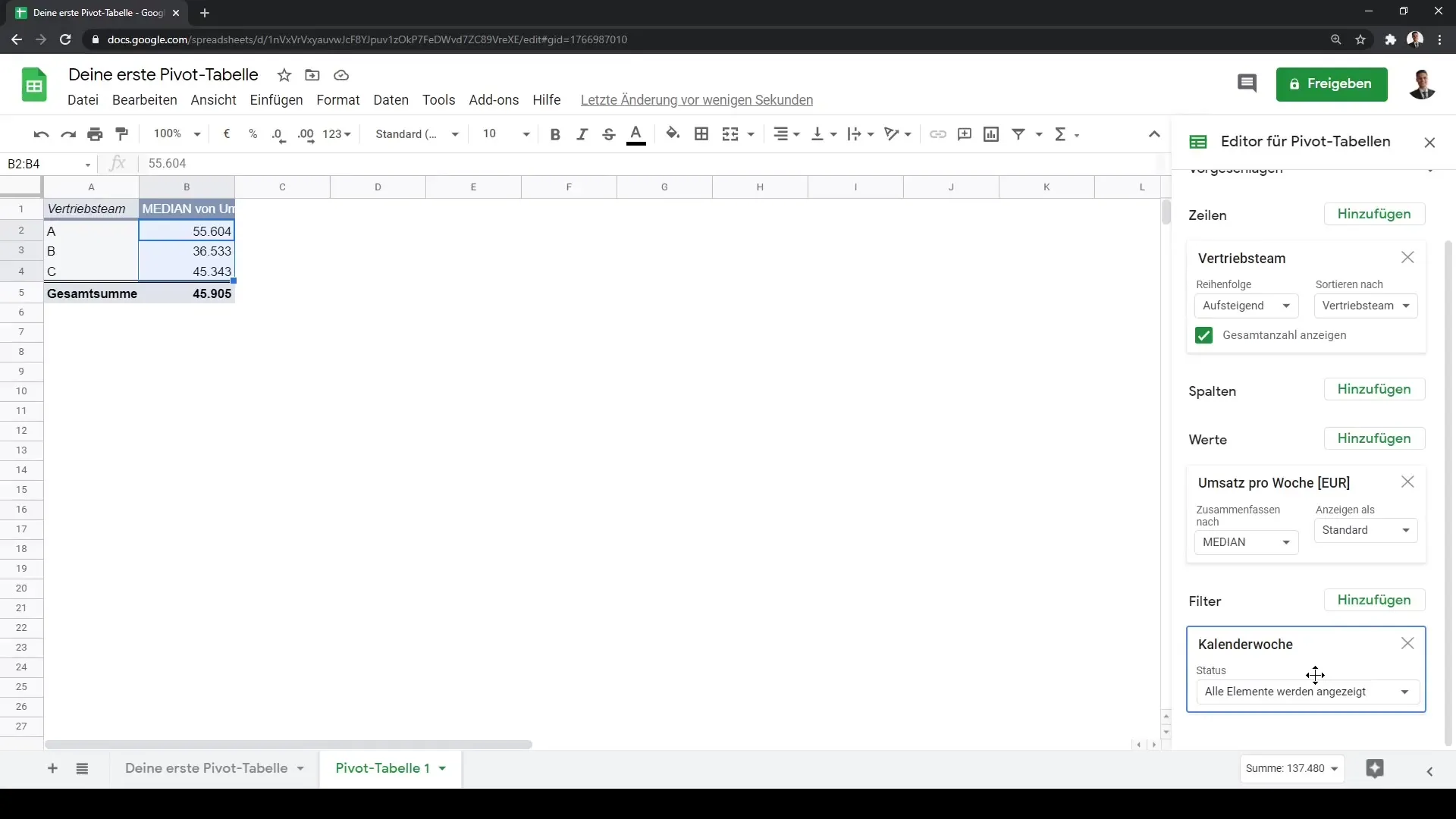
A useful feature in pivot tables is the ability to filter data. For instance, you can also add calendar weeks as a filter. By using filters, you can analyze specific data without having to search through the entire table. It also allows you to focus the results precisely on specific time periods.
Step 8: Add More Values
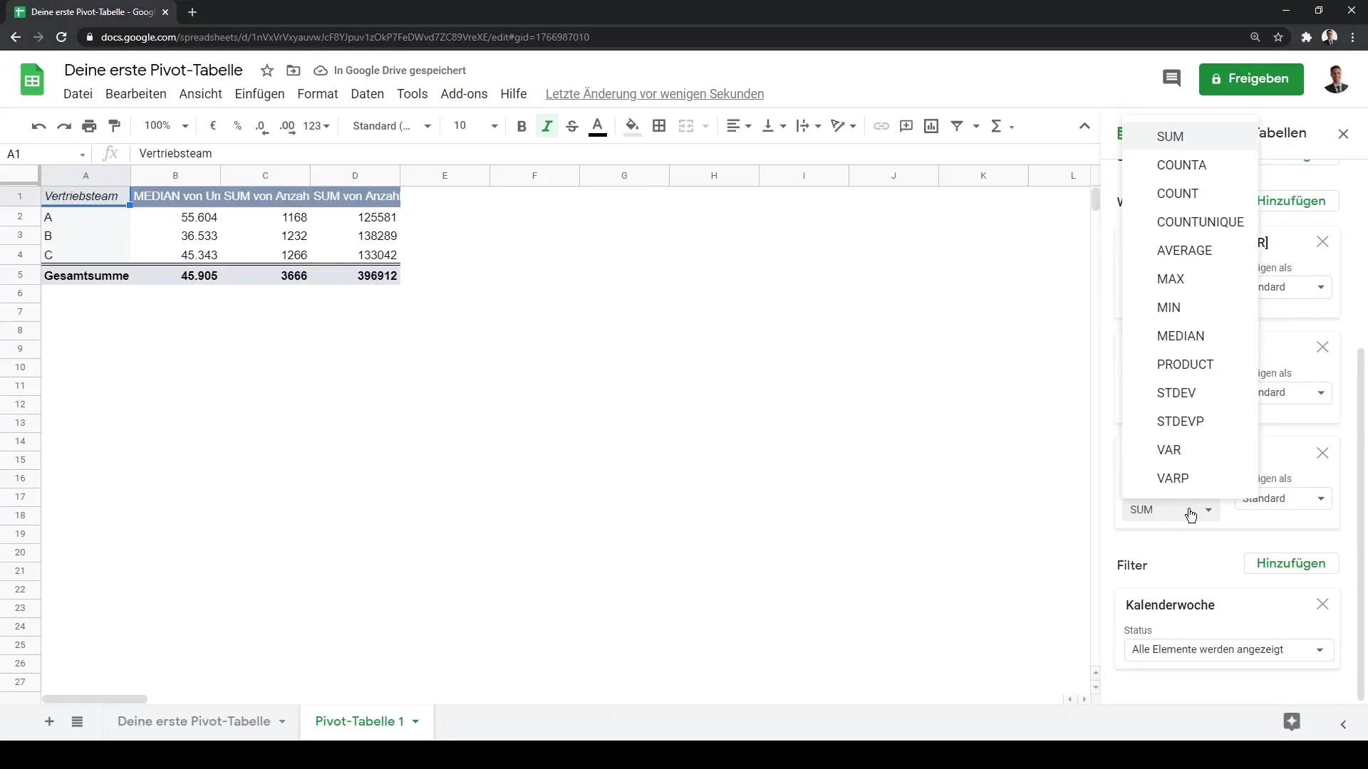
In addition to revenue, you can add other metrics to your pivot table, such as the number of employees or the number of phone calls made on a specific day. This diversity helps you conduct a comprehensive analysis of performance data across different dimensions.
Step 9: Completing the Pivot Table
You have now successfully created your first multidimensional data analysis in Google Sheets. You can make additional adjustments at any time to further refine the data analysis. Use the flexibility of a pivot table to visualize and understand your data in new ways.
Summary
In this tutorial, you have learned how to create a pivot table in Google Sheets to analyze your data. Creating pivot tables is ideal for analyzing extensive datasets. By adding rows, columns, and values, you can filter out and analyze the information that is relevant to you.
Frequently Asked Questions
How do I create a pivot table in Google Sheets?Click on "Data" and then on "Pivot Table", select the location and customize the table.
Can I create the pivot table in an existing spreadsheet?Yes, you can choose whether the pivot table should be inserted in a new or existing spreadsheet.
How do I add rows and values to my pivot table?Use the editor area on the left side to select and add rows and values.
Can I also display average values in my pivot table?Yes, you can add average values and other statistical metrics such as minimum and median.
How do I use the filter function in a pivot table?In the editor area, you can add filter options, such as table filters or date filters, to restrict the data in your pivot table.


