In this tutorial, I will show you how to create and customize line charts and area charts in Google Sheets. Charts are an excellent way to visually represent data and present complex information in an understandable manner. With the right charts, you can clearly identify trends, comparisons, and patterns of development. Let's work together on establishing the basics and learning how to present your data in an appealing way.
Key Takeaways
- You can easily create and customize line charts and area charts in Google Sheets.
- Charts can be further personalized to clearly represent the data implications.
- Error bars and data labels help clarify the information.
- Pleasant visual adjustments can significantly improve the readability and understanding of data.
Step-by-Step Guide
To create your first line chart, begin by selecting your data. This data must be in a clear and structured format in order to successfully create a chart. Select the cells containing the data you wish to visualize.
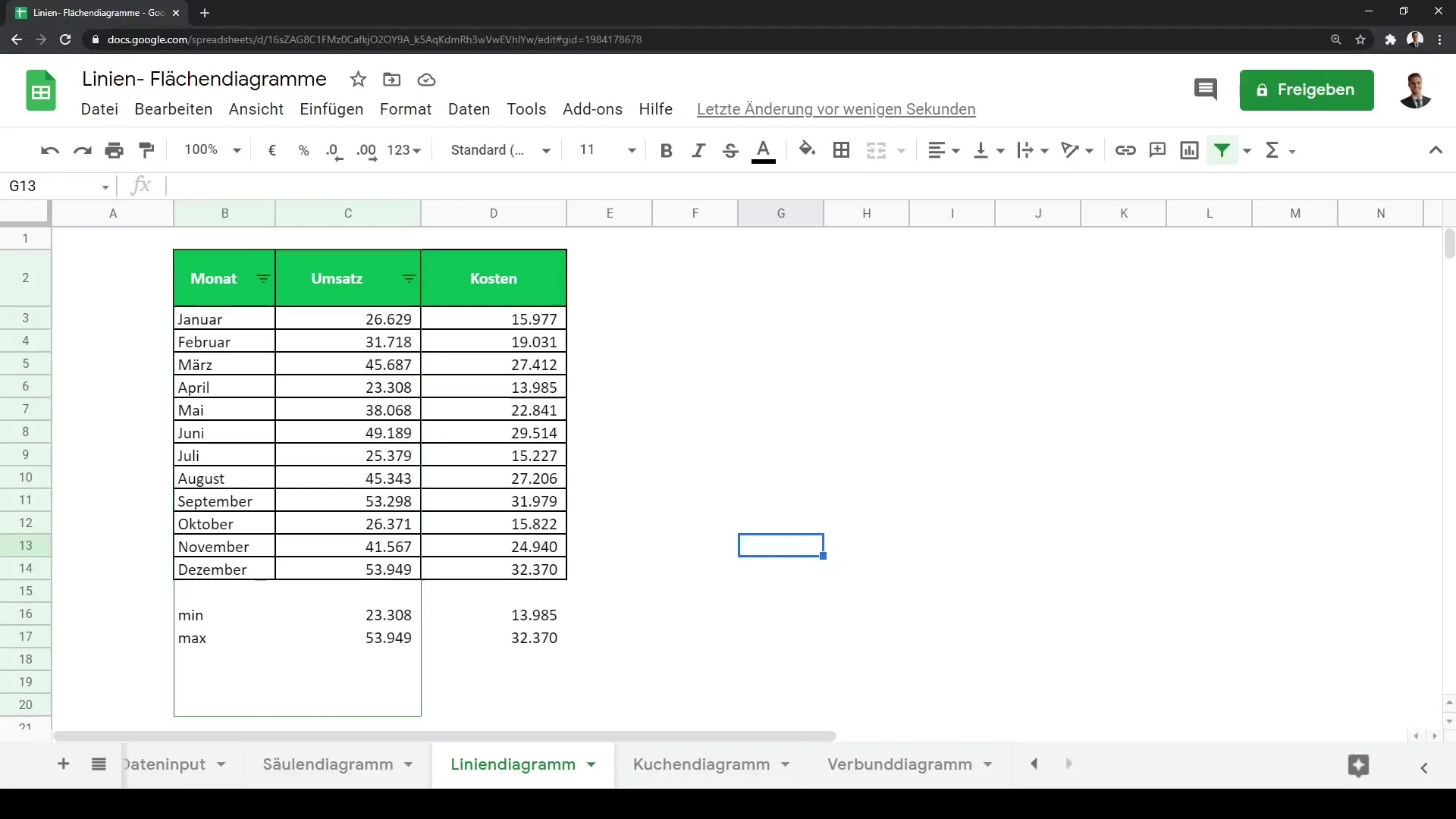
Now that you have selected the relevant data, click on the "Insert Chart" button. This is the starting point for creating your line chart. Google Sheets will then show you a standard preview of a line chart.
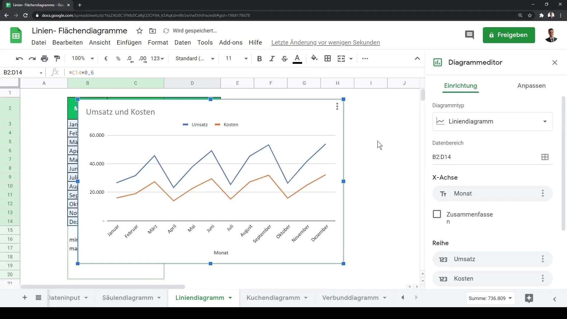
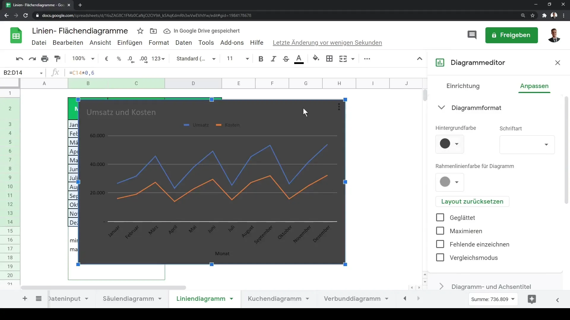
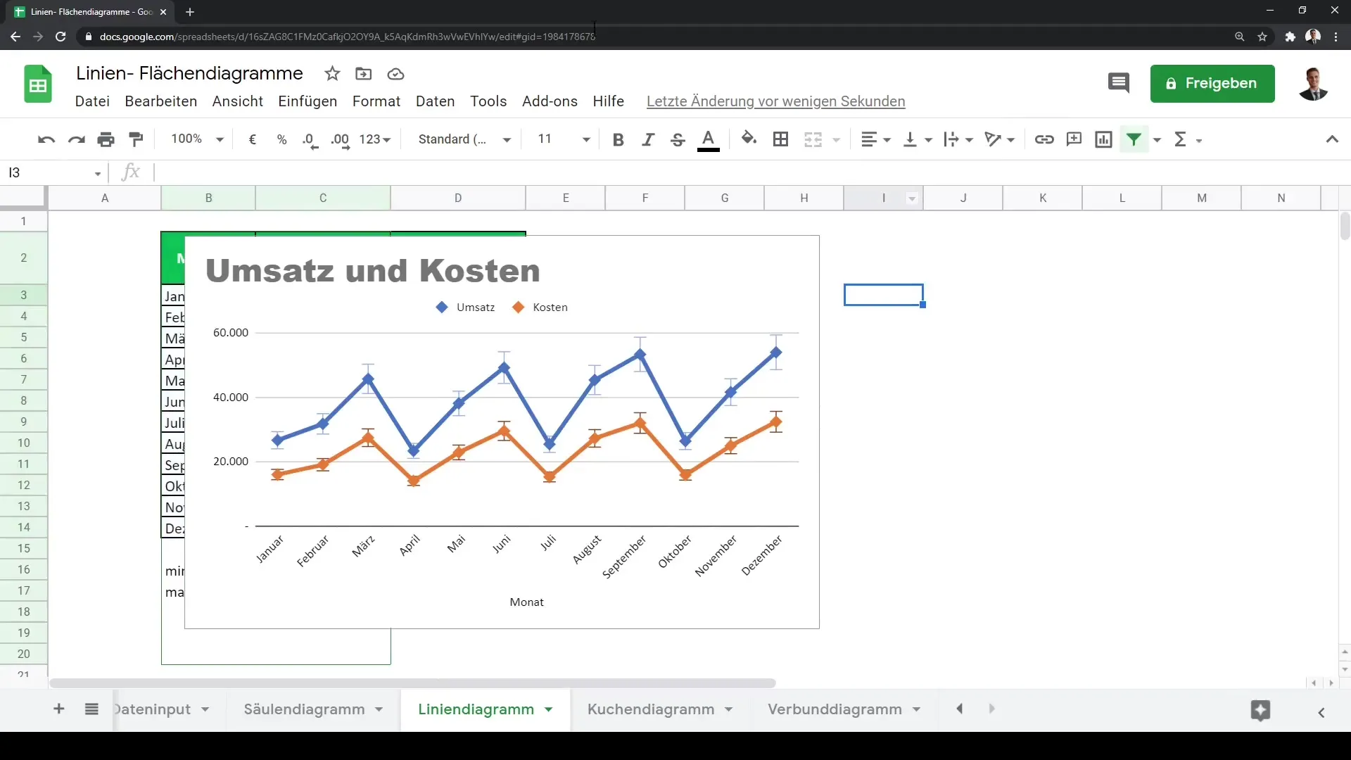
The line chart you now see can be further customized. You have the option to change the chart formats and backgrounds. For example, if you prefer a darker background, you can select one. Ensure that the data labels are easily readable, such as being displayed in a light color.
It is now time to adjust the titles for your chart and axes. You can use names like "Revenue" and "Costs" here. These labels are important for viewers to understand what the data represents.
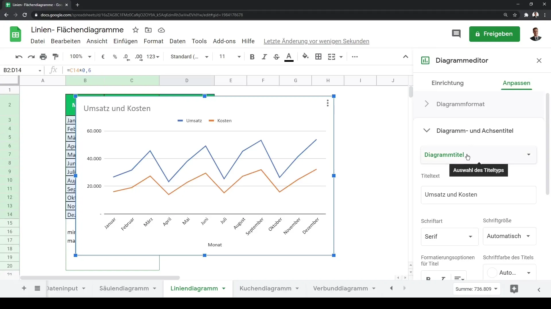
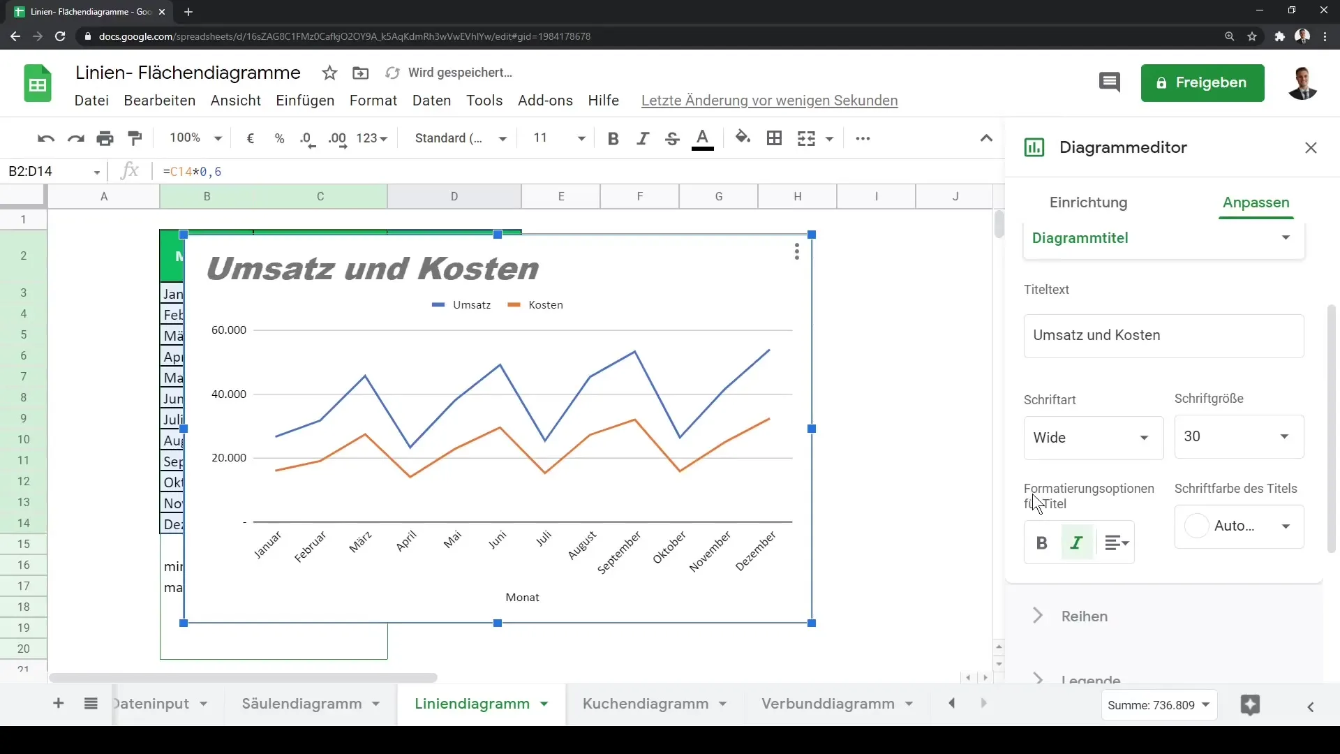
While customizing your chart, you may also want to change the font style and size. For example, using italic font can provide a nice visual addition. Go to the settings to adjust the font style according to your preferences.
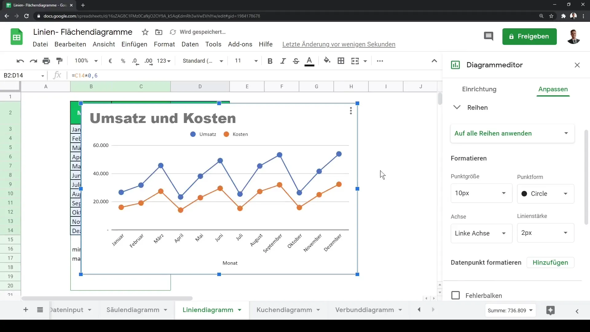
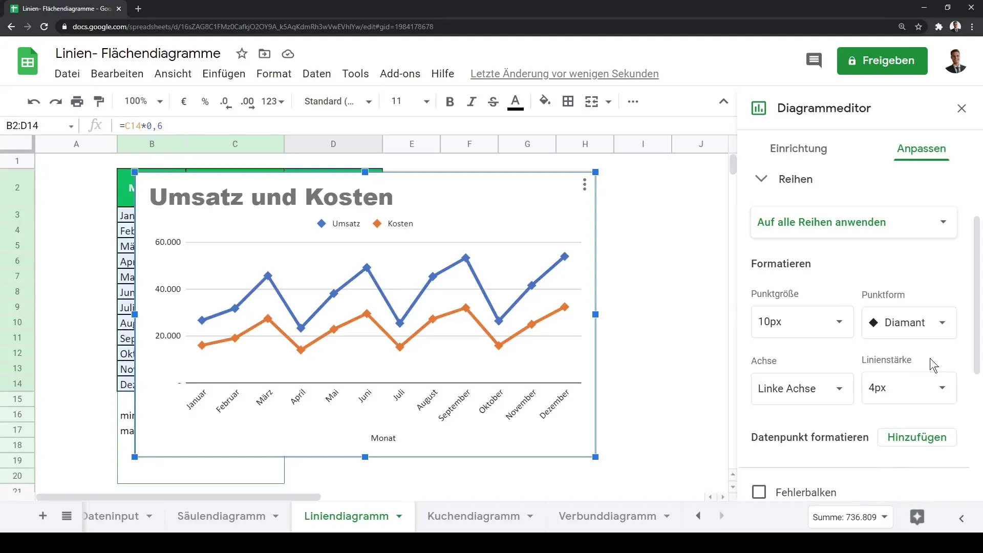
Next, we move on to the data series. If you want to display points in addition to the lines on your chart, you can activate this feature. This makes the data even clearer to see. You can also choose different symbols for these points, such as circles, stars, or triangles.
In addition to adjusting points, you can also increase the line thickness. A thicker line can help highlight the data, especially when sharing or presenting your chart to others.
Another interesting option is displaying error bars. These provide additional information about the uncertainty of the data and help interpret the results. You can also customize the data labels, or legend, to provide more clarity in your chart.
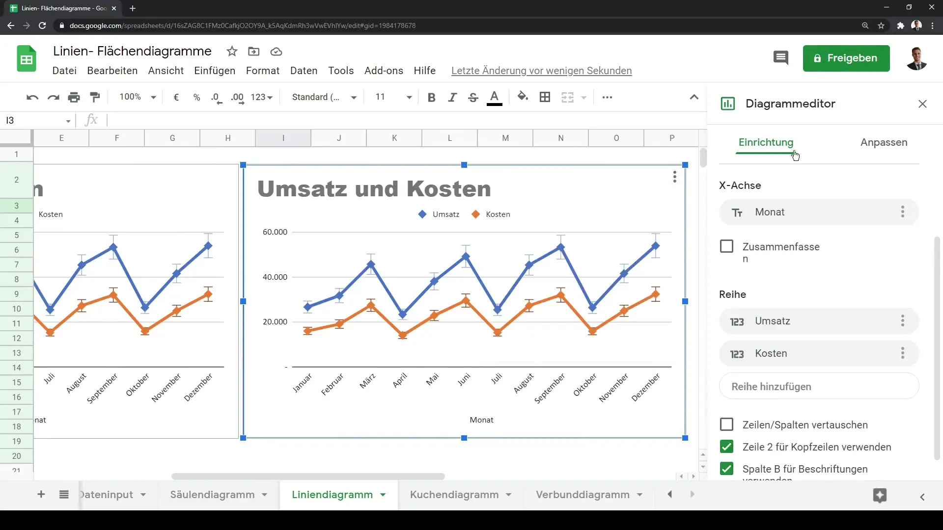
If you decide to further edit or enhance your chart, Google Sheets also offers the option to copy the chart. Go to the three dots on the chart to use the copy function. With the keyboard shortcut Ctrl + V, you can paste and adjust the chart in a new location.
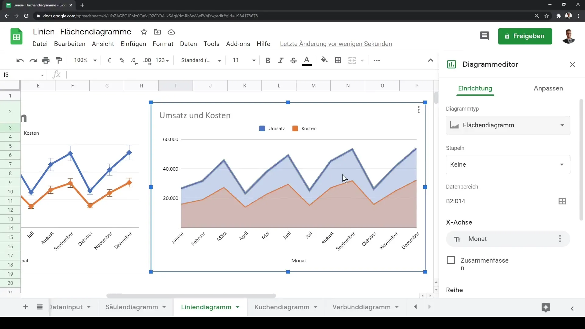
Sometimes you may want to change the chart type. This is also simple. Select your chart, go to the right sidebar, and open the chart editor to switch the representation between a line chart and an area chart.
The main difference between a line chart and an area chart lies in the representation of the data: While only the lines are displayed in the line chart, the area under the lines is completely filled in the area chart. This gives you a clearer visual representation of trends, such as the evolution of your revenues and costs.
Summary
In this guide, you have learned how to create and customize line charts and area charts in Google Sheets. From selecting the data to customizing the chart and implementing visual aids such as error bars, everything is part of this process. Use the techniques learned to present your data in a more visual and understandable way in the future.
Frequently Asked Questions
How do I create a line chart in Google Sheets?Select your data, click on "Insert Chart," and choose the chart type "Line Chart."
Can I change the colors of my chart?Yes, you can adjust both the colors of the lines and the background color.
How do I add points to a line chart?Enable the option for points in the chart editor to display different symbols.
Can I change the font of my chart titles?Yes, the font and size of the chart titles can be adjusted in the chart settings.
How do I copy a chart in Google Sheets?Click on the three dots in the chart and select the copy function. Then use Ctrl + V to paste the chart.
