One of the simplest and most effective ways to visualize data in Google Sheets is through Sparklines. These small charts provide a compact and appealing way to instantly detect trends and patterns in your data without having to create large charts. In this guide, I'll show you how to use Sparklines in Google Sheets to make your data more comprehensible.
Main Takeaways
Sparklines are miniature charts that can be embedded in a single cell. They are ideal for providing a quick overview of trends, allowing you to quickly interpret your data without relying on separate charts.
Step-by-Step Guide
To get started, open your Google Sheet and navigate to the area where you want to create Sparklines.
For instance, you can represent your sales development either in a separate chart element or directly in cells with Sparklines. Let's go through an example directly.
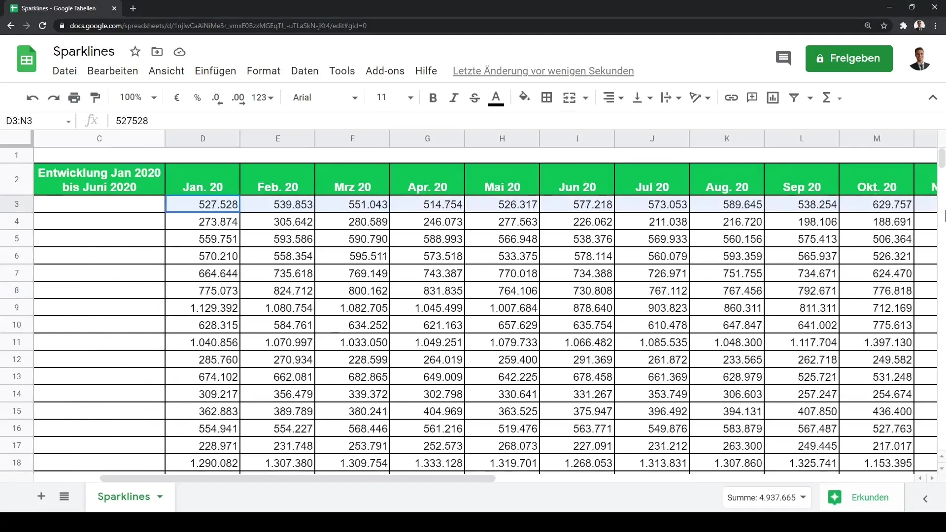
To create Sparklines, you need to apply the function in a cell. The syntax for the Sparkline function starts in the cell where you want to display the chart. For example, you can define the data range you want to visualize and then specify the type of chart.
An example of the syntax would be =SPARKLINE(A2:E2), where A2 to E2 are the cells containing your data. You can also define the type of chart. The most common chart types are line or bar charts.
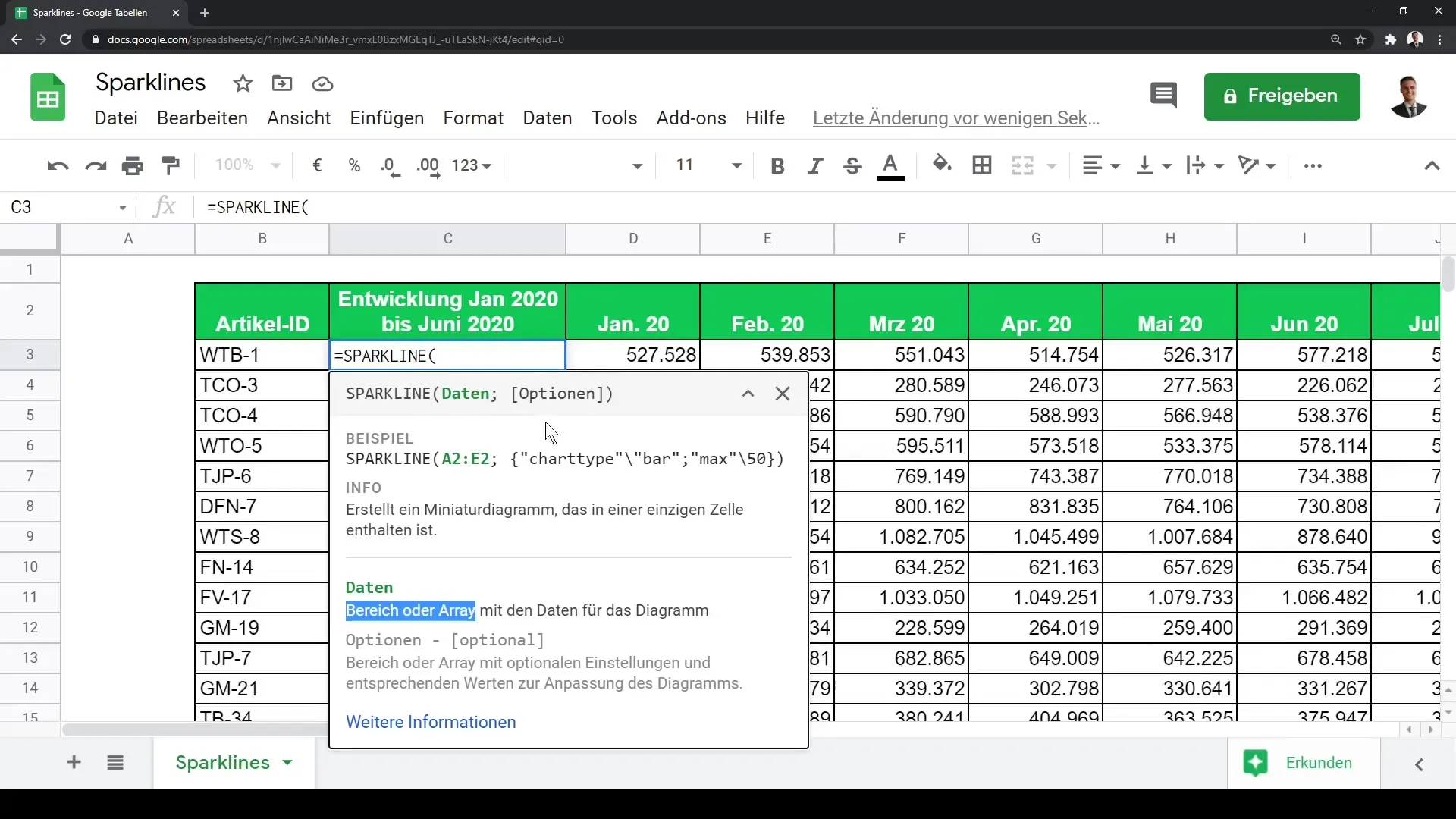
Select the data range you want to visualize. For example, you can choose the data from January 2020 to December 2020 and up to June 2021. Expand the range as needed to get a more comprehensive display.
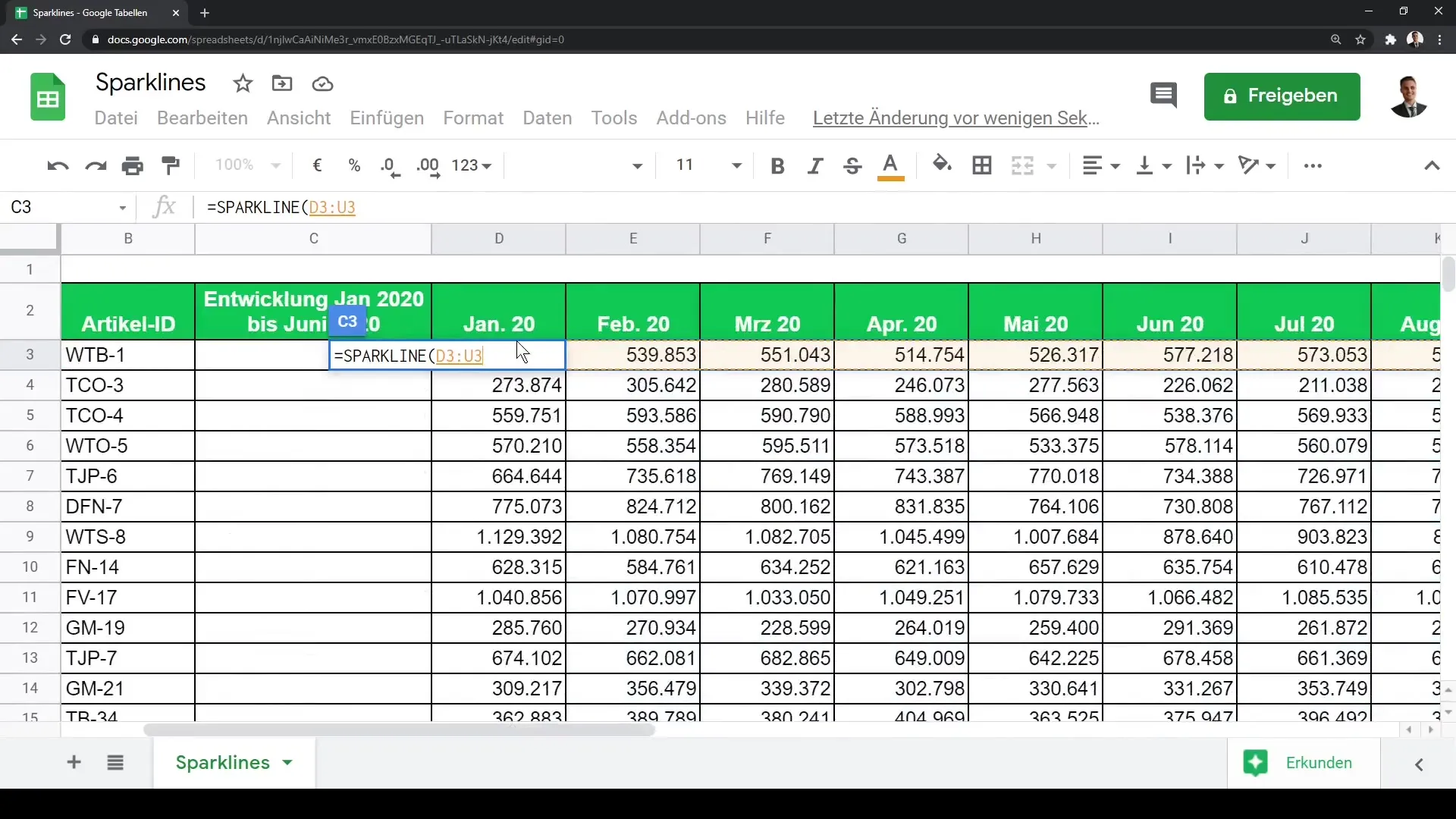
After entering the function, you will immediately see a graphical indication of your data. When you drag the formula down, the function will be applied to the cells below.
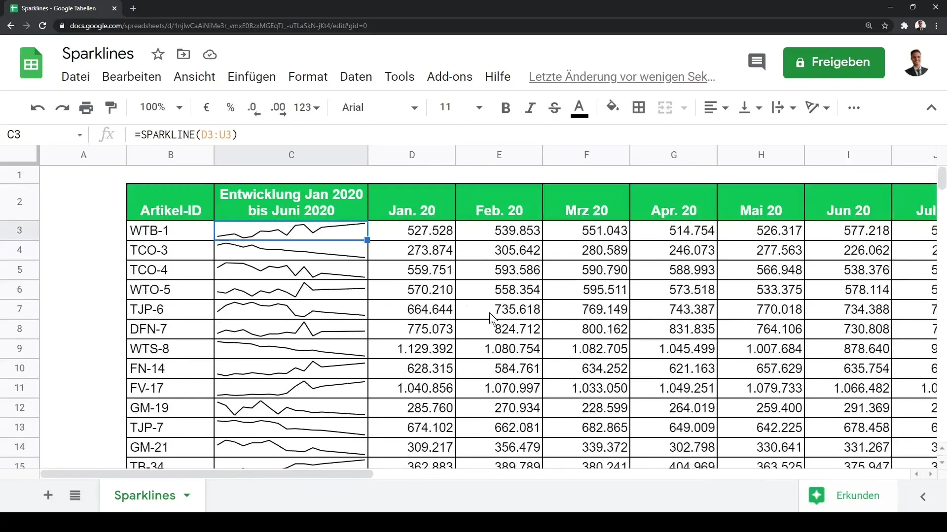
At this point, you can increase the row height slightly. This improves visibility and makes it easier to identify trends in the Sparklines.
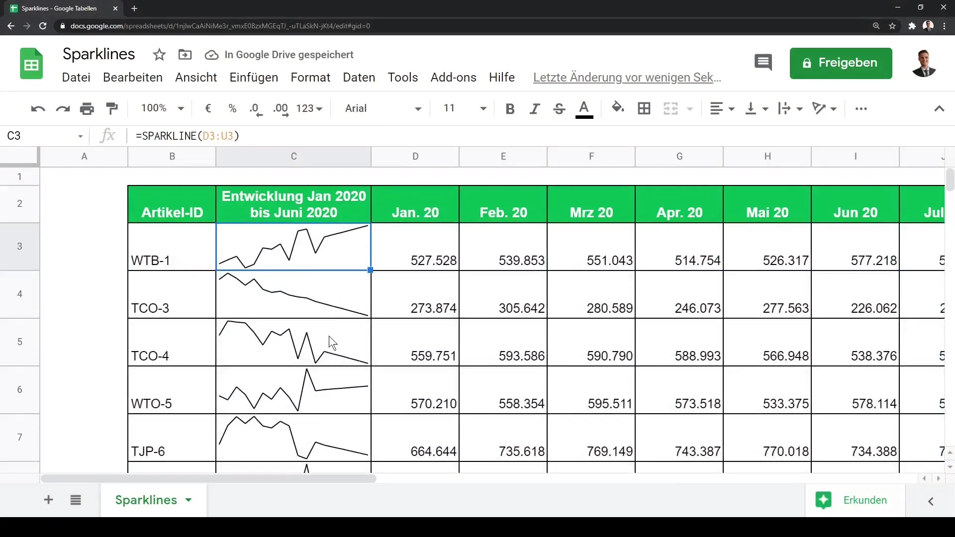
Keep in mind that with Sparklines, you can immediately recognize the trends in your data. For instance, with article ID WTB1, you can see a stable increase, while TC03 appears to show a downward trend.
If you want to change the representation style, you can insert a semicolon in your formula and adjust the chart type. For example, you can also present the graphic as a bar chart by changing the type accordingly.
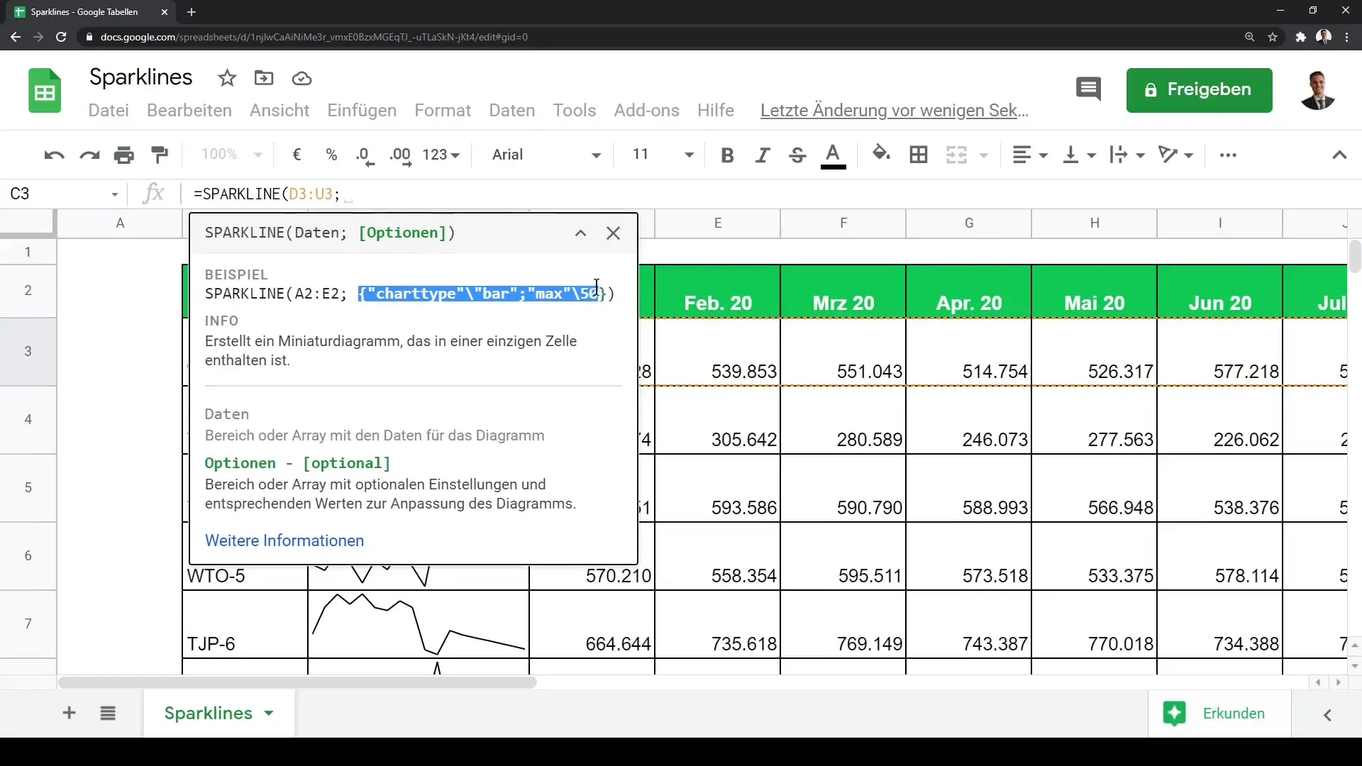
Experiment with different chart types and adjustments to find the optimal design for your data. You now have the ability to effectively utilize Sparklines in your Google Sheet.
Summary
Sparklines allow you to visually represent trends and patterns in your data without much effort. You have seen how to insert these small charts into Google Sheets and customize them to fit your needs. Use this technique to dynamically and appealingly present your data.
Frequently Asked Questions
How do I insert a Sparkline in Google Sheets?You can insert a Sparkline in Google Sheets by entering the function =SPARKLINE() in a cell and specifying the data range.
What data range can I use for Sparklines?You can use any range of cells that contain numerical data. Choose the range you want to represent, such as A2:E2.
Can I change the type of Sparkline?Yes, that is possible. You can customize the chart type by expanding the function with appropriate parameters like in the syntax =SPARKLINE(data_range, {"charttype", "bar"}).
How can I scale the Sparklines to make them more visible?You can increase the row height in Google Sheets to make the Sparklines more prominent.
Are Sparklines interactive?No, Sparklines are not interactive. They are solely used for visual data representation.
