Welcome to this tutorial on creating visualizations in Google Sheets. Visualizations are crucial for understanding data at a glance and extracting valuable insights from them. In this tutorial, you will learn how to create and customize various types of charts. We will guide you through the process step by step to ensure that you can make the most of all the features and possibilities of Google Sheets.
Key Insights
- You can create charts in various ways, both using the menu and specific commands.
- Google Sheets offers a variety of chart types that can be selected from the menu.
- The chart editor allows for comprehensive customization of your visualizations.
- It is possible to display multiple data series in a chart and make different adjustments.
Step-by-Step Guide
Selecting Data and Creating the First Chart
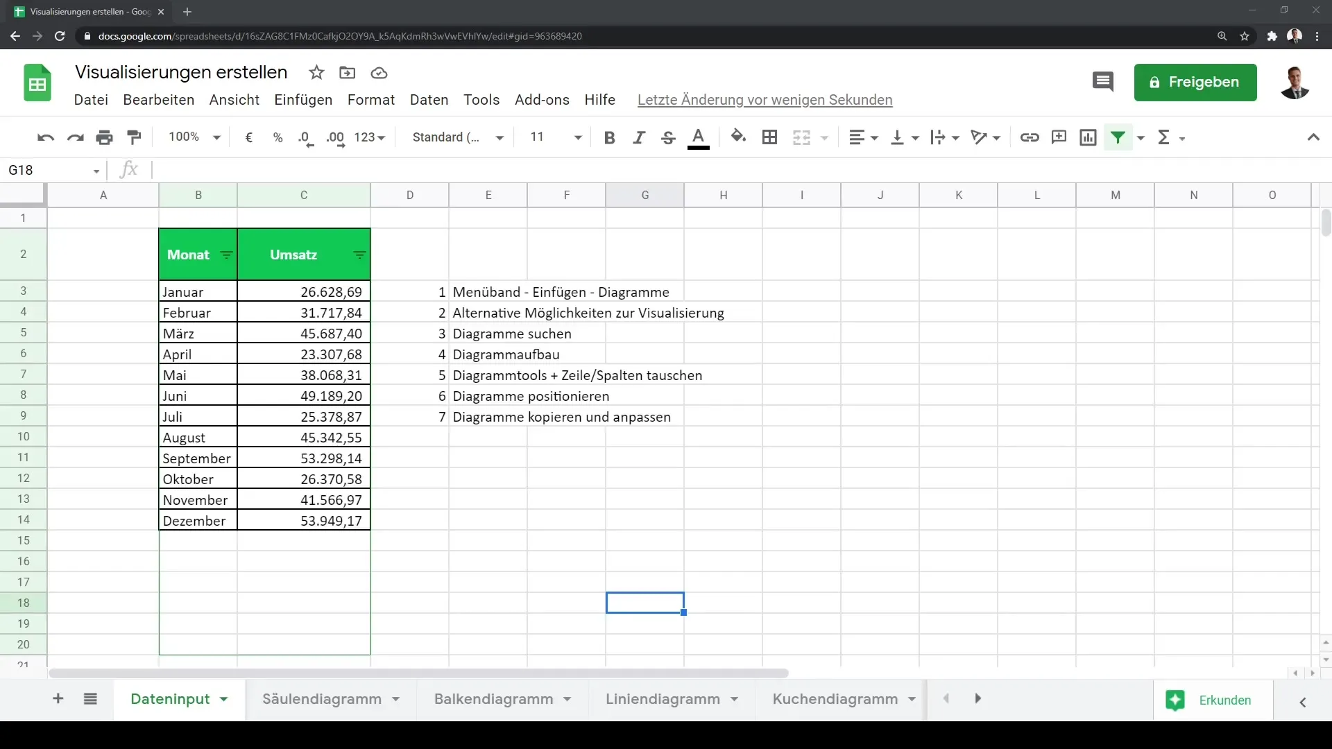
To get started, you should have your data selected in Google Sheets. For example, you can highlight the entire range of your data or use the Ctrl + A key combination.
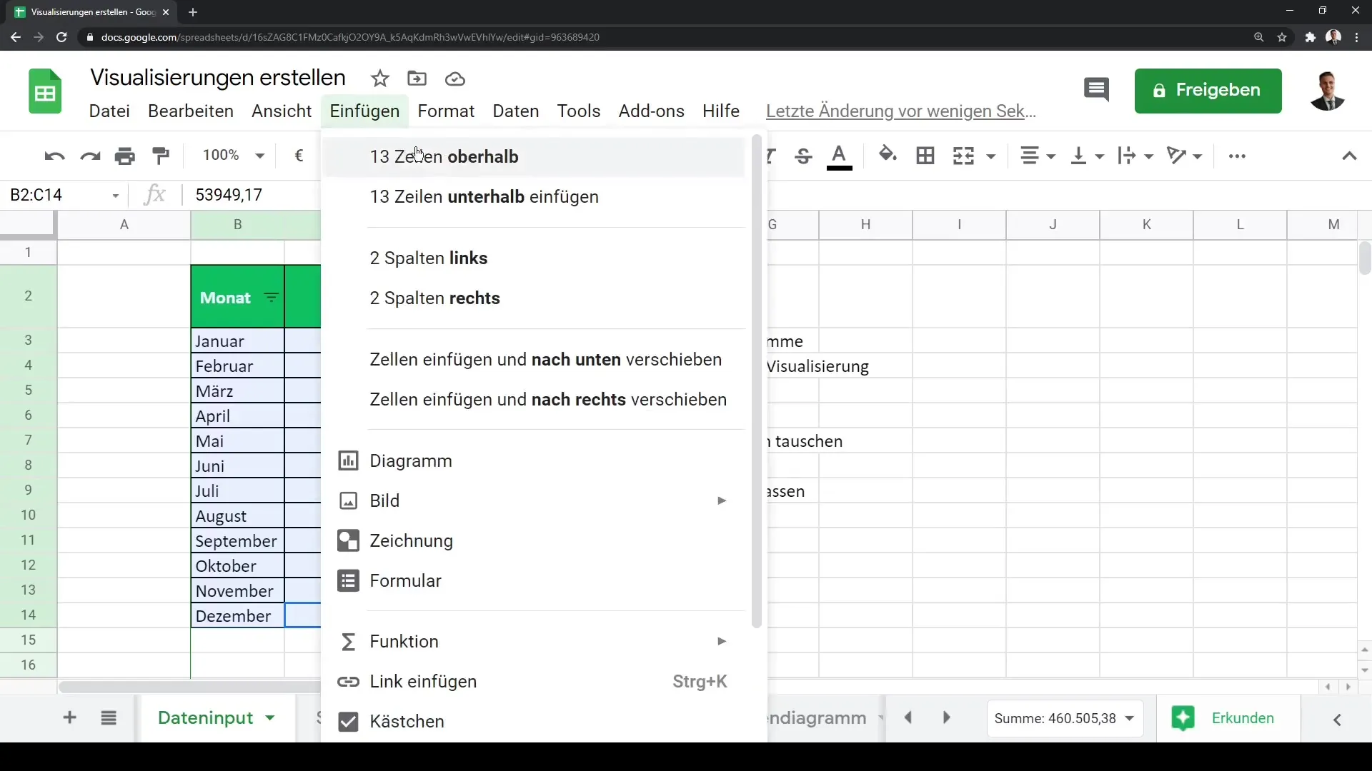
There are two main methods to create the first chart. The first way is to go to the menu. Click on "Insert" and then on "Chart". This will directly create the first chart based on your selected data.
Another way to create a chart is by simply clicking on the "Insert Chart" icon in the toolbar. Here too, your first visualization will be generated instantly.

Understanding and Customizing the Chart
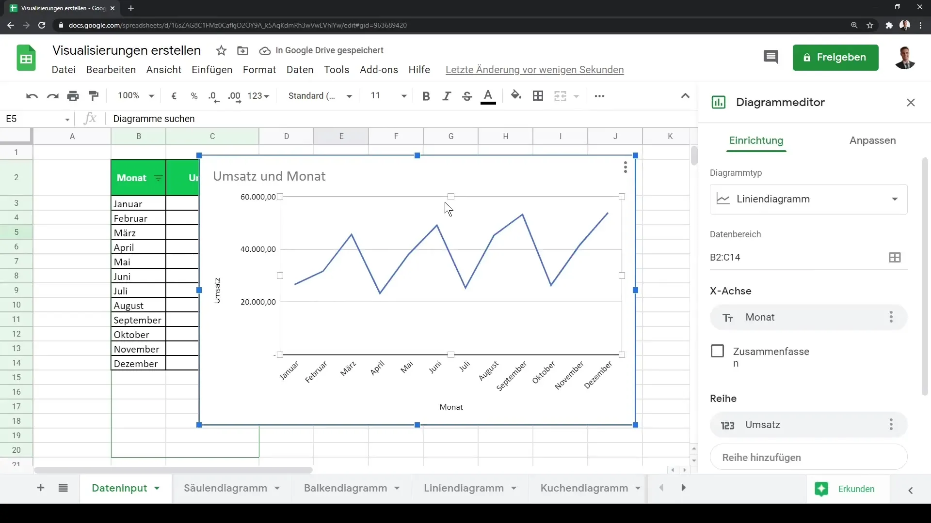
Once you have created your first chart, you will notice that it is surrounded by a blue border. You can drag it to any position and adjust its size. Additionally, the chart editor will open on the right side, allowing you to make many customizations.
In the chart editor, you can choose from various types of charts, such as line charts, bar charts, or even more exotic forms like waterfall charts. Google Sheets offers some visualization types that are not available in Microsoft Excel, giving you more flexibility.
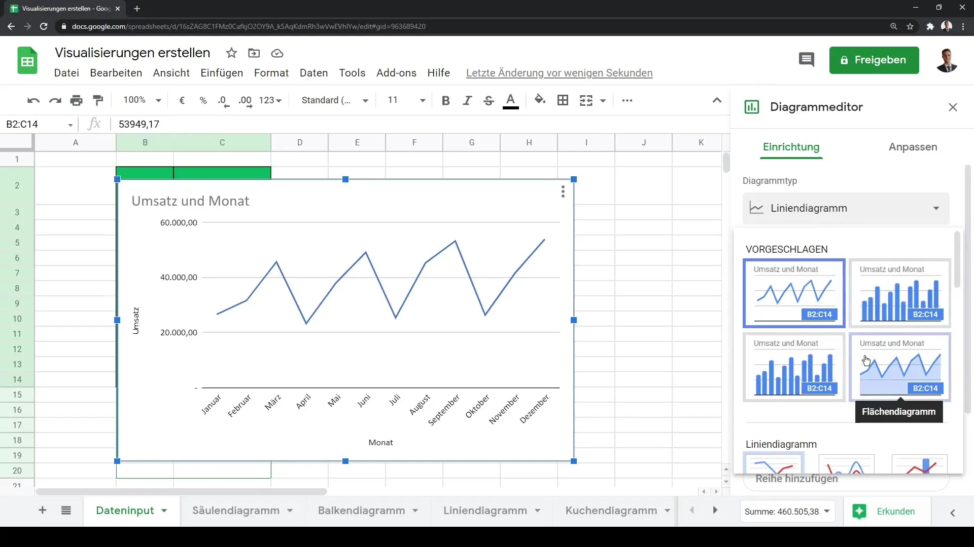
By clicking on your chart, you can also use the three dots in the upper right corner to edit it. Here you will find all the necessary options to customize your chart according to your preferences.
Structuring the Chart and Adding Data
In the chart editor, you also have the option to add new data series. For example, if you want to insert additional revenue data for the next month, you can simply adjust the data range. Select the range in the table that you want to display and update the range in the editor.
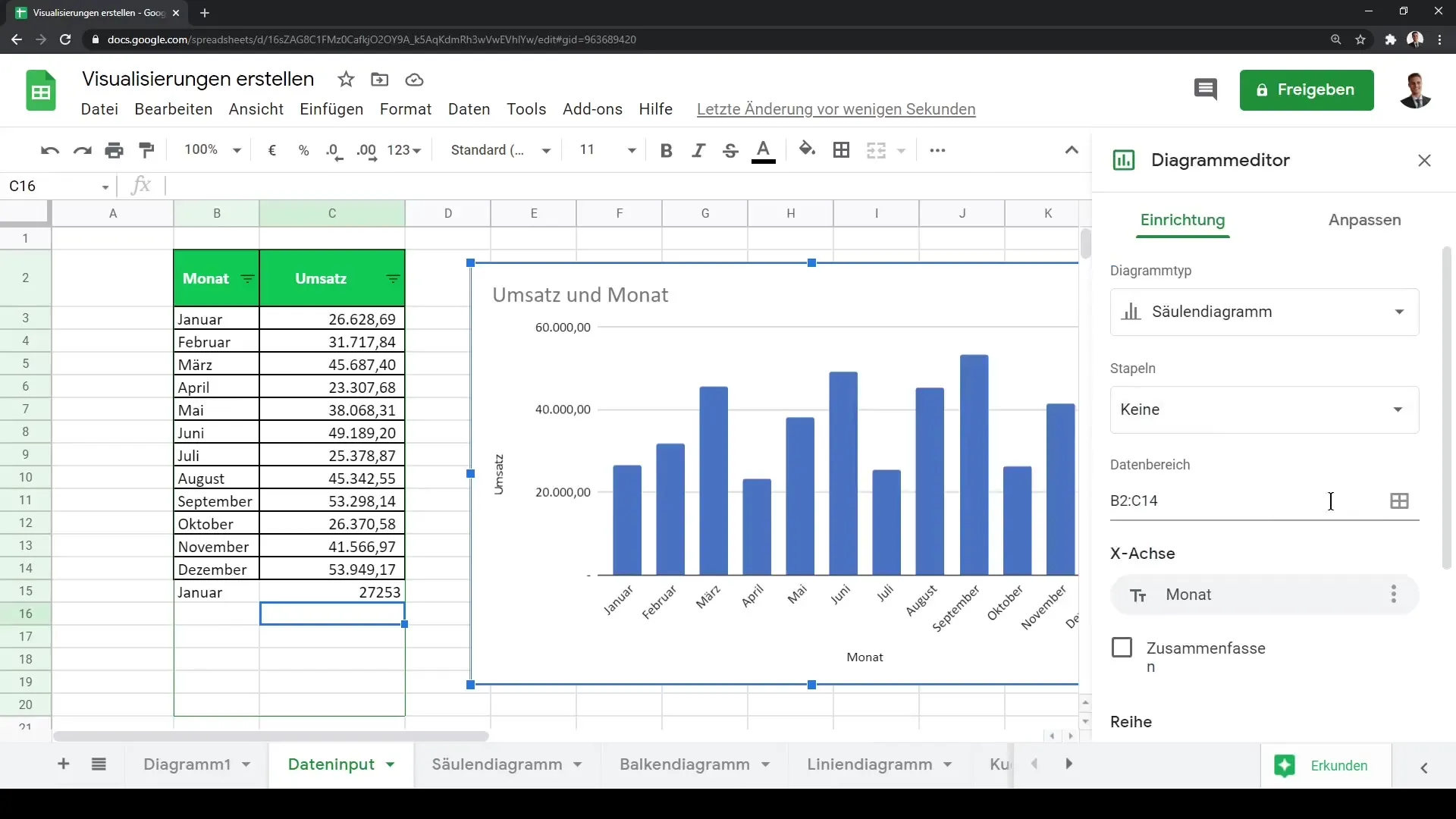
It is important to adjust the x-axis accordingly so that the months are displayed correctly here. You can also visually represent the data by hovering over the individual bars to see the corresponding numbers.
Further Customizing the Chart
To further personalize your chart, you can make numerous adjustments to the appearance. You can change the colors, customize the background, or set the fonts. This is particularly helpful in aligning your chart with your presentation or corporate brand.
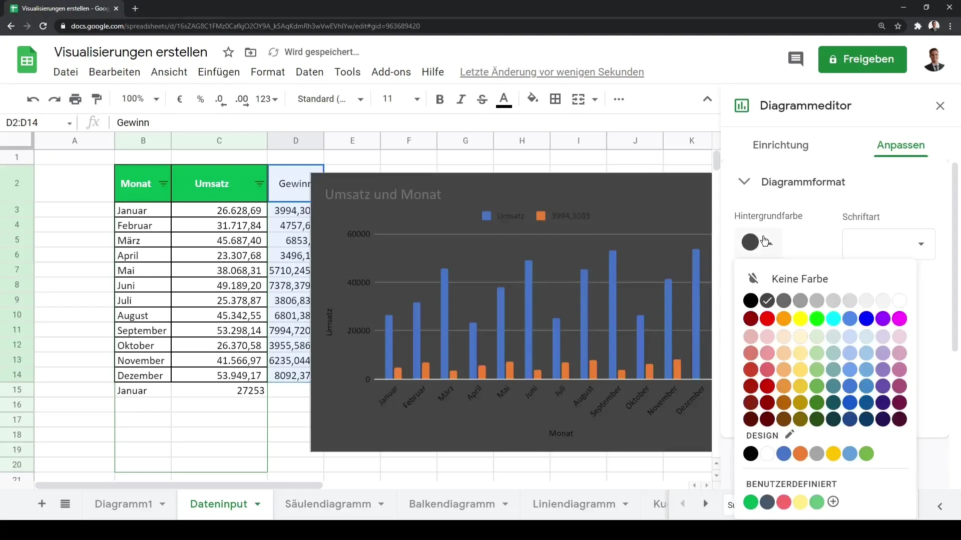
If you wish, you can also add titles to your chart, such as "Revenue and Profit per Month." This helps in understanding the data being presented.
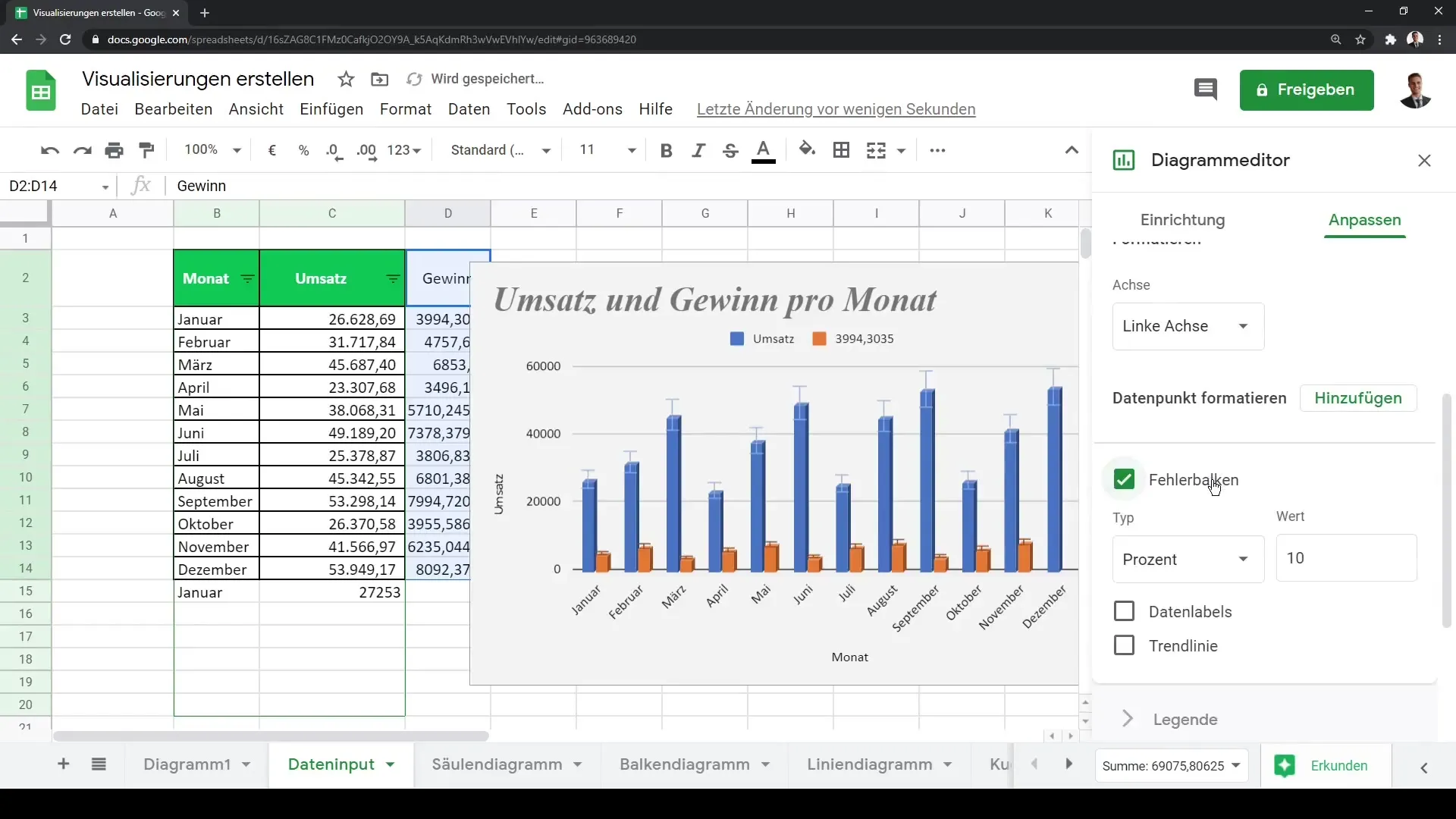
In addition, you have the option to add error bars or trendlines. This way, you can highlight trends in your data more clearly and help the recipients of your data to quickly recognize patterns.
Customizing Chart Formats and Legends
The legend in your chart can also be customized. You can change the position, font, and font size to make it clear and understandable for the viewer.
Furthermore, you can further adjust the formatting of the horizontal and vertical axes and even use a logarithmic scale if it makes sense for your data. This is especially useful when working with very different orders of magnitude.
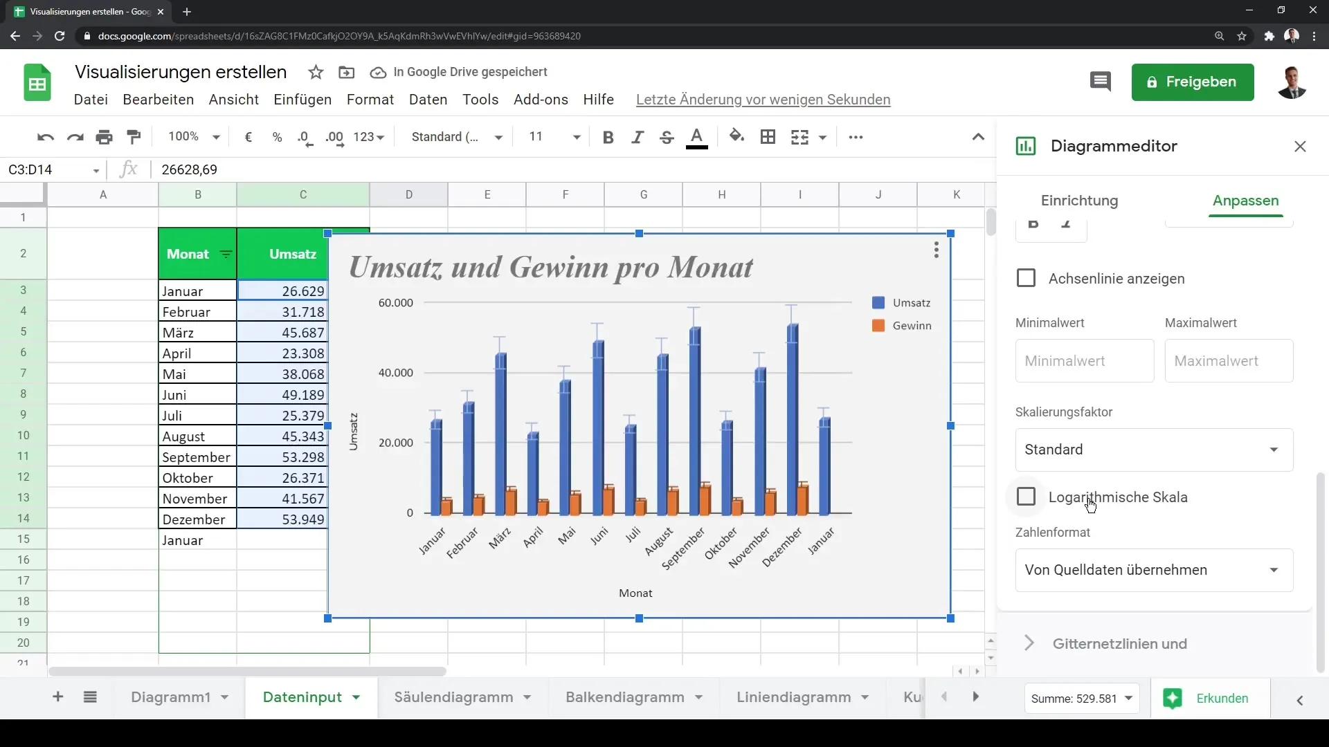
Gridlines and Final Adjustments
Finally, you have the option to remove or add gridlines. This setting may vary depending on your target audience and the data being presented.
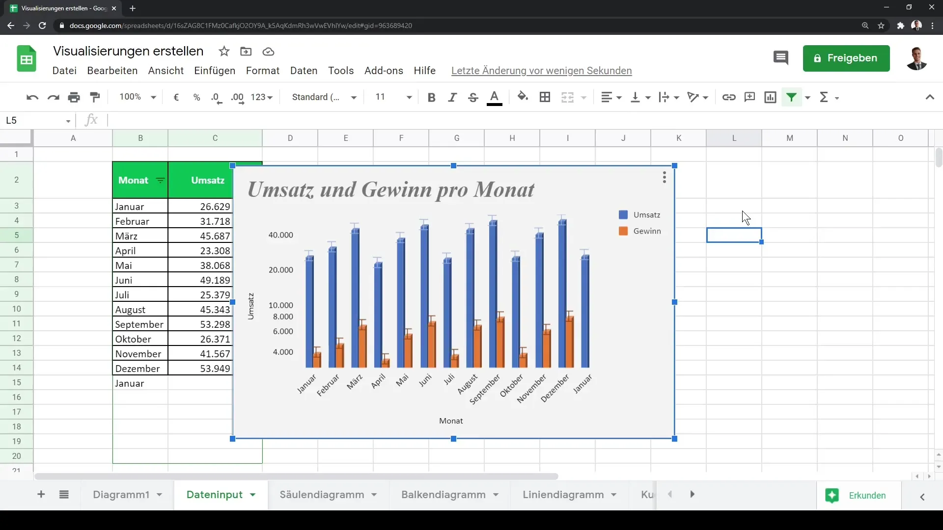
Now that you have gone through all the steps, you are ready to visually represent your data and gain valuable insights!
Summary
In this tutorial, you learned how to create visualizations in Google Sheets. You now know how to select your data, try out different chart types, and utilize all the features of the chart editor to create an engaging and informative graphic.
Frequently Asked Questions
How can I create a chart in Google Sheets?Select your data, go to "Insert," and click on "Chart" or click on the chart icon.
Can I display multiple data series in one chart?Yes, in the chart editor, you can add additional data series and customize the display.
How do I change the chart type?Click on the chart, open the chart editor, and select the desired chart type.
Can I customize the chart?Yes, you can customize colors, fonts, and layouts in the chart editor.
How do I add a title to my chart?In the chart editor, you can add and customize a title under "Chart and Axis Titles."
