In this tutorial, I'll show you how you can create impressive visualizations in Google Sheets based on your pivot tables. If you already have experience with pivot tables, you will find that visualizing data with them is not only simple but also extremely effective. You will learn not only how to generate charts from your pivot tables but also how to customize them to suit your needs. Let's get started!
Key Takeaways
- Pivot tables are excellent for dynamic data analysis and visualizations.
- Charts based on pivot tables offer interactive features that are not possible with raw data.
- You can customize visualizations at any time and create interactive dashboards using data slicers.
Step-by-Step Guide to Creating Visualizations with Pivot Tables
Preparing the Pivot Table
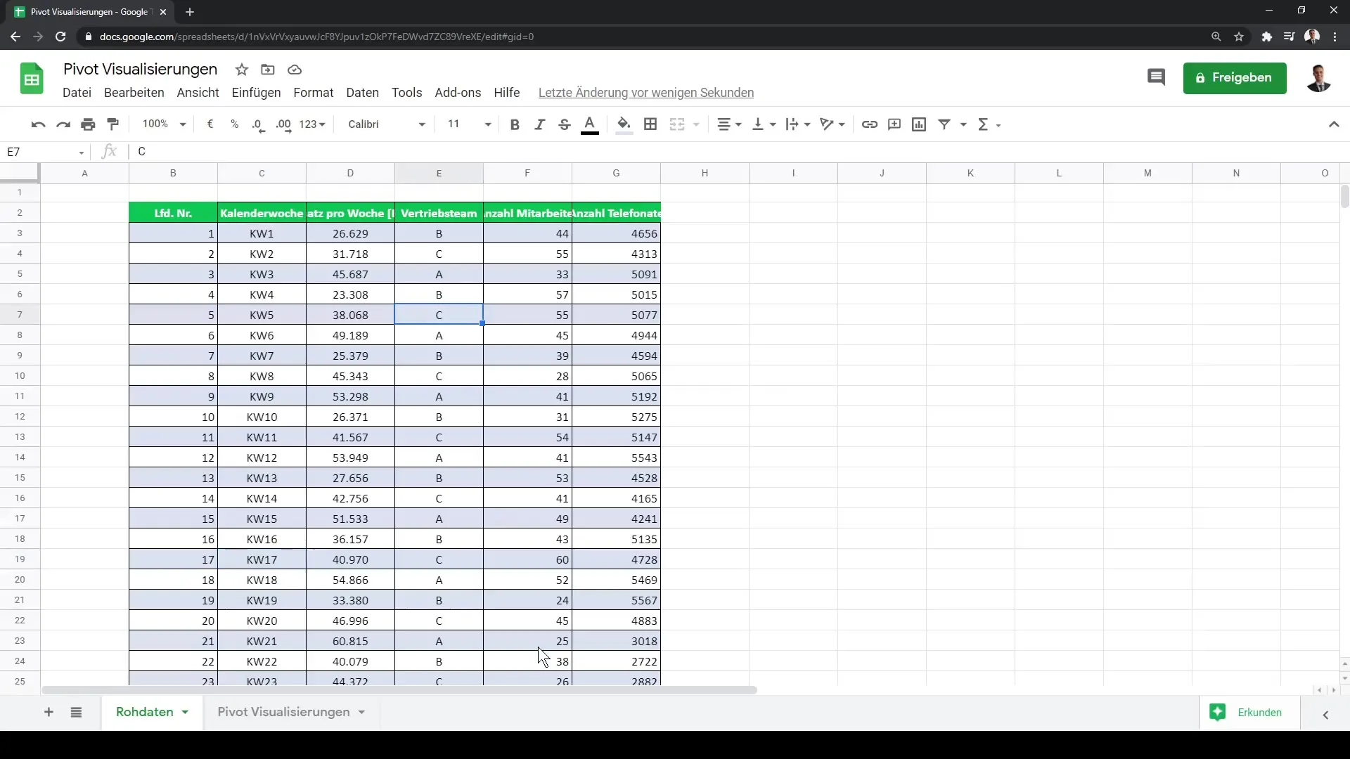
Before we start visualizing, make sure you have created a pivot table. You already have the data in a suitable format. If you don't have a pivot table yet, you can easily create one by clicking in the data range and selecting "Pivot Table".
Creating the First Visualization
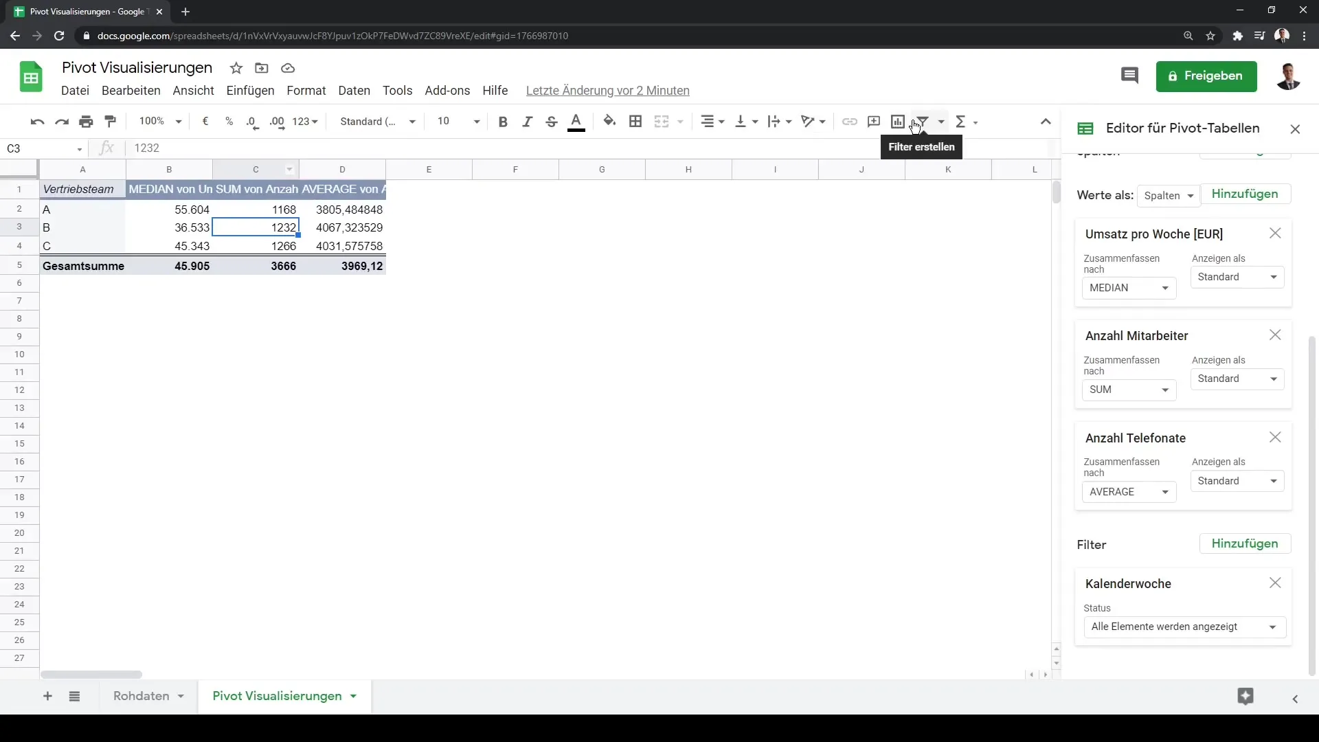
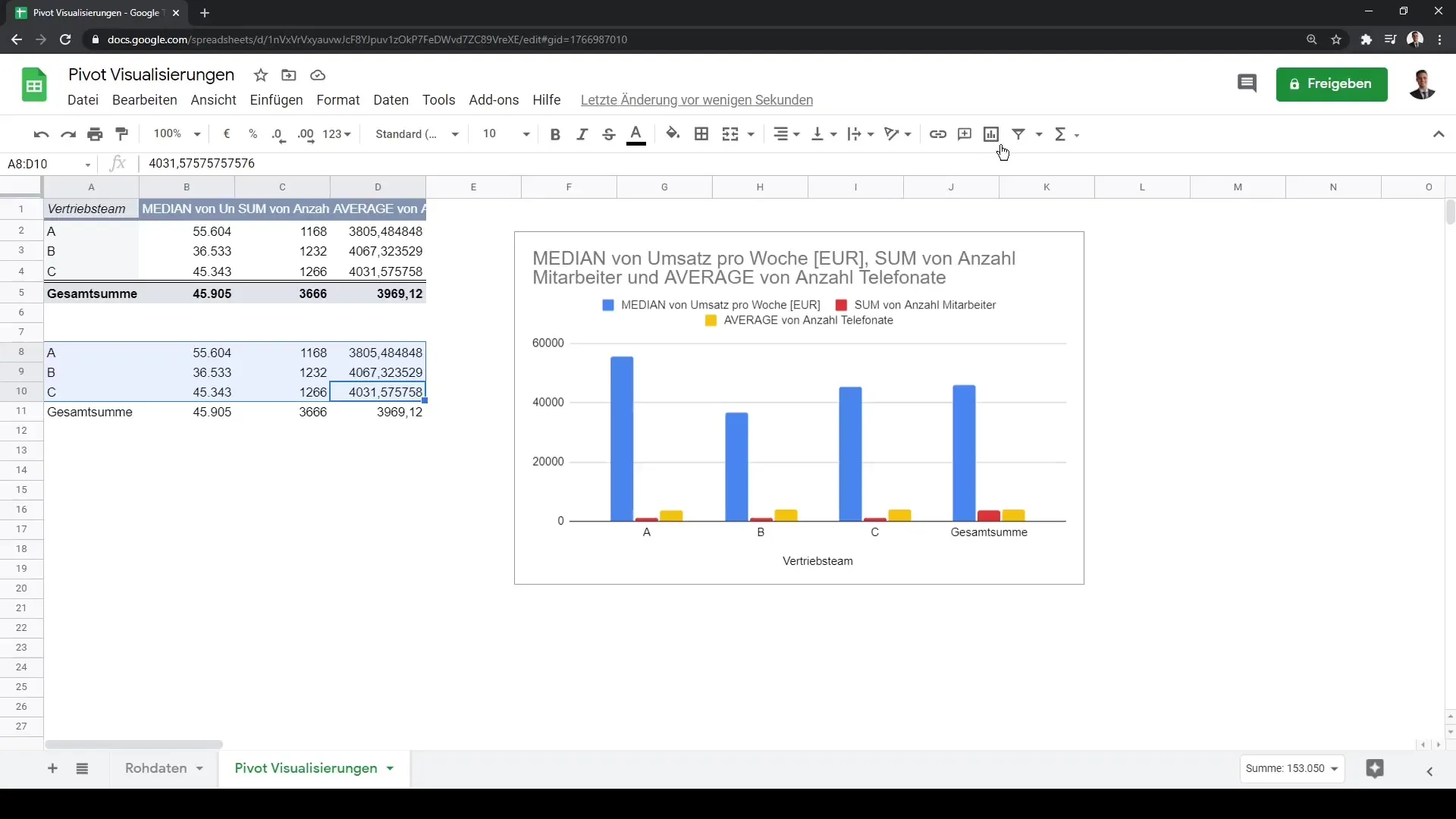
Now that your pivot table is ready, you can start creating your first visualization. Simply click within your pivot table to ensure that the menu bar appears on the right side. Select the range of your pivot table for which you want to create a chart. To create the chart, click on "Insert" and then "Chart".
Difference between Pivot Visualizations and Raw Data Charts
One important point to note is the difference between visualizations based on pivot tables and those created from raw data. If you make a copy of your data and attempt to create a chart without using the pivot table, you will find that important features like interactive adjustments are missing. This is because the pivot table is dynamic and updates automatically, while raw data is rigid.
Choosing the Right Chart Type
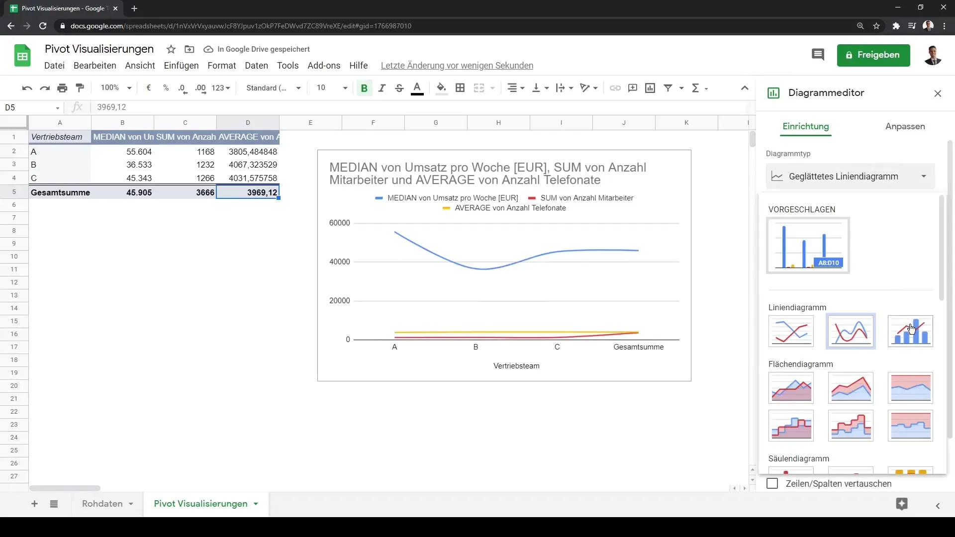
After creating your first chart, it's important to check if the chart type suits your data. You have various options like bar, line charts, or area charts. To change the chart type, simply click on the chart and select "Edit Chart". Here you can choose the desired type and customize the design.
Updating Visualization with New Data
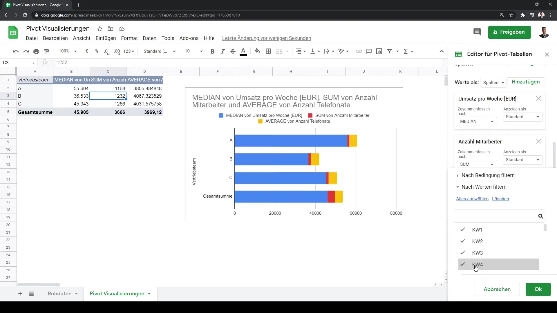
Another advantage of pivot tables is dynamic updating. When the underlying data changes, your chart will also update automatically. For example, you can apply filters to your pivot table to hide certain data. These changes will immediately reflect in your visualization and are an excellent way to keep your analysis up to date.
Using Data Slicers for Interactive Dashboards
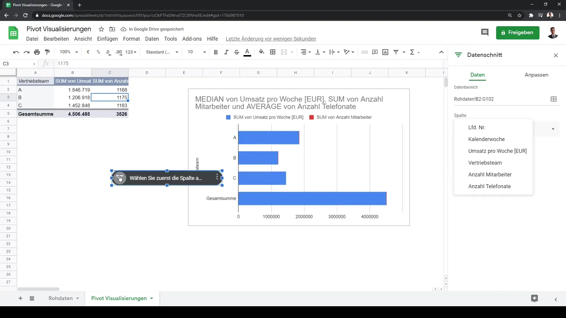
To make your visualizations even more interactive, you can use data slicers. These allow you to switch between different data categories in your pivot tables. To do this, select the column you want to filter and click on "Data", then on "Data Slicer". For example, you can select sales teams, which will dynamically adjust the visualization.
Customizing Visualizations
You can continue to customize your charts to make desired changes. Experiment with different layouts, colors, and chart types to enhance the presentation of your data. The better you visualize your data, the clearer the results and insights you can derive from them.
Summary
In this guide, you have learned how to create effective visualizations from your pivot table data in Google Sheets. You are now able to create charts, dynamically adjust them to fit your data, and create interactive dashboards using data slicers.
Frequently Asked Questions
What is the advantage of pivot tables over raw data?Pivot tables enable dynamic analyses and interactive visualizations that are not available in raw data.
How can I change the chart type in Google Sheets?Click on the chart and select "Edit Chart" to choose a different chart type.
Can my visualizations update automatically?Yes, if the underlying data changes in the pivot table, the visualizations will also update automatically.
