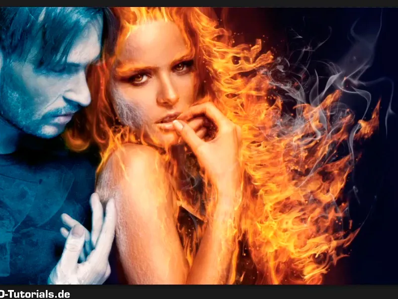
Note: The tutorial "Further optimization of the frosty look" is a text version of the corresponding video training by Marco Kolditz. The texts may therefore have a colloquial style.
Here we go: Steps 1-10
Step 1
Marco has already given the Man of Ice group a layer mask, which looks like this: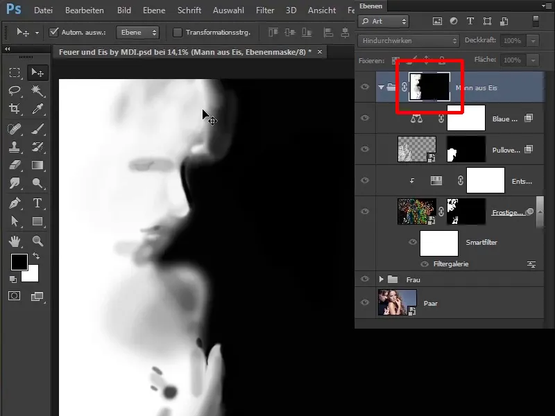
Step 2
This means that the blue tone and all the ice shimmer etc. really only affect the man ...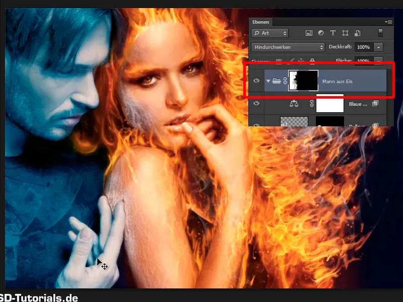
... and not on the whole picture as in the last tutorial.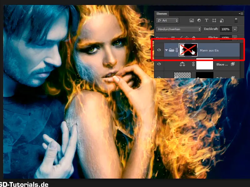
Step 3
Now you want to make the man's face a little frostier with the help of an ice cube. To do this, select File>Open...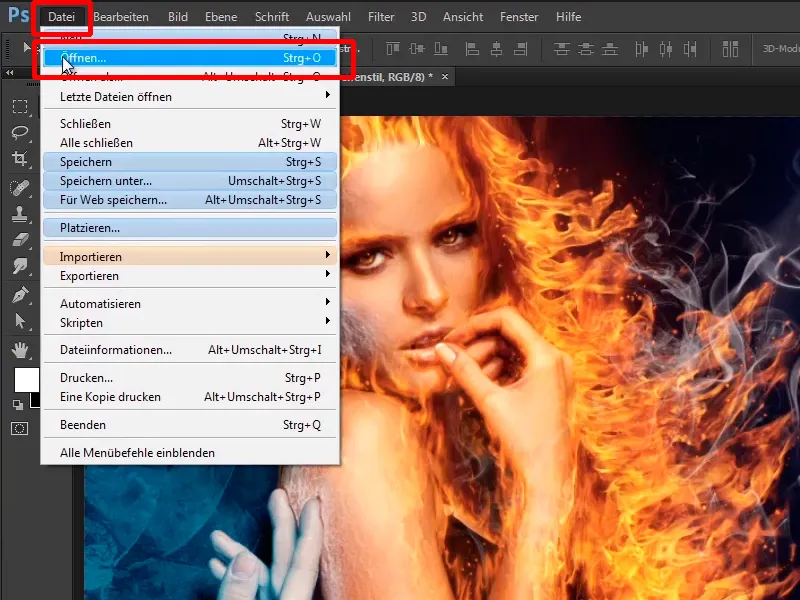
... and select the image that most closely resembles an ice cube, namely "Ice 2.jpg".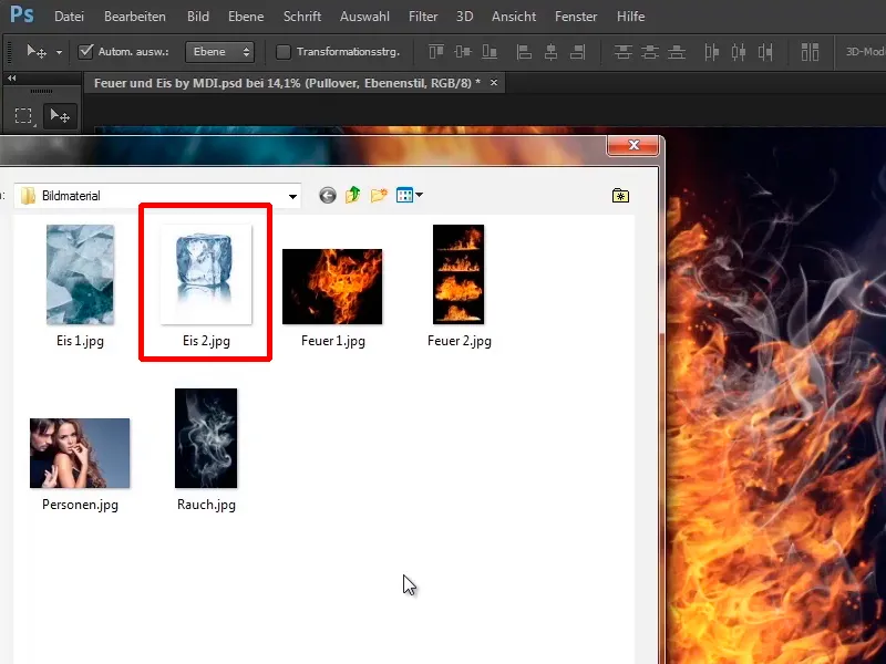
Step 4
You haven't gone through File>Place again because you want to prepare this image for your composing. Click on the hand symbol to move a little closer to the image and the first thing you want to do is desaturate the image because there is still a bit of blue in the image. And how do you do that? You've already done this a few times, with Ctrl+Shift+U.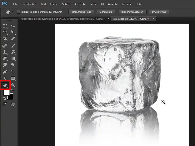
Step 5
Now you want everything that is dark shaded in the image to be white, i.e. light, and to do this you press Ctrl+I for invert. Now everything that was previously white is dark and everything that was dark is now lighter.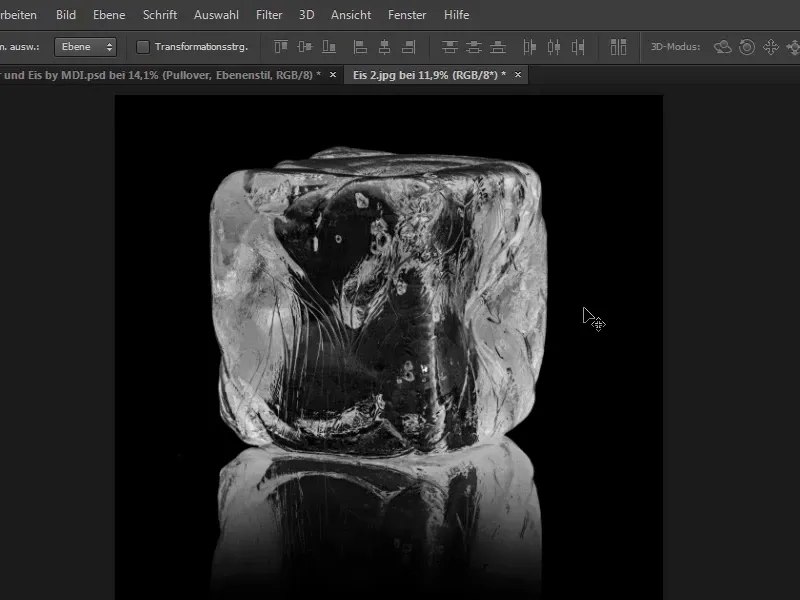
Step 6
However, it is not light enough, because it is still more of a gray tone, and you can see this if you press Ctrl+L and open the tone value correction. In the histogram you can see that there are no white values in the left area.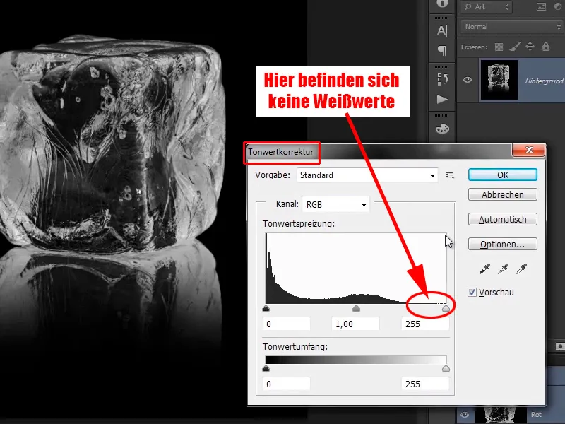
Step 7
Now drag this white slider to the start of the tone value data 200 and the image will look much more contrasty.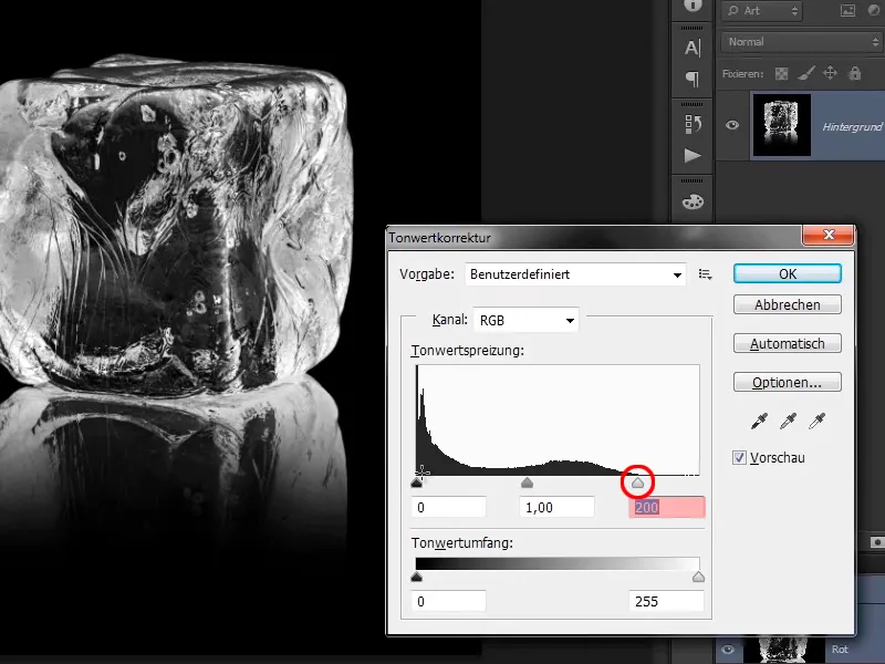
Step 8
However, you can go a little further to the left, but not too much, because then it will eat out again, and that is a big mistake.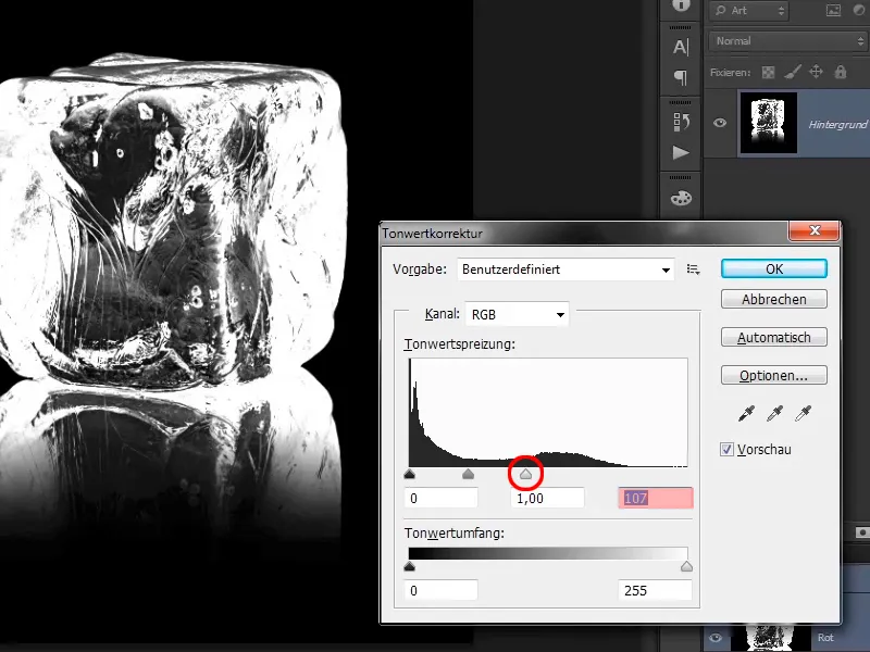
Step 9
In this case, it looks quite good, maybe a little more contrast in the shadows. Play with the mid tones a bit and it looks very good.
- Black: 18
- Gray: 1.14
- White: 165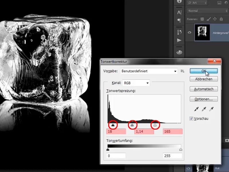
Step 10
You will crop the file with the cropping tool. For the sole reason that it is much easier to work with, you can scale it much better and the image file will also be smaller.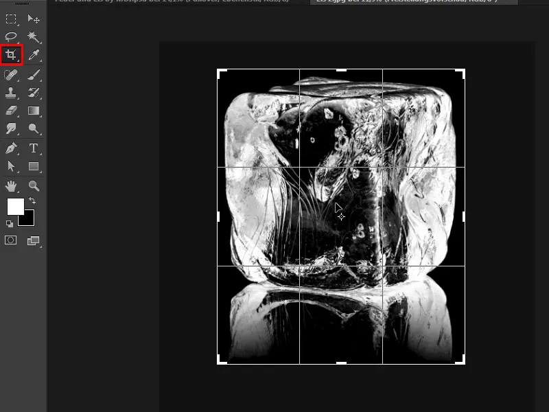
Steps 11-20
Step 11
Now you only want to drag the light areas into your image, not the dark areas, and you have already done this several times. This means you look in your channels paletteand click on the RGB channel while holding down the Ctrl key and create a luminance selection again.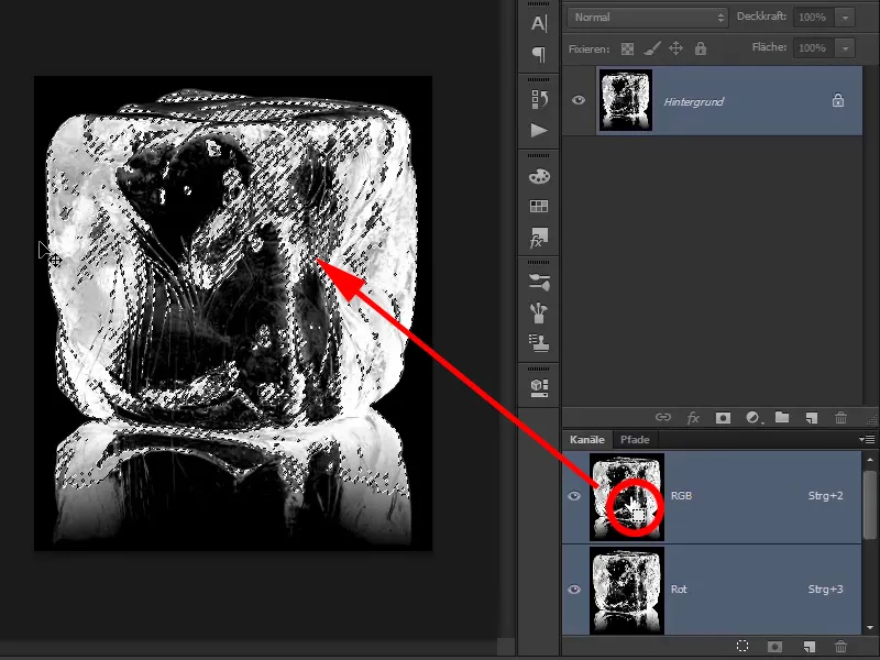
Step 12
Create a new layer and in this case, because you have white as the foreground color, press Alt+Backspace. You have now filled your selection with white.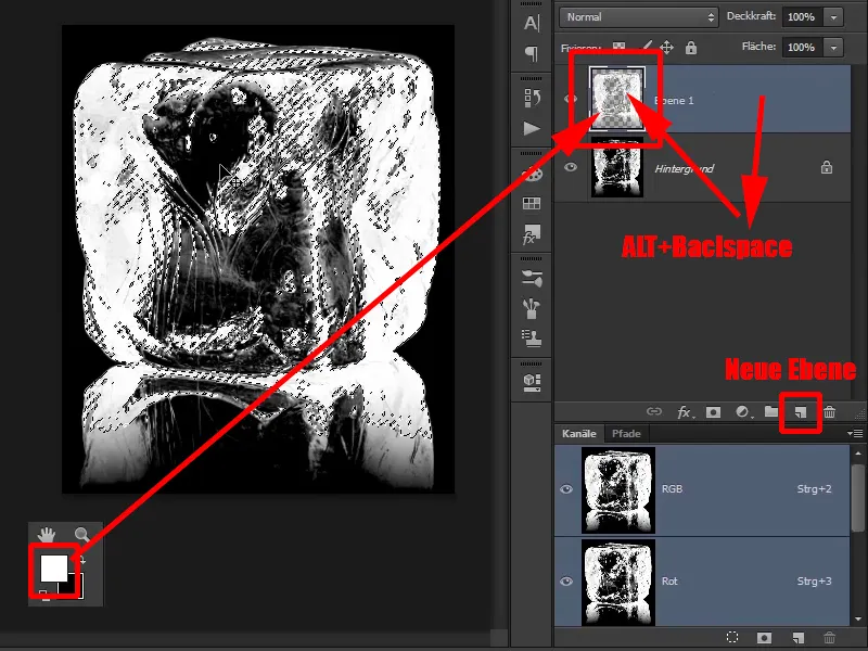
Step 13
With Ctrl+D, probably for deselect, you have removed the selection again. You can delete the image underneath and ...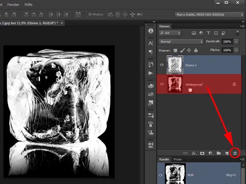
... you now only have the block of ice, i.e. this ice cube, in the image.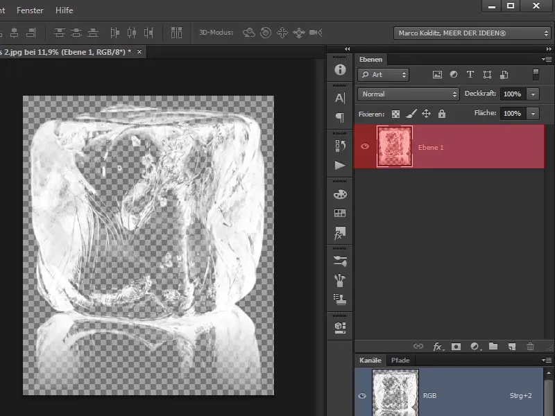
Step 14
And you will drag this ice cube directly over to your picture, which will take a moment.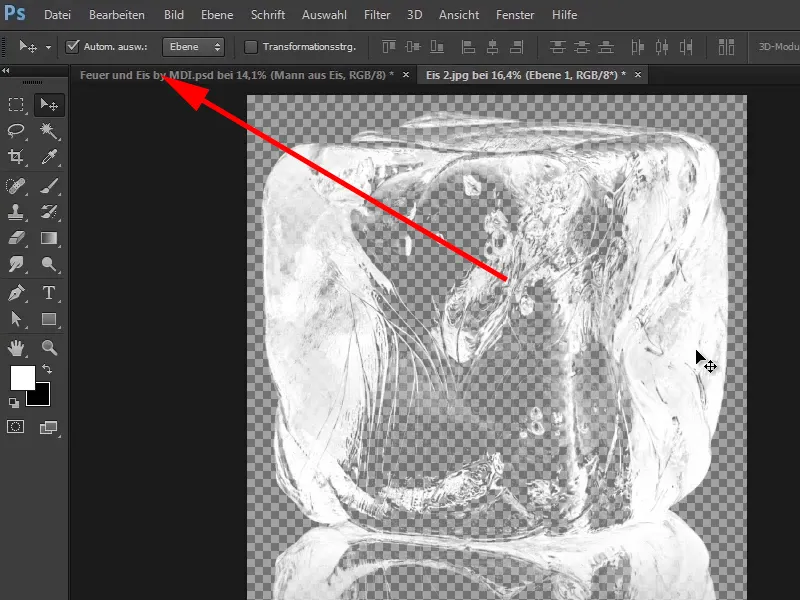
Step 15
What do you do with the image that you have dragged over? You will first convert the layer into a Smart Object and ...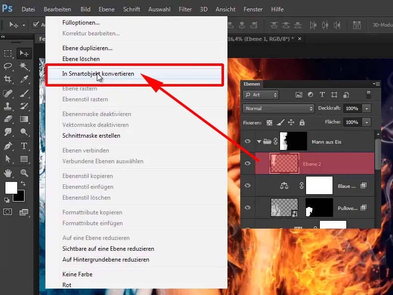
... call it "Ice block for the face" in this case.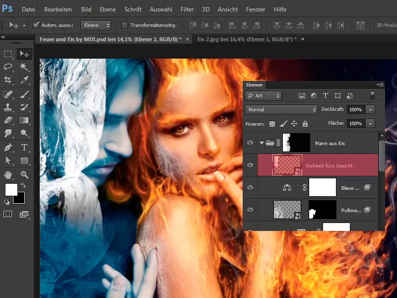
Step 16
You can then use Ctrl+T to scale this layer a little and it's best to orientate yourself to this curve in the ice, which looks as if it was made for the eyes. You rotate the image a little and it looks quite cool, it even fits better with the hair, something like that. You can take your time here too.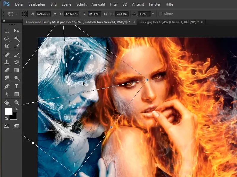
Step 17
You will now use Edit>Transform>Shape to adjust this even further.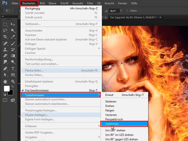
It looks as if it was made for the face, so it doesn't look too bad. Raise the forehead a little more, take your time.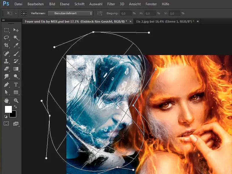
Step 18
Something else has been moved a little so that this white runs along the crease of the mouth, ...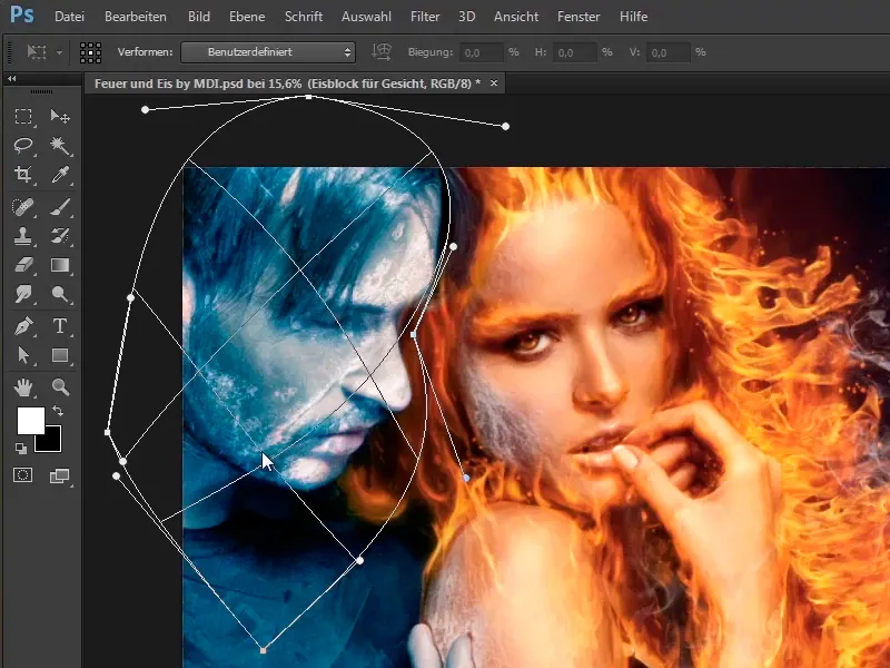
... and Marco also created a mask after confirming with Enter.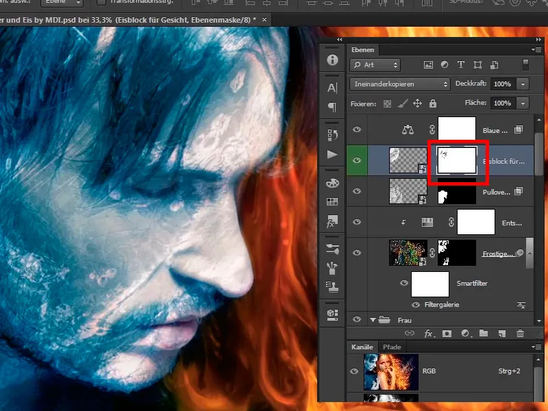
Step 19
The ice block was removed from the eye area in particular, which is always a good idea so that these areas are excluded from the change.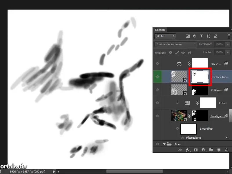
Step 20
If you deactivate the mask, you will see that the ice block would have gone right through the eyes.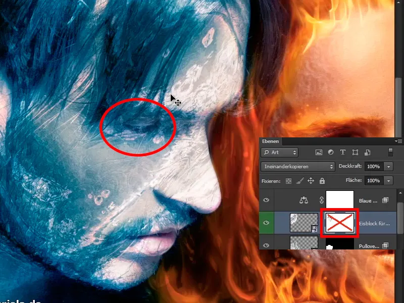
Let's continue: Steps 21 to 30
Step 21
You activate the mask again and it looks much better.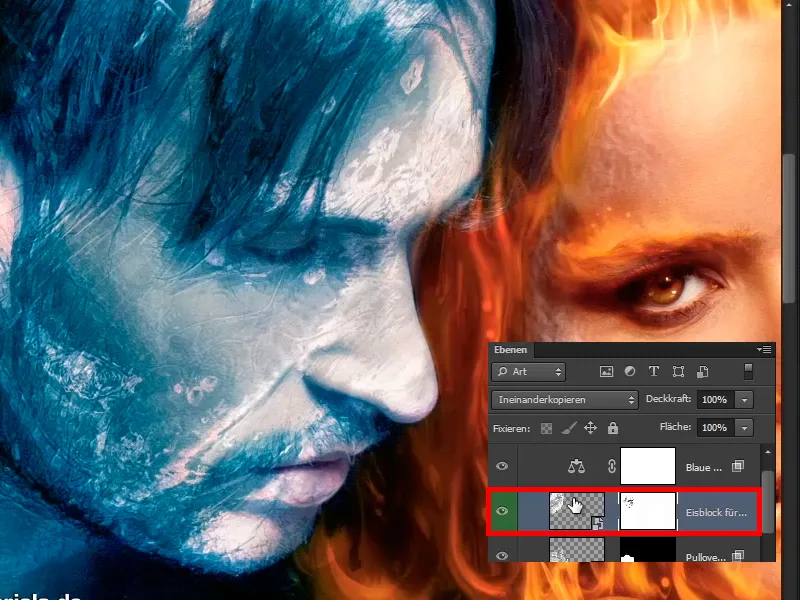
Step 22
You have the block of ice in the Interlace mode , here it still looks too strong, so reduce the opacity of the layer to 49%. It looks good like this.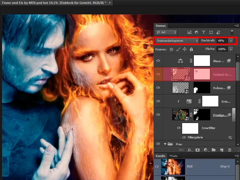
Step 23
Do the same with the hand; it already looks really frosty. It looks very good as it is, so duplicate the "Ice block for the face" layer again and call it "Ice block for the hand".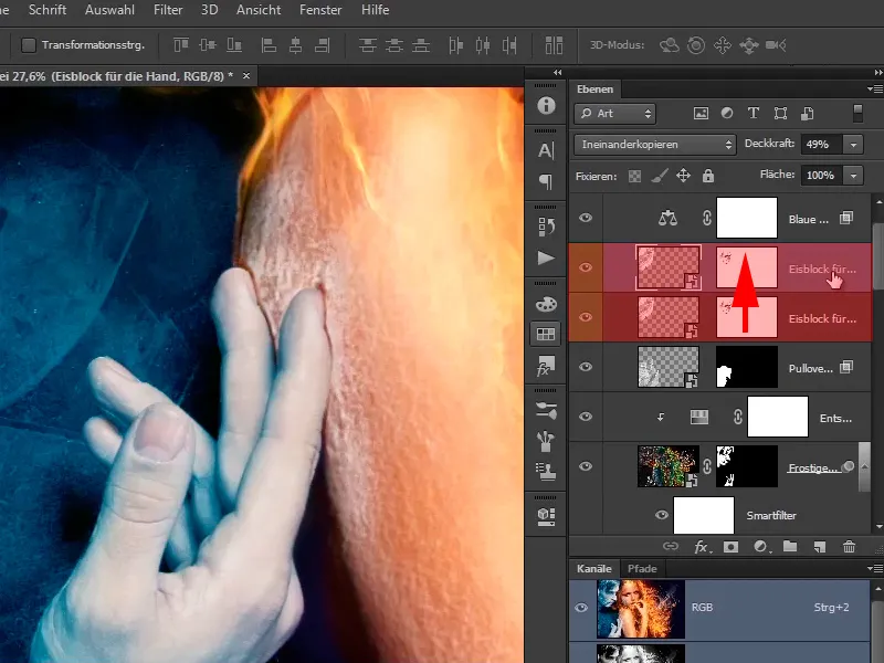
Step 24
Here you will delete the layer mask again.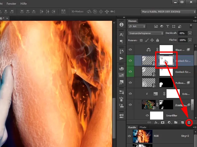
Step 25
Place the ice block at the bottom of the hand. You will see how best to work with it. Set the opacity to 100% again so that you can see the ice block better. The area with the lines already looks very good, ...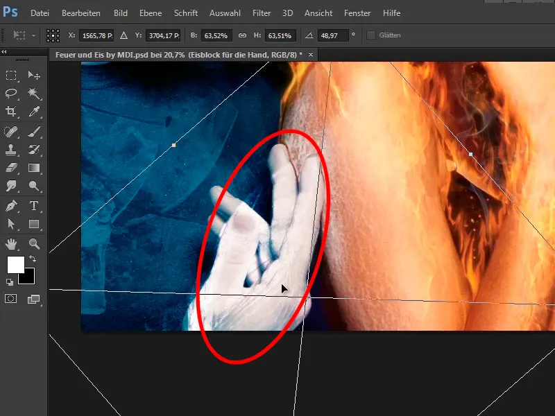
... and there you go again to Edit>Transform>Shape.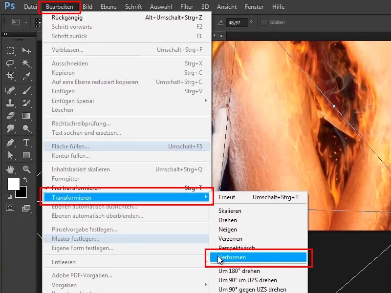
Step 26
Take a look at this and you'll see that there's a bit of warping along the hand. These lines now look really cool because you are really moving along the hand. Don't leave out the fingers and curl them inwards a bit more.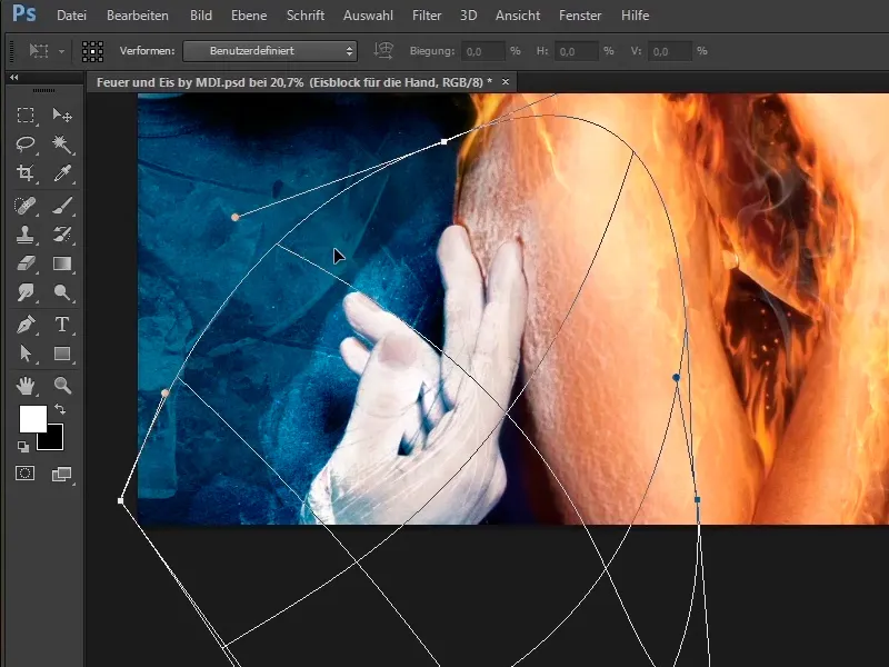
Step 27
When everything is shaped until it fits, it looks like this: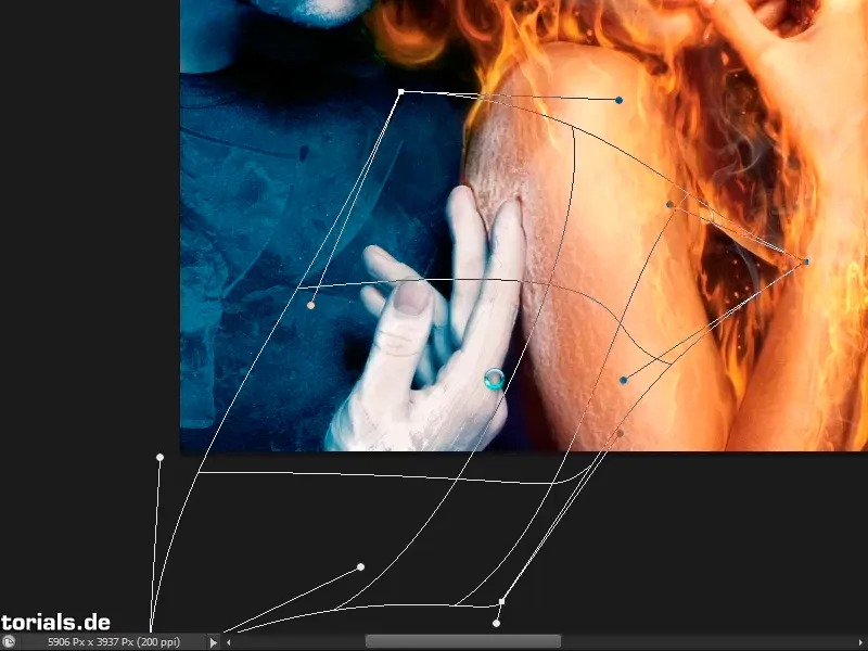
Step 28
A mask was also created and in this mask the folds on the thumbs etc. were taken back a little.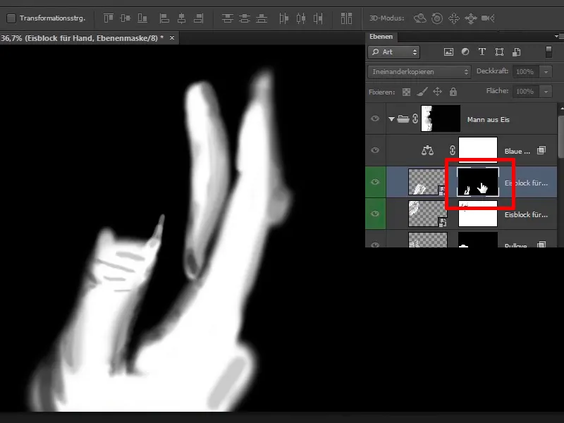
Step 29
If you deactivate this - this is what it looks like before ...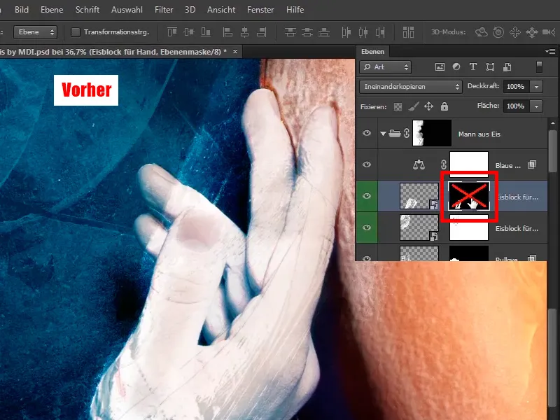
Step 30
... and like this afterwards.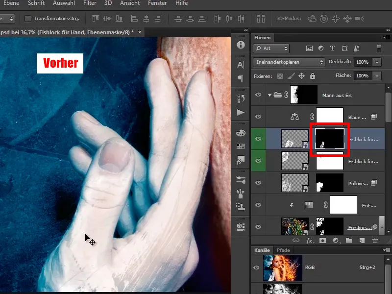
Keep at it: Steps 31-40
Step 31
This means that you only have this ice look on the front fingers, a little on the inside and, for example, this fingertip has been left out completely.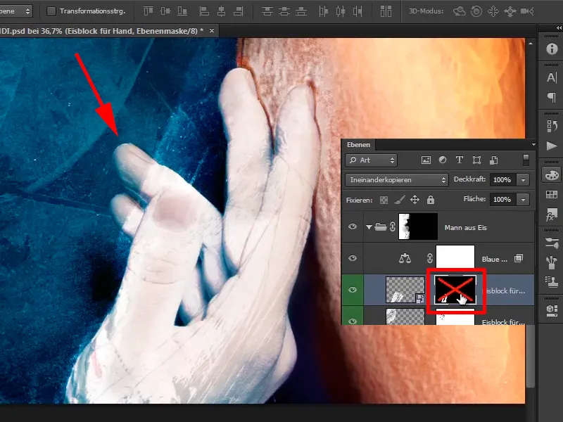
Step 32
It looks really good like this, it really has an icy look and you can leave it like this.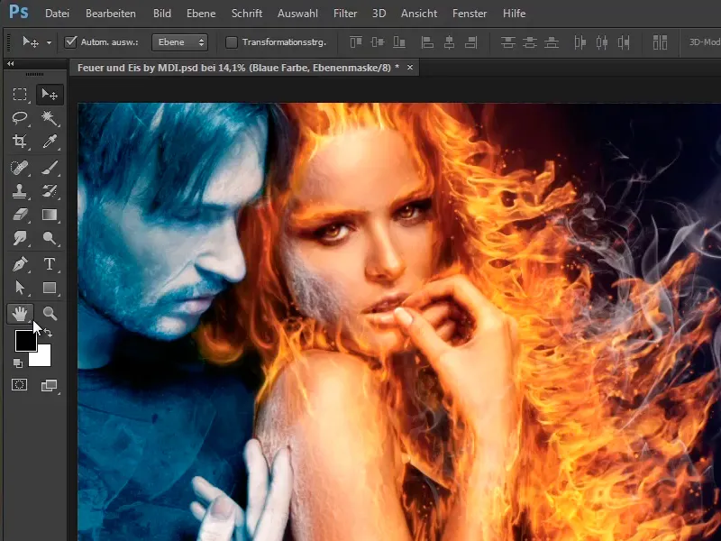
Step 33
Now you're going to make two quick corrections, namely you're going to correct the finger, i.e. you're going to fix these shadows or these missing frost areas. This is because you created these contours at the very beginning of the tutorial and they were a bit outside of the finger and therefore didn't work with this mask.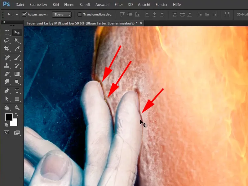
Step 34
Close the "Iceman" group, create an empty layer above it and name it "Finger corrected".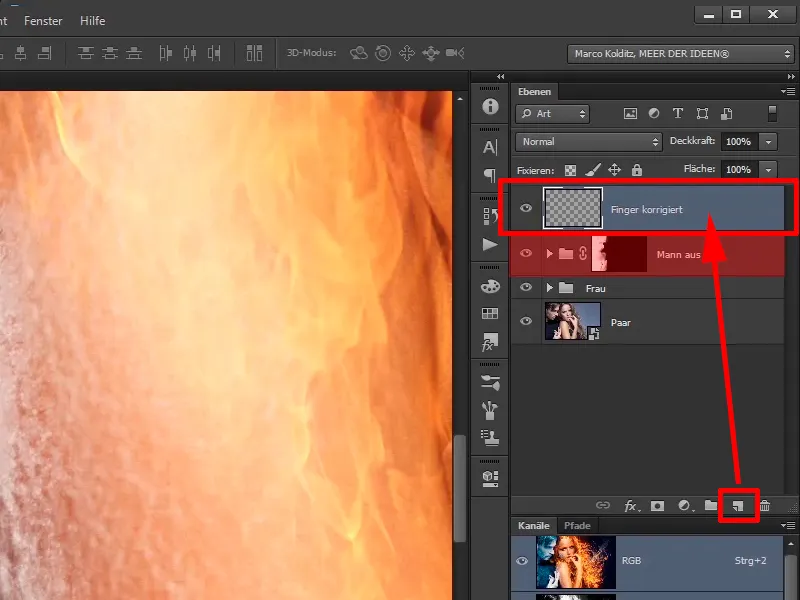
Step 35
You now select the Copy Stamp tool and say Act below, this is what you want to select.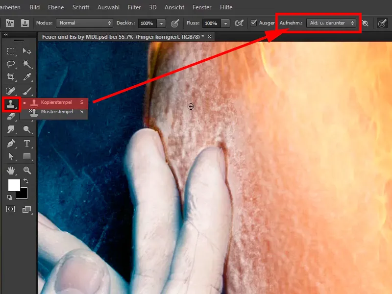
Step 36
With this tool you will copy areas of the image to the desired location. This means that you hold down the Alt key, which changes the cursor a little, click on a place and release the Alt key.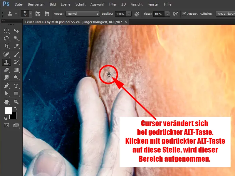
Step 37
Now you can paint these areas into the picture with a lower opacity (34%). This can also be corrected at any time by moving a little further into the image. You can also press the Alt key again and again to make some areas look really good.
Now paint the areas back into the picture so that the transition looks much better.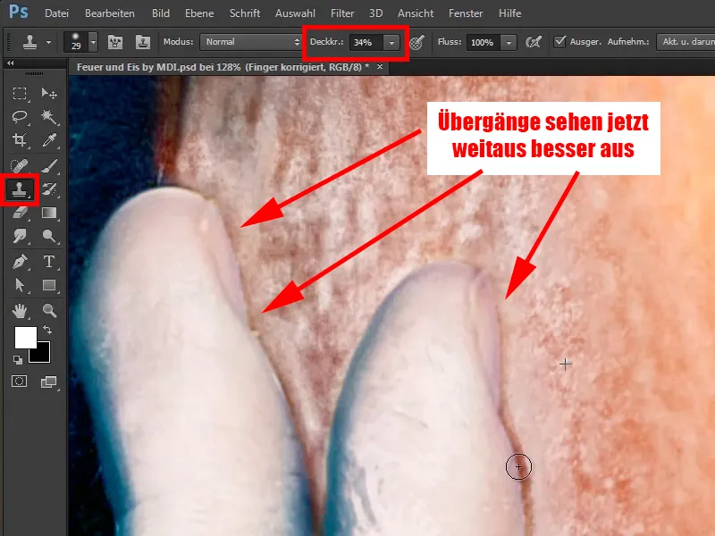
Step 38
You can make the tip of the brush a little smaller and keep pressing the Alt key to pick up, paint, pick up with the Alt key and paint. You have to be careful that some areas do not repeat themselves too obviously. In other words, you shouldn't always record something from the same place, but alternate a little. Move down and you are finished.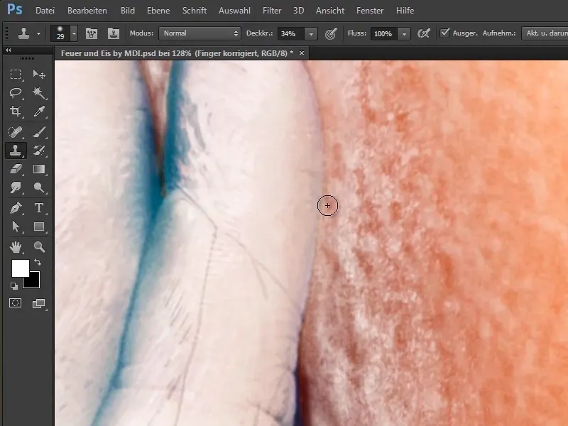
Step 39
In this way, you can correct unsightly areas and this is of course also typical of Photoshop, you can't do everything step by step when you take a picture like this. In other words, you take a few steps in this direction, a few steps in that direction, then you take something back in some places and so on. That's just Photoshop and it looks pretty good that way.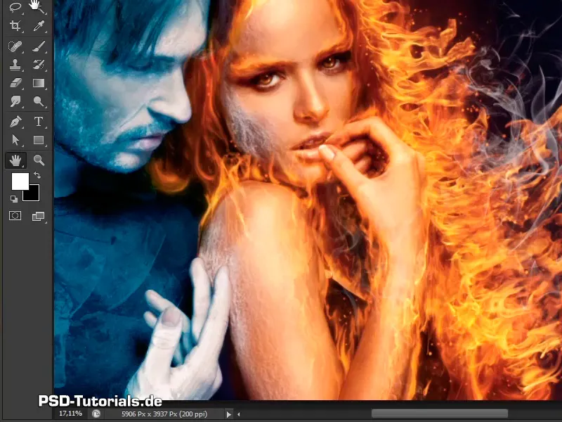
Step 40
Next, you want to add a bit of shadow to the image, so you move closer to the image, create another empty layer and call it "Shadow behind fingers".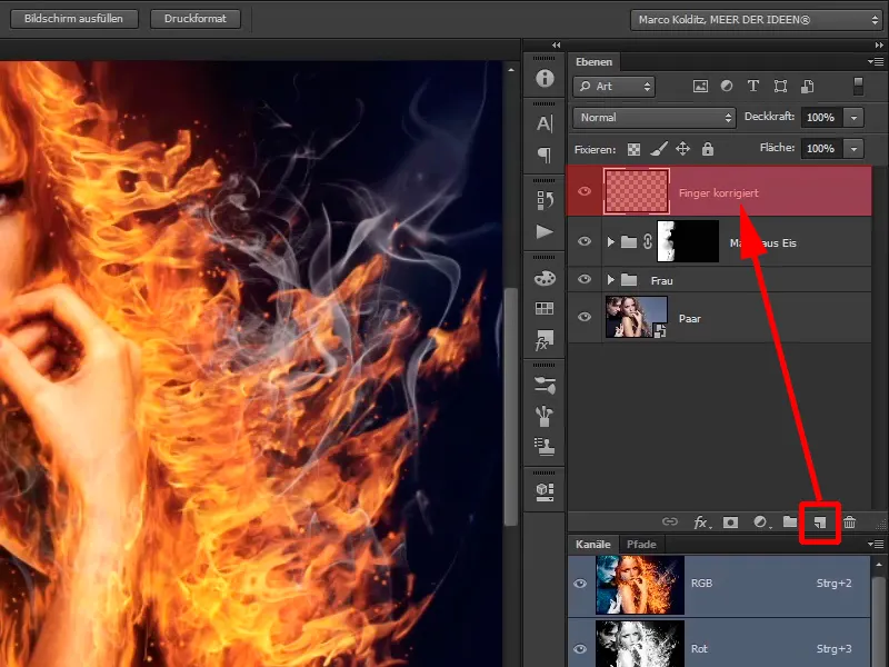
The last steps of this tutorial
Step 41
You can do this relatively easily by selecting a brush with a soft brush tip.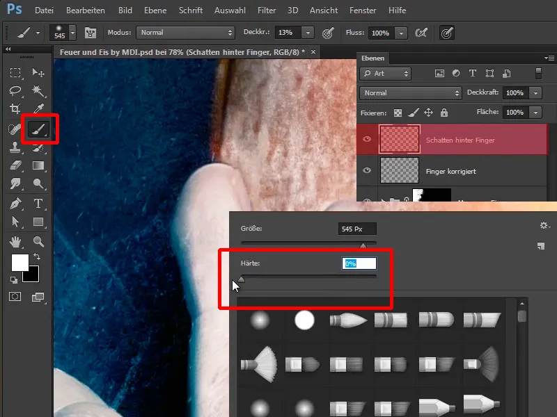
Step 42
Increase the opacity to 100%. If you have now pressed the Alt key, your cursor will turn into an eyedropper.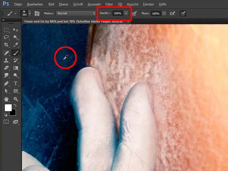
Step 43
Press the space bar to move the image back and forth and, as I said, if you press the Alt key, you can now pick up a dark shade of blue.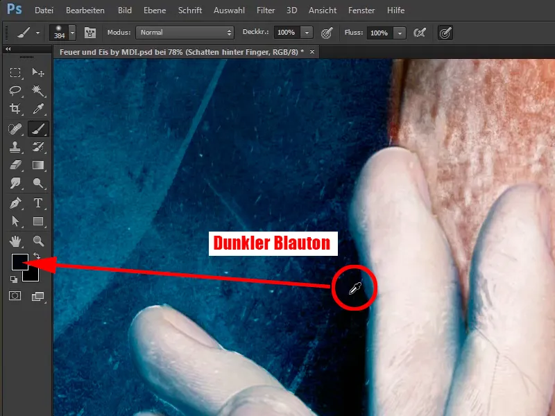
Step 44
Now just click, something like this.
Click again with a lower opacity of 31% to create a softer transition.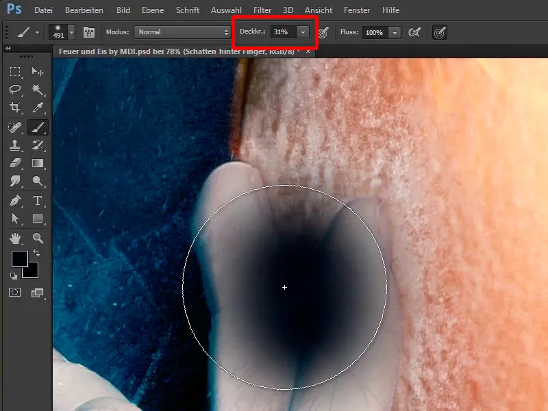
Step 45
It looks good like this, but of course it is not yet a nice shadow behind the finger, because you will now paint it into the picture. Alt-click on the add layer mask icon.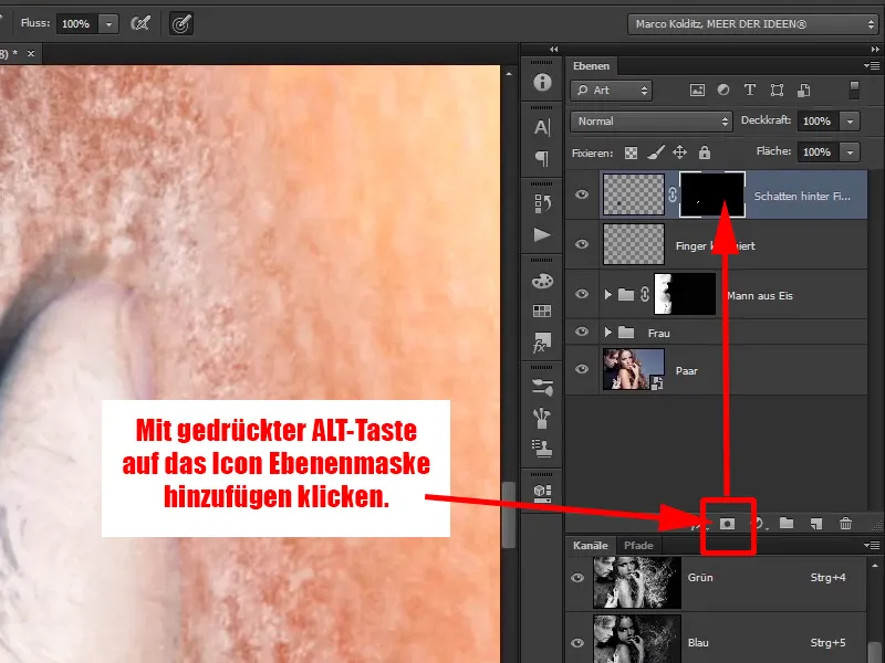
Step 46
You will now paint this shadow back in with a white foreground color and an opacity of 100%. In other words, press the X key to make the foreground color white and paint the shadow along the outline of the fingers again.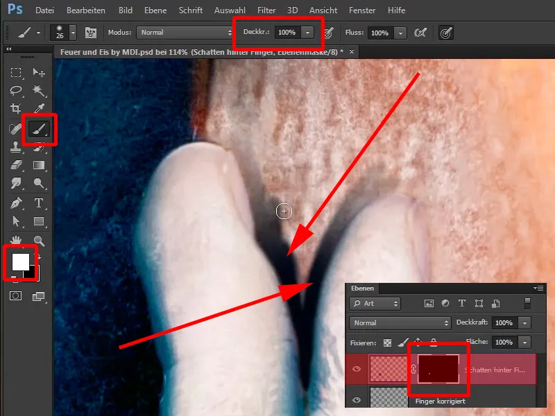
Step 47
You can paint a little coarser at the top of the fingers, make the tip of the brush larger, ...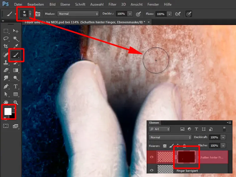
... and make the tip of the brush very small again between the fingers.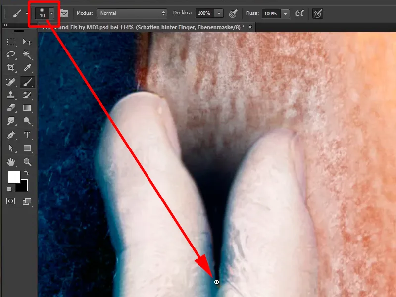
Step 48
Now you can reduce the opacity of the layer. First of all, remove it completely to 0%, go a little further out and see what happens when you play with the opacity. At an opacity of 70%, it looks quite good.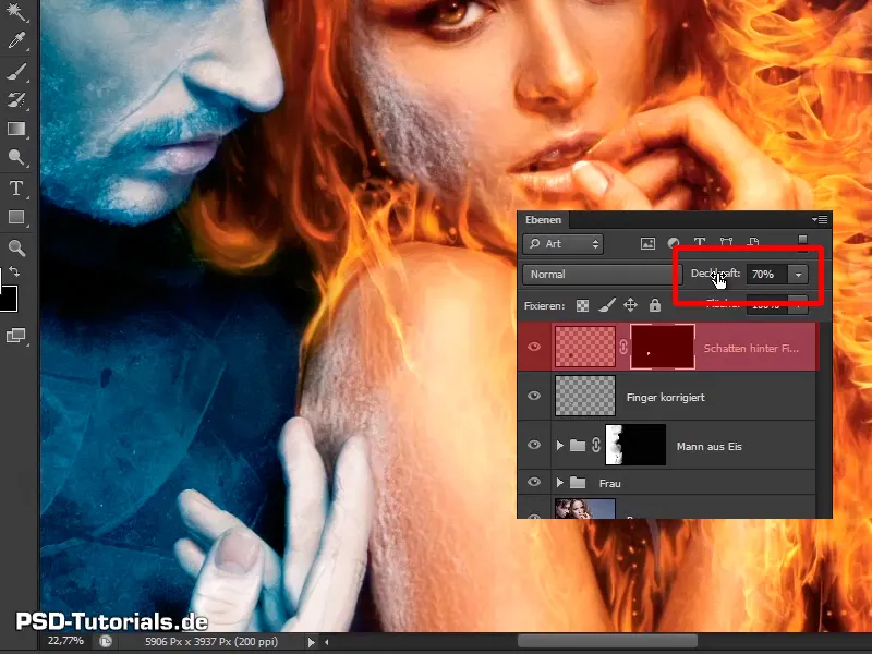
Step 49
You can now use the layer mask, a soft brush, a black foreground color and a lower opacity of 43% to take something out.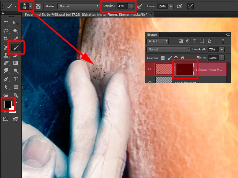
Step 50
It looks quite good like this; set the opacity of the layer to 65% again. You have now added a small shadow and that's the end of this tutorial.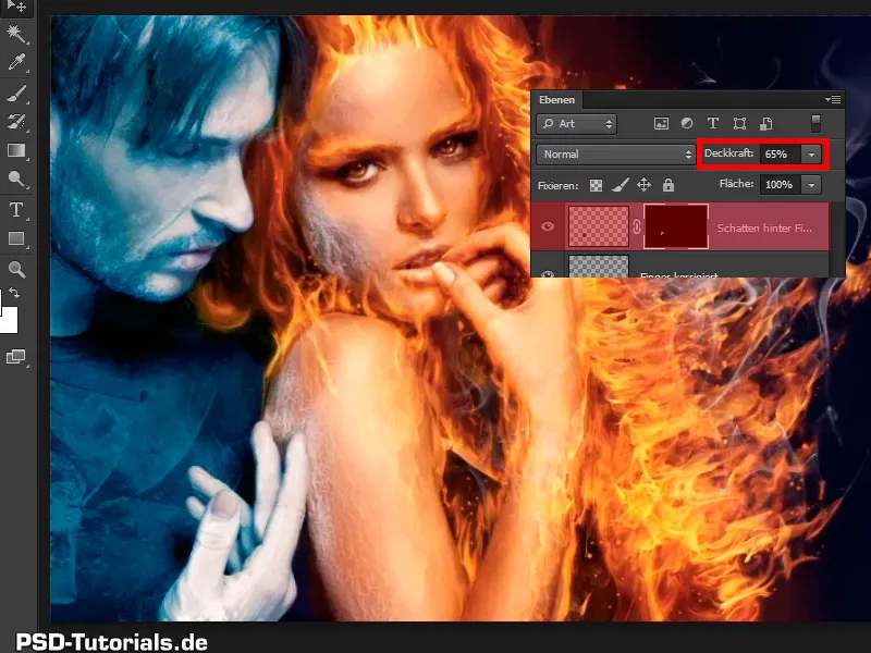
Step 51
The next tutorial is about the color look in the picture and about icy fog.