Welcome to this tutorial. As we inevitably approach the end of the year, one topic is coming to the fore: calendars.
Today I've brought you a workshop that will equip you with the tools you need to make really good calendars.
What can you expect? We will go through the following stages:
- Project presentation wall calendar DIN A3 landscape format
- Where do you get a usable calendar template?
- Working with drawing formats, color fields and sample pages
- Designing the calendar using the split-screen method
- The right choice of images and text elements and the use of different fonts
- Creating a fourteenth page for the company portrait
- The correct export from InDesign
- Final document preview on the print shop's website and submission of the order
- Unboxing and conclusion
We start with the template. Where can I get an up-to-date template? What peculiarities do I need to consider?
We will then design the calendar together from A-Z. We will create formats and color fields and use the interplay of illustrated key stimuli in combination with typographic effects. We will discuss the correct export from InDesign and then send the product to print. You can contact your trusted print shop, I'll go to viaprinto.de.
And then we'll see whether the printed version looks as good as it does on the desktop and whether it makes a real eye-catcher on our office wall.
.webp?tutkfid=66418)
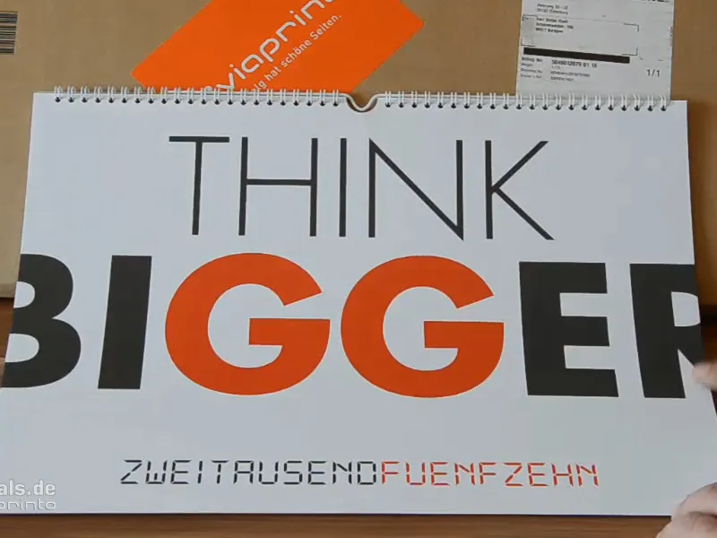
We use a simple typographic effect on the cover page. THINK BIGGER - we want to go beyond ourselves and do something that doesn't fit into the frame. That's why the letters B and R protrude beyond the page and are cut off.
On all monthly pages we have a two-part layout, a so-called split screen, with an image on the left and the typographic part on the right. The combination of image and typographic elements has a very special appeal and the two elements emphasize each other.
The individual pages are characterized by homogeneous, pastel shades, all beautifully flat in line with the trendy flat design, with the classic orientation towards corporate and business customers with motivating slogans. We have the 12 months and a final page with the company portrait.
The interplay of image and text makes it the ideal gift for business partners, investors, colleagues, employees, grandma or friends. We simply want to suggest a bit of motivation every month anew and in this sense we simply start with the template.
Here we go: Steps 1-10
Step 1
Where do we get the template? At www.viaprinto.de.
viaprinto is a print shop that provides us with the calendar we need as an InDesign file.
We select the Wall calendar product on the start page. Then we select the DIN A3 landscape format on 170g/m2 paper and choose 14 pages, because we want to attach the company portrait.
Then, of course, you can also choose the print run. There are no finishing options for 50 copies. This is only possible from 100, where you can then choose UV varnish, matt, lamination, etc. From 100 you can give the whole thing an extra kick and also reduce the unit price.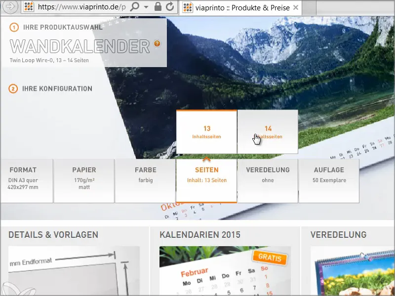
Step 2
Then we scroll down and find Details & Templates and Calendars.
Details & Templates is quite interesting, because here we see the dimensions and get various document information, including a reference to the spiral binding and information on the distance we need to keep to the top. There are also details on margin elements, safety margins, image quality, fonts, etc. Numerous tips on the correct creation of the working basis can also be found on the help page for creating calendars.
However, we don't need all this information at the moment because we will be pulling a fixed template from the server. If you click on Details & Templates, you will get a file without a calendar.
What we need is calendars for 2015. There are various designs, some of which are very clever and exciting layouts. We have already decided on the A3 landscape template, so click on Download and save the file.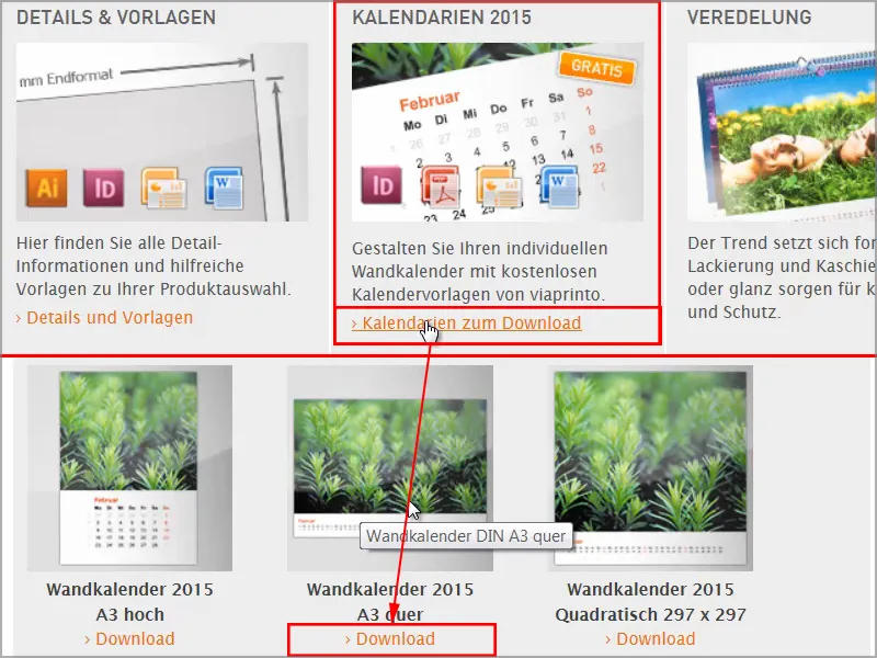
Step 3
Then go to your folder directory, right-click on the .zip folder and select Extract all.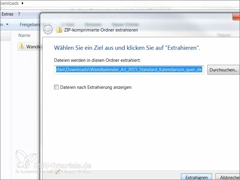
Step 4
Here we have the file "Wandkalender_A3_quer_2015.indd". There are also templates for Word, as a PDF or as a PowerPoint presentation, but no other file is as easy to work with as InDesign.
That's why I simply drag this file into my InDesign window.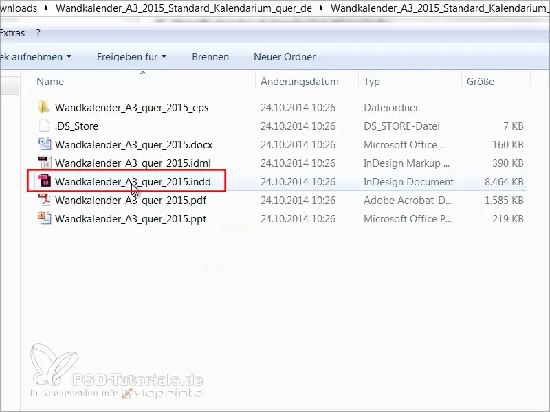
Step 5
When working with other people's files, it's a good idea to get an overview first, so let's take a look at the layers:
We have a "Calendar" layer and "Your layer". The lock in front of it means that the "Calendar" layer is locked. However, as we want to change this, we unlock it by clicking on the lock.
And if we open the "Calendar" tab, you'll see that it only says "2015". We can delete that because we don't need it.
If I go one page further and open the "Calendar" tab, we can see that the individual days are on the calendar layer and our design layer is "Your layer", which is currently still empty.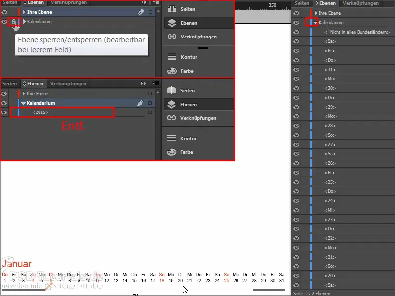
Step 6
Then we look at the color fields.
There are already two. However, since every company has its own colors as part of its corporate identity, we also go to load color fields first - and this is typical Adobe: the more important the function, the smaller the button.
Then we open this .ase file and our color palette is already enriched with lots of CMYK values.
Step 7
Next question: Are there already paragraph formats? No, and no character formats either, which is a bit of a problem because we don't want to change everything individually. The advantage of formats is that you can make changes to the entire document with a single click. If I want to use our own font instead of the default font, I don't want to change everything manually.
Since there are no preset formats, we use a trick.
I click out and open the search and replace dialogwith Ctrl+F. I click on the inconspicuous Search format window and the Search format settings dialog opens.
Under Basic character formats, I enter Arial as the font family with the font style Regular and the font size 30Pt.
And I am also looking for the character color red.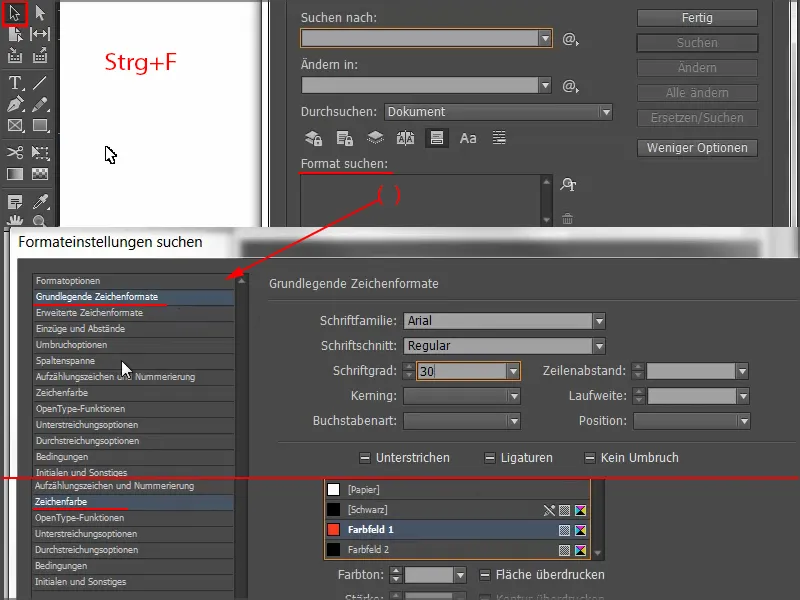
Now we see the list of parameters for what we want to search for under Search format.
Then we click on Replace format, and a dialog opens again where I can define that everything that is selected should be changed to a new character or paragraph format.
I select New character format, name the month, and under Basic character formats I select Aller in Regular with 30 pt as the font family and I want our house red as the character color.
I confirm the whole thing with OK,...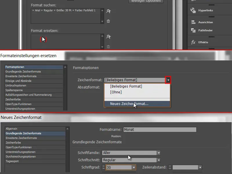
... and now take a look at "January" below to see how it changes as soon as I click on Change all.
I get the message that the search is complete and 12 replacements have been made - and the month names are now in the desired format.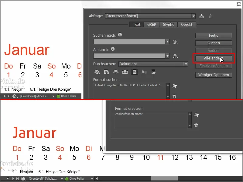
We will repeat the same for the red and black days. To do this, we look at which font size was used in each case, as we can use the font size of the template. Here we have 13.5 pt.
We repeat step 7 again and find everything in Arial, Regular, with 13.5 pt in the character color red and replace it with a new character format, which I call "Calendar red", select Aller and our house red. I confirm this and get the message that 136 replacements have been made.
And I do the same with the black days: I search for everything that has Arial, Regular, 13.5Pt and color field 2 and replace it with a new character format that I call "Calendar black", select Aller , 13.5Pt, and as the character color I take this almost black CMYK value (C=0, M=0, Y=0, K=90).
Very bright black would look too contrasty here, whereas a softer black looks more homogeneous.
Click on Change all and it is confirmed that 373 changes have been made. Done.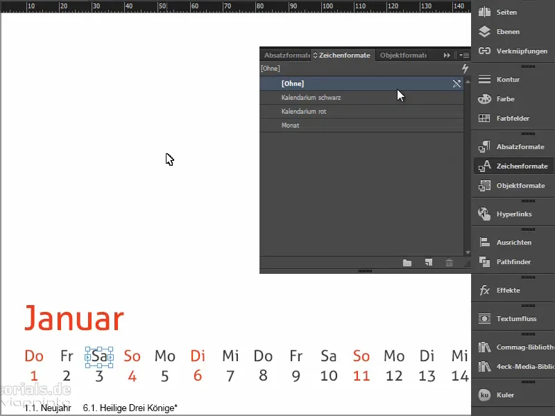
Now we have the corporate font everywhere and if something needs to be changed afterwards, just click on the formats and everything in the document will be changed. You should definitely make use of such possibilities to speed up the process.
Step 8
Of course, every page of the company calendar also needs a logo.
Let's take a look at the pages and we also have a sample template here. If we place the logo on this and apply this sample page to everything, then we have the logo in the same place everywhere.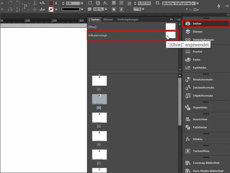
In such cases, I prefer to work with libraries. These are saved locally on the computer and can be created via File>New>Library. Then you have the files you frequently need to hand and can simply drag and drop them into the document.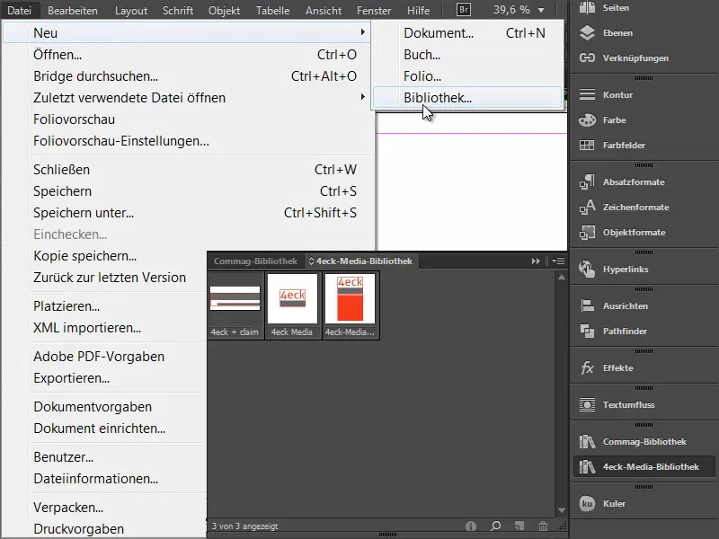
Step 9
Here is our logo with slogan. I place it on the sample page.
And then I'll pull out the guidelines that I've already prepared. The easiest way to do this is to drag the guidelines roughly into the image and then enter the exact number in the field at the top:
We need three vertical guidelines . One in the middle, i.e. exactly at 210 mm, another at 105 mm and the third at 315 mm. This defines our areas for the image and text and we also have a reference line for centering.
We also need two horizontal guide lines: we measure 15 mm from the top, as we have to allow for the distance to the spiral binding. And we draw a second one at 244.3 mm. This is our finishing line at the bottom.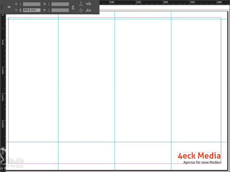
As we have created these auxiliary lines on the sample page, they will also be visible on the normal working pages.
But we now also have these guidelines and the logo on the cover page, even though we don't need either guidelines or the logo there.
So I drag the blank master page onto page 1 and everything disappears.
Step 10
Then we start designing the cover page. I take a look at the template: We have three text boxes, in Futura, 250 pt and in Futura Bold in 360 pt respectively.
I draw a text field, aligned nicely to the bleed on the right and left, select Futura in Light, enter the size 250 pt and use a very soft grey as the color. I use it to write "Think", mark it again and activate the capital letters, center it and that's it.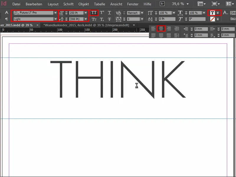
Then I drag this lettering downwards by holding down the Alt+Shift key, which gives me a duplicate of it.
I write in "BIGGER", select and enlarge it to 360 pt and enter Bold for the font style. As the text field is not big enough for this font size, I make it bigger and use the guideline , which is activated automatically..webp?tutkfid=66434)
If the guide is not visible, go to View>Grid and activate the Smart Guides option under Guides. This is a very important simplification, because wherever symmetries are recognized, guides are automatically displayed.
Steps 11-20
Step 11
I select the two "GG" and apply our red color field to them.
Then I select the two text fields and move them up using Shift and the arrow keys and look at them in the preview by either clicking back and forth between the two windows or simply pressing D.
I write the lettering "two thousand and fifteen" in DS Digital in Normal, we increase the font size with Shift+Tab in steps of ten until it fits, to about 90 pt, and of course center it.
When centering, it always makes sense to draw the text field right and left exactly to the edges, then the text is really centered.
The color is still too black for me, so I make it a lighter gray and the "fifteen" in red. I then place the line.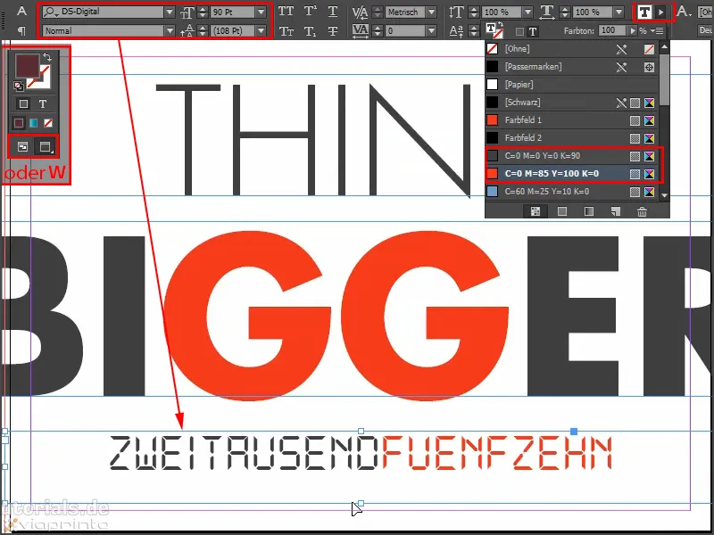
Step 12
Let's take another look at the template to see what January should look like.
Then we open the place dialogwith Ctrl+D. Click on the image material and then drag the image up to the bleed and the guide line in the middle.
Then I right-click on the image and select Customize>Fill frame proportionally.
With Shift+arrow keys we will align the image content. You always have to be careful whether you have activated the picture frame or the picture content. You can recognize this by the frame: If the picture frame is activated, the frame is slightly turquoise around it. If the image content is activated, we have a brown frame.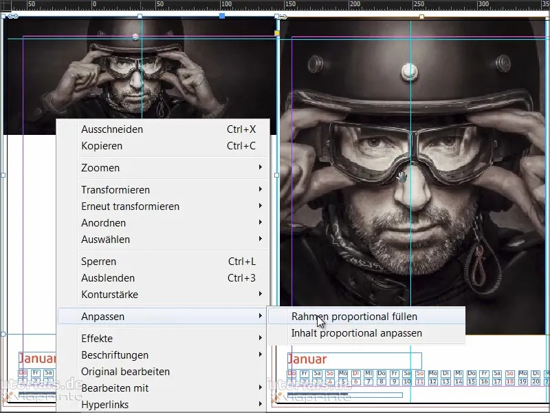
Step 13
Once the image has been placed, we draw a color field on the right. I start again at the bleed, drag it cleanly to the guide lines and select our red as the color field again.
In this context, we can also delete the old color fields that we don't need, i.e. "Color field 1" and "Color field 2".
We get an error message, because somewhere earlier we apparently missed "Color field 2" when replacing it. It is still used in the document, I assume in the footer. But we can also say here that the replacement color should be our 90% black (C=0, M=0, Y=0, K=90). We confirm this with OK.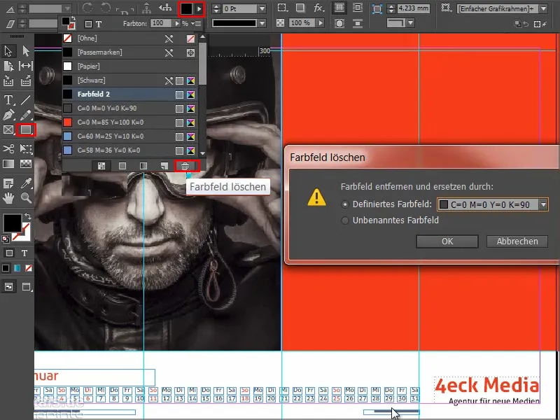
Step 14
We work with a very reduced design and concentrate on the essentials. That's why we don't need any drop shadows, flattened edges and so on. Simple, flat graphic design. We have a wonderful contrast effect here and now we're adding a white font. (Black doesn't work on a red background, nobody recognizes it).
So I draw a text field again, then I take the Paper color field and select Reklame Script as the font family. I center the whole thing and write "Business starts with visions".
Next, we need to play with the font size: "Business" gets 160 pt, "Visions" also 160 pt, "starts" is set to 100 pt and "with" gets 60 pt. This gives it a bit of dynamism.
The line spacing is still a problem because we need the two gaps to look the same. You can work this out in detail, but it will have to do here: I select "visions" and set the line spacing to 161 pt.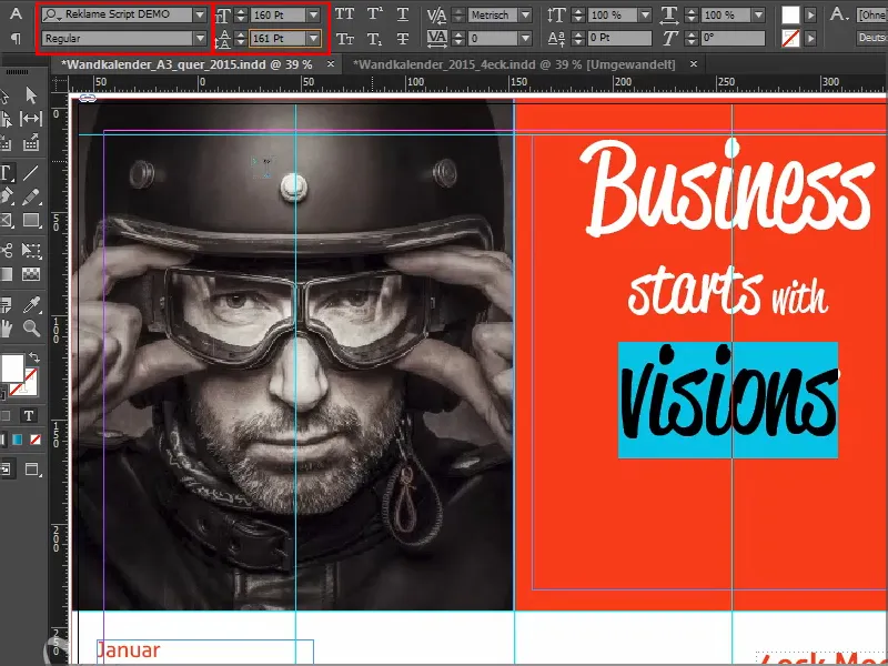
Then you align everything with the guideline and position it correctly - and voilà, January is finished.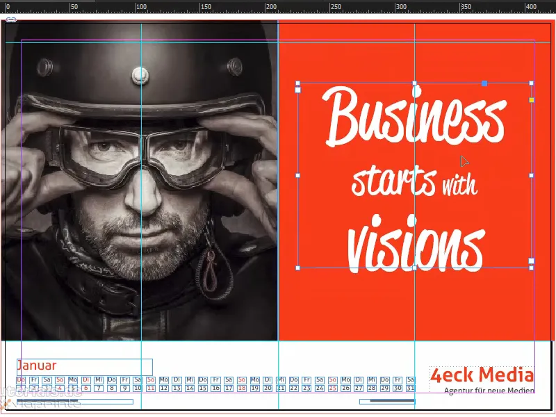
This is what it looks like when it's finished: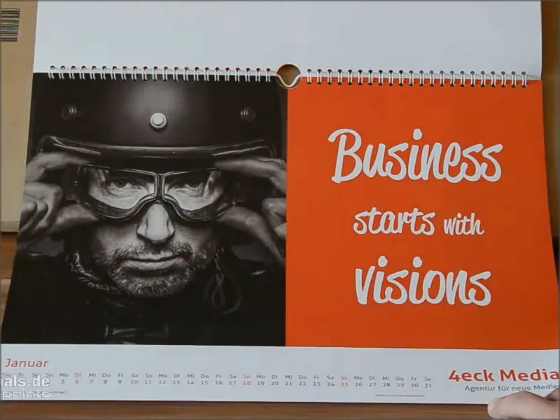
Step 15
Then we do February.
We insert and position the image as we just did. However, I have mirrored the original image here so that it looks out of the image on the left. To do this, I click on the image once and go to Object>Transform>Mirror horizontally.
Here we also have a special design feature. We have to imagine that the printer cuts at the bleed line. If I switch off the mounting area (D), then I don't want a piece of the boot heel to stick out. So I move the image to the left until I can no longer see the right-hand heel.
Then comes the new graphics frame, which I draw as before and fill the area with 20% gray.
Then I use the rectangle tool, click once on the colored area and define the dimensions: 160 in width, 23 mm in height..webp?tutkfid=66441)
I align the field to the center.
The next step is to fill it with a color, this shade of green, which harmonizes beautifully with its surroundings.
If you are looking for such tones, use the Kuler from Adobe. You can enter a search term and it will spit out various color fields that you can import directly into your color palette using this little arrow.
If you have not yet shown the Kuler in the bar, you can activate it via Window>Extensions>Kuler.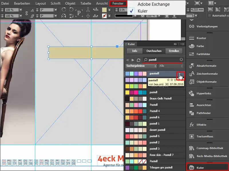
Step 16
We select this green field and go to Object>Corner options. There we set 2mm. This will slightly round off the corners.
Then we turn the graphic frame into a text frame by selecting the text tooland clicking once in the frame. Now it is no longer a graphic frame, but a text frame.
You can also check this by right-clicking and you will see under Content that the checkmark is now next to Text. If you no longer want this, you can also change it back here by simply setting the checkmark back to Graphic.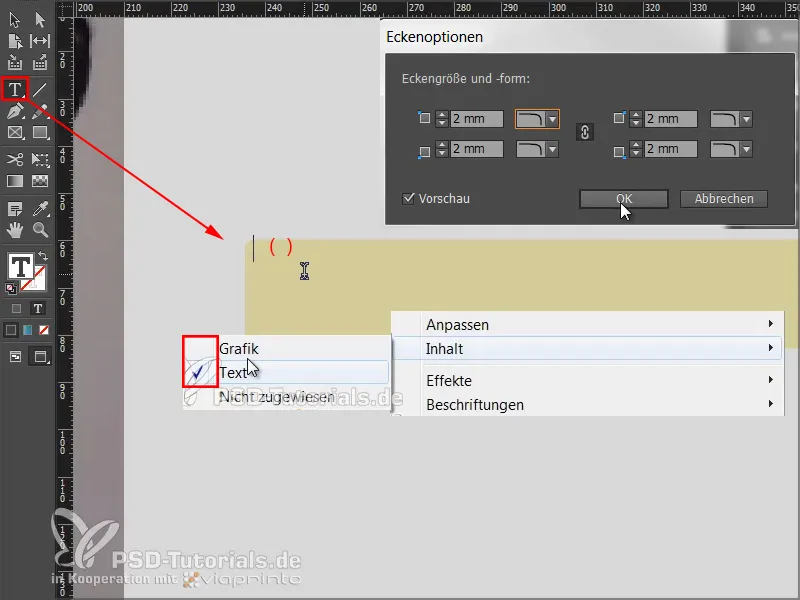
Now let's adjust the parameters for the font: Frutiger LT in Light Condensed, 50 Pt, capitals, centered, color brown.
And then we simply write in "THERE ARE".
We want to center this text within the graphic frame. To do this, you need the text frame options, which you can get either by right-clicking and then in the context menu or by pressing Ctrl+B or with the classic: Alt+double-click. Then this dialog opens, where you select Vertical alignment: Center.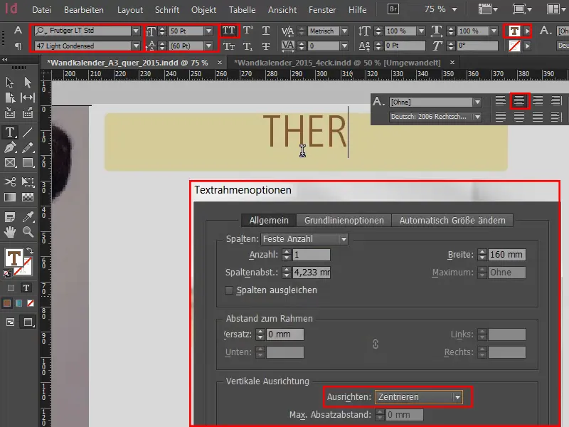
Step 17
I move the whole thing upwards, create a clone by holding down the Alt keyand drag it downwards on the axis by holding down the Shift key. I do the same again and then get green guides as soon as the distances are symmetrical.
Then we rewrite the text - always format first and then copy, otherwise we have double the work.
Now we will apply a classic rule in graphic design: We will use the "law of proximity". This means that elements that are grouped together are perceived as a unit.
We have an appeal at the top and want to express a solution at the bottom. So we create a certain distance at the top and write "Stop Doubting" in the next line.
I underline the statement by demonstratively putting a period at the end. "And period" - in a way, this is an irrefutable statement..webp?tutkfid=66445)
Step 18
We change the font style to Bold Condensed and the color to white.
We copy the last line again, drag the copy down and rewrite the text as "Start Building". Make sure that the spacing is really identical.
To measure the spacing, I always like to draw a small rectangular frame at a reference point and then take it with me to the other points to take measurements. I then delete it again, which is the quickest way.
In the last step, I create another duplicate, delete the text and convert the text frame back into a graphic frame using the technique described above. I also remove the corner options and select 90% black as the fill color.
I rotate this field a little. As I want it below the text fields, I click on the text field and right-click to bring it to the foreground..webp?tutkfid=66446)
I can adjust the size a little.
Then I make sure that it is aligned to the center, copy and drag it to the bottom.
This page is finished and I really like the flat look and the reduced message.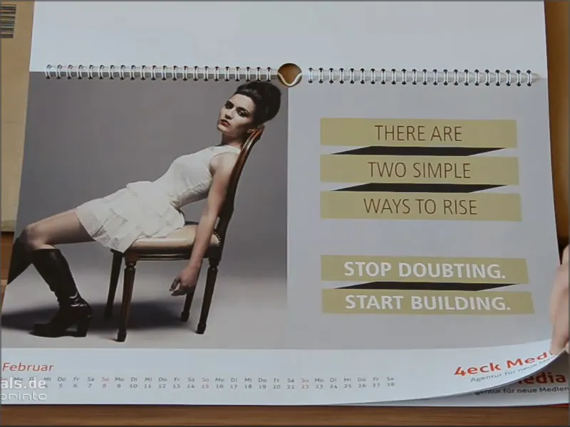
Step 19
Let's move on to March. We have already placed the image in our working file and I have already drawn a rectangular frame. I want to fill it with a really deep black.
But not all blacks are the same. Up here in the color palette we have various shades of black.
Some people use registration marks, but that's not a color for printing, it's just for the precise alignment of printing plates. Small crosses are printed - this is not a color.
With black, we have cyan, magenta and yellow each with zero and a K with 100%, but even that doesn't really come across as black in print. Why is that?
I'll show you in this comparison: Black in comparison.
We have registration marks. Then one more, this is the black that InDesign has predefined. But compare this black with the deep black 1 below it . Deep black 1 is significantly deeper because 40% cyan and 100% black have been added.
But it goes even further: Deep black 2, which still has 50% cyan, 50% magenta and 100% black.
If we look at them all, we can clearly see that we have a very, very deep pure black down there, and that's exactly what I want.
So let's create a new color field and enter C 50%, M 50% and K 100%. Click on Add and then on OK.(1).webp?tutkfid=66448)
Try to see how black your black is when you can see print comparisons. If it is not black enough, simply adjust the values and do not use the predefined value from InDesign.
Step 20
Then we draw a text box, make a right-aligned alignment, increase the font size to 90 pt, color in white (paper) and choose Devil Breeze in Light as the font.
We mark the text and set the whole thing in capitals and that's it.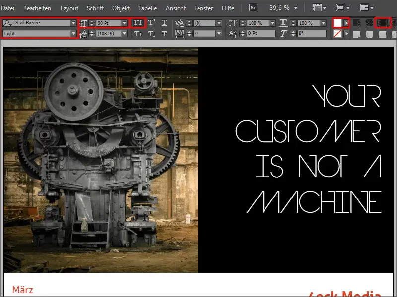
This is what it will look like when it's finished: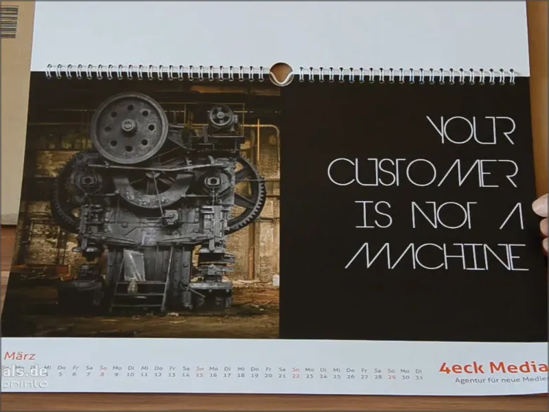
Let's move on: Steps 21-30
Step 21
Next comes April. On the left we have a retro-looking studio, on the right very soft tones, the look is almost feminine.
I draw a graphic frame, fill it with white color (paper, take the text tool and write the text "OPTIMIZE YOUR" in Myriad Pro in Light, 54 Pt, in capitals, and the 90& black.
I then right-click in the text frame options and define the spacing; with the preview box activated, we can also directly observe how the text gains distance from the frame.
We don't need the alignment at the moment, but we can simply set it to Center. We confirm this with OK.
Double-click on the handles to set the frame size so that the words fill the frame.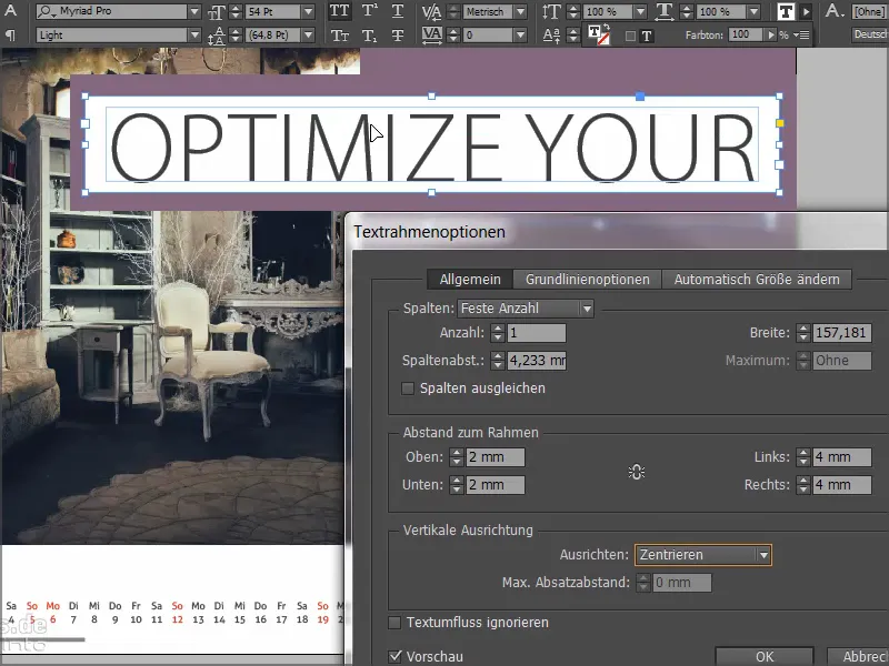
Now we simply move the text to the desired position in the top right corner and make a copy again with the Alt key. I write "Work-life balance" in the new field, set the font style to semibold and adjust the frame.
Then I copy the first line again and write "For better results". That's how we get these headlines that look great on adjusted color frames. And in such a way that we always have symmetrical spacing..webp?tutkfid=66452)
Step 22
Now we want to create a symbiosis between the two circles. I take the ellipse tool, click once and enter 75 by 75 mm as the values.
I have a circle that you can't see yet until I give it a color. I create a copy of it and use a second color.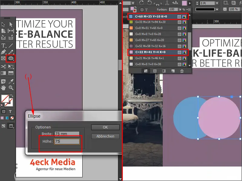
And now we want to create an intersection of the two circles. To do this, we use the blending methods from the Effects panel: Multiply Negative..webp?tutkfid=66454)
This is what it will look like when it's finished: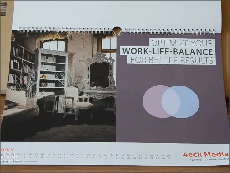
Step 23
For May, we take the image and text field from the template to the clipboard with Ctrl+C and paste them into the new document via Edit>Paste to original position.
Then I simply select the rectangle tool, click once in the document and enter the values 181 by 181 mm.
We fill the frame with black.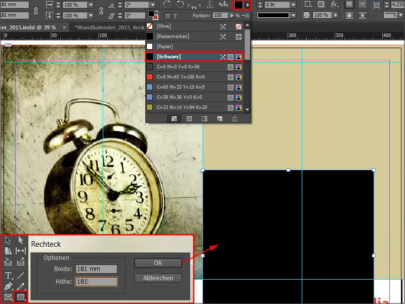
Step 24
Then we use one of those great blending modes again, this time Soft Light. This makes the field very soft.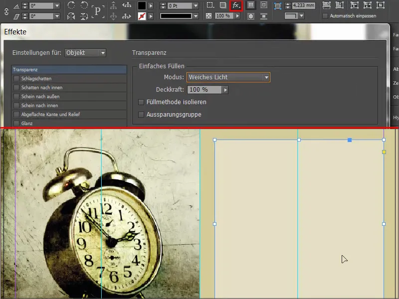
Step 25
The pen tool has an option to delete the anchor point. Click on the anchor point at the top here and the square becomes a triangle..webp?tutkfid=66458)
Step 26
I pull up the text field and we select the Charlemagne in Bold, right-aligned, 57Pt in capitals. We use this to write our text and change the third line to a shade of blue.
Double-click on the frame of the text field to adjust its size exactly to the font. We move the text field slightly to the left so that we are not too close to the edge. We don't want it to look squashed or squat.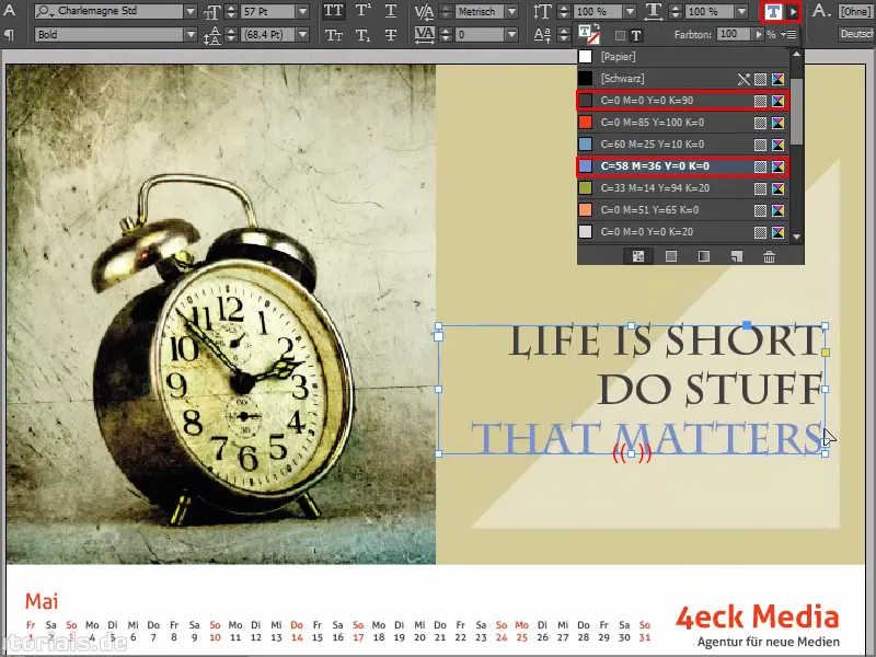
This is what it will look like when it's finished: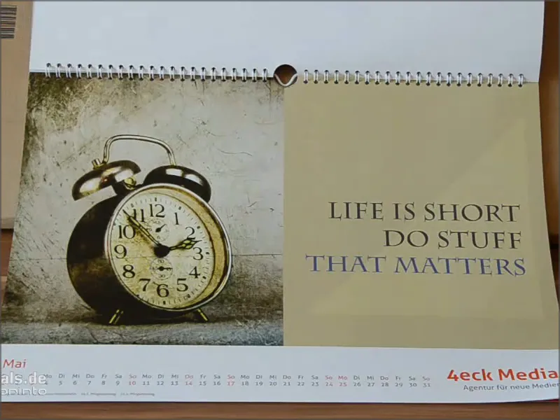
Step 27
In June, the month with the shortest night and the longest day, we ask about the viewer's personal mood and have added a very cool hover effect to the answer options, which you will be familiar with from websites: Happy changes color. This simple structuring is particularly effective in combination with the very expressive photo.
The image and color background have already been created and now it's time for the text. I use the text tool, open the text field, select the font Aller in 86 pt in white and write "Welcome".
I reduce the second line to 16pt and remove the capitals. The whole thing is centered.
Then we draw a graphic frame with a white outline (paper) in 3 pt, activate the corner options again via Object and set them to 3 mm rounded.
We click once in the graphic frame with the text tool, set the size to 30 pt and write "Happy" in paper or white.
Double-click to open the text frame options again and center the text in the field.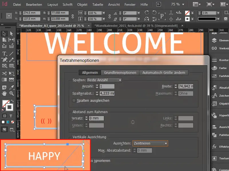
We position the field on the center line. Then I copy the field, paste it and position it on the other side of the center line. Here I'll change the text to "Unhappy".
Then I'll move the two fields so that they both have some distance from the center line. With Shift+arrow key to the left, I click 3 times in steps of ten. I do the same to the right, also 3 times.
I select the "Happy" field and set the color for the hover effect.
Finally, I drag everything a little deeper.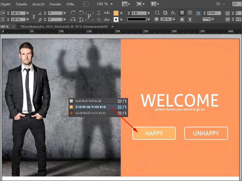
This is what it will look like when it's finished: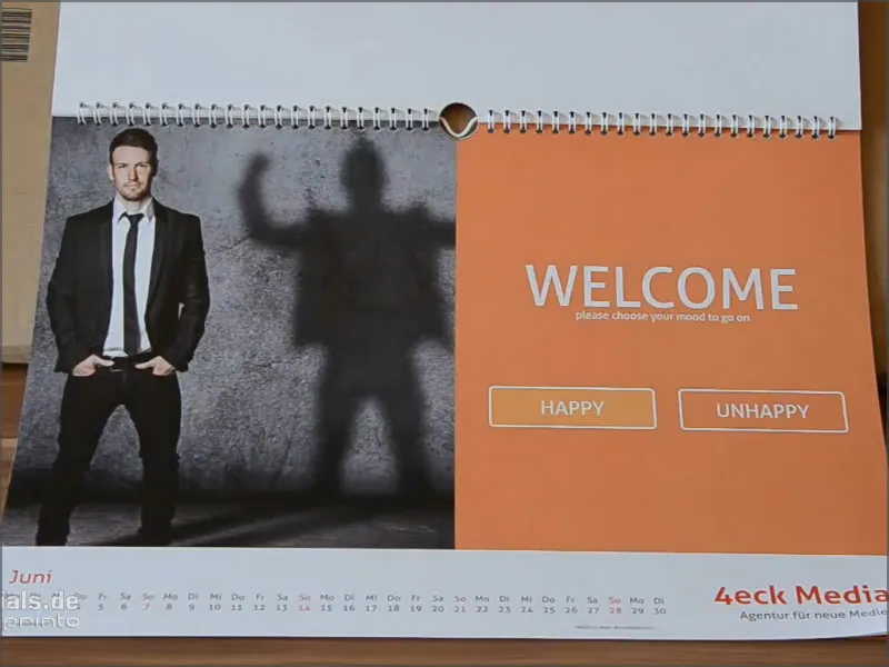
Step 28
We have a very subtle shade of black of 20% in the background.
For the circle in which we then place the typo, click once in the area with the ellipse tool and set the values in the control panel to 150 for both width and height.
Give the circle the color paper and center it on the guides.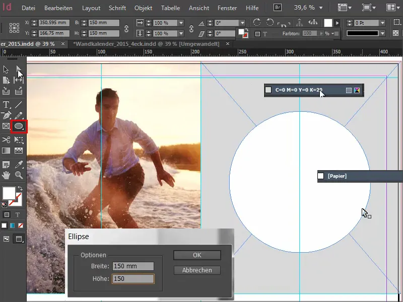
Then we draw a text field with the font Elephant Regular in 67Pt in capitals, centered. The special feature here is that the individual lines have different font sizes, namely 67, 60, 89 and 121.
The line spacing has of course been adjusted accordingly so that we have visual symmetry. You can use the very simple rectangles that I showed you earlier.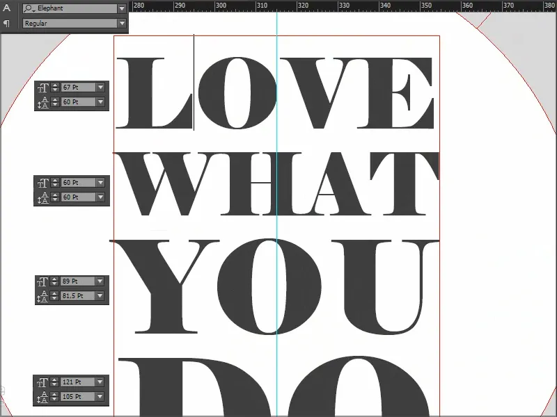
I select the text field and, holding down the Shift key, the circle behind it and use Align to center it both horizontally and vertically.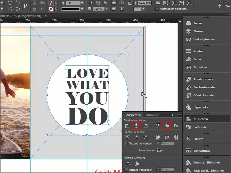
This is what it looks like when it's finished: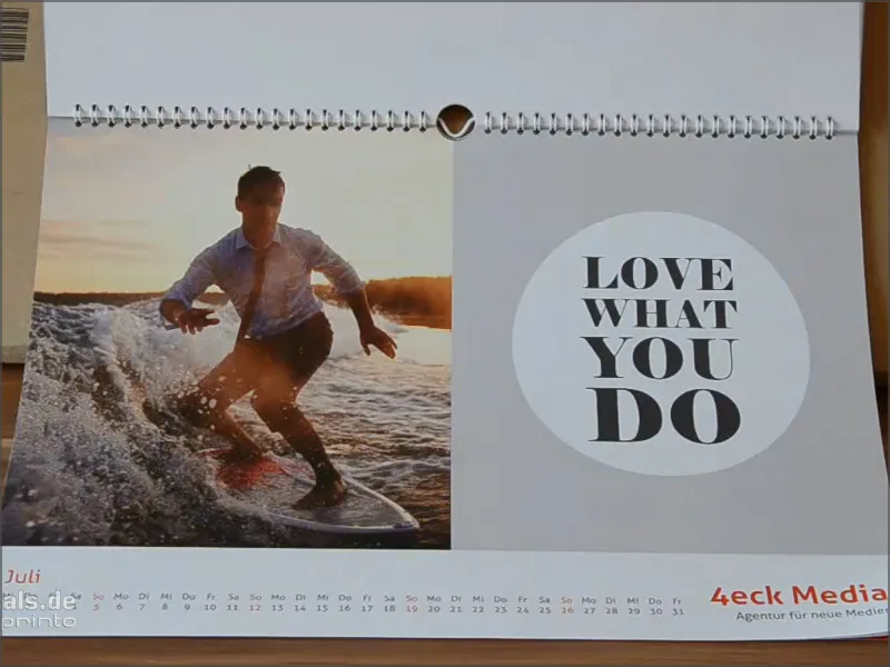
Step 29
What I particularly like about the August leaf is the image in combination with the color scheme.
In case you find it difficult to mix the color manually: Here it's 27% magenta, 65% yellow and 20% black - then you can simply take the eyedropper tool and select a spot color from the photo.
This dashed line indicates that the text is currently grouped. I can ungroup the text by right-clicking. Then we have three text fields and a graphic box at the bottom.
What has been done? We have only drawn a rectangle, set flattened corners and then created a subtle outline. Less is more" applies to the outline, so I choose Narrow - Narrow.
You could also use triple, but then you might have to adjust the pt sizea little (e.g. to 5 pt) so that it really comes into its own.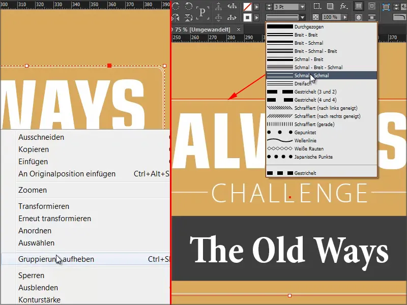
This is what it will look like when it's finished:
Step 30
Something very cool awaits us with the September sheet: The photo on the left is no problem, but on the right we have a very delicate effect, the dashed lines that fade outwards - with the message: Stay focused.
The text field is actually just a mirror image of the form in the photo, a contrasting effect, concentrated on the core message.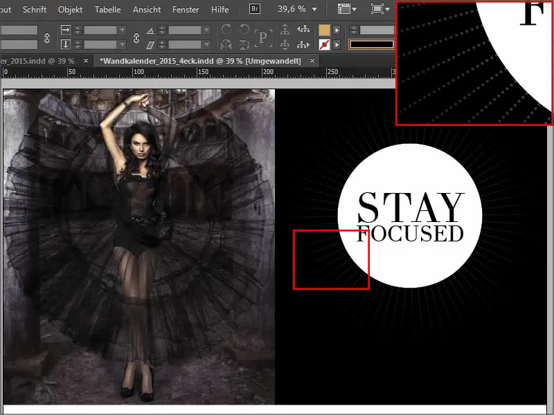
We draw a line in white, Japanese dots with a width of about 2.5 pt. I start in the middle and draw it to the bottom right. Zoom in to take a closer look. Use Ctrl+O to zoom out again.
Then we'll change the reference point. It's currently centered, of course, but we want it at the top left.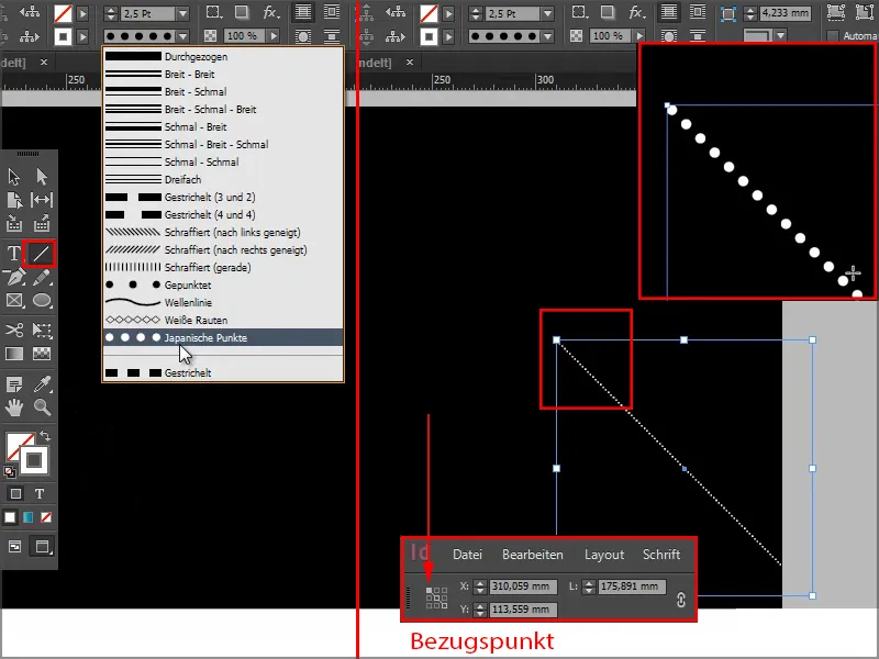
Keep at it: Steps 31-40
Steps 31
And now we go to Object>Transform>Rotate and set 5° with Preview so you can see what happens and click on Copy.
We now have two of these point lines and can obtain further copies via Object>Transform again - Sequence or the shortcut Ctrl+Alt+4. So we click on it as often as necessary until the circle closes.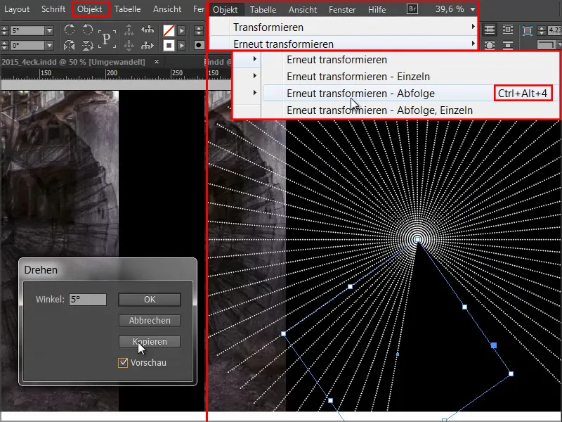
Step 32
I will lock the photo on the left as well as the black background image on the right by right-clicking.
And then I can easily draw a selection rectangle over all the individual elements and put them into a group.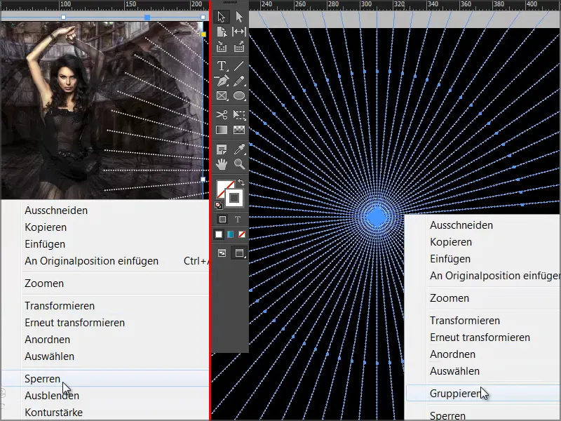
Step 33
And now I will apply the soft gradient edge via the effects panel. The type should be Radial.
The effect is still a little too strong for me, so I'll move the middle slider a little to the left. We can confirm this at around 18.5%.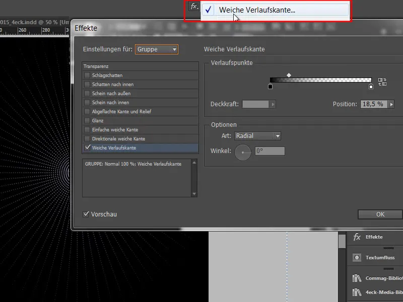
Make sure that you don't get any stripes in the photo - by placing the photo layer over it.
Step 34
Next, we just need to insert the white circle with the lettering and place it in the middle.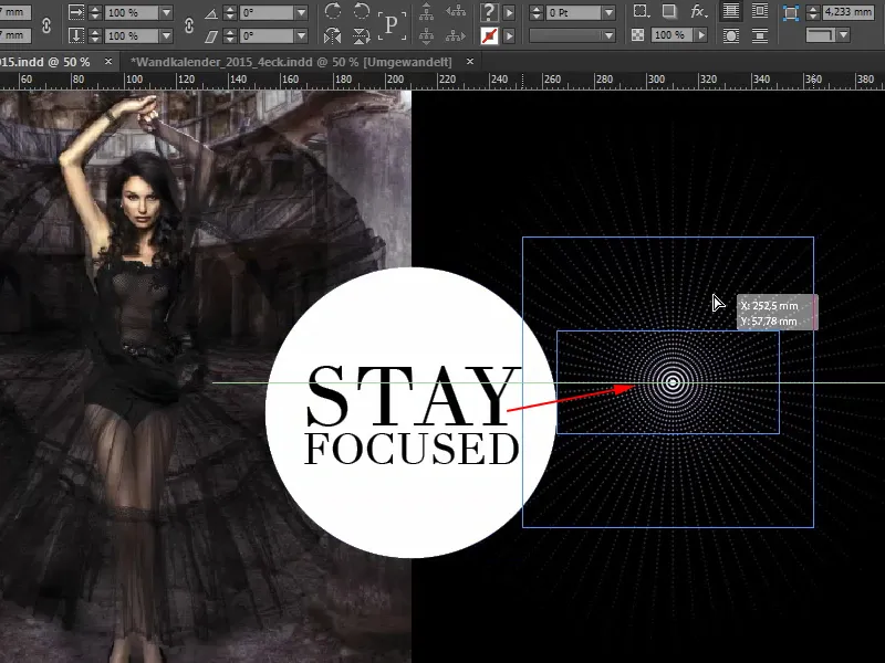
This is what it will look like when it's finished: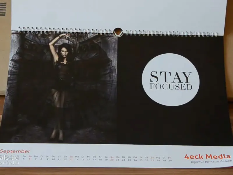
Step 35
The October sheet is simple - the font is Myriad Pro in Light and then all you have to do is add the circle and line..webp?tutkfid=66479)
Step 36
The November design is nothing more than drawn-on rectangles with text fields. You can find washing instructions on all kinds of textiles and this is based on them. Simply copy with Ctrl+C and paste into the original position in November..webp?tutkfid=66480)
The color is also important here, this pastel shade of green, which you can also find somewhere in the look of the photo. In any case, keep it soft, nothing gaudy.
Step 37
I used the eyedropper tool to get the color tone of the right-hand field from the curtain in the photo.
We draw another text field, select the Aller in Regular, font color Paper, 90Pt.
For "Solution", we remove the color and instead add a white outline, which must be kept very delicate, maximum 2 pt. If you work with thin lines, this must still be visible in print. But with 2 pt we are absolutely right.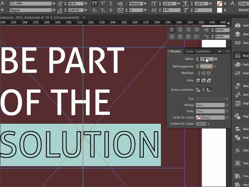
Step 38
Then we'll simply draw another white line with the Shift keyheld down so that it stays nice and straight, solid, 2 pt.
We adjust the size of the text field exactly to the font by double-clicking so that we can align the new line exactly symmetrically in height.
Then we want a checkbox. To do this, hold down the Shift keyand draw a square in white, again using the 2pt.
I click once with the text tool. Then I set the font size to 72pt, the color to white and then I go to Font>Glyphs, enter the Wingdings at the bottom and look for the checkmark. Double-click to insert it into the document.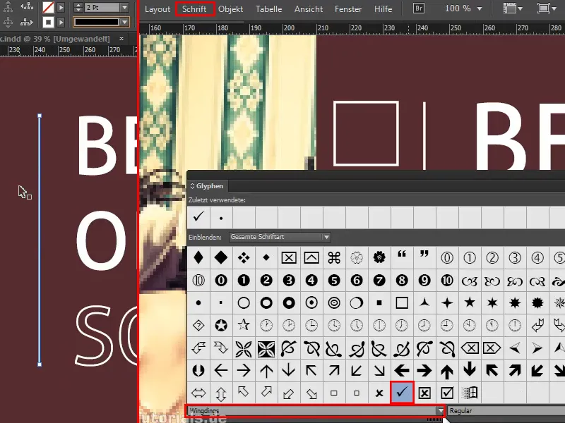
If the tick does not appear in the text field, the text field is a little too small, I simply drag it to the correct size.
Step 39
Pay attention to the distances of the checkbox to the line and the line to the text - these should of course be even. I drag the line a little to the right and the guide line shows me when it fits perfectly.
You can take a look at the whole thing by pressing Ctrl+0. You will then see that the distance between the checkbox and the image should also be identical to the distance between the checkbox and the line. You probably won't notice this straight away, it's more of a subconscious perception where you say something is right or something is wrong. So if we want to have it tidy, then ...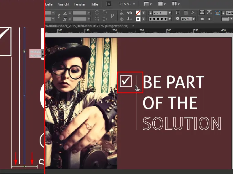
... we first lock the burgundy background, select the checkbox, line and text field and move everything a little to the right. I'll do this purely visually, you can be a little more precise.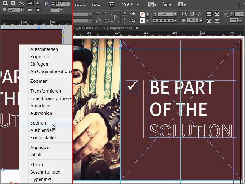
And then December looks like this: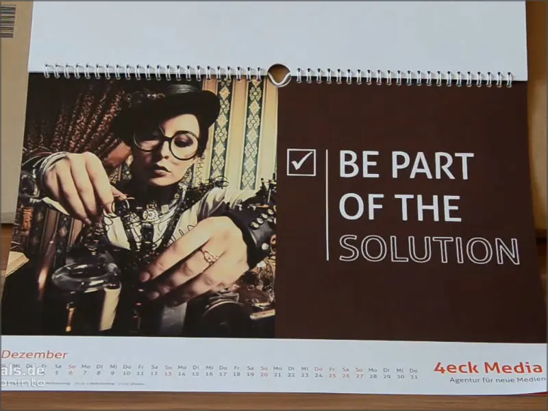
Step 40
Finally, let's take a look at the pages. We add an additional page at the end of the document, on which we add the company portrait.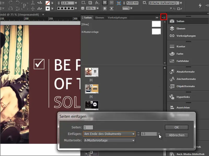
The last steps
Step 41
We get the sample page with the logo again, but we simply correct this by dragging the page withoutonto it.
Then I drag&drop the logo from the library, rotate it by 28° and draw it really large.
Step 42
I copy the address data from the template and click on Paste in original position.
And the page is ready. When the calendar is printed, it will look like this: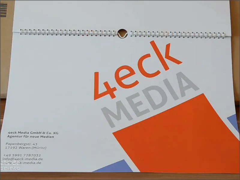
I save the whole thing first.
Step 43
Now, of course, we also want to print the calendar. I'll do that with viaprinto.
We go to Help>Instructions>Create source documents. And there I select PC in my case.
We get Adobe InDesign for PC and click on it.
There we find a great help guide on how to create the document correctly and, above all, how to export the document correctly.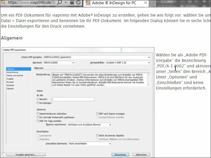
We'll do that together right now.
Step 44
We will now open the dialog via File>Export and give the print file a name.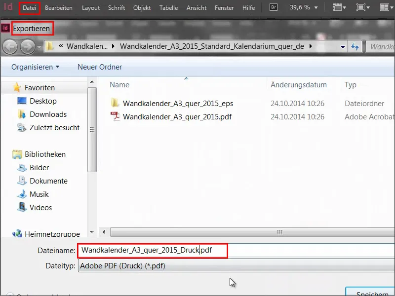
Step 45
The export dialogwill then open and we will start to enter the parameters. For General the following values:
- Default: PDF/X-3:2002.
The compatibility is automatically set to Acrobat 4.
- Pages: All
The options are not relevant for us, we can deactivate them all.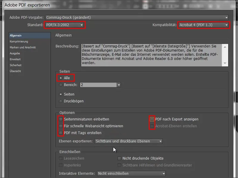
Step 46
For compression, we select the bicubic recalculation to 356 and write "534" in the field below.
- Compression: Automatic (JPEG)
- Image quality: Maximum.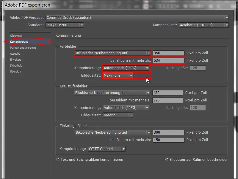
Step 47
And in the Marks and Bleed tab, we select Use document bleed settings because we have already received the 3 mm bleed in the template.
We could also do this later, but then we would have the problem that we have not drawn the images all the way to the edge.
So simply activate this checkbox and everything will be fine.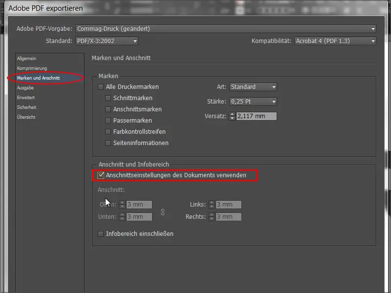
Step 48
In the output we select Convert to target profile (keep values) and as target we select ISO Coated v2 300% (ECI). This is the correct setting for coated paper.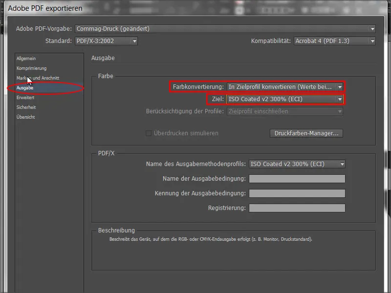
Step 49
In the advanced dialog, we select the default setting for Transparency resolution : High resolution.
If this checkbox is activated underneath, please simply deactivate it.
Then we go to Export and get a PDF.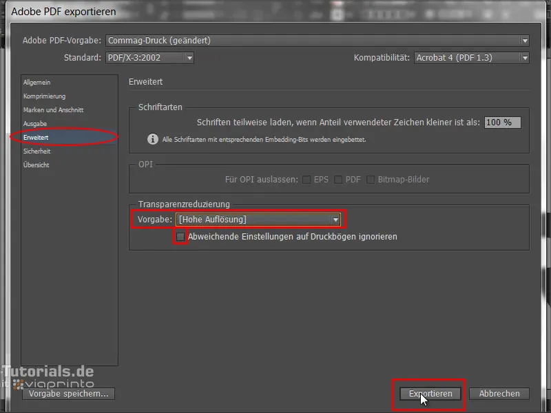
Step 50
Back on the viaprinto website, we go to Upload documents.
Then I select my PDF and the upload begins. It takes a different amount of time depending on the speed.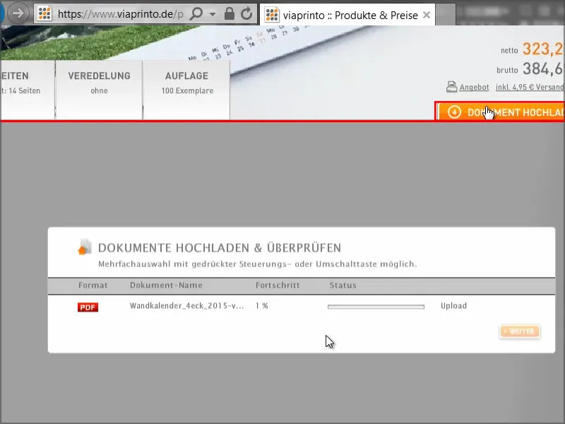
Step 51
Here we have the calendar and can use this really practical preview function to see exactly what the calendar will look like.
We can see the spiral binding very clearly and we can switch through the pages at will. Everything looks great..webp?tutkfid=66498)
This preview option is worth its weight in gold. I'm sure you've also sat there and sent off an order without knowing whether everything will fit. That doesn't happen here.
Step 52
It is also very practical that we can save the document for later. To do this, we go to Save and place it in our shopping cart.
Then we have the option of going to Documents - I first have to click Save + Next...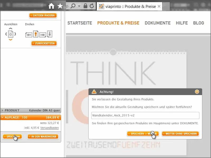
... and go to the document manager. There I select the wall calendar, go to Information and then to the Publish tab. Here I can copy the link to the clipboard.
When I click on it, I have to confirm a few legal things, but then I have the link in the clipboard.
I can now paste it into a new tab in the browser, for example, or pass it on to colleagues or customers, who can then access a preview of the calendar. This is particularly useful if you work for companies or clients and want to make sure that everything is really in order. Publish the link, pass it on to the client, who can take a look at the product and so both you and the client are on the safe side.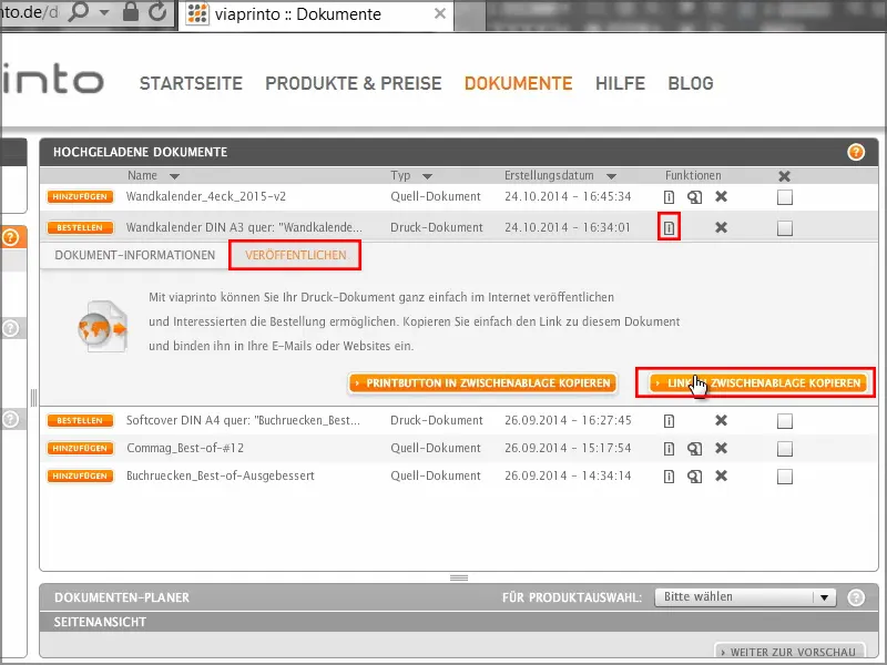
I go back to the shopping cart and get another overview of the costs, print run and settings. Then comes the address entry, where you can of course also enter various sender/billing and delivery addresses in detail. I complete my order, it goes to payment and then I receive a brief overview and confirmation.
So, the calendar has arrived and looks great.
It's cleanly cut off on the left and right, the double Gs look very striking and the thin typography at the top - really great.
And the grammage is also great - the 250 grams per square meter make for an excellent feel.