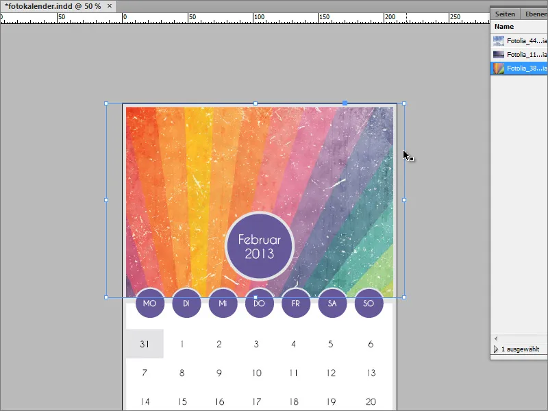
Photo calendars are very popular and make an excellent gift for loved ones. But a calendar like this doesn't just come out of the printer and has to be designed in advance. I'll show you how to do this in this tutorial.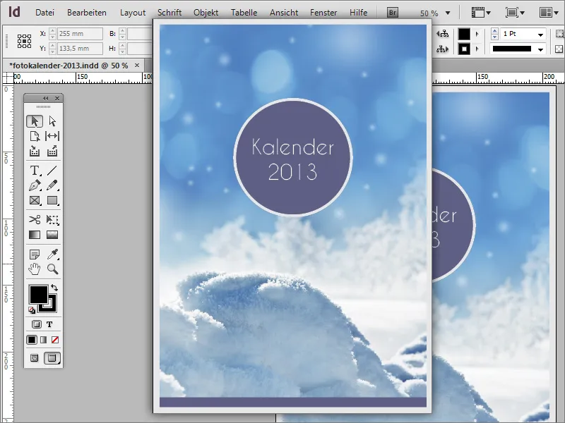
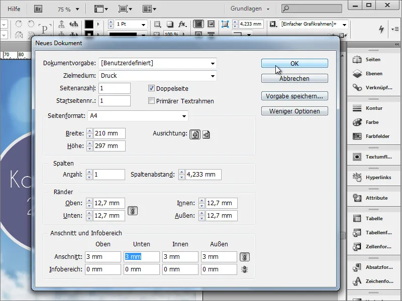
You can start with the cover page. If you print this calendar at home on your PC, you can dispense with the bleed in the document settings. This tolerance value should be set for high-quality printouts via a print provider. The calendar is created in A4 portrait format for the example. To do this, create a new document via File>New.
The first element, the year, is now added to the still empty working document. This is created in a circle using the ellipse tool. Hold down the Shift key while creating the circle to be able to create a uniformly round circle.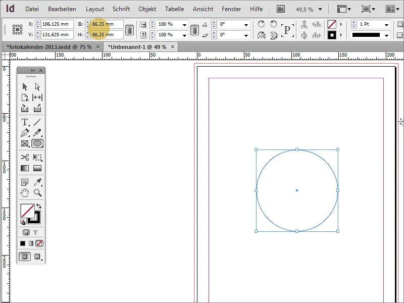
You can fill the circle with any color. You can select an existing color from the colorpalette, edit it by double-clicking on a color entry or create a new one using the New icon.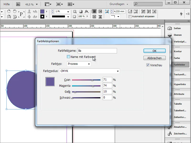
The same applies to the outline color. This should also be created in advance. In our example, a light gray is used.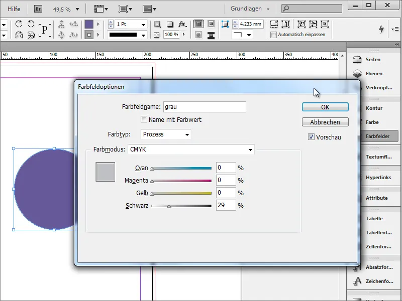
Now change the outline thickness to a value around 10 points.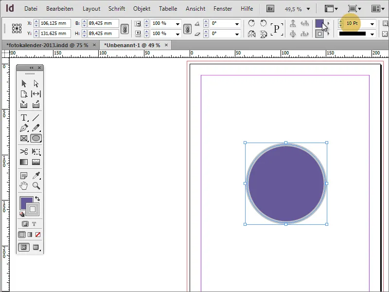
The circle should be in the middle of the page. If the intelligent guides are active, you can move the object on the page until a vertical guide appears. It visualizes the middle of the page. Then simply release the object.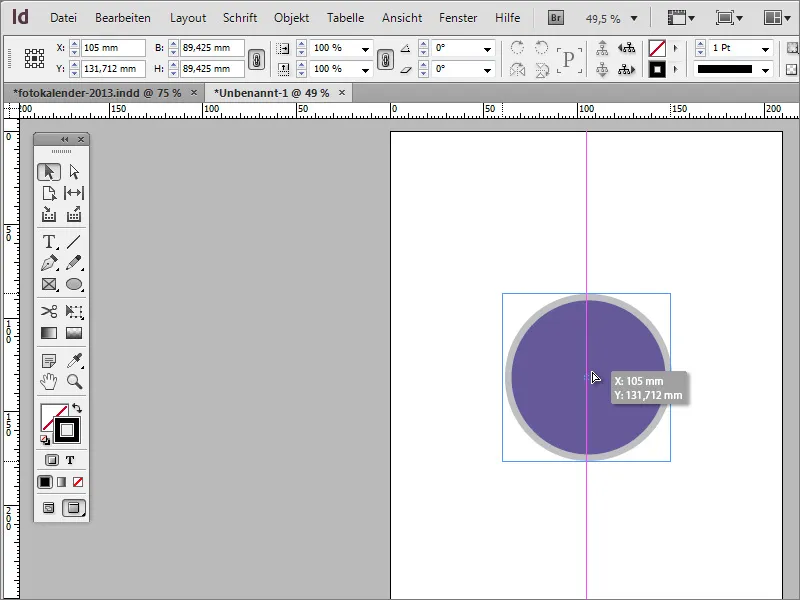
You can activate the intelligent guides via the View>Grid and guides>Intelligent guides menu.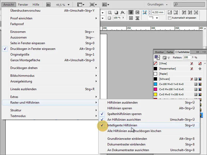
Now give the calendar its title and the year. To do this, you need the text tool and can enter this information in the circle. The font used is Caviar Dreams with 44 point size in centered alignment.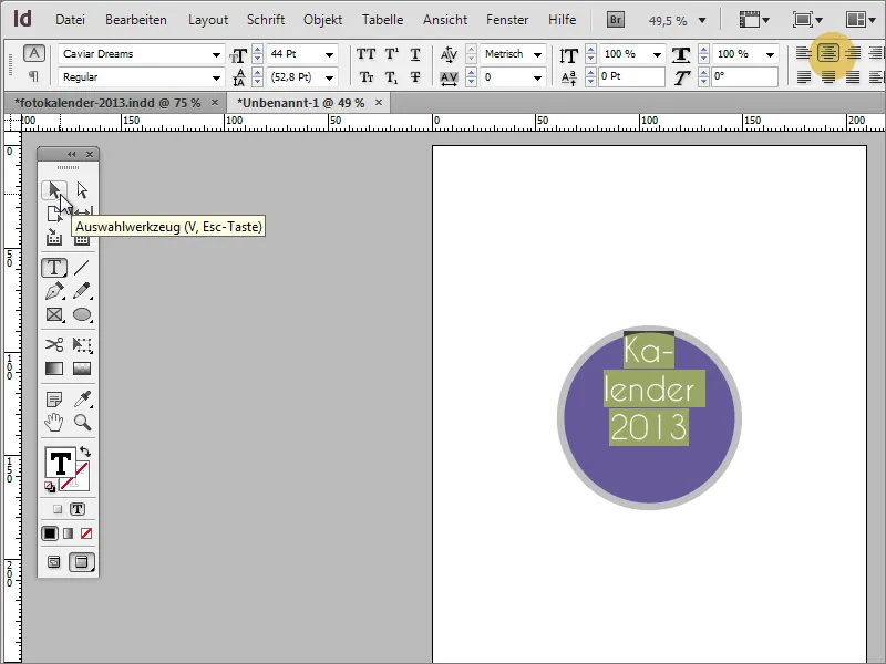
If the text does not yet fit into the area, you can use the selection tool to position this text centered in the vertical alignment, for example. The text will then also fit into the circle. The circle may need to be scaled or the font reduced in size.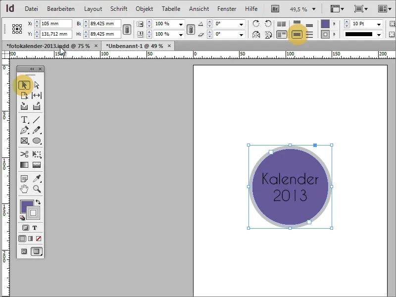
The font in black on a dark background is certainly not a good combination, which is why you should now change the color of the font to white.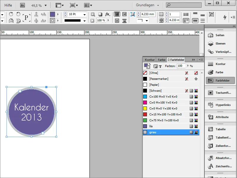
Use Ctrl+D to place a photo in the document. Select the image file to be inserted from the file explorer and drag it so that it fills the area up to the trim edge of the cover page. Use Ctrl+Ö to move the image to the background.
You can also create a border. To do this, use the rectangle tool and draw a congruent rectangle over the entire page and give it a correspondingly large outline with a thickness of approx. 25 points in the desired color.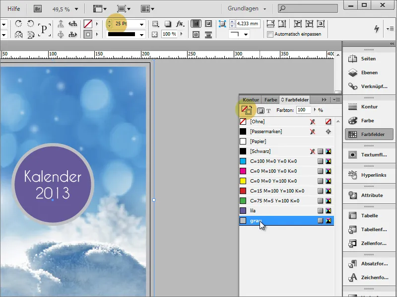
Now you can move on to the inner part. This has a few special features in store.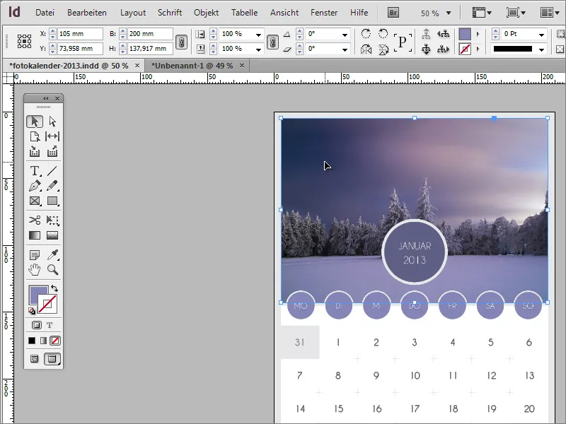
First, you can duplicate the title page you have just created in the page control panel by dragging it onto the new icon.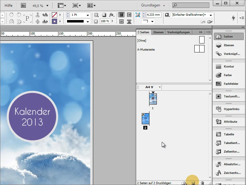
If it looks like the screenshot, then you still have the duplicate pages active. Go to File>Document setup and uncheck the Duplicate page checkbox.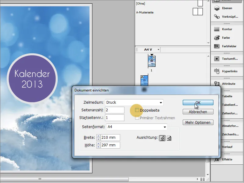
Now simply remove the photo of page 2. The grey color of the outline should be applied to the area. To do this, you can simply change the assignment from outline to area in the colorswatches panel.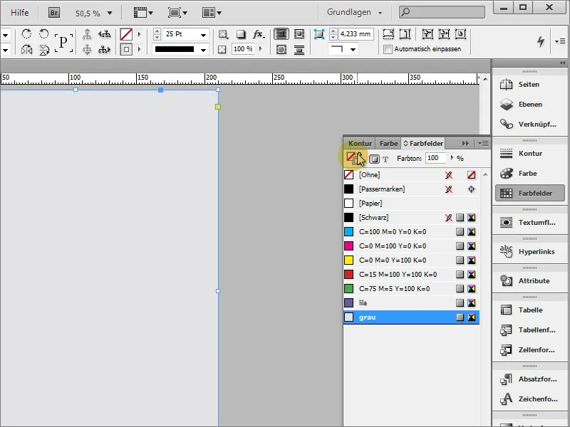
Use Ctrl+O to bring this area into the background. In the design view, you can see that the area does not yet reach the trim edges. Therefore, scale the area to at least the red marking.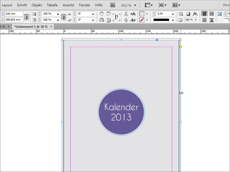
Use Ctrl+Shift+Alt to reduce the calendar title proportionally.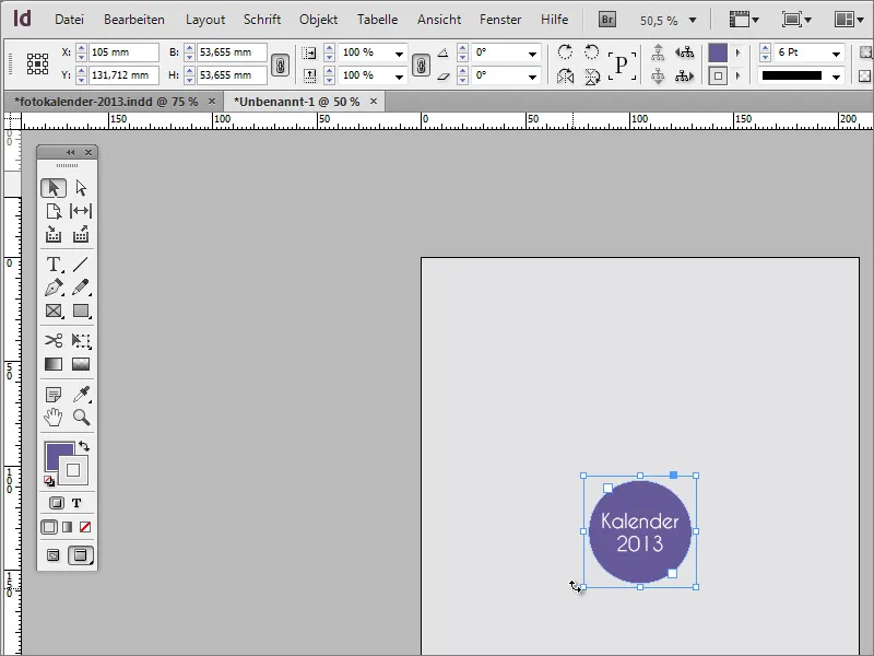
Every season needs a photo, so the year starts quite cold with a winter image. Insert this into the document. However, before the photo is placed, you need a shape that will later contain the photo. To do this, first create a rectangular area up to the middle of the page using the rectangle tool. The intelligent guide lines show you when you are in the middle of the page.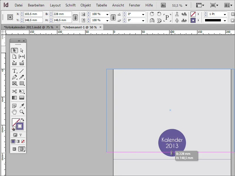
You can move the calendar title slightly upwards.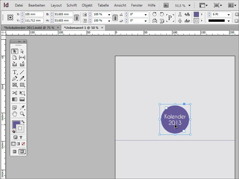
To make the rectangle stand out better from the background, you can now color it. Use any color from the color swatches palette. Then move the object further into the background with Ctrl+O.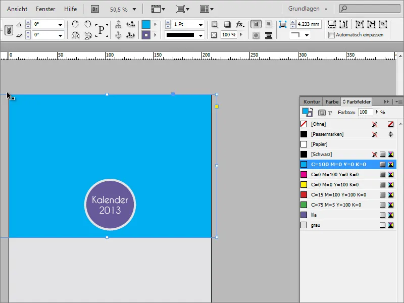
You will then need a circle, which you can create using the ellipse tool. You should hold down the Shift key while dragging so that the ellipse becomes a uniformly round circle. Alternatively, you can enter fixed values of approx. 20 mm x 20 mm in the options bar.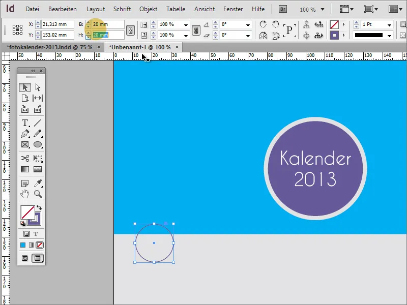
You can fill the circle with any color. Set the contour to the value 0.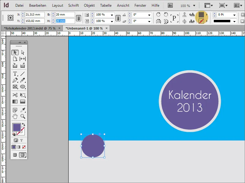
Now copy this circle to the clipboard with Ctrl+C and paste it again at the exact same position using Ctrl+Shift+Alt+V. The upper circle is given a diameter of 25 mm via the options bar. Both objects are then selected by holding down the Shift key.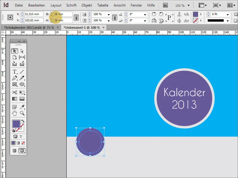
Both objects are then grouped. To do this, call up the context menu for the selected objects with the right mouse button and select the Group entry.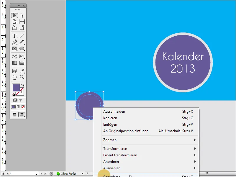
You can now create a copy of this group by holding down the Shift+Alt key. The intelligent guides also show you the positioning aids here.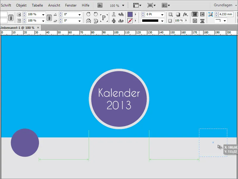
Alternatively, you can also use an auxiliary object such as a rectangle to check the edge distances of the circle objects.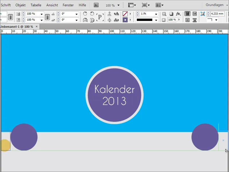
Now copy the first circle as many times as required by holding down the Alt key. As the week has 7 days and 2 objects have already been created, you will need 5 additional copies. The distance between the objects does not play a major role here.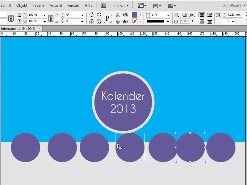
These objects are then precisely aligned and distributed. To do this, select all objects using the Shift key.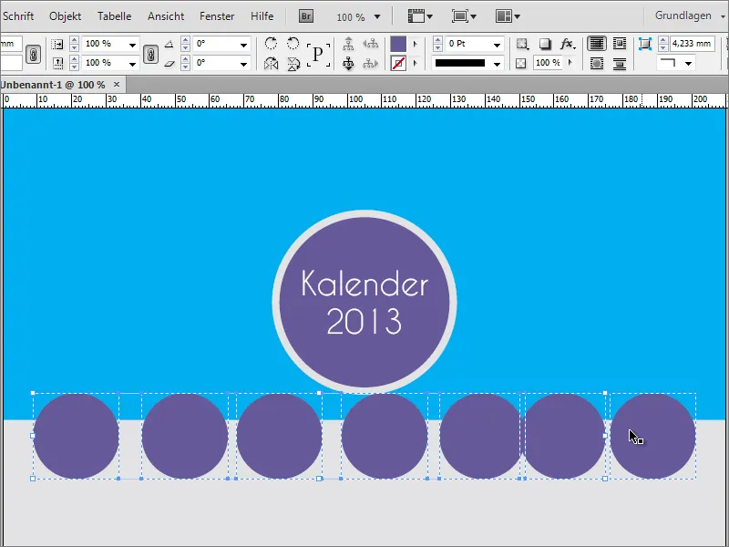
Use the menu item Window>Objects and Layout to call up the Align function in InDesign. Click on the icon to distribute the objects around the horizontal center axis. This distributes the objects evenly.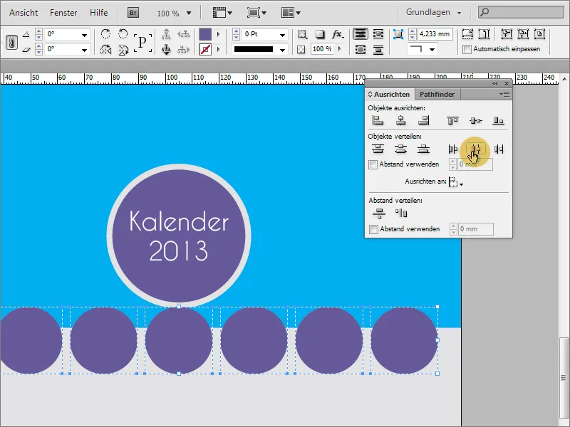
Right-click or use the key combination Shift+Ctrl+G to ungroup the objects.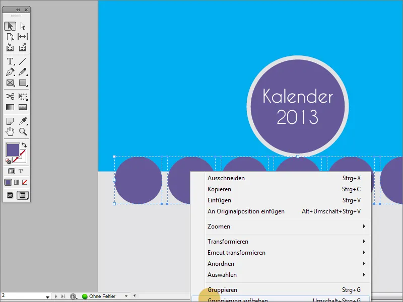
The large circles (not the small circles) and the rectangle are now selected.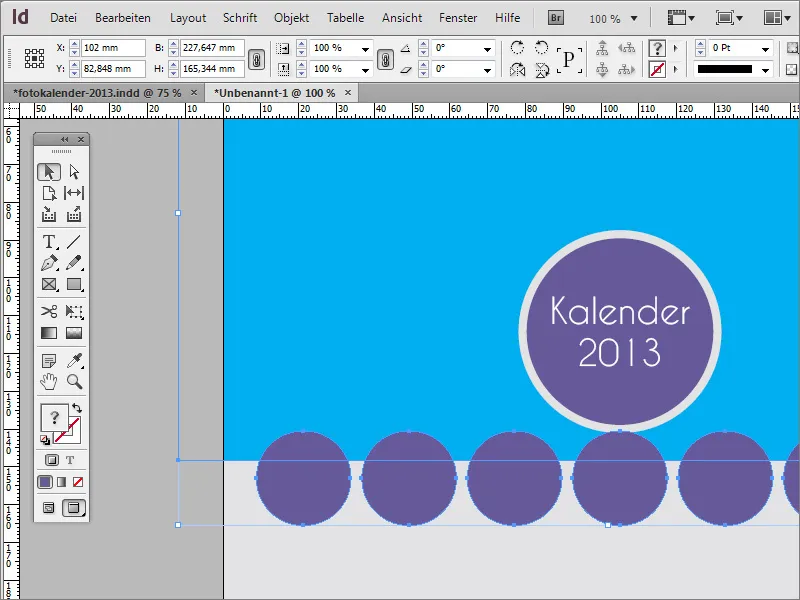
Once you have successfully selected the objects, you will need the Pathfinder functions. This can be found under Window>Objects and Layout>Pathfinder. In this dialog box, click on the Subtract option so that the large circular areas are subtracted from the rectangle. The smaller circles with a diameter of 20 mm remain visible after this action.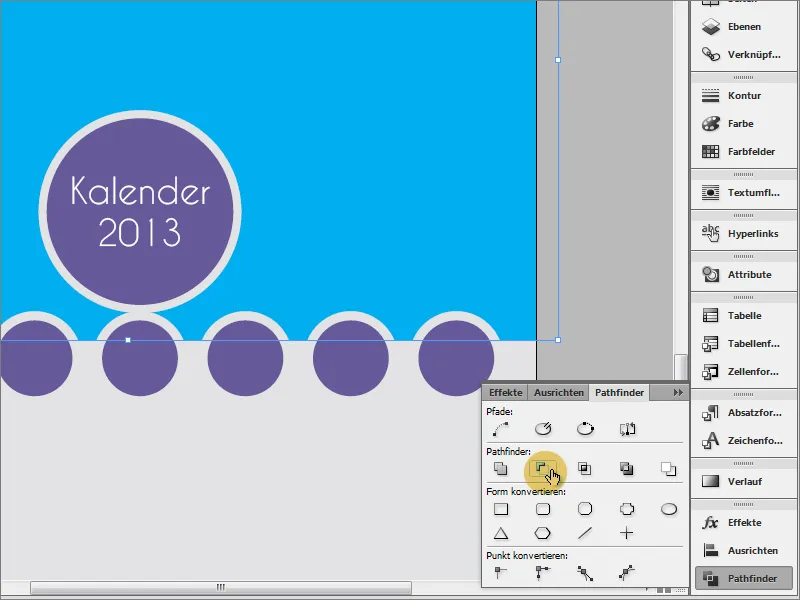
These small circles can now be labeled with the days of the week. The Caviar Dreams font was used in the Regular font style with a 16-point font size and white color.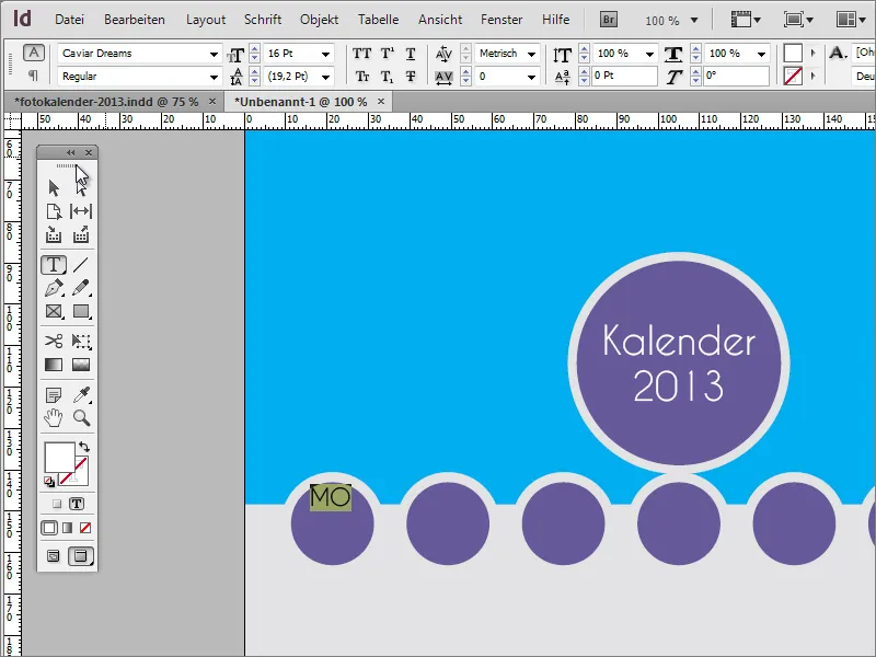
The text should be centered. To center it vertically, you must first activate the selection tool and then change the text alignment in the options bar.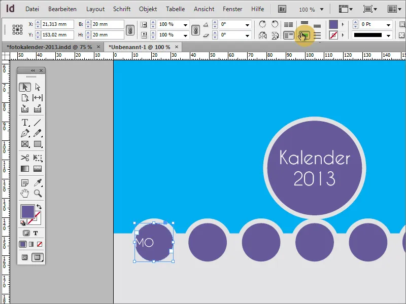
The text is now centered vertically, but not yet horizontally. To change this, simply double-click on the day of the week entry, which will automatically switch to the text tool, and align the text horizontally centered via the options bar.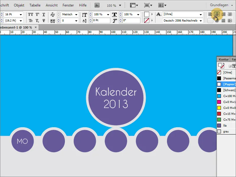
You can enter the other days of the week unformatted. The disadvantage of such individual text creation is that each text module must be changed manually if changes are made later.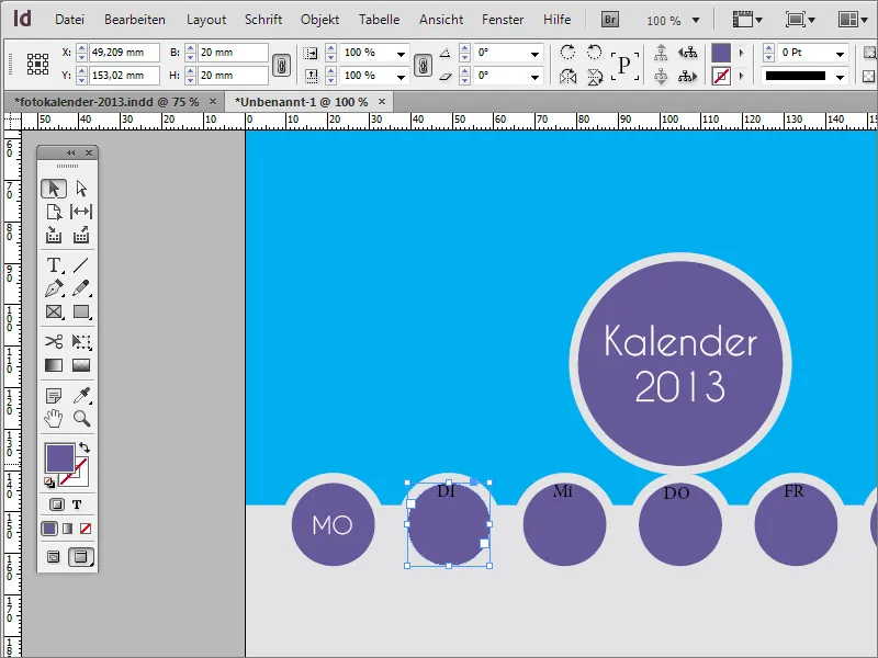
Ideally, you should work with paragraph formats in such cases. First click on the pre-formatted entry for Monday with the text tool and create a new entry in the paragraph formats panel using the New button. Double-click on the Paragraph format 2 entry to access the settings dialog.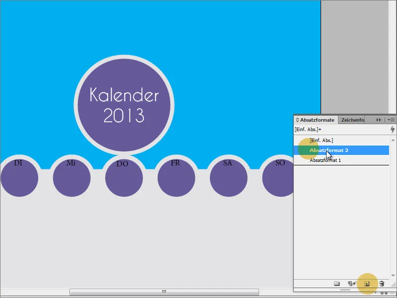
You can now make further settings in the settings dialog if required. The formatting of the text has already been adopted when the new paragraph format was created. You can assign a unique name to the entry, for example "Circle weekday". Then simply click on the OK button to save this paragraph format with the settings.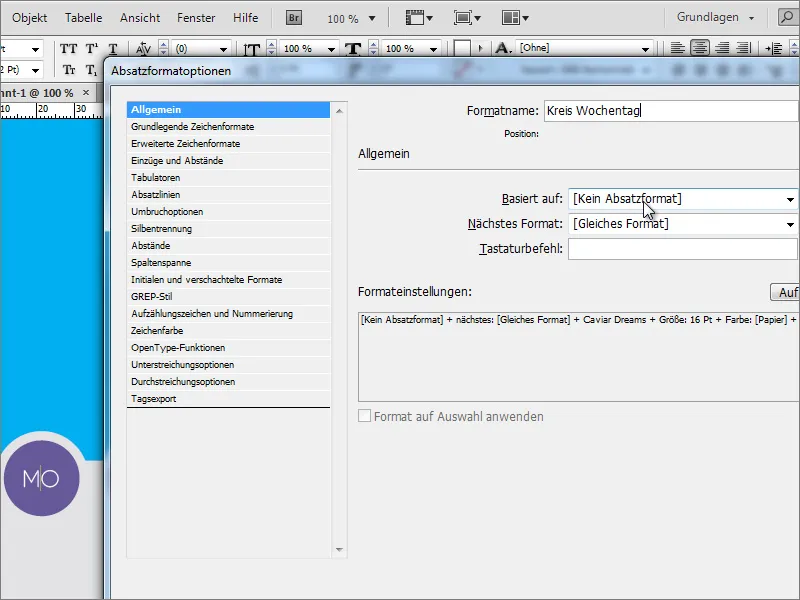
You can now format the entire text using this format. What has not been adopted is the vertical, centered alignment of the text. However, you can also do this manually using the button in the options bar.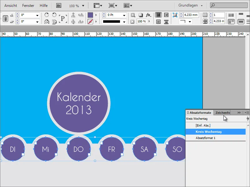
It's time for a nice photo. Select the rectangle and place an image with Ctrl+D. Select a suitable motif from the file explorer.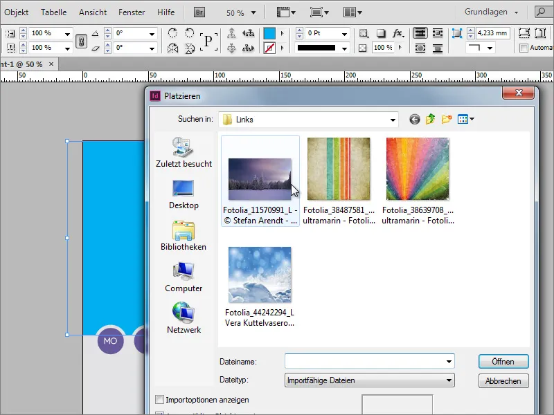
If the image is not large enough, it can still be scaled as soon as you click on the semi-transparent circle in the middle of the image with the mouse.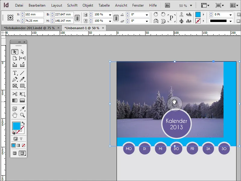
The image's handles then become active. They can be used to enlarge or reduce the image and move it within the image frame.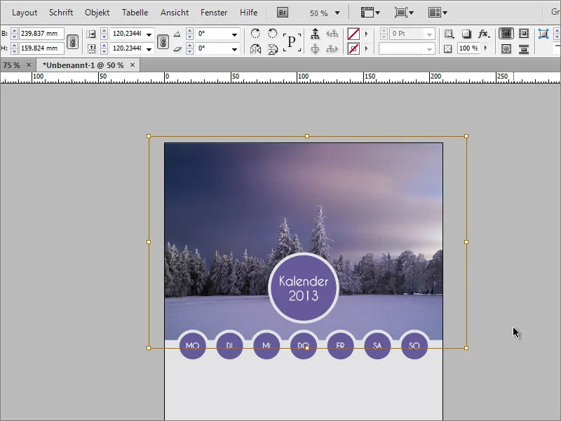
If you want to enlarge or reduce the size of the circle for the day of the week, for example to adjust the distance between it and the rectangle, you can simply select the circle and use the options bar to specify new sizes.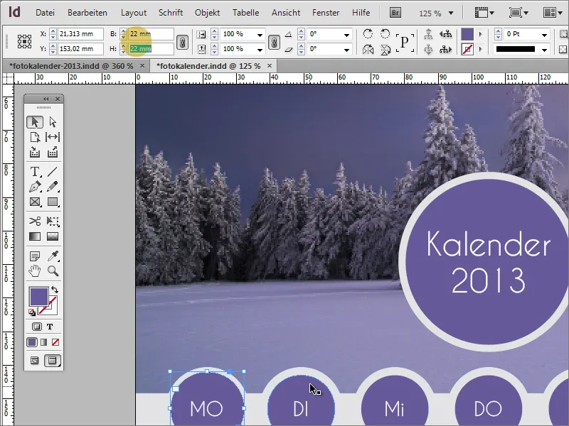
Now comes the table with the dates. Basically not a difficult task.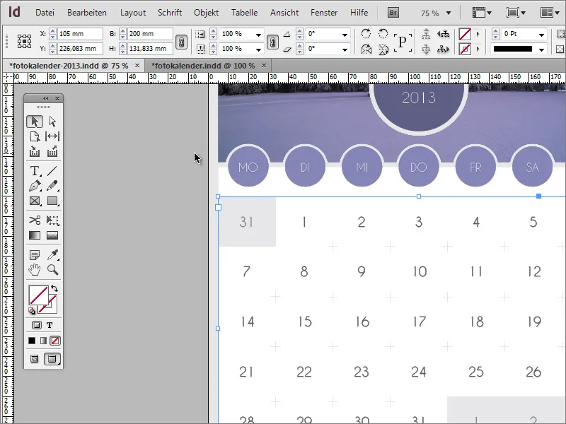
First you need a text box. This is drawn with the text tool. Make sure that this text box is as evenly spaced as possible.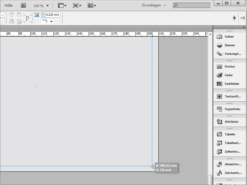
Now you can color this text area. This also contributes to better visibility.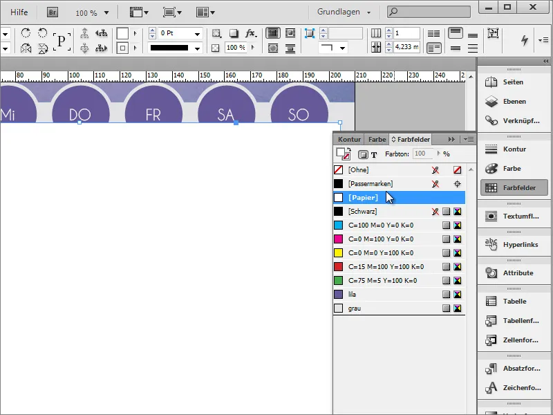
After you have moved this text area further into the background with Ctrl+Ö, you can go down a few lines with Enter to insert a table there. Navigate to the menu item Table>Create table and set the required rows and columns in the following dialog box.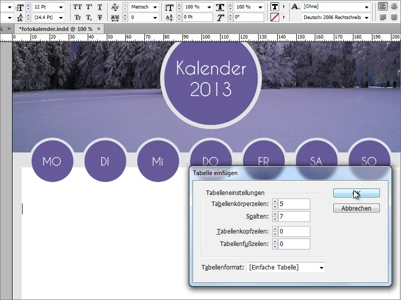
Now enter the dates in the table. Use the tab key to move to the next cell.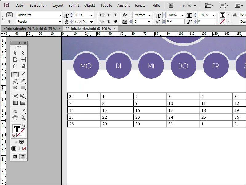
This doesn't look very good yet. Therefore, select all cells with the text tool. Format the font in the usual way. In the example, Caviar Dreams was again used in 18 point and centered alignment.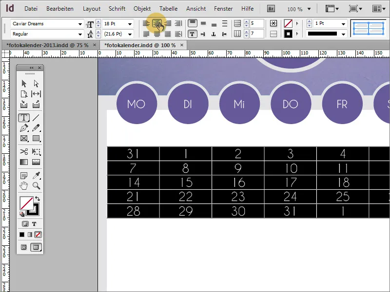
This looks a little better. However, it still looks very compressed. However, you can adjust the line height to gain a little more space. Be sure to use the Shift key when enlarging so that all rows are enlarged and not just the bottom row.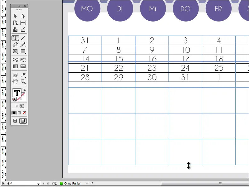
After you have selected the cells again if necessary, you can center the font in the vertical alignment. To do this, click on the corresponding button in the options bar.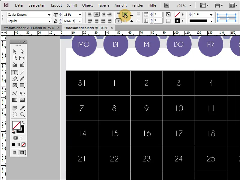
A table does not really look good for a calendar. For this reason, the table outline is now reduced to the value 0 via the options bar.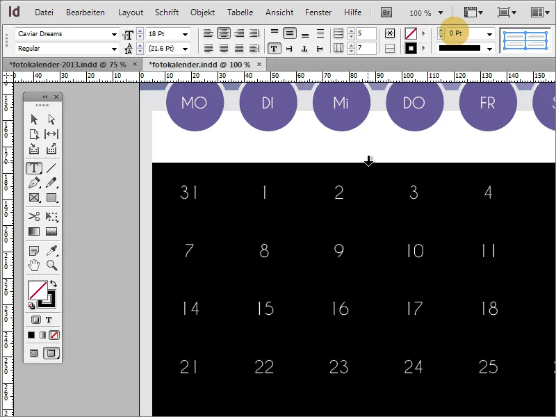
To make certain days, such as the last day of the previous month, stand out from the rest in the calendar, you can customize these entries. To do this, use the menu item Table>Cell options>Contours and areas.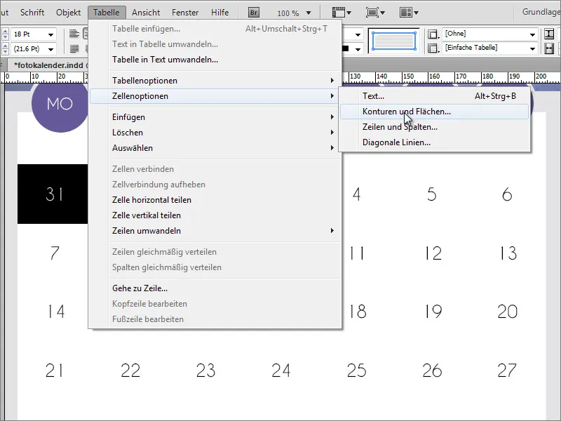
In the dialog box that then appears, you can adjust the cell area for the selected cells.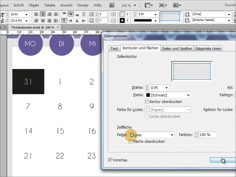
However, before each individual cell has to be changed using these functions, you can use the cell you have just set up as a template for a cell format. To do this, activate the control panel for the cell formats and create a new cell format by clicking on the Create new format button.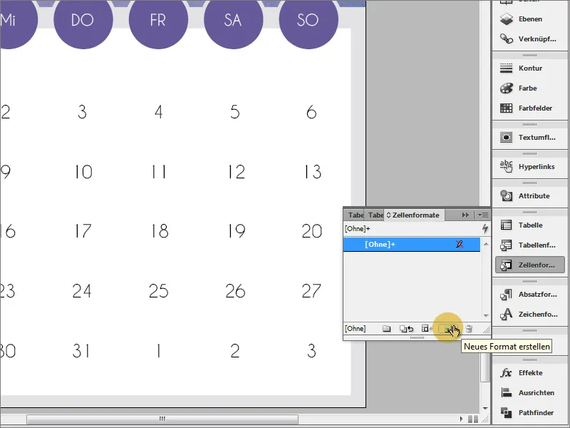
You can assign a unique name to the format in the dialog box. The properties have already been copied from the selected cell. The dialog box can therefore be closed immediately.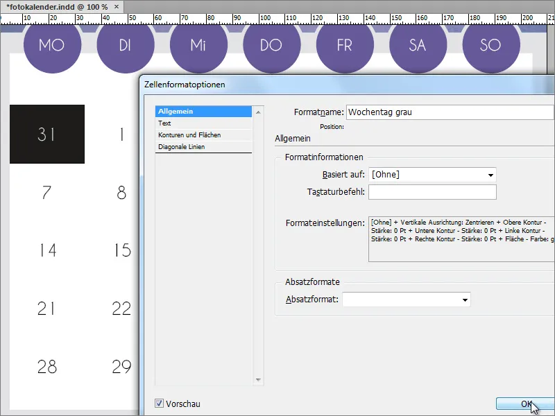
You can now adjust the format for any cell by simply selecting the cell and choosing the desired cell format.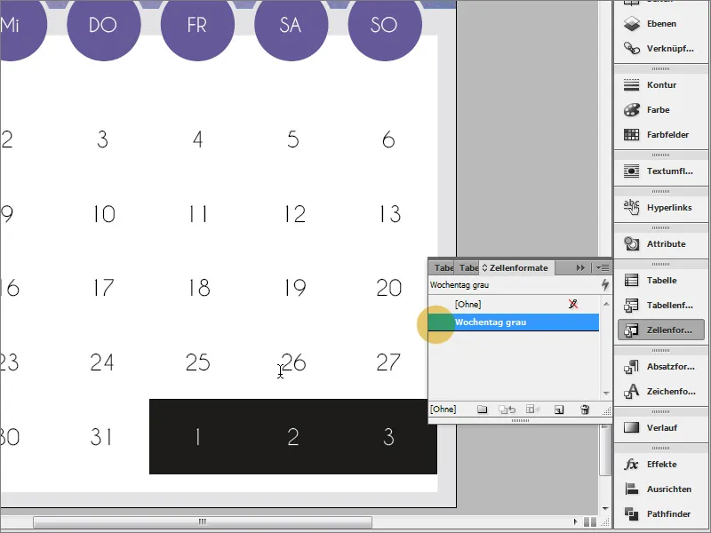
If the graphic in the header of the calendar is also to have a border, you cannot simply scale it. This would also move the cut-out areas and create an offset between the weekday entry and the cut-out.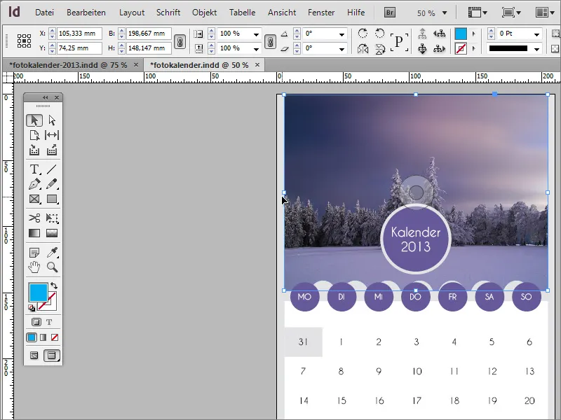
You can create such a frame by first drawing a full-surface frame around the calendar using the rectangle tool.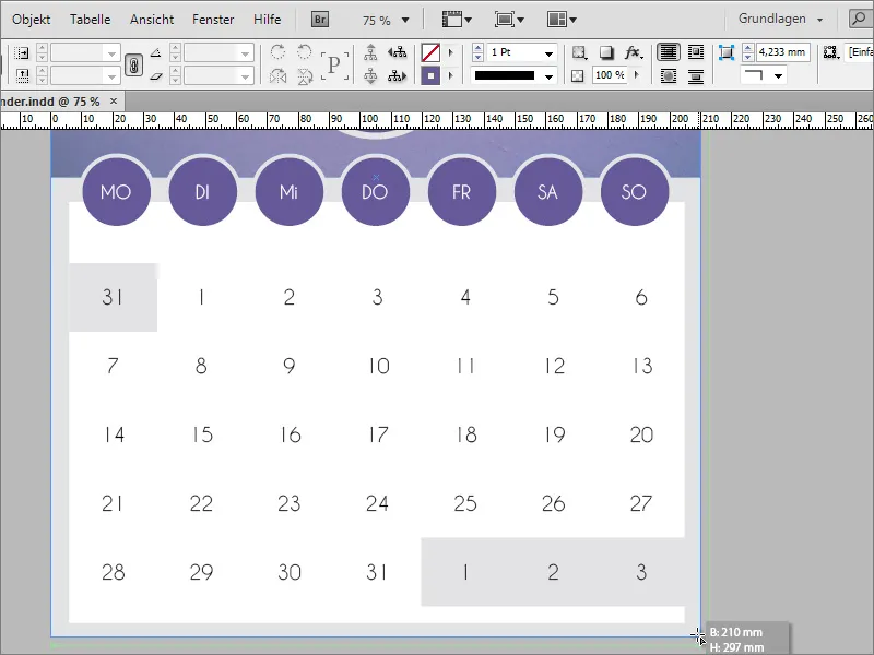
Simply set the outline thickness using the option button. A value of approx. 15 points may already be sufficient. In addition, the area is set to the value None using the color fields control panel and the outline is colored with the desired color - in our case grey.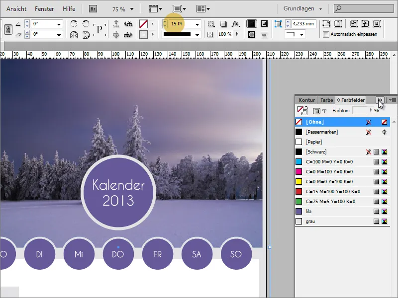
The width and height of the text area with the dates may then need to be adjusted slightly so that all edges have the same visual thickness.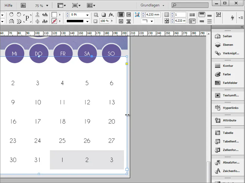
So far, the title on the calendar page still reads "Calendar 2013". This should of course be changed so that the respective month name appears on each page to match the image and date information. Therefore, edit this area with the text tool and replace the word "Calendar" with the respective month name.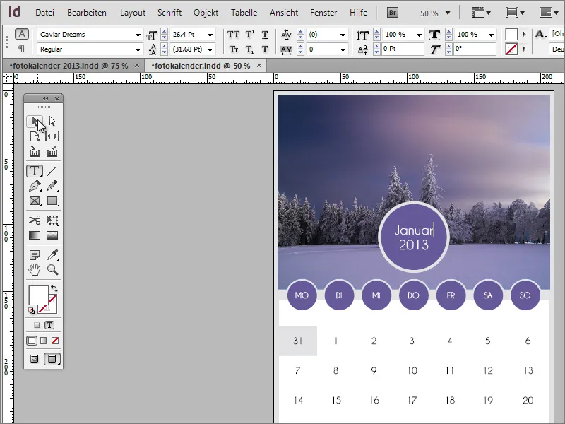
Optionally, you can add further details to this calendar page. This can also be a simple line at the bottom of the date overview, for example. Ideally, this should have the same coloring as the circles and be created with the line drawing tool and a thickness of approx. 4 points.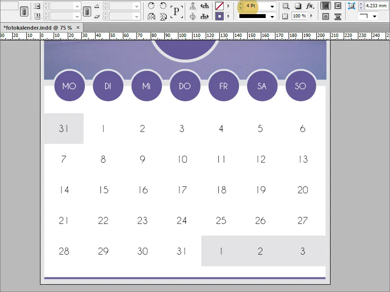
Once this template has been created successfully and satisfactorily, you can duplicate it using the page control panel.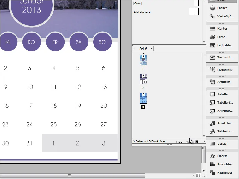
On the duplicate page, only the month name and the dates need to be adjusted. The image can also be exchanged via the Link panel. To do this, click on the Relink button.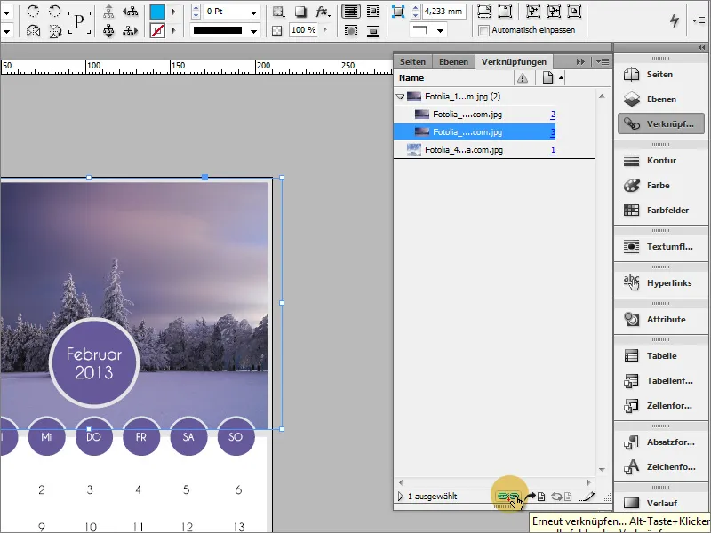
Then select a different image file in the file explorer and confirm the dialog box. The newly linked image then appears in the image frame.