Here we go: Steps 1-10
Step 1
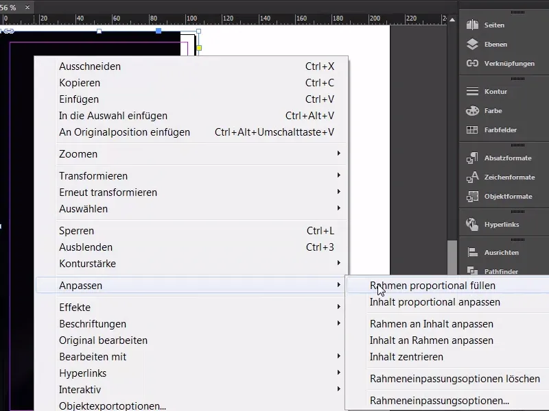
We are on part two and therefore also on page two, open the layer control panel for the pages and then add a new page, it's that simple, but it can't stay that way, because the essential information is missing, and we will simply add it now. First of all, of course, a picture. Ctrl+D, I open my dialog, and here I've already found my suitable object; drag once, up to the bleed at the bottom. Here too up to the bleed. Adjust>Fill frame proportionally,...
Step 02
... and I think I can almost leave it like this. I will now lock it once with Ctrl+L (1), we may have to adjust it again later.
As usual, the text tool follows (2), draw it nice and large, in the Bebas. Of course, we use the same font as on the front, 85 pt (3), center (4), and color: Let's use the first one (5). Like this.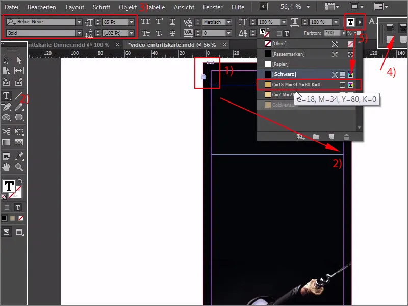
Step 03
Then we write in: "Exclusive". Unfortunately, we have an overset here, so I'll take a look at it. What exactly has happened here? Let's draw it once (1), and then we'll just continue writing in the next line. "Invitation". Here too, of course, we have an overset (2), in the second line we have to reduce the font size a little, so Ctrl+Y, select the word "Invitation" and reduce it to 83 pt (3). Good.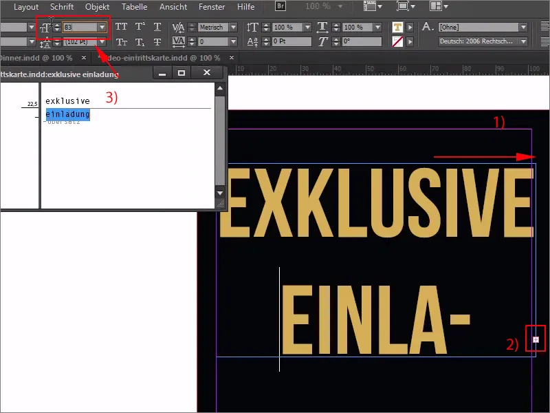
Step 04
We need to reduce the spacing. Here I simply enter 70 pt (1). That should be fine, and we'll get straight to the nice point alignment by simply dragging the whole thing onto the line (2). We can also let it bounce upwards, up to here, that should be enough for now (2). And then let's take a look at the right-hand side, so that we can get there, there, that doesn't quite fit now, but if I increase the font size by a whole point, namely to 86, then we get an overset text. So: Ctrl+Z, back again, the trick is very easy: you simply hold down the Ctrl key and Shift key briefly at the top here (3), and now the content is moved visibly (4). And now we have to make sure that we get the line right here. Okay (5). I'm satisfied with that.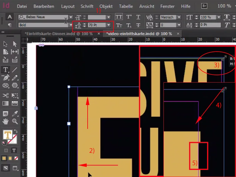
Step 05
The line is still missing, so let's use the line tool (1 ) with a pt (2). Then we'll dock exactly (3) ...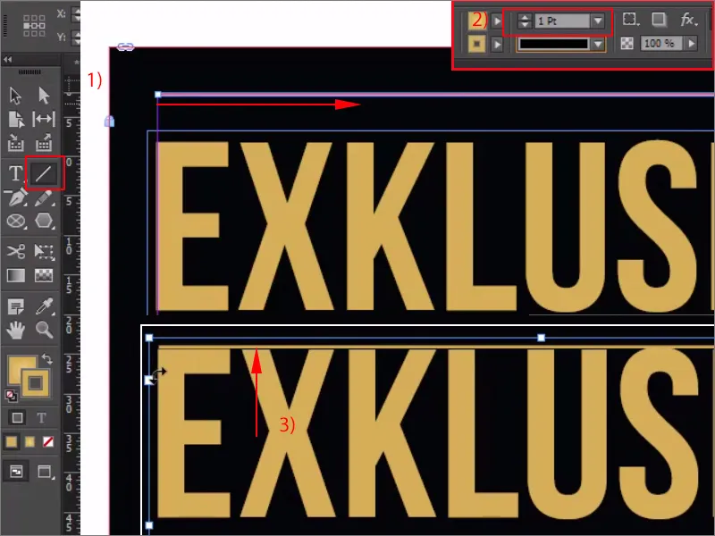
Step 06
... and press Shift and down once (1), duplicate up to here (2), and press Shift and down. Now the whole thing gets a new color, namely our gold gradient (3), as well as the two contour lines, which are also part of this game, and then we've already finished the head.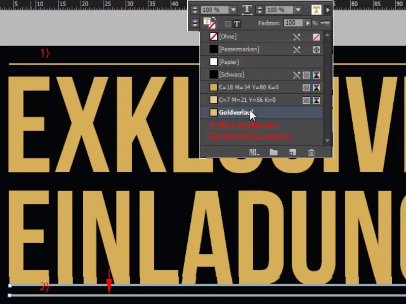
Step 07
Let's go straight down to the foot and repeat the game there. Draw up the text field (1), Bebas Neue, (2) and we start in Light, then set the font size to 15 pt (3), there's no such thing here, you have to enter it manually, no problem, we have healthy fingers. Color: Also first in yellow (4), and I will now copy the text from my clipboard here, center it, "Deep Dark" is not in Light, but in Bold, and now reduce the size by clicking on this handle (5) ...,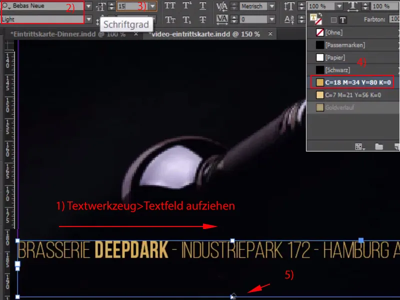
Step 08
... move down and select the appropriate color (1). Then we go up one more time, then I get the line from above, Ctrl+C, and paste it once at the bottom, be careful with the spacing, it shouldn't be more, make a copy of it, paste it above the font.
OK, then I'll save the whole thing with Ctrl+S and we'll move on to the middle part.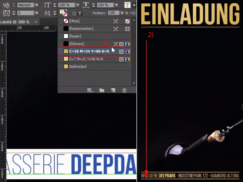
Step 09
Now I'll simply draw up a text field and then simply write in our Bebas Neue, starting with the light in 20 pt and the color white: "Start date admission".
I would now like to have the date left-aligned, "Start" right-aligned and "Entry" centered. It's actually quite easy to handle by using the ultimate hardcore justification here, which produces exactly the result I need, but it doesn't work so easily in the line below. But let's give it a try, I'll show you why it doesn't work, so I'll now write here with the font style Bold and the color gold: 1.9.2015. Now comes the space, 18:00, that looks quite good, but if I now make a space and enter "clock", then the clock jumps to the right. Another space for 19:00 and then we have this result image. So it doesn't work perfectly with this ultimate hardcore block set, we have to find another way.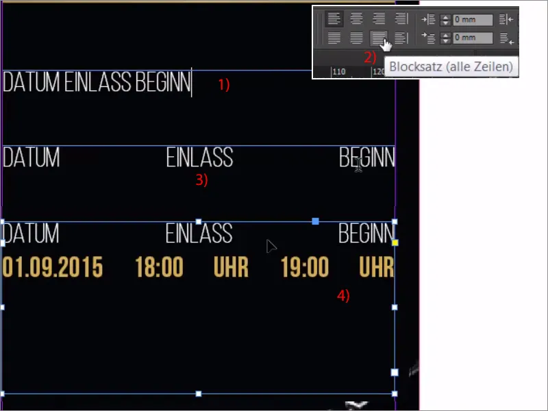
Step 10
And there is one: It's very simple, the very first thing you'll do is to show the hidden characters at the very bottom via Font. And now let's look for the place where we really want to gain the great distance. I will now mark this point and then insert the equalizing space at the bottom via Font>Insert Space. Now you have a dot here with a blue curly bracket above it (3). I repeat the same for the one between clock and 19, via Font>Insert Space>Equalizing Space, and now we have exactly this effect, without it taking up the space between 18 and clock. What we need to do now is to highlight the whole thing a little in color; you can change the opacity via your Effects panel. You probably know this, but you may not know that you can also change the opacity of the individual components. For example, you can adjust the opacity of the outline , you can adjust the area and you can adjust the text. We would like to adjust the color of the area, of course I choose a color, with 100 % opacity everything is ruined, no: If we now enter 20 % here (4), then we have this very glamorous, delicate effect. Take a look at this: a wonderfully smooth transition.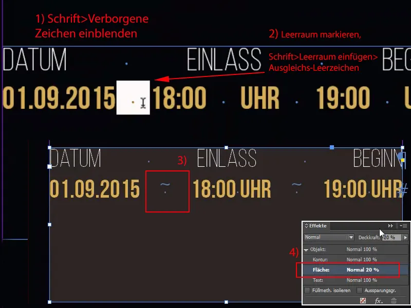
Steps 11-20
Step 11
The only thing that's really annoying here is that everything sticks to the edge. No problem. Click once (1), Ctrl+B for the text frame options and then enter 3 mm everywhere. With the chain symbol (2) it jumps over in any case.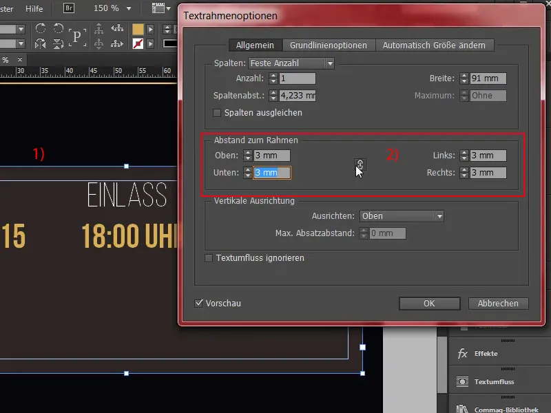
Step 12
And now reduce it to the required size, perhaps move it a little higher. That's it. We need the same thing at the bottom, so take it once and create a copy with Alt+Shift, make it really big (1), and then I'll throw out all this text here and center it (2).
Here we write in bold: "What to expect" (3). We can leave it as it is, add a paragraph, and then of course there's a small letter donation so that people know what they're getting into. I get that from my clipboard, of course. This is what it looks like, much too big of course, in white and then of course in regular font, which is perfectly adequate, the font size also has to be reduced to 13 pt (4). We make the keyword in it a little bolder, i.e. emphasize it in bold, and now we've already done the job. What I don't like, however, is this large paragraph after the headline (5), I'll simply replace it with a small one ... voilà.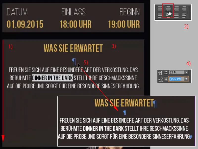
Step 13
Now comes the list of individual services. No witchcraft either: Simply draw up a text field once (1). Now we'll format the whole thing correctly and then we'll duplicate it six times, so we'll start again with the Bebas Neue in Book font style , nice and narrow, size twelve pt (2). Fits. Color in white, flush left is also fine, and now we'll reduce this text box to 38 mm flush left (3). Just move it to the middle here, where I will copy the first text once, "Dinner in the Dark Deluxe" (4).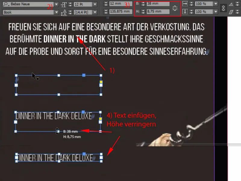
Step 14
Now comes the matching bullet point, which we'll quickly create as a rectangle measuring 2 by 2 mm (1). Now it's time to draw an auxiliary line here, that's the 3 mm distance (2) we need, and then I'll position it like this. Let it dock completely here (3), ....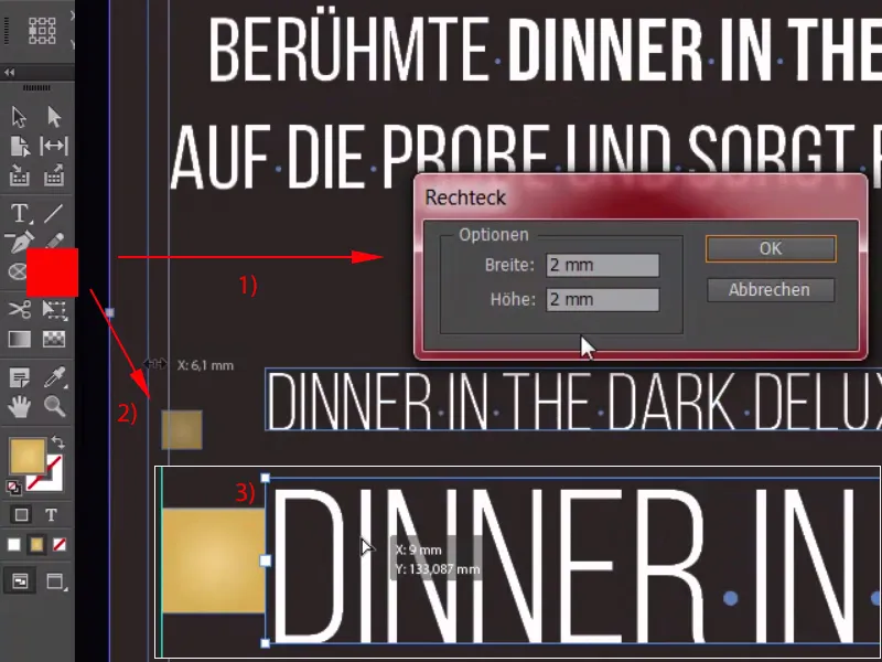
Step 15
... and Shift and arrow key to the right, the first enumeration is ready (1), and I'll simply copy these two and add the next service (2).
"Opening with champagne reception" and the game one last time (3): "Including accompanying drinks" (4).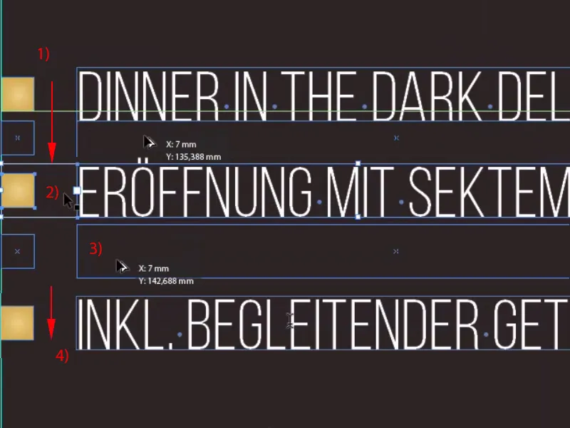
Step 16
Now I can select everything, hold down the Shift key, zoom out once and copy (1). And now I will move the reference point from these three fields on the right-hand side (2) to the left (3), if it is not already there, ....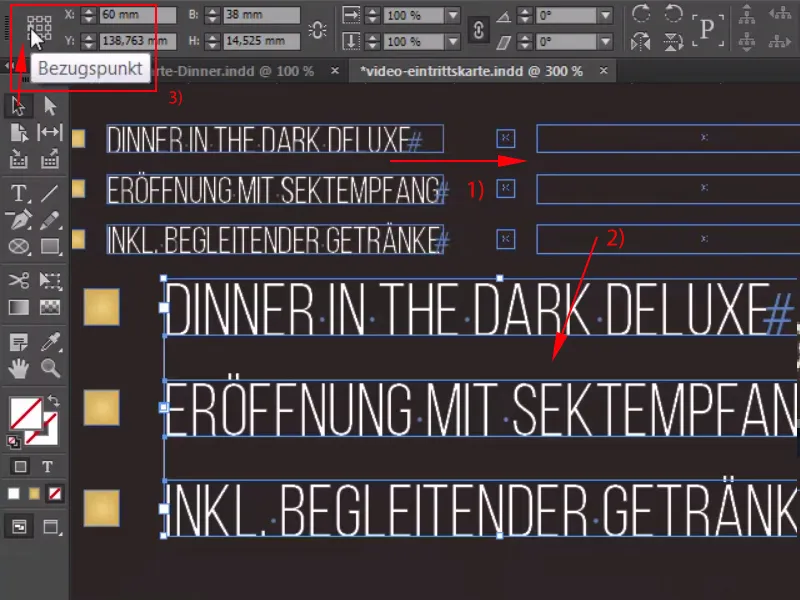
Step 17
... increase the width to 41.2 mm (1) and then dock it. Replace the text once here too: Our guests of honor get a limousine service, an exquisite five-course meal and, of course, a musical evening rehearsal (2) ... overset. Well, what do we do? No problem: Ctrl+A, adjust the run length a little, -10 (3). Voilà, everything is in the box.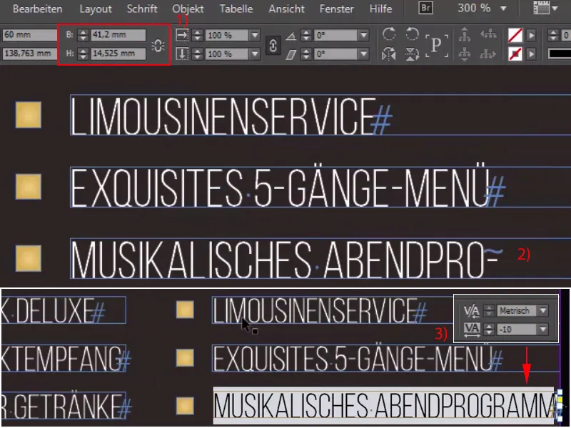
Step 18
However, we made a small mistake here: We have to keep our 3 mm, they are exactly at this point (1), and then we move all six elements to the left (2) and that's how we got it right (3).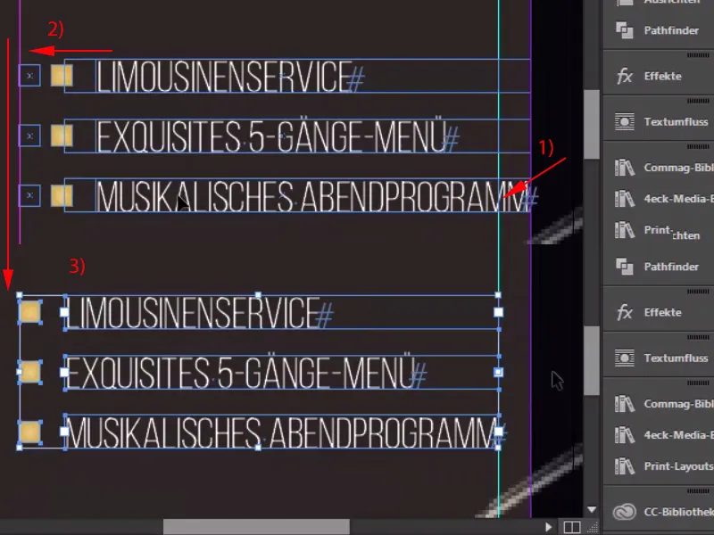
Step 19
But as usual with a design, you have to maintain consistency, you have to make the elements appear again and again, so we'll grab the star once from the top, Ctrl+C, and I'll position it down here next to the heading (1), although I might make it almost a touch smaller there, going to 4.5 mm in height, which looks a little more harmless. And then I'll move this here. 1,2, make a copy of it, 1,2, done. Select both, move them over to the right edge of the T, 1,2, and we've achieved a symmetrical alignment with our stars.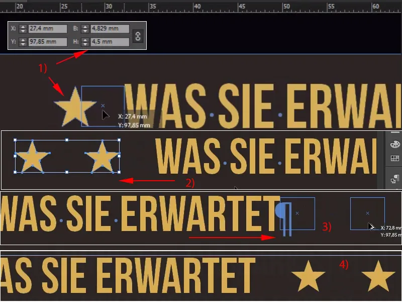
We can also make the text field larger; I will now take all of this and throw it into a group (right-click>Group).
Step 20
And now let's take a look at the whole thing and then we'll see: We still need to work a little on the spacing, of course. I'll move the top box all the way to the top, and then I'll gain 1,2,3 distances downwards according to our spacing method. The same with the bottom box, 1,2,3 distances downwards, then check that we haven't slipped at the edge and push back where we've overshot the boundary a little.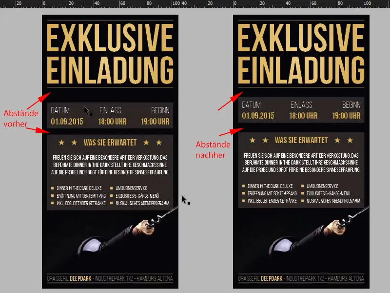
The last steps
Step 21
In any case, the visible part of our invitation card is finished, and now it's time for the invisible part. You'd think this would be quite difficult, but to be honest, it's no problem at all: Let's just switch to the layers, call this layer "Layout" (1) and then create a new layer, which I'll call "UV" (2).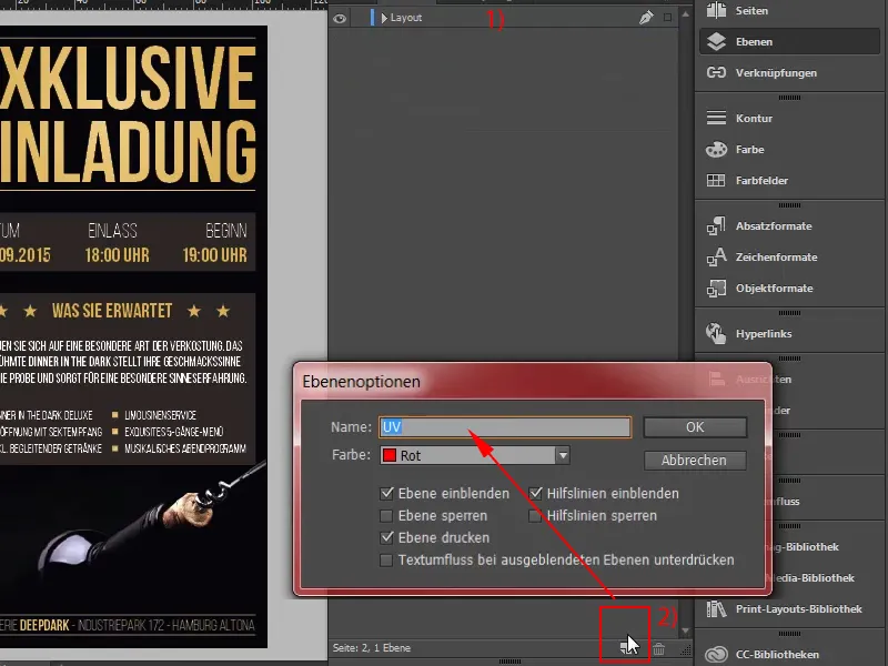
Step 22
We will now work on this layer and I will simply draw a large text field, of course again our Bebas Neue in Bold (1), and then I will simply write in white: "Valid 1.9.2015" (2). Center the whole thing (3) and make it really BIG, at 60 pt, and reduce the spacing a little (4). Okay.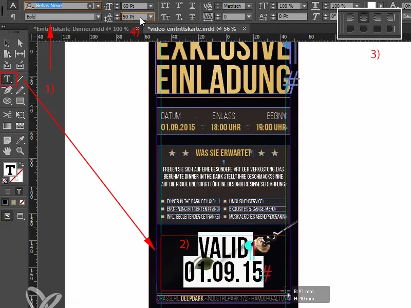
Step 23
In the end, this should only be visible under black light and now it's time to create it in the right color. That's why I'm going to create a new color field under New color field (1). Not a process color, but a solid color(2) in 100 % magenta. And I'll call this color "UV" (3). It is very important that you name the child this way, because the print shop needs it with exactly these two letters. The color is now created - a solid color.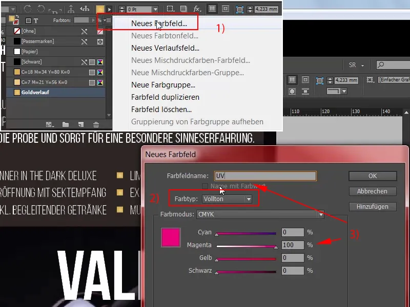
Step 24
And now we can add the new color 100% magenta to this text (1). However, it is still important that this area is set to overprint.
To be on the safe side, I'm going to convert this into a path again first , I don't need to change the font, (2) ...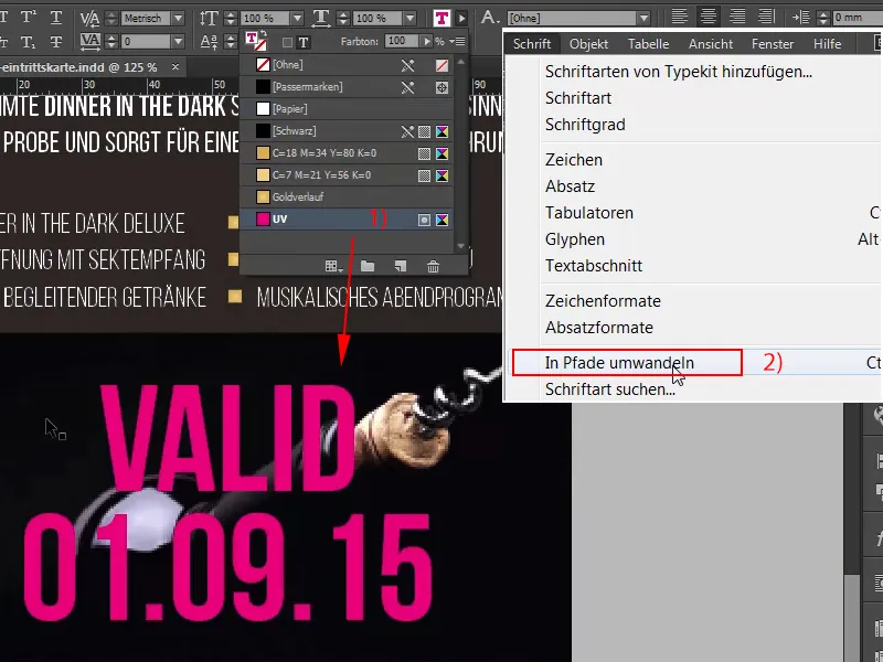
Step 25
... I can now select the path and chooseWindow>Output>Attributes>Overprint Area. All right, now this disappears, once again for the second path: Window>Output>Attributes>Overprint Area, it shows through very slightly down here, I'll zoom in, have a look at this (2), you can see it very slightly here now, and then I select Ctrl+E for the export.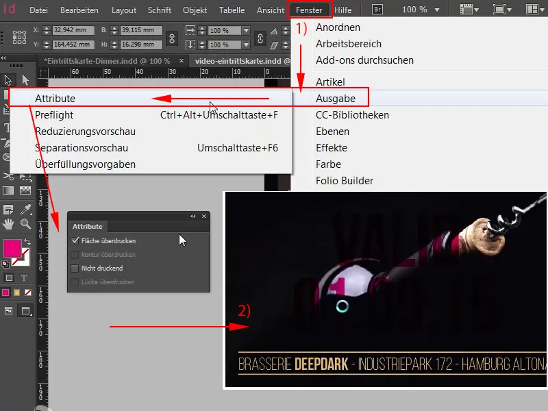
Step 26
Compression 300 450 (1), that fits, 2 mm bleed, also okay (2), ISO Coated v2 also fits (3), so we can export (4).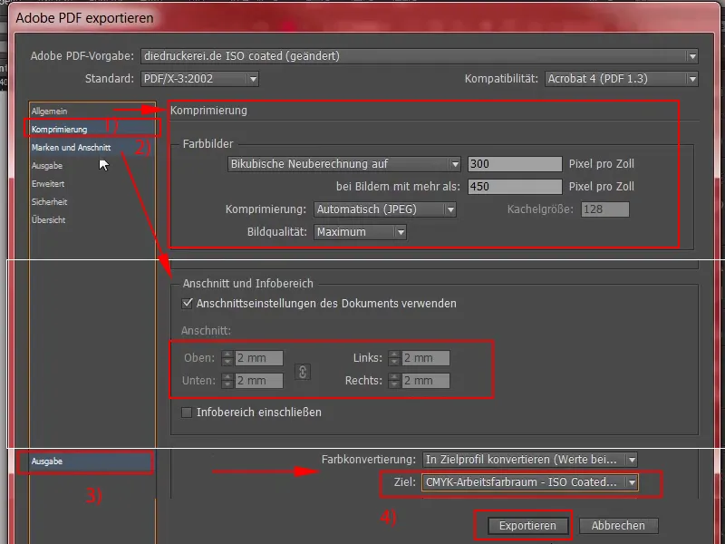
Step 27
So here we have the final PDF with our wonderful champagne on it. Scroll down once and we can also see the tamper-proof security color and the footer area down there. Wonderful, I think we can move on to the upload. Back on the page of our print shop I scroll down once, we are still at the tickets (black light DIN long) (1), there we choose 300 g/m2 picture printing paper(2), the grammage is of course incredibly important to convey a high-quality feel. Of course, 100 is not enough for a print run; we can also use 400, for example. For further processing, I use without numbering. So you have the option of adding a numbering field that is automatically consecutive. I have not done this now, but you are welcome to do it yourself with your examples. Of course with data check (3), and then it goes on to the order (4)..webp?tutkfid=66768)
Step 28
Continue. Confirm once again, this is us and we confirm the billing address and payment method, I choose prepayment, Next, we accept the terms and conditions, scroll down once completely and then go to Buy. Continue to upload our file: And in the upload manager of our print shop (1) we can then simply upload the PDF via drag & drop (2).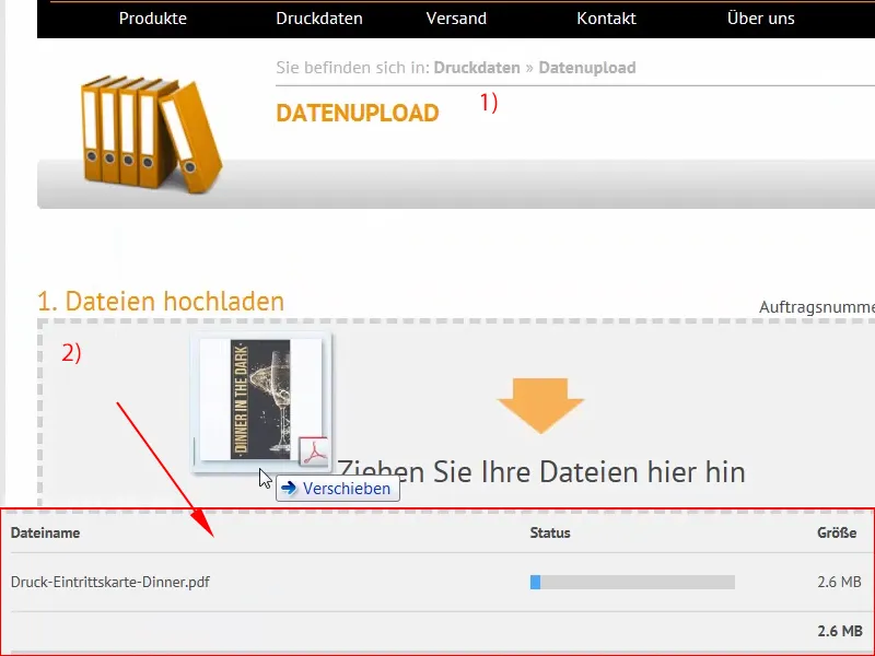
Step 29
And the file is already uploaded. We select everything in one document (1), it is checked again, the print data can be produced, we confirm this (2) and complete the order (3). Now I'm just curious to see if the black light effect really comes across that well. I'm happy to be surprised and I'll see you at the unboxing.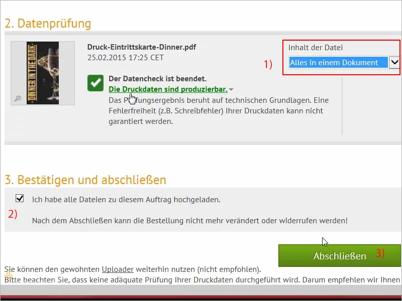
Step 30
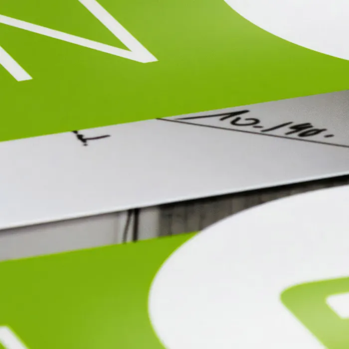
Guys, you held out until the unboxing! I praise you for that, because now you'll be rewarded: here are our tickets to Dinner in the Dark, and with a very cool black light effect too. Let's just take a closer look, I'll prepare them for you so beautifully: There you see this great gold effect that we applied. Really cool! This slight plasticity that we tried to create. Let's take a look at it: This is the back. Wow, really cool!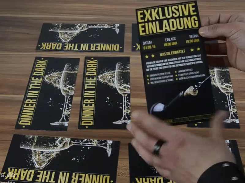
You can easily see the black light through here if you hold it at a slight angle. I don't know if you can see that in the camera, I can see it very easily. But from the impression I'm getting here, I'm actually satisfied. Yes, the champagne glass comes out well. If I take a really close look at it, I don't see anything that should somehow dampen my joy, but now of course we're going to look at the really exciting things in the next step, namely: What does the thing look like when we test it in black light? So let me surprise you guys, I'm going to switch off the lights, because it's good to be in the dark. Are you ready? Then let's get started right away.
Here's our black light!
Can you see that? Wow! I'm going to walk over here, I'm going to walk slowly over here - really strong, isn't it? I think it's really great. Can you see that? See how it glows red? And it has a total 3D effect. I don't know if you can see it really well in the camera, but it looks totally three-dimensional! Cool! So, I'm really totally amused by it. Guys, you have to try it out! You'll have so much fun! If you have half as much fun as I do, then that's enough. It's totally powerful. Really great!
I think we can live with that. Yes, dear friends! So, really give it a try. Black light has a totally cool effect, as you can see for yourself here. It looks really cool, maybe less so on camera, but here, live, it looks really stunning. I'm really blown away. You have to try it out! Guys, I'm off, I'm in flight mode for now, have fun with it, try it out, and until then, your Stefan from PSD-Tutorials.de.
