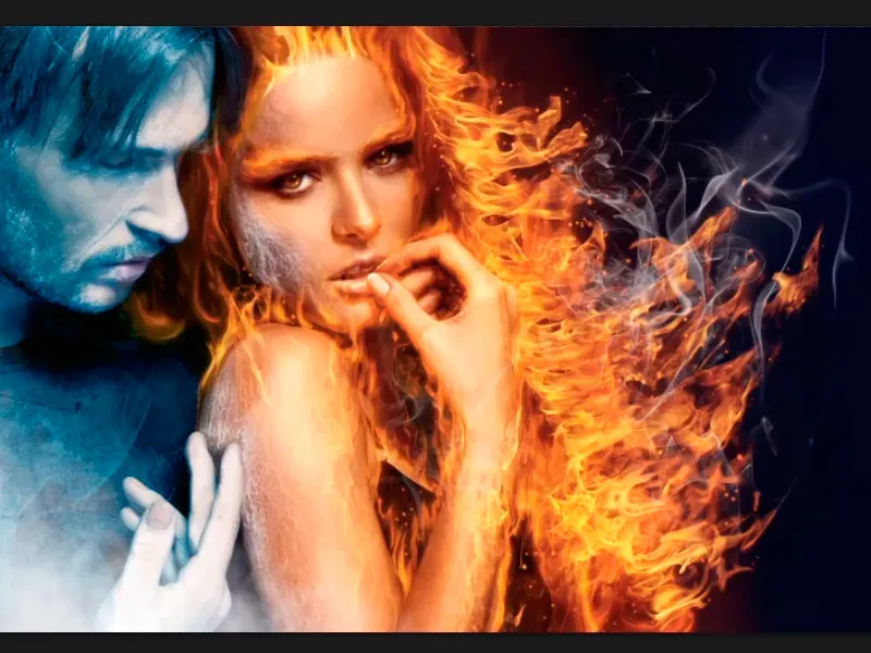
Note: The tutorial "The icy fog and color adjustments" is a text version of the accompanying video training by Marco Kolditz. The texts may therefore have a colloquial style.
Let's get started: Steps 1-10
Step 1
A little icy fog can't do this picture any harm and that's why you're going to create this fog together. In the meantime, Marco has created the "Man" group. This includes all the layers and groups that you have created for the man so far.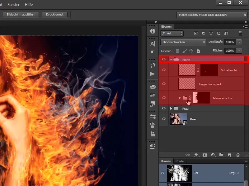
Step 2
This means that if you hide this "Man" group, you will see the normal color of the man again, ...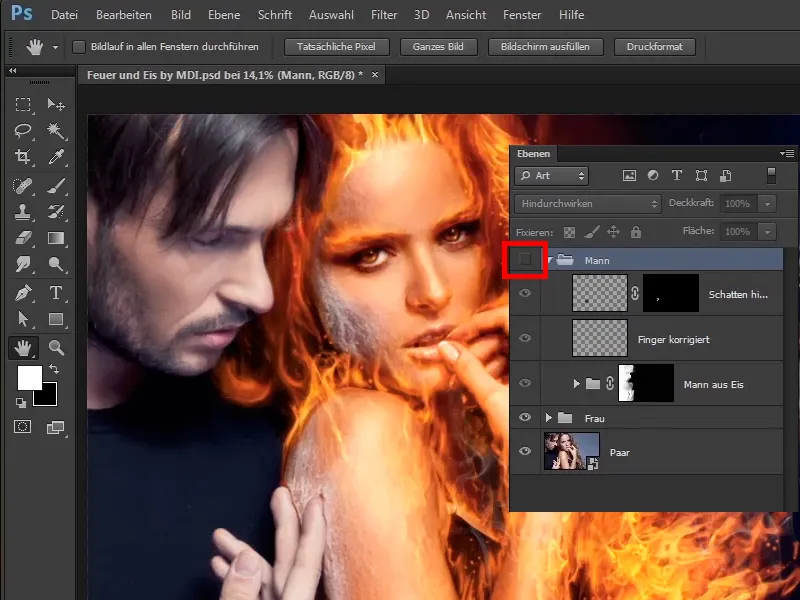
... and if you show it, Mr. Ice or Mr. Frost.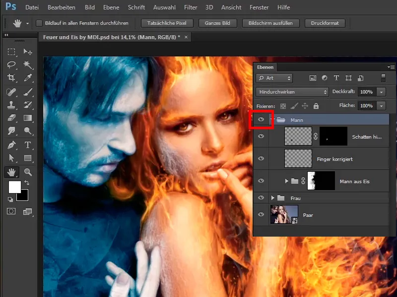
Step 3
It's also nice to see if you hide both layers: You now have the original image here: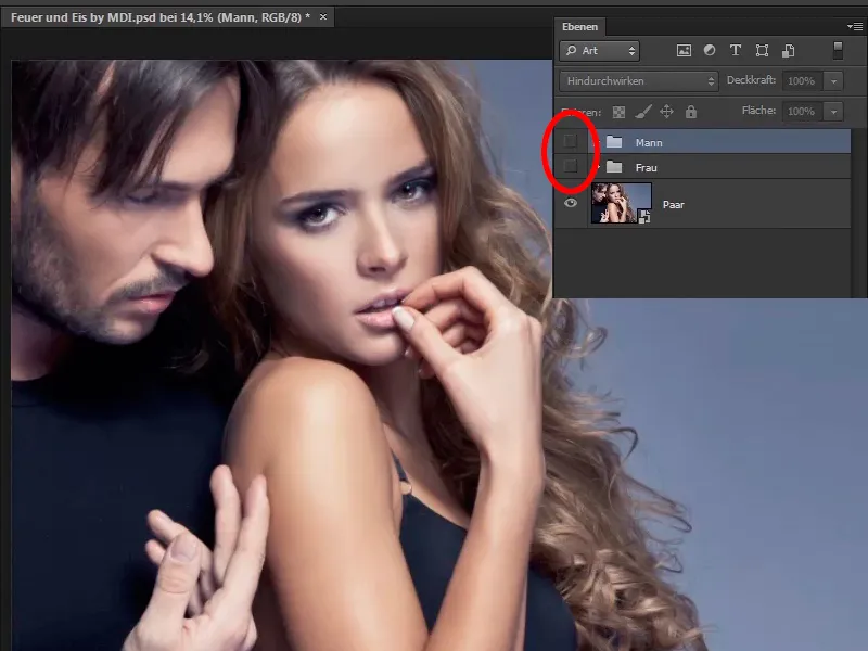
Step 4
In the meantime, you have turned the woman into fire and ...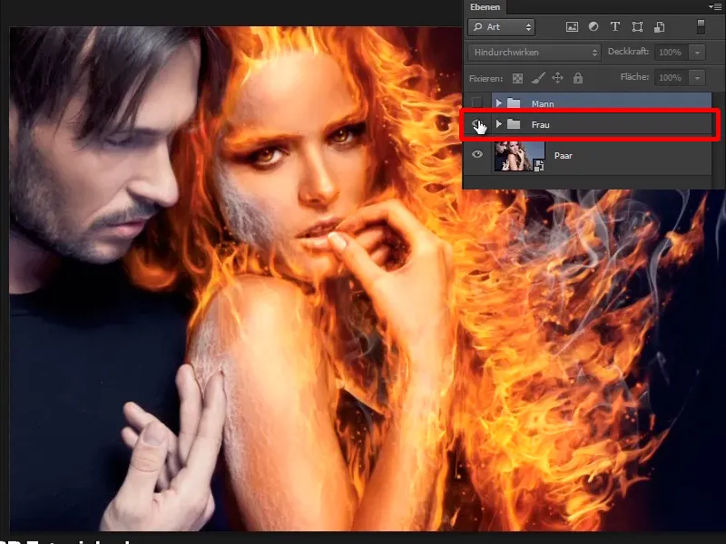
... the man into pure ice.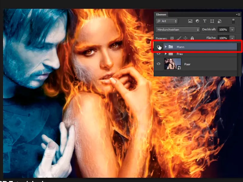
Step 5
If you go to the "Man" group, click on the top layer, create a normal empty layer and name it "Icy mist".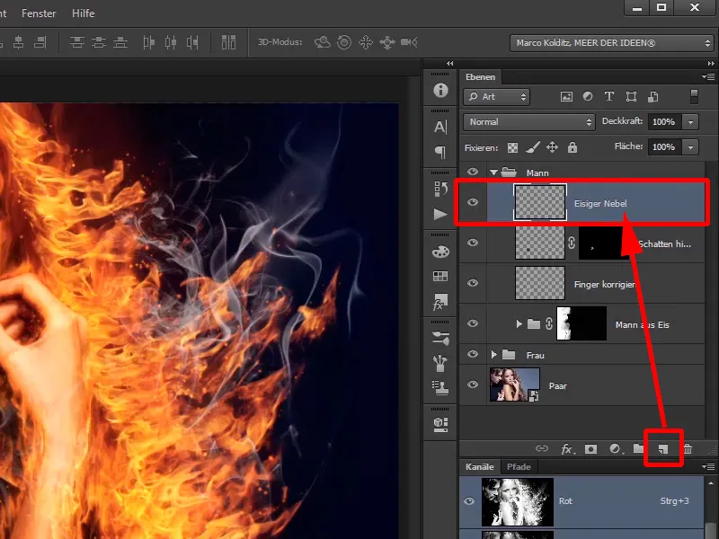
Step 6
You will now use a brush, in this case a rather soft cloudy brush, to paint the fog into the picture.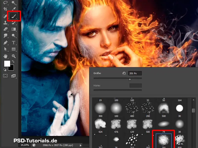
Step 7
As we have often said, there are various free brushes available on the Internet for this purpose , or you can make your own. In this case, use a soft brush, zoom out of the picture a little and simply click into the picture with a white foreground color.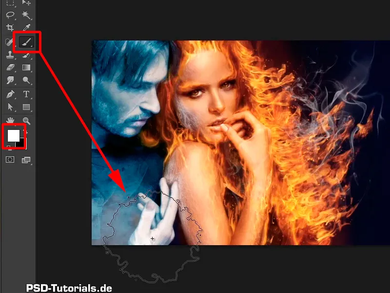
Step 8
By the way, a little tip: If you have a completely different color here, e.g. something like this, and you want to have black or white very quickly - just press the D key at this point and you will have black as the foreground and white as the background. You can always switch between the two foreground and background colors with the X key.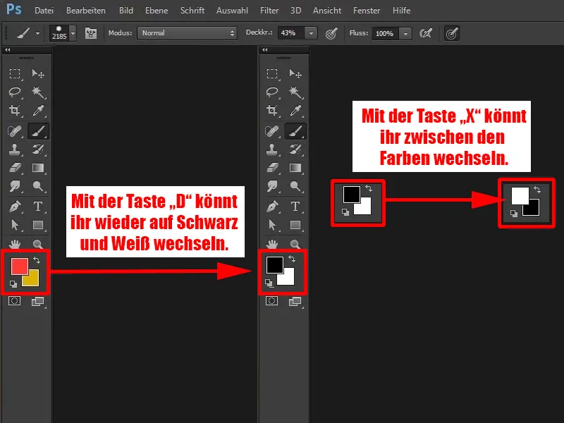
Step 9
And this is what you do now. With white, simply paint into the picture with a large brush, click a few times, and you can already see that when you click in the edge area, everything becomes frostier and foggier.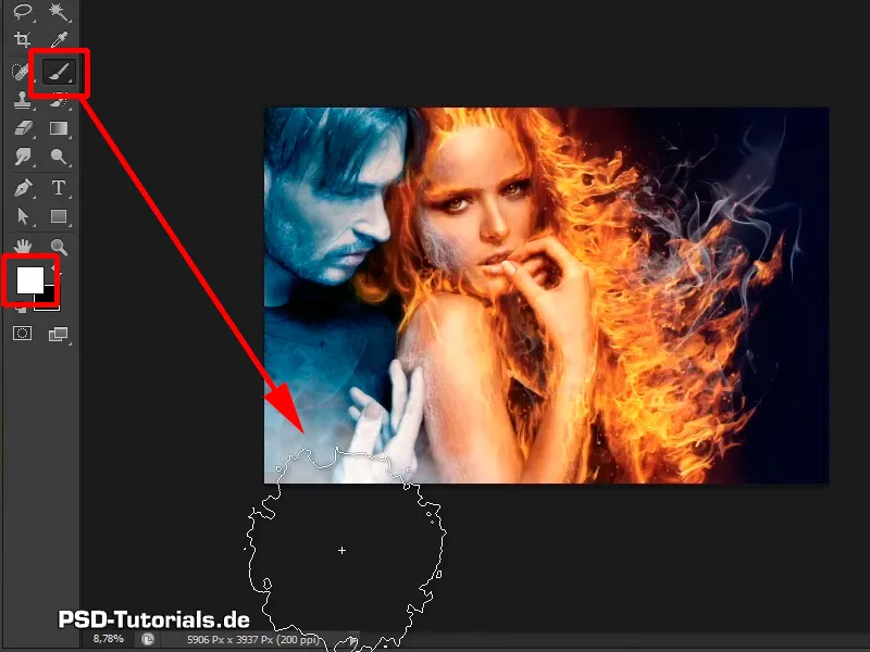
Step 10
You shouldn't do too much, you should now reduce the opacity even further to 20% and click again in the bottom corner. That's actually enough.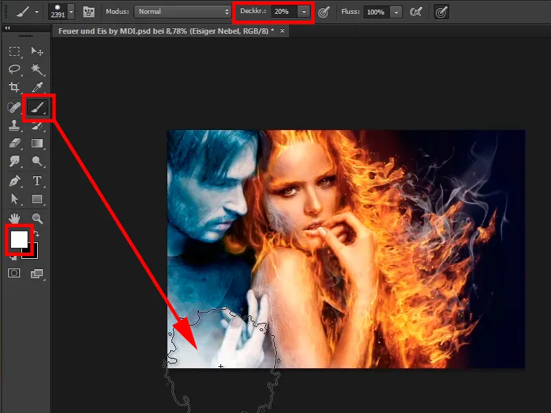
Steps 11-20
Step 11
Now select another brush, the same frayed brush as before.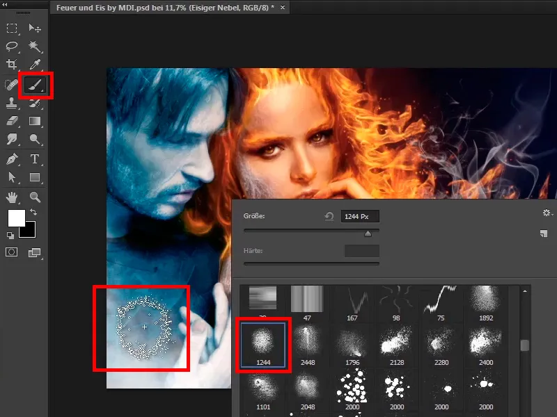
Click on it again to give it even more texture.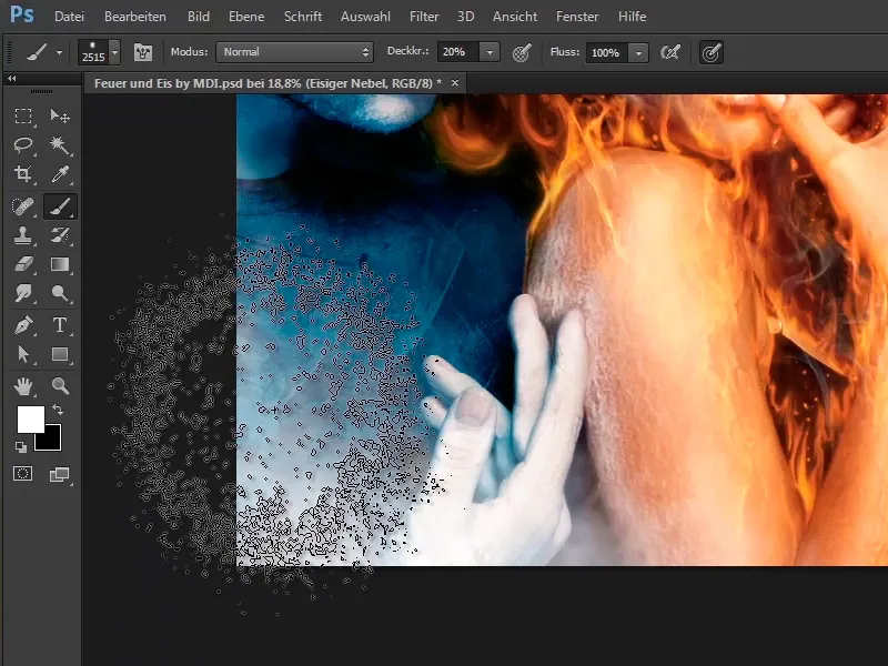
Step 12
It looks very good now.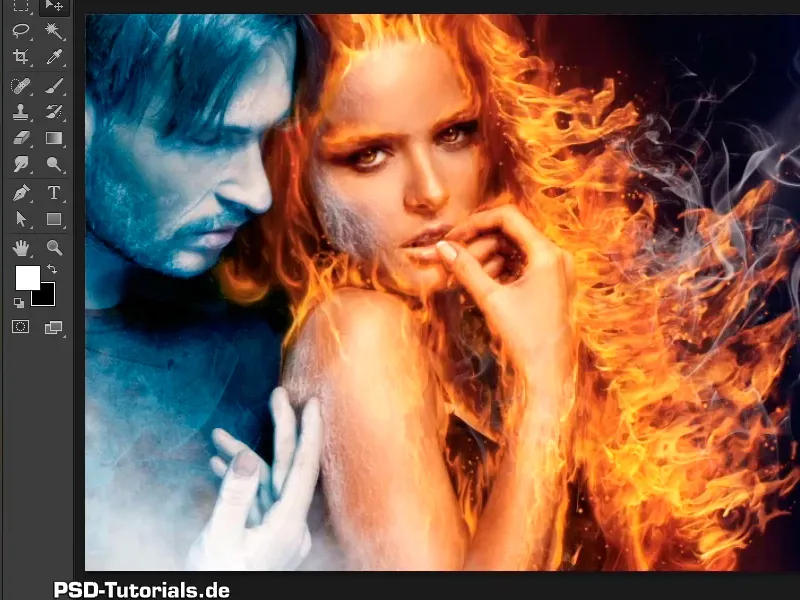
Step 13
Close the "Man" layer and now you want to change the color look a little between the woman and the man. Because the man is quite bluish, she is fiery orange, which means that here, where they meet a little, the color has to be adjusted a little.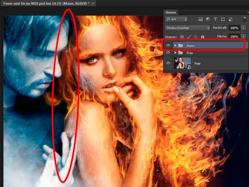
Step 14
This means you select the "Man" group and create a New adjustment layer Color area.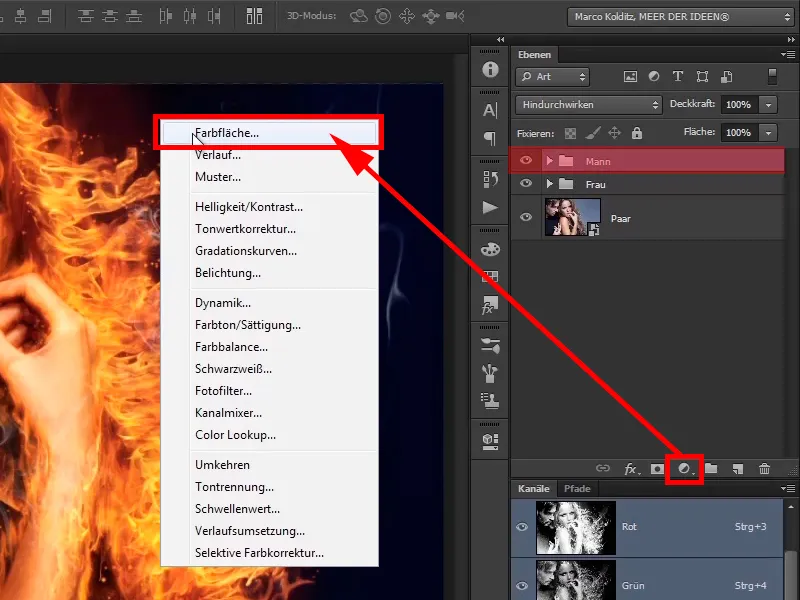
And look for a cool, bluish tone. Marco of course has the color values ready for you, as he has already prepared the image.
R: 61
G: 105
B: 121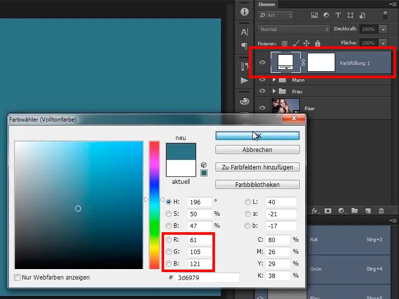
Step 15
This is not about the exact color value, so don't orientate yourself exactly to these values, i.e. whether it says 60 or 61 is jacket like pants. It is simply about this similar color tone and you now rename it "Blue Shimmer".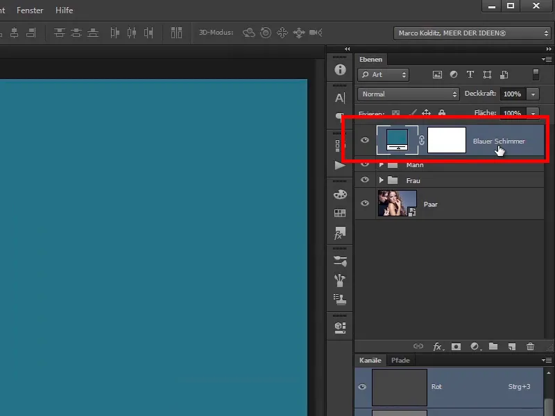
Step 16
Set this layer to soft light mode.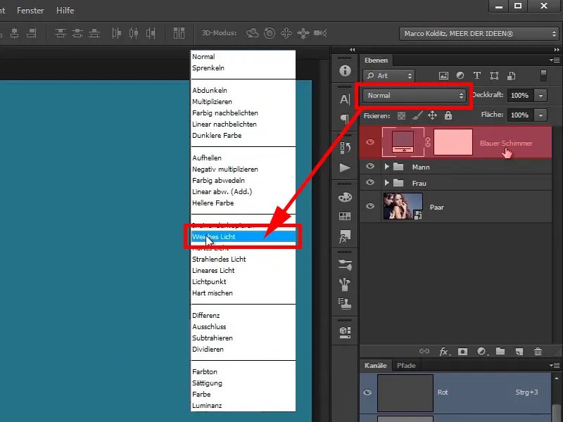
Step 17
You hide the layer; this is what it looks like before ...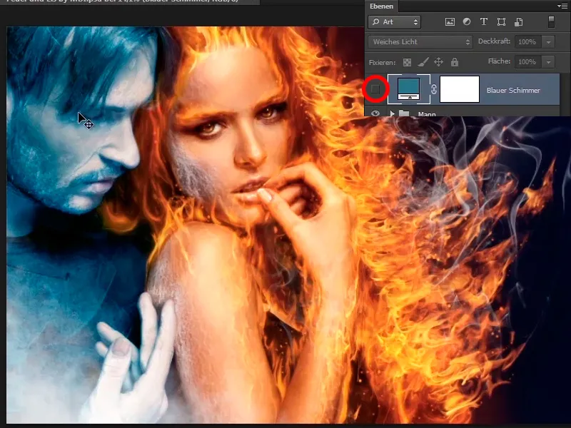
... and this is how it looks afterwards.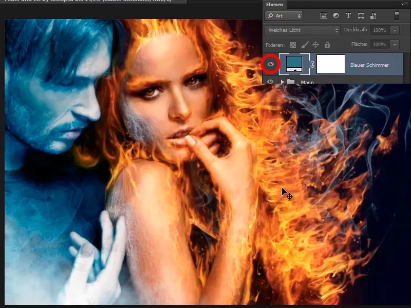
Step 18
The whole image has become a little darker and bluer and of course you only want to apply this to the area between the man and the woman. This means that you will invert the white mask, which just lets everything through, with Ctrl+I.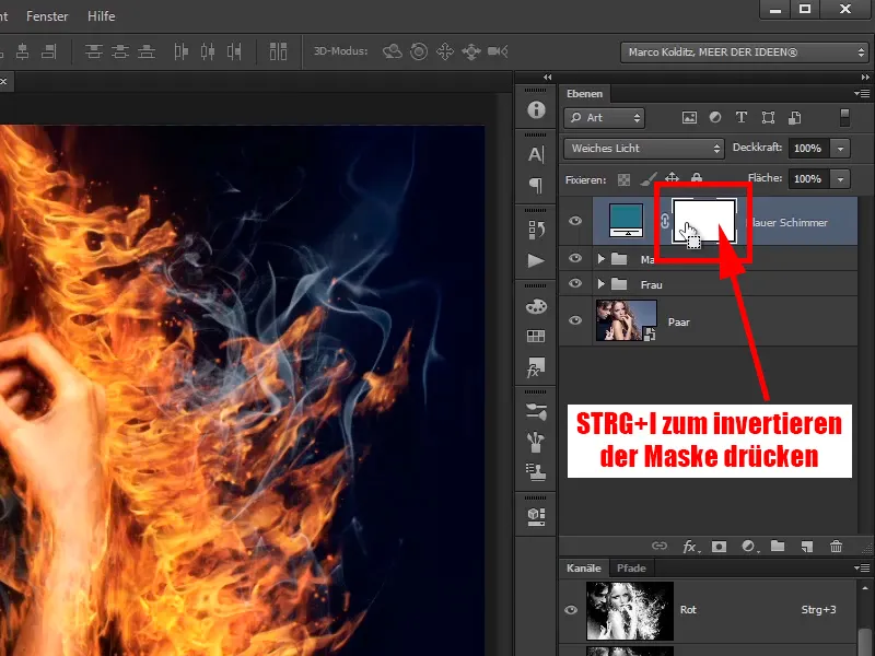
Now the mask is black: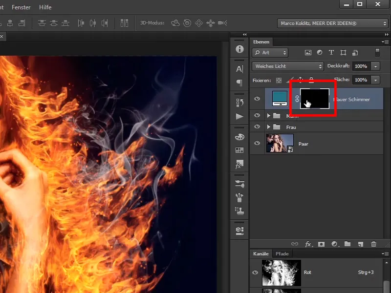
Step 19
And then paint the change into the picture where you want it, using a normal soft brush, not the texture brush.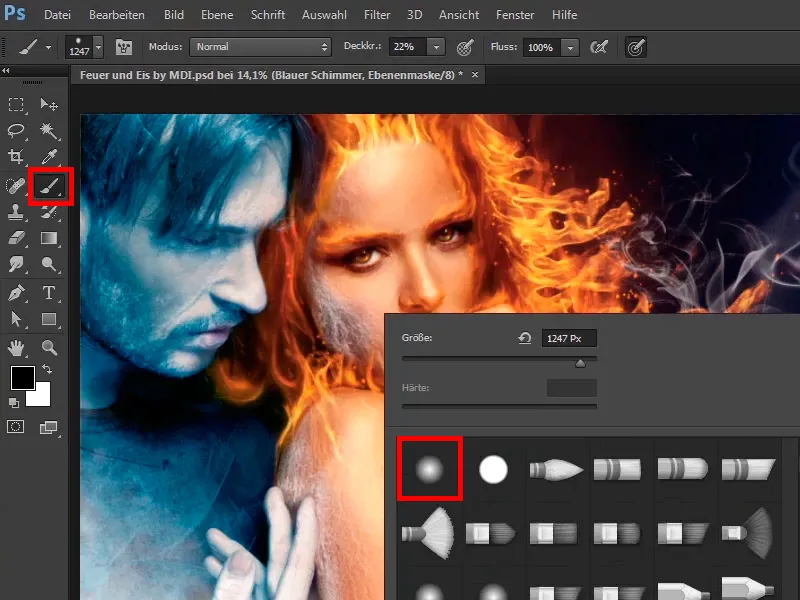
Step 20
You can set the opacity to 100% for now, you can still play with it. Now you will make this area a little bluer with a white foreground color.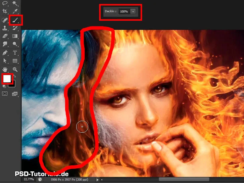
The last step
Step 21
What results in cyan and yellow or blue and yellow? Green. That's why it will be a little greenish here. But you shouldn't overdo it and go back down to 34% opacity. At the transitions from the man to the woman, you can make it a little bluer because the icy guy gives off a little of his color to her because he is so close to her.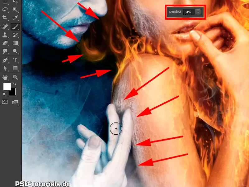
Step 22
It looks pretty good like this; you do the before and after comparison and ...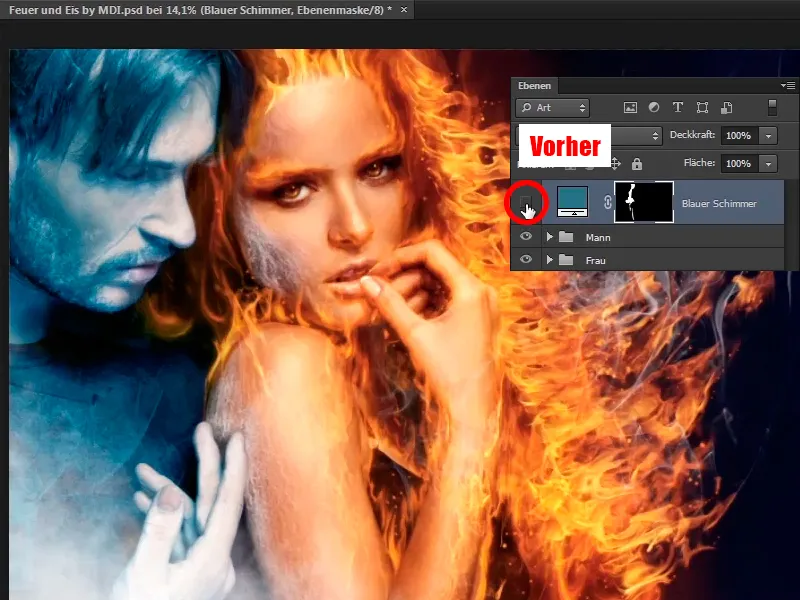
... this makes it look much more appropriate.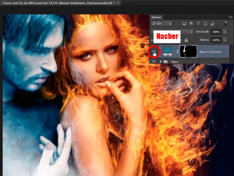
Step 23
Now you can add a little contrast to the white, also using a Gradation Curves adjustment layer.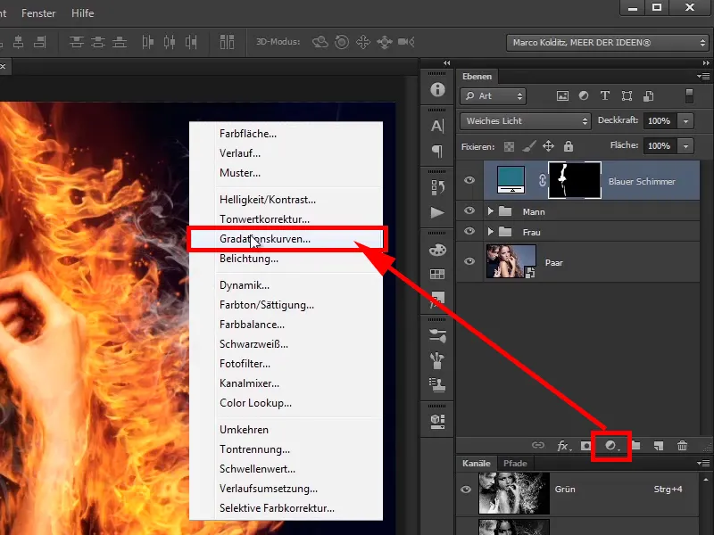
Step 24
Click once in the middle, this will leave the middle tones, you already know that, the grayish tones or the tones that are not too black, not too white, you tack them down there for now.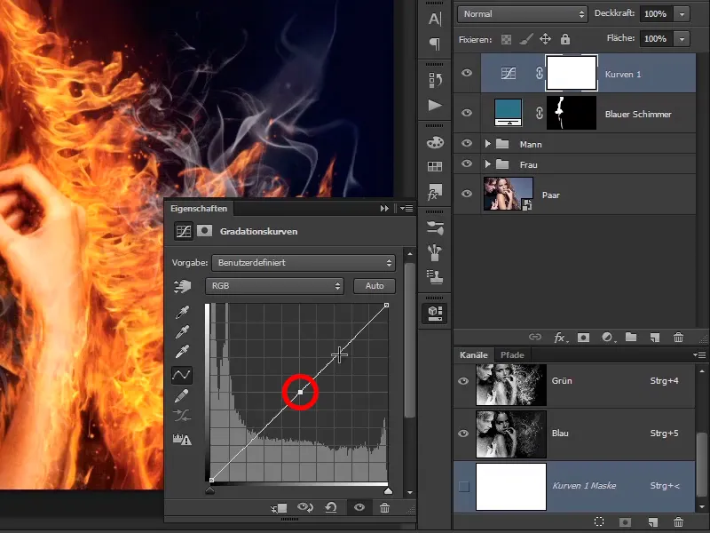
Step 25
And then you pull the light tones up a bit here at the top, in luminance mode, so that it only affects the brightness and not the color saturation. At the bottom here you stay roughly on the line so that the black tones are not affected.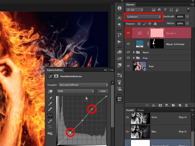
Step 26
So, before and after, now everything is a little brighter. You can go down a little on the lighter tones. You can also reduce the opacity of the "Curves 1" layer to 95%, ...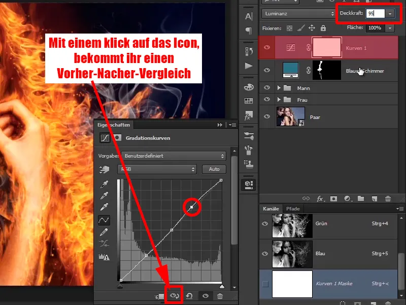
... the blue shimmer to 90%.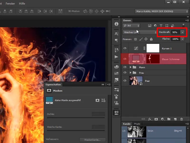
Step 27
Take another look at the gradation curve and rename it "Some contrast". If you now hide it and ...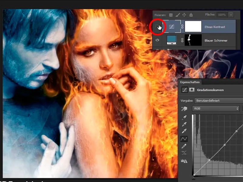
... then you'll see that where there is normally white everywhere, it's now a little whiter. This means that the image is a little crisper.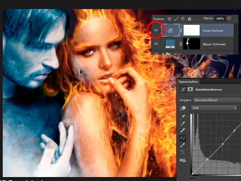
Step 28
And now comes the final tutorial, in which Marco shows you how to sharpen the image a little and then add noise. Why do this? You'll find out in the next tutorial.