Welcome to this tutorial where you will learn how to create effective visualizations using Pivot Tables in Excel. In this lesson, we will cover the chart creation process and the different options available to you. If you are already familiar with Pivot Tables, you will quickly discover how to use these powerful tools to create dynamic and engaging data visualizations.
Key Insights
- There are various ways to create charts based on Pivot Tables.
- Pivot Charts offer the flexibility to dynamically visualize data.
- You can customize the design and formatting of charts within Excel.
Step-by-Step Guide
To provide a clear step-by-step guide, I will explain in detail the process of creating charts with Pivot Tables.
1. Establishing the Data Foundation
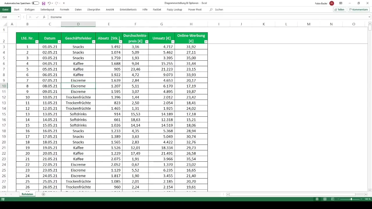
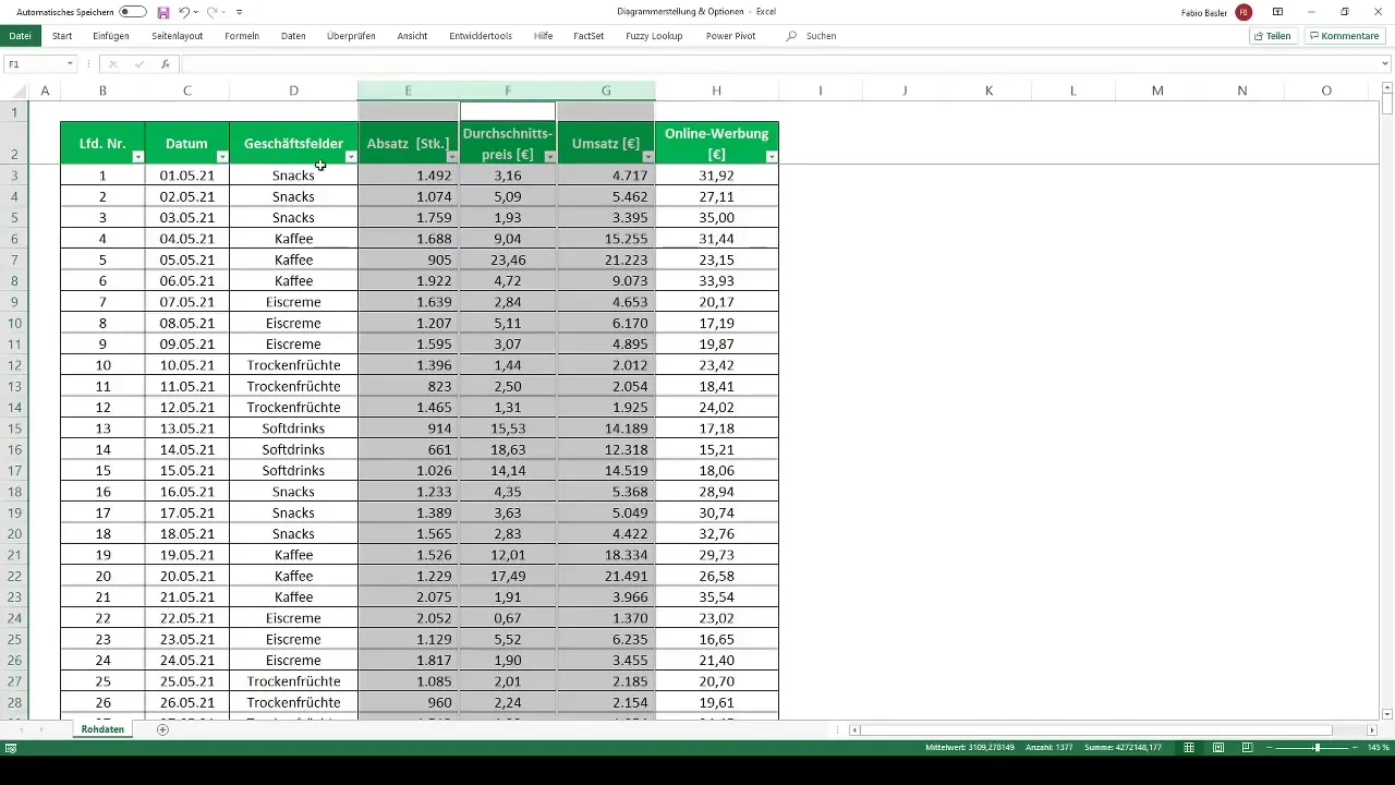
First, you need to establish your data foundation. To work with Pivot Tables, make sure your data is arranged in a structured table. Press Ctrl + A to select all data and use Ctrl + T to format the data as a table. Click "OK" to complete the table creation.
2. Creating the Pivot Table
Now you can create a Pivot Table. Click on the "Insert" tab and select the "PivotTable" option. You will be asked where the Pivot Table should be placed. Choose "New Worksheet" and name it, for example, "Pivot Analysis".
3. Inserting Data
In the Pivot Table, it is important to select the right data. Drag the total revenues into the values area and the business fields into the rows area. You may also want to adjust the representation of numbers, for example, by adding thousands separators and removing decimal places.
4. Creating the Chart
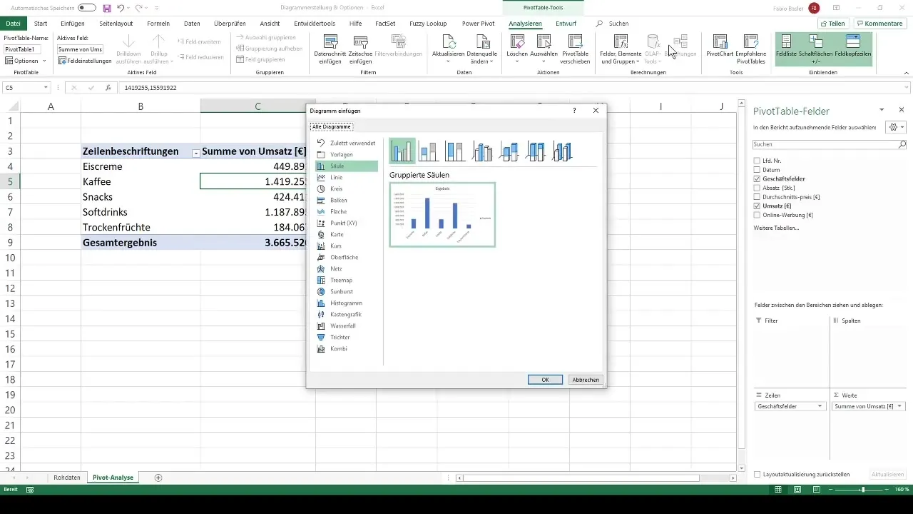
The next step is to create a chart. Click on any cell in your Pivot Table. Then select the "Analyze" tab and click on "PivotChart". Here you can choose between different types of charts. The preview will help you find the appropriate representation.
5. Customizing the Chart
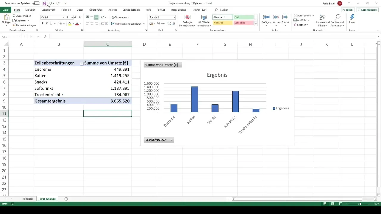
After creating your chart, there are many customization options. You can change the fill color, adjust the outline, or even add existing shapes like rectangles and circles to your chart. Right-click on the chart to change the fill and lines, and customize the layout to your preferences.
6. Adjusting the Chart Size and Formatting
You can easily change the size of your chart by dragging the corners. Holding the Alt key allows you to align the chart precisely to the cells in the background. Through the formatting options, you can also manually adjust the height and width.
7. Using Field Buttons
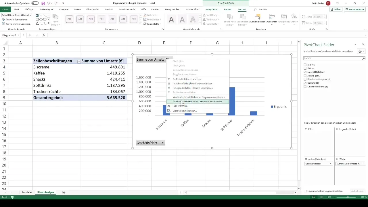
The field buttons allow you to make dynamic filters in your chart. You can show or hide them as needed to improve the clarity of your data. This is particularly helpful when you only want to view specific areas of your data.
8. Changing the Chart Type
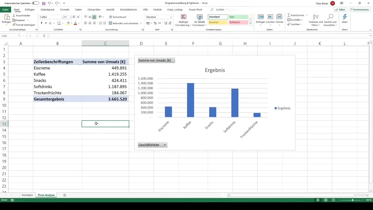
If you are not satisfied with a specific chart type, you can easily change the chart type. It is often useful to try out different types such as column charts, line charts, or pie charts to find the best representation for your data.
Summary
In this tutorial, you have learned various steps for creating charts from Pivot Tables in Excel. You have learned how to establish the data foundation, generate Pivot Tables, and customize charts. Use what you have learned to visually and dynamically represent your data.
Frequently Asked Questions
How do I create a Pivot Table in Excel?To create a Pivot Table, select your data, go to "Insert," and click on "PivotTable."
What are Pivot Charts?Pivot Charts are charts that are directly linked to Pivot Tables and enable dynamic visualizations of data.
How can I customize the layout of my chart?You can customize the layout of your chart by changing fill, borders, and shapes using the right-click options.


