This guide will focus on the creation of combo charts, also known as combined charts, in Excel. These charts combine different types of representations and are an excellent way to visually and informatively display data from a pivot table. The goal is to show you how to display various metrics in a single, dynamically updated chart. You will learn how to create a pivot table, choose the right types of charts, and format the final combo chart.
Main Insights Combo charts in Excel allow you to represent different types of data in one chart. Pivot tables make it easy to analyze and dynamically visualize the data they contain. Understanding how to use secondary axes is crucial to clearly present the desired information.
Step-by-Step Guide
Step 1: Prepare Data and Create Pivot Table
First, you need a dataset to work with. This can be sales figures, revenues, or other relevant metrics. Make sure your data is correct and contains all necessary information.
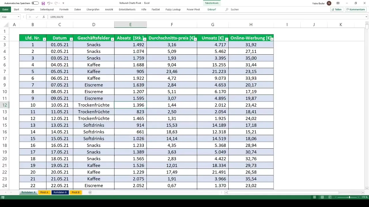
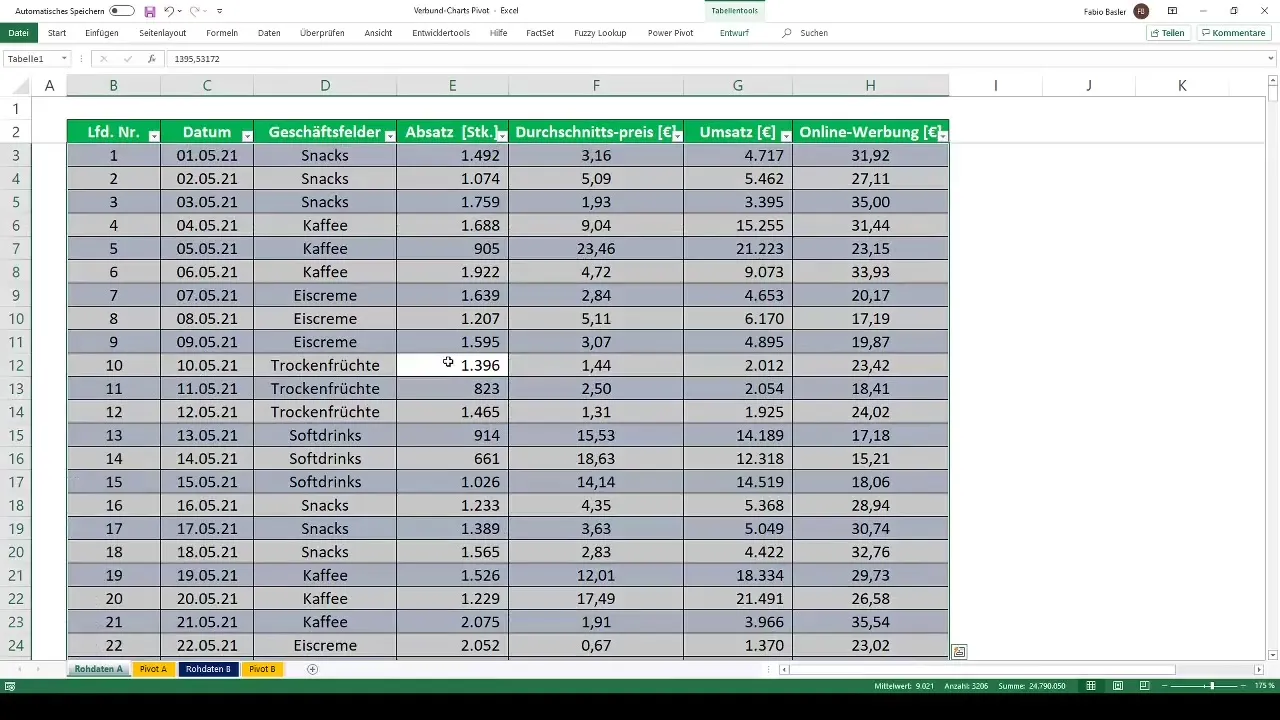
To create the pivot table, select your entire dataset by pressing the Ctrl + A key combination. Then go to the "Insert" tab and click on "PivotTable." Choose the target worksheet where the pivot table should be placed and confirm with "OK."
Step 2: Perform Analysis in the Pivot Table
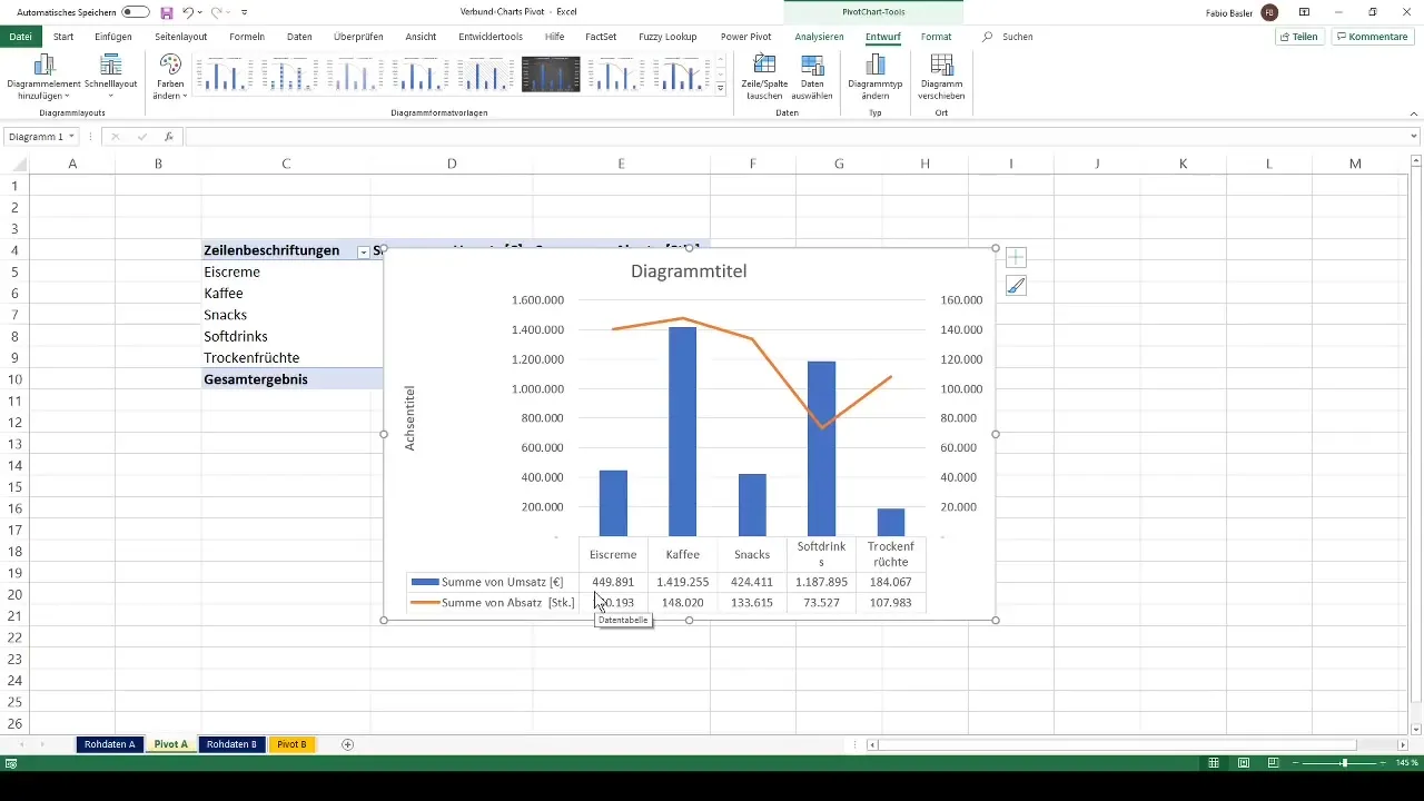
In the newly created pivot table, you will perform the desired analyses. For example, you can analyze revenue per business area and units sold. Make sure to format the two values with a thousand separator for easier readability.
Step 3: Create Pivot Chart and Choose Chart Type
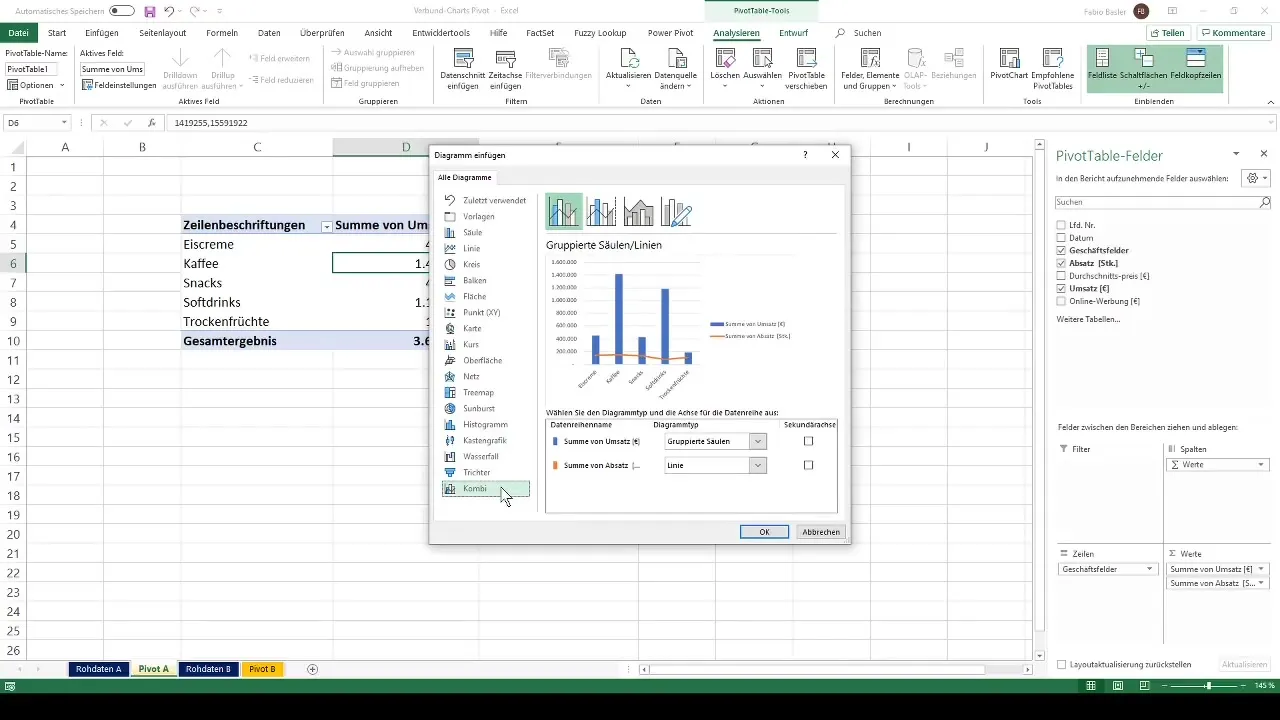
Now that you have your pivot table, it's time to create a pivot chart. Right-click on the pivot table and select "PivotChart." In the dialog that opens, you can choose between different types of charts. Pick a combined chart.
Step 4: Add Secondary Axis and Customize Chart
An important feature of combo charts is the ability to add a secondary axis. This is especially helpful when representing values with different orders of magnitude. Select the data series to be displayed on the secondary axis and right-click to choose the "Format Data Series" option. Check the box for "Secondary Axis."
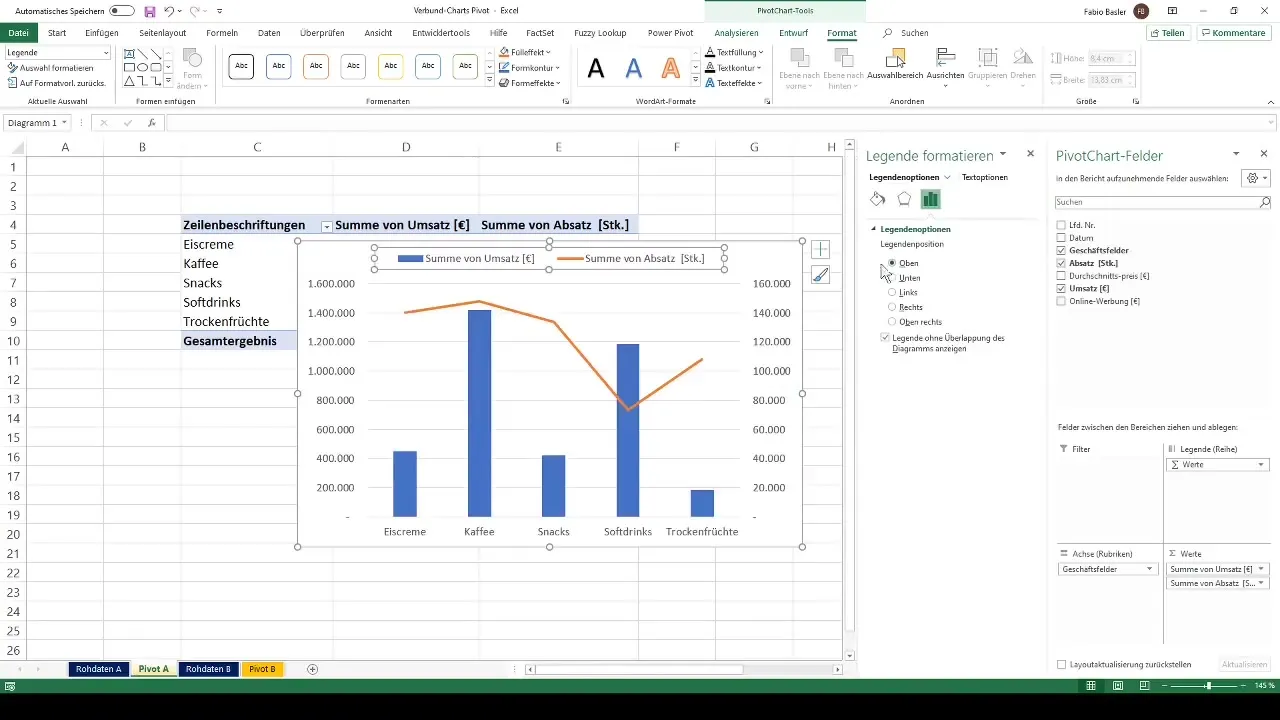
Step 5: Design the Chart
Now you can design the chart to your liking. You can move the legend, change color schemes, and adjust formatting. In the Design tab, you have access to various layouts that you can use to make your chart visually appealing.
Step 6: Insert Table Overview
To further enhance the clarity of the chart, you can insert a tabular overview of the numbers. Choose the appropriate layout from the Design tab and activate the option to display data labels.
Step 7: Try Other Chart Types
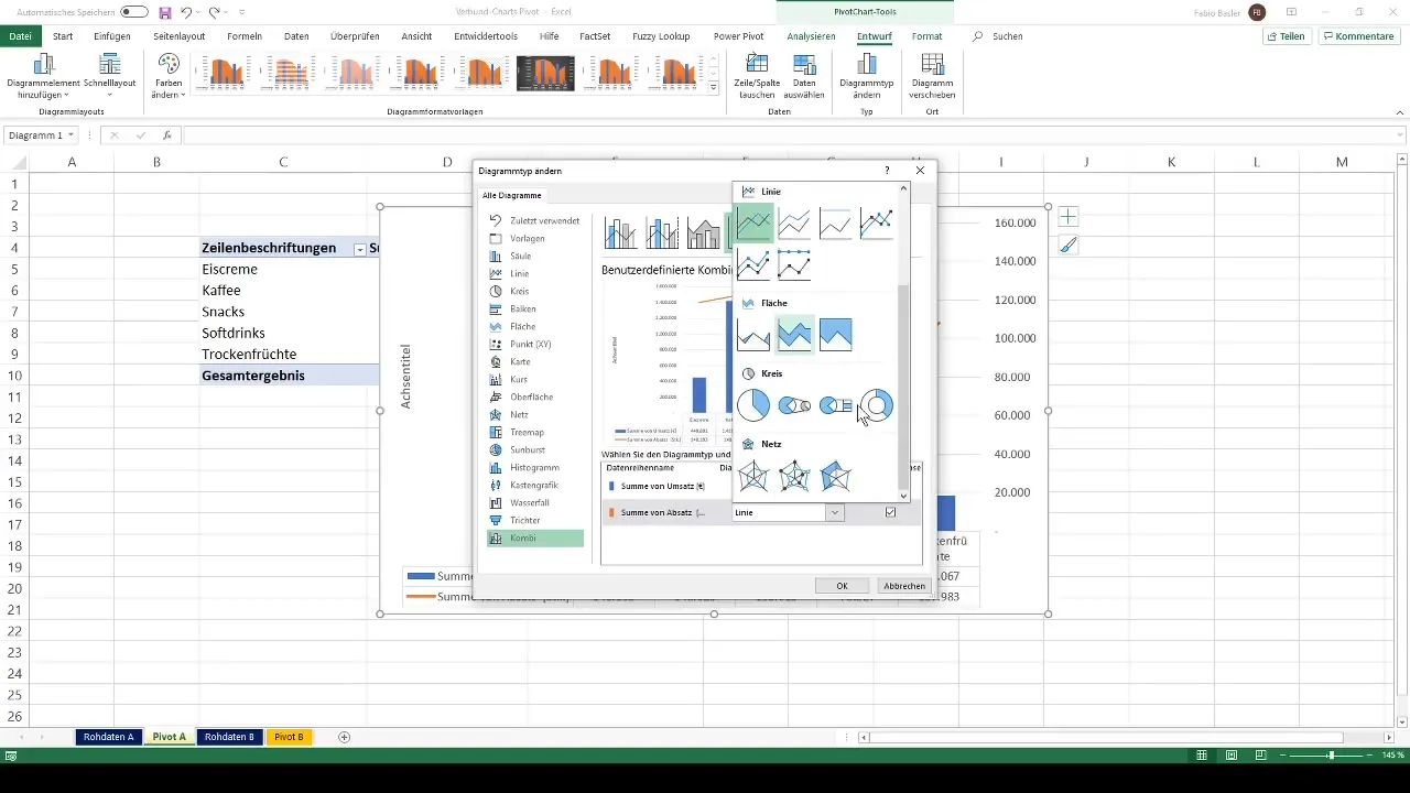
Once you have created the combo chart, you can also experiment with other chart types. Use the "Change Chart Type" option to integrate, for example, an area chart or a bar chart to gain different perspectives on your data.
Step 8: Finalize Chart
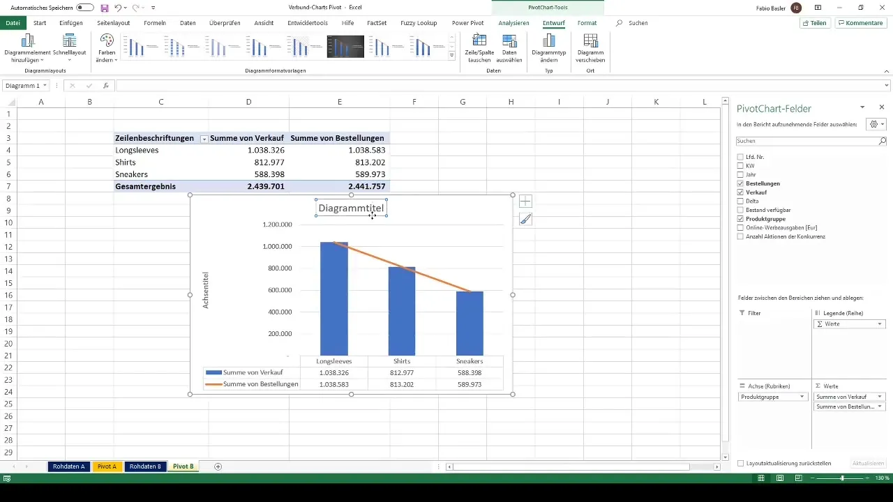
Make the final adjustments, such as removing or renaming the chart title. For example, you could rename it to "Combo Chart." Ensure that the information is presented clearly and concisely so that your chart is both informative and visually appealing.
Summary
In this guide, you have learned how to create and customize combination charts in Excel to dynamically visualize various metrics from a pivot table. By using secondary axes, you can ensure that different data formats are presented in clear graphics. Utilize the various Excel functions to optimize the presentation of your data.
Frequently Asked Questions
How do I create a pivot table in Excel?Select the dataset, go to "Insert" and choose "PivotTable".
What are combination charts?Combination charts are charts that combine different chart types in one representation.
How do I add a secondary axis?Select the corresponding data series, right-click and activate the secondary axis.
How can I change the layout of my chart?Use the design tab to select layouts and adjust formatting.
Can I try out different chart types?Yes, you can change the chart type at any time and combine different visualizations.


