Note: The tutorial "Image look and highlights + shadows" is a text version of the accompanying video training by Marco Kolditz. The texts may therefore also have a colloquial style.
Step 1
Now the color mood of the mask, which still looks very human, should be changed a little and, above all, adapted more to the surroundings. First zoom into the picture and move it a little to the side so that you can see the mask clearly. The mask should no longer be so orange and human, but look a little more mysterious. Select the "Mask" folder in the layers, click on the Create new fill or adjustment layer icon and select Black and white.... This black and white conversion now affects the entire image. As you don't want this to be the case, click on the icon at the bottom of the settings window to create a clipping mask. The changes will then only affect the area below. Marco immediately renames the layer to "SW".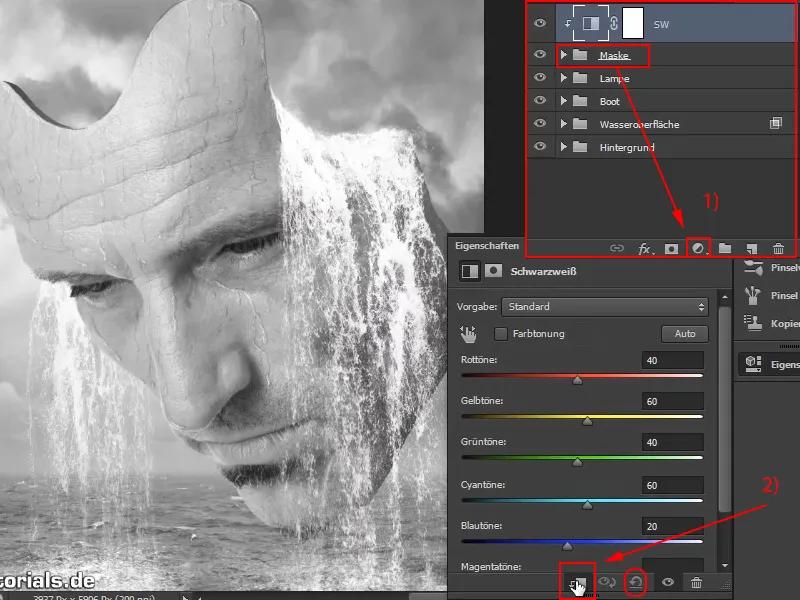
With all the options in the Properties window, you could of course adjust a few things and adapt the black and white conversion, but Marco just leaves it at the basic settings because the face is desaturated. Of course, there are also various ways to desaturate, another of which has already been shown in this series.
If you have already adjusted the sliders and want to return to the original value, click on the arrow symbol two positions to the right of the clipping mask symbol.
Step 2
Now create another adjustment layer above the "B&W" layer. This time select Color balance ...
You will see three sliders that are responsible for the shadows, midtones and highlights in the image. Marco has already discussed this before: The dark pixels in the image are addressed with Shadows, the grayish midtones and pixels with Midtones and the bright areas in the image with Highlights.
The mid tones should be adjusted first. So set the selection menu to Midtones. Marco zooms out of the image slightly so that the effect can be better assessed in the context of the background.
Of course, you also go back into the clipping mask. Then drag the Cyan slider a little to the left (-15) and Blue a little to the right (+19). Of course, you can play around and create a completely different style if you want. Marco also briefly checks whether the depths should also be adjusted, but decides to leave it as it is. You rename the new layer to "Bluish look".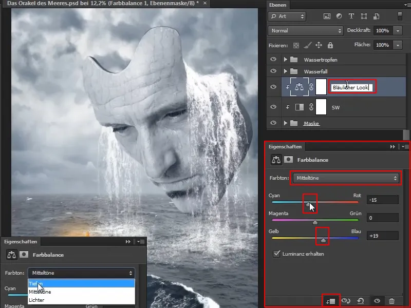
Step 3
Now apply something similar to the boat, because the green of the boat doesn't really fit in with the surroundings, where everything is so slightly blue: the sky, the sea and the mask are bluish-grey and that reflects everything. It's nice that you can still see some of the boat's green in the water, but in general this boat should be a little bluer.
Select the "Boat" group (1) and apply an adjustment layer by clicking on the icon (2), in this case the green should be desaturated first. So go to Hue/Saturation.
With this little hand with the arrow pointing left and right, you can click on the green of the boat, for example, because this area should be desaturated (3). As a result, something has changed in the lower color bar of the control panel. You can see the area that you now want to influence and move the sliders slightly towards the green area, as you don't want to remove any of the red (4).
Then drag the Saturation slider a little to the left (5) and you can see what happens. That's exactly how it should be. Finally, rename the layer to "Desaturate green".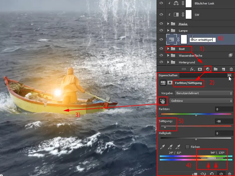
Incidentally, this is similar to the layer styles: The areas in the middle are completely deleted (**) and then there is a transition on the right and left where not all pixels are deleted, but where there is a color gradient ().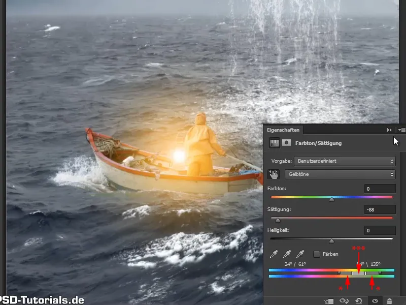
Step 4
And now place a colored area layer above it ... by clicking on the symbol and confirming with OK. Turn it into a clipping mask.
No clipping mask was created in the previous step, so make up for this now and create a clipping mask for the "Desaturate green" layer by Alt-clicking in between.
Double-click on the icon to open the color picker and select a greyish blue tone.
Rename this layer to "Bluish look". This now has an effect on the boat. First it was desaturated from the green and now you have given it a bluish look.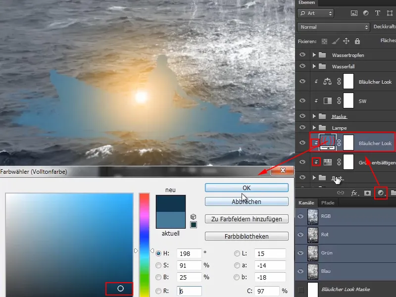
Step 5
Set the layer to soft light mode and everything will be much more bluish.
And then you can work with the opacity and reduce it.
If you still want to change the color, you can adjust it at any time by double-clicking on the icon to open the color picker again and making a new selection.
What I don't like yet is that the water in the boat itself is still a bit greenish. You could apply a mask to the "Boat" group here, but Marco does something else ...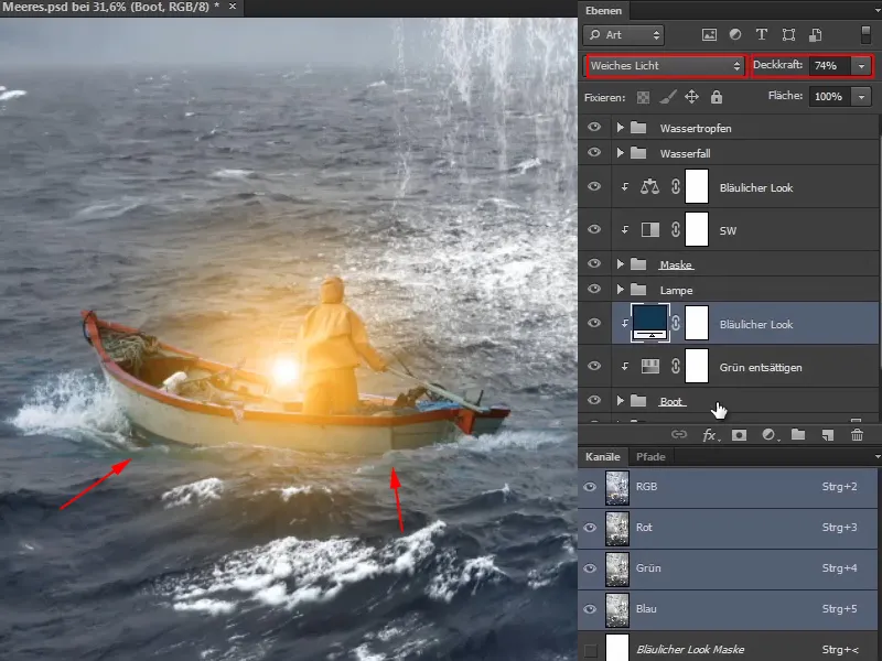
Step 6
He clicks on the "Boat" layer and zooms into the image. Now he masks out the unsightly areas a little with a very soft brush and reduced opacity. With a black foreground color, of course.
This makes the effect less noticeable. It remains a little greenish in some places, but that will disappear by itself later.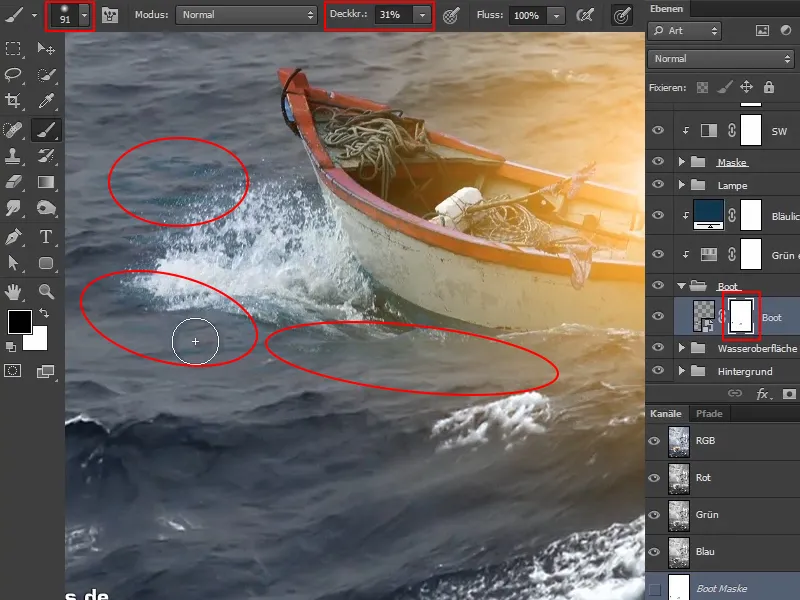
The before/after comparison of the mask looks like this: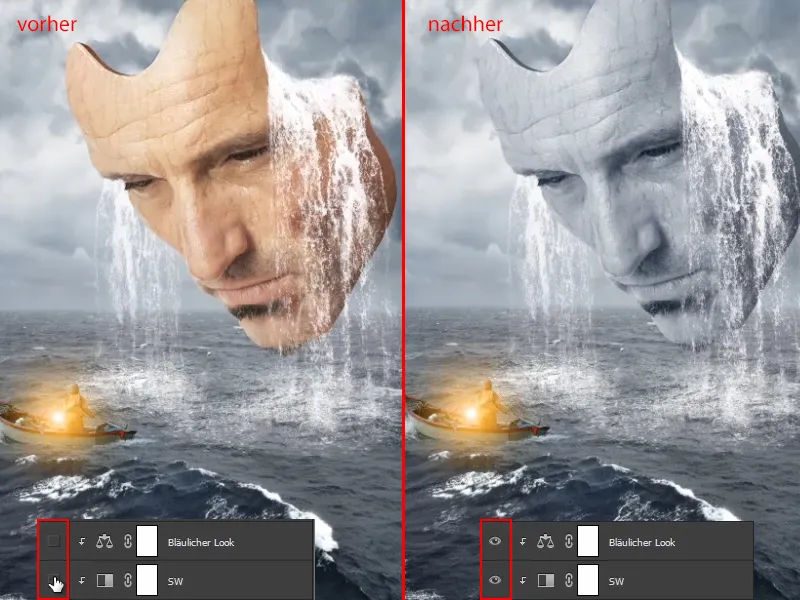
And the boat looks like this. Before, the surroundings were still bright green and now it is better adjusted.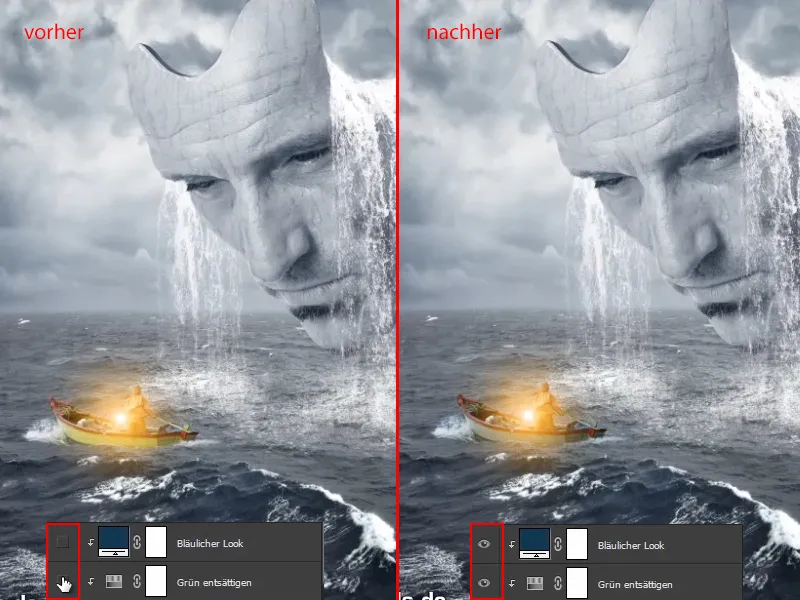
Step 7
Now take care of the highlights and shadows on the mask and boat.
To do this, click on the "Mask" group and create a Color plane layer ... in this case two, namely a black and a white one.
Rename the black layer to "Shadows" and the white layer to "Lights".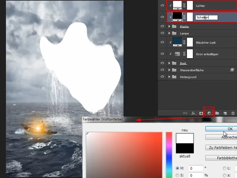
Marco points out that there are, of course, many different ways of adding highlights and shadows to images. You always have to see which variant is particularly suitable for the existing image and, above all, what you feel like doing.
Step 8
Marco shows the following variant in the video training:
First, he inverts the two masks so that they are initially hidden.
It is important that the two layers are below the "Bluish look" layer so that the bluish look and so on can still have an effect on the highlights and shadows.
Now zoom into the image a little, select the brush and set the opacity to 8 %. You have to be very careful with shadows because they are not as forgiving as highlights, for example.
Now paint the shadows onto the mask. Marco clicks on the areas that are still too light for him, especially on his chin, and paints the shadows into the picture. Some people call this Dodge & Burn, but that works too, of course. Anyone can do it however they like. For Marco, this effect is completely sufficient.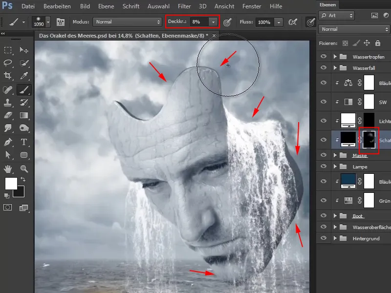
Step 9
Marco now reduces the opacity of the "Shadows" layer to 90 % because people generally tend to overdo highlights and shadows quickly. He says that what he has already seen when lightening the whites of the eyes alone is beyond good and evil. You really have to be careful.
Now switch to the "Lights" layer. You now want to paint a fringe of light into the picture, because there is a kind of light area around the eye level of the mask in the area of the sky, and this could flatter the contour of the mask on the cheek and forehead a little.
You can now increase the opacity again to around 22%, as highlights are a little more forgiving than shadows, so you can use a little more force.
Now paint along the contour. It looks particularly good in the eye and upper cheek area because the white and the light waterfall come out particularly well when there is a light line. In the video tutorial, Marco keeps changing the size of the brush during this step.
It looks quite good this way: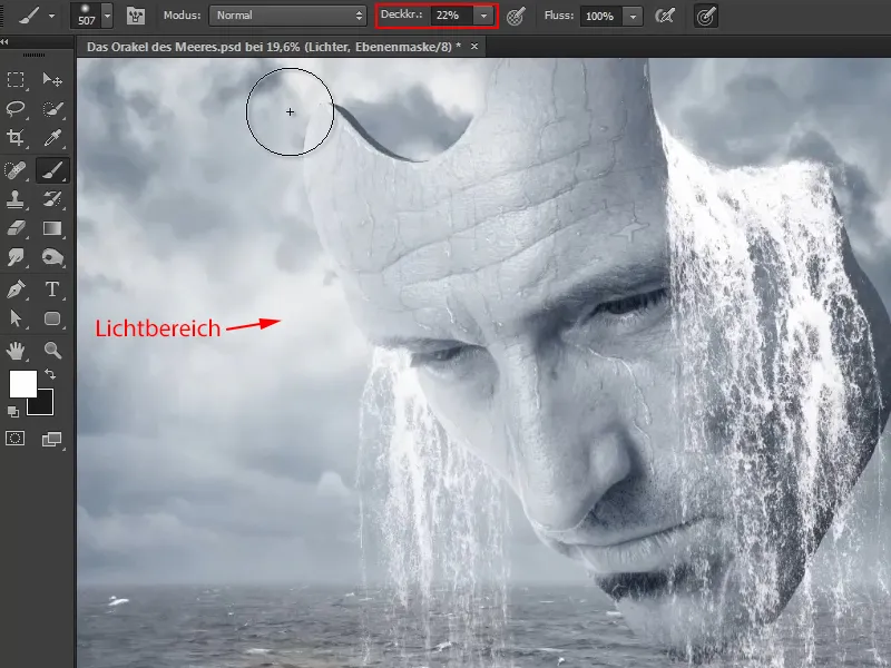
Step 10
Of course, this is not destructive and can still be adjusted afterwards. You could even adjust the color of the light border, but it looks pretty good like this.
What should still be brought back, however, is the eye, because the eyes should always be in focus, in a photo always in the focus area and in this case also in the contrast area. Even if it would of course be more realistic for the eye to also be affected by the light fringe. But this always varies from picture to picture. And since this is a fantasy image and Marco likes it better this way, he decides to darken the eye a little again. Everyone can do that however they like.
It looks quite good like this.
Of course, you can also take your time again.
Step 11
Marco reduces the opacity of the layer to 80%, which has already added light and shadow to the image and made everything much more three-dimensional.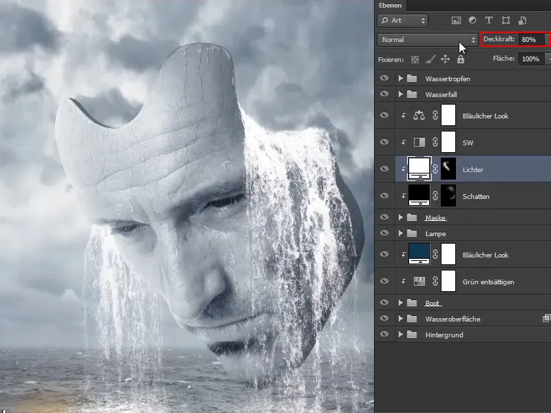
Step 12
Now do the same for the boat, but only for the shadows.
Click on the "Boat" group and create a color area ... in black.
Set this to Multiply - by the way, the "Shadows" layer created above should also be set to Multiply and the "Highlights" layer to Multiply Negative.
Now invert the mask and carefully paint a little shadow into the image using a brush and white paint - with an opacity of 10 % it should work. Again, you can take your time here. You have to be careful with the water.
This way you can add a little shadow and integrate the boat even more into the surroundings.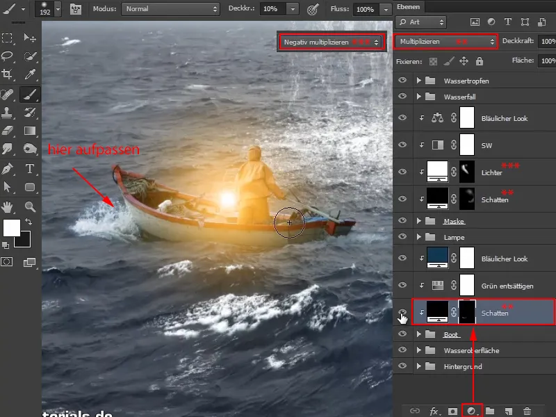
Take a look at the before and after: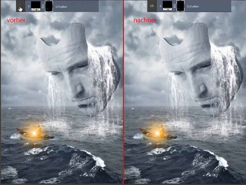
Step 13
To make the mask's eyes glow a little more - the mask is looking down at the boatman with the incredibly bright lantern - you can paint two more points of light into it.
To do this, go above the "Bluish look" layer, as the orange of the eyes would become bluish again below it, which of course makes no sense.
Create a Color plane layer there ... and select an orange shade, very roughly. Of course, you can also use the exact color value of the lantern, but for demonstration purposes, Marco only needs an approximate value.
The mask is of course inverted again and the opacity is set to 100%. Zoom into the image, select a very soft brush (hardness 0%) and set it to a size of 30 pixels.
And then you have to see where the light spot goes..webp?tutkfid=67882)
Step 14
Of course, set this to Multiply negative again, as this will make it much brighter.
You can also create another color layer with a lower opacity and place a slightly smaller light spot on top of the current one. Marco tries this out briefly in the video training, but deletes the layer again straight away as he likes it better without it.
Now it still looks as if the point of light is above the eyelashes. To change this, you can simply use the mask. Click on the mask and paint along the lashes with a 7% brush and black foreground color.
You can reduce the opacity if necessary, Marco sets the opacity of the right eye to 64%.
This allows you to optimize the points of light a little more and of course it looks as if the point of light is actually caressing the lashes a little.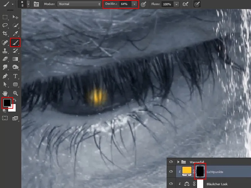
Step 15
Overall, this looks quite good. Marco selects a slightly warmer light by double-clicking on the color icon to open the color selector panel again and pulling the slider down slightly.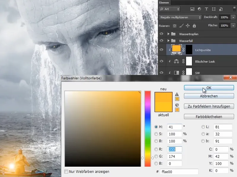
Step 16
Marco has paused the video briefly to position the light points so that they are looking exactly at the man. Now he shows the result.
He has also painted light reflections on the cheek and nose area. In doing so, he has followed the same working method as before when painting the lights on the contour of the mask.
In contrast to before, however, this time he has offset the layer ("lamp effect") in Color mode, which turns the original blue into the yellow-orange shimmer.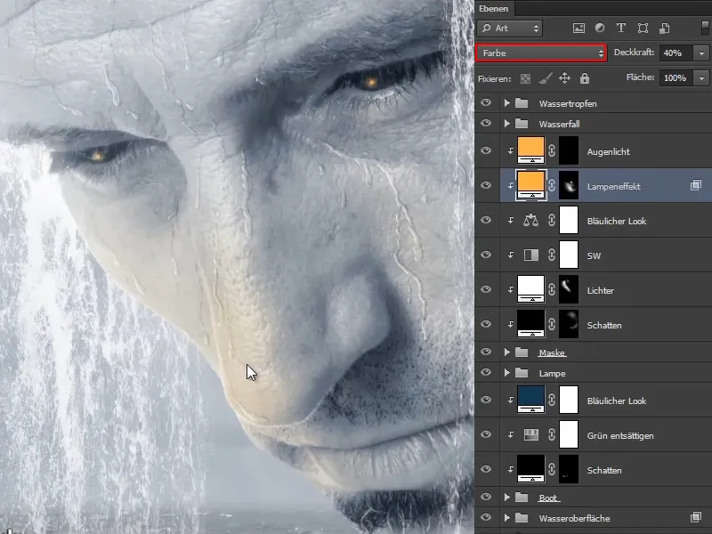
This is what the mask looks like right now: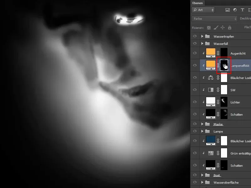
And this is what the image looks like overall right now: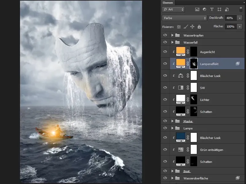
It actually looks almost finished. However, the image should be made a little bluer and, above all, a bluish look should be applied to the entire image and the edges darkened. This will be done in the last part of this tutorial series.
