In this tutorial, you will learn about the possibilities of conditional formatting within Pivot Tables in Excel. Using a realistic example of a streaming company, we will explore how you can prepare and present your data in an informative way. Conditional formatting not only helps you quickly identify important information, but also enhances the visual design of your reports. Let's get started!
Key Takeaways
- Conditional formatting offers an efficient way to visually present data.
- It is important to highlight only the relevant individual values and not the totals.
- Various formatting options such as color scales, icon sets, or rule-based formatting can be easily applied.
Step-by-Step Guide
Step 1: Create Pivot Table
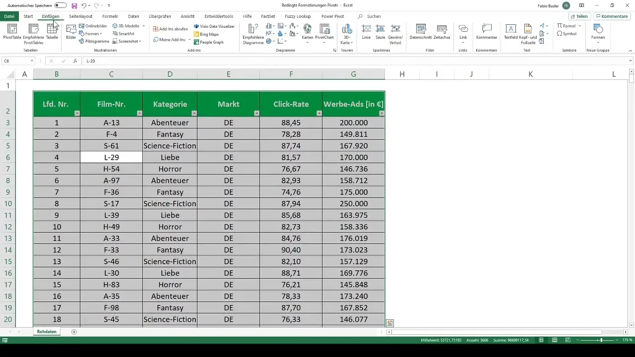
First, you need to create a pivot table from your collected data. I have prepared an example where the business figures of a streaming company are analyzed. We have information about various movies categorized into Adventure, Fantasy, Horror, Romance, and Science Fiction. The next step is to create the pivot table.
Step 2: Add Market and Category Analysis Points
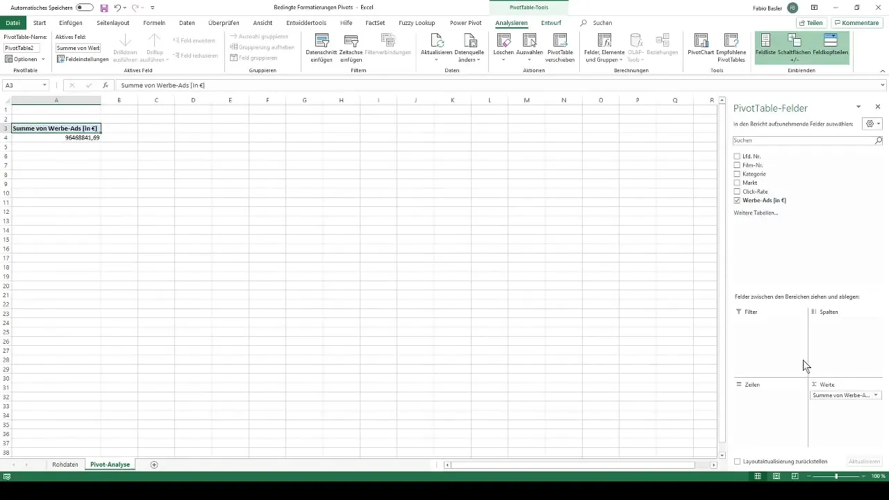
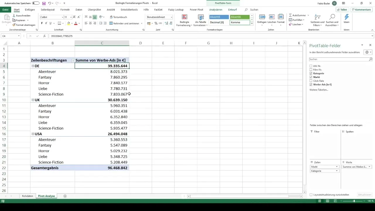
To refine the analysis, we add market segments. In this example, we look at Germany, the United Kingdom, and the USA. We also add the different categories of movies to get a comprehensive view of the business figures.
Step 3: Format Cells
Before starting with conditional formatting, you should optimize the cell formatting. Make sure the thousand separators are enabled and remove the decimal places. This will give you a clearer overview of the numbers.
Step 4: Apply Conditional Formatting
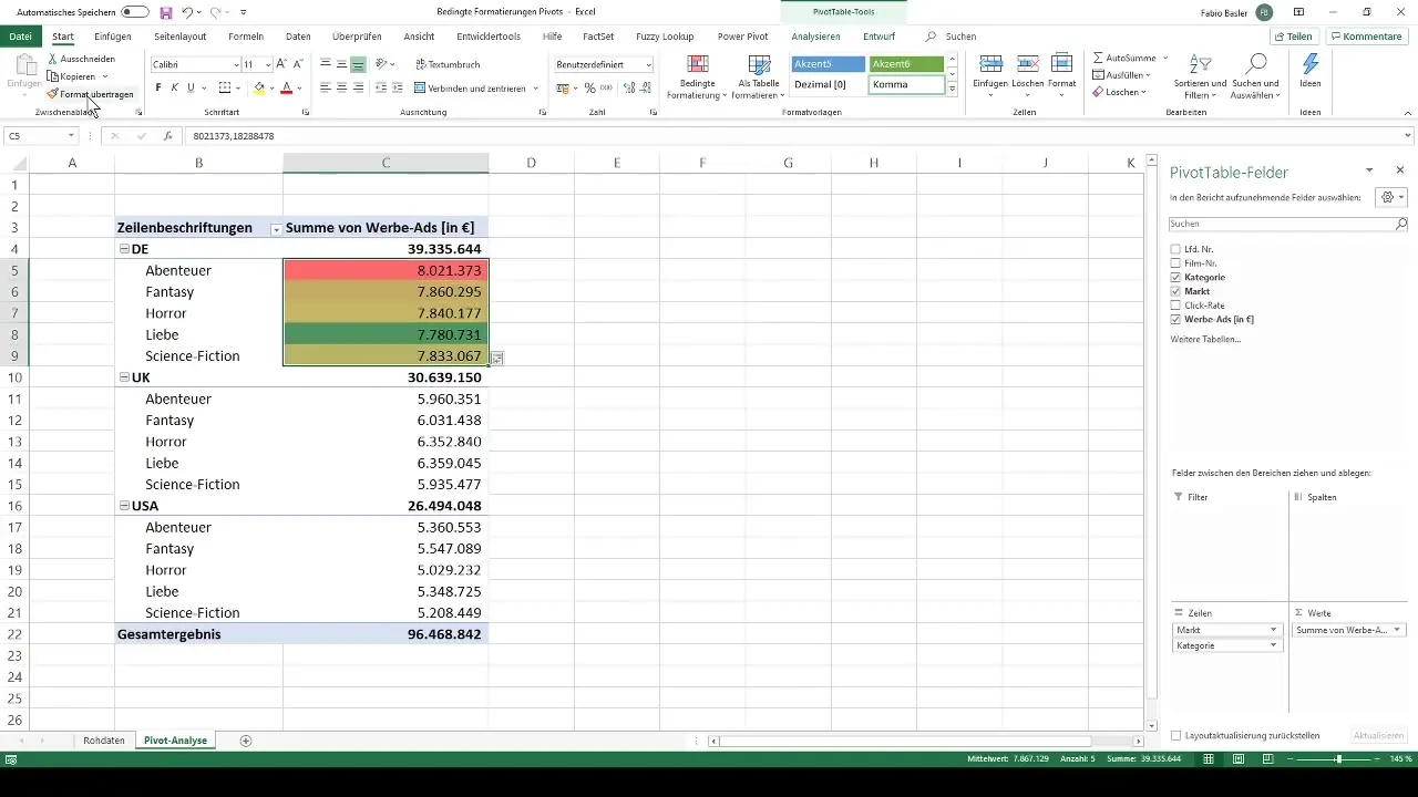
To make the data visually appealing, select the range you want to format. Go to the menu bar, choose "Home," and then "Conditional Formatting." Here you will find pre-designed color scales to help you categorize the values.
Step 5: Use Color Scales
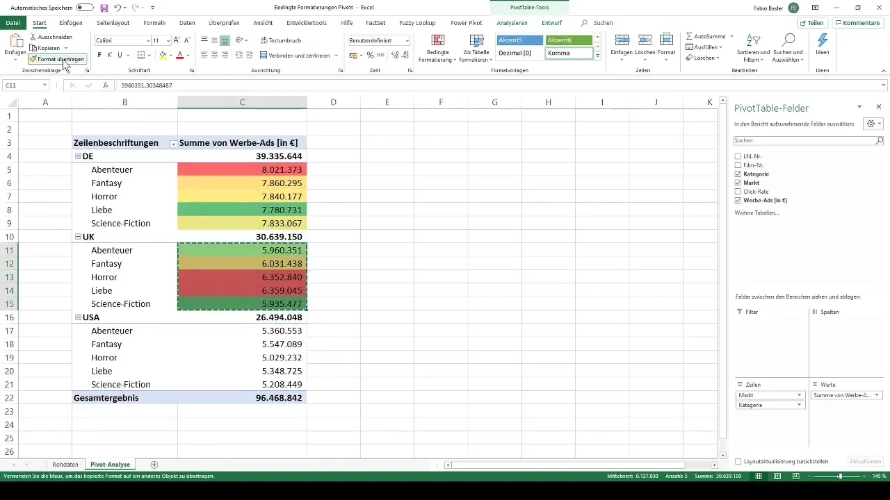
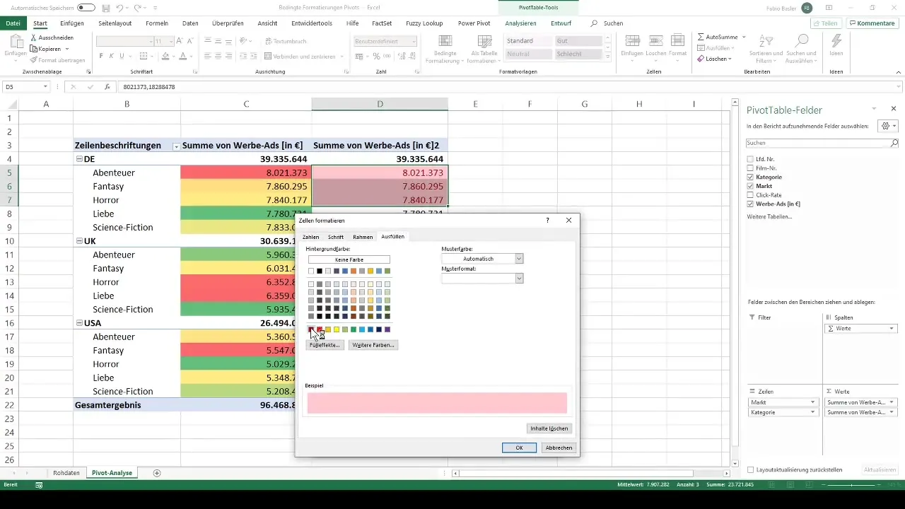
For advertising expenses, we want to use a color scale that represents higher expenses in critical red shades. For example, you may choose the red-yellow-green color scale. Make sure to highlight only the individual values and not the total sums.
Step 6: Transfer Formatting
To transfer your formatting to other cells, you can use the Format Painter. This is an easy way to apply the previously set formatting to other values without having to manually adjust them.
Step 7: Add More Conditional Formatting
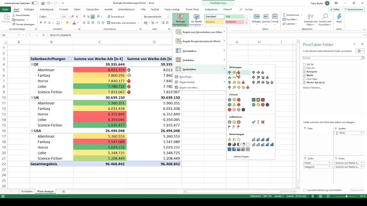
In addition to color scales, you can also use icon sets. These help you quickly identify trends or deviations in the data. For example, you can use arrows to represent upward or downward trends.
Step 8: Customize Rule-Based Formatting
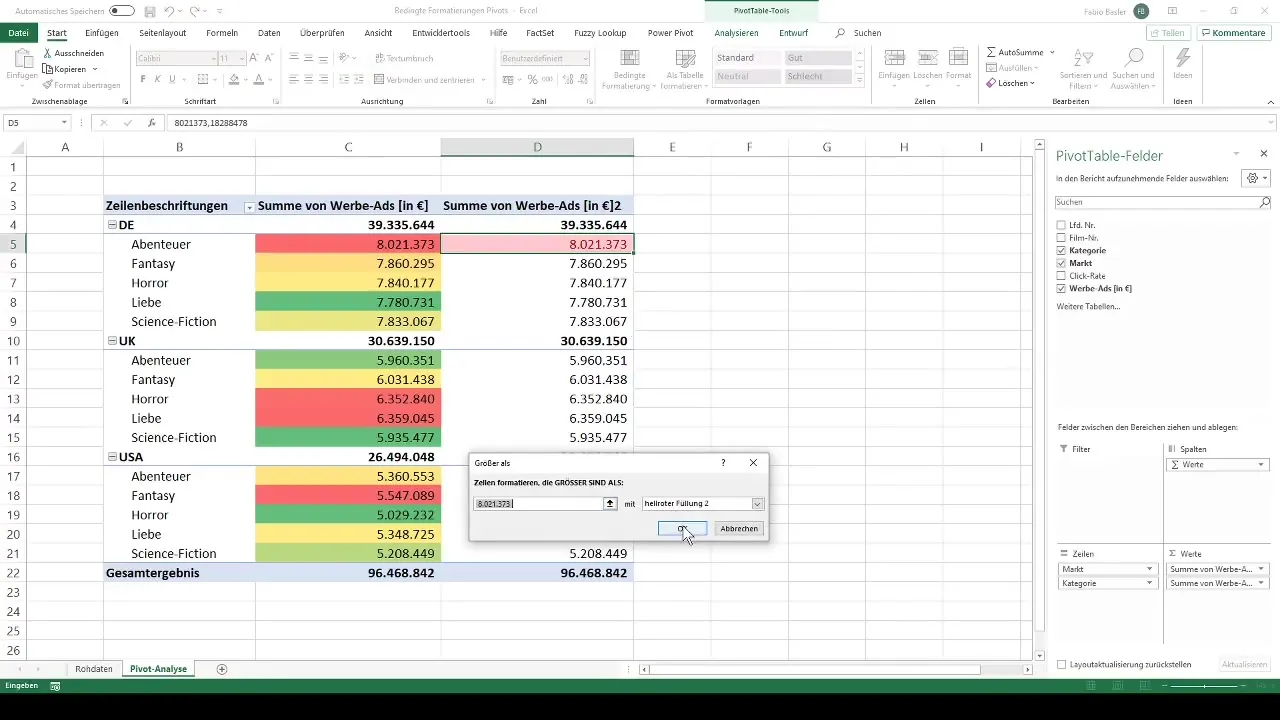
By customizing the rules for conditional formatting, you can, for example, specify that cells with values above 8000 are colored green and values below are shown in red. This promotes quick analysis of your values.
Step 9: Display Top and Bottom Values
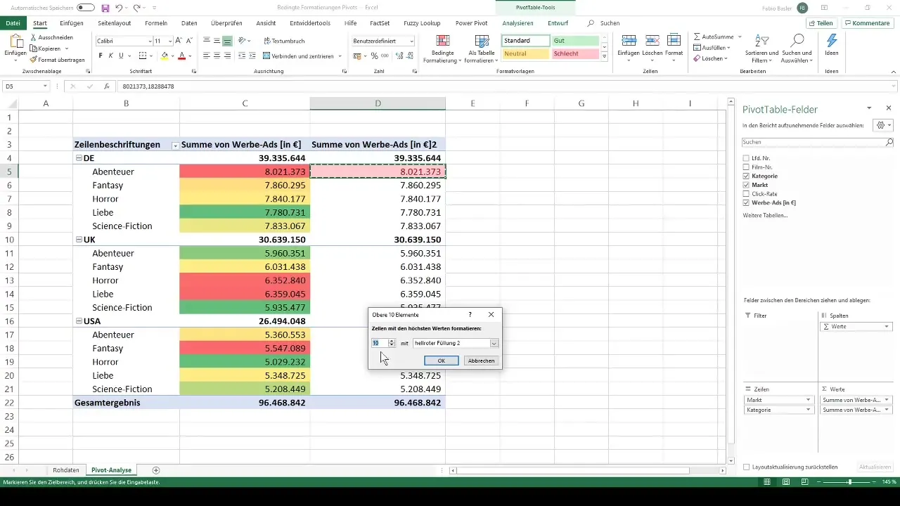
Another useful feature is displaying top and bottom values. You can specify that the best and worst three values are highlighted in a specific color, helping you quickly assess the performance of your movies at a glance.
Step 10: Customize Individual Formatting
Conditional formatting can be customized individually. You can decide whether you want to display only the top five values in a different color or add a border line to them. This will make your report even more appealing and informative.
Summary
With the steps presented, you can efficiently use conditional formatting in Excel to make your pivot tables more appealing. You have learned valuable techniques to visually highlight your data, which helps you in analyzing business numbers.
Frequently Asked Questions
How do I create a pivot table in Excel?You can create a pivot table by clicking on "Insert" and then "PivotTable," and selecting the desired data.
What are conditional formatting?Conditional formatting are visual adjustments in Excel that highlight important values and enhance data understanding.
How can I apply the formatting to other cells?Use the format painter tool to apply the formatting of one cell to other cells.


