Hello and welcome to this guide on creating Pivot Tables in Excel! In this lesson, I will show you how you can effectively visualize and analyze your data. Creating Pivot Tables is an essential skill for anyone who regularly works with large amounts of data. Let's go through the steps together to gain deeper insights into your data.
Key Takeaways
- With Pivot Tables, you can summarize and analyze large data sets effectively.
- Adding slicers improves the user-friendliness and filtering options of your Pivot Tables.
- Conditional formatting helps quickly identify important information such as revenue trends.
Step-by-Step Guide
Step 1: Select Data Source
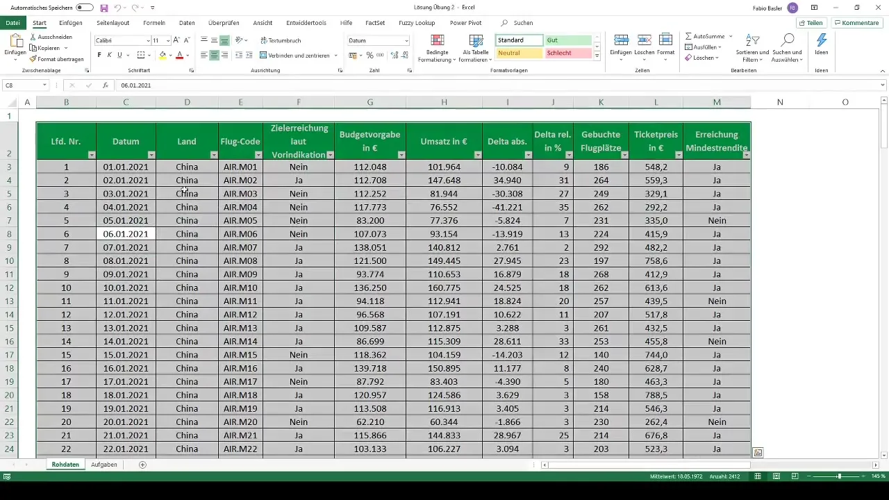
To start creating your Pivot Table, you first need to select the entire data source. You can easily do this by pressing Control + A to select all the data in your worksheet.
Step 2: Create a Pivot Table
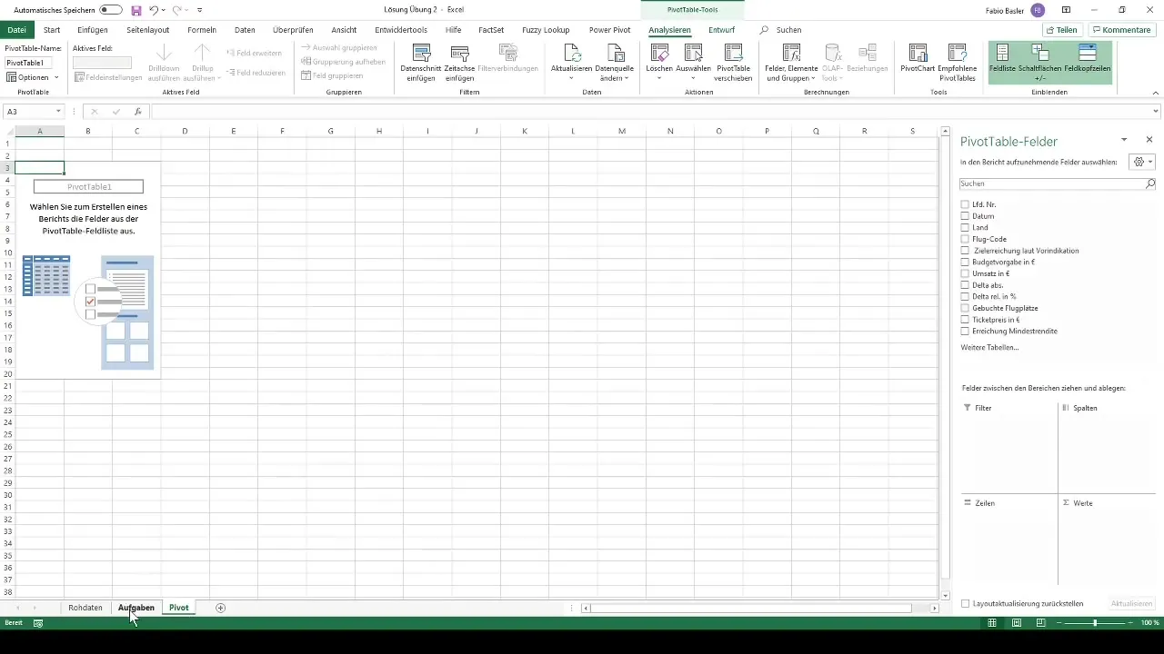
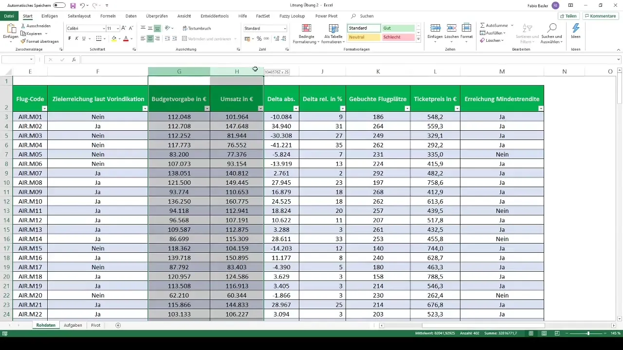
After selecting the data, you want to format your data as a table. Go to the menu options and select the function to create a Pivot Table. Choose a new worksheet and name it, for example, "Pivot".
Step 3: Analyze Revenues by Countries
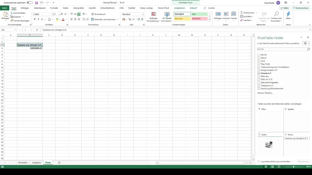
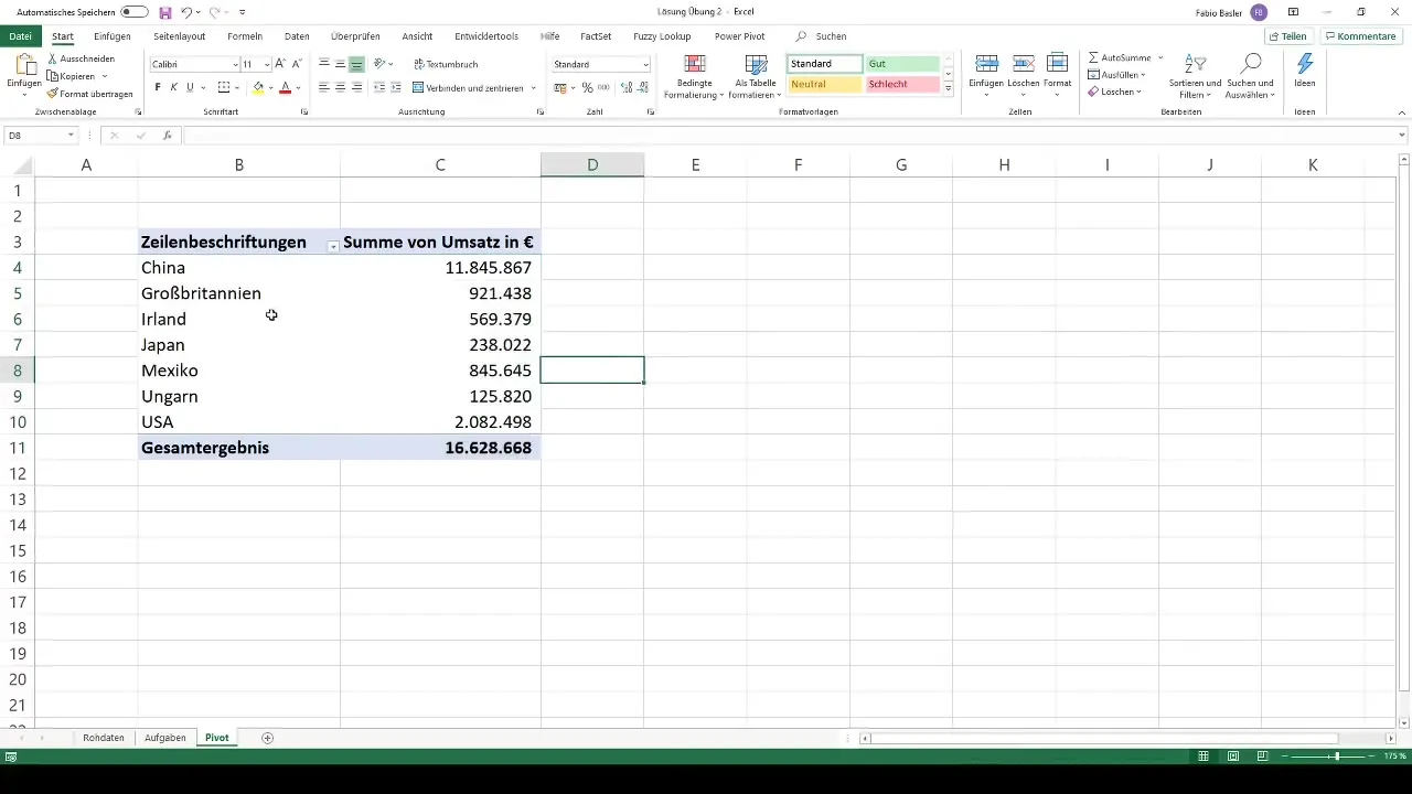
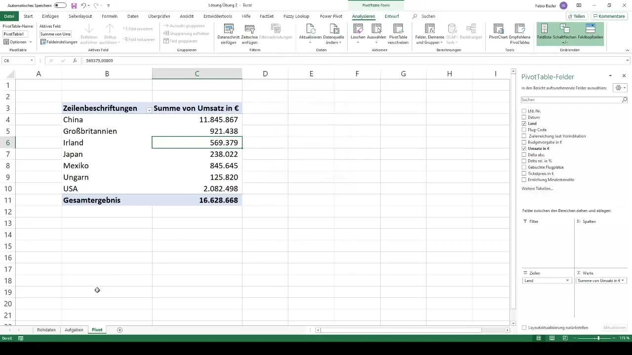
Now it gets interesting! You want to create an overview of revenues by countries. Drag the revenue field into the values area of your Pivot Table and the country into the rows area.
Step 4: Format Values
To make your data more readable, format the revenue values with a thousand separator. Click on the respective values and choose the formatting options in Excel.
Step 5: Add Slicers
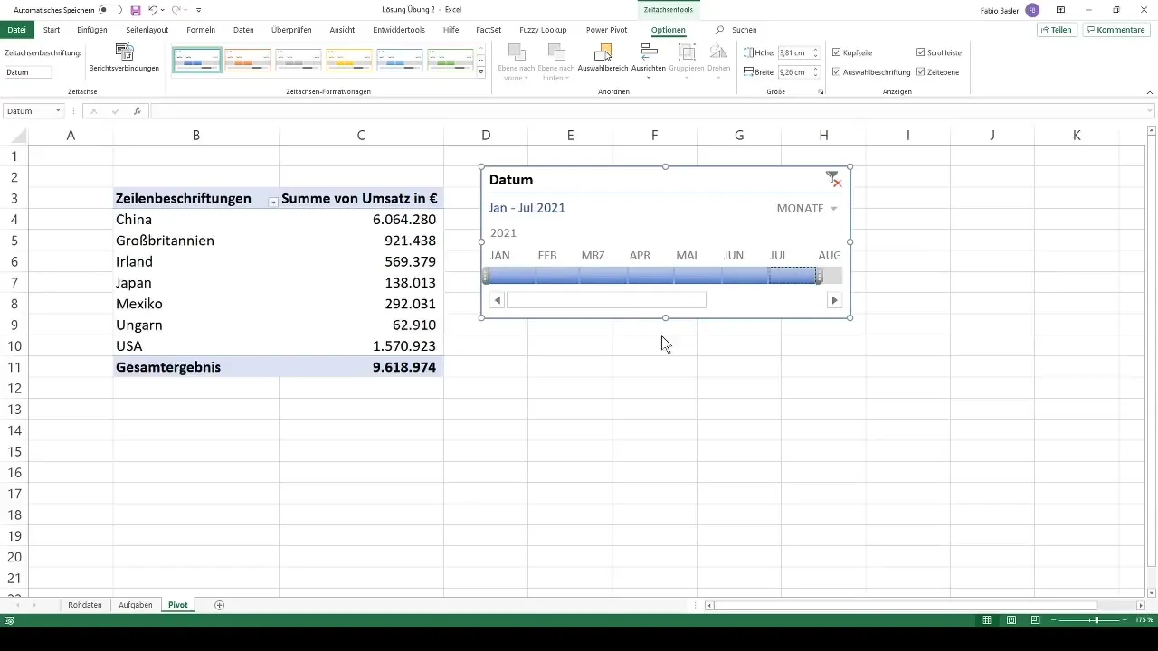
To make the analysis more interactive, we will add slicers. Select the Pivot Table and go to the PivotTable Tools. Click on "Add Slicer" and choose the time feature "Date".
Step 6: Adjust Time Filters
In this step, you can adjust the analysis for different time periods. You have the option to filter the data by both quarters and months. This is where the flexibility of Pivot Tables comes into play.
Step 7: Add Additional Slicers for Countries
After creating the timeline, we want to add additional slicers for different attributes. Consider which dimensions make sense, such as countries or target achievements.
Step 8: Add Conditional Formatting
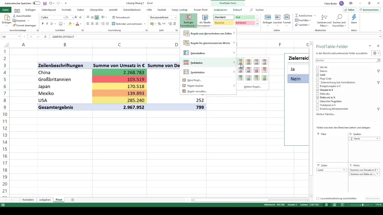
Now that you have the basic data, it's time to apply conditional formatting to your revenues and delta values. This helps identify critical values immediately.
Step 9: Analyze Flight Codes
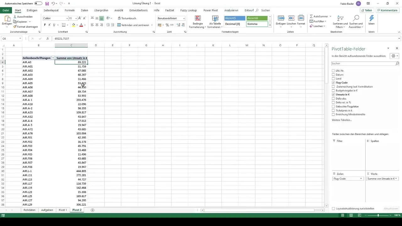
To analyze detailed revenues, we will create another Pivot Table for the flight codes. Drag the revenue field into the values area here as well and format the table accordingly.
Step 10: Visualization through Charts
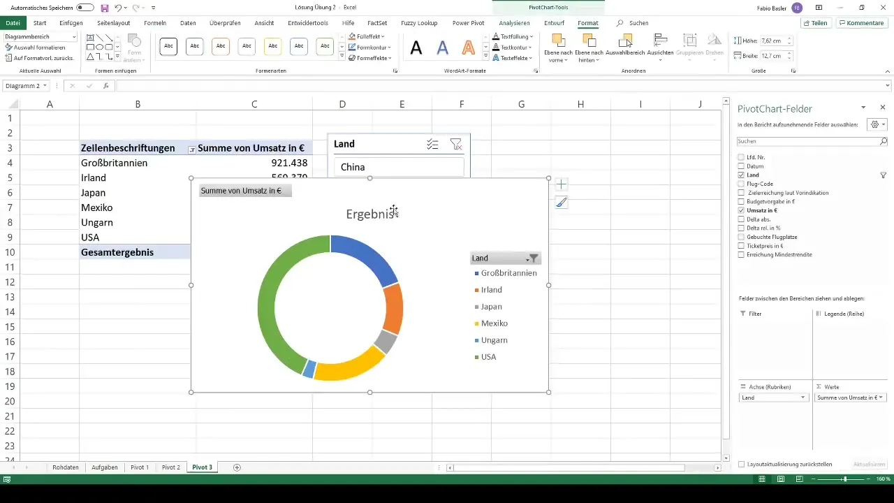
To better visualize the data, you now want to create a chart. Select the pivot table and go to "Analyze" and then to "Pivot Chart". Choose the appropriate chart type, for example, a pie chart.
Step 11: Creating a Combo Chart
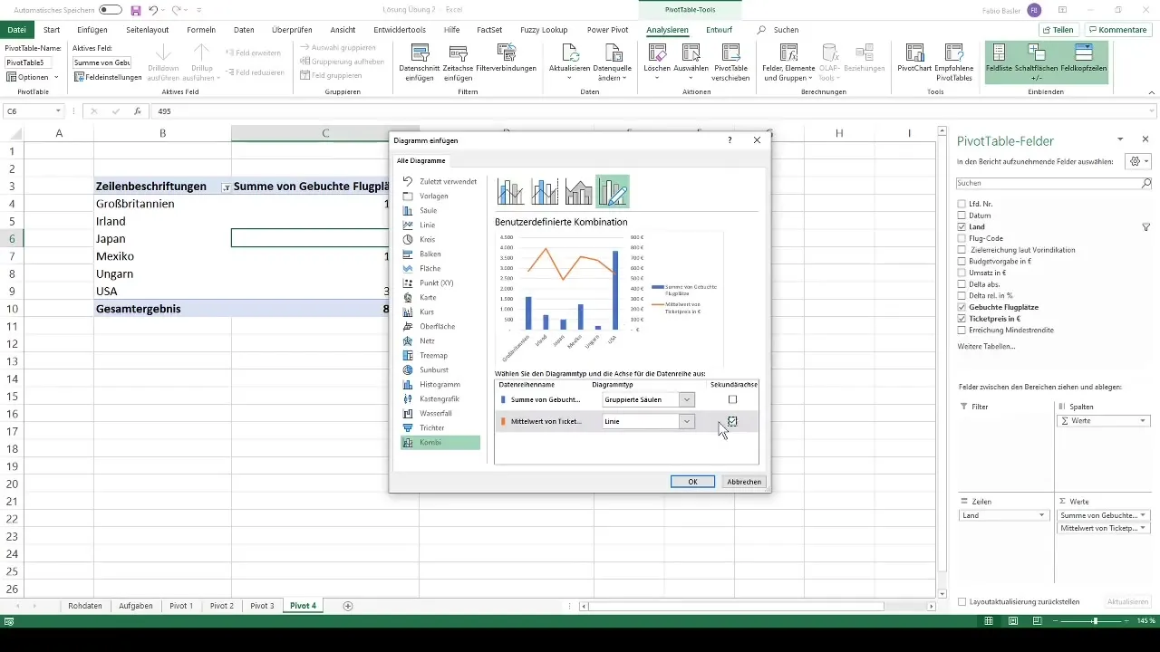
In this step, you can create a combo chart for booked flight places and ticket prices. This will give you a comprehensive overview of your data.
Step 12: Creating a Radar Chart
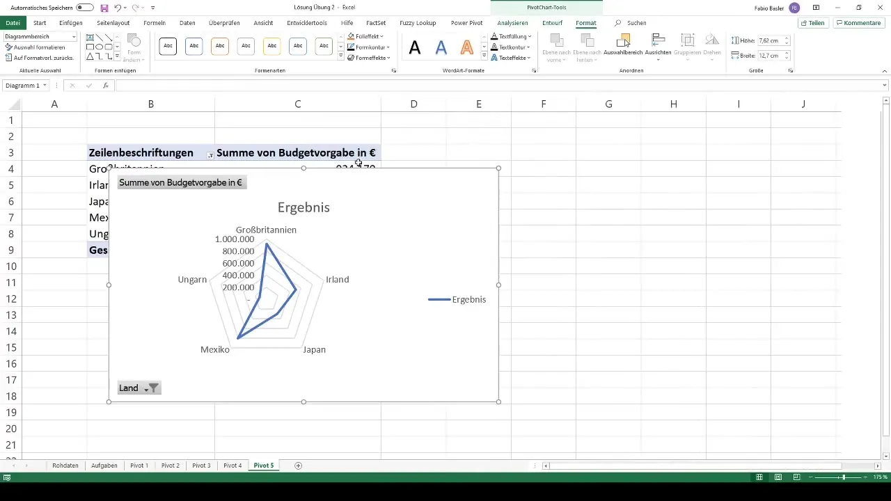
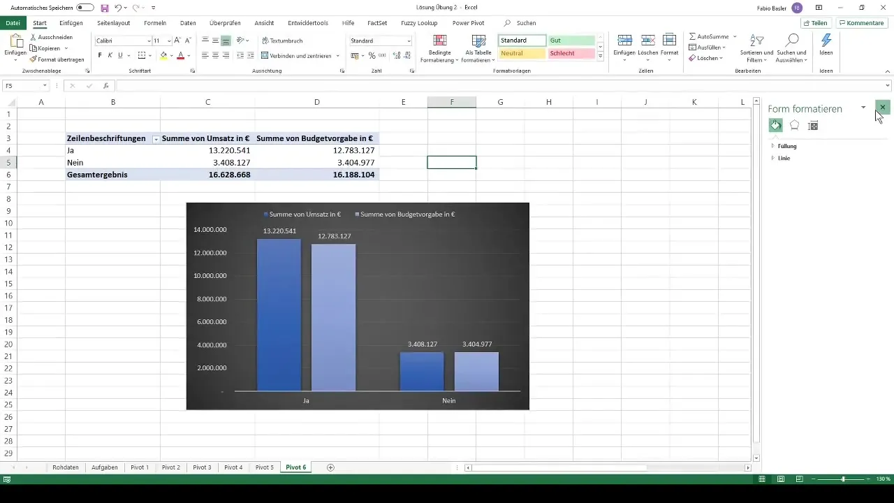
For the analysis of budget targets, you want to create a radar chart without specific countries. For this, you create a pivot table again and select the desired data.
Step 13: Final Review and Adjustments
In the final step, you review your charts and tables, make any necessary adjustments, and ensure that everything is easily readable and informative.
Summary
In this tutorial, you have learned how to create pivot tables in Excel, enrich them with slicers and conditional formatting, and visually present your data. With these skills, you are well-equipped to analyze a variety of data and gain important insights.
Frequently Asked Questions
How do I create a pivot table in Excel?Select the entire database and go to "Insert" > "PivotTable".
What are slicers?Slicers are visual filters that help you interactively filter the results of your pivot table.
How can I use conditional formatting?Select the cells you want to format, and go to "Home" > "Conditional Formatting" to create the respective rules.


