In this tutorial, you will learn how to use Excel Pivot Tables to display advanced visualization forms. Pivot tables are a great tool in Excel for organizing and analyzing data. While the basic functions are already popular, here we focus on special and lesser-known types of charts that you can use to visually represent your data and clarify their meaning. Whether you are an experienced Excel user or just starting out, this tutorial will help you discover new ways of data visualization.
Key Insights
In this tutorial, you will learn how to create advanced visualizations with Excel Pivot Tables, including Sunburst charts, line charts, network charts, and surface charts. You will get to know the various chart types available for use with Pivot Tables and how to use them to gain insights from your data.
Step-by-Step Guide
1. Getting Started with Pivot Table Creation
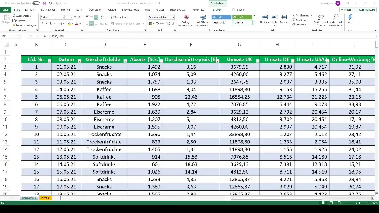
Begin by entering the raw data you want to analyze into an Excel sheet. To create a Pivot Table, select the data and go to the "Insert" tab. Here, choose "PivotTable." A new table will be generated either in the current worksheet or a new sheet.
2. Selecting the Right Chart Representation
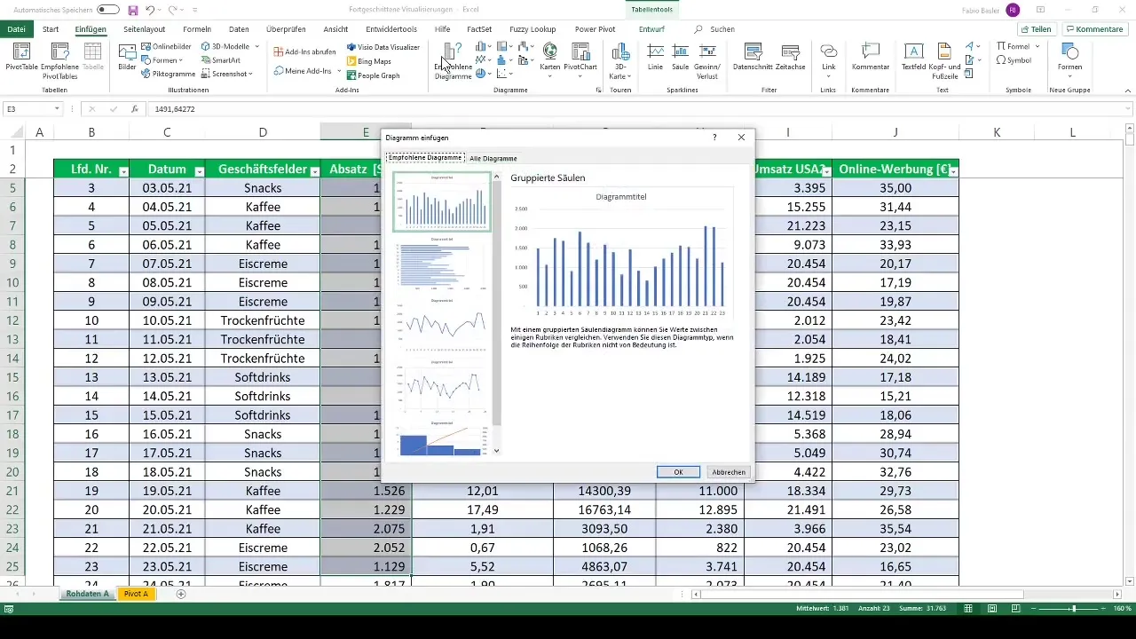
Once you have created your Pivot Table, you can start inserting a chart. Click on the Pivot Table, go back to "Insert," and choose "Recommended Charts." Here you can see various chart types based on your data.
3. Classics: Line Charts and Bar Charts
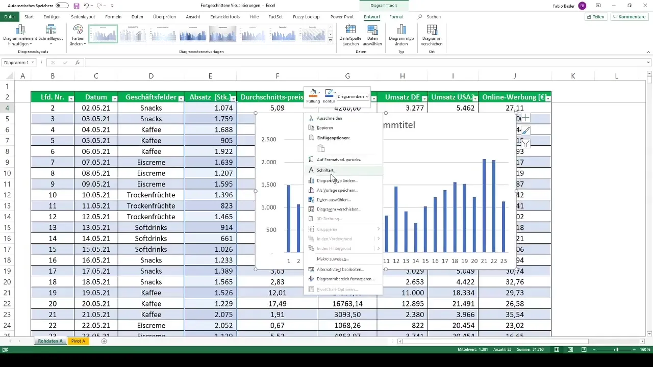
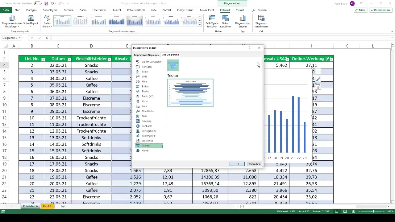
A classic type of chart is line charts or bar charts. These can quickly make the trends in your data visible. To do this, click on "Change Chart Type" and select a line chart. You can customize the representation according to your preferences.
4. More Exotic Visualization Forms
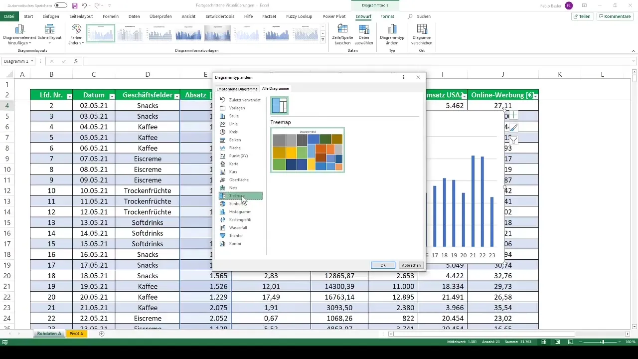
Now, the exciting part begins: the exotic types of charts. For example, there are the Sunburst or Treemap chart. These visualizations are helpful for hierarchically representing data. Go to "Change Chart Type" and look for these options.
5. Using Network Charts
Another particularly useful chart is the network chart. With this chart, you can represent data points in multiple dimensions and compare them. To create a network chart, select your Pivot Table and then the corresponding chart type.
6. Dynamic Adjustments Using Slicers
You have the option to dynamically adjust your charts by adding data filters (slicers) or timelines. This allows you to analyze your data in different time frames and categories, keeping you informed at all times.
7. Using Surface Charts
Finally, let's take a look at the surface chart. This chart can be displayed in three dimensions and provides a visual breakdown of data categories. Choose the chart type you want to create – here you can also select wireframes or contours.
Summary
With this, you have now gone through all the basic steps to create advanced visualizations with Pivot Tables in Excel. You can now use line charts, network charts, surface charts, and many other types of charts to present your data impressively and efficiently.
Frequently Asked Questions
What are Pivot Tables?Pivot tables are Excel tools for data analysis that allow you to summarize and analyze large amounts of data.
Which chart types can I create with Pivot Tables?You can create line charts, bar charts, area charts, network charts, and many other charts, although some options, such as histograms or box plots, are not available.
Can I dynamically adjust the charts?Yes, you can use slicers or timelines to dynamically adjust your charts and perform various analyses.
How do I start using Pivot Tables in Excel?Start by selecting your data and then choose "PivotTable" in the "Insert" tab to create a new Pivot Table.
I'm having trouble creating charts – how can I find support?There are many online resources and tutorials that can provide extensive support. You can also search for specific questions here.


