In this tutorial, you will dive deep into the world of pivot tables. We will examine a comprehensive case study that will help you apply the theoretical knowledge you have gained about pivot tables in Excel to practice. Pivot tables are a powerful tool for analyzing and summarizing large data sets. In this guide, we will walk through the steps to create a pivot table from scratch, utilize various forms of analysis and visualization, and effectively present the insights gained.
Key Insights
- Pivot tables allow for quick analysis and representation of data.
- Conditional formatting helps highlight important metrics.
- Visual representations such as charts are important for visual feedback.
- Data filters and slicers enable targeted data analysis.
Step-by-Step Guide
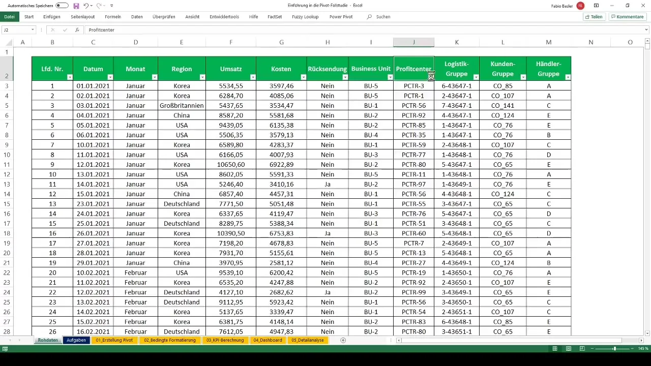
To create a pivot table, start by preparing your data.
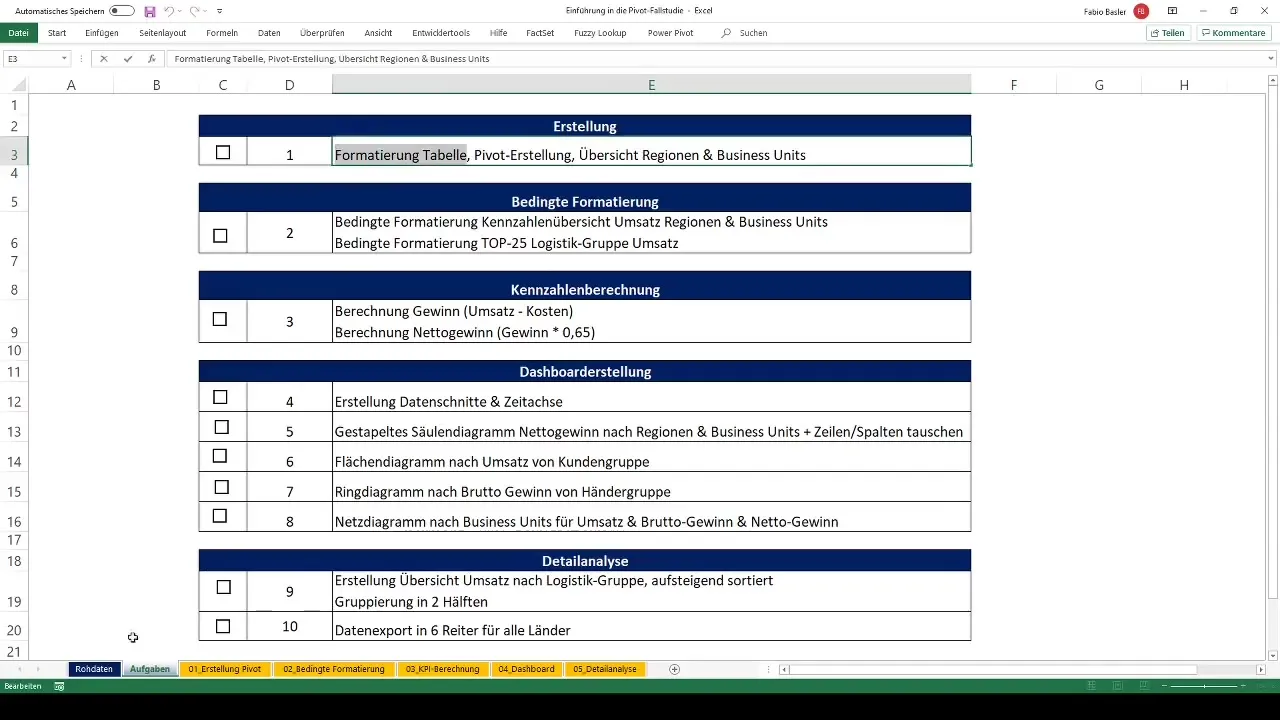
Prepare data First, you must ensure that your data foundation is formatted as a table. Excel makes working with data easier when it is in table design. To format your data as a table, select any cell range and go to "Insert" > "Table." Make sure to choose the header row as one of the options.
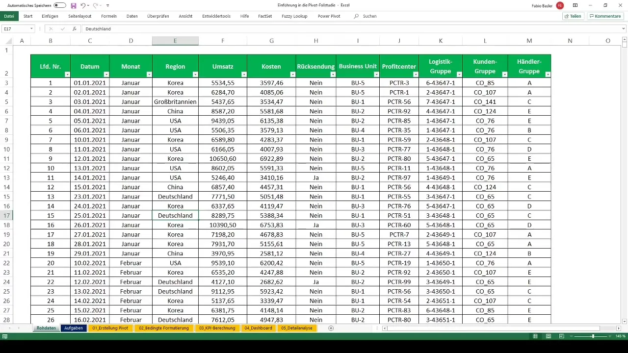
Once you have formatted your data as a table, you can create the pivot table. Go to the "Insert" tab and click on "PivotTable." Then choose the desired data source and specify where the pivot table should be placed.
Creating the first pivot table
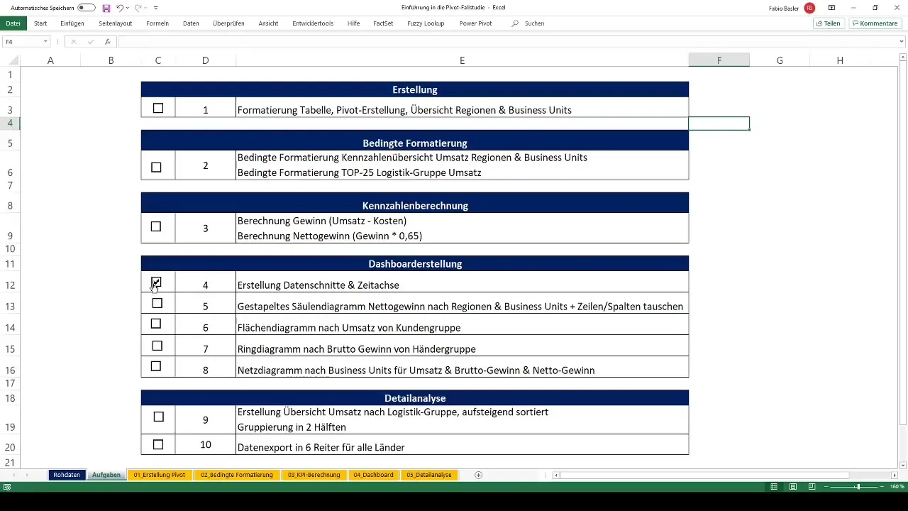
To create the initial overview, drag the desired "fields" into the rows and columns areas of the pivot table. In this case, you can, for example, insert the regions and revenue. This will give you a clear overview of how revenue is distributed across different regions and business areas.
Apply conditional formatting
To make the pivot table visually appealing and meaningful, add conditional formatting. Select the cells containing the metrics and go to "Home" > "Conditional Formatting." Then choose a color scale, such as a green-yellow-red color scale, to visually represent revenue values.
You could set up another important conditional formatting for the logistics group. Here, you want to mark the top 25 values in green. Go to "Conditional Formatting" again and select "Top/Bottom Rules."
Calculate metrics
Now that the pivot table is ready, let's focus on calculating metrics. By adding a calculated field within the pivot table, you can calculate profit. Insert the formula "Revenue - Costs." The result will be displayed immediately in the pivot table.
In addition, you can determine the net profit by applying a tax rate of 0.35 to the profit. Add another calculated field to represent this.
Create data filters and slices
Use data slicers to make the pivot table interactive. Go to "Analyse" > "Insert Data Slicer" to add filters for specific categories or time periods. These filters will help you analyze specific data quickly and easily.
Also, create a time-based data filter to make the results analyzable over different periods.
Create charts
To visually represent the insights, create a stacked column chart for net profit. Select the appropriate cell range in your pivot table and go to "Insert" > "Chart" to choose and format the desired chart.
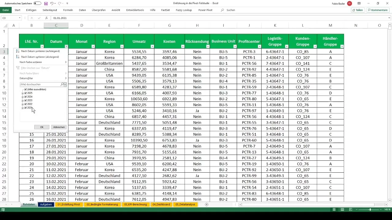
Apply the "Swap Rows and Columns" function to display different views of the data. This way, you can analyze both the regions and business areas.
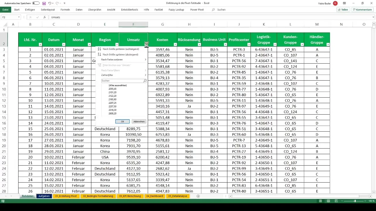
Additionally, you can create an area chart for revenue by customer groups and a pie chart for profit by dealer groups. I am particularly interested in how the different segments relate to each other and where optimization potential is visible.
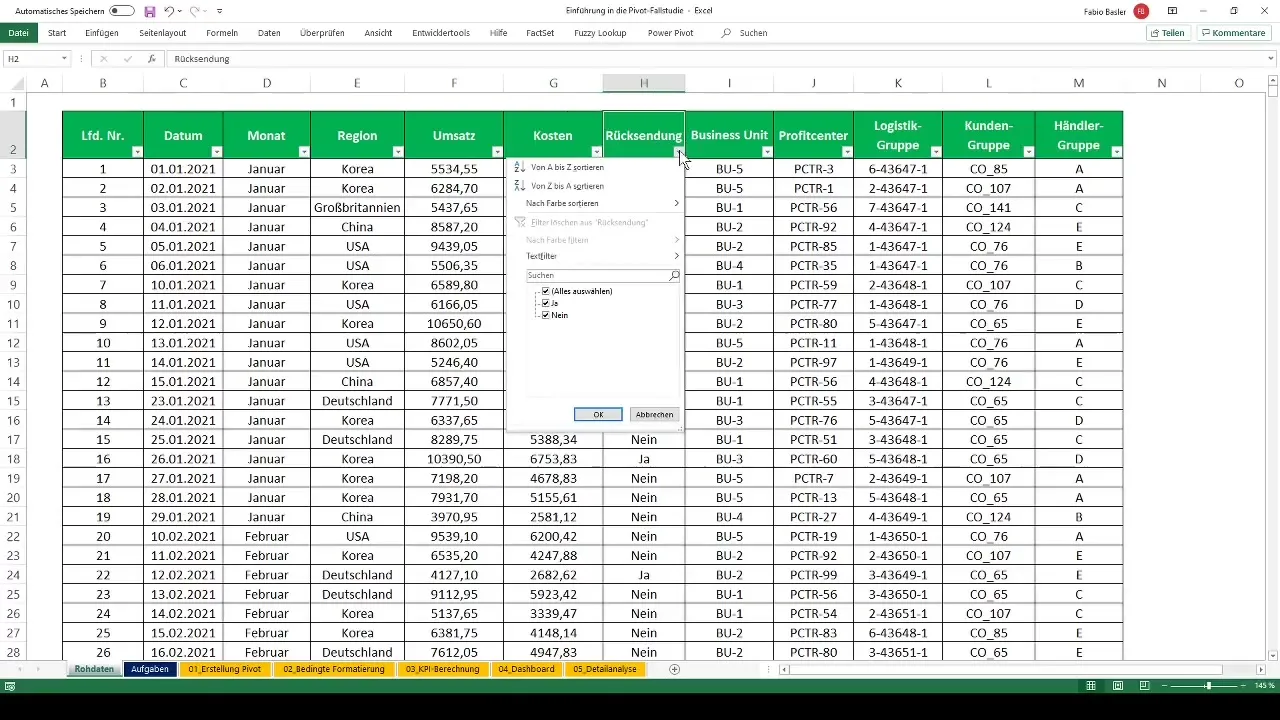
Create a radar chart
To analyze the performance in the business units, I recommend creating a radar chart. This chart shows the revenue, gross profit, and net profit, giving you a comprehensive overview of your business units.
Detailed analysis
To perform a detailed analysis, create an overview of revenues by logistical groups. Sort them in ascending order to identify patterns and trends.
Use the grouping function to manage large data sets. By dividing the revenue numbers into groups, you can keep a better overview.
Exporting data
Finally, you can export the results to transfer them to other formats or further processing. Select the data for all relevant countries and copy it to a new worksheet or an external file.
Summary - Introduction to Creating Pivot Tables in Excel
In this guide, you have learned how to create, format, and analyze pivot tables in detail. From data preparation, creating charts and conditional formatting, to detailed analysis and data export - all these steps help you better understand and effectively use your data.
Frequently Asked Questions
What are pivot tables?Pivot tables are a tool in Excel that allows for quick and easy analysis of large data sets.
How do I create a pivot table?Select your data-driven table and choose "Insert" > "PivotTable" to create a new pivot table.
How can I filter data?Use Slicers to selectively choose data from your pivot table.
How can I calculate metrics?Add calculated fields in your pivot table to calculate specific metrics such as profit or net profit.
How do I export my pivot table data?Copy the relevant data from your pivot table and paste it into a new worksheet or an external file.


