What is stationery and what is it used for?
Stationery is a special paper used for letters and other written communications. It is often printed with a letterhead that includes the name, address, and possibly the logo or other identifying features of a person or organization. Stationery is mainly used for formal correspondence, including business letters, official communications, personal letters, and more. Stationery is used to make communication professional and tidy by ensuring a uniform and attractive appearance.
Learn how to design stationery in InDesign
In this tutorial, I will show you how to create your own stationery in InDesign using two examples. I will present a classic design and a playful design.
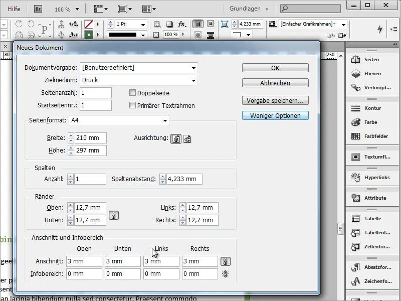
I will start by creating a new blank document and set a 3mm allowance in the advanced view so that the print shop has some leeway for trimming later.
A business paper typically requires an address field. This should be created according to the common DIN standard, so that the address field appears complete in the window of the envelope. You can find information on this on the internet, for example on Wikipedia.
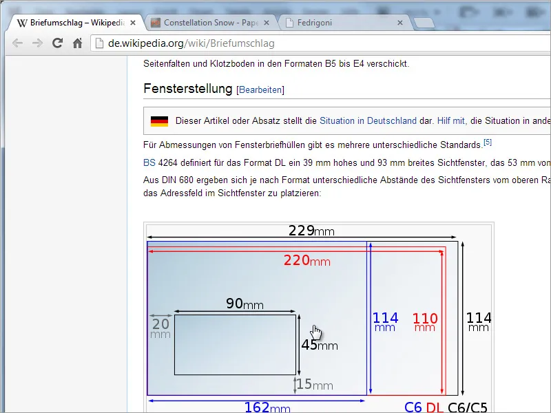
For simplification, and so you don't have to switch windows each time, you can temporarily copy the graphic from Wikipedia into your document. That way, you have it directly in view.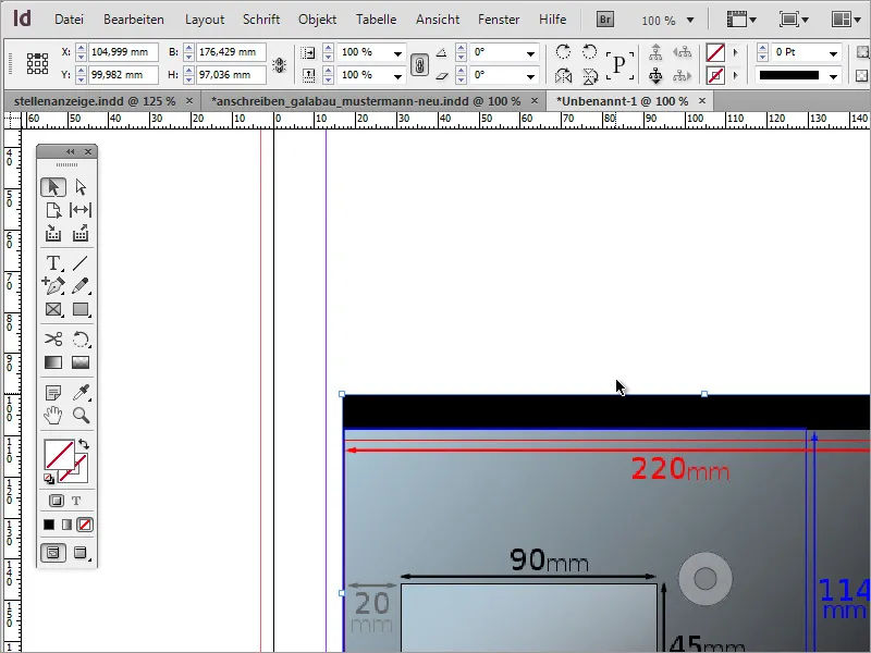
Now you need a 162mm by 114mm window, representing the C6 format. Either adjust the object accordingly and read the values from the cursor position while dragging, or simply create an object and change the values in the Properties bar.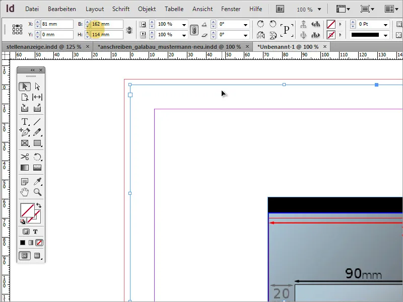
After aligning the object with the left and top edges, you need to further edit it. According to Wikipedia, the distance of the window from the bottom should be 15mm, and from the left should be 20mm. In the Properties bar, you can directly calculate these values as InDesign supports simple math. Subtract 15mm from the height by subtracting it from 114mm.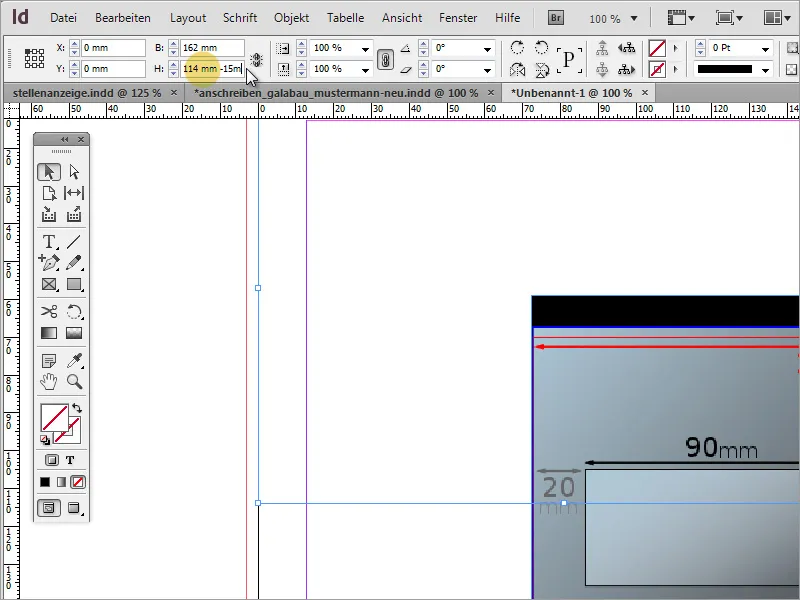
Now, shift the object 20mm to the right. Simply change the X-value in the Properties bar. Please make sure the reference point is set to the top left.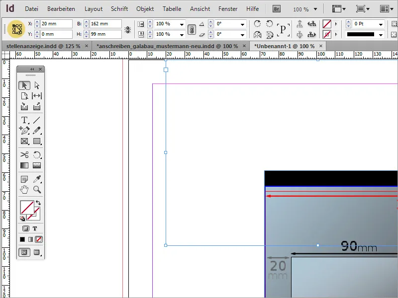
Next, adjust the width of the window to 90mm. Use the Properties bar again and enter the value 90mm in the width field.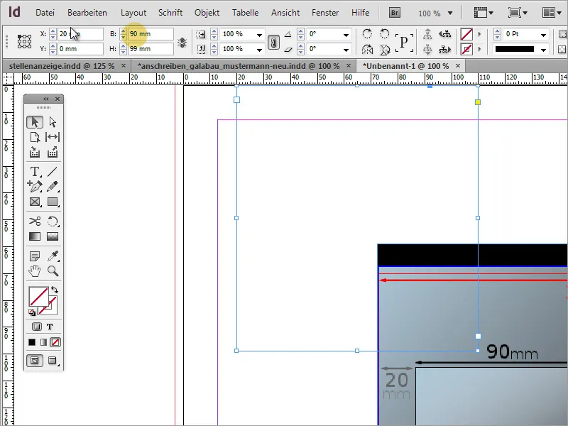
The window height should be 45mm. You can manually enter this value. However, make sure the reference point this time is at the bottom left. After this modification, the address window is properly set up and positioned.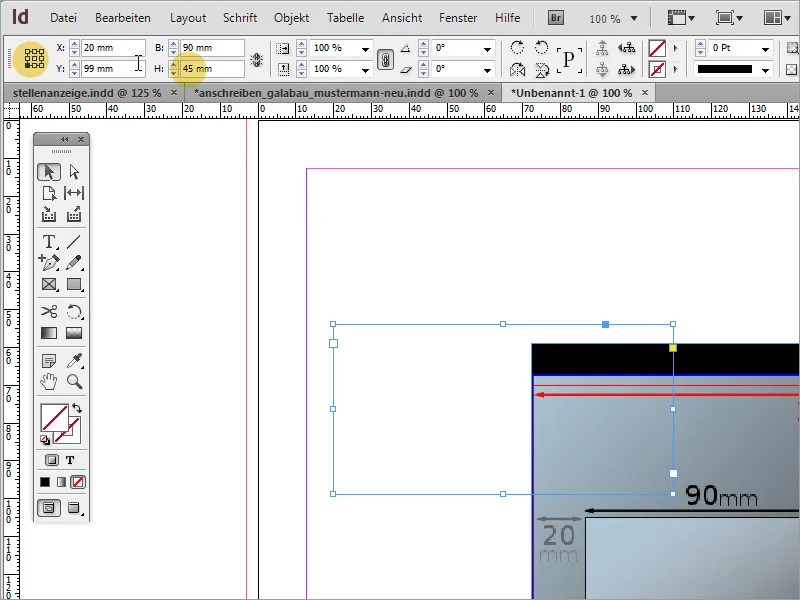
The temporary graphic can now be deleted. It is recommended to save this template for later use. This way, you can refer back to it if needed.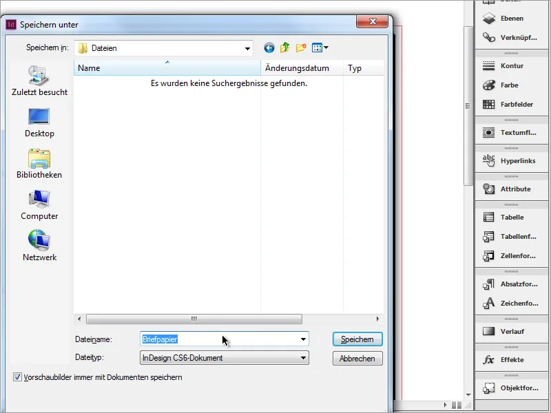
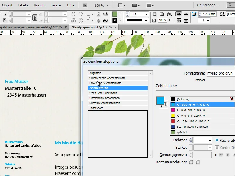
Now you can enter the recipient's address. I also take advantage of the ability to create character styles in InDesign. To do this, I create a new format in the Character styles docked window.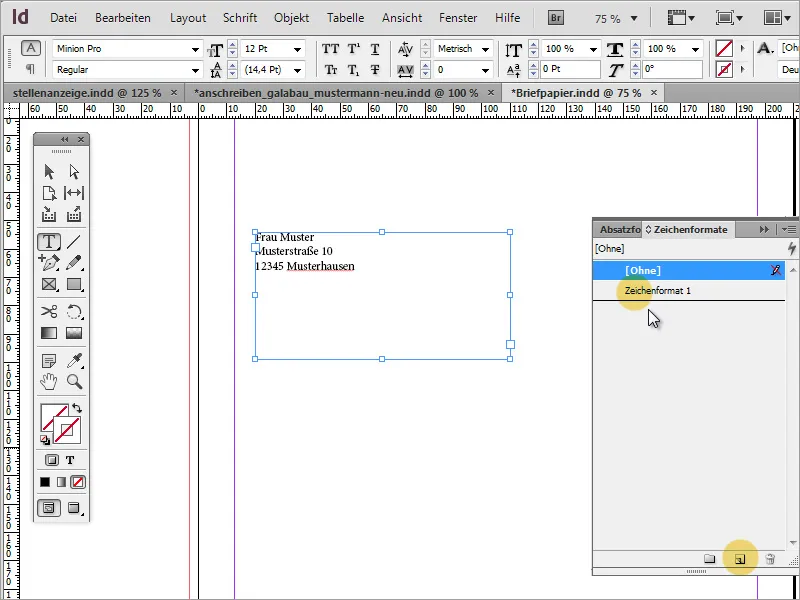
In the dialog box, which can be opened with a double-click, I define the font family and give the character style a unique name.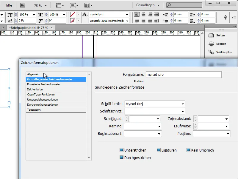
Additionally, you can also set a character color.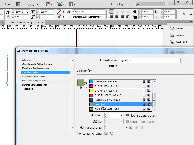
If you need multiple text colors, you can create multiple character styles.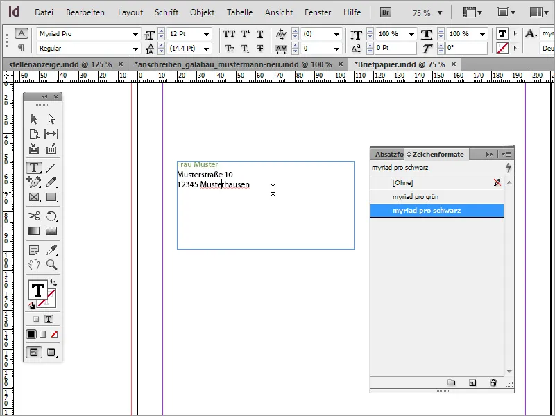
The recipient should be easily recognizable in this field. Therefore, it is advisable to use an appropriate font size for quick information retrieval. Moreover, adjusting the line spacing can sometimes enhance readability. This has also been set more generously.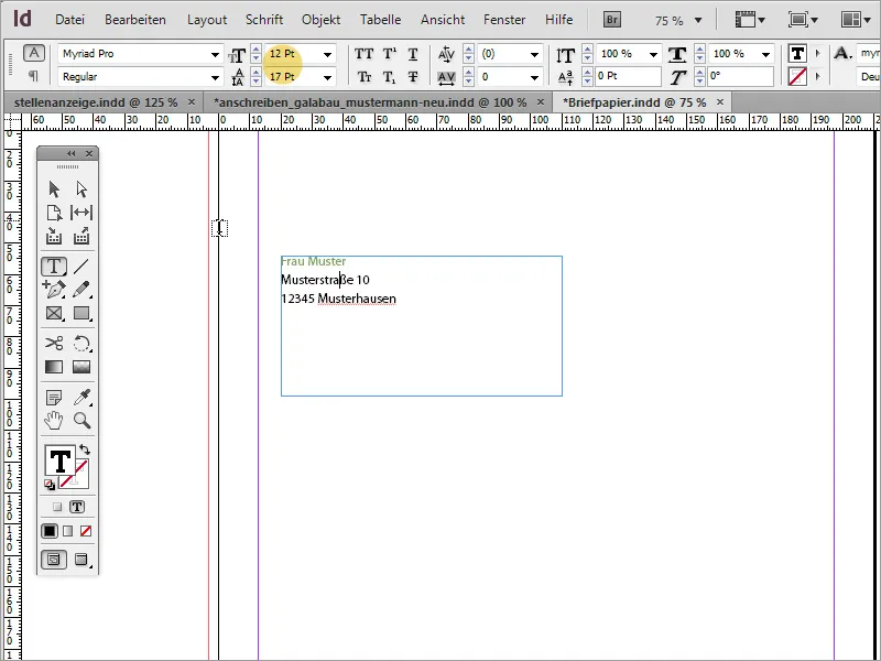
The text doesn't necessarily have to appear at the very top of the text box. You can adjust the position by selecting the text box with the Selection tool enabled and then changing the text position to a middle alignment in the Properties bar.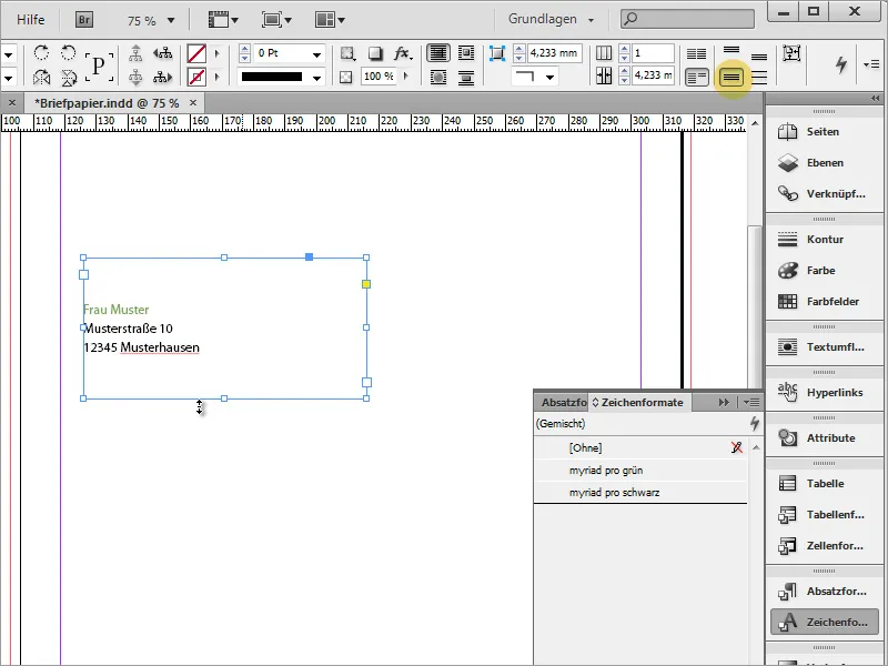
Next, you can integrate the logo. Press Ctrl+D to open the Place dialog and select a graphic there. The selected file can then be placed in InDesign. Simply drag the graphic to the desired size.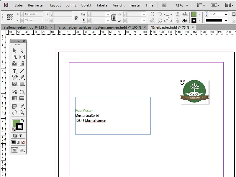
After placing the logo, you may notice that the document's margins have not been set correctly yet. You can change the margin settings at any time via the menu item Layout > Margins and Columns. In the example, the margin was changed to 20 mm on each side.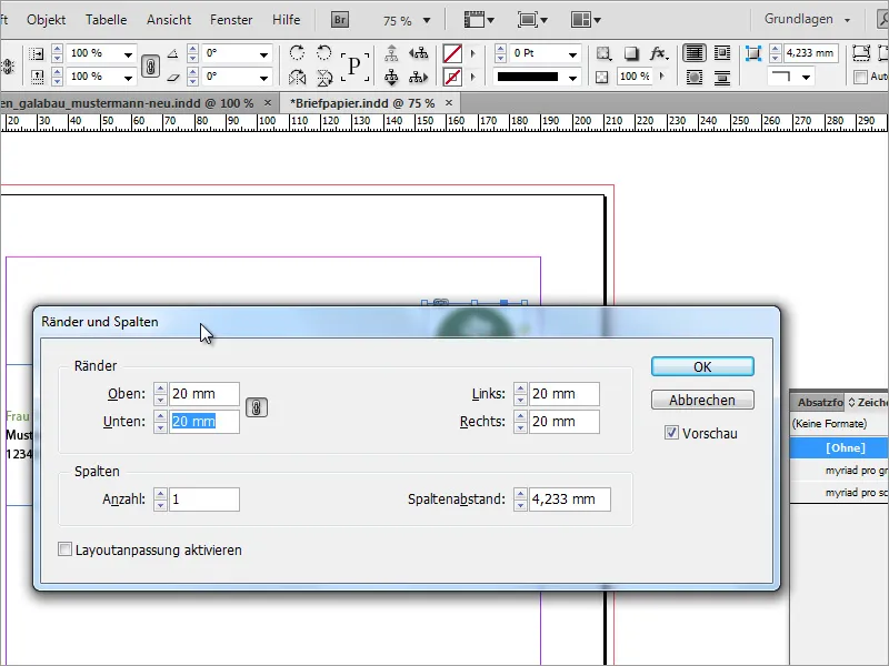
The default setting of the dialog box is designed so that all margins adjust equally when changing a value. If you unlink the chain icon, different margin distances can be set for each side.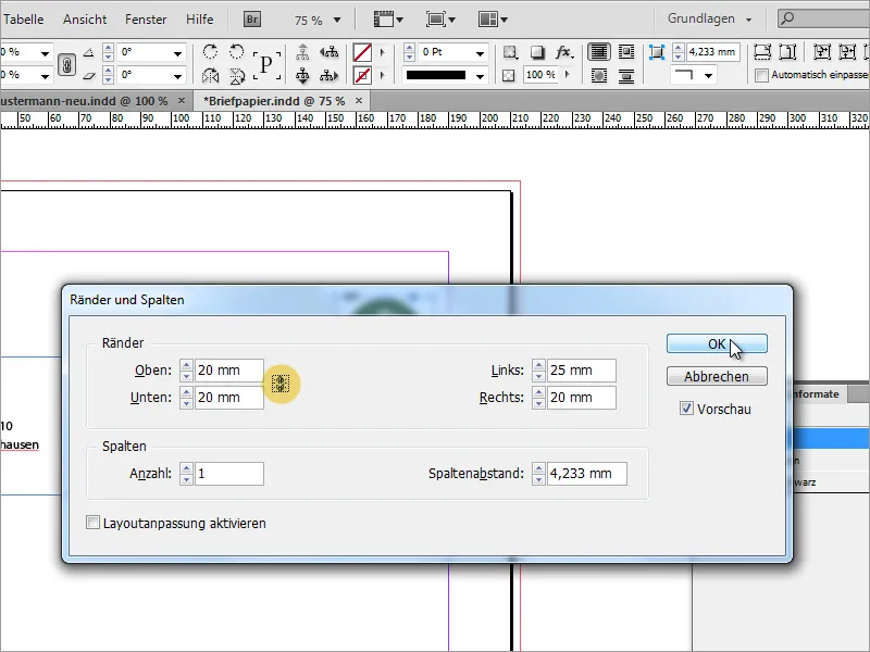
It is noticeable in the address field that the text reaches up to the frame. You can change this by right-clicking and selecting Text Frame Options via the context menu.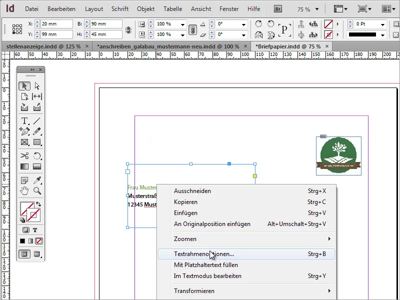
In the Text Frame Options, you can define how text should behave in a text box. For example, you can increase the distance to the left side to approximately 5 mm. This will give you a slightly larger gap to the frame and make the text easier to read, as it will no longer extend beyond the edge of the page in editing mode.
Next, you may need an accurate company name to match the logo. You can copy this from existing documents and paste it in InDesign, or create it anew. In our case, a copy is used.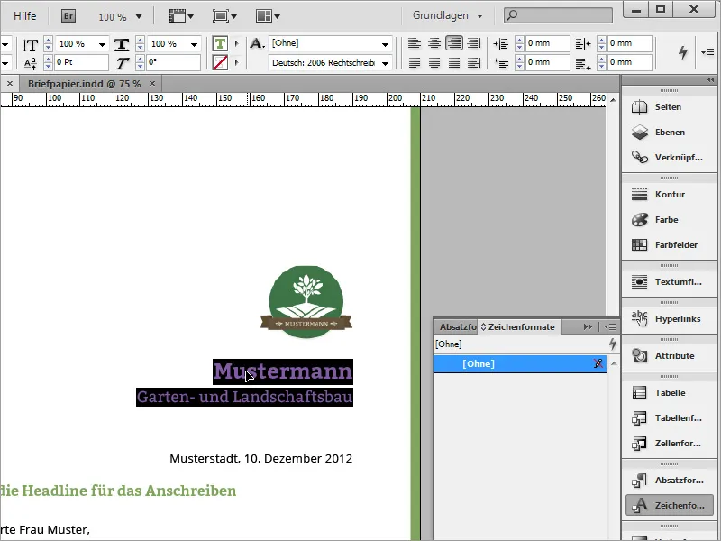
In the new letter, you first need to draw a text frame. By clicking directly on the page margin, the text area will align with that side.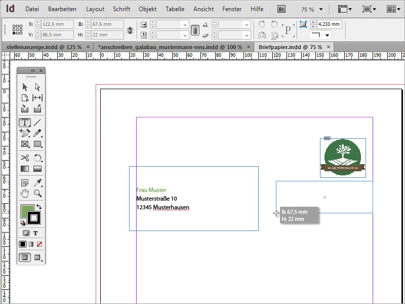
Now you can paste the copied text into this text area using Ctrl+V. If the text has not been selected yet, assign it a text format. In the example, the green variant of Myriad Pro was used.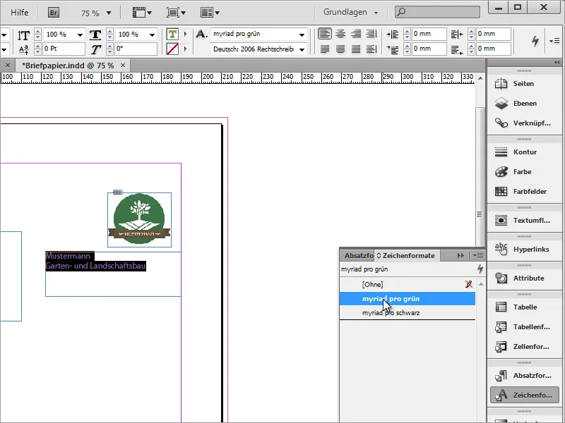
Additionally, align the text to the right using the Properties bar and format the font. The company name is set to a font size of 18 pt in bold, and the additional company name is formatted in 13 pt font size.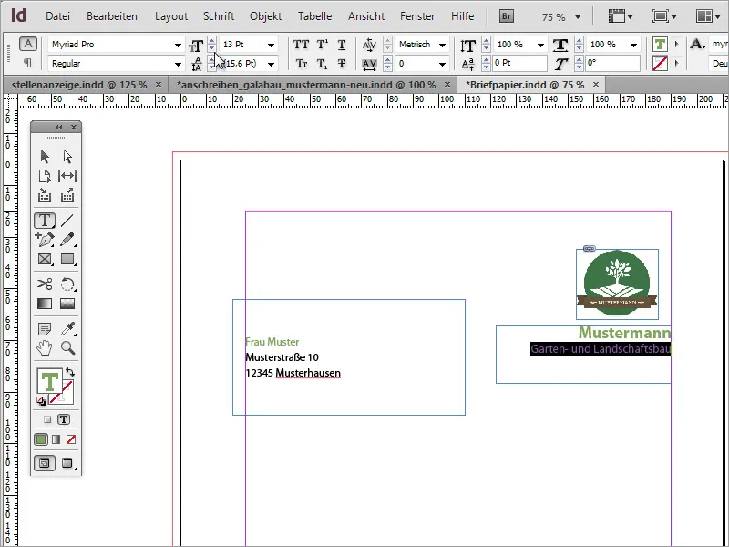
You can use guides for page layout by simply dragging them from the ruler into the document. Align the logo to these guides, both with the top and right edges.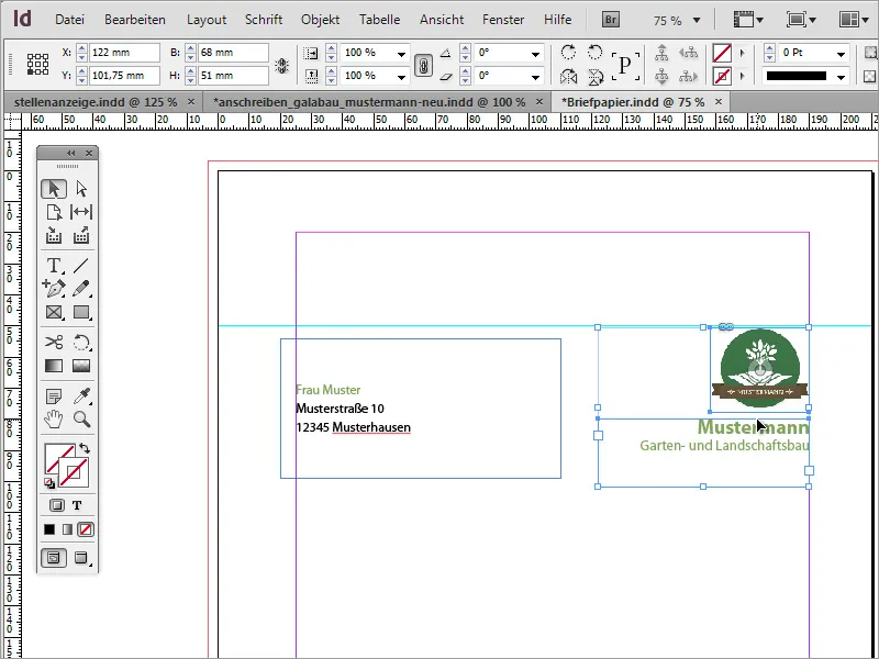
A small additional design element completes the look. Simply use the rectangle tool to draw a narrow rectangle along the right side to the bleed edge and fill it with the same green shade you used for the company name. The stroke should be hidden for this example.
Any correspondence with clients or business partners is based on documents that include a date. Such a date is now inserted. You will need another text frame for this. In it, the text for these details is right-aligned and set in the character format for black font and Myriad Pro Light font weight.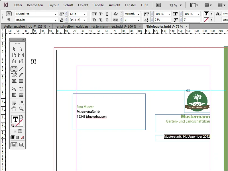
Next, it's time for the actual business letter content. For the message dialog box, another text area needs to be drawn. Select the text tool and draw a text frame in the desired size.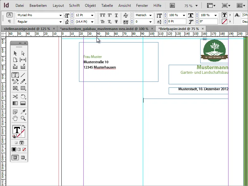
Now this text box can be filled with text. For testing purposes, Lorem Ipsum text is recommended. If the text appearance is not correct, it may be due to the shape of the text area. You can experiment with making it slightly wider or narrower.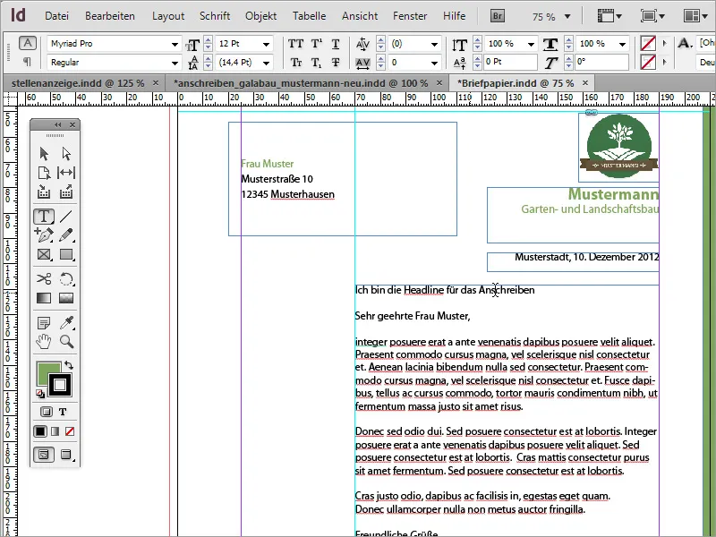
The text in this text area should also be formatted. The heading is assigned a green tone using character formats, set in 12 pt with a bold font style.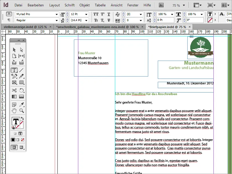
The body text is formatted with the character format Myriad Pro Black and in the font style Light. This font style appears significantly finer and more elegant.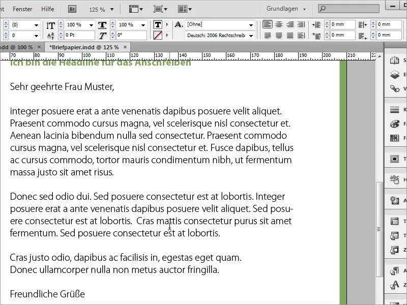
Next comes a dividing line. This is drawn below the text area using the line tool. By holding down the Shift key, the line will be drawn horizontally. Make sure it extends from the left to the right side of the text frame. While drawing, you'll notice the line snapping to the frame's borders. The stroke color should be green, and the fill color should be turned off.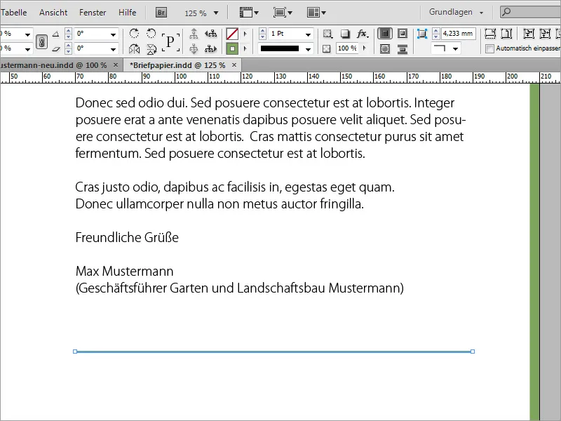
Now the general contact and bank account details should be inserted below this line. To do this, you insert another text frame that aligns with the guideline on the left and fill it with the information. These will be set in the character format Myriad Pro Black and 8 pt.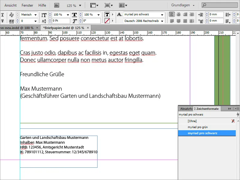
So that you don't have to create and fill a new text area every time, you can also refer to existing ones and duplicate them by holding down the Alt and Shift keys. Only the text then needs to be replaced accordingly.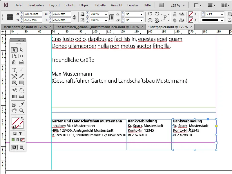
All text boxes in this area can be selected and resized simultaneously. The text within these text areas can also be formatted simultaneously, for example, aligned at the bottom.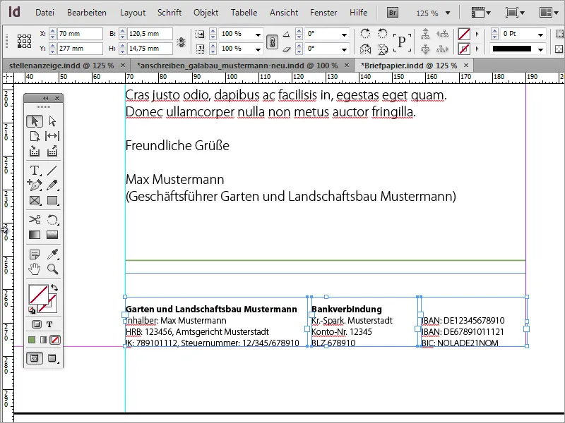
You can still adjust the individual sections of this letter so that they are distributed more harmoniously.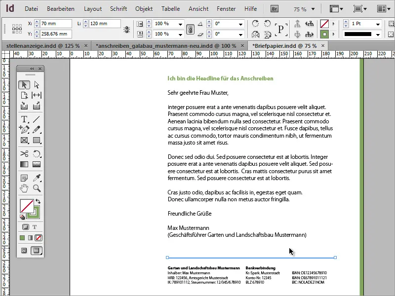
You can also adjust the line spacing of the body text. Here you can provide a bit more space by increasing the line spacing depending on the amount of text.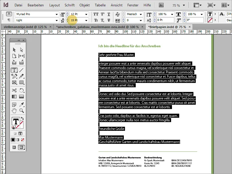
Now, to the left of the body text, you can insert the key information such as the sender's name and contact details once more. For this, you need another text area that you initially create with the text tool.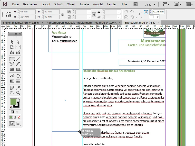
You can insert or write the text in size 8 and highlight it with colors.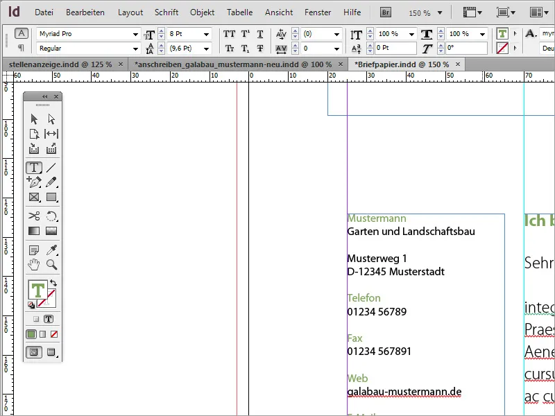
For some of the text areas, it is advisable to use a different font style in the Bold variant. For example, the name or the designation of the telephone, etc., can be a bit bolder.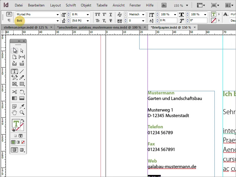
In the end, it has become a very nice business letter.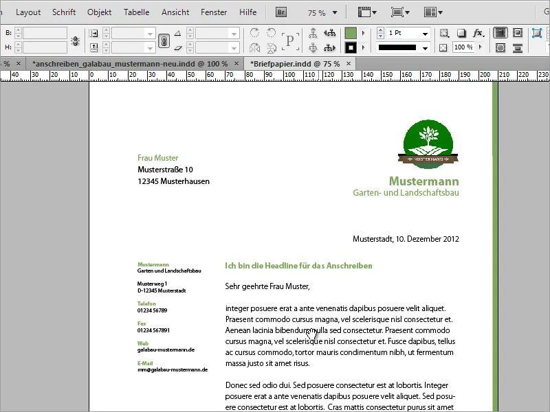
Whimsical Design
However, this template can also be further developed and, if desired, made a bit more whimsical. The first step towards this can be taken by duplicating a page, which you create in the pages panel.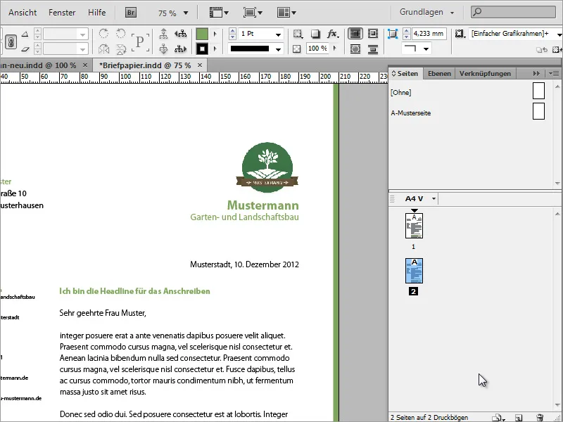
In a graphics program of your choice, you can prepare graphics for use in the business letter. Here, a branch of a tree was initially extracted in Adobe Photoshop.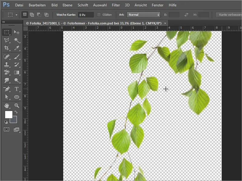
This branch can be placed in InDesign. When placing it, you can also specify the size it should be depicted in by dragging the image area with the left mouse button held down.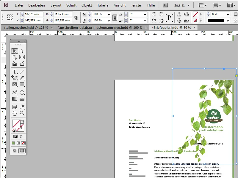
Afterwards, this graphic can be further adjusted by moving, rotating, and scaling it more precisely.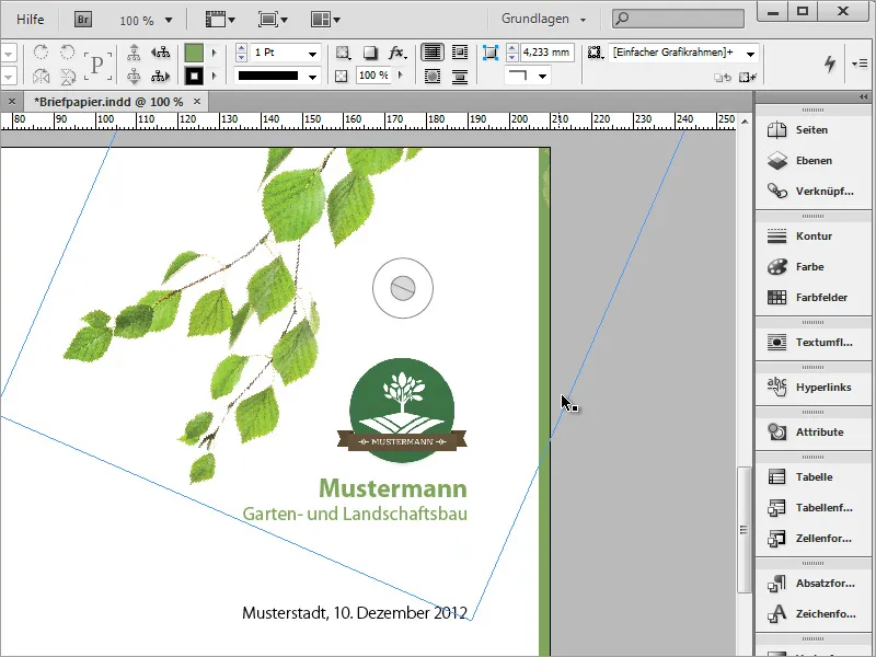
You can copy this graphic using the Alt key and move it, for example, to the lower left corner. Then, it can be rotated again and scaled proportionally while adjusting its position using Ctrl+Shift keys.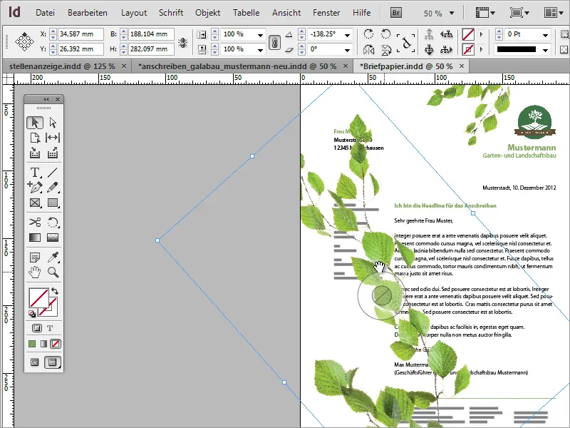
Furthermore, you can also mirror an image object to better fit it into the document visually. Simply use the context menu and the option Transform > Flip Horizontally.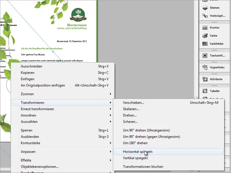
After that, the object must be readjusted in position and size. To prevent it from covering the text, it should be further down in the structure using the layers panel.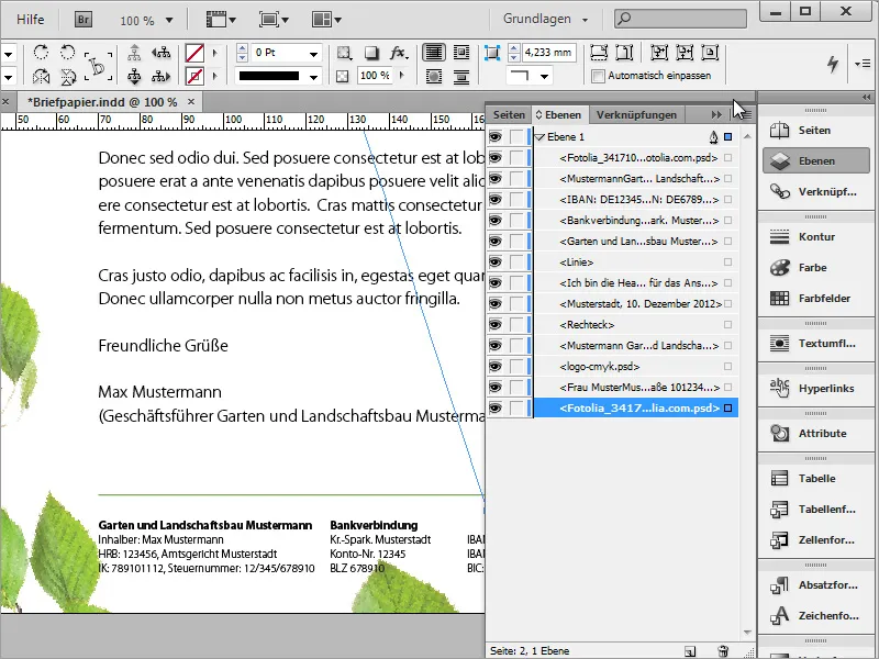
A small ladybug should adorn one of the leaves and is placed and adjusted in InDesign using a pre-made graphic. This includes assigning a small shadow to the ladybug.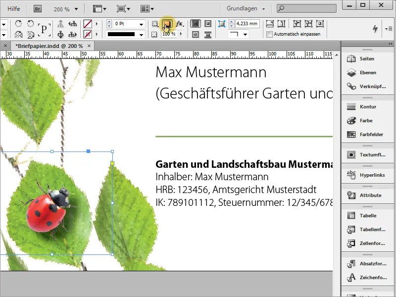
Of course, the effect can be adjusted more precisely and made more realistic. You just need to call up the effect editing and adjust the values more precisely in the shadow options.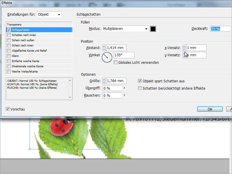
The background should receive a texture. To do this, select a background graphic in the Place dialog, which you access with Ctrl+D, that is large enough to fill the area.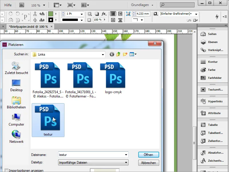
Drape the texture completely, especially up to the crop or beyond. Now switch to the layers panel and move the layer to the very bottom of the layer stack.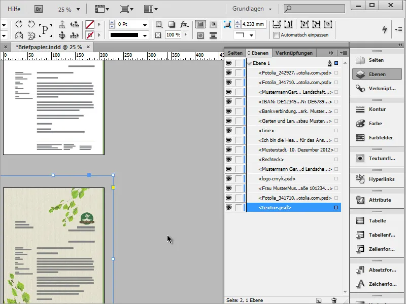
The new template is now ready for the time being.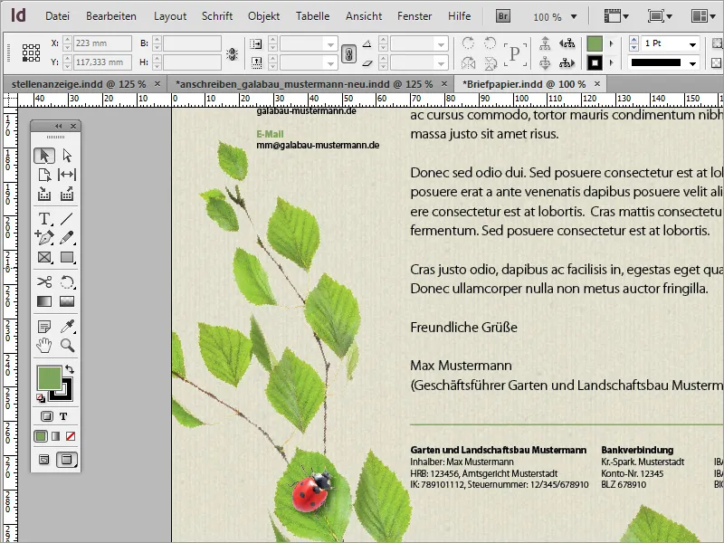
If the texture turns out to be too strong, you can reduce the opacity a bit.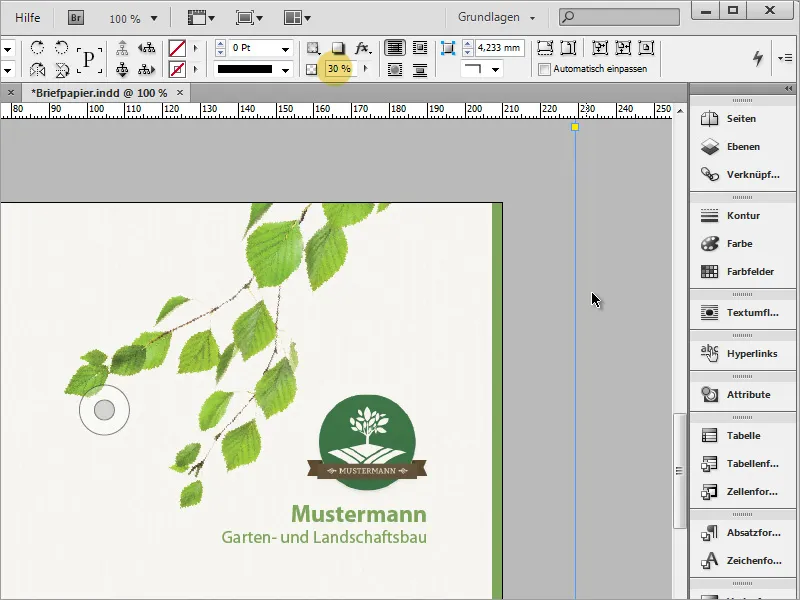
For those with a larger budget, specialty papers can be an option to save on high printing costs. One of these websites is www.fedriqoni.de or www.paperoffice.de.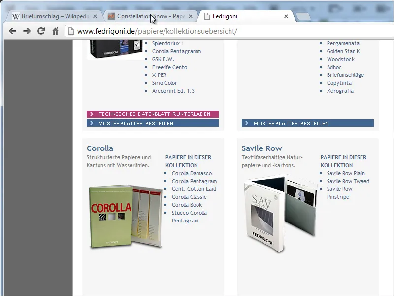
The design variant of the letter is based on the same principle as the website. For companies, it is particularly important to present a uniform appearance outwardly. This allows customers to memorize a company based on colors and shapes and to remain loyal to it due to this high recognition value.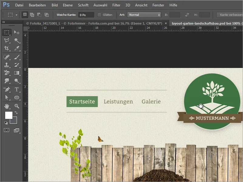
In your project, you have now set texts based on a character format. This makes sense, for example, if you want to replace a certain color with another. By double-clicking on the format, the dialog box for the format options opens.
If you now change the font color or font style there, it will be changed throughout the entire document wherever this font has been created with the format.