Excel offers an outstanding opportunity to simplify and visually represent complex data sets with its Pivot Tables. In this tutorial, you will learn how to use Pivot Tables to create engaging visualizations and dashboards. This step-by-step guide will walk you through the entire process, from creating Pivot Tables to dynamically visualizing your data.
Key Insights
- Create Pivot Tables efficiently from raw data.
- Utilize Slicers and Timelines for interactive filtering options.
- Visualize data with different chart types in Excel.
- Create an attractive dashboard with multiple charts and reports.
Step-by-Step Guide to Dashboard Creation in Excel
1. Creating a Pivot Table
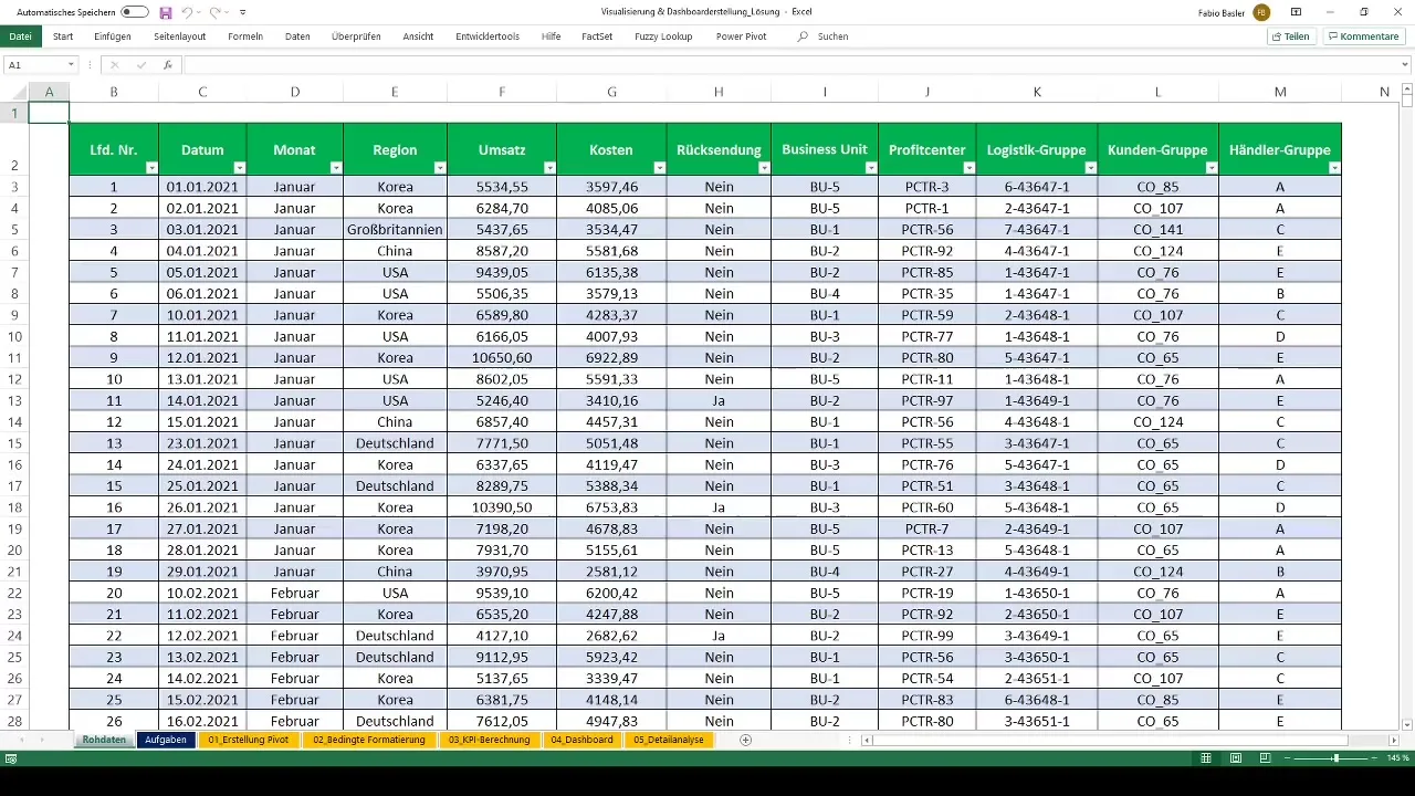
Start by ensuring your raw data is in a structured table. Then, go to "Table Tools" and select the "PivotTable" function. Here, you will be guided to create a new Pivot Table. You can save the Pivot Table in Worksheet 04 under the "Dashboard" theme.
2. Creating the first Pivot Table
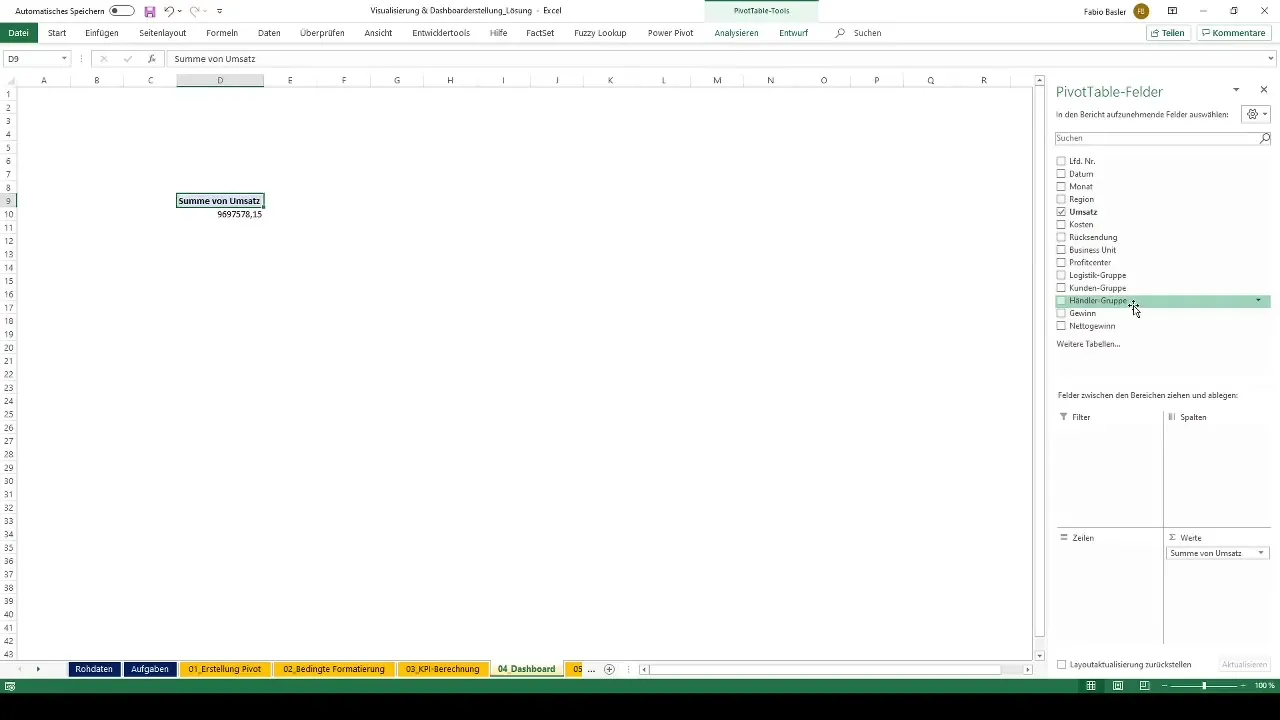
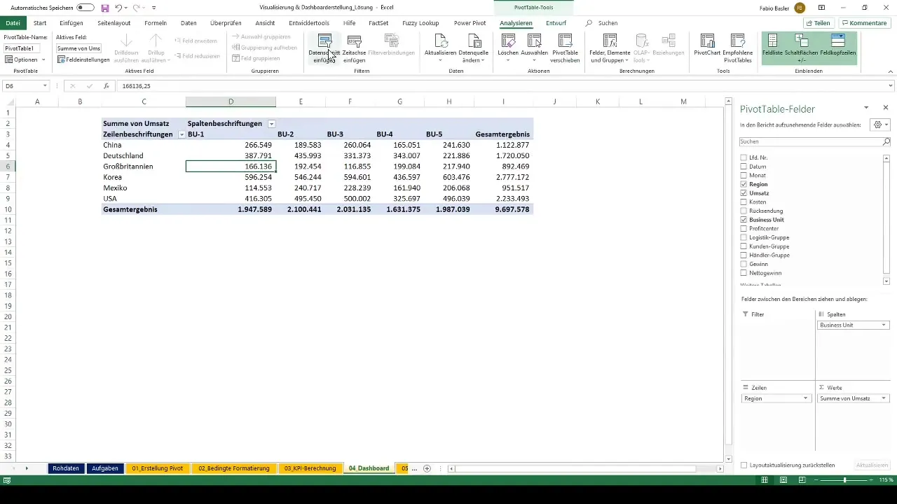
Now, it's time to create the first Pivot Table. You want to represent sales data by Region and Business Unit. Select the appropriate data fields in the PivotTable Field List and drag them into the Row and Value areas.
3. Adding Slicers
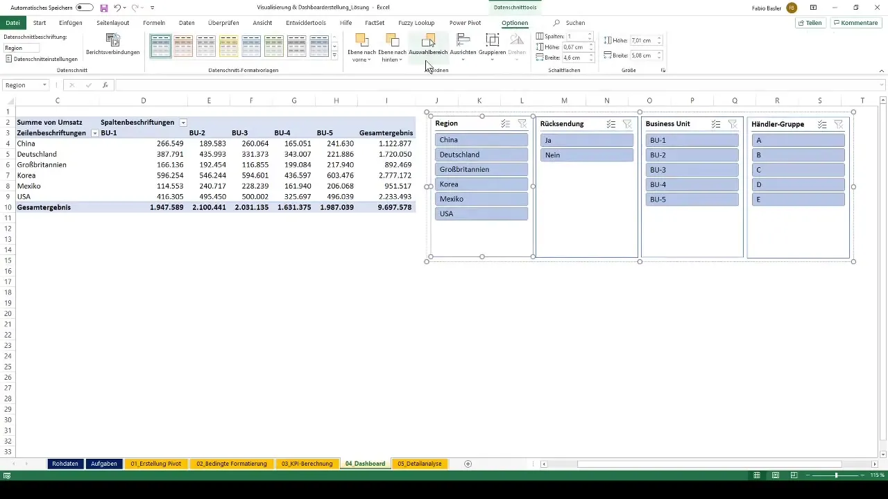
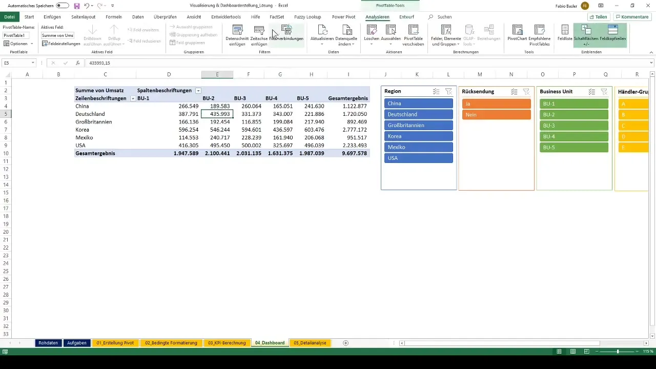
To create filtering options for your data, you can add Slicers. Click within your Pivot Table to open the "PivotTable Tools" menu. Select "Add Slicer" and add relevant Slicers, such as Region and Returns.
4. Formatting Slicers
An aesthetic design is important. Group your Slicers for better clarity and use the Slicer tools to customize colors and shapes.
5. Adding a Timeline
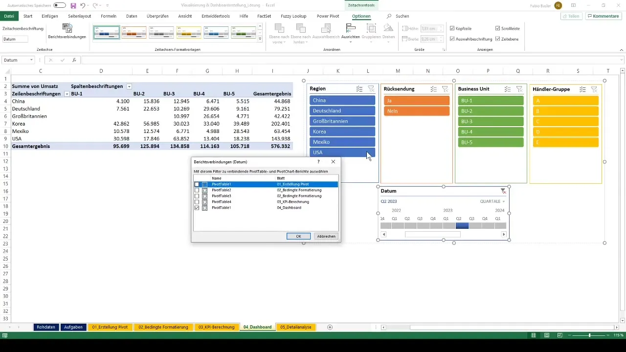
To incorporate the time dimension of your data, add a Timeline. Click on "Add Timeline" and select the Date or Month data. Then, choose which years or quarters should be displayed.
6. Establishing Report Connections
If you want to use multiple Pivot Tables in your dashboard, it makes sense to establish report connections. This way, you can use a single selection of Slicers for multiple Pivot Tables.
7. Creating Another Report for Net Profit
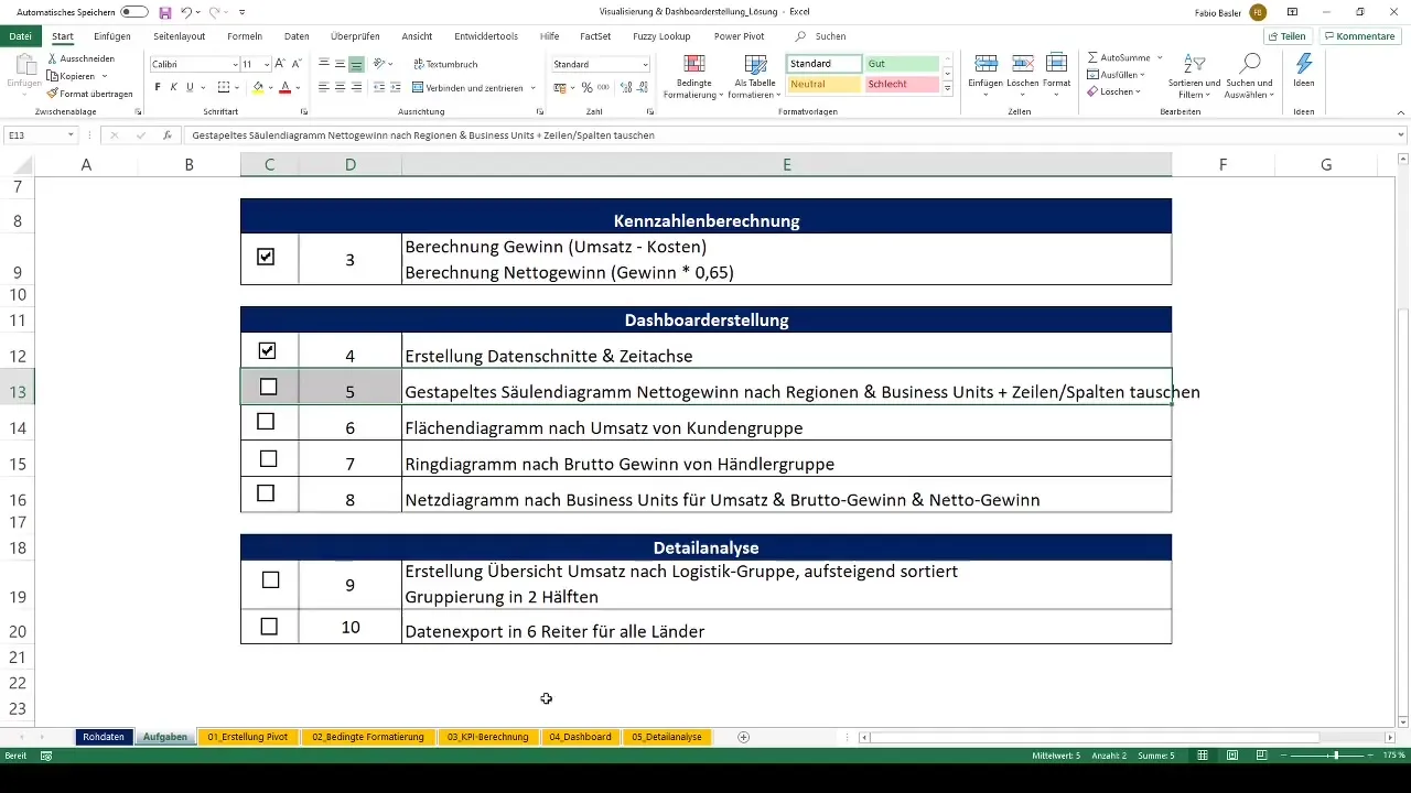
Apply the same steps to create a report for Net Profit. Drag the relevant data for Net Profit into the Pivot Table and start the chart tool.
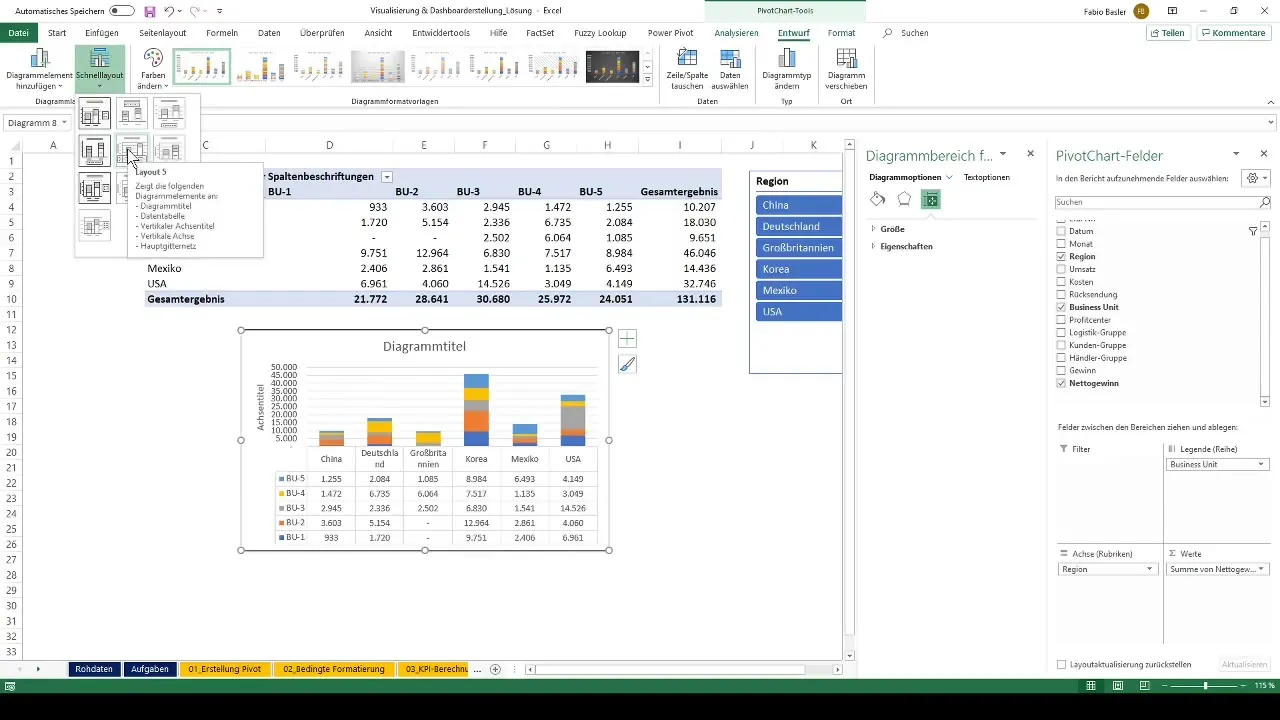
8. Customizing Charts
Each chart should be customized individually. Add outlines, change the layout, or adjust colors to achieve a clear representation.
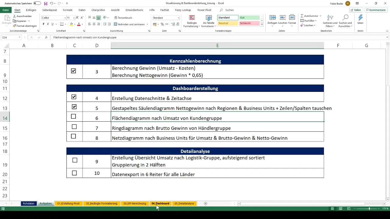
9. Adding an Area Chart
To analyze sales by customer groups, create an additional area chart. Design a new Pivot Table and select the sales data.
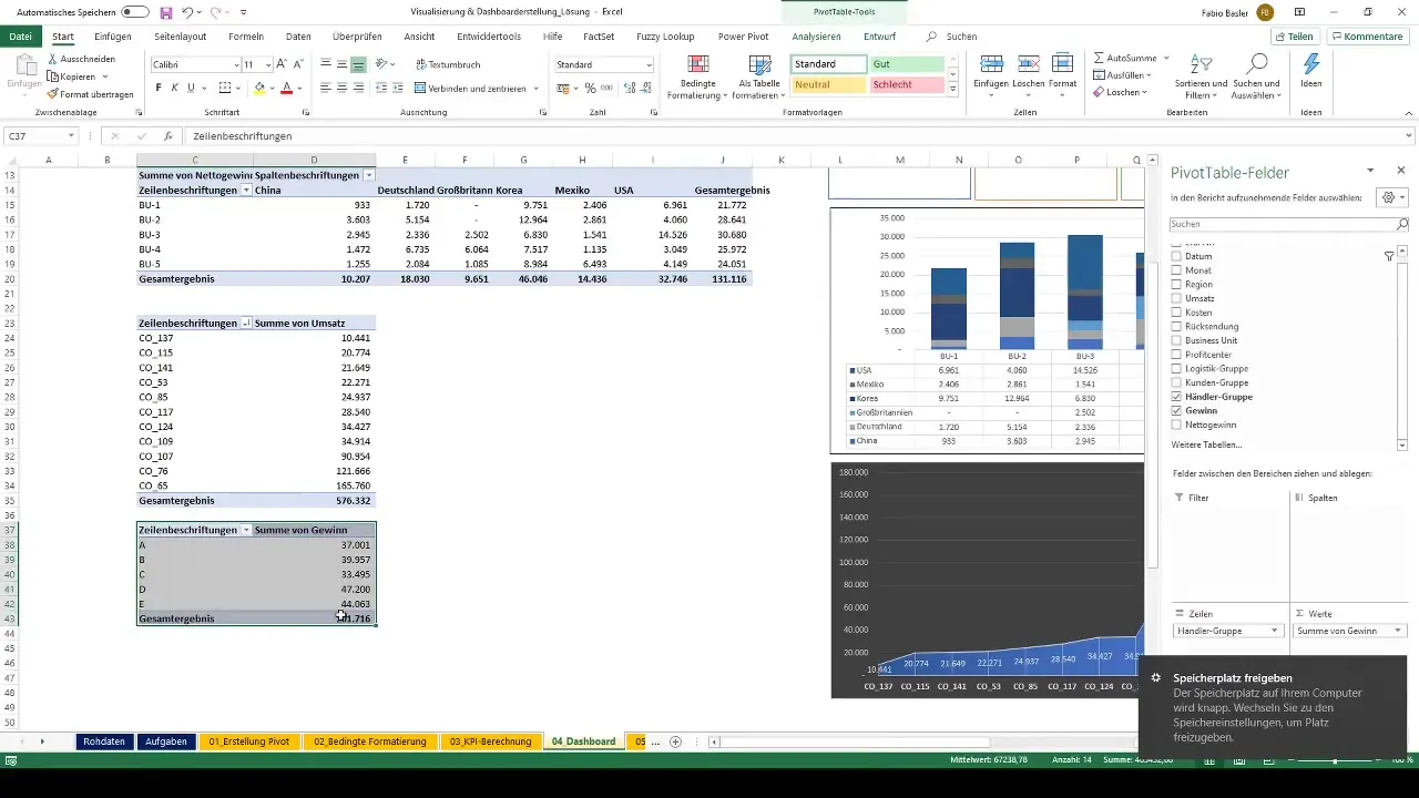
10. Adding a Donut Chart for Gross Profit
Create a donut chart to represent the gross profit of the dealer groups. Copy the relevant Pivot Table and paste it in.
11. Creating a Network Diagram
A network diagram is useful for representing revenue, net profit, and gross profit. Create a new pivot table to add this data, and then select the diagram.
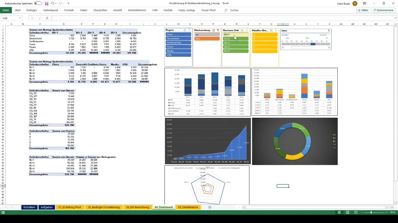
12. Finalizing the Dashboard
After creating all the diagrams, make sure they are well arranged and have a consistent design. Ensure that the diagrams remain interactive and responsive to data slices and timelines.
Summary
In this tutorial, you have learned how important it is to effectively use the functions of pivot tables and their visualization capabilities. You have learned the steps to create interactive dashboards in Excel, which will help you analyze data effortlessly and present it attractively.
Frequently Asked Questions
How do I create a pivot table in Excel?You can create a pivot table by going to "Table Tools" and selecting "PivotTable."
Can I insert multiple charts in one dashboard?Yes, you can integrate multiple charts in an Excel dashboard and dynamically link them together.
How do I manage report connections for my pivot tables?You can set up report connections through the "Report Connection" function in the context menu of the pivot tables.
How do I add interactive data slicers to my pivot tables?Data slicers can be added by clicking on the pivot table, accessing the "PivotTable Tools" menu, and then selecting "Add Slicer."
Can I change the colors of my charts in Excel?Yes, you can easily adjust the colors of your charts using the chart tools in Excel.
