In this tutorial, I will show you how you can perform complex data analyses in Excel using Power Pivot. By taking the example of an industrial supplier for the automotive, aerospace, and rail transport sectors, you will learn how to prepare, import, and analyze data. We will explore various dimensions and visualize them in pivot tables. The goal is to provide you with a comprehensive understanding of Power Pivot and enhance your skills in data analysis.
Key Insights
You will learn how to prepare data in Excel, import it into Power Pivot, establish relationships between different dimensions, and ultimately create a pivot table for data analysis. You will also understand how to visualize data in charts and work with slicers to refine your analyses.
Step-by-Step Guide
First, you need an Excel file containing the necessary sales data for our industrial supplier. This file should have multiple tables, including sales data, customer information, and time data.
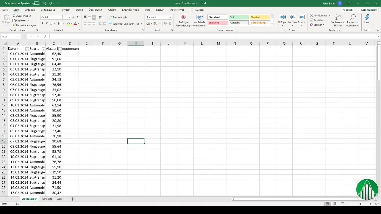
Step 1: Prepare Data
Before starting the analysis, ensure that the data is formatted as tables. Select all data rows in your sales data table, then press "Ctrl" + "A", followed by "Ctrl" + "T". Excel will automatically format the data as a table and recognize the header row for each column.
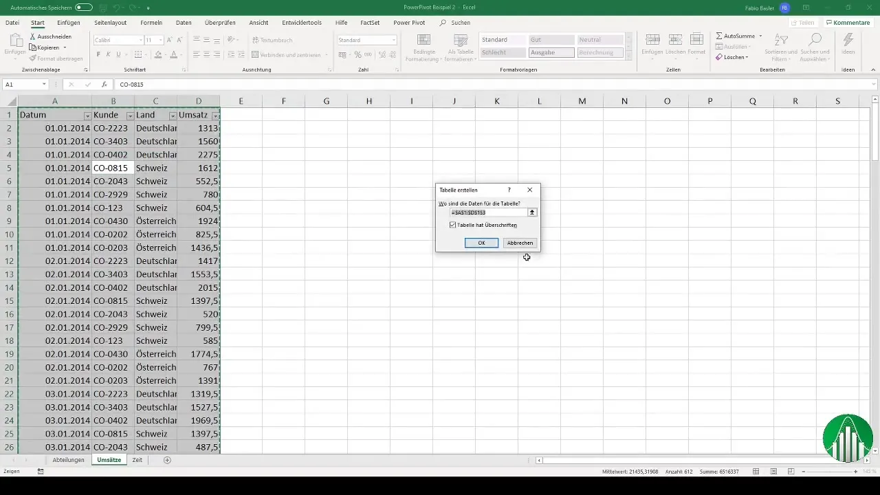
Repeat this process for any other sheets you wish to use, especially for the department tables and time dimension.
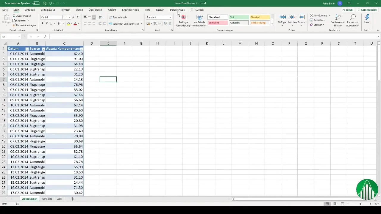
Step 2: Import Data into Power Pivot
Once the data is properly formatted, return to the Excel main window. Go to the "Power Pivot" tab in the ribbon and click on the button to add the data model. You can import the department table and give it a meaningful name to facilitate future handling.
Repeat this import process for the other two sheets: customers and time dimension. This ensures that you have all relevant information available in your Power Pivot model.
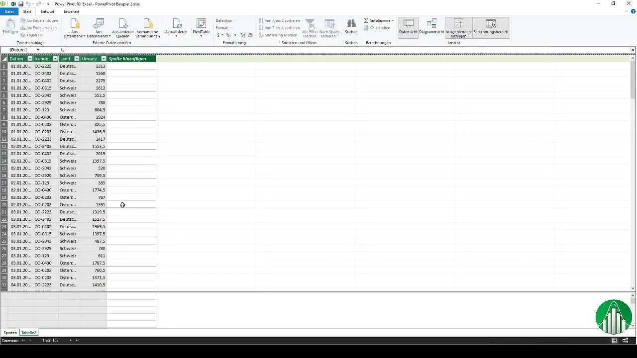
Step 3: Model Relationships
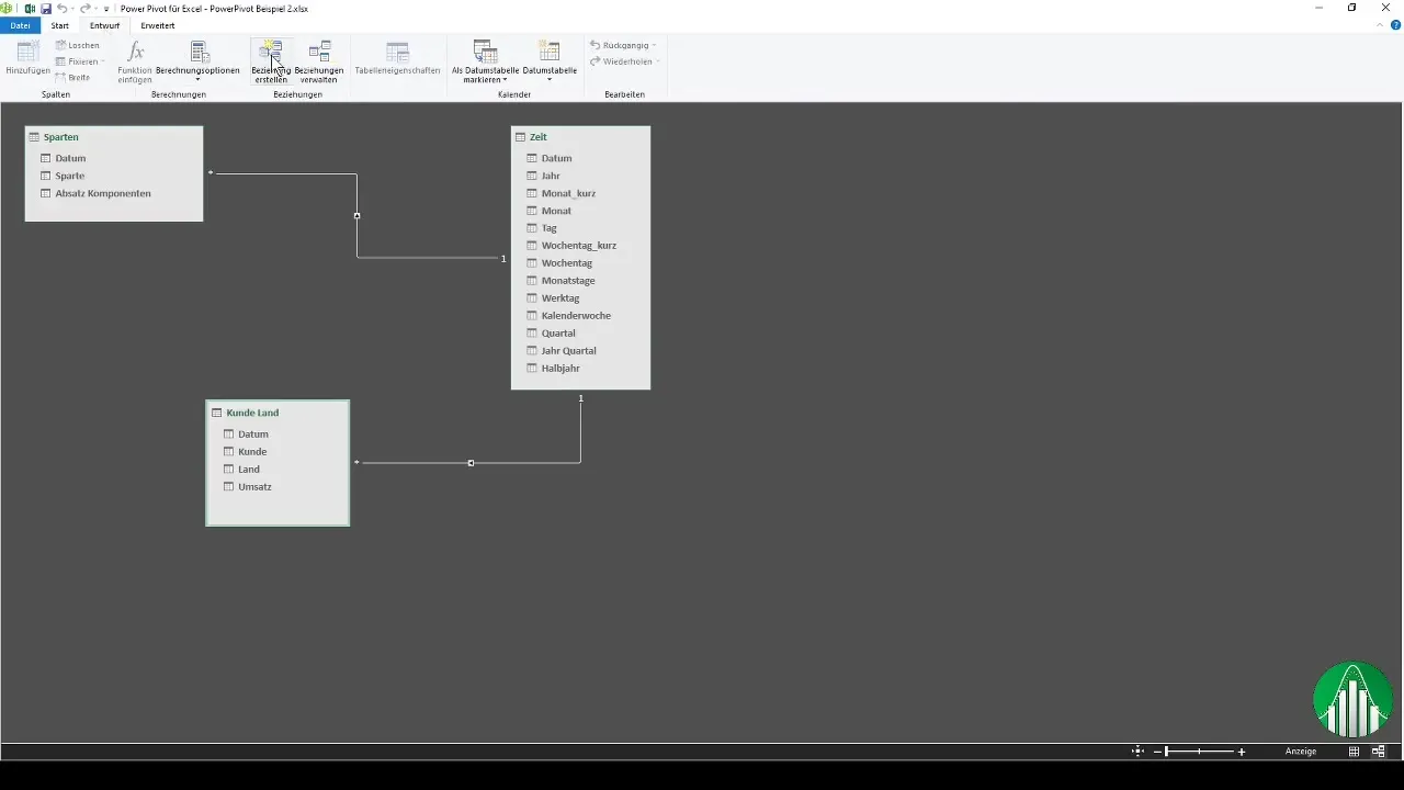
To connect the different datasets, go to the diagram view in Power Pivot. Here, you can link the dimensions together. Start by connecting the departments with customer data. You will notice that the model is initially incorrect because the time dimension also needs to be linked with the date.
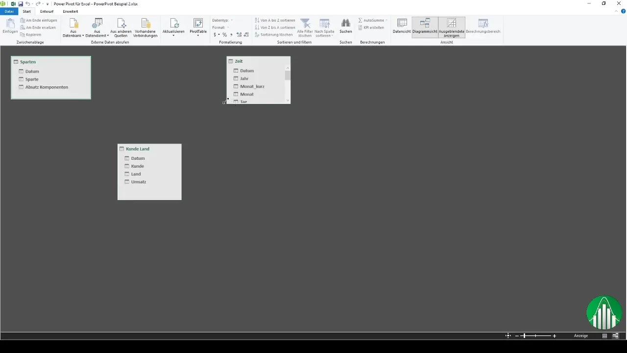
After establishing these connections, you can check if there are any other relationships you would like to model. Click on the relationships button and set the connections accordingly.
Step 4: Create Pivot Table
Once you have modeled the relationships, it's time to create a pivot table. Go back to the main Excel menu and click on "PivotTable". Choose to create a new worksheet and confirm.
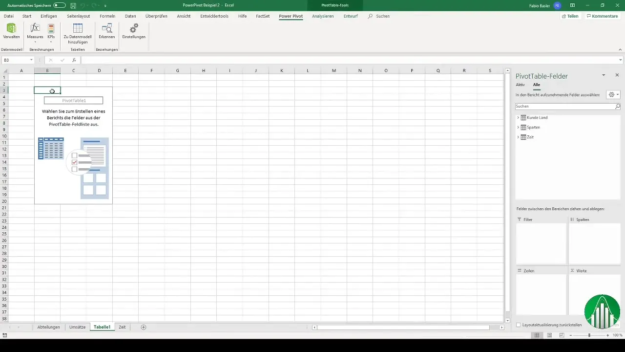
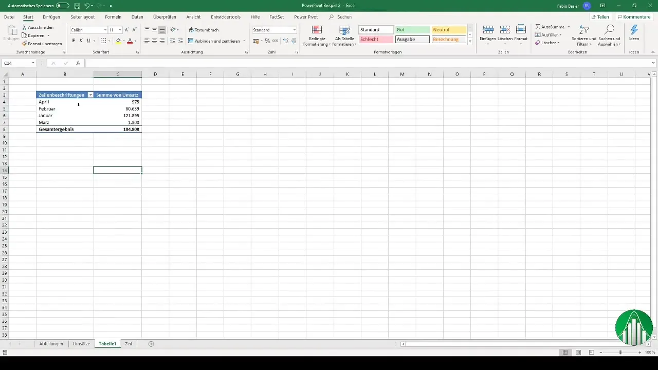
Now you can start creating a multidimensional data analysis. First, add the revenue as a value in the table. Sort the data by months to analyze the information clearly and structurally.
Step 5: Visualize the Data
Once the data is organized in the pivot table, you can further analyze and visualize it. You can create a stacked column chart to clearly represent the revenues and design the representation by countries and customers.
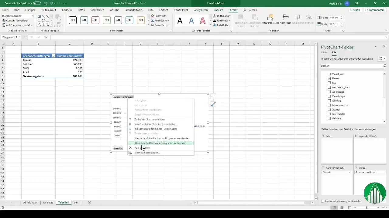
You can duplicate the pivot table to also check the quarterly view. To do this, remove the monthly view and place the quarterly data in the rows.
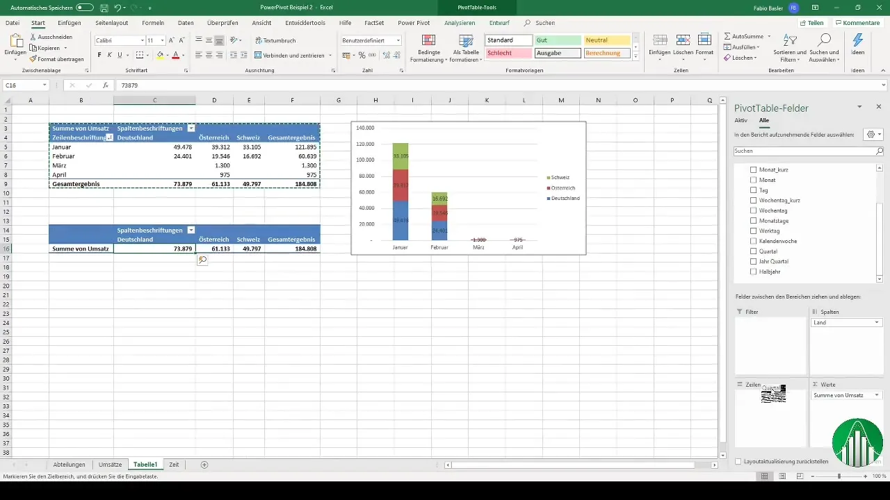
Now you should also be able to consider the sales figures of the components. Be aware that connection problems may arise that also need to be fixed.
Step 6: Using Slicers
A very helpful tool in data analysis are slicers. These allow you to select data based on specific criteria, such as by quarters. Add a slicer to refine the analysis and directly determine the months from the slicer.
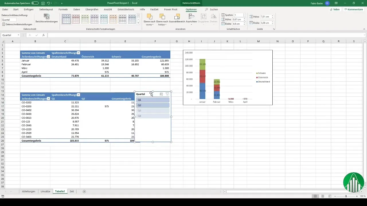
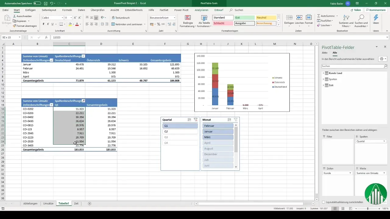
When you apply the slicer to a specific quarter like Q1, you reduce the displayed data to the months of January, February, and March. The second worksheet slicer will also automatically adjust to the changes made, providing you with a dynamic data analysis here as well.
Step 7: Charts and Dashboards
Finally, you can visually present the results of your data analysis by creating graphs, charts, and dashboards. You can use various types of charts such as pie charts or other visual representations.
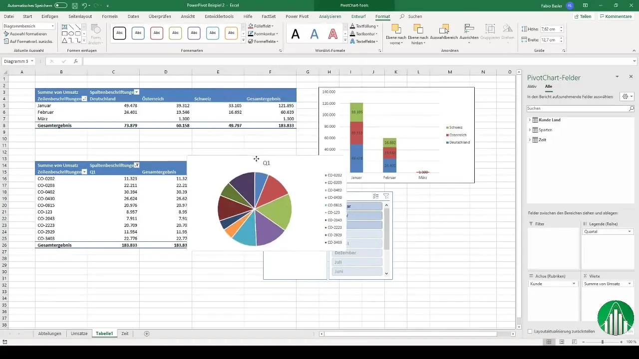
With these techniques and methods, you can perform comprehensive data analyses and create dashboards that help you and other users gain insights from the data.
Summary
In this guide, you have learned how to effectively use Power Pivot for data analysis in Excel. From data preparation to importing and modeling to creating pivot tables and slicers, you have gone through all the steps to conduct your own data analyses. Use these methods to enhance your Excel skills.
Frequently Asked Questions
What is Power Pivot?Power Pivot is an add-in in Excel that allows you to analyze large data sets and create complex reports.
How do I import data into Power Pivot?Data can be imported into Power Pivot by formatting them as a table in Excel and then adding them to the data model via the ribbon.
What are slicers?Slicers are filters used in pivot tables to restrict the displayed data based on specific criteria.
How can I create pivot charts?Pivot charts are created by selecting a pivot table and then choosing the "Pivot Chart" option in the ribbon to generate various graphical representations of the data.
What can I do with the collected data?With the collected data, you can perform comprehensive analyses, identify trends, and create visual dashboards to present the results.


