Yes, hello everyone and hello world, this is your Stefan from PSD-Tutorials.de. We're on to a new part of our big project "Fresh Print Layouts in InDesign", and today we're designing something that might not necessarily be the strong oak in every print shop's portfolio like business cards or flyers, but still has a highly exciting design character: We are designing a DIN A4 folder, as this example shows.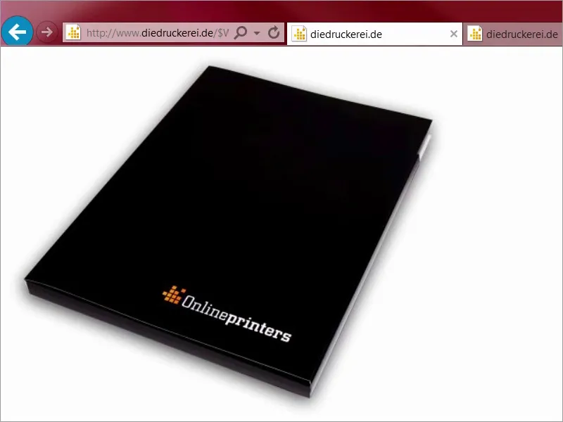
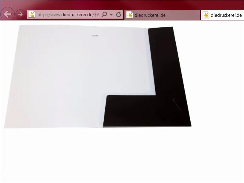
Or this example unfolded. You know folders like this, you get them at trade fairs, for example, as handouts when you've been to presentations, as company brochures and so on and so forth, and that's exactly what we're going to do today.
Here we go: Steps 01-10
Step 1
What makes this thing so interesting, of course, is that you have to think a little around the corner, more around the edge, to be honest, because we have to think three-dimensionally here, as the product itself already reveals. I came up with a very special theme for the design, because I would like to use color as a brand ambassador, because color not only makes walls beautiful or clothes interesting, but is also an instrument for concise branding.
I'll open a new tab for this, let's take a look at our colleague Google, once on the image search, and now I'll show you something: Sparkasse advertising. So, what's the result? Take a look at this. The savings banks in Germany use exactly this effect. We have monochrome, i.e. single-color images, and always only red, red, red, red, red, red, red. Red everywhere.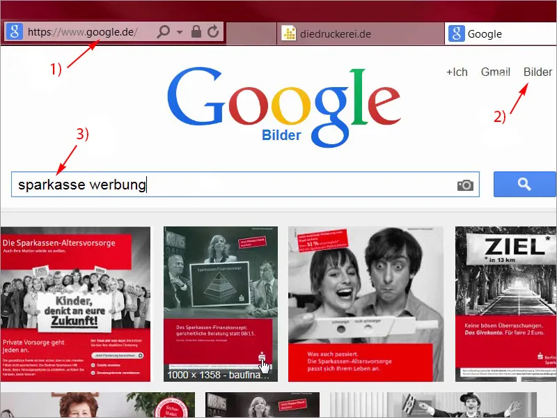
Step 02
Of course, there is a very interesting thought behind this idea, because it is about evoking an automatic association in the minds of visitors: Bank - savings bank - red. But that's not just a snappy trio, no folks, I'm telling you! It works too! I was employed there myself a few years ago, and it shows how simple components can be used to write advertising history. In this case with just one color, which has just three letters and when read backwards leads to an eruption of cheers and waves of la-ola in every soccer stadium. But we're going to turn the tables and switch from the color of blood and human life and, as I said, the color of finance to the color of growth and fertility, and what color is that? That's right, green. Yes, let's take a look at what Google spits out when we enter a new search term up there: Green is the color of ecology, just think of organic fruit. I'll type that in: ecology. Take a look at what comes up: everything is wonderfully green. So green has a calming effect, it's the color of the middle, it evokes positive associations.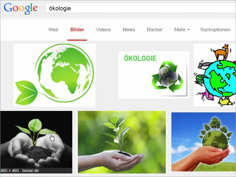
Step 03
I'll enter a new search term: Take a look at this: green traffic lights. Fortunately, we no longer see red here, no, green traffic lights mean a clear road or green light. For this reason alone, you should actually like the color green better than the color red, because who likes to stand still?
But funnily enough, green also has something demonic about it, something poisonous even. Or dangerous. Take a look at this search term: Do you know it? It's certainly not as tame as a nice juicy organic apple, but what I'm trying to tell you is that it always depends on the content.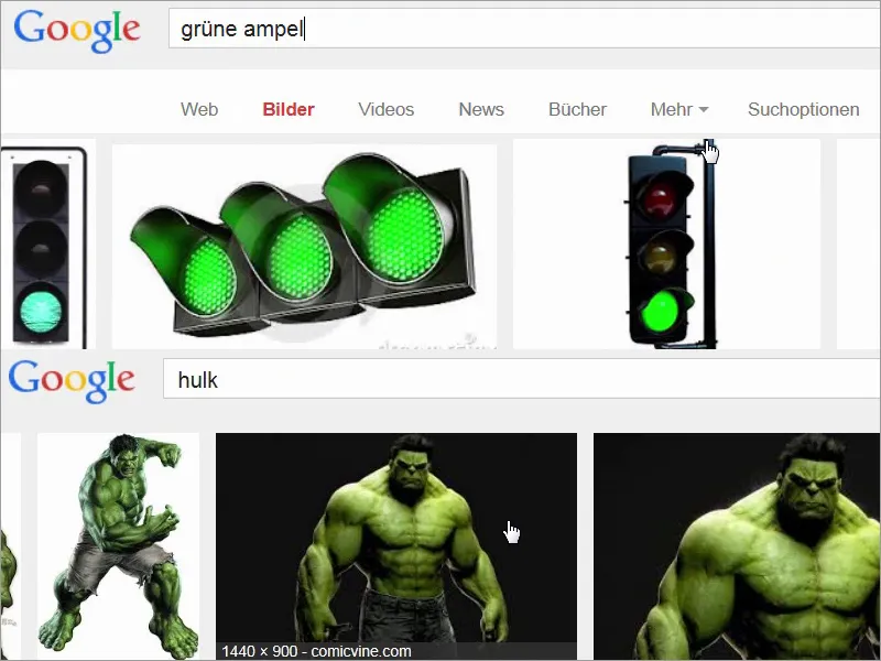
Step 04
So in summary, we can really say that green is the color of choice when it comes to naturalness, when it comes to organic, when it comes to an authentic character, and we will combine that: We will take up exactly the savings bank idea, use green as a brand ambassador, and couple the whole thing with real estate that not only has a green image, but also comes across as damn luxurious. I think we'll just go to our print shop's website and take a close look at the print parameters. Under folders/folders, there it is: folders 4/4 color, which means we print outside and inside in four-color printing, and then we choose the DIN A4 format, and now take a look at what great things await us here, because in addition to the general information we already know from the other videos, there really is an incredible amount to discover here.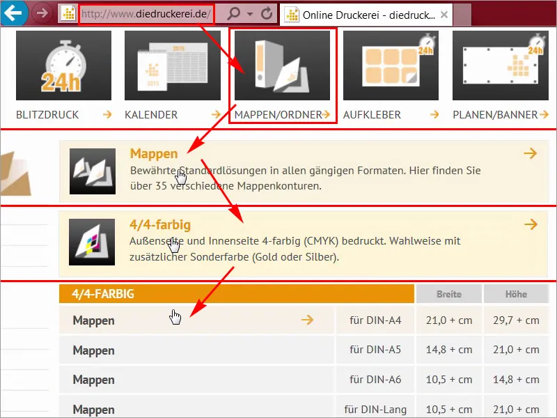
Step 05
Under the details (1) you can select the format, and there are really different variants here. It starts at seven, and you can always see what changes here, or even with a ballpoint pen, for business cards to clip in or CDs you can clip in or use the double format etc. and so on. I have already decided on one, namely punching format number 14, where we can take a closer look at the data sheet (2). I'll open it here in a new tab and will also download the template for it, "14_44_en.indd" (3), because it can be that easy. You don't have to create something new every time. Above all, as a designer, I wouldn't have the time to prepare a corresponding template once, no, I am very grateful that our print shop already provides the InDesign working file.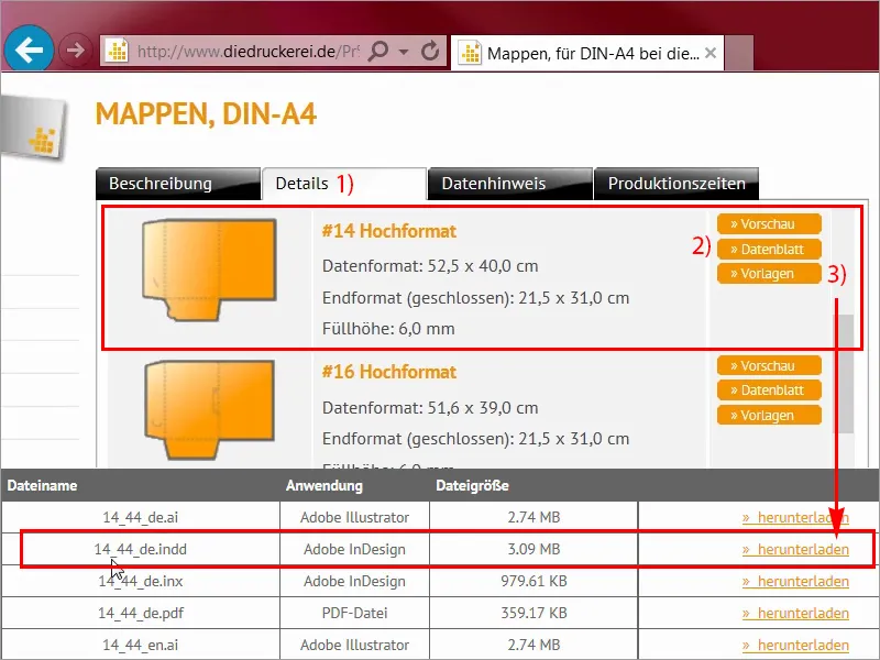
Step 06
Let's take another look at the data sheet, I'll close it here, and you can see exactly what it will look like. We have a front side here, this is the back of the folder and these are the two wings, one on the left, one at the bottom, which can then be tucked into each other and folded inwards..webp?tutkfid=68144)
Step 07
Data formats are actually rather unimportant for us now, because we are working with the template that I have just loaded, and this is the inside, by the way, with all the dimensions that we actually need. I'll now open the template in InDesign and then we'll get started.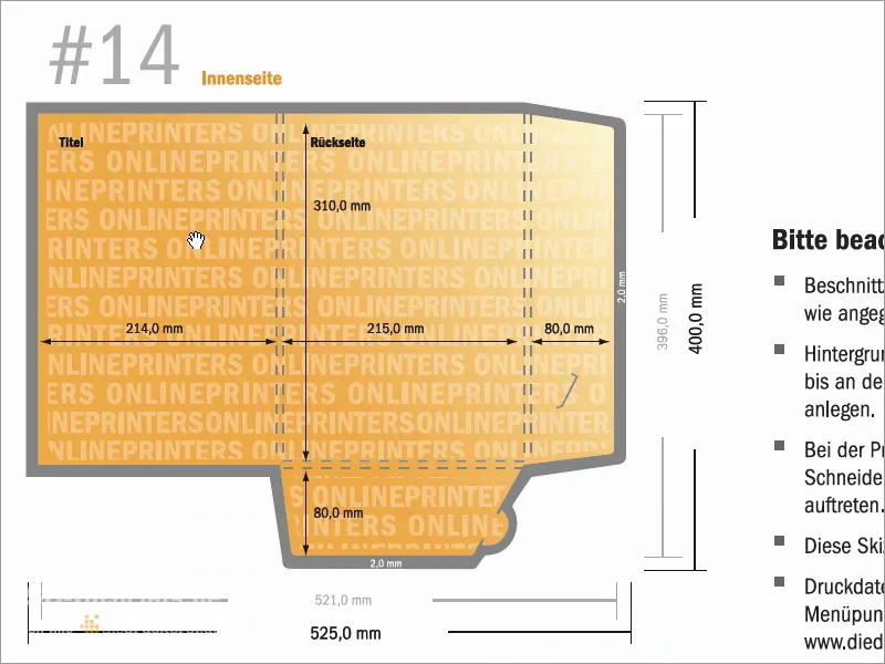
Step 08
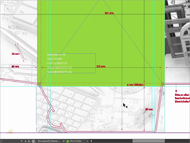
So, here we are in InDesign CC. Now you can finally see what we're designing today. Our design is based on two essential pillars that are largely responsible for the brand message. Let's take a closer look at them. On the one hand, we have the color grass green combined with black and white images as seen here and the white decorative elements here on the back. So on the right we see the front of the folder, on the left we see the back of the folder, and these are the two wings.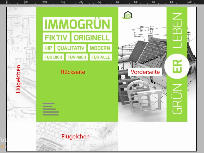
Step 09
The second essential pillar we're working with is the curve-friendly typography. Take a look at this: This is the so-called Exo, I'll double-click on it, it comes in different weights, as you can see here, you can also download it, I think, for free on fontsquirrel or dafont. And although Exo is completely free of any Serif, it has a friendly, round and lovely character. This sets the scene perfectly. Let's take a look at this in detail. Take a look at this wonderfully shaped E: unconventional and yet totally perfectly formed, including the L at the bottom, where there are often hard edges or corners. Very delicate, lovely and round.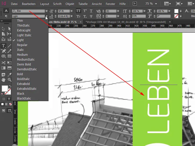
Step 10
I really like this font, it's a perfect fit for our upcoming design, so you can remember: Exo. But the best thing about the entire folder design is the built-in finishing. Of course, we can't see it here on the monitor, but the print shop has given us the option of enhancing our print product with partial relief varnish. This means that we will apply this relief varnish to all white surfaces, on the left, here on the right the circle; I think green living is a really interesting play on words; you can say living greener or experiencing green, and the ER in the middle will of course also be enhanced with this wonderfully beautiful varnish.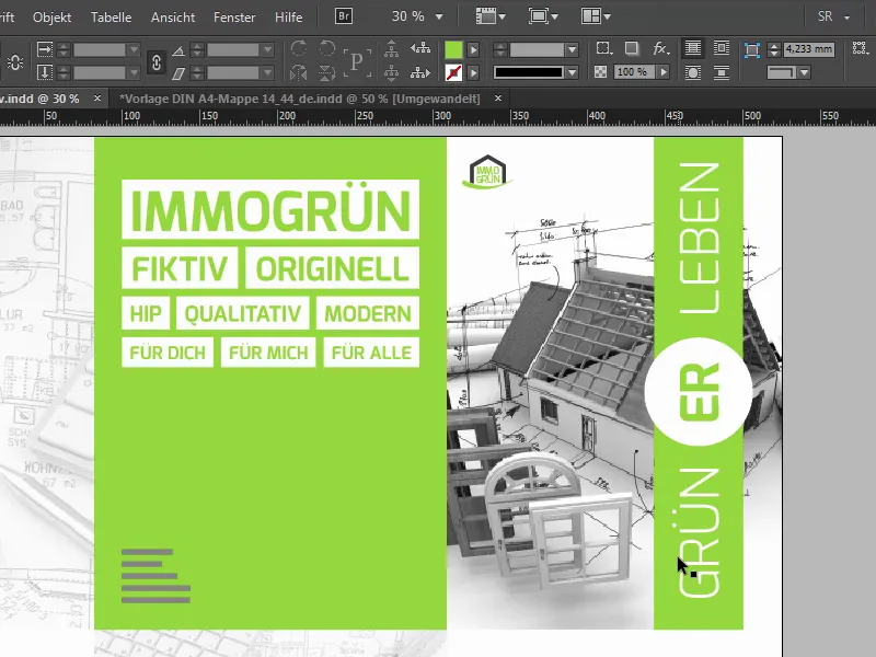
Continue with steps 11-20
Step 11
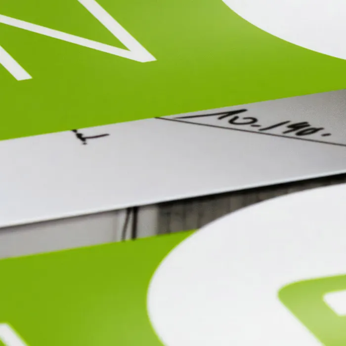
The question naturally arises as to what a relief varnish like this does for the bottom line. It can be used to emphasize lettering or motifs three-dimensionally. Fortunately, the substrate is not deformed in the process, which is why this is an excellent option for this folder. And as a graphic designer, it's also about thinking beyond the simple design process. The finished PDF that we then see is by no means the end of the story. Because when it comes to finishing, the intermezzo goes into the second round, and you should bear this in mind: Finishing is of course also design. This is not just some kind of accessory that you should nod off with a skeptical look afterwards. No, it contributes to the overall impression, or rather the impression experience.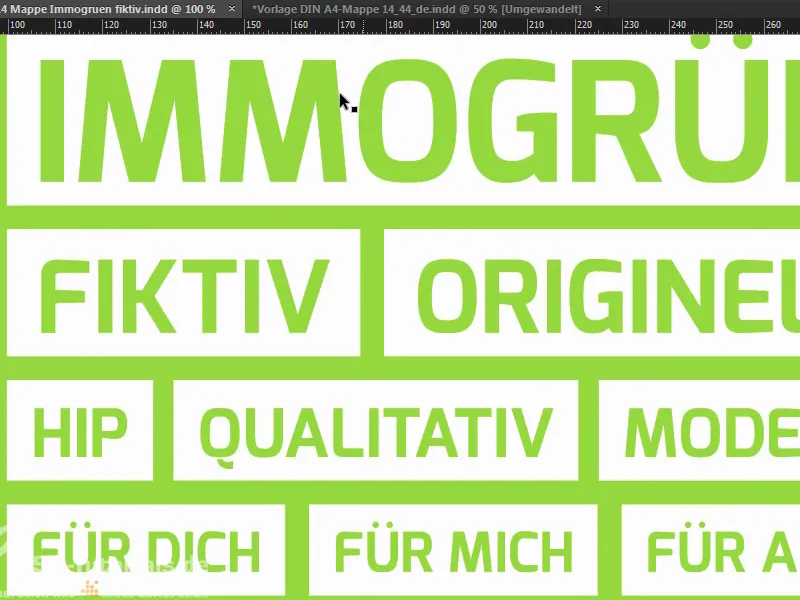
Step 12
I want to encourage you to consider the option of finishing, depending on your available budget, because the client and the viewer will really appreciate the new feel. We will of course take a closer look at this later, right in front of the camera. Before we start, let's take a quick look at the second side, which looks like this: We can see it here.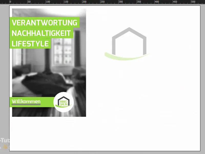
Step 13
I can also show you the punching outline in the layer control panel so that you can see how the shaping actually works.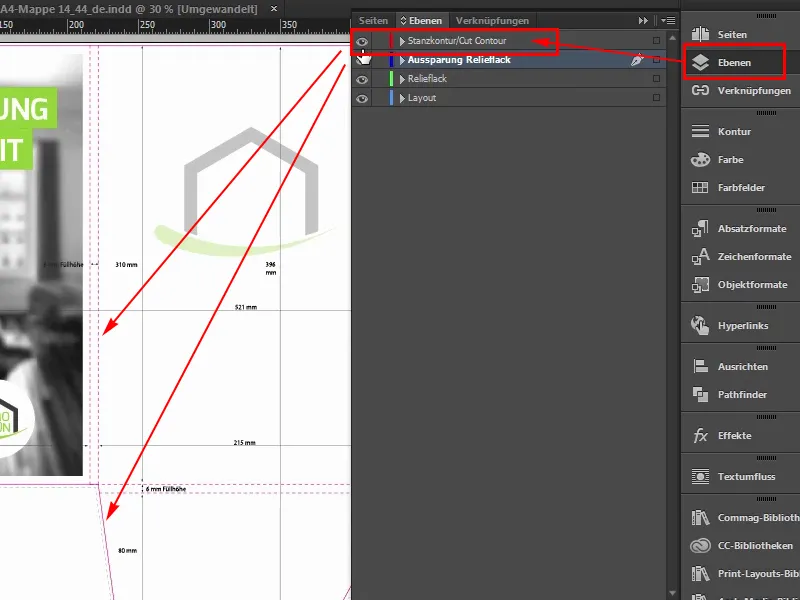
Step 14
Here we have the inside of the wings again, which remain in white. The logo is centered on the inside with a reduced opacity of 30% and three pithy words on the left of the inside that you open: responsibility, sustainability, lifestyle. Welcome to the world of immogrün. And a completely blurred image in the background, where the Gaussian blur in Photoshop has done a great job. This is done so that the eye really captures the essence of the message, which is definitely the color and these three keywords. So nothing should distract from the color.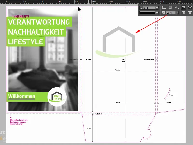
Step 15
Well, I'd say we'll start with the template, which I've already opened here, and there we are on the outside. We have two layers here again: the die-cut outline, which I can show and hide. If it bothers you, Blender it out. It's very helpful at the beginning if you leave it in for the time being. And the layout layer, which we will work on at the end.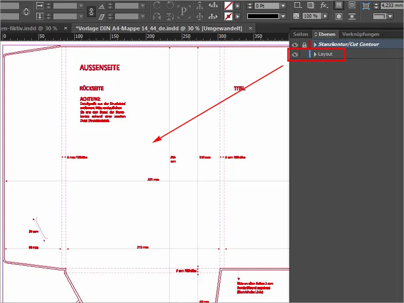
Step 16
So we start by placing an image on the right-hand side, and here we can already see the line, that's where the outside ends, unfortunately we don't have a guide here, which means we can't work with docking guides here, so we'll make it easy for ourselves now, we'll scroll to the right, to the right edge, down a little here, and there we see that we have a width of 214 millimeters available. I'll simply draw a guideline here at the very edge. It also docks automatically because this is the end of the document.
I'll drop it and now I'll enter a small calculation at the top here. We'll first reduce by -2 mm, that's the two millimeters of bleed we have here, and I'll enter: -214 mm, and now the guide has jumped to the left, exactly at this point.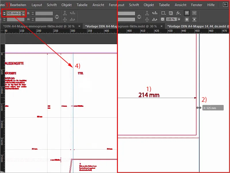
Step 17
Now we can easily open the Place dialogwith Ctrl+D, select our suitable image and click on Open.
Step 18
Then dock here at the top of the guide line and drag the image once beyond the bleed (1). Here at the bottom we also go a little further, more or less, as long as we are over the bleed (2). And now we select Right-click>Customize>Fill frame proportionally (4), and the next step is to place the image correctly.
So on the left we see slightly cropped doors, on the right the house is still quite good, maybe we could move it a little to the left, not much, but I think on the whole we can leave it as it is. If in doubt, we'll just have to readjust it afterwards.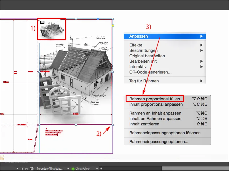
Step 19
For better visualization, I will also increase the display performance here (View>Display performance>High quality display), which is jumping out of the window, but at the bottom I can selectHigh quality display, we would actually have performance losses, but my computer can do it that way. In any case, the logo belongs on the top left of the title page, and I'll place it from my library (1), I'll just pick it out, here I have immogrün (2). This is a group, I'll move it right to the top, in the corner, and then down, to the right, down, to the right, down, to the right, down, to the right. Four times approximately, so I can imagine it quite well (3).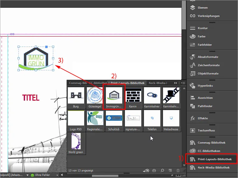
Step 20
What's missing now, of course, is our color band, which extends from here at the top to the very bottom.
I'll show you this again on the template: this is what it looks like, this is what we need. Let's take a quick look at the dimensions: First of all, this value is important to me (57.375 mm): I'm going to copy it.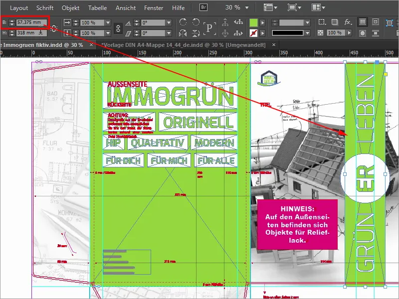
Steps 21-30
Step 21
Click on it once (1), copy the width from the clipboard (2), confirm, then of course the whole thing needs the right color, namely 50 0 100 0 (3).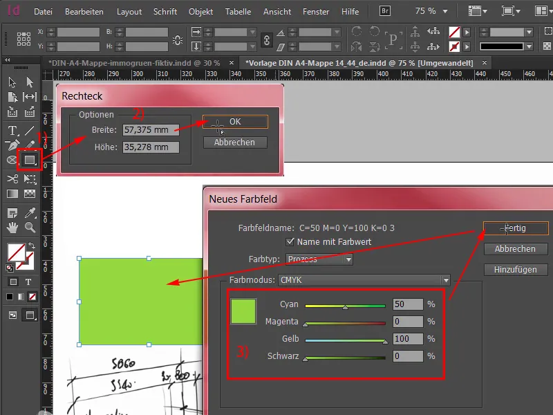
Step 22
Add, and now I'll move it to the very top of the bleed (1) and scroll out a little, by the way, you can do this by holding down the Alt key and mouse wheel, and then drag it down. We also need a circle in the middle, which I can easily select: Ellipse tool (2), click once, confirm with 70 to 70 mm (3), I select the color white for it (4), scroll back in, have selected the circle, select the element behind it with the Shift key pressed and try the Align panel (5) by aligning the whole thing to the horizontal center axis (6) and to the vertical axis (7). Now it has slipped a bit, no problem, with Shift and left on the arrow keys you can move it back to the right position. I'm using the roof gable as a guide here.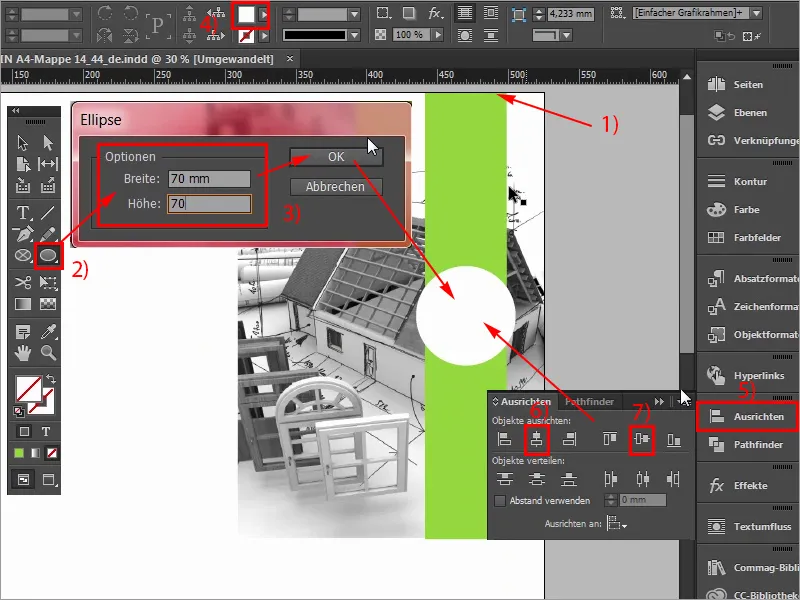
Step 23
Now, of course, the font is still missing, Green live, so let's do that quite simply using the text tool (1). Draw a text field, font size is 97 pt (2), as font the Exo in the font style Light (3). And then the color white (4), and then I can just start typing: Green, select everything, in capitals (5), confirm, then I will reduce this to the correct size by double-clicking on the handles, rotate by 90° (6), and now the guides have just appeared, i.e. we are already on the correct axis, and I will let this text field dock to the circle at the beginning and now also move 1,2,3,4,5 distances downwards by holding down the Shift key and arrow keys (7).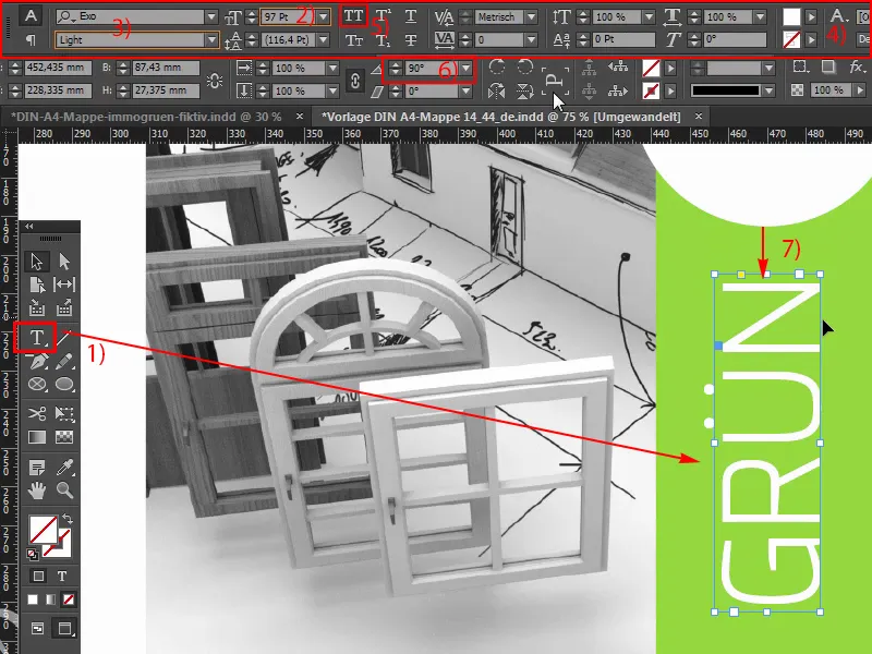
Step 24
I scroll out a little and then I create a copy of it with Alt and Shift, and then I also dock it to the circle. Like this. I drag the whole field a little larger and change the text to "Life". Now five times upwards again, ok, wonderful, just make sure that we're not too close to the edge, that should be 4 mm (1). But I also think that we are definitely on the safe side. Now I'll copy this text field one last time, move it to the middle and change the color once to green (2). Here I'll write in: "ER" (3), center (4), in Bold font (5), I'd like it to be a little bolder, reduce it to the size that's necessary, and then select the circle behind it again with the Shift key pressed, Align panel and adjust the axes accordingly (6). It's that easy with the outside, we're actually already done with it, and we'll quickly move on to the back, which we'll design on the left.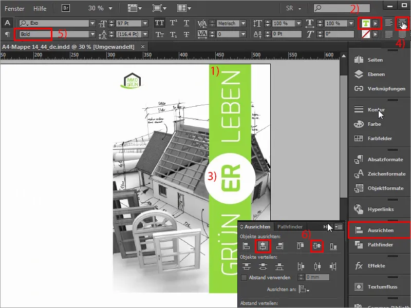
Step 25
So we start drawing our auxiliary lines again, on the left side we start here on the wing downwards, and you can clearly see when you draw the auxiliary line here that it docks. Now let's add the 2 mm bleed we have here plus the 80 mm from the wing, which means we're at 82 mm (1), and this part here is identical to this part here (2), i.e. a filling height - in this case the spine of the folder - and we have the same play here too. I would like to include this in color.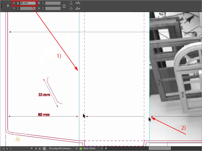
Step 26
Likewise in the lower area, we have the same scenario here, so I'll draw a new guide line again, if I zoom out once, then you can see here, that's 310 mm down here from the very top to the very bottom, and if I now draw a guide line from the ruler, I add the 2 m at the top of the bleed, plus 310 plus the 6 mm fill height that we have here, which is output here, then we are exactly at 318 mm, and that is now the type area I want to work with.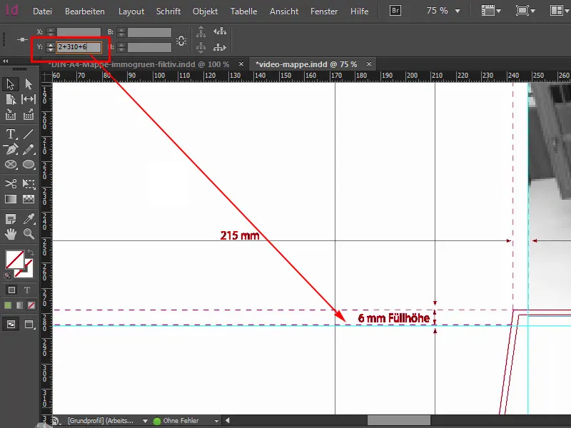
Step 27
First of all, I need it to be a little greener. So: draw up a new rectangle (1), start at the top left, I'll check right away whether we're sitting exactly there, once drawn up, the color is right, exactly, 50 and 100, that's our grass green (2), and now I'll look at the top to see if we're sitting exactly here. That looks good. Let's scroll down a bit, up to here, and we still need to make some improvements. So where's the handle? Here it is. Pull it down once, ok, and then we'll check the same thing here at the transition: we've overshot the mark a little (3), i.e. I'll also correct this manually, directly on the guide line. Now our back shines in a beautiful lush green and what's still missing are our distinctive text boxes, which we'll create together.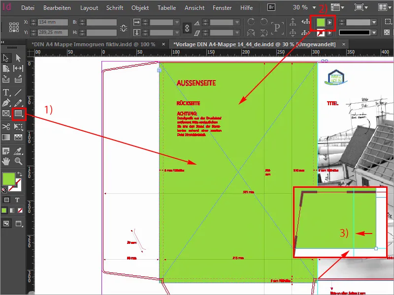
Step 28
First of all, I'll draw the corresponding guidelines and please don't be surprised at these crooked values that I'm entering now, but I've already measured them once. So: 99.705 mm (1) and the second goes to 291.314 mm (2). We have now drawn a line here and a line to the right. I'll hide the auxiliary layer (3) so you can see a bit more.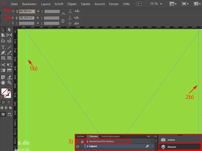
Step 29
Now let's move on. We will now draw white boxes (1). To do this, I'll start at the left auxiliary line, change the color to white (2) and define a very special height, namely 38.22 mm (3).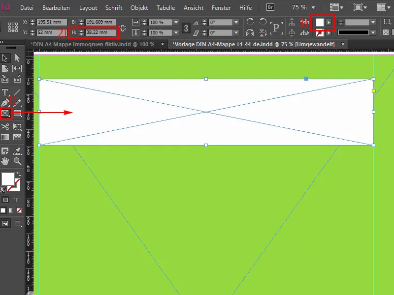
Step 30
I will now place a text box (1) on top of this.
Of course, you could also do this all in one go, i.e. you draw a box, fill it with the color white and then make a corresponding text frame from it, but we need this later for the relief painting, so we have to do it on different layers. You'll see why that is, it's a bit more complicated at the beginning, but of course it serves a purpose.
So I'll activate the exo in bold (2) off, capitals (3), 100 pt (4) large. And the color, yes, that will be set to green (5) for now. And then we write in: immogreen.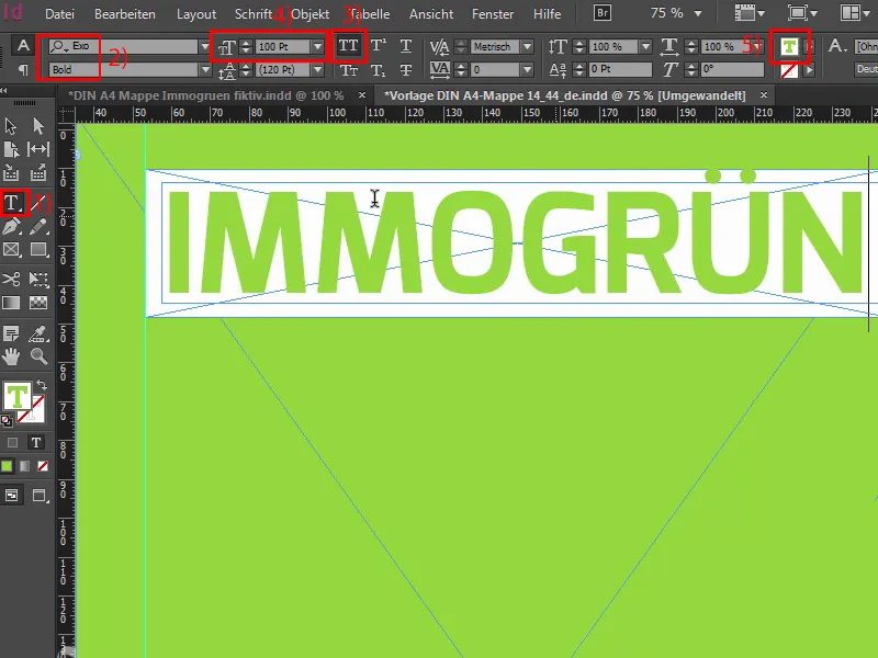
The last steps
Step 31
Now I will reduce the text field to the size that is necessary, select both in succession and align it properly once using the Align panel (1). All right. The back layer is locked (2), as you can see from this lock symbol. In other words, nothing can happen here if we simply click around with the mouse. And now I'm going to grab these two (3), make a copy of them, dock them directly at this point, and now jump down two distances by holding down the Shift and down arrow keys. And now it goes on, I will reduce the size of the white box, specifically in height to 26.933 mm. Move the reference point (4) upwards and again to 26.933 mm (5).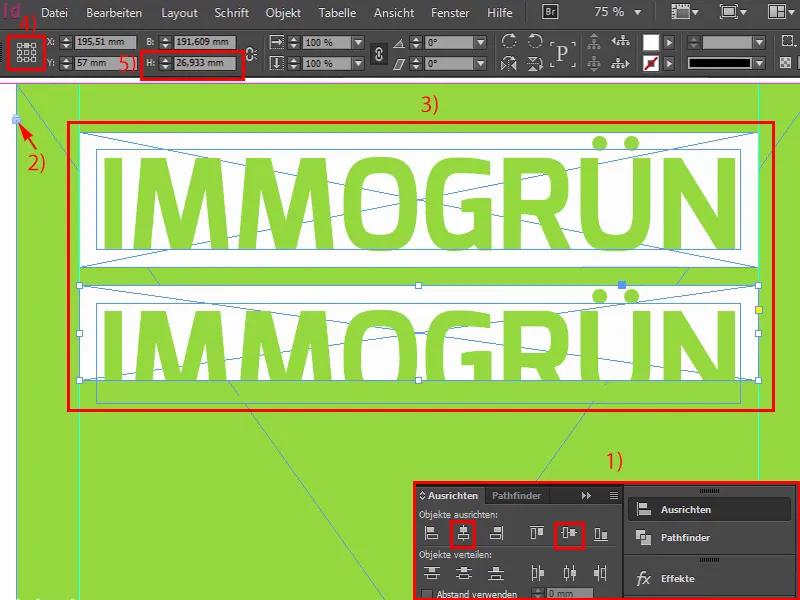
Step 32
We reduce the font size to 60 pt. So, that's what I entered above, and then we write in here: The first word is "Fictitious", maybe doesn't quite fit with all the key messages we want to convey here, but in this case we have to include it. I'm going to draw a second guideline here, because this will be quite asymmetrical if we don't take care to align the various keywords properly.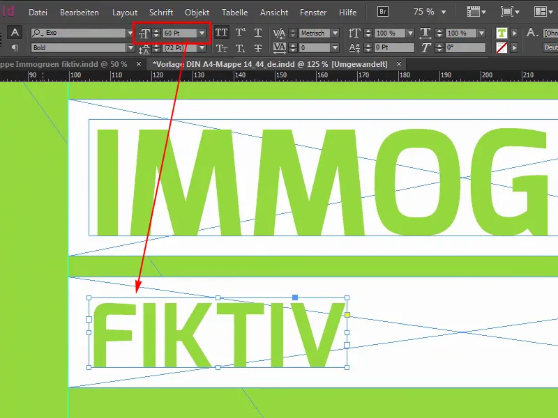
Step 33
That's why I simply draw a guideline here (1) and also over here (2), so that we at least always have a clear end on the left and right, and in these places where it doesn't quite work out, we then play with a bit of variable values in the middle space. We continue with the reduction of this white box (3). Copy both once, right-align, ... like this (4), I'm going to make it a little bigger, of course you also have to search a little for the right words. I have now chosen "Original" for this place, because it really fits quite well, and now we can help ourselves here with the gap tool, because we will now adjust the spacing.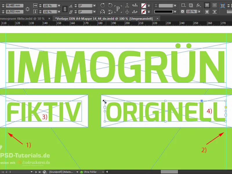
Step 34
This is the gap tool. If I click up here, we can see that we're at 5 mm (1). Here we are at 10 mm, with the Ctrl key pressed and if I move the mouse to the left, I reduce the whole thing and then we end up at 5 mm (2).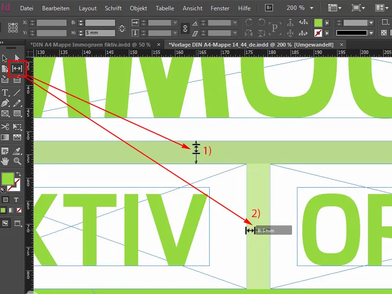
Step 35
I'm going to use this principle to create the following lines, 12, shift and down arrow key, you already know all that, basically it's enough if we copy one of them, we don't have to copy both. And the font size in this case is 40 (1). Rewrite once to the word "Hip". Also a short word, it's more of a gap filler, as you might have guessed, but it's still appropriate for our company's standing.
So, the spacing: 21.289 mm (2). Okay. Move it over there once and make a copy of it, move it to the right, make both larger, and the next word is "Modern", on the far right, once up to the auxiliary line. That's what we made it for. Up here we also have to be careful that we go right up to the guideline, I didn't take that into account earlier. Now. And now let's make a copy of it, draw it up arbitrarily, because we know our gap tool will fix it. "Qualitative". All such nice words that companies like this always throw around. Like this: Gap tool. Okay. First push over a little and then 5 mm (3) ...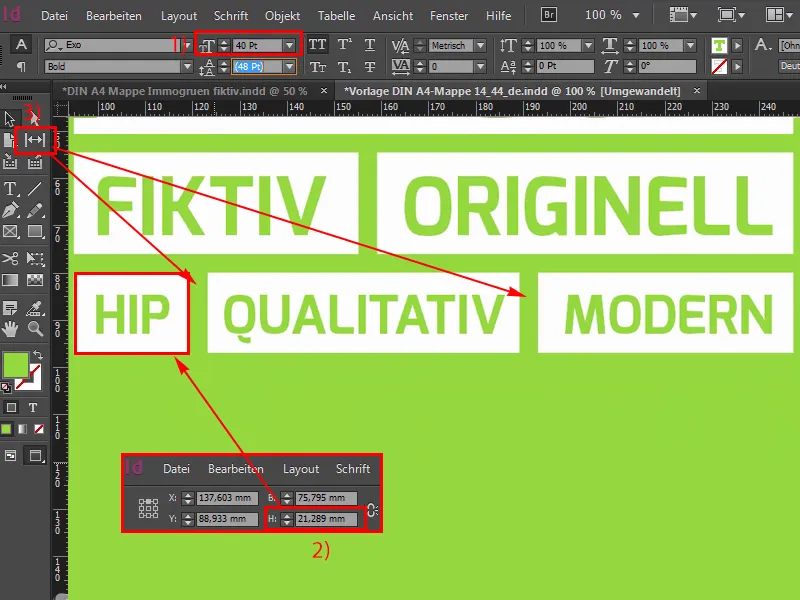
Step 36
Yes, we move on to the next line or the last line, so copy once, zig zag, drag both a little larger, change the font size to 33 pt, another crooked value that you probably don't use often, but I had to measure it that way, and the height of the white box is 19.313 mm. Okay. Then we move it to the left and make a copy of it. We turn the D into an M, then we have an overset. "For me". And once more to the right: "For all". Right-align again, here we may have to adjust the height again, exactly, for that too, you have to be careful. But that's why I'm showing you this here. And now let's find the appropriate spacing here, which is also a practical help here, but it's a little too big for me. Maybe like this. I think if we look at the whole thing from a bird's eye view, we have a wonderfully beautiful cube format here, there's still a little too little distance at the top (1), which means we can drop the whole thing a little lower here. That's how I could imagine it. Yes!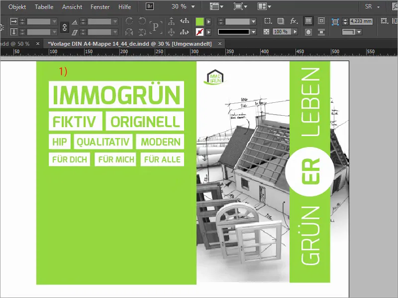
Step 37
Now we'll add our address at the bottom left, so simply draw a text field (1). I already have the text in the clipboard, that's Exo Light (2) with twelve pt (3). And then we can simply align it as we like it.
Step 38
And now our folder gets wings. Then show the punching outline once, perhaps draw a guide line at the lower point, quasi at the lower base of the green rectangle, and then the wings are simply equipped with Ctrl+D (1) and a corresponding image (2). I simply drag it from the top left all the way down to the guide line (3). Reduce the size, because then we have exactly up to 6 mm fill height of this image and it already looks very, very dominant, unfortunately. So what do you do? Trick 17, of course: Simply reduce the opacity to 30% (4), you take out the force of the image a little, so to speak, and this makes it look a little more homogeneous and perhaps also a little more unobtrusive. Then, of course, we also need the right image section, so mark the image content once and I'll look for the right place here, where the hallway is now, that's okay, let's add a little bit of the keyboard, of the wonderfully beautiful ballpoint pen, that's how I could imagine it.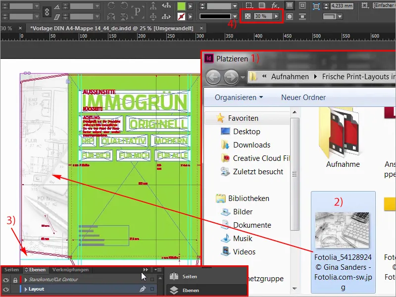
Step 39
Then I can make a copy of this picture and I'll just resize it and put it down here, because of course we also need an illustrated layout on the bottom wing.
Always make sure that you always take these contours with you here, and if you look at the whole thing now, it actually fits quite well, the image section still doesn't fit, so I go to Customize>Fill frame proportionally, then I take a look at it like this, then I think, yes, actually quite good, we have the compass on it, we have the keyboard on it again.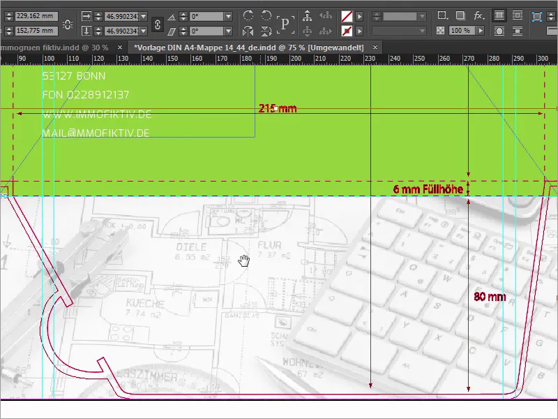
Step 40
But now, of course, we have to rethink: Imagine the folder is now closed. If the folder is closed, then this whole picture is upside down, and we don't want that. So we have to mark the contents of the picture. Make sure that the reference point is in the center (1), and then use Object>Transform to flip horizontally once (2).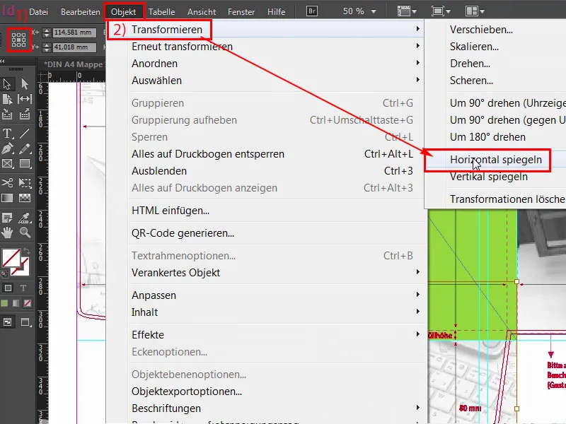
Step 41
But that's not enough, we also need to use Object>Transform>Flip Vertical.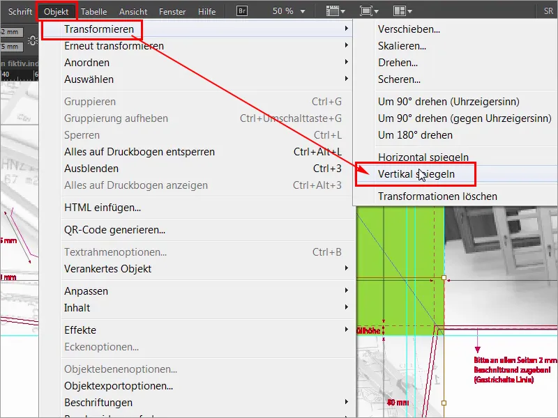
Step 42
So, now we have mirrored it twice in both directions, and if you now fold the folder over, i.e. if the wing is pointing inwards and you have opened the folder, then everything is correct and it is just treacherous if you have words like kitchen hallway or numbers, which you should of course be able to read correctly. So please proceed with a keen eye, otherwise it could be quite embarrassing. That's it for the first part, the second part will follow soon, so stay tuned, folks, until then.