This guide covers the basics of Power BI using a specific example related to pivot tables in Excel. This lesson presents the second example of the Power BI course, showing you how to import data, model it, and then visually represent it. You will learn how to work with the various functions and graphics of Power BI to effectively design your data views.
Key Takeaways
- Power BI allows you to import and model data from Excel.
- You can establish relationships between different data dimensions.
- Power BI offers a variety of visualization options to present data clearly.
- Dynamic data filtering is achieved through slicers.
Step-by-Step Guide
Firstly, I welcome you to this final lesson of the basic Excel course for controllers, where we delve into multidimensional data analysis in Power BI. Here we will go through the second example of Power BI together.
To begin, you import the required data. To do this, choose the Excel file that you can download for this Power BI example. In Power BI, navigate to the "Excel Import" option and select example 2.
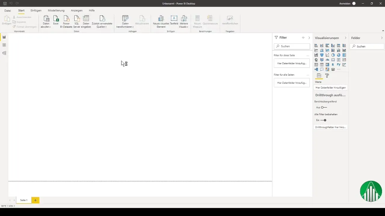
After loading the Excel table, you will see the various import options. It is important to select the departments, revenue data, and the time dimension.
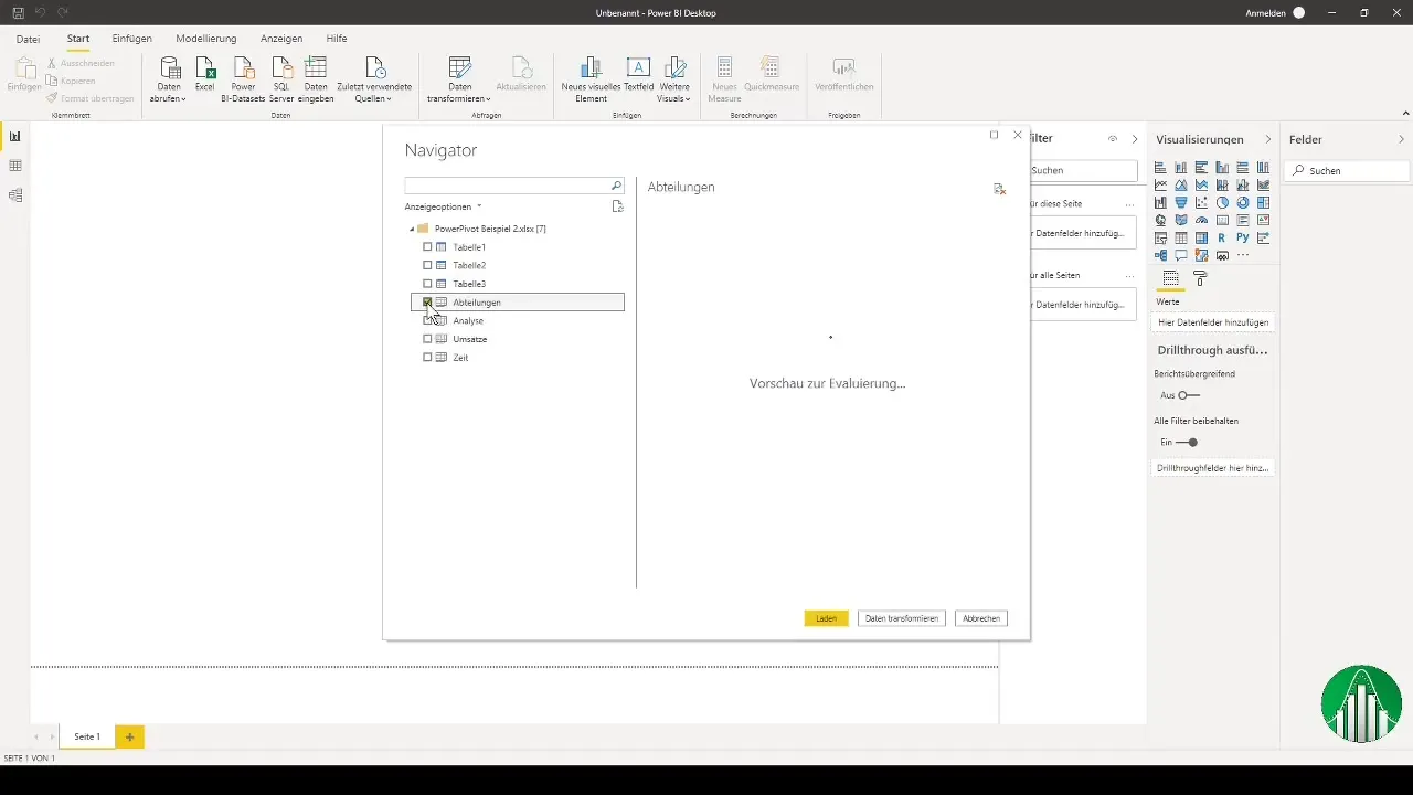
Simply click "Load" to import the data into Power BI. This may take a few moments. Just be patient while the application processes the data.

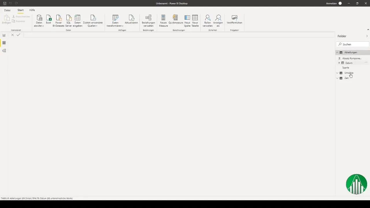
Once the data import is successfully completed, you will see the different dimensions in the fields. You can expand the individual metrics to get an overview of the data.
Power BI is now in table view. Here you can see the different dimensions and review the table structure before starting the modeling process.
The next step is data modeling. Create relationships between the dimensions, especially between the time dimension and the departments and revenues. This ensures that the data is correctly linked.
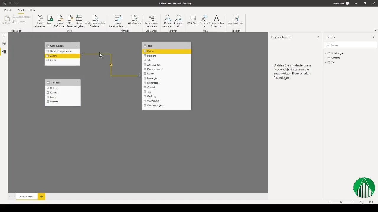
After modeling all the required relationships, you can start the initial visualization. Choose a stacked bar chart for this purpose. It will be similar to that in Excel.
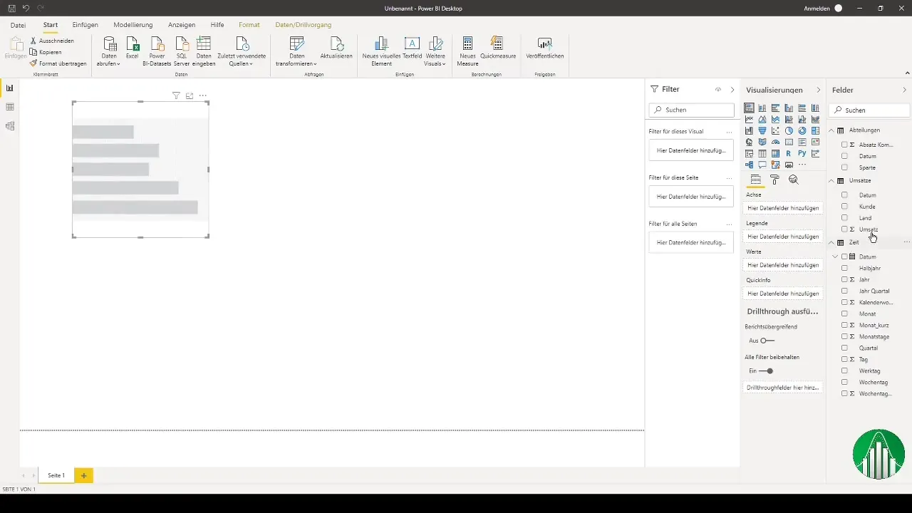
Drag the revenue metric into the value dimension of the chart. You will now see a blank graph that you can fill with your data.
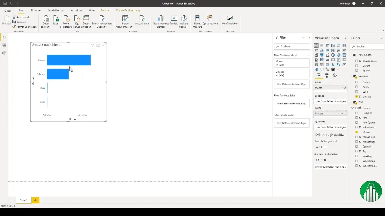
To display the chart data on a monthly basis, drag the months into the chart's axis. This should give you a clear visual representation of revenues over the months.
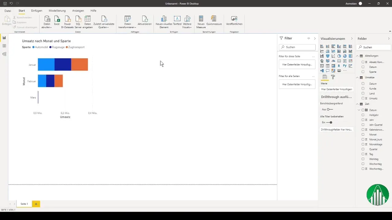
You can further customize the chart, for example, by splitting the legend by the different divisions. This will provide you with a deeper insight into your sales data.
Additionally, it is recommended to create a pie chart to visually examine the different divisions. Pay attention to whether you want to represent revenue or quantity, depending on your analytical needs.
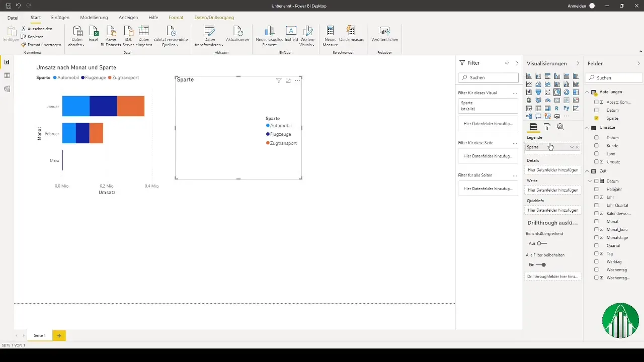
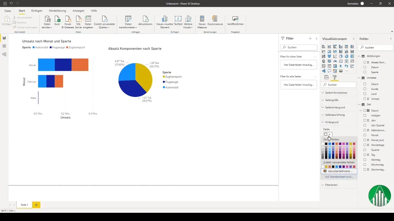
When experimenting with graphical representation, remember to customize the colors and layouts according to your preferences. Power BI offers you a variety of customization options.
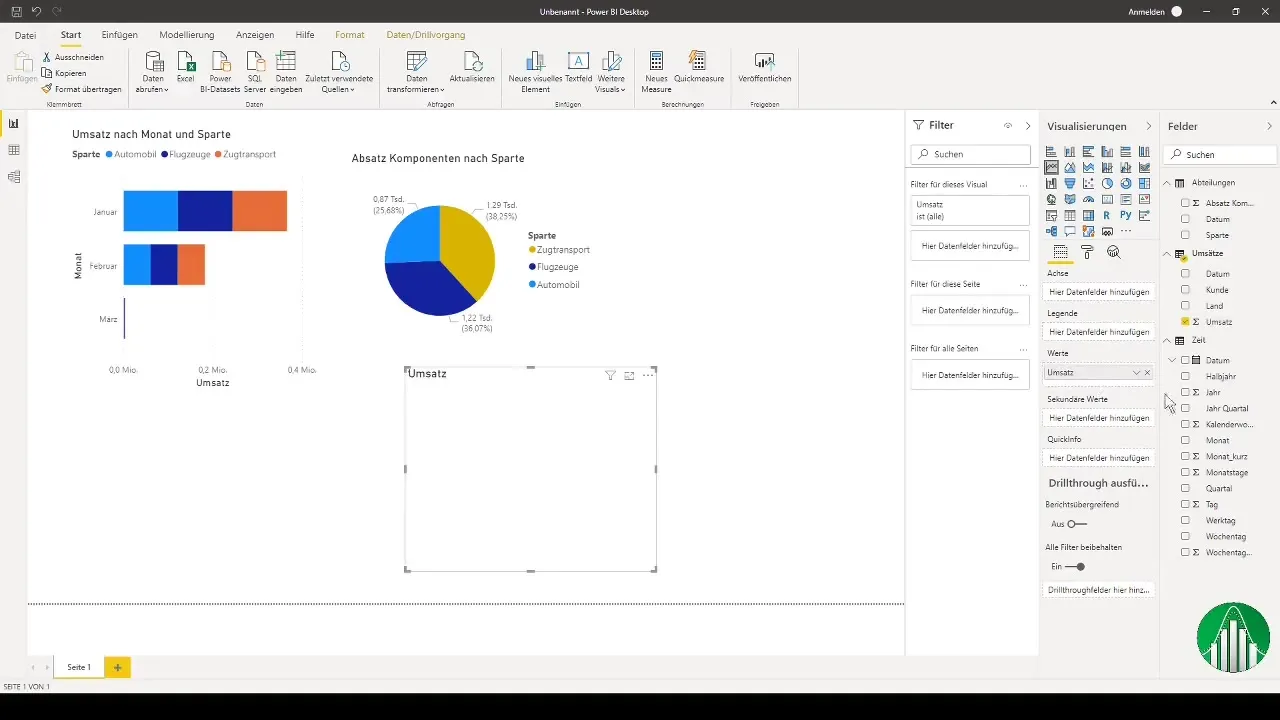
Finally, create a line chart where you want to represent the sales by customers. For this, drag the customer variables to the corresponding axis.
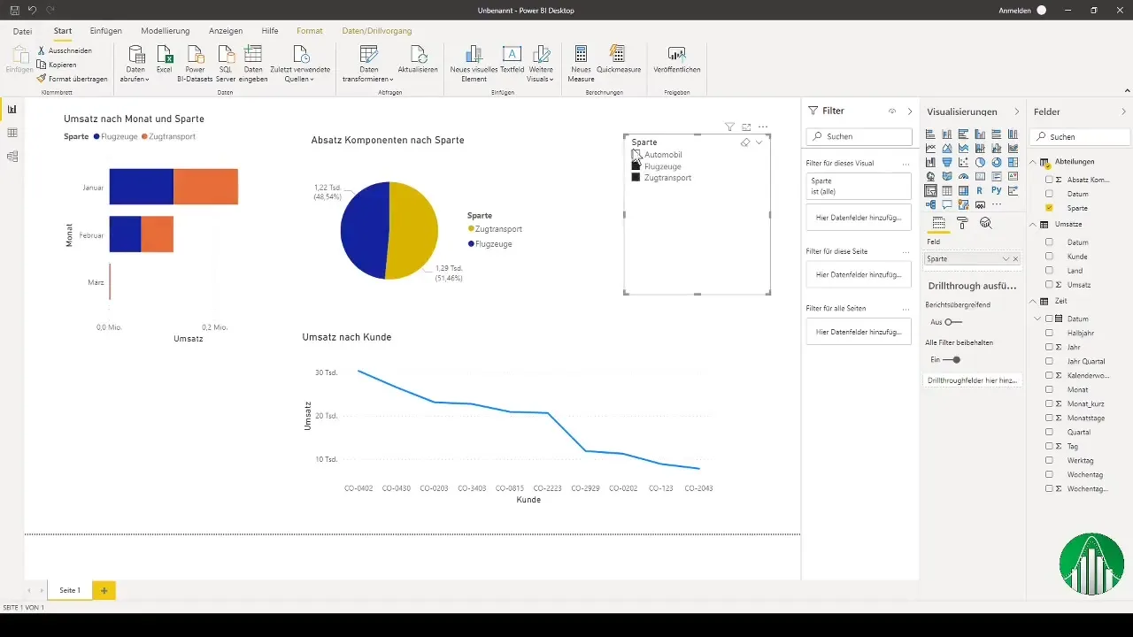
To make the analysis even more flexible, you can add a slicer. This allows you to filter the representation by different divisions.

The application of slicers allows for dynamic filtering; this way you can analyze how different parts of your business have developed.
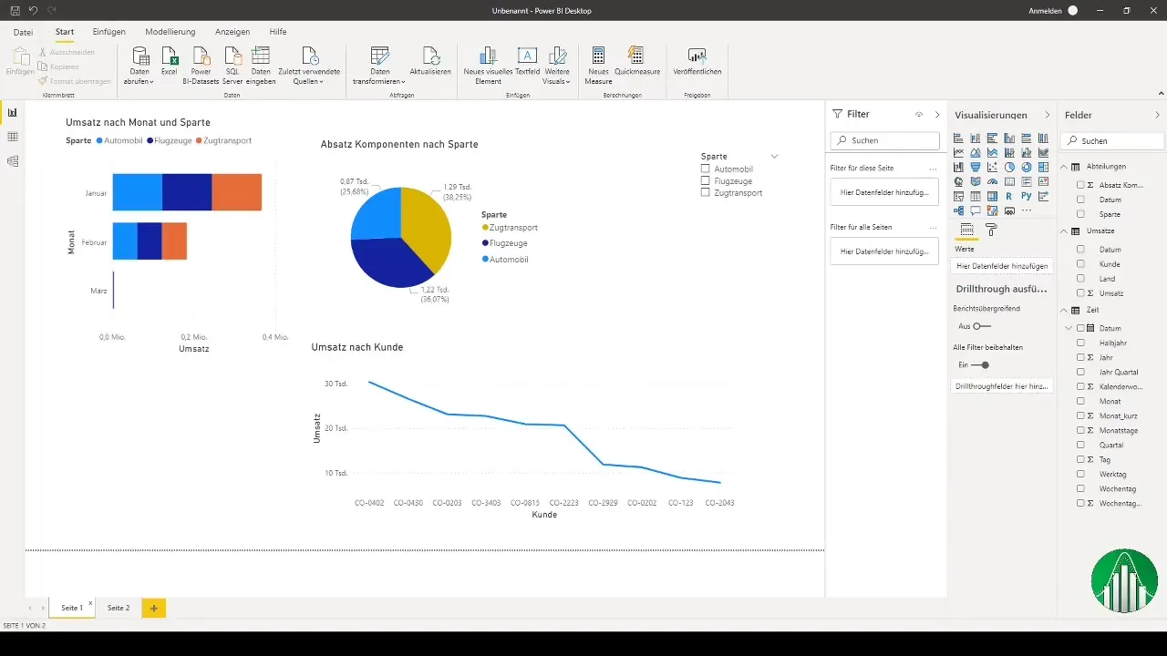
After setting everything up, you now have the opportunity to create and compare comprehensive data and reports through various visualizations in Power BI.
Finally, I invite you to continue experimenting with Power BI and creating your own analyses and visualizations. If you are interested in another Power BI course, let me know.
Summary
In this tutorial, you have learned how to import, model, and visualize data in Power BI. You have also received valuable tips on customizing the graphical representation and using slicers. Use these skills to deepen your data analysis in Power BI and create different views.
