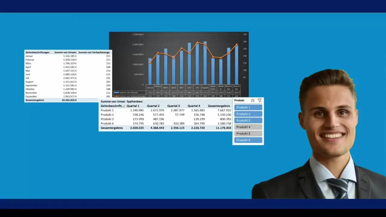
In this tutorial, I will show you how to efficiently use pivot tables in Excel to transform large amounts of data into manageable dashboards. You will learn how to index your data, dynamically filter it, and create complex reports with just a few clicks.
Key Takeaways
Pivot tables allow you to analyze data quickly and effectively without altering the original data. They assist you in creating complex reports in the shortest amount of time and offer many functions for calculating metrics.
Step-by-Step Guide to Creating Pivot Tables
Step 1: Prepare Data Source
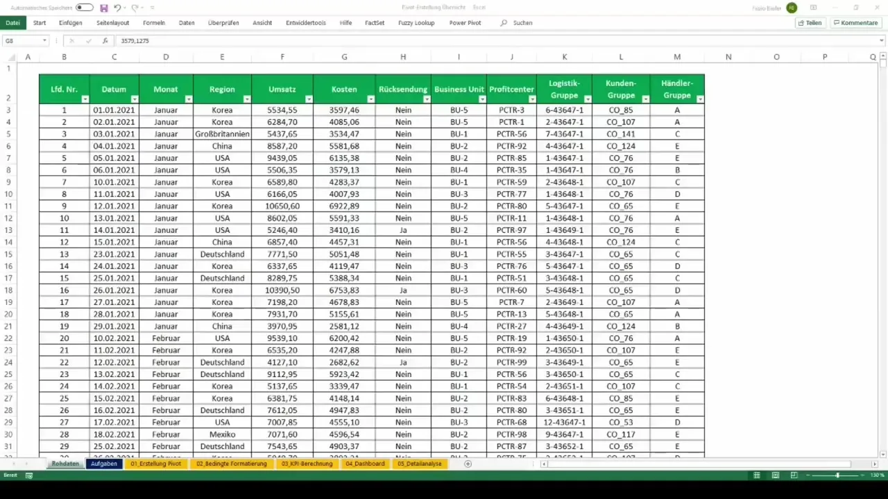
Before you can create a pivot table, you need to ensure that your data is in a suitable format. Your data should be organized in a table format without merged cells. Make sure the first row contains meaningful headings describing the different data categories.
Step 2: Create Pivot Table
To create a pivot table, go to the "Insert" tab in Excel and click on the "PivotTable" option. A dialog box will open where you can define the range of your data. Excel will suggest using the entire table. Then, choose an appropriate location to display your new pivot table.
Step 3: Customize Pivot Table
After creating the pivot table, you will see an empty layout on the page. On the right side, you will find the "PivotTable Fields" pane. You can drag the fields to different areas (rows, columns, values, and filters) as needed. This gives you the flexibility to present your data the way you want.
Step 4: Analyze Data
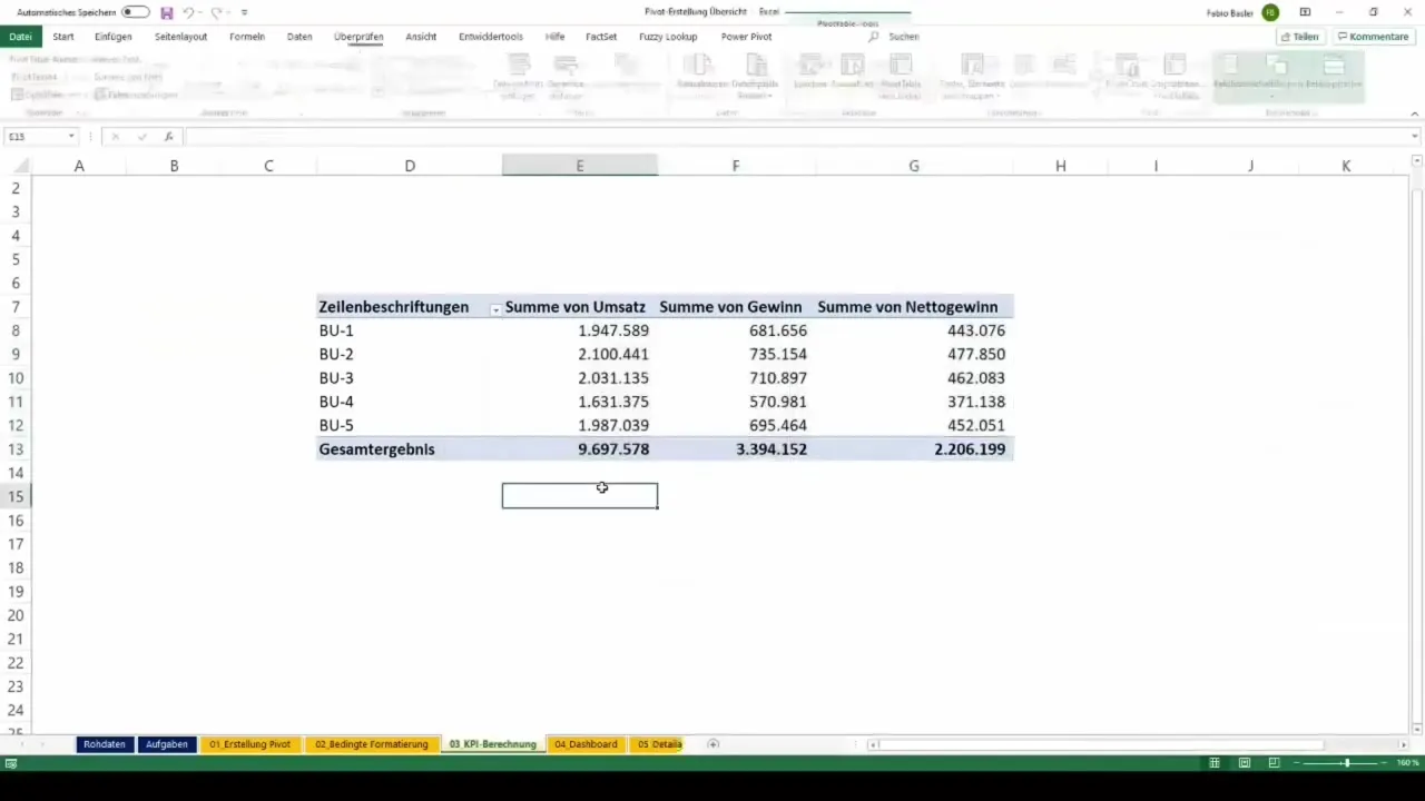
Once you have assigned the fields, the pivot table will immediately give you an overview of your data. You can select sums, averages, or other metrics to further refine the analysis. Right-click on individual values in the table to choose different calculations.

Step 5: Add Dynamic Filters
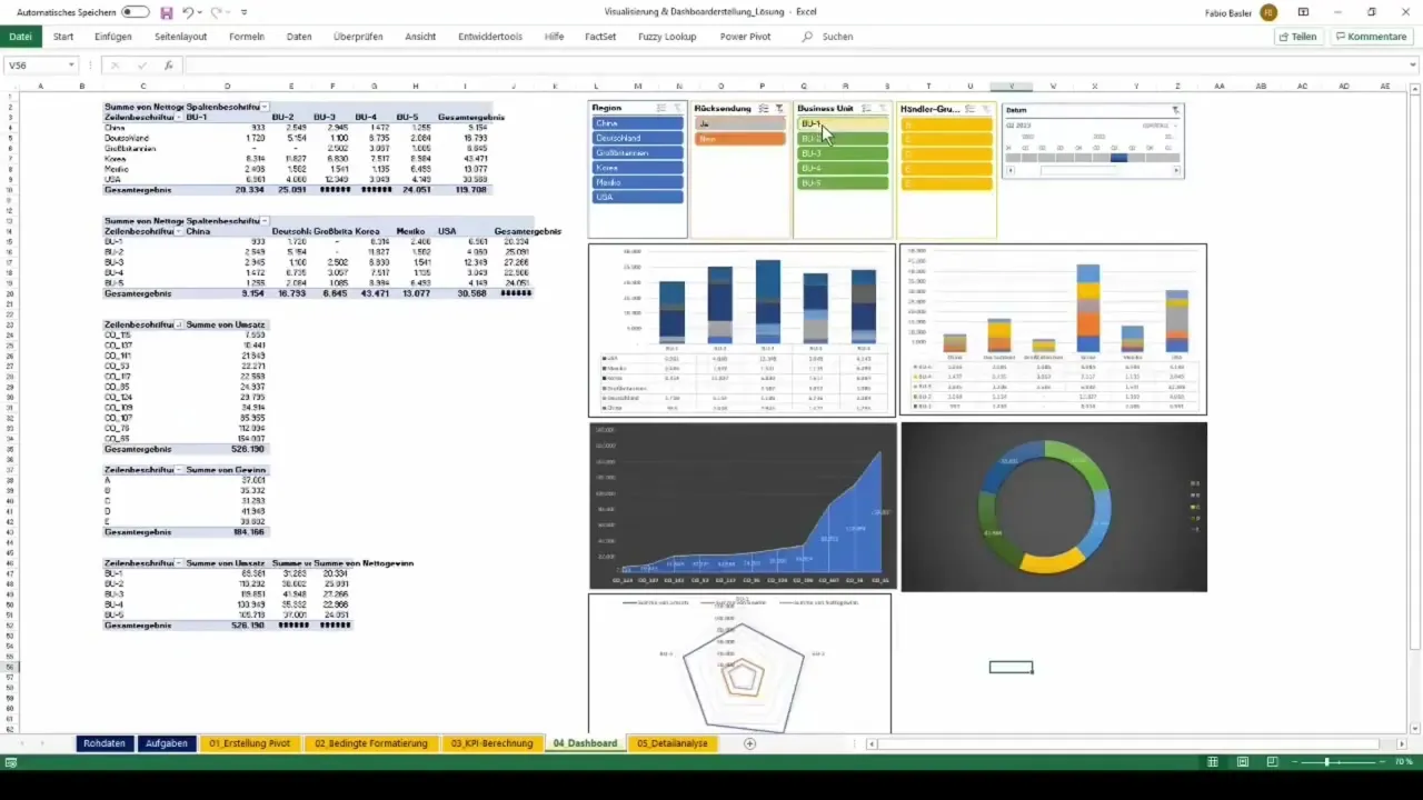
To make your pivot table more interactive, you can add filters or slicers. Go to the "PivotTable Analyze" tab and select "Slicer". Choose the field you want to filter to create a visual interface for data selection. This allows you to easily customize your reports and display only the relevant data.

Step 6: Create Dashboard
The next step is to create a dashboard with your pivot table. You can create various charts and graphs that automatically update as you edit your pivot table. To do this, choose the desired chart type on the "Insert" tab and link it to your pivot table. This enhances the visual appeal of your data presentation.

Step 7: Export Reports
Once you have completed your analysis and are ready to share the results, you can export your pivot table or the entire dashboard in various formats. Use the "Save As" function to save your file in the desired format (e.g., .xlsx, .pdf, or .csv) so that others can access it.

Summary
In this tutorial, you have learned how to create and customize pivot tables in Excel. You now know how to analyze your data source-free, add dynamic filters, and create informative dashboards. With these skills, you can perform complex data analysis in just a few minutes to help you make important business decisions.
Frequently Asked Questions
What are pivot tables?Pivot tables are specialized Excel tables that allow for quick and dynamic analysis of large data sets.
How do I create a pivot table?You can create a pivot table by clicking on "Insert" in Excel and then selecting the "PivotTable" option.
What functions do pivot tables offer?Pivot tables offer many functions, including calculating sums, averages, and filtering data through slicers.
How can I make my pivot table interactive?By adding slicers and timeline filter options, you can make your pivot table interactive.
How do I save my pivot table?You can save your pivot table by saving the file as usual using the "Save As" option.

