In this tutorial, you will learn how to create a professional dashboard in Excel using Pivot Tables. With Excel's tools, you have the ability to analyze complex data, gain important insights, and present them in a clear dashboard. After covering the basics of Pivot Tables in previous lessons, we will combine this knowledge in this tutorial to create a dynamic and visually appealing dashboard. Let's get started.
Key Insights
The goal of this tutorial is to show you the steps needed to create a professional dashboard with Pivot Tables in Excel. You will learn how to add slicers and timelines, customize colors, and use different chart types to visually represent your data.
Step-by-Step Guide
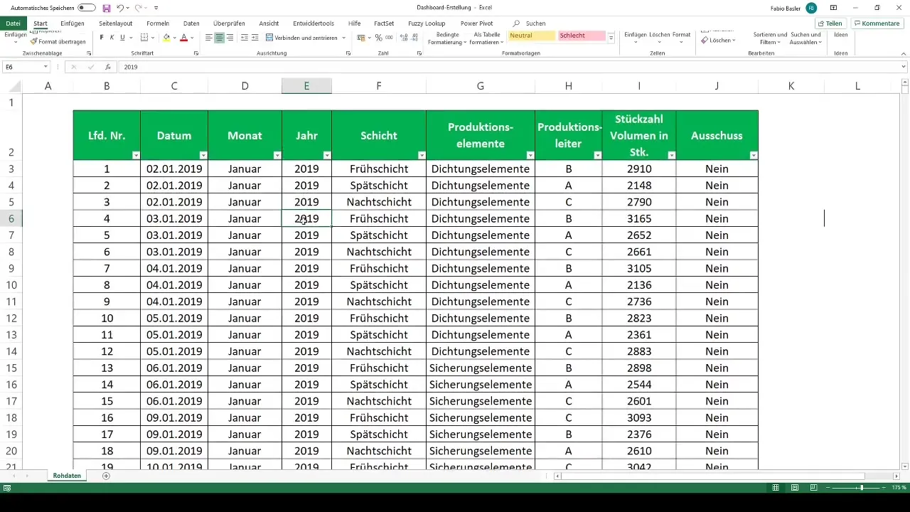
First, we will prepare a pivot table and import our raw data.
To create the pivot table, you open the Excel file and press the Ctrl + A key combination followed by the T key to format the data as a table. Then we click on the "Create Pivot Table" button and select the import into a new worksheet, which we will name "PIV Dashboard."
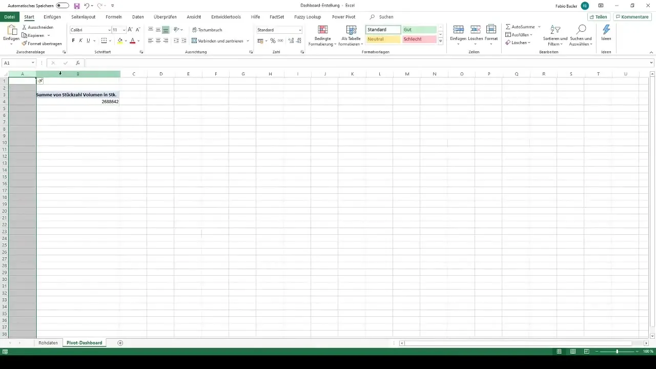
Now we start creating our pivot analysis. We select the production numbers in volume, as they are crucial for our dashboard. Here, we break down the data into different production elements, adjusting the formatting to present the information clearly.
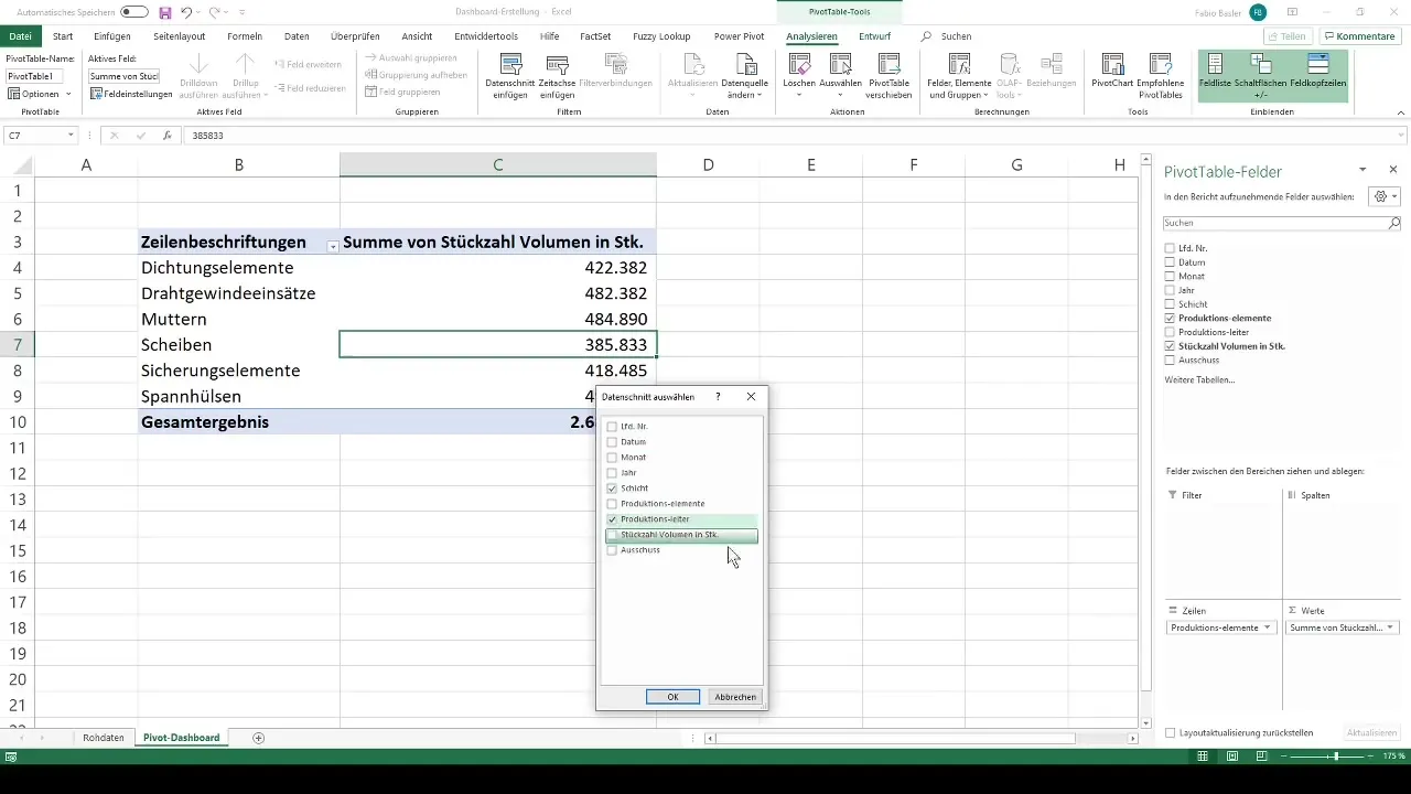
After creating the basic pivot table, we add slicers. These allow us to quickly filter specific information such as shifts, production managers A, B, and C, and information about defects.
We expand our analysis with a timeline to track the data over several months. This timeline gives us insights into how production numbers evolve over time.
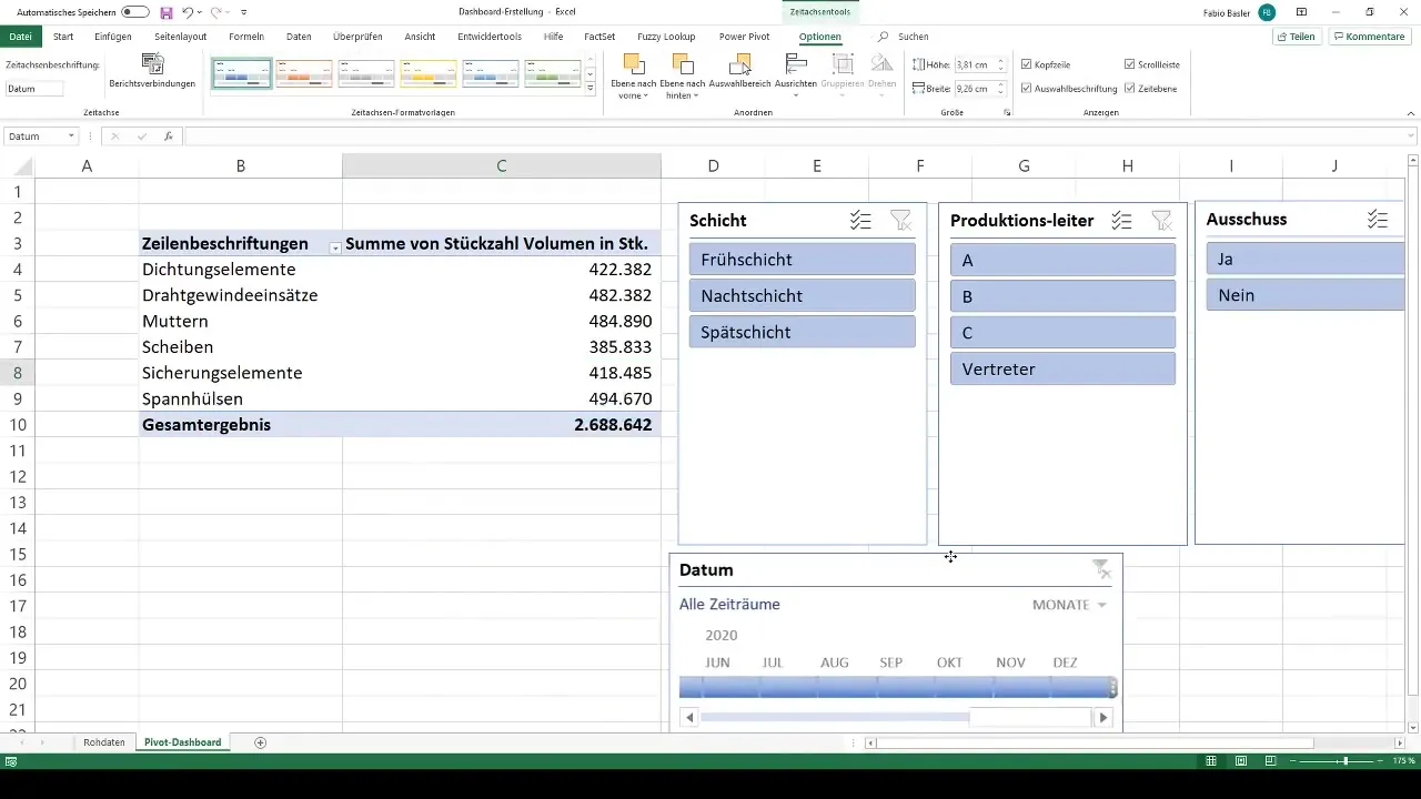
Additionally, we group the existing slicers to create a clear view. To do this, you select the desired slicers, hold down the Ctrl key, and then right-click to choose the "Group" option.
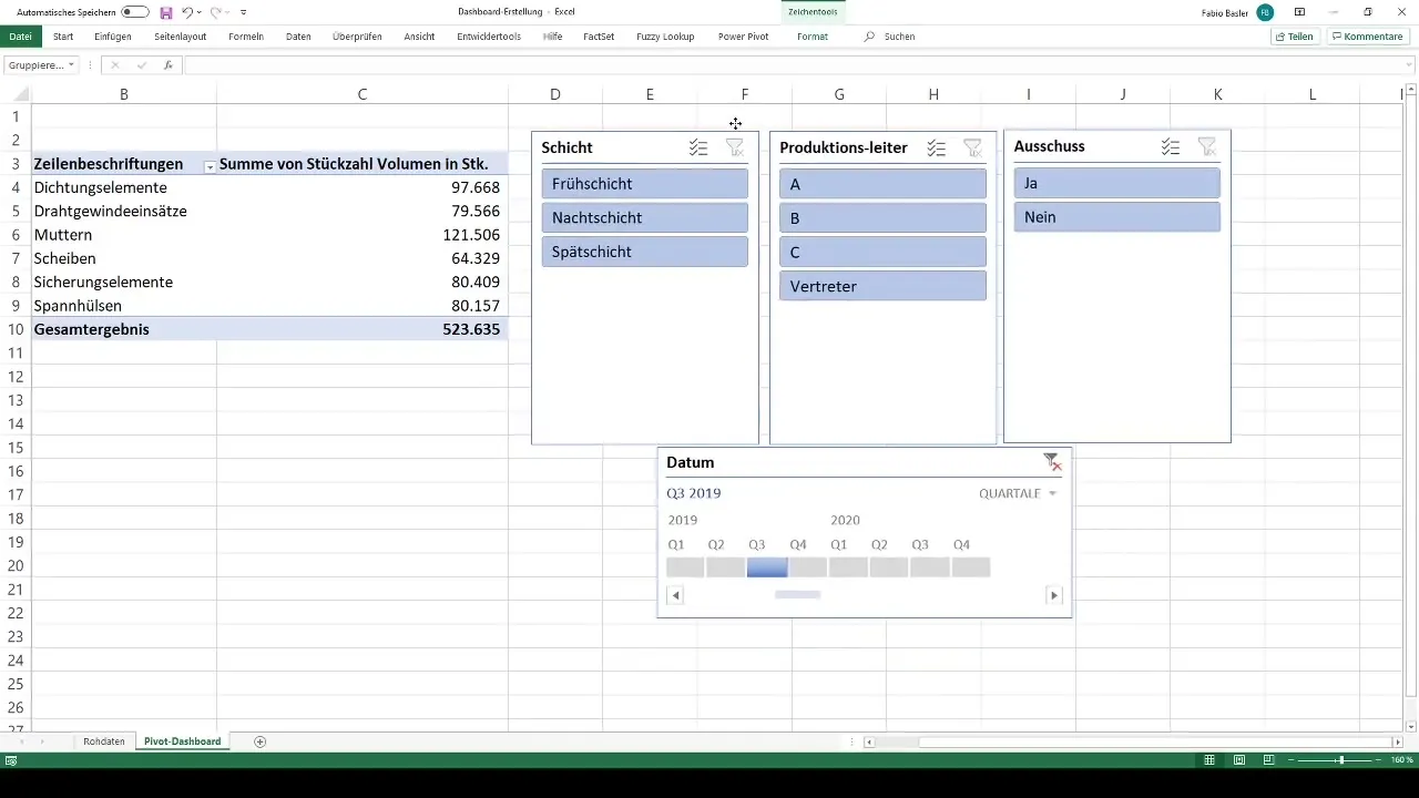
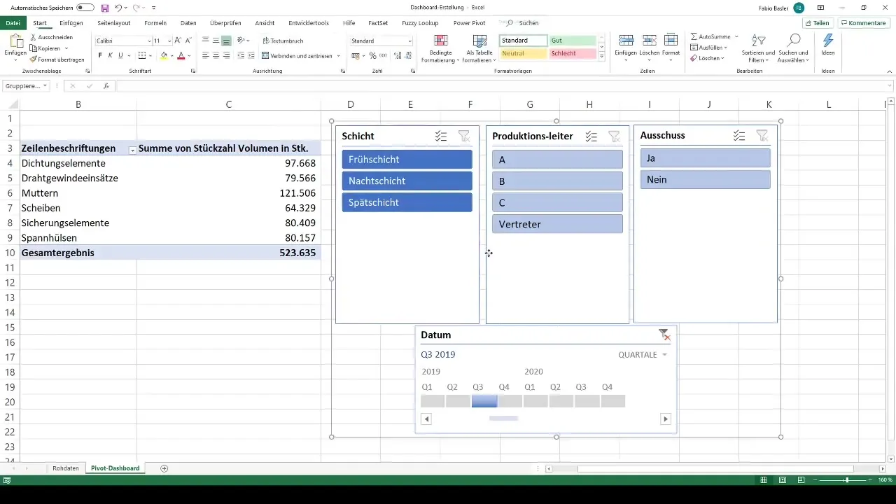
Next, we customize the colors of our slicers to visually enhance the dashboard. Here, you can use different shades to highlight the various data points.
We will then add a PivotChart using the chart function. We select a column chart and remove the field buttons and legends to make the chart more concise.
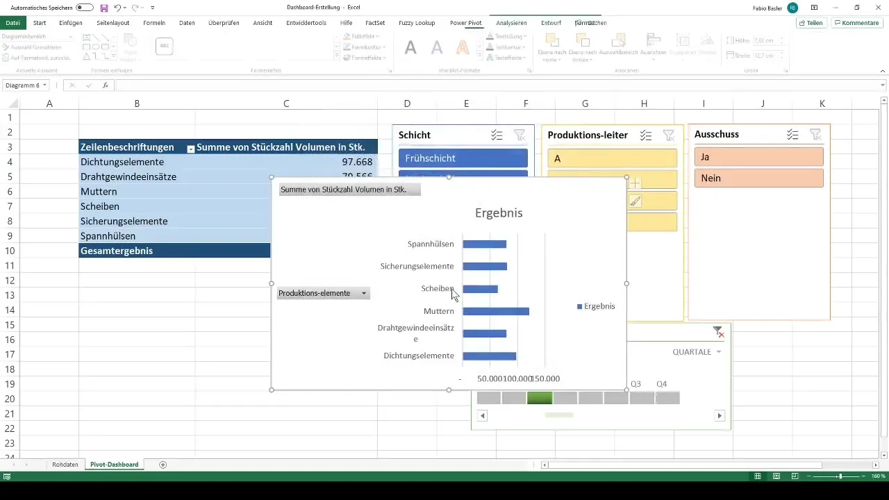
Now we add data labels to clearly display the production values in the chart. This helps to easily understand the information directly from the chart.
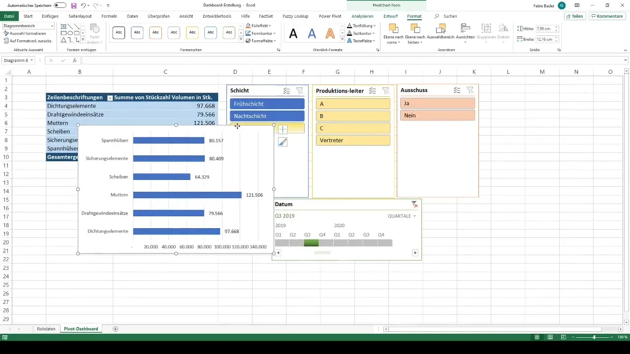
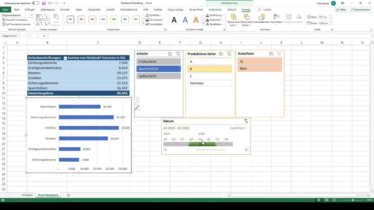
To ensure the interactive use of the dashboard, we can combine multiple options in the slicers. For example, we can select multiple quarters and have the overview update in real-time.
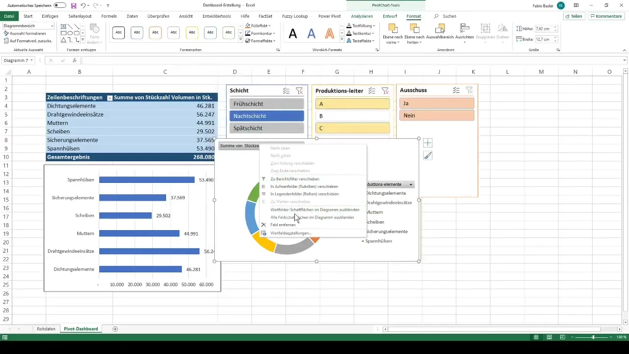
Furthermore, we create a second chart, in this case, a pie chart, to represent the data from a different perspective.
To further improve user-friendliness, we move the timeline filters and ensure that the dashboard's structure is cohesive. Here, you have the freedom to adjust the design according to your own preferences.
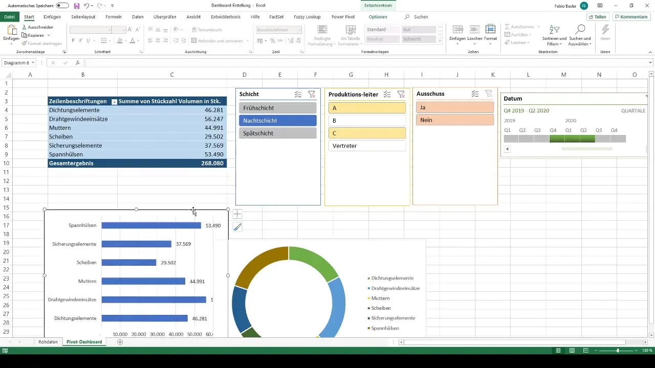
Finally, we summarize all elements and possibly add an outer border to round off the overall picture. We give the dashboard the final touch by removing gridlines and grouping the charts and display elements.
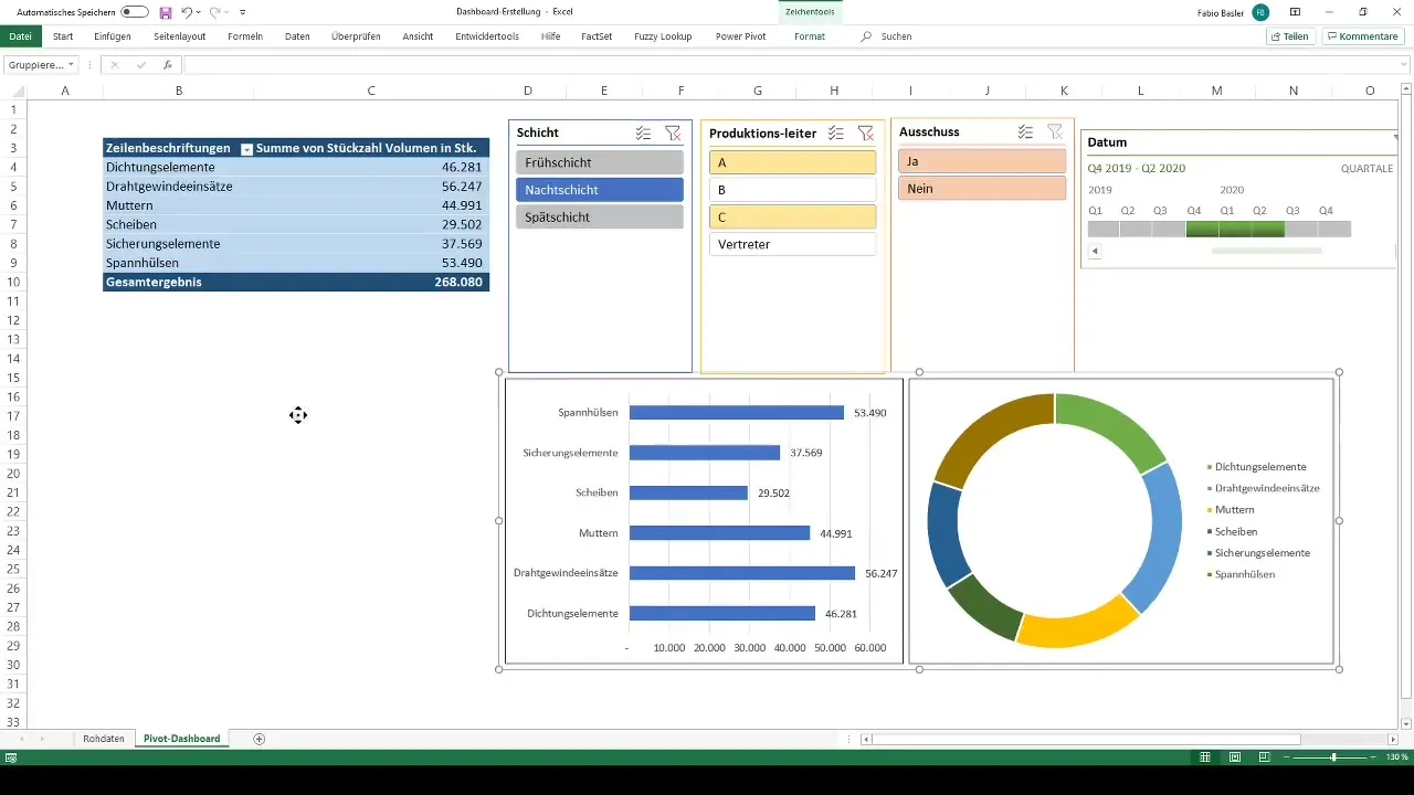
Your professional controlling dashboard is now ready for use. You can analyze and present information such as production numbers and committees at any time. No matter how the raw data changes in the background, your dashboard remains dynamic and up-to-date.
Summary
In this guide, you have learned how to create a professional dashboard in Excel with pivot tables. From data preparation to analysis and presentation, you have gone through all the important steps to create a dynamic dashboard that is easily adaptable. With these skills, you are able to visually represent important information and make better-informed decisions.
Frequently Asked Questions
How do I create a pivot table in Excel?You can create a pivot table by formatting the data as a table and selecting the "Create PivotTable" option.
How do I add slicers to my pivot table?Go to the "Analyze" tab and click on "Add Slicers" for the desired data fields.
Can I customize the colors in my PivotChart?Yes, you can change the colors in your PivotChart under the chart design options.
How can I group my slicers?Select the slicers, hold down the Ctrl key, and right-click to choose the grouping option.
How often is my dashboard updated?Your dashboard updates automatically when the underlying data changes.
