Pivot tables are powerful tools in Excel that allow you to analyze and visualize large amounts of data. However, simpler concepts that help you effectively present this data can often be overlooked. In this guide, we focus on the basic visualizations that you can create with pivot tables. You will learn how to use different types of charts to visually represent your data and gain important insights.
Key Insights
- There are different simple types of charts (column chart, bar chart, line chart, pie chart).
- You can hide field buttons and add data labels to make your charts clearer.
- It is possible to copy an existing chart and change the chart type to display alternative visualizations.
- Design options like backgrounds and color schemes help make your visualizations more appealing.
Step-by-Step Guide
Creating a Column Chart
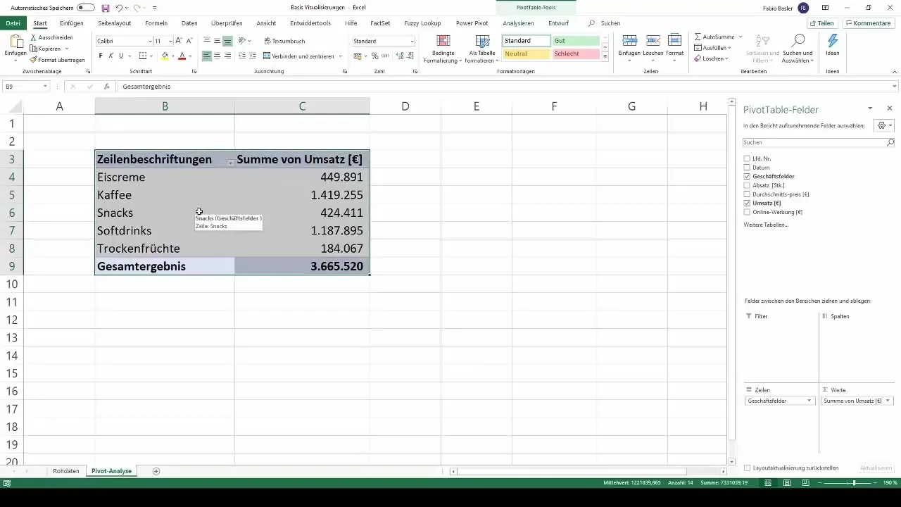
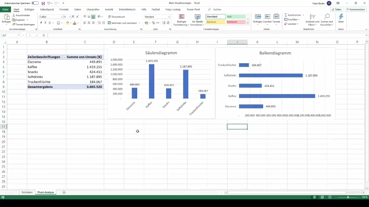
To visualize your data, start with a simple column chart. To do this, open the pivot table and navigate to the "Analyze" tab. Here you will find the option to create a pivot chart. Choose the column chart as the chart type.
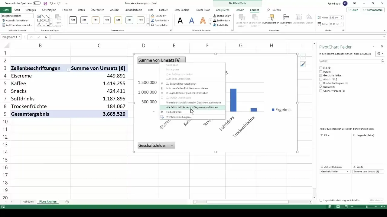
After selecting the chart type, it is advisable to hide the field buttons that are often displayed in the chart. Right-click on the fields in the chart and select "Hide All Field Buttons in Chart". This will provide a clearer representation of your data.
To further enhance readability, you can now also add data labels. Right-click on the chart and choose the option to insert data labels. This will display the corresponding revenue figures for each column.
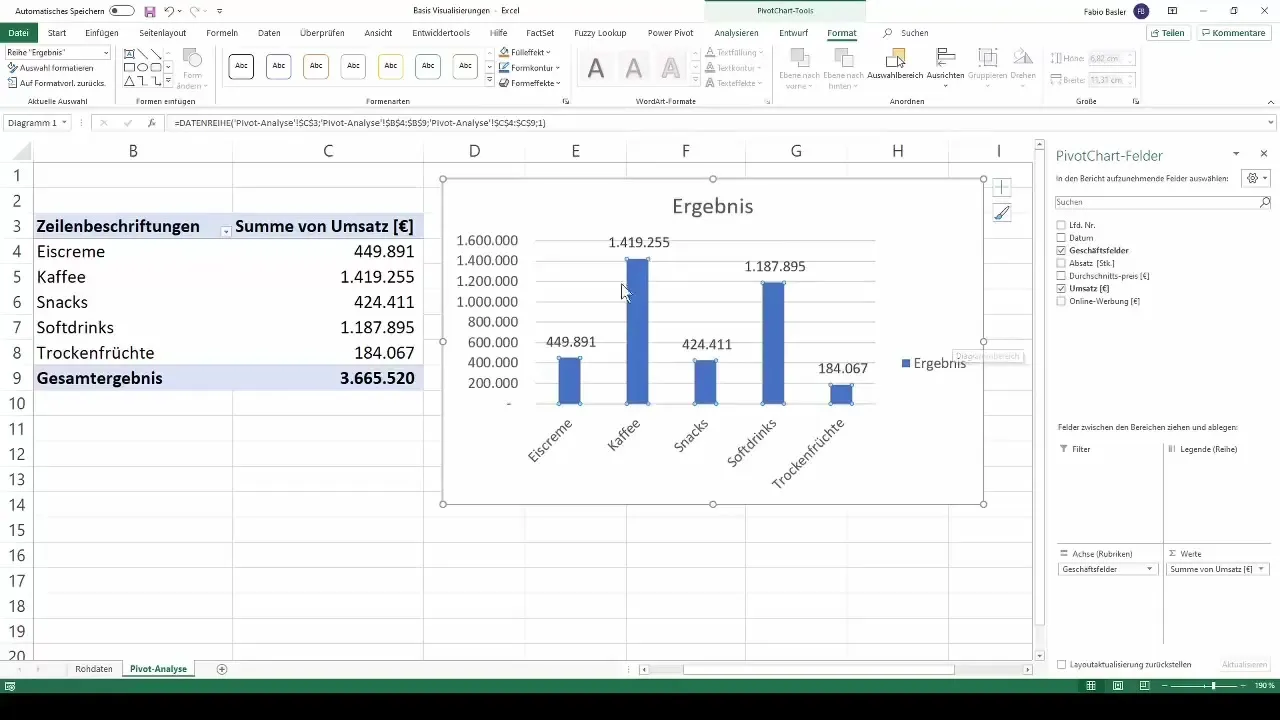
Optionally, you can also remove the legend from the chart to make more space. This will give your chart a clearer appearance.
Creating a Bar Chart
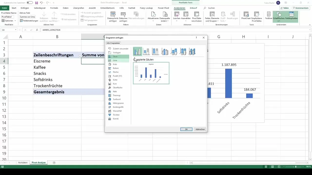
The bar chart is another simple and effective type of chart. You can create a new bar chart by selecting the "Change Chart Type" option again and choosing "Bar Chart". Analogous steps to the column chart apply here as well: Hide the field buttons and add the data labels.
As with the column chart, removing the legend from the bar chart also has a positive effect on clarity.
Changing Chart Types
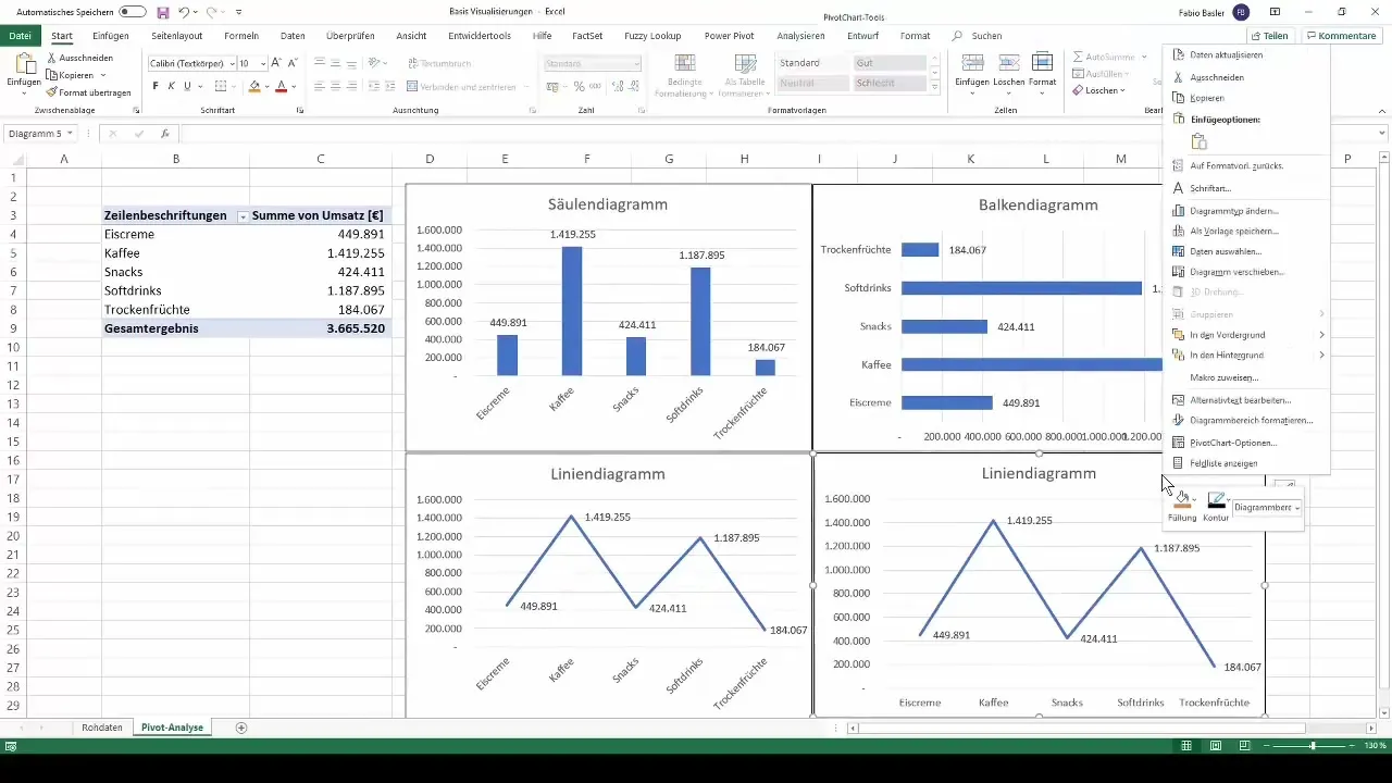
An interesting feature of Excel is the ability to copy existing charts and change the chart type. Simply click on the chart frame, copy it, and paste it again. You can then change the chart type – for example, from a clustered column chart to a line chart.
You can apply the same steps as before: hide field buttons, add data labels, and if necessary, remove the legend to make the chart more clear.
Creating a Pie Chart
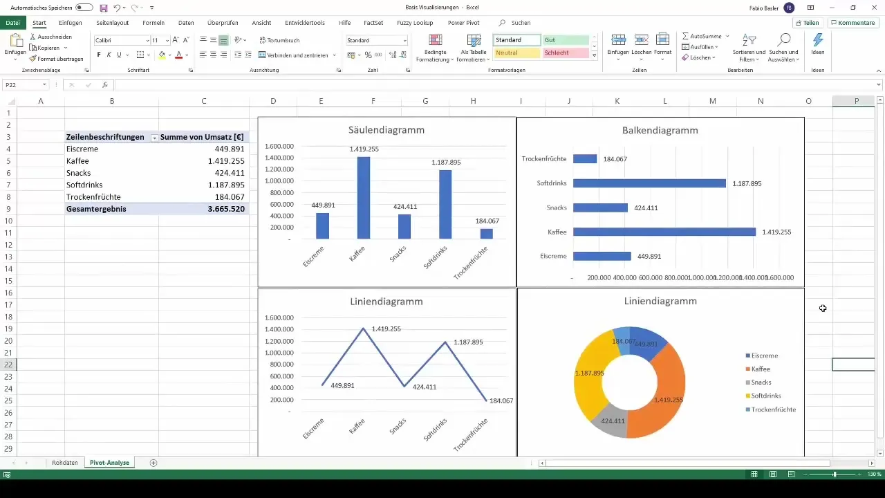
The pie chart, also known as a donut chart, is another effective way to visualize data. You can copy the line chart you created earlier and change the chart type to pie or donut chart.
Be sure to choose the legend to provide a clear breakdown of the numbers by individual business areas.
Customizing Visualizations
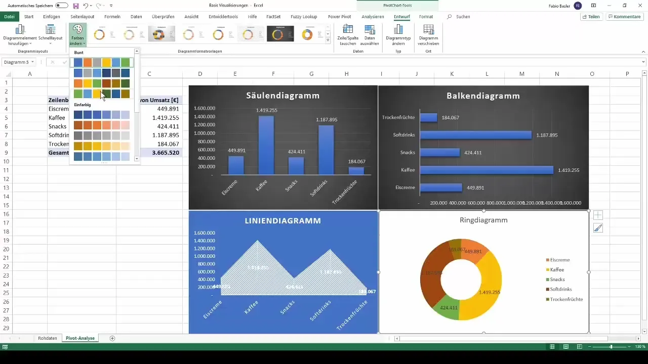
Designing your charts is as important as the data itself. In the design functions, you have various customization options. For example, you can change the background of your column or bar chart to a darker shade.
For your line chart, you could choose a blue background to create a clear contrast. Likewise, it is possible to customize your pie chart according to your color preferences.
Dynamic Updates
An important advantage of using pivot tables is that they are dynamic. After creating your dashboard, you can show the field list again by right-clicking and make changes to the data. For example, adding and filtering the date field will automatically update the charts accordingly.
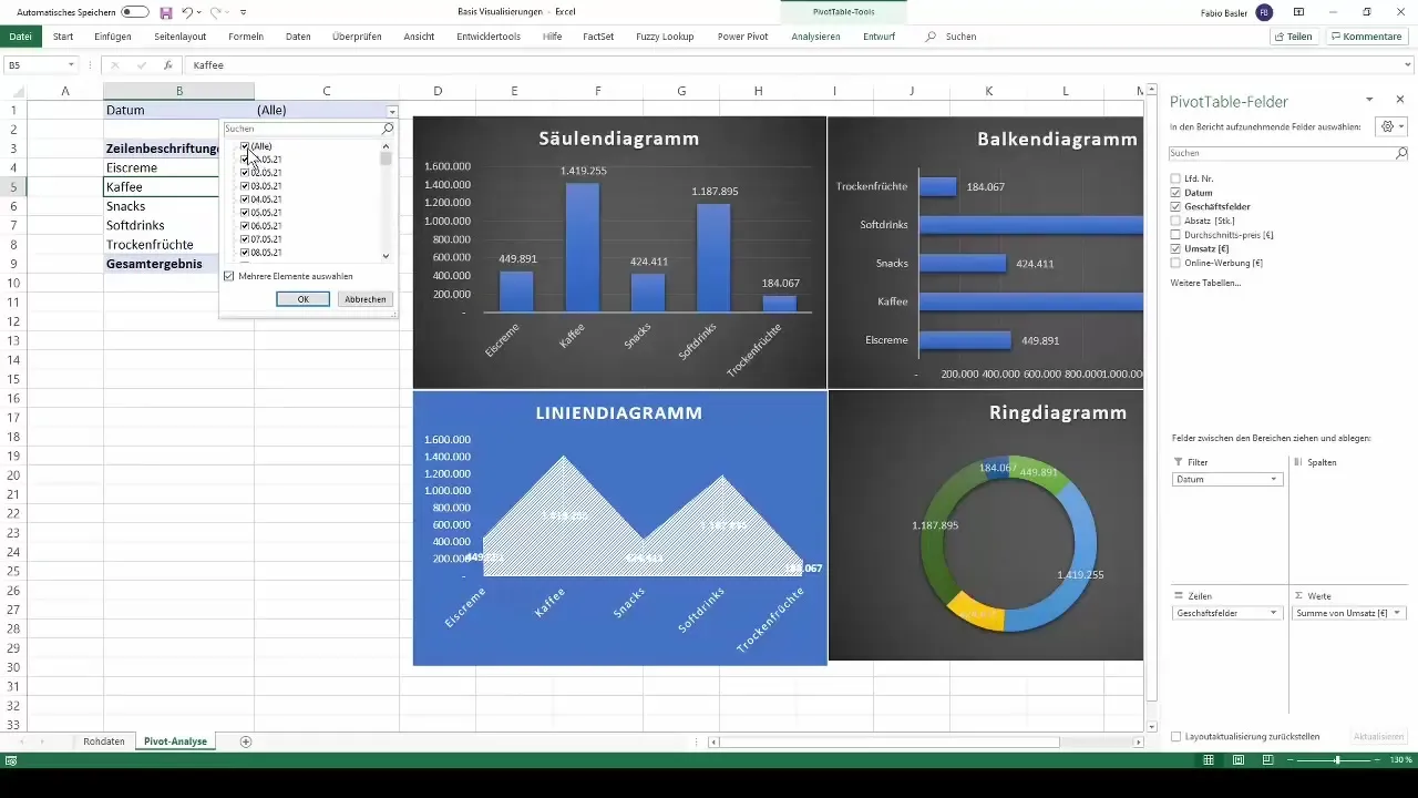
This way, you can ensure that your visualizations always reflect the most current data, allowing you to make informed decisions.
Summary
With the steps described above, you have now learned the basics of creating basic visualizations from pivot tables in Excel. These types of charts are easy to apply and provide you with an illustrative way to present and analyze your data.
Frequently Asked Questions
What are the main types of charts I can create with pivot tables?Column chart, bar chart, line chart, and pie chart are the main ones.
How can I hide field buttons in my charts?Right-click on the field buttons and select "Hide All Field Buttons in Chart".
Can I copy existing charts and change their type?Yes, you can copy a chart and then change the chart type using the "Change Chart Type" option.
What customization options do I have for my charts?You can customize the background, colors, and layouts of your charts to make them more appealing.
How can I prevent my charts from becoming outdated?Use the dynamic features of pivot tables to ensure that all updates in your data are reflected in the charts.


