Pivot tables are a powerful tool in Excel that allows you to easily analyze and visualize large amounts of data. Customizing the design of your pivot tables can significantly improve the readability and presentation of your data. Here I will show you how you can effectively design the layout of your pivot tables so that they not only look informative but also visually appealing.
Key Takeaways
- You can easily customize the design of a pivot table.
- Different color and layout options are available.
- By adjusting the headers and formatting, you can improve the readability of your table.
Step-by-Step Guide to Designing Pivot Tables
Step 1: Open and Prepare Pivot Table
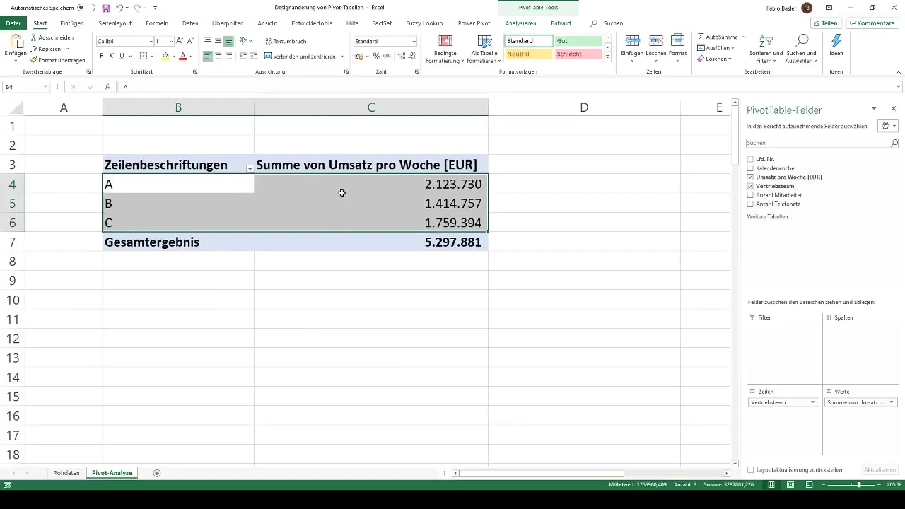
Open the pivot table you want to customize. You already have some data showing the revenue figures of a financial company. If you want to add more data, you can drag additional metrics like the number of phone calls into the values to expand the table.
Step 2: Enable Pivot Table Tools
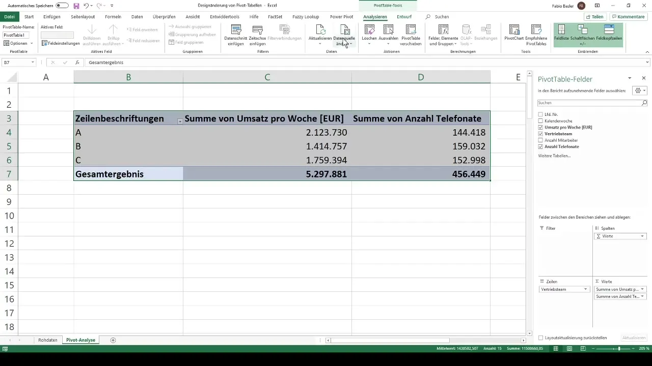
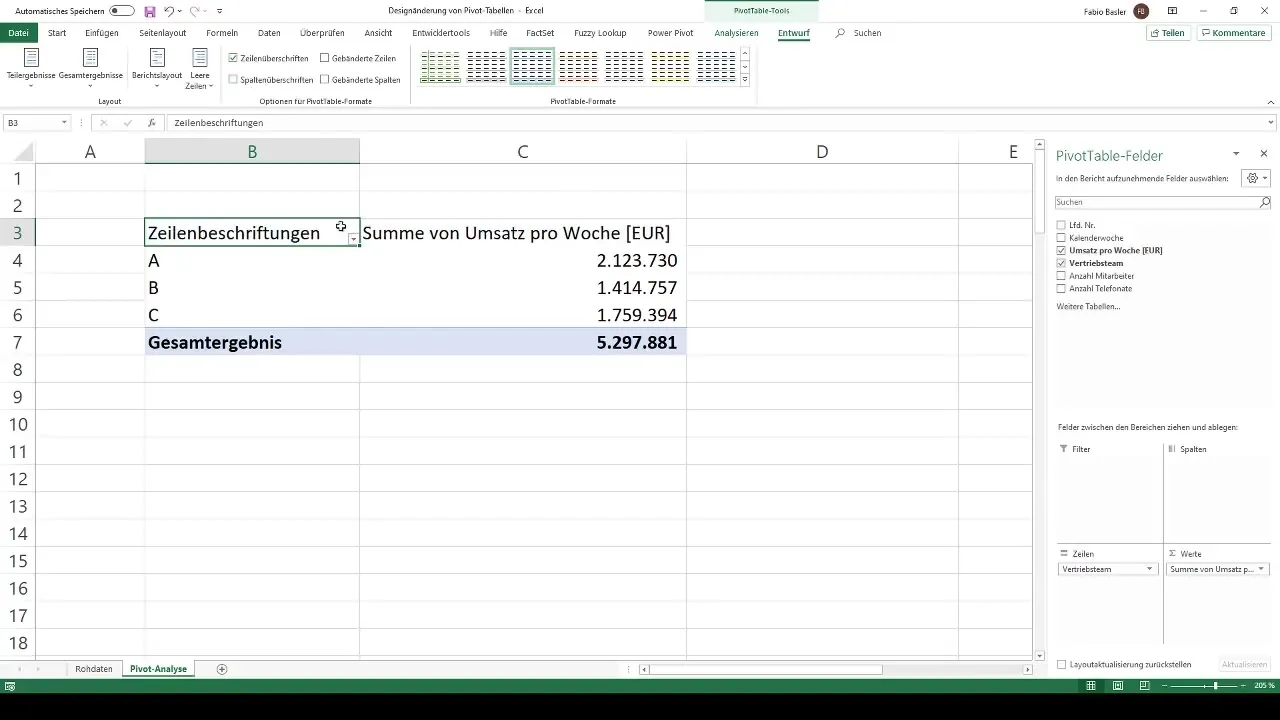
Once your pivot table is selected, go to the "PivotTable Tools" tab at the top of the Excel menu. You will see two main areas: "Analyze" and "Design." In this guide, we will focus on the "Design" option, as it helps you influence the visual layout of your pivot table.
Step 3: Make Color Changes
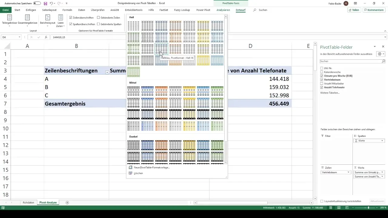
Under the "Design" section, various pre-designed color schemes are available. These are divided into three categories: light, medium, and dark. By default, your pivot table is usually in a light blue format (light number 16). To change the color, select a different scheme that you prefer, such as gray or orange. You can easily experiment with these adjustments to find the best result.
Step 4: Dynamic Adjustments
When you change the color selection, the formatting remains dynamic. This means that as you move ranges or add new data, the table automatically adjusts to this new structure. This gives you flexibility when working with your data and ensures that the color scheme remains consistent.
Step 5: Additional Design Adjustments
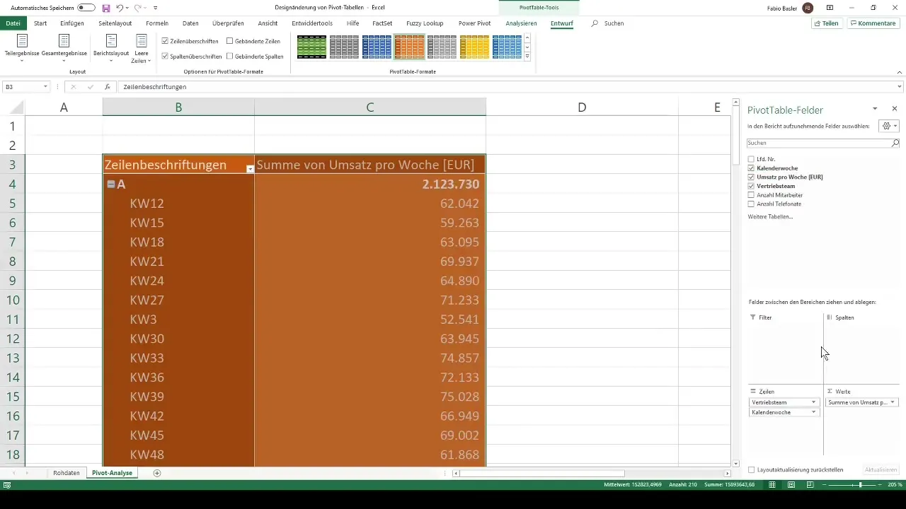
In addition to color changes, you can make other design adjustments. For example, you can change the formatting of the row and column headers. Go to the respective options in the "Design" section. Here you also have the option to control the display of subtotals and grand totals—either visible or invisible, depending on your needs.
Step 6: Customized Adjustments
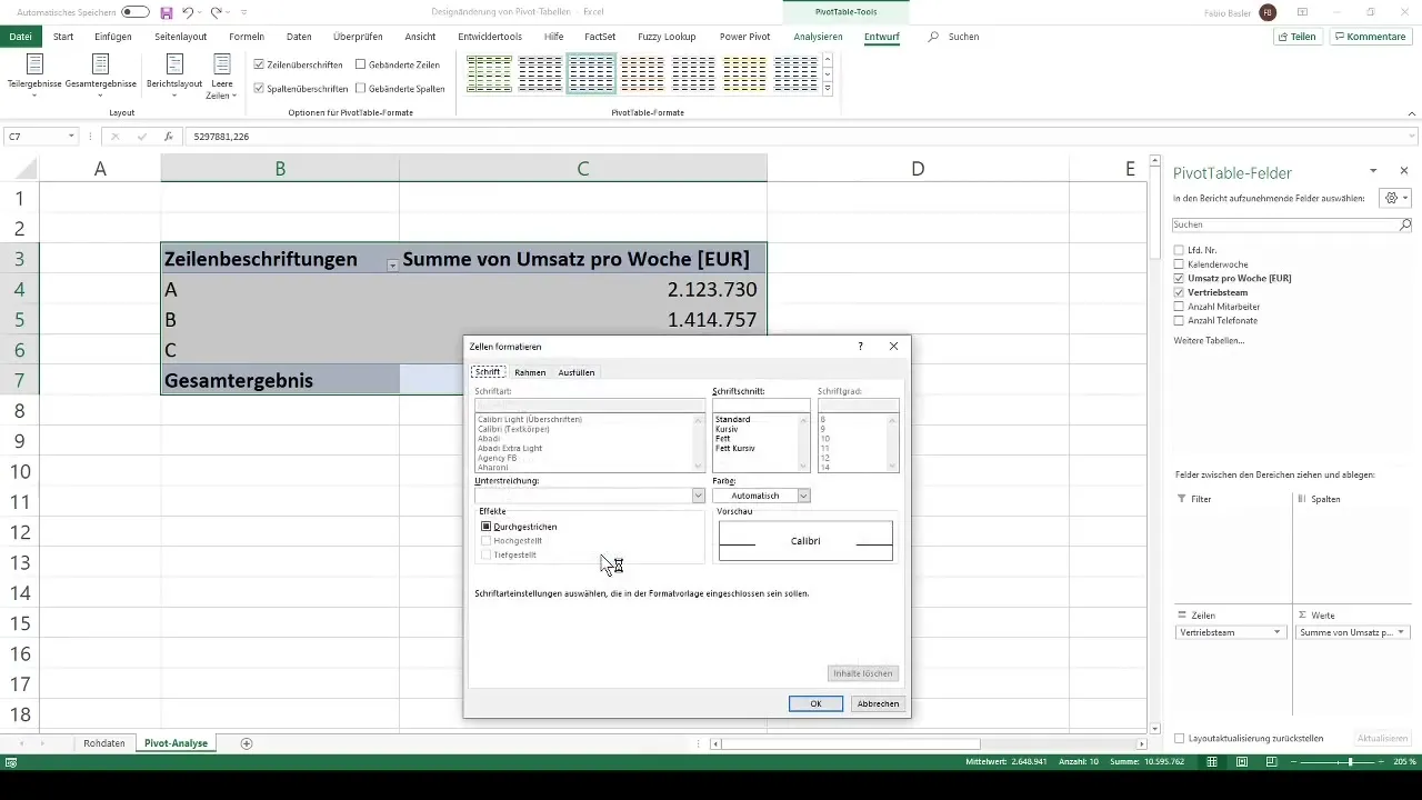
If the standard color schemes are not sufficient for you, you can create a custom format style. Choose "New PivotTable Style" and go to the formatting options. Here you can adjust the font, borders, and even the overall cell fill. For example, you could choose a deep blue fill and change the font color to green. This allows you to create a unique design that aligns exactly with your vision.
Summary
You have now learned how easy it is to customize the design of your pivot tables in Excel. With the various color options and individually customizable formats, you can make your pivot tables not only more informative but also visually appealing.
Frequently Asked Questions
How do I change the color of my pivot table?You can change the color in the "Design" tab under the PivotTable Tools, where various pre-designed color schemes are available.
Can I customize the design of my pivot table individually?Yes, you can create a new PivotTable style and adjust the cells in terms of font, borders, and fill according to your preferences.
How does the design affect readability?A well-designed layout improves readability and helps in quickly grasping information.


