Working with pivot tables in Excel offers a variety of options for data analysis and visualization. One of these special features is the use of a time axis, which allows you to filter and analyze your data based on time dimensions such as months, quarters, or years. In this guide, you will learn how to effectively integrate a time axis into your pivot tables to create dynamic and user-friendly reports.
Key Insights
- The time axis in pivot tables facilitates filtering your data by various time dimensions.
- The time axis allows for a dynamic analysis of time periods, whether on a daily, monthly, or quarterly level.
- With the time axis, you can gain better insights into sales figures and trends.
Step-by-Step Guide
Create a Pivot Table
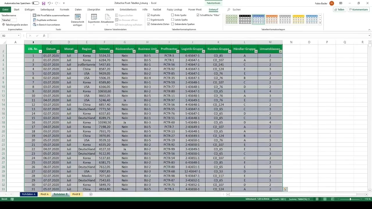
To start using a time axis, first select your data. You can quickly do this by using the shortcut Ctrl + A to select all data. Then format the data as a table with Ctrl + T to ensure Excel recognizes it correctly.
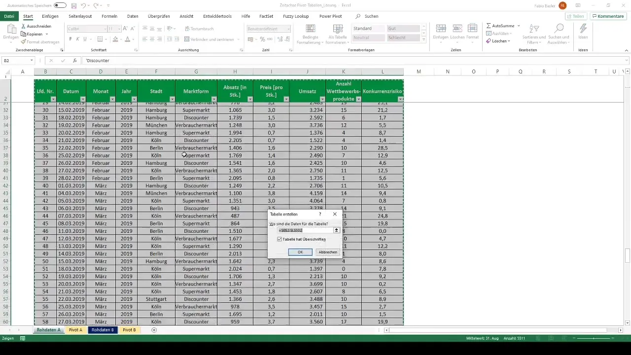
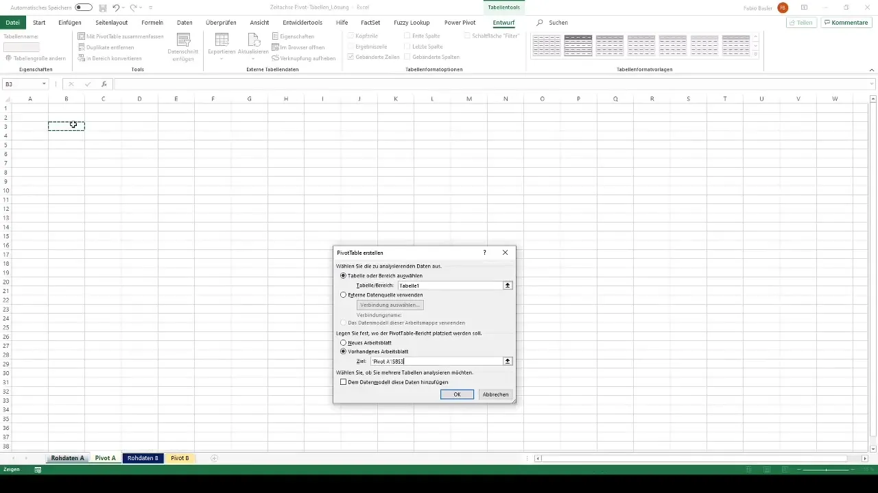
Now go to the worksheet where you want to create the pivot table. Navigate to the "Insert" tab and select "PivotTable." Here you can choose the option to create the pivot table in an existing worksheet.
Drag Data into the Pivot Table
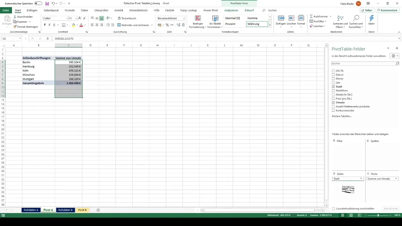
After creating the pivot table, drag the relevant fields into the row and value fields area. For example, you could add cities as rows and sales as values. It may be advantageous to format the values accordingly, such as in Euros and without decimal places.
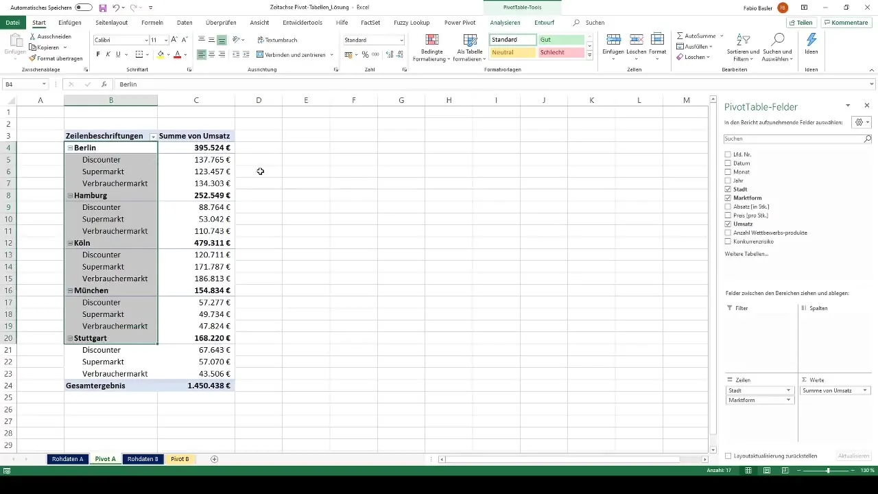
To better organize the data, you can also add additional categories like market types. This way, you'll have a clear overview of sales figures across different cities and market forms.
Add a Time Axis
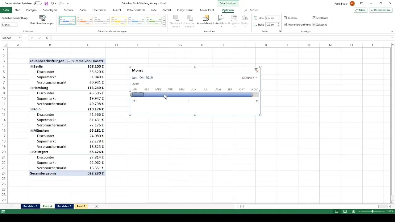
Now things get interesting: You can add a time axis to enable temporal analysis of your sales figures. To do this, click on the pivot table and look for the "Time Axis" option in the menu bar. You can then select the date field on which the time axis should be based.
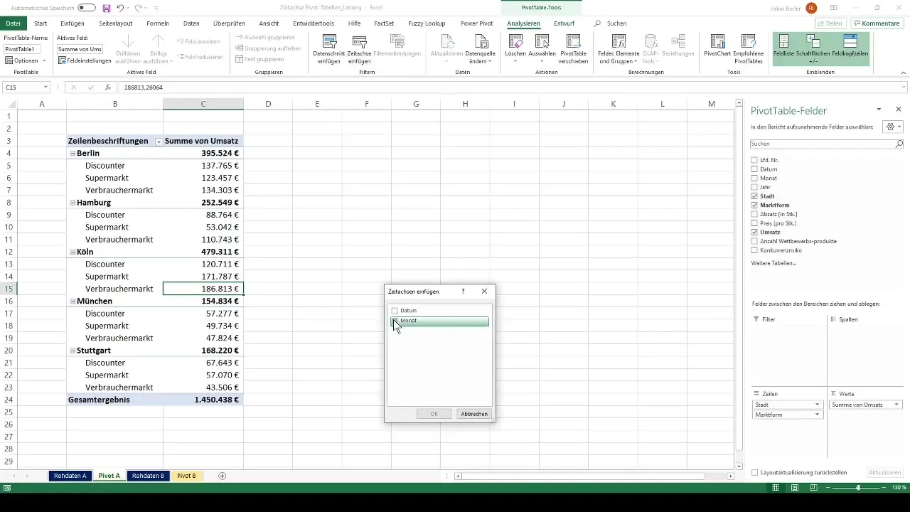
When the time axis is added, a new control element will appear, offering you various options. You can customize the time axis to the desired time dimensions – whether it's year, quarter, month, or day. This way, you have the flexibility to choose the period you want to analyze.
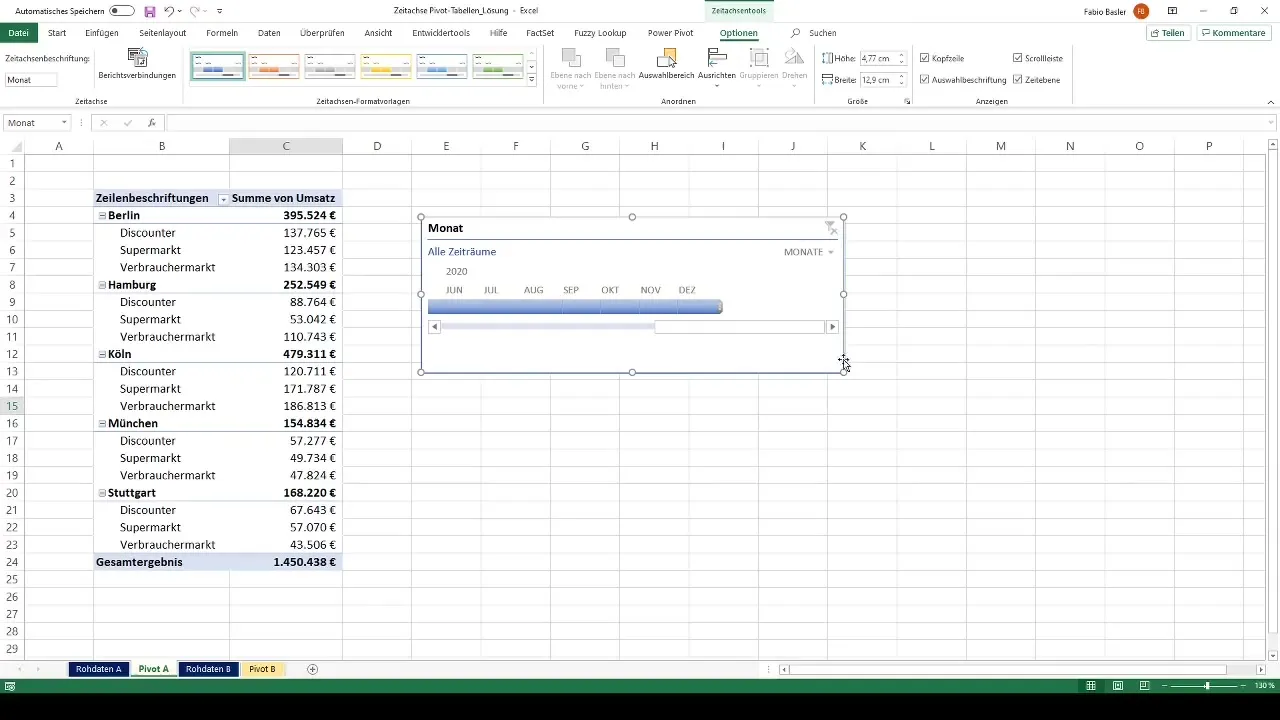
Dynamic Filtering
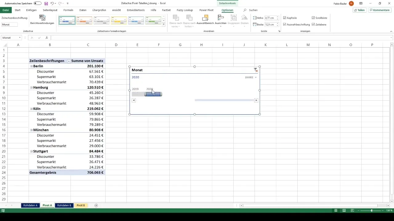
The time axis allows you to dynamically filter the data. For example, you can switch to a monthly view and display only the sales figures for July 2019. This allows you to conduct focused analyses and identify changes over time.
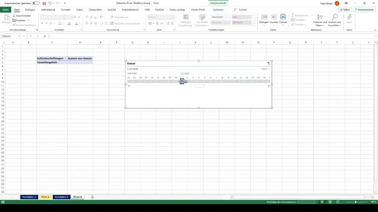
Another cool feature is "zooming in". For instance, you can limit the view to a specific period of days, like from July 1st to 10th. You can easily switch between different time frames and gain deeper insights into your data.
Advanced Analysis
For a more comprehensive analysis, you can also add multiple time axes to your pivot table or adjust the existing time axis to encompass multiple dimensions. This way, you can simultaneously examine both monthly and quarterly sales.
You can also change the view to cumulative data to display an annual overview, for the year up to the selected month or day. This is particularly useful if you want to analyze the development over a longer period of time.
Summary
Using a timeline in pivot tables is a powerful tool for data analysis. With simple steps, you can interactively filter your data and gain detailed insights into time-based trends.
Frequently Asked Questions
What is a timeline in pivot tables?A timeline in pivot tables is a visual control that allows you to filter data according to different time dimensions.
How do I add a timeline to my pivot table?Click on the pivot table and select the "Timeline" option from the menu to choose the date field you want to analyze.
Can multiple timelines be used?Yes, you can add multiple timelines to analyze different temporal perspectives in a pivot table.
How can I switch between different time dimensions?Use the timeline controls to switch between daily, monthly, quarterly, and yearly views.
Why is the timeline useful for analysis?The timeline enables dynamic and targeted analysis of revenue data over different time periods, helping to identify trends.


