Welcome to your next challenge in the area of Pivot Tables in Excel! In this tutorial, you will focus on applying your knowledge from the previous section in a practical manner. You will learn how to visualize, analyze, and present the available data. Keep in mind that mastering Pivot Tables not only saves you time but also helps you make data-driven decisions.
Key Takeaways
- Daily booking data and statistics can be efficiently evaluated using Pivot Tables.
- Data visualization is crucial to present results clearly and comprehensively.
- Applying filters and slicers optimizes the analysis dynamically and interactively.
Step-by-Step Guide to Creating a Pivot Table
Step 1: Understand the Data Foundation
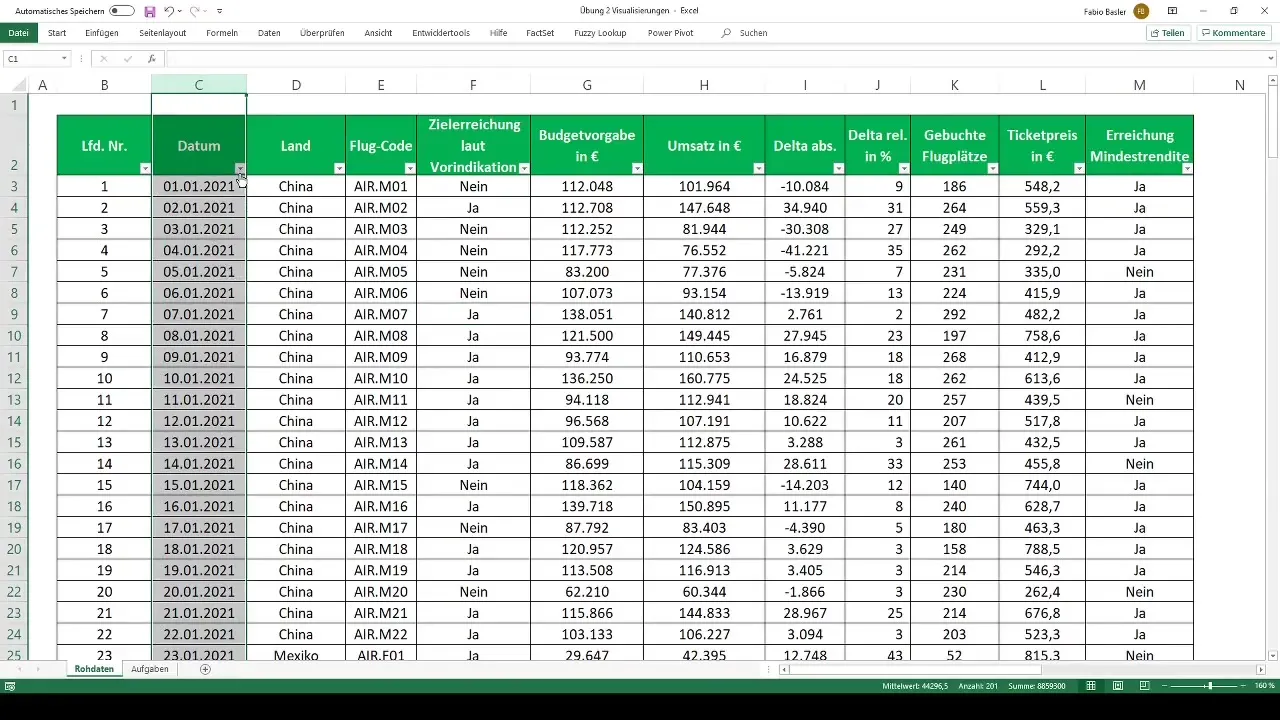
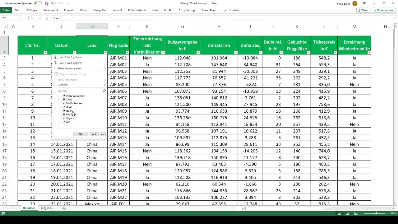
To create an effective Pivot Table, you first need to understand the underlying data. In this case, it is a dataset that contains booking information of an airline company.
This dataset includes timestamp information from January 1, 2021, to July 2021, with details on available bookings, flight codes, ticket prices, and budget allocations. Familiarize yourself with each field to conduct precise analyses later on.
Step 2: Create the Pivot Table
Once you understand the data structure, it's time to create the Pivot Table. Select the entire dataset and go to the "Insert" tab, where you'll find the "PivotTable" option.
Then choose the desired location for the table, either in a new worksheet or the current one. Click "OK" to create the Pivot Table.
Step 3: Data Arrangement
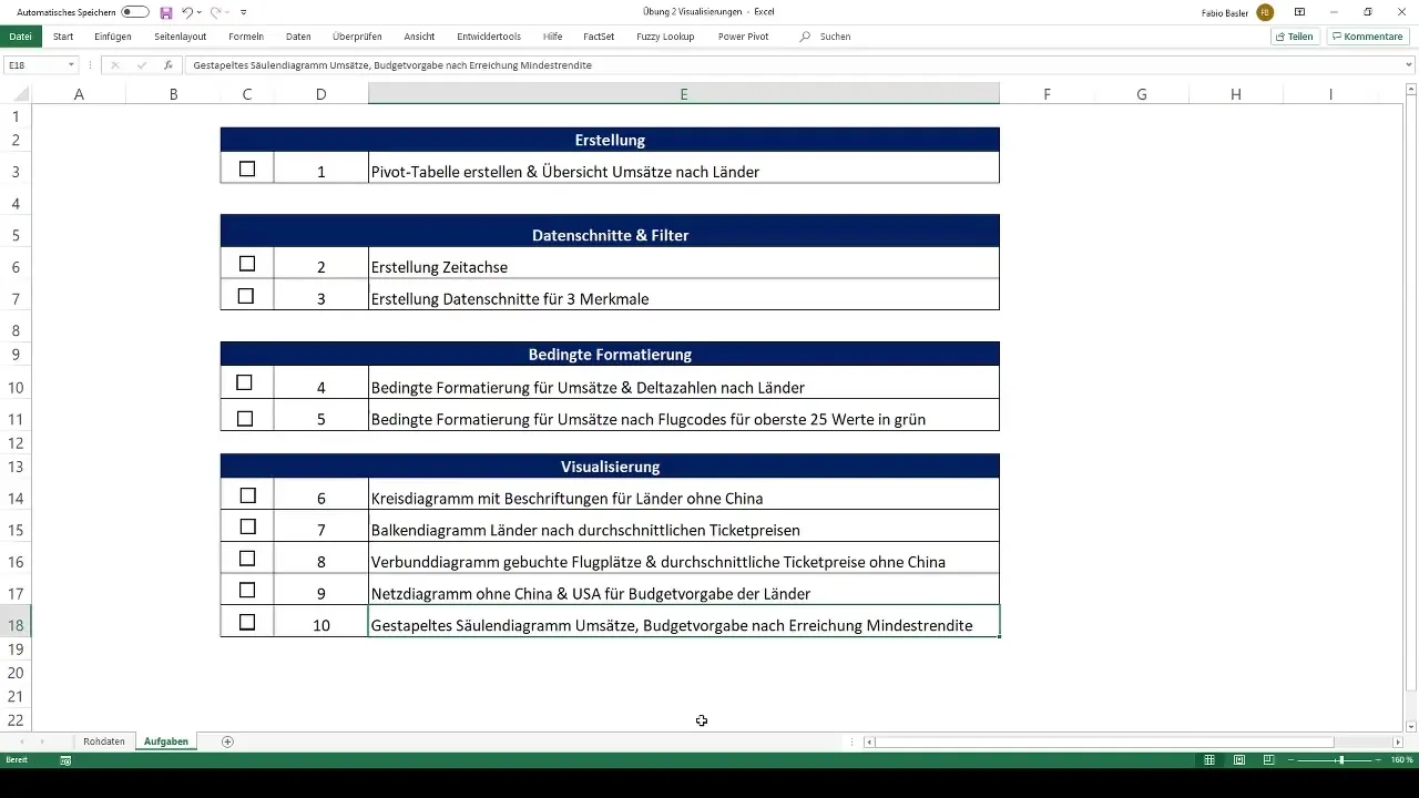
Now it gets exciting. In the right window area, you can arrange the fields for your Pivot Table. Drag the relevant data into the respective areas for rows, columns, and values. In your example, you could drag countries into rows and revenue figures into values.
Experiment with the arrangement to obtain different views of your data.
Step 4: Add Filters and Slicers
To refine the analysis, add filters and slicers. You may want to filter the timeframe to view only specific months or years. Go to the PivotTable Analyze tab and select the "Slicer" option.

Choose the "Date" field to create a slicer, which allows you to easily filter the data by time.
Step 5: Apply Conditional Formatting
Conditional formatting is a powerful tool to highlight the results of your Pivot Table visually. Mark specific values that are above or below a certain threshold to make them instantly visible.

Select the corresponding value field and go to the "Home" tab. There you will find the option for conditional formatting. Experiment with the available rules to highlight your revenue figures by countries or flight codes.
Step 6: Visualize Data
The final step is to visually represent your results. Create charts such as pie charts, bar graphs, and column charts to present your data more effectively.
Select the desired Pivot Table, go to the "Insert" tab, and choose the chart that best suits your data presentation. These charts help identify trends and patterns.

Summary
In this guide, you have learned how to analyze and visualize data using Pivot Tables in Excel. The emphasis was on creating, arranging, and formatting your data. Additionally, you have also discovered how to use interactive filters and slicers to enhance your analyses.
Frequently Asked Questions
How do I create a Pivot Table in Excel?Select the desired data range and go to the "Insert" tab, then click on "PivotTable".
Can I add filters to my Pivot Table?Yes, you can add filters and slicers to display specific data.
How do I apply conditional formatting to my data?Go to the "Home" tab, select "Conditional Formatting", and set the desired rules.
Can I create charts from a Pivot Table?Yes, select your Pivot Table and go to "Insert" to choose the desired chart.
What types of charts can I use?You can use different chart types such as pie, bar, and column charts.


