Data Visualization is one of the most crucial skills you can learn when working with Excel. It enables you to present large amounts of data in a clear and appealing way. In this tutorial, I will cover the basics of creating diagrams in Excel and initially show you some essential steps to successfully design your visualizations.
Key Insights
- Choosing the right form of diagram is crucial.
- All relevant data should be correctly marked.
- There are different ways to customize and format diagrams.
- Keyboard shortcuts and shortcuts make work easier.
Step-by-Step Guide
To create a diagram in Excel, follow these simple steps:
Step 1: Enter Data
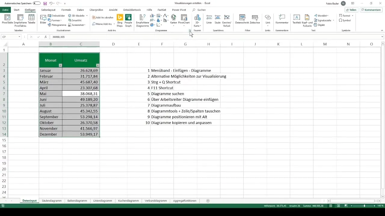
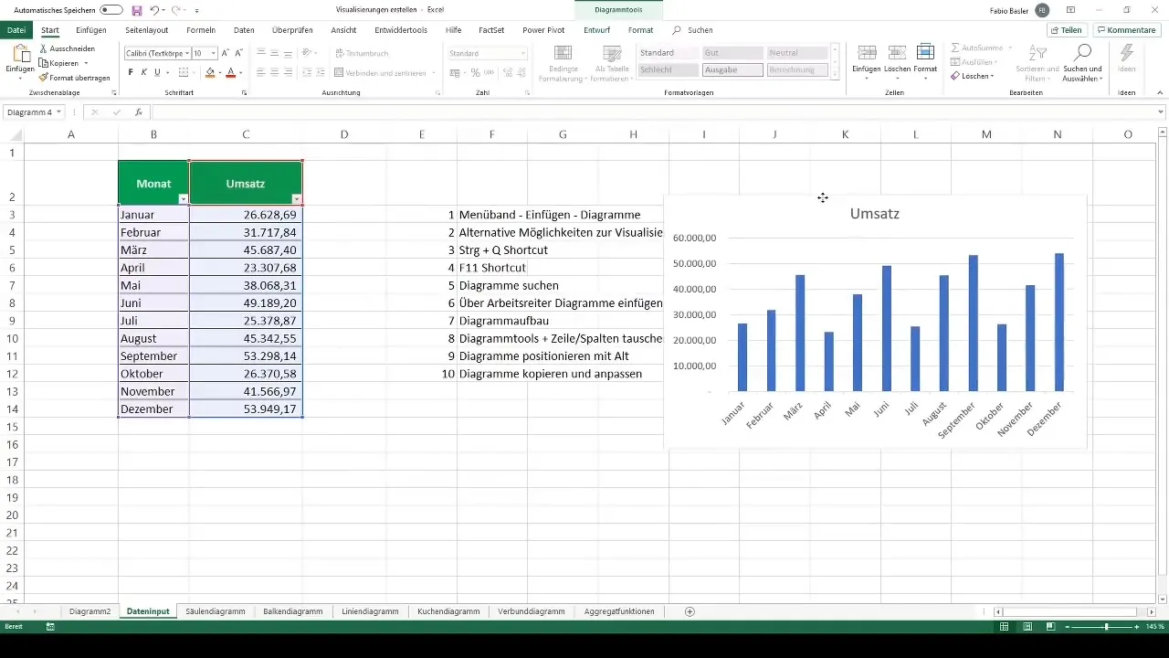
First, you need to enter the data you want to visualize into an Excel worksheet. A typical example could be a list of month names and their corresponding sales figures.
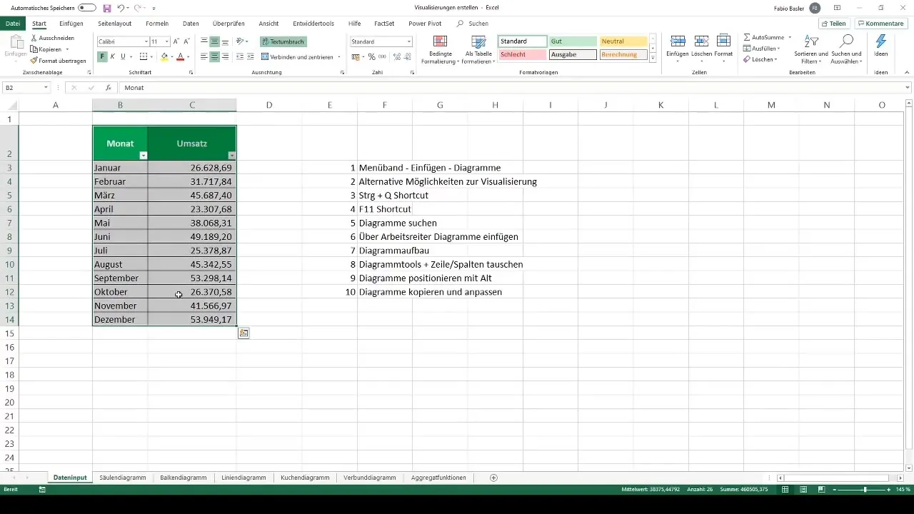
Step 2: Mark Data
Once you have entered the data, the next step is to mark this data. Click into the cell with the first date, and then press Ctrl + A on your keyboard to mark all relevant data.
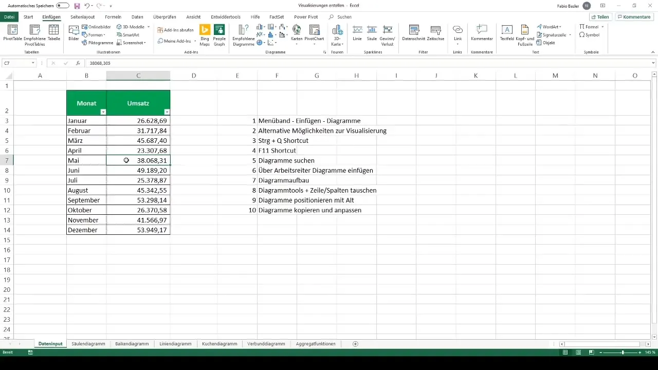
Step 3: Access Diagram Options
Now it's time to explore the diagram options. Go to the ribbon and click on "Insert." There you will find various types of diagrams such as column, line, or pie charts.
Step 4: Select Diagram Type
Choose the diagram type that best fits your data. For example, if you want to track sales throughout the year, a column chart might be the right choice.
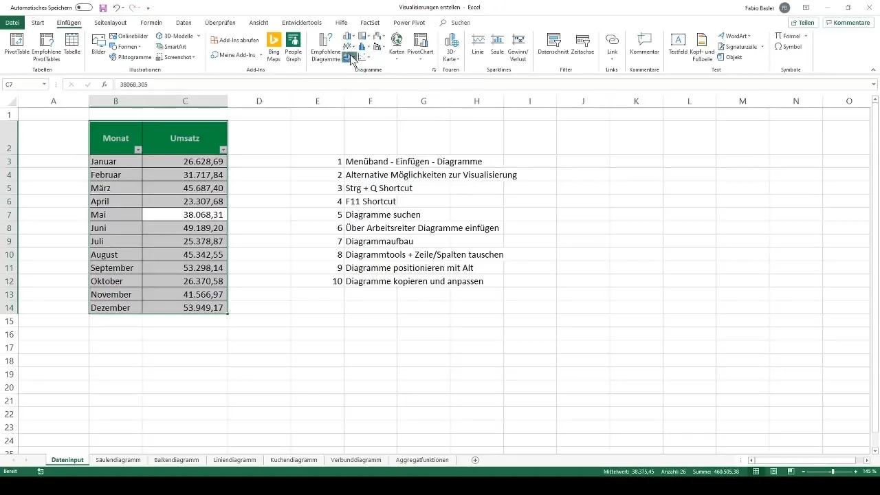
Step 5: Use Recommended Charts
A useful function in Excel is the "Recommended Charts" section. Here, Excel shows you suitable diagram forms based on your data input. Click on "Recommended Charts" in the Insert tab for this.
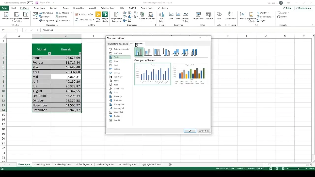
Step 6: Insert Diagram
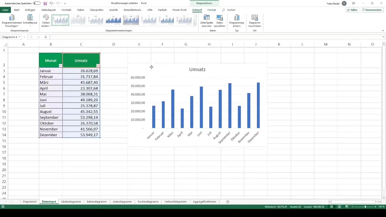
Once you have chosen a diagram type, click on the corresponding icon to insert the diagram into your worksheet. The diagram will be automatically created and placed where the cursor was last positioned.
Step 7: Customize Diagram
Click on the newly created diagram. You can move and adjust it as desired. Hold down the Alt key while dragging the diagram to position it along the gridlines.
Step 8: Add and Remove Elements
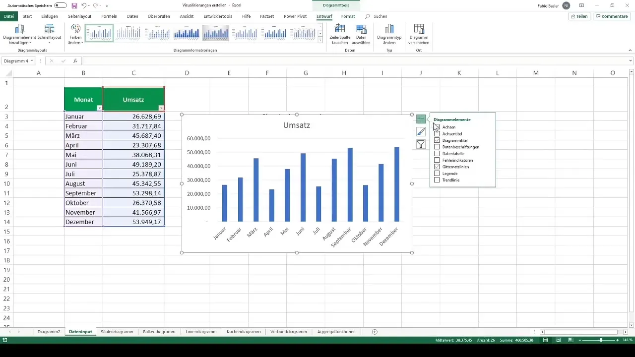
To add or remove various diagram elements, click on the green plus sign located at the top right of the diagram. Here, you can manage axis titles, legends, and data labels.
Step 9: Use Additional Features
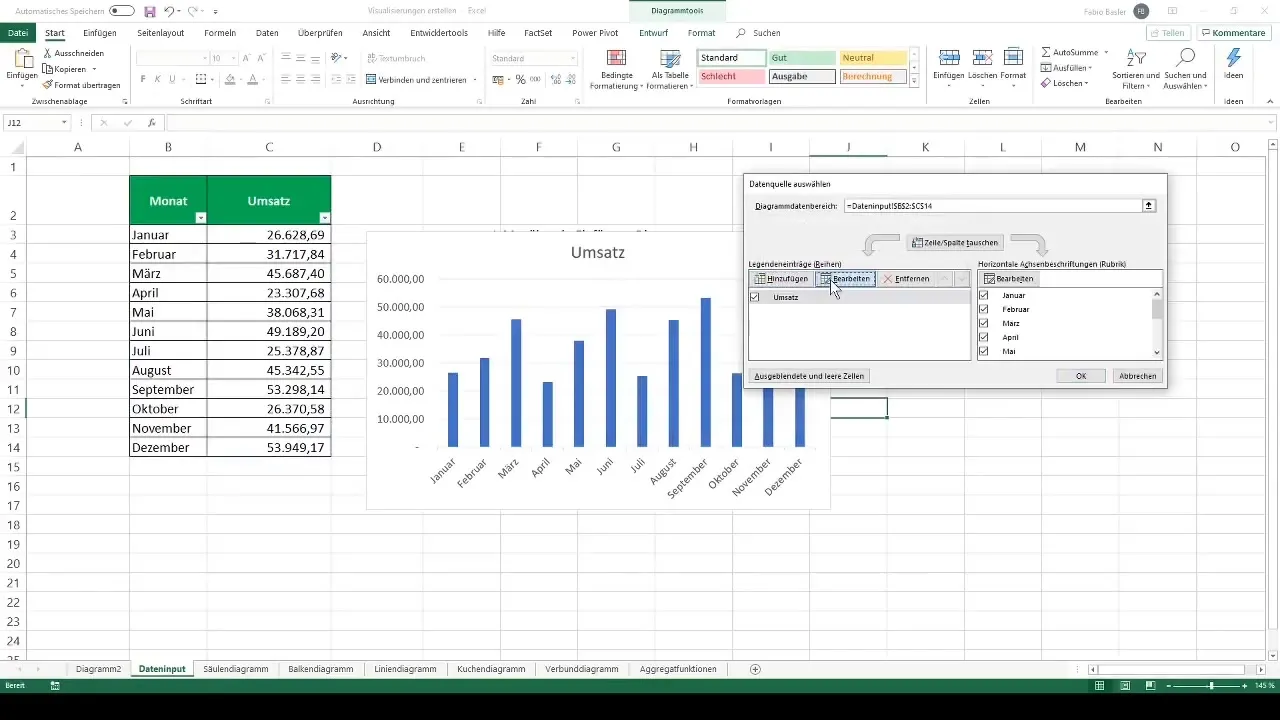
You also have the option to change the representation or add data series. Right-click on the diagram and select "Select Data" to add new data or legends.
Step 10: Change Diagram Type
If you want to change the diagram type later, for example, from a column to a line chart, go back to the ribbon under "Chart Tools," select "Change Chart Type," and pick the desired type.
Summary
Throughout this guide, you have learned the basic steps to create charts in Excel. From data entry to adjusting chart elements, Excel offers numerous options to present your data in an appealing and informative way. Each of these steps is crucial in optimizing the visualization of your data.
Frequently Asked Questions
How do I select all data in Excel?Press Ctrl + A to select all data in your worksheet.
What should I do if I want to change the chart type afterwards?Click on the chart, go to "Chart Tools," and choose "Change Chart Type."
How do I add axis titles to my chart?Click on the chart, then click on the green plus sign to add axis titles.
Can I display multiple charts on one worksheet?Yes, you can create multiple charts on one worksheet and position them accordingly.
Which keyboard shortcut facilitates the creation of a chart?Press Ctrl + A to select the data and then press F11 to create the chart on a new tab.


