You want to effectively visualize your data? Pie and donut charts are simple but very effective ways to represent partial values of a whole. In this guide, I will show you how to create and customize these types of charts in Excel so that your presentations are clear, concise, and appealing.
Key Insights
- The pie chart is suitable for representing partial values of a whole.
- With Excel, you can customize colors, data labels, and legends to improve readability.
- Donut charts are a variant of pie charts that can visualize additional information.
Step-by-Step Guide
Creating a Pie Chart
To create a pie chart, you first need your data. Let's say you have sales figures for various products of a company. Start by selecting the relevant data.
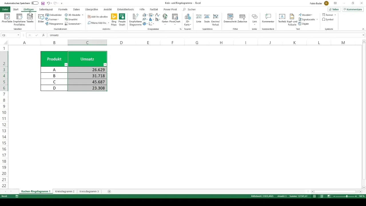
Then navigate to the menu bar and select the "Insert" tab. There you will find the option for Pie or Donut Chart. Click on the button and choose 2D Pie from the available options.
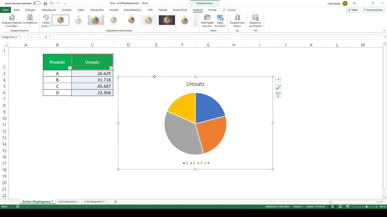
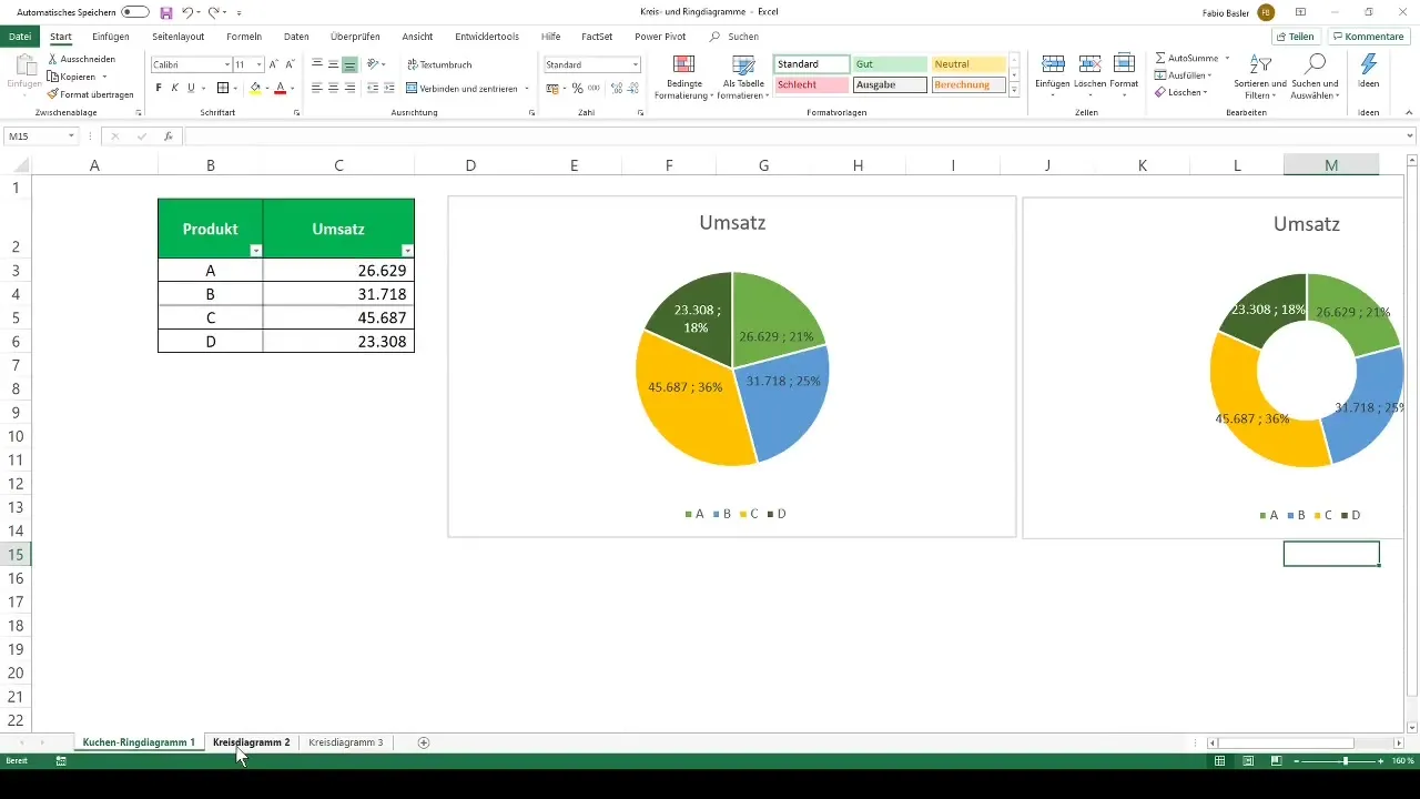
The chart will now be inserted into your worksheet. You should now see the proportional revenues in the form of different pie sectors. If the colors and presentation do not meet your expectations, you can customize them in the next step.
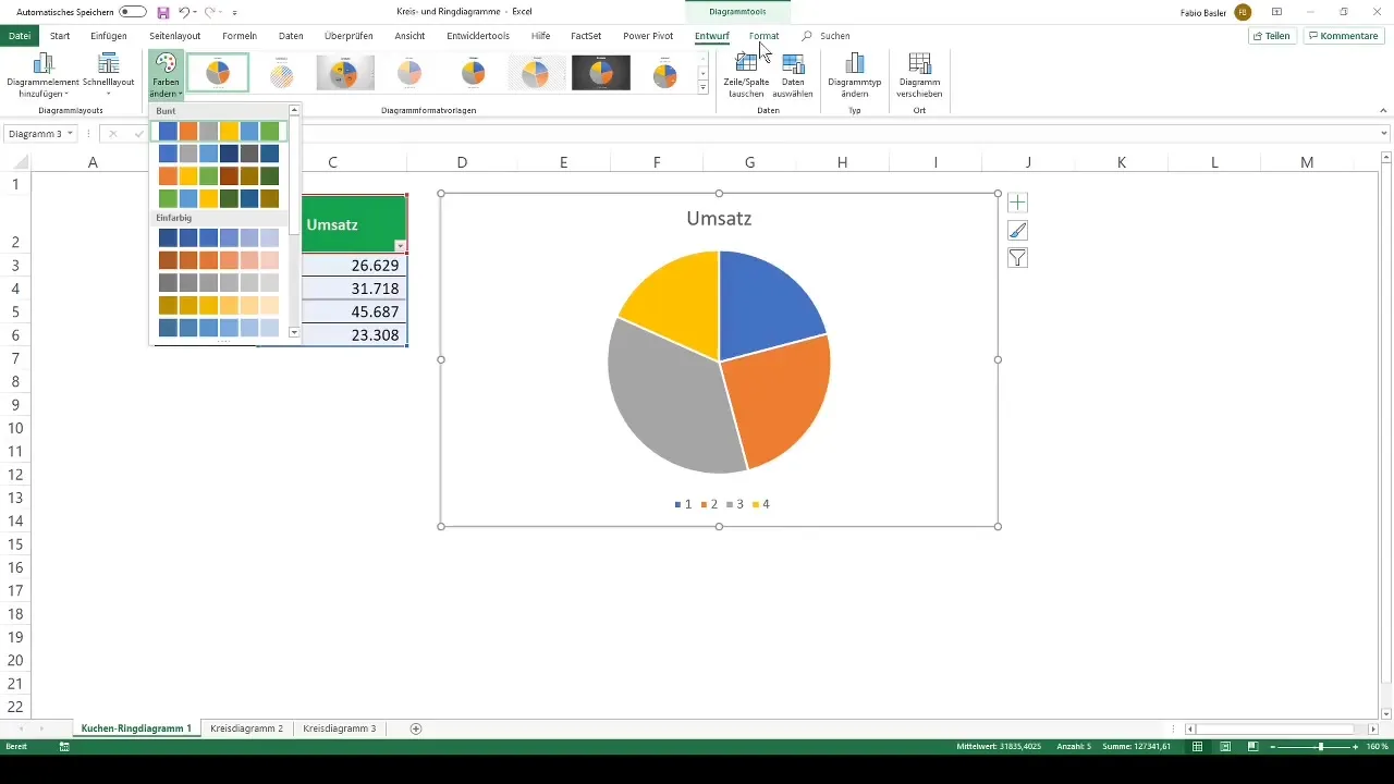
Customizing Colors
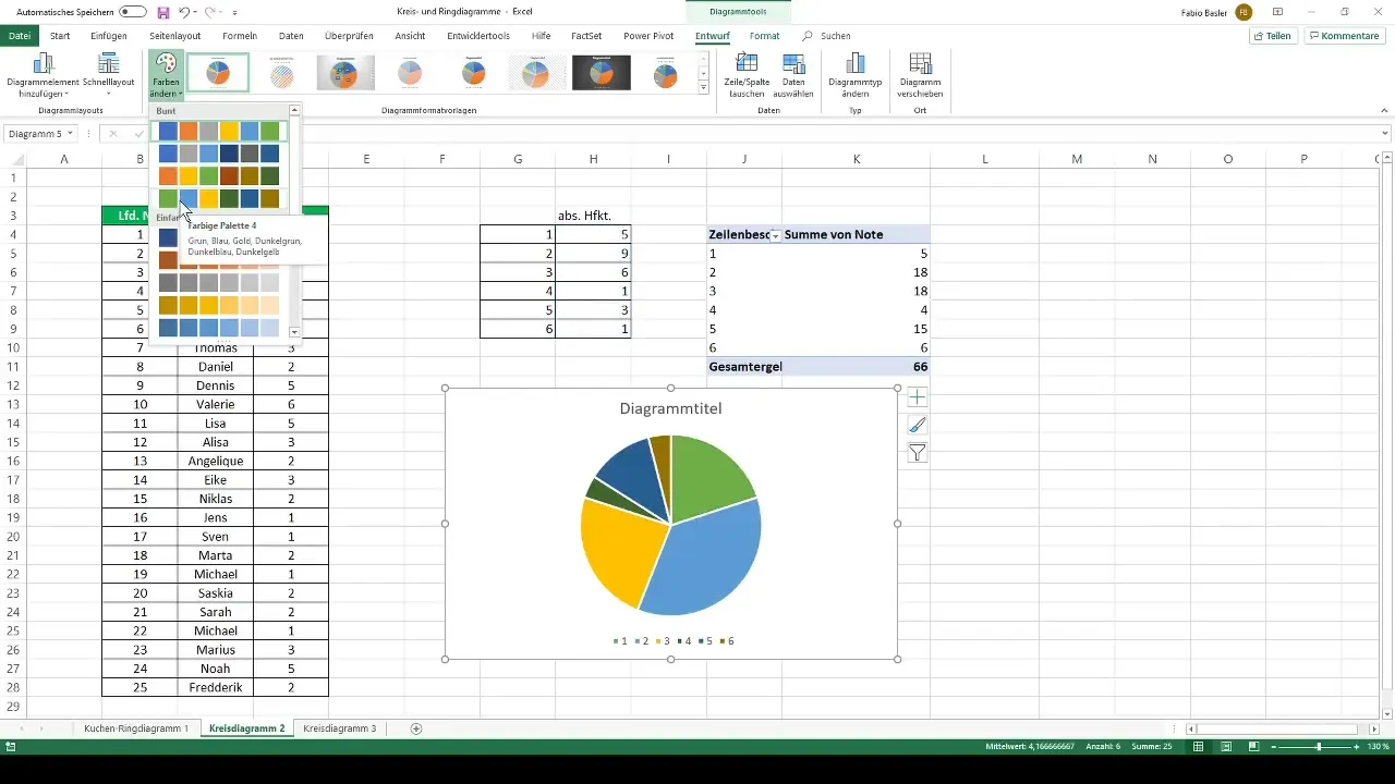
To change the colors of the individual parts of your chart, go to the Chart Tools under the Design tab. Here you will find various color palettes. Choose a palette that suits your preferences, such as a combination of green, blue, gold, and dark green.
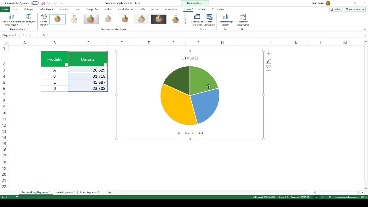
Editing the Legend
To label the legend of your chart, showing the relevant products instead of numbers, right-click on the Horizontal Axis Label. Then select "Edit" and enter the product names.
After adjusting the axis labels, your legend will be updated accordingly.
Adding Values
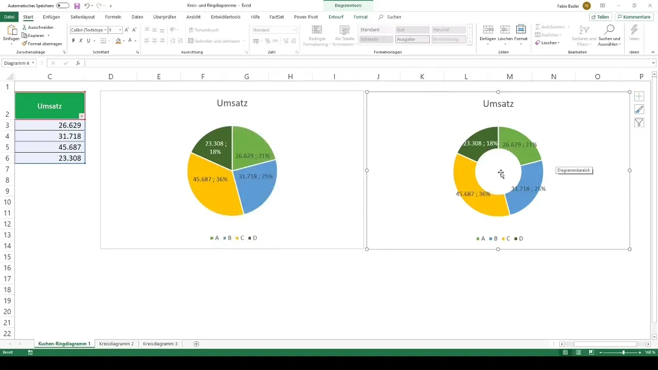
To display the absolute values in your chart, right-click on the chart and select "Add Data Labels". This will visually associate the respective revenue values with the chart sectors.
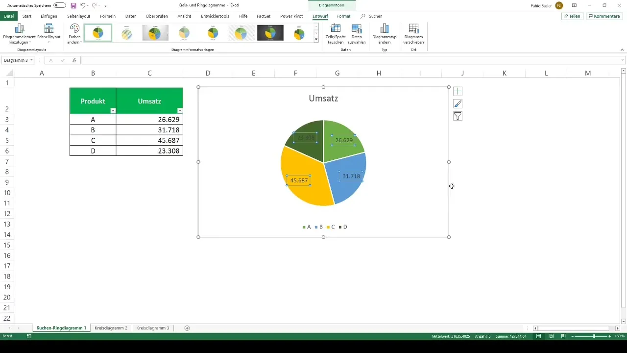
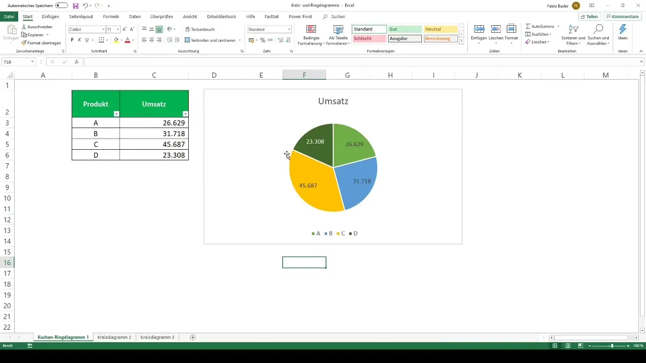
You can also adjust the font colors to improve readability if the font is difficult to read. Change the font color to white to highlight the numbers.
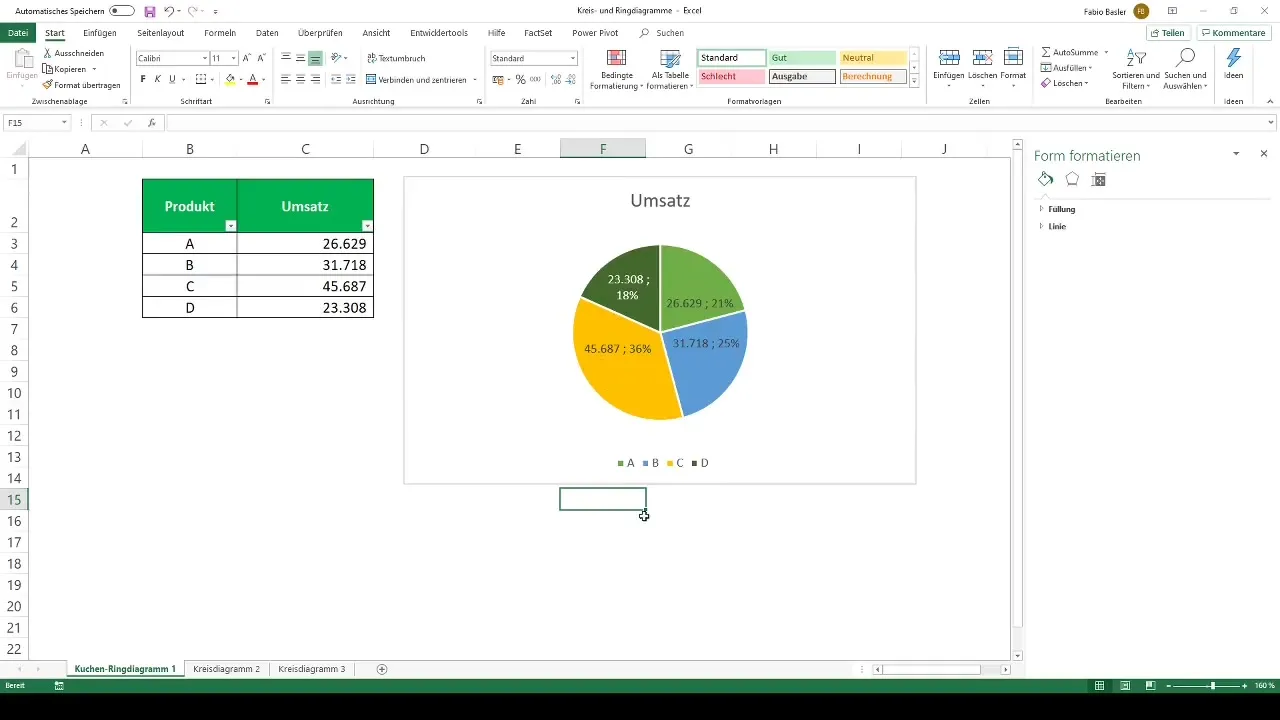
If you also want to display the percentages of revenues, right-click on the data labels again and select "Percentage". This will make your presentation even more informative.
Creating a Donut Chart
A donut chart shows the same data as a pie chart but in a different form. To create a donut chart, you can simply copy (Ctrl + C) and paste (Ctrl + V) your existing pie chart.
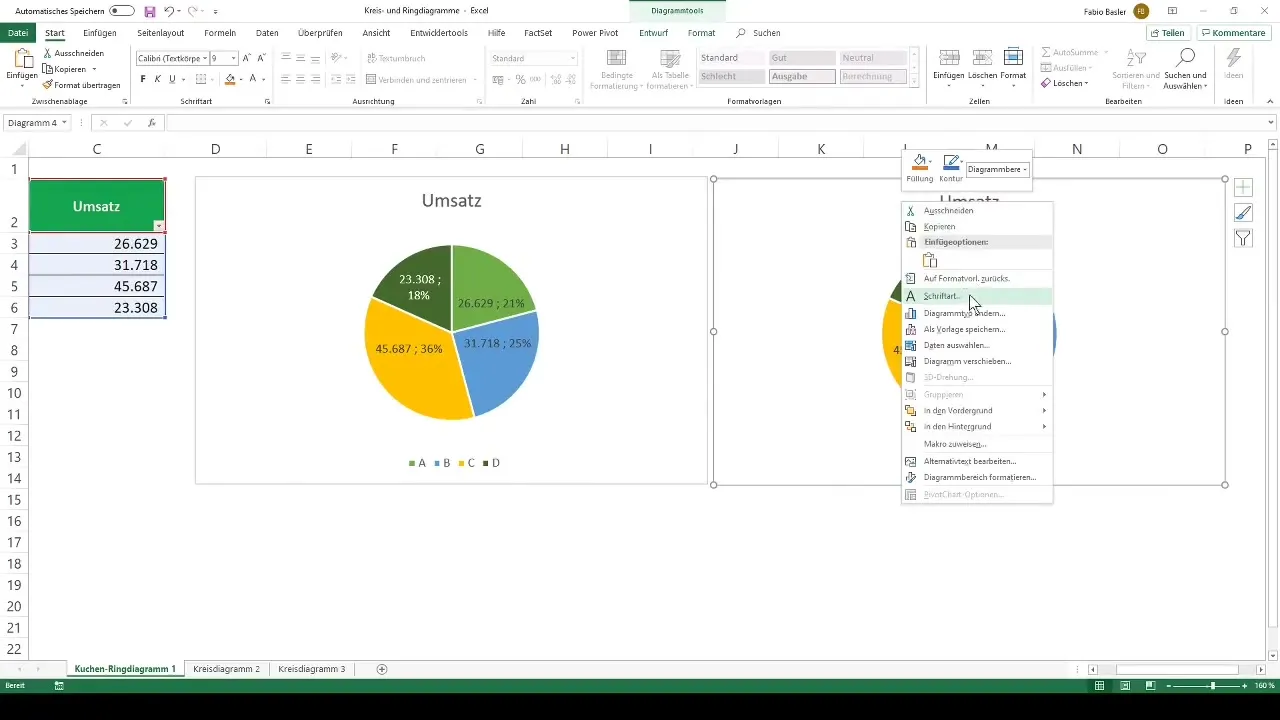
Then right-click on the inserted chart, select "Change Chart Type", and change it to a donut chart. Here too, you can edit colors, data labels, and legends.
Examples of Usage
Let's consider examples like the grading distribution of a school class or the regional sales figures of a company. In the first case study, we want to visualize the grading distribution of a cohort (1 to 6). You first need to calculate the absolute frequencies for each grade to get a clear picture.
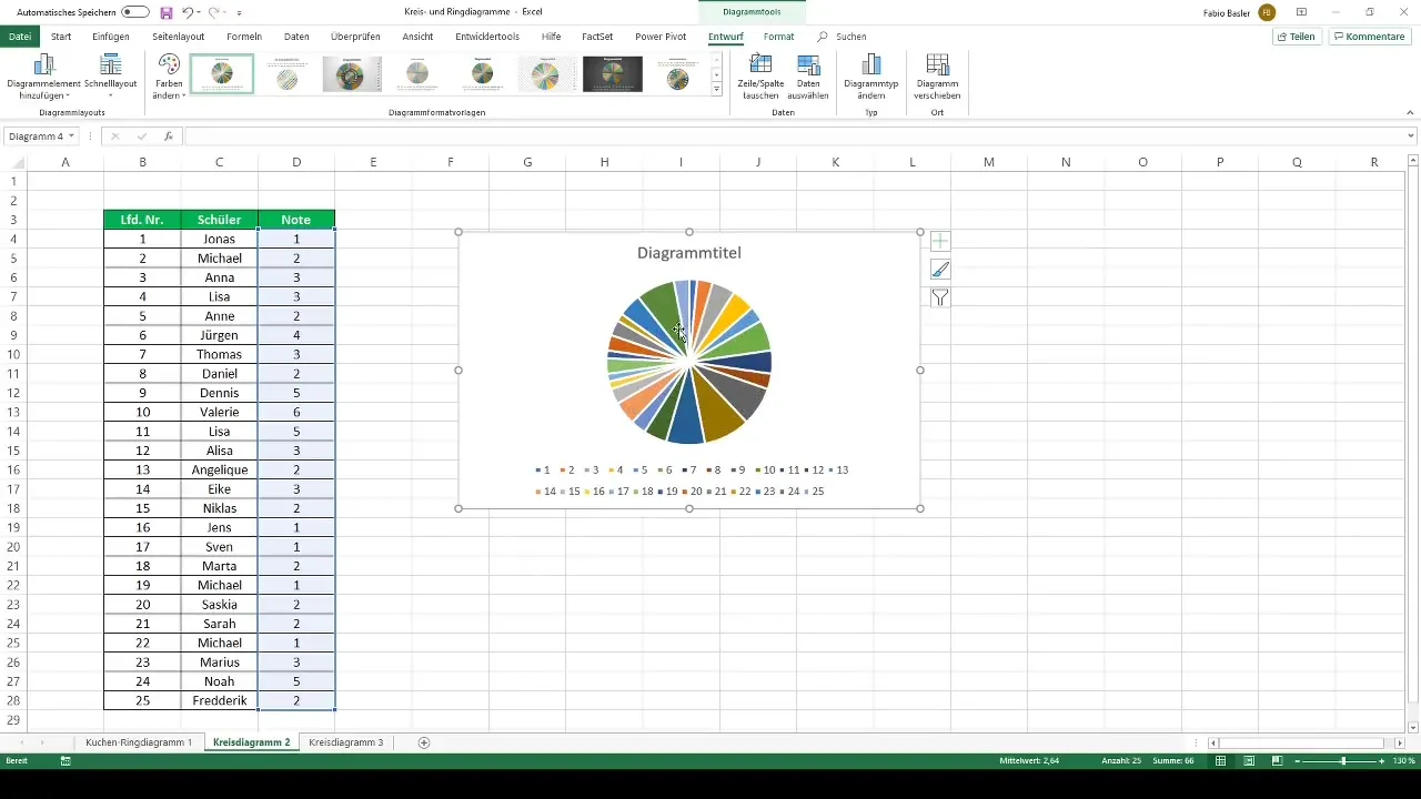
In this case, the formula =COUNTIF(...) is suitable for determining the number of students for each grade. Insert the calculated frequencies into your 2D pie chart and adjust the labels.
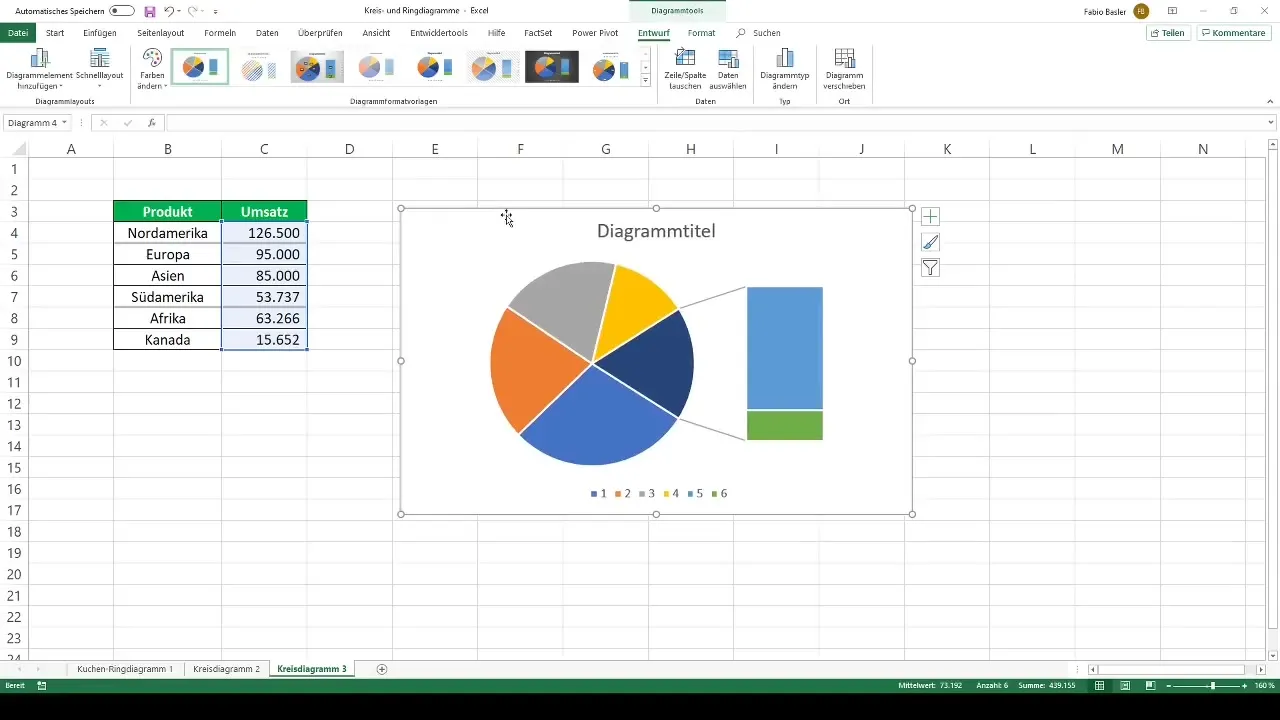
Another profitable example is representing the regional sales of a company. In this case, you also have the option to present another value in an extended pie chart, for example, sales from different regions.
Conclusion and Further Options
Overall, charts are a powerful means of data visualization. Use the options in Excel to design and customize your pie and ring charts. You have the opportunity not only to change visual properties but also to shape the content to convey exactly the information you wish to present.
Summary
Pie and ring charts are effective tools for data visualization in Excel. They help to visually represent partial values and communicate your information clearly and understandably.
Frequently Asked Questions
How do I create a pie chart in Excel?Select your data, go to "Insert" and choose "Pie Chart".
Can I customize the colors in my chart?Yes, you can change the colors of the chart sectors in the chart tools under "Design".
How do I add data labels?Right-click on the chart, choose "Add Data Labels".
What is the difference between a pie chart and a ring chart?A ring chart shows the same information as a pie chart, but has a hole in the center that can display additional data.
How can I customize the legend?Right-click on the axis label, choose "Edit" and enter the desired labels.


