You want to present your data in an illustrative way and visualize trends or changes over time? Line charts in Excel are an excellent way to do this. With them, you can not only display individual data values, but also track their developments over time. In this guide, you will learn how to create both simple line charts and trendlines in Excel to identify the main trends in your data.
Key Insights
- Line charts show trends over a period of time by connecting data points with lines.
- There is the option to display multiple number series in one chart.
- Trendlines help you identify the general direction of your data.
- The chart can be further optimized using axis titles and data labels.
Step-by-Step Guide
Creating a Line Chart
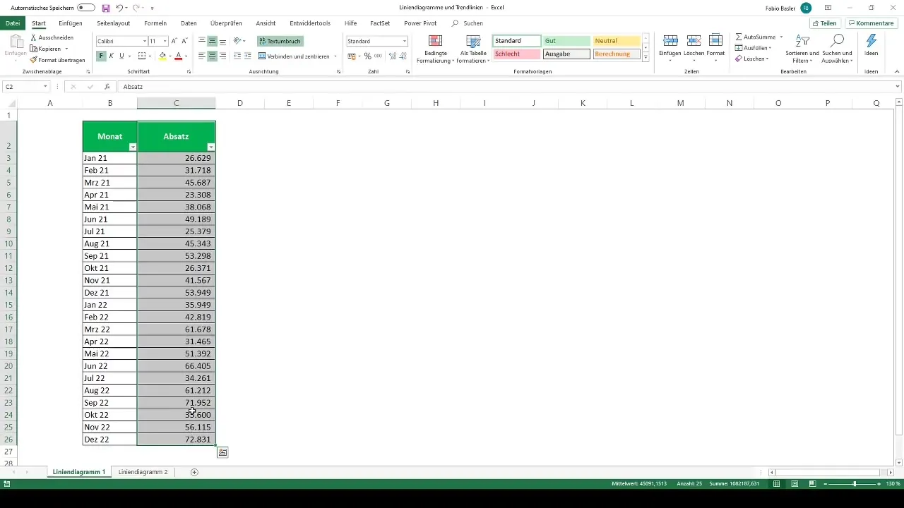
To create a line chart, start by creating the necessary data. Let's say you have the sales figures of a company from January 2021 to December 2022. Select the corresponding numbers and the heading "Sales."

Then go to the menu bar and select 2D Line Chart in the "Insert" section. This type of chart is particularly suitable for displaying trends over a specific period of time.
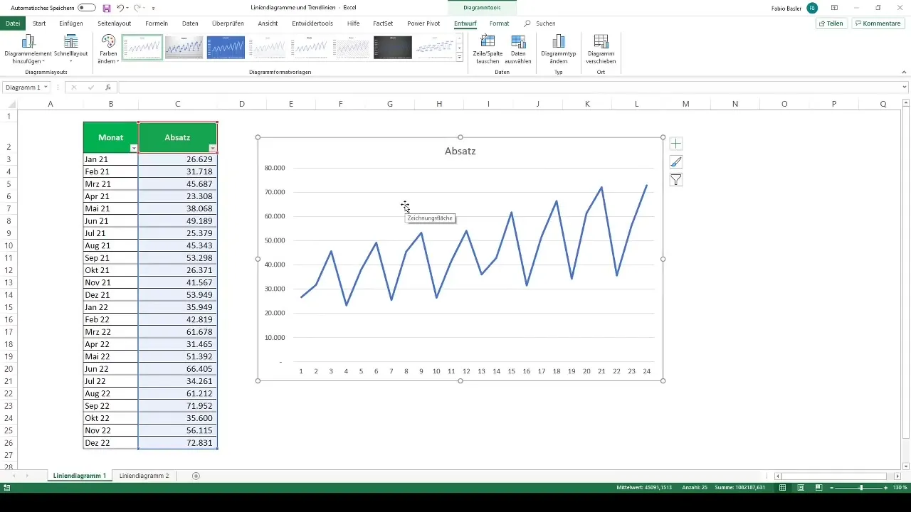
You will now see the chart that visualizes the trend of your sales figures. It is important to further optimize the chart. For example, you may want to adjust the data labels. You may not want to see the individual numbers of the months but the months themselves as horizontal axis labels.
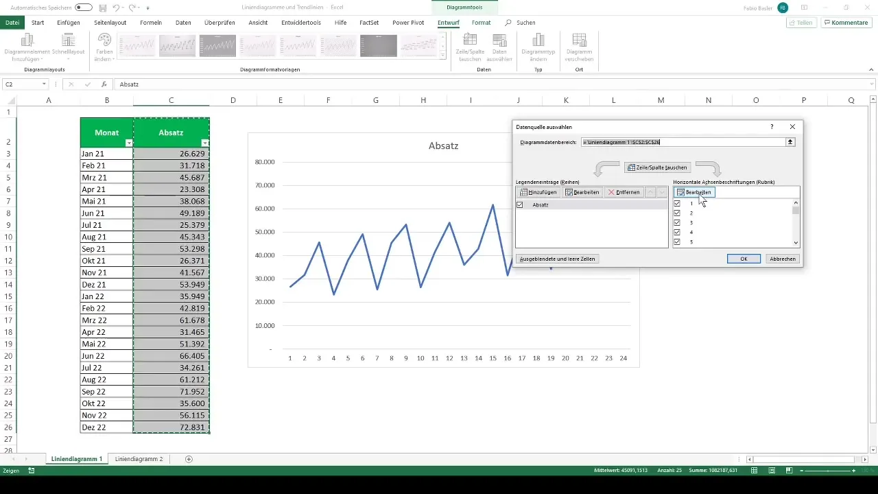
Simply select the months to ensure that the horizontal axis displays the months. The chart should now correctly represent the months.
Adjusting the Chart
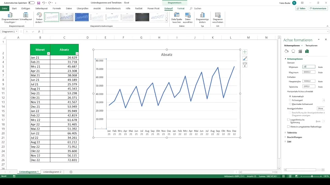
To get a more clear chart, you can adjust the vertical axis. Right-click on the axis and select "Format Axis." Here, you can increase the minimum, for example to 20,000, and reduce the maximum to 75,000. This helps to compress the line graph and makes the chart more concise.
Furthermore, there are numerous graphical customization options in the realm of chart elements. Here, you have the opportunity to add axis titles or activate additional chart elements to enhance the chart.
Adding Trendlines
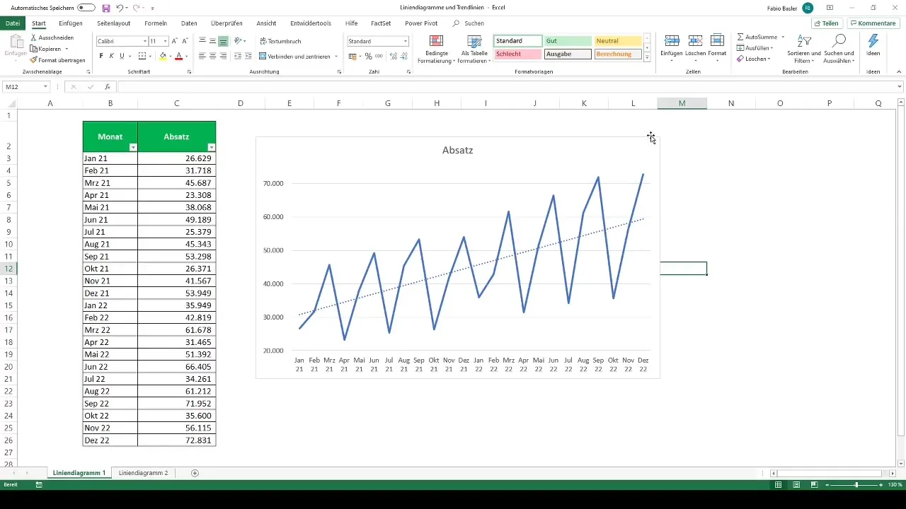
An important element you can add to your line chart is the trendline. To activate this, go back to the chart elements and select "Trendline." This allows you to identify the general direction of the trend.

Trendlines are particularly useful when sales figures are subject to strong fluctuations or follow seasonal trends. They provide a good way to identify the underlying patterns in the data.
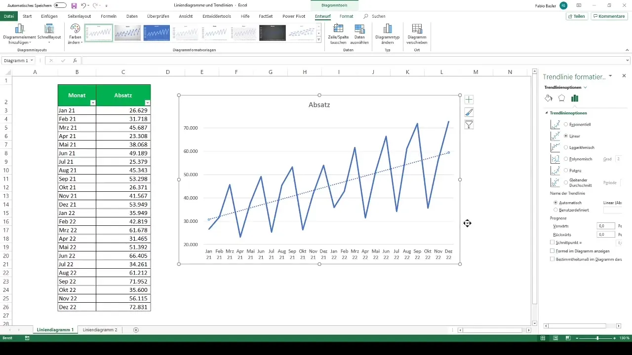
For a more in-depth analysis, you can adjust the trendline. Click on the trendline and select "More Options." Here, you can change the trendline to polynomial or logarithmic, for example. The default format is linear, which is sufficient in many cases.

If you want to learn more about the mathematical background of trend calculation, you can also display the coefficient of determination or the formula if you are interested.
Example with Regional Sales Data
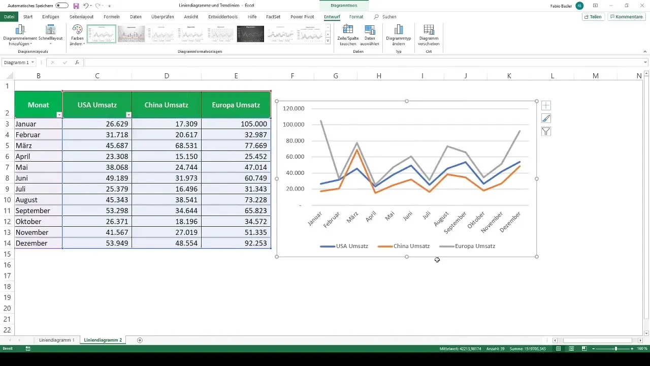
Now let's look at another example: The sales figures of a company, broken down into different regions – North America, China, and Europe. First, select the corresponding monthly numbers for each region and go to "2D Line Chart" again. Excel automatically recognizes the different data series.

A chart is created where the colors for each region are easy to distinguish: the USA appears in blue, China in orange, and Europe in gray. You can use the legend in the chart to easily identify the individual regions.
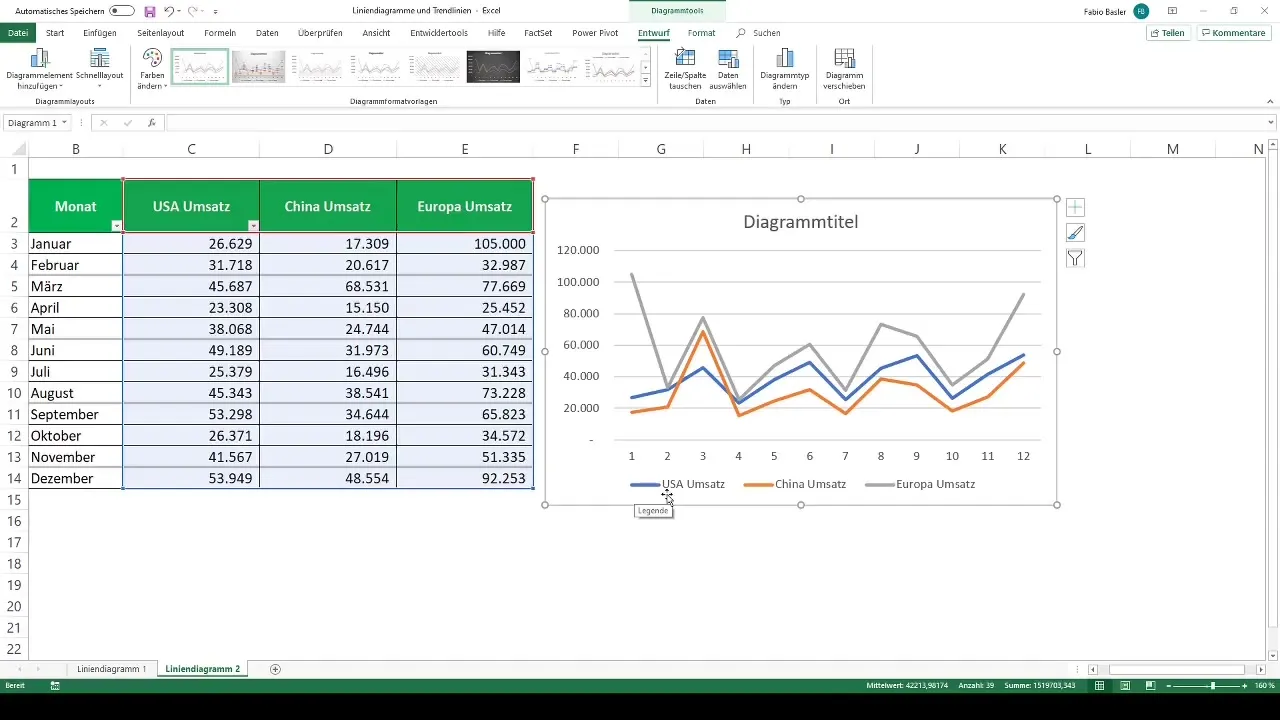
If you want to remove the chart title, you can do so to get a clearer representation. Simply go to the chart tools and remove the title.
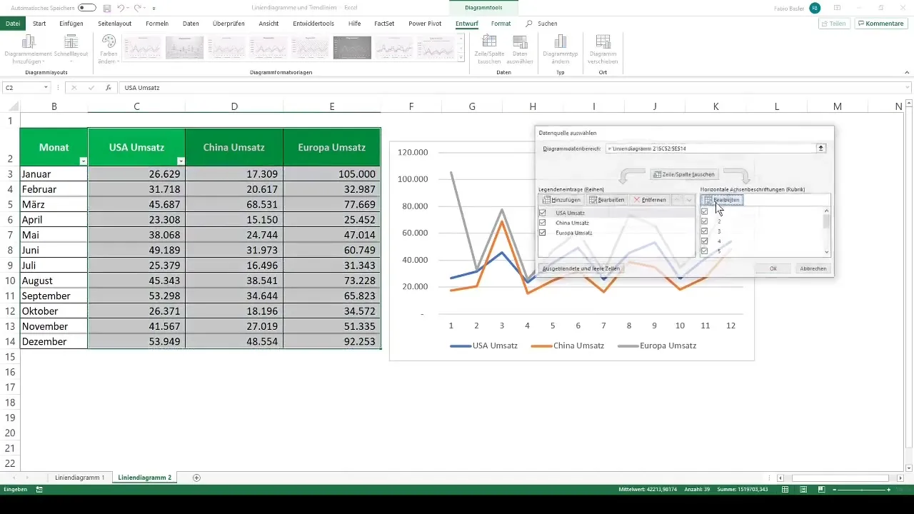
To change the horizontal axis labels, select "Select Data." Here you can change the display from numbers to months, thus getting the trend by months again.
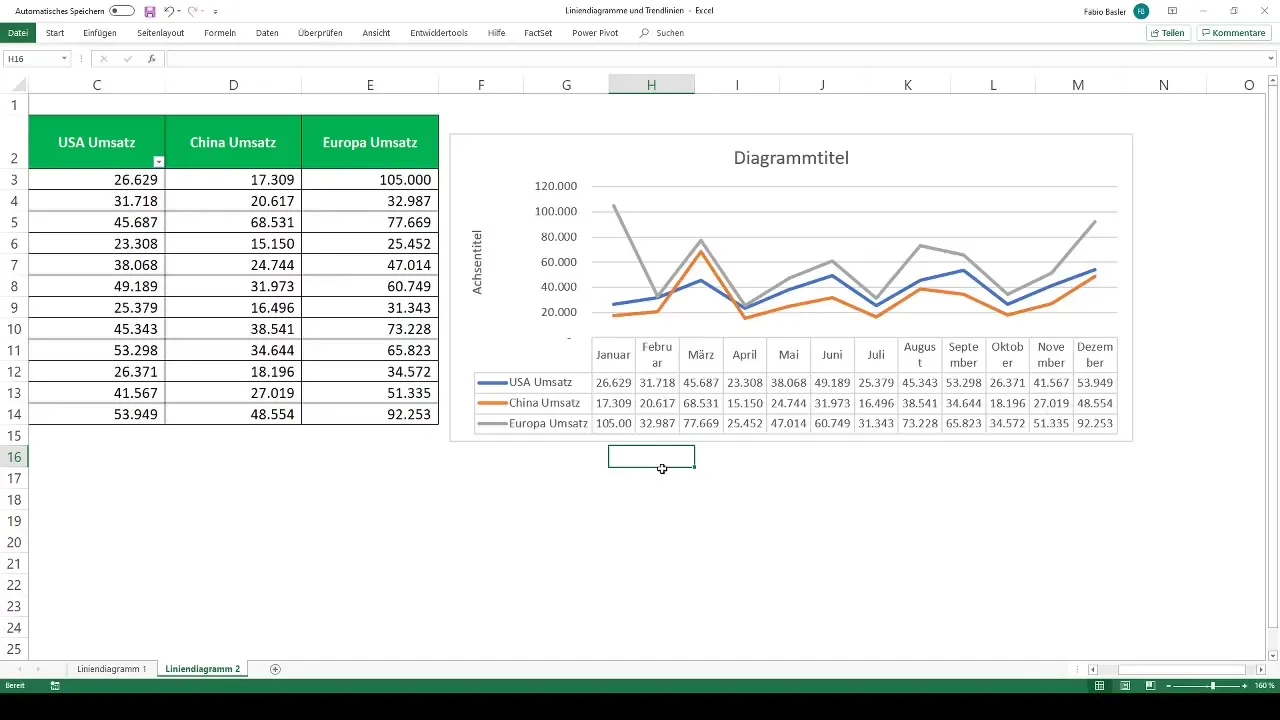
An interesting way to further enhance your chart is to use the "Add Table" option. This function displays the revenue figures in a tabular structure below the chart.
Summary
In this tutorial, you have learned how to create and customize line charts in Excel. By being able to visualize trends and integrate trendlines, you can take your data analysis to a new level. Use these tools to make better-informed decisions and improve your presentations.
Frequently Asked Questions
How do I create a line chart in Excel?Select the data values and go to "Insert", then choose "2D Line Chart".
Can I represent multiple data series in a line chart?Yes, you can map multiple number series in a line chart and differentiate them by color.
What is a trendline and how do I add it?A trendline shows the general direction of a data series. You add it through the chart elements.
How can I improve the appearance of my chart?The chart can be optimized by adding axis titles, data labels, or tables.
What are the advantages of a line chart?Line charts help visualize trends over a specific period, facilitating data analysis.


