Area charts are a particularly visual way to represent developments over time or compare multiple datasets in Excel. In this tutorial, you will learn how to create, customize, and visually enhance area charts in Excel. Let's get started!
Key Takeaways
- Area charts visualize the development of quantities and provide a clear color coding for different data.
- Creating an area chart in Excel is done through the "Insert" menu and selecting a recommended chart type.
- Stacked area charts are useful for comparing multiple data series.
Step-by-Step Guide
Understanding the Basics of Area Charts
Before you start creating an area chart, it is important to know that it is a visual representation that typically shows the development of quantities over a specific period of time. These charts are often based on line charts, with the areas between the axis and the lines highlighted by different colors or patterns.
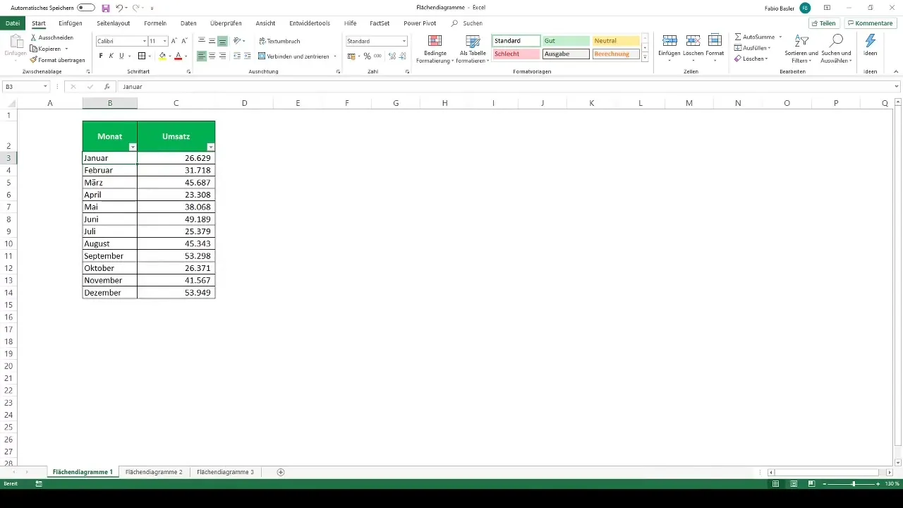
Preparing Data for Creation
To get started, you should first enter the relevant data in Excel. In this lesson, you will find practice examples to help improve your skills. Make sure you have the data in neatly organized table formats to facilitate the chart creation process.
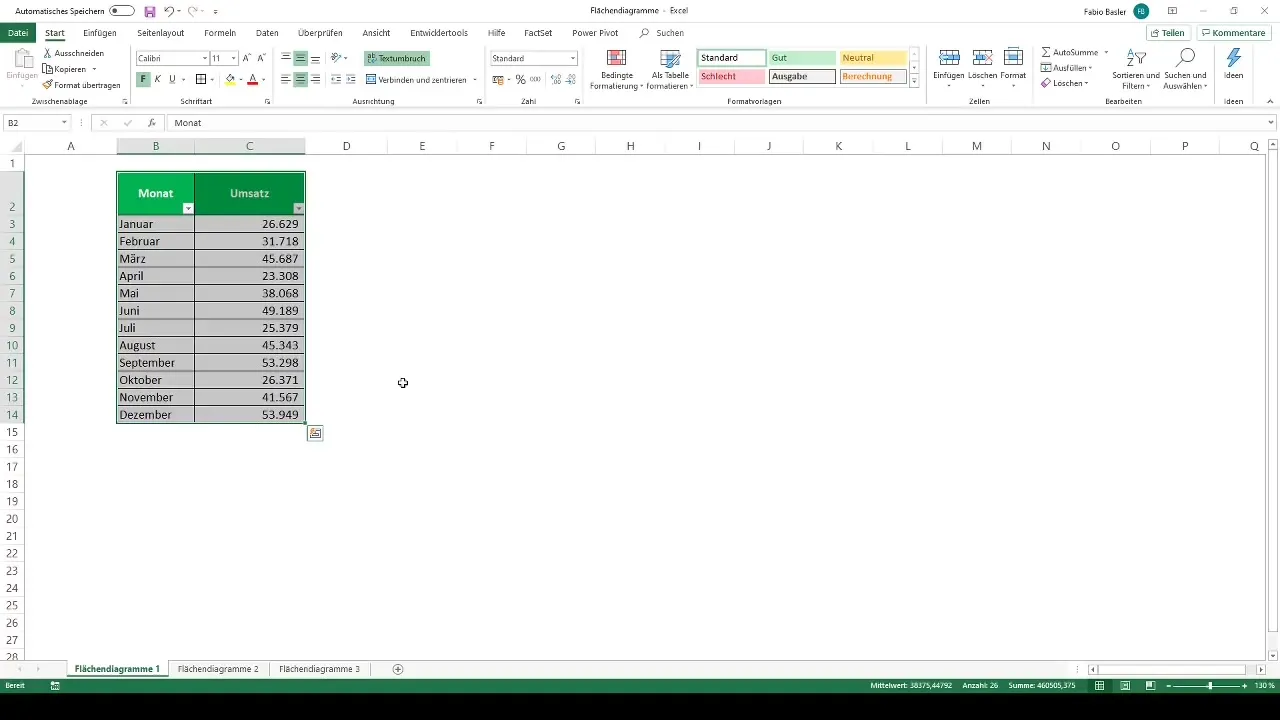
Using Recommended Charts
An excellent tool in Excel is the "Recommended Charts." Go to the ribbon menu and select "Insert." Choose the relevant numbers you wish to visualize and click on "Recommended Charts." Excel will then show you various visualization options, among them the area charts.
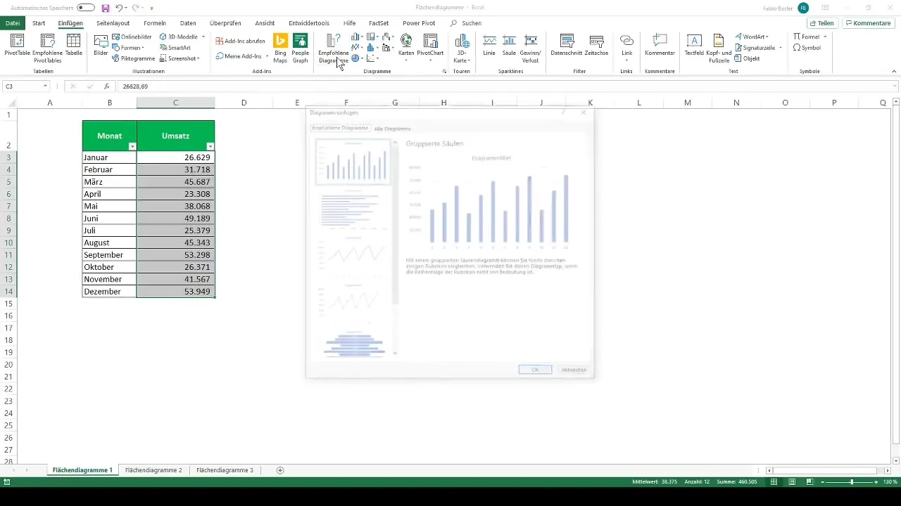
Selecting 2D Area Chart
For displaying trends over a period of time, select the 2D area chart. This will already graphically display your monthly sales data. Ensure that Excel automatically arranges and represents the data for the chart.
Adding Axis Labels and Legend
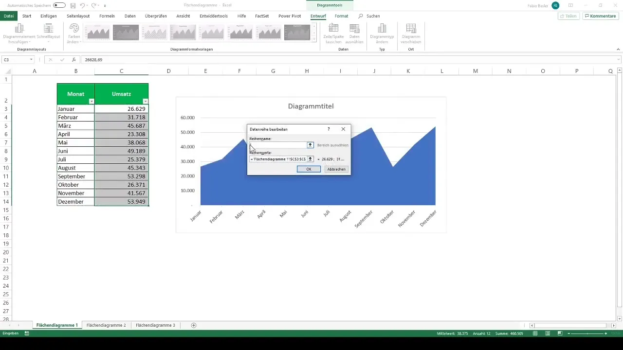
One important element of any chart is the axis labels. Right-click on the chart and select "Select Data." Here you can customize the horizontal axis label to add the months for your sales data. Alternatively, you can also add a legend to clarify what the different areas in the chart represent.
Inserting Data Labels
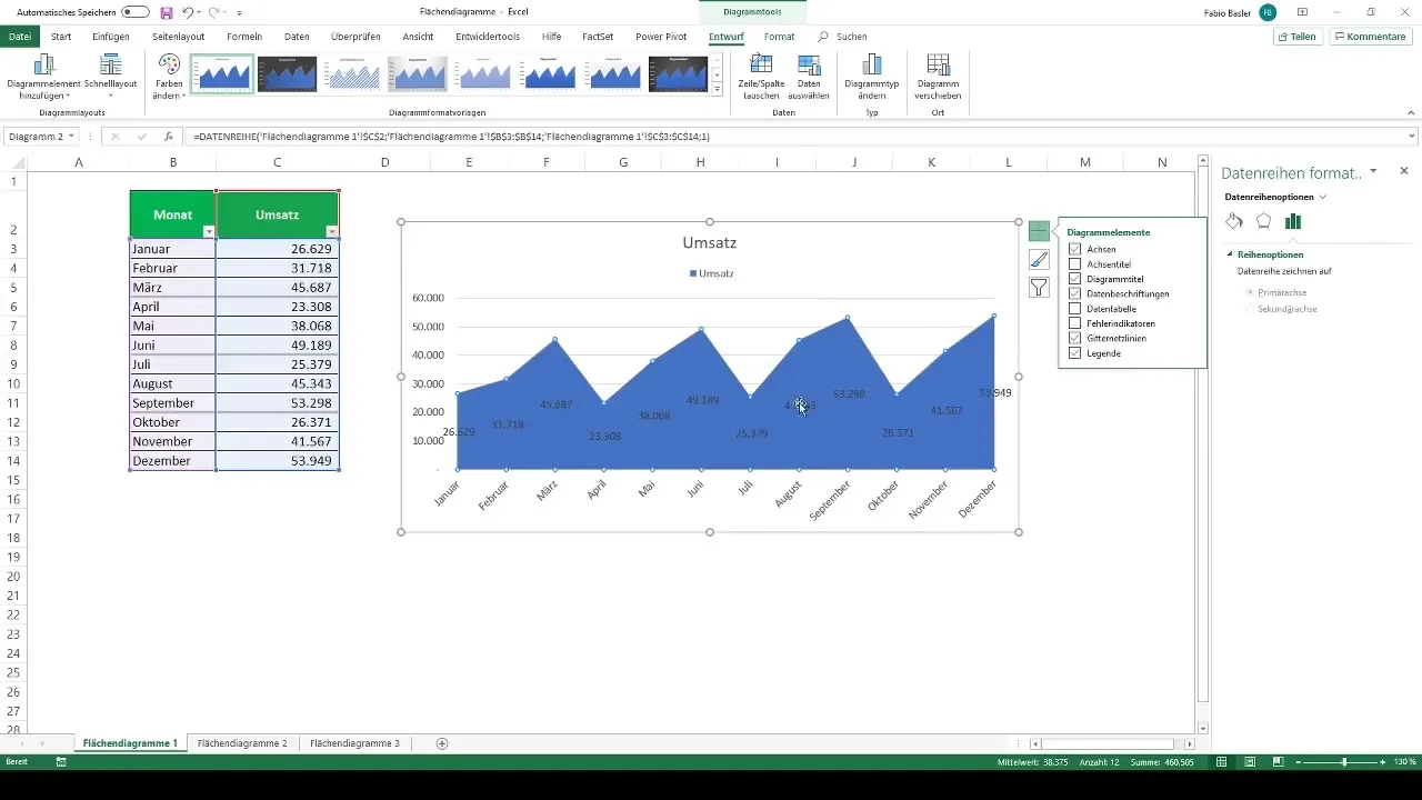
To display the values directly in the chart, you can add data labels. Right-click on the data series and select "Add Data Labels." This will make the numbers visible in the chart, enhancing readability.
Customize Layout
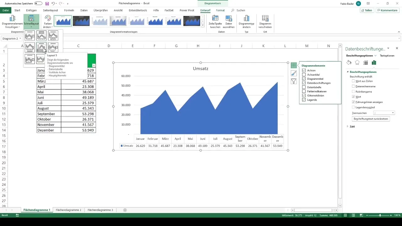
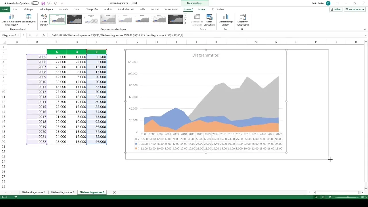
For an appealing presentation, layout 5 works best. Go to "Design" and select this layout type. This will display the respective variations not within the area chart but below on the horizontal axis, increasing readability.
Creating Stacked Area Chart
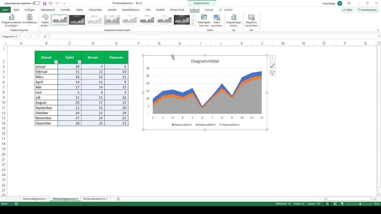
Let's move on to the next imperative: creating a stacked area chart. Highlight the necessary numbers representing, for example, apples, pears, and bananas. Again, go to "Insert" and select the 2D area chart. Here, the largest data series will automatically be pushed to the background, making the shares clearly visible.
Name data series
Click on "Select data" to give a name to the first data series, and then do the same for the other series. For example, rename them to Apples, Pears, and Bananas. Make sure to also add the horizontal axis label to display the monthly values.
Compare sales data from different business areas
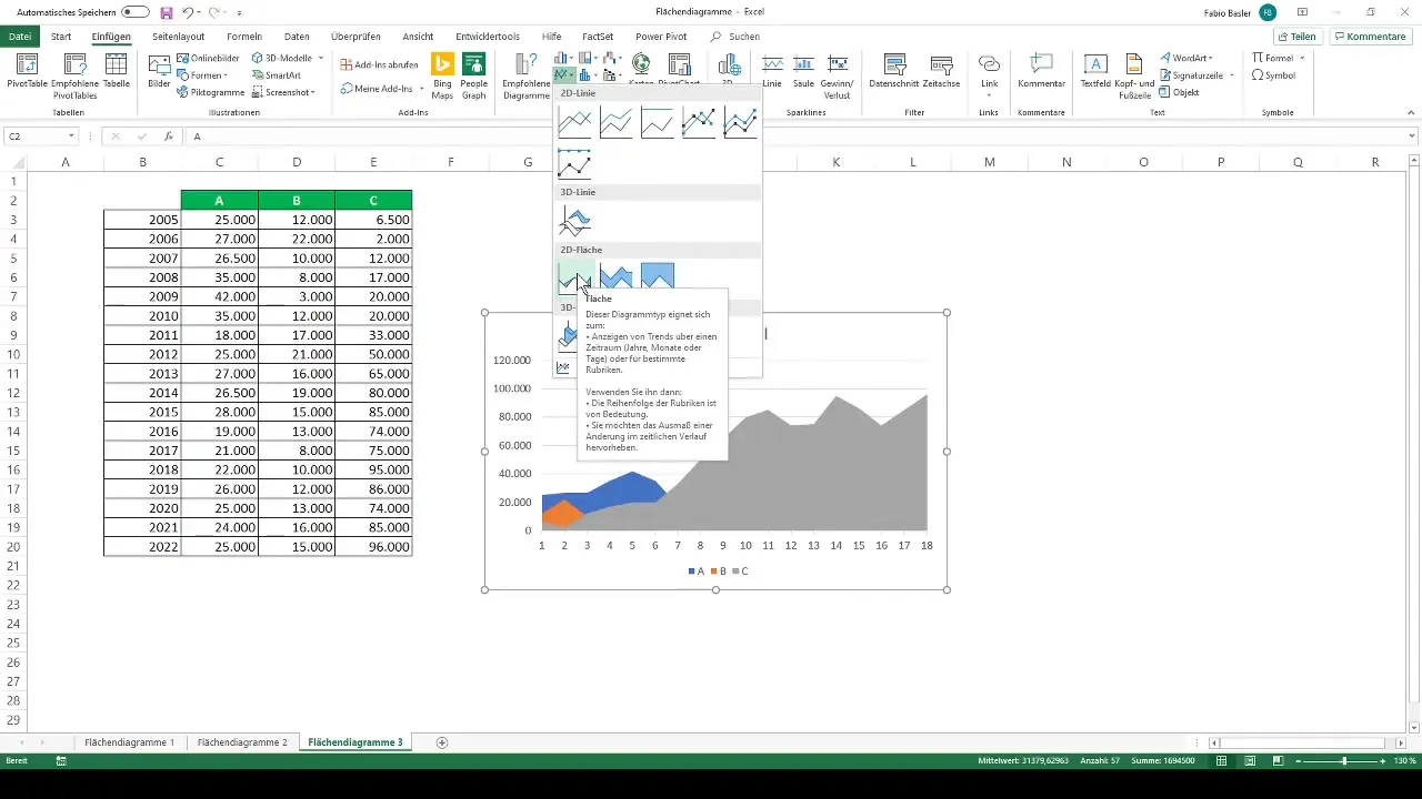
To compare the sales figures for different business areas A, B, and C, select the corresponding data again and create a 2D area chart accordingly. Be sure to consider the headings to properly associate them with the data series.
Adjust the order of the data series
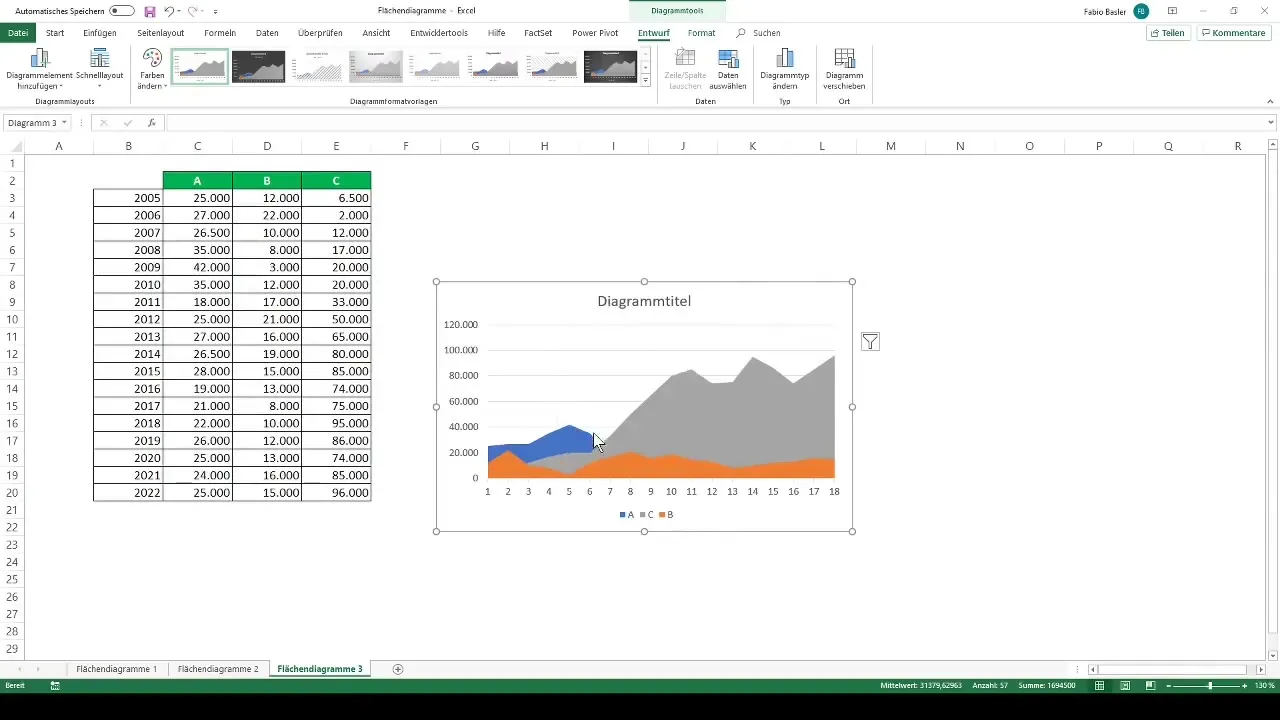
If you notice that one data series (for example, for business area C) is overshadowing the others, you can adjust the order. Go to "Select data" and rearrange the series to highlight the values better.
Present yearly data
If you want to display sales data over years instead of months, you can quickly switch. Select the appropriate data again and observe how the graphical representation changes, allowing you to evaluate the sales more effectively.
Final adjustments
Once you are satisfied with the representation, finalize by adding the data labels again or adjusting the layout. The quick layout 5 provides the best results to ensure clarity.
Summary
Area charts are an effective tool in Excel to represent data trends over time. By using recommended charts, adjusting axis labels, and data series, you can create appealing and informative graphics.
Frequently Asked Questions
How do I create an area chart in Excel?Select the corresponding data, go to "Insert," and choose "Recommended Charts."
What is the difference between a regular area chart and a stacked area chart?A stacked area chart displays multiple data series stacked on top of each other, while a regular area chart only displays one data series.
How do I add data labels to my chart?Right-click on the data series and choose "Add Data Labels."
What should I do if one data series is overshadowing others?Go to "Select data" and change the order of the data series to improve visibility.
How can I change the axis labels?Click on "Select data" and edit the corresponding axis labels.


