Excel is a powerful tool for data analysis and visualization. Visualizations such as histograms and Pareto diagrams are particularly helpful in making large amounts of data understandable. This guide will walk you through the process of creating a histogram step by step and explaining the advantages of these types of charts.
Main Insights
- Histograms show the distribution of data and allow for frequency analysis.
- In Excel, you can quickly create histograms, either using templates or manually.
- The correct formation of classes is crucial for the meaningfulness of the histogram.
Step-by-Step Guide
Understanding Histograms
Histogram is a specific form of data visualization that is often used to show the distribution of quantitative data. Unlike a bar chart, which represents categorical variables, a histogram illustrates the frequency of value ranges within the data. You visualize sales figures across intervals to identify patterns.
Creating a Histogram Using the Excel Template
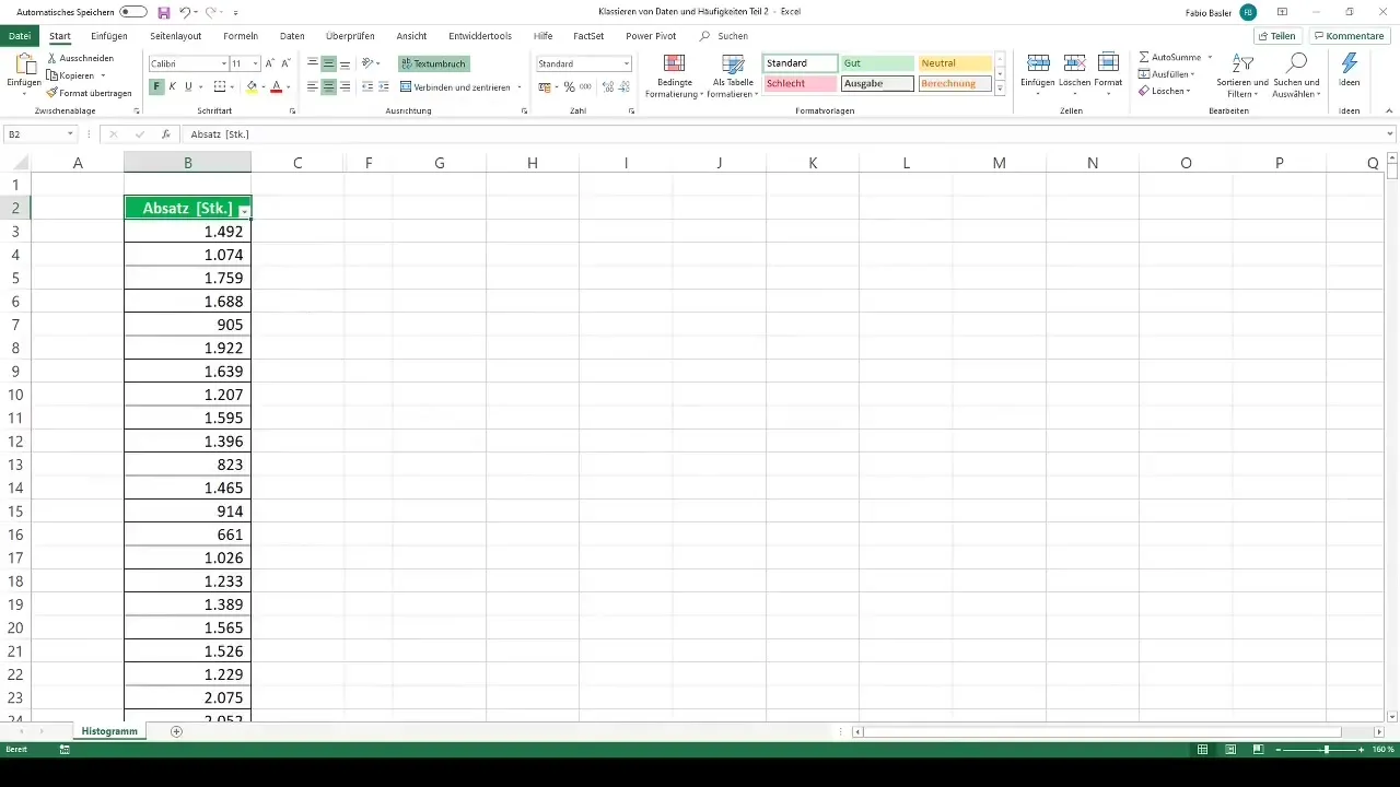
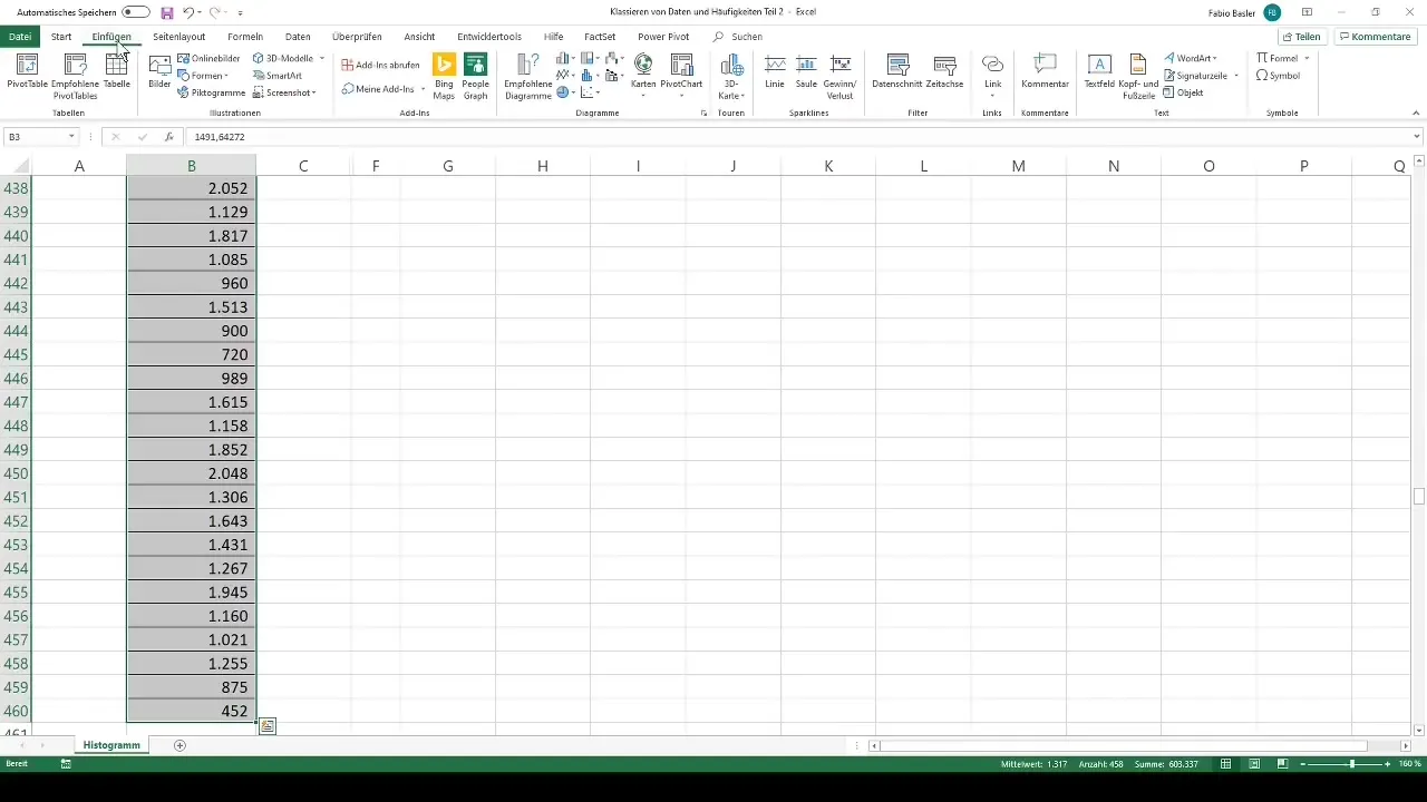
As you have already learned, there is a convenient way to create histograms in Excel by using the built-in template feature. Start with the sales numbers you have in a workbook. Find the "Insert" tab in the menu bar and locate the "Histogram" option. Excel will automatically divide the data into different classes.
Adjusting the Number of Classes
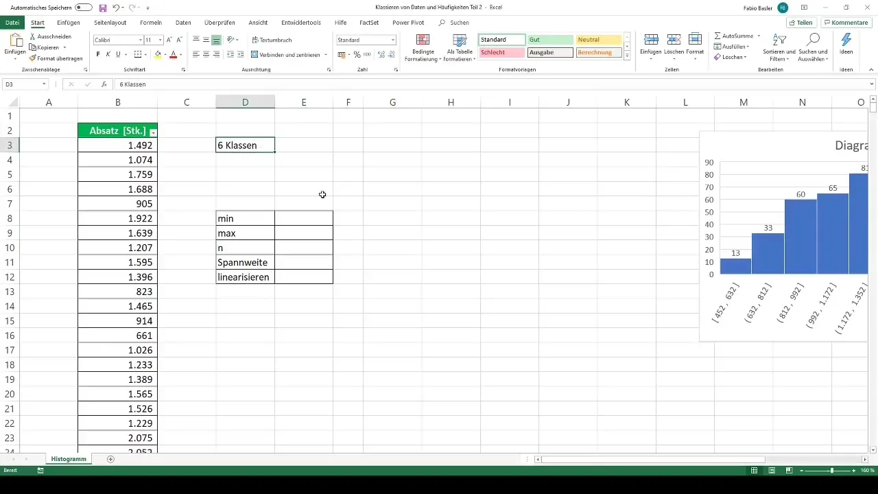
Once the histogram has been created, the question arises whether the default number of classes is sufficient for your analysis. It may be necessary to change the number of classes – either increasing or decreasing them to perform specific types of analyses. To do this, you need to work with the class intervals. This means that you have to divide the range of your data into the desired number of classes.
Calculating the Class Width
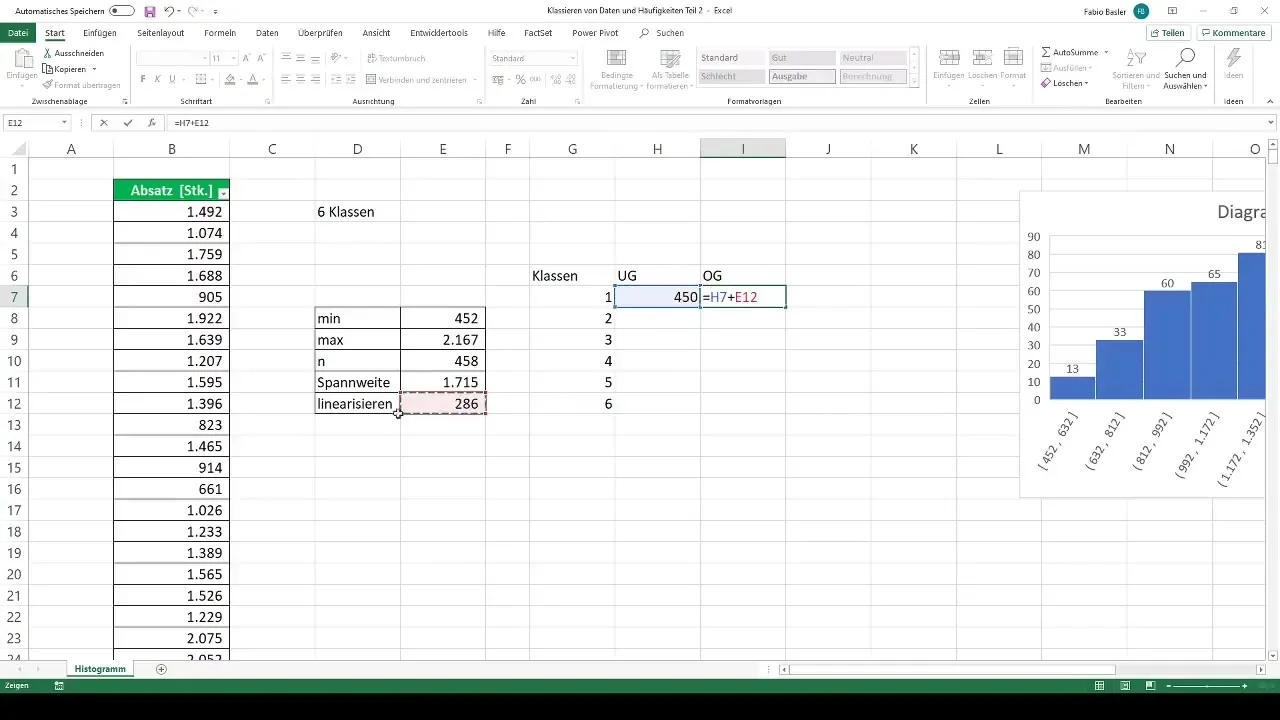
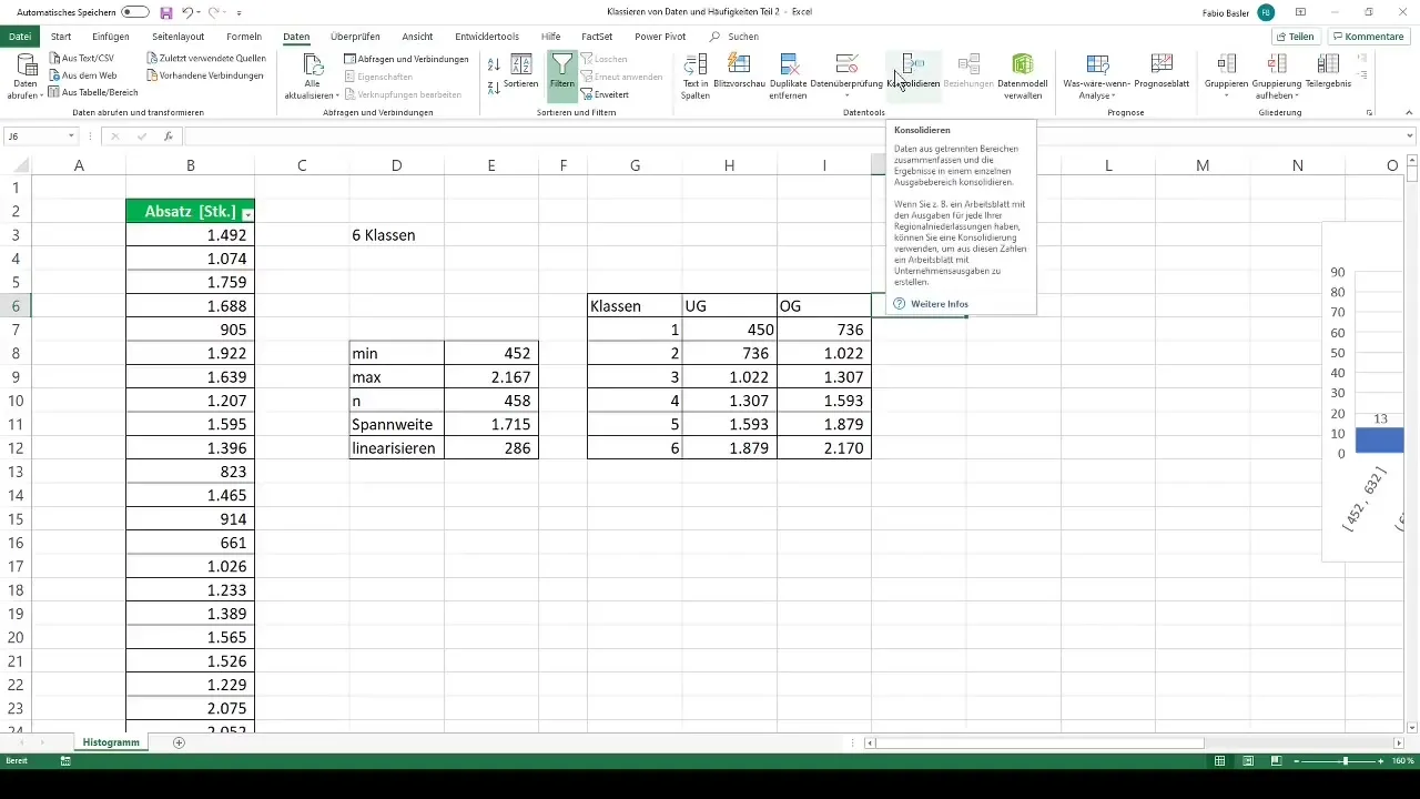
To determine the class width, you first need to identify the minimum and maximum values of your data. In the example, the values are 452 and 2167. Using these values, you can calculate the range by subtracting the minimum value from the maximum value. Then divide this range by the desired number of classes.
Setting the Upper and Lower Class Limits
Once you have the necessary class width, you set the lower limit for the first class with the rounded-down minimal observation set at 450 from the minimum value. The upper limit of each class is the lower limit of the following class. Repeat this process until you have defined all upper and lower class limits.
Calculating Frequencies
Once the classes are set, you need to determine the frequency to calculate the number of values that fall into each class from the observations. Go to the "Data" tab and select the "Data Analysis" function. If this function is not active, you need to enable it in the options. Choose "Histogram" and define the input ranges for your data.
Visualizing Frequencies
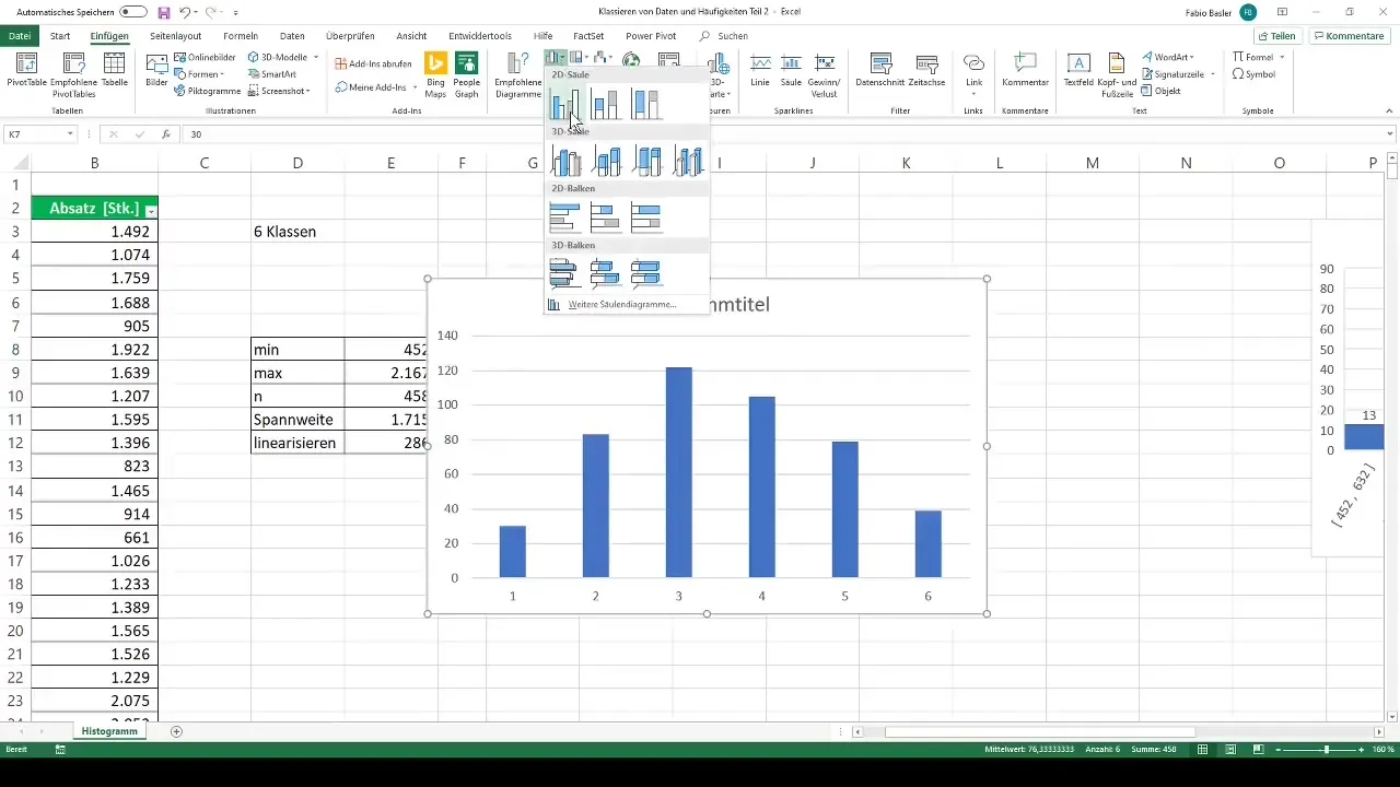
Once the frequencies have been determined, you can visualize the results in Excel. Now choose a 2D column chart to represent the quantitative classes. This representation allows you to quickly grasp the number of observations in each class and how they are distributed.
Summary
Creating histograms in Excel is a simple process that helps you present your data visually. By correctly calculating class widths and frequencies, you can gain valuable insights into your datasets and identify patterns that may have escaped you. The histogram is thus an indispensable tool for data analysis.
Frequently Asked Questions
How do I create a histogram in Excel?Select the data, go to "Insert", then click on "Histogram" and adjust the classes as needed.
How can I adjust the number of classes in a histogram?Calculate the class width and manually set the upper and lower limits to define the desired number of classes.
Which function do I use to calculate the frequencies?Use the "Data Analysis" function and select "Histogram" to determine the frequency.
How can I format the histogram in Excel?You can customize the chart by using the design options in Excel, such as colors, data labels, and border settings.


