Combination Charts, also known as Combo Charts, are an excellent way to visualize different types of data in a single chart. They allow you to combine different types of representations, such as a bar chart with a line chart, providing a clear overview of more complex data relationships. In this tutorial, you will learn how to effectively create different types of charts in Excel to present your data in a clear and informative manner.
Key Insights
- Combination charts combine various types of charts into a single chart.
- You can use different axes for different data series.
- There are various customization options, including colors and layouts.
Step-by-Step Guide
To create an effective combination chart in Excel, follow these steps:
Step 1: Prepare and Select Data
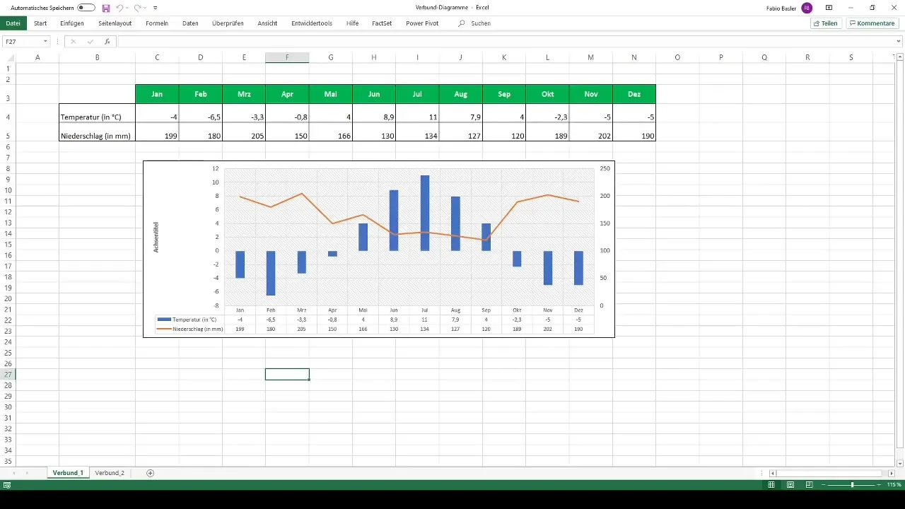
First, you need a suitable data set. For example, you can use data on temperature and precipitation. Select your first data series to be used in the chart by highlighting the corresponding cells.
Step 2: Insert 2D Column Chart
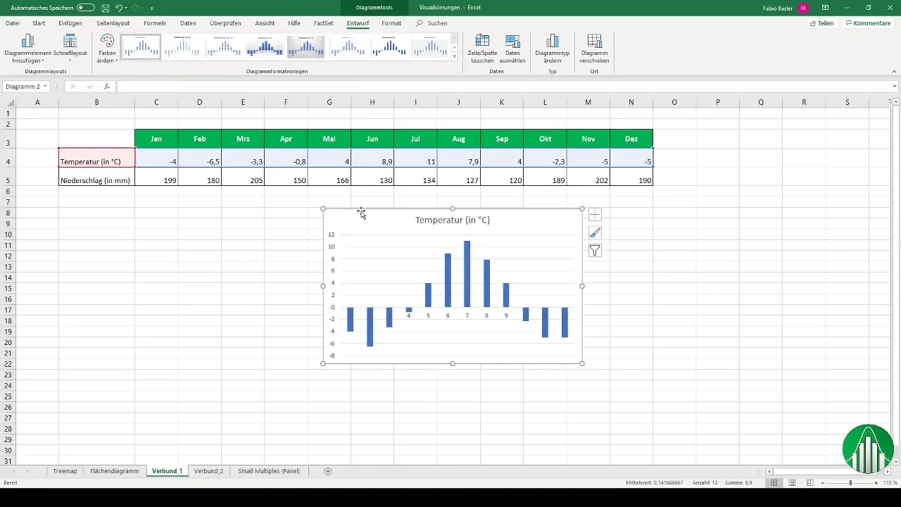
Go to the "Insert" tab and select a 2D column chart. This is the first of two types of representations you want to combine.
Step 3: Add Second Data Series
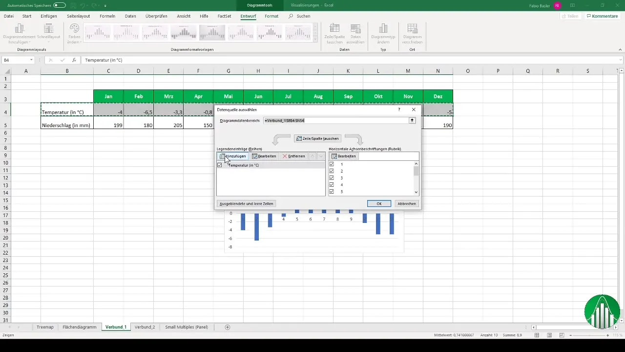
Now you need to select the second data series, in this case the precipitation data. Right-click on the chart and select "Select Data" to add the precipitation data.
Step 4: Customize the Chart
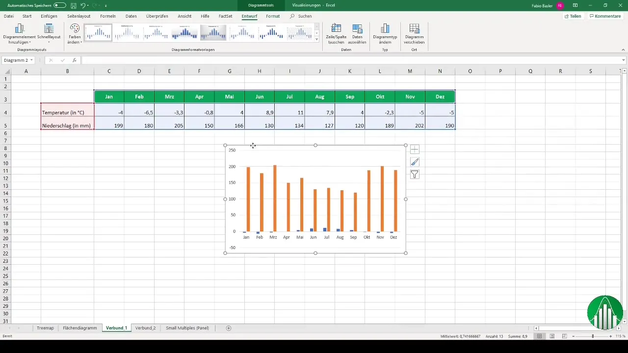
The chart is now created, but may not be optimal yet. To add horizontal axis labels, click on "Edit" and select the relevant months. Then, right-click and choose "Change Chart Type."
Step 5: Select Chart Type
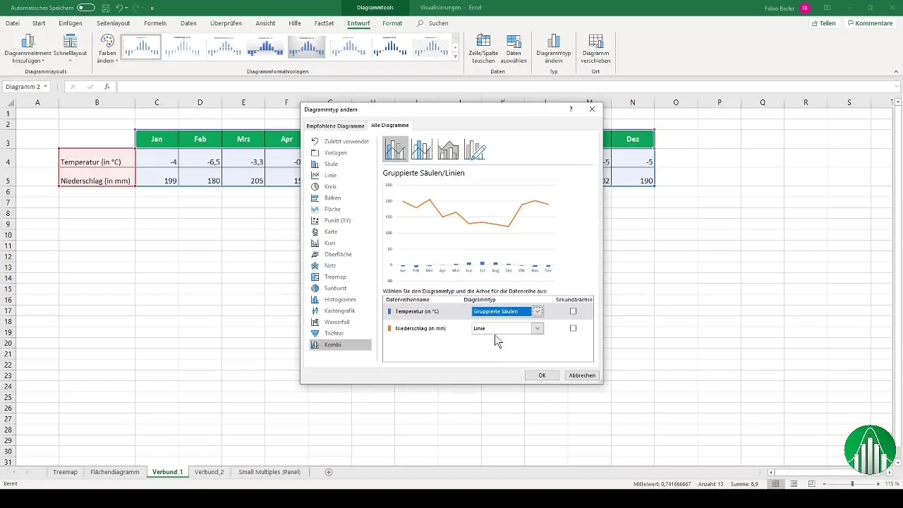
Select the Combo Chart. For example, you may want to display temperature as clustered columns and precipitation as a line chart. Ensure that precipitation is displayed on a secondary axis.
Step 6: Add Data Labels
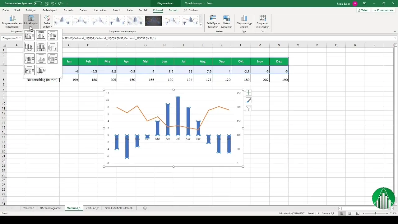
To make your chart more informative, you can also add data labels. Right-click on the chart and select "Add Data Labels."
Step 7: Customize Layout
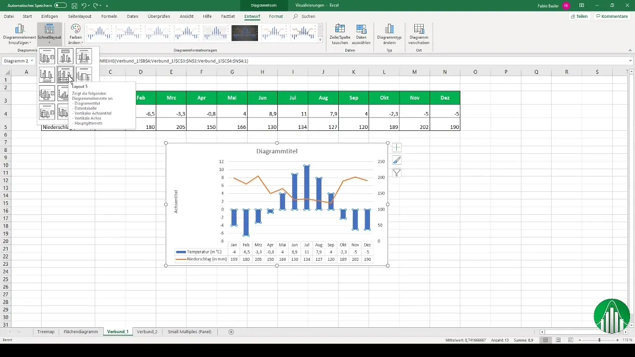
It's helpful to try out different layouts to make the chart visually appealing. Select the desired layout to display the corresponding numbers below your visualization.
Step 8: Create Second Combination Chart
Now let's look at another interesting combination: an Area Chart together with a Line Chart. Select the sales data and choose an Area Chart.
Step 9: Add Second Data Series
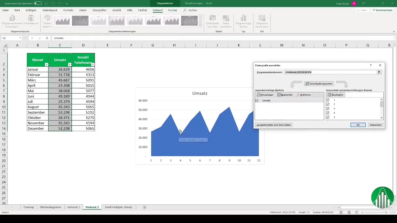
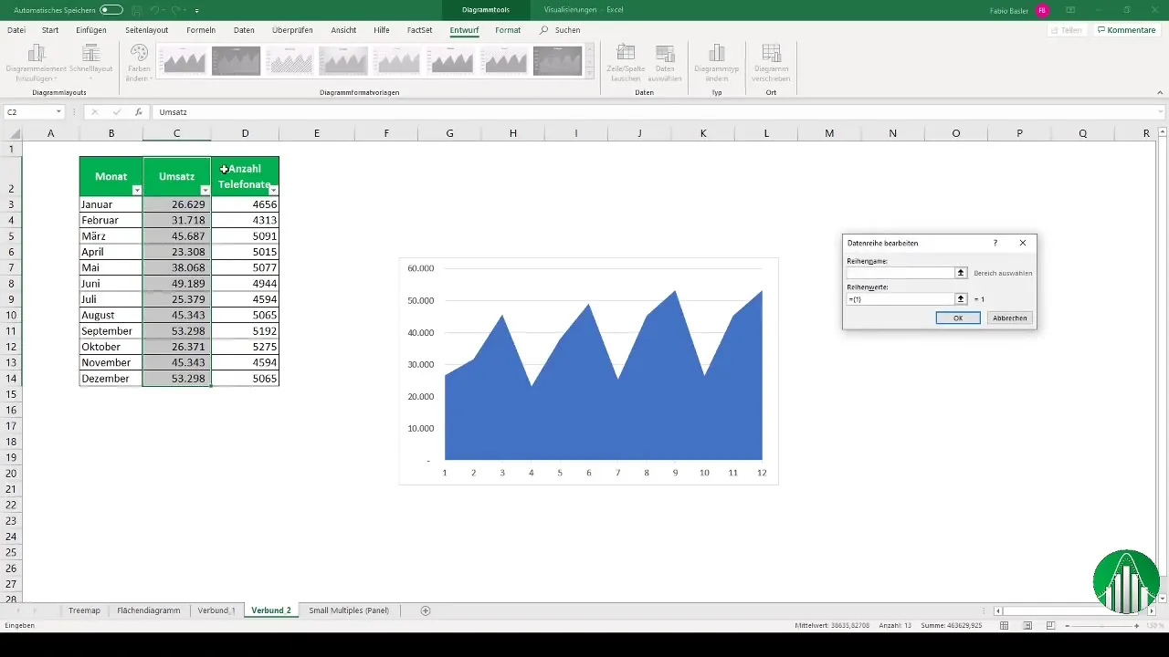
Follow the same steps to add the data series for the number of phone calls. Right-click again and select "Select Data." Add the values for the phone calls.
Step 10: Change chart type
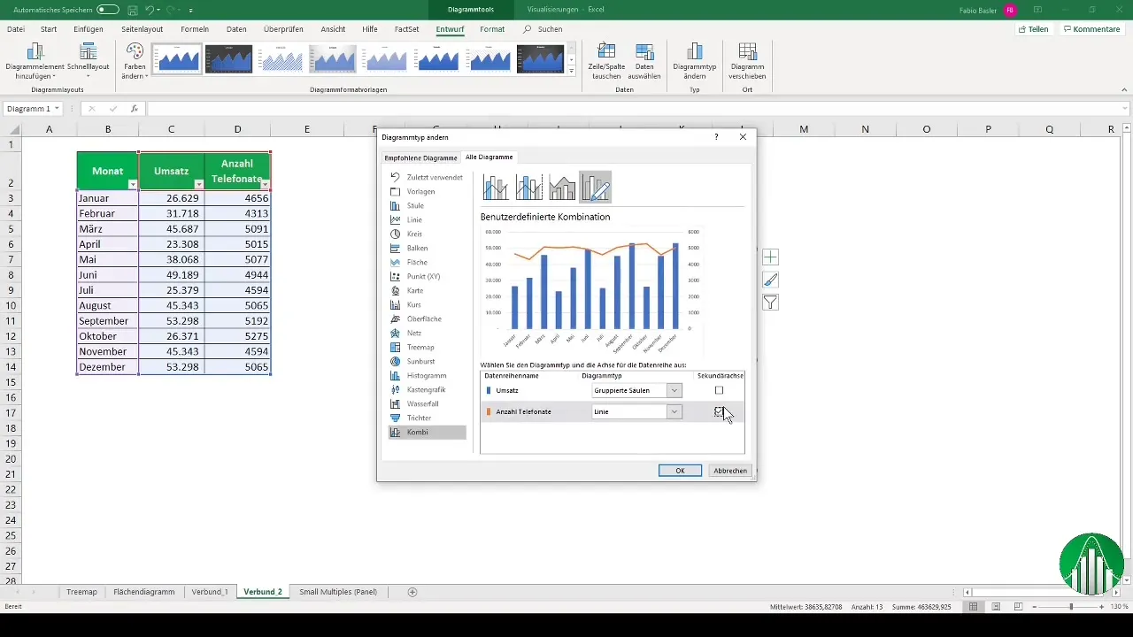
You now need to change the chart type again. Select "Change chart type" again and switch the representation to a combination chart. Make sure that the area and line charts are easily readable.
Step 11: Customize the chart
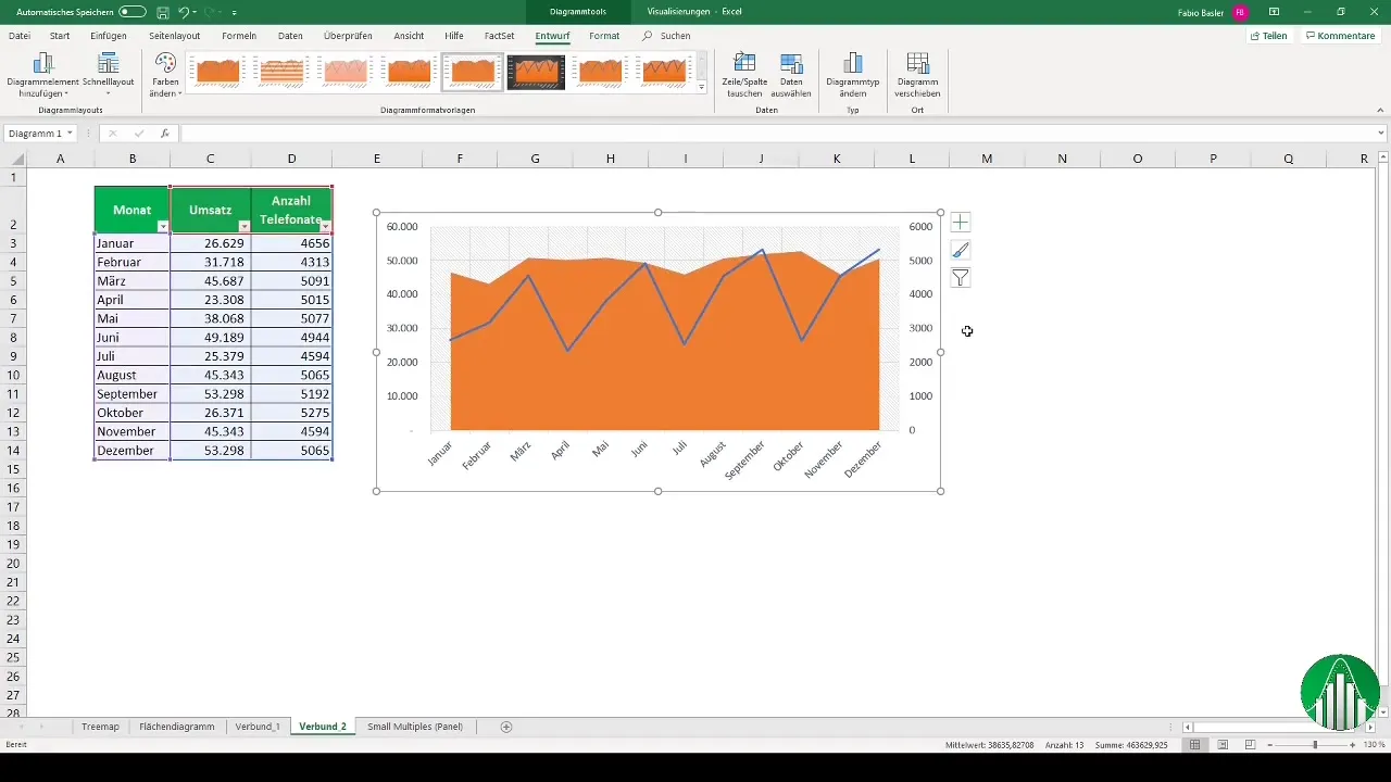
Now you can adjust various parameters regarding the display. Experiment with colors and layouts to achieve the desired visual results.
Summary
Combination charts are an effective method to visually represent multiple data sets. With the steps mentioned above, you can combine and customize different chart types to clearly depict complex developments and trends.
Frequently Asked Questions
What is a combination chart?A combination chart is a chart that combines different representation forms, such as bars and lines, to visualize different data sets.
How do I add a second data series?Select your chart, right-click, select "Select Data," and add the desired data series.
Can I use different axes?Yes, in combination charts, it is possible to use different axes for different data series.
How can I customize the layout of my chart?You can select layouts and adjust colors to make the chart visually appealing.
Which chart types can I combine?You can combine a variety of chart types, including bar, line, area, and other charts.


