Stacked column charts offer an excellent way to visually represent complex data. In this tutorial, I'll show you how to create and customize such a chart in Excel. You will learn how to group data, optimize the representation, and apply various formatting options to make your charts more illustrative and comparable.
Key Insights
- Stacked column charts are characterized by their ability to represent multiple data series in a single column.
- By properly grouping the data, you can make simple comparisons between different categories.
- Effective visualization through adjustments makes your chart more understandable and appealing.
Step-by-Step Guide
Prepare Data
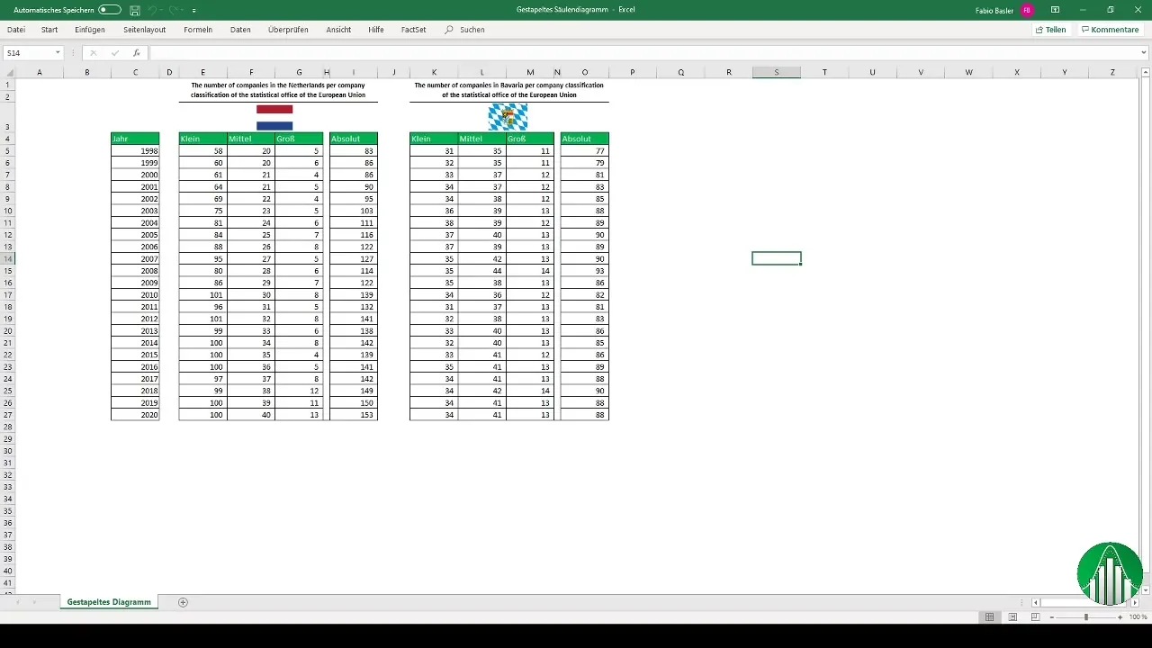
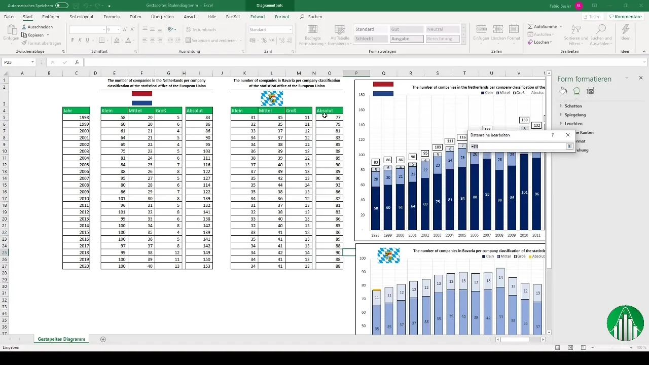
Before you start creating your stacked column chart, make sure you have prepared your data accordingly. In our example, we are comparing the number of companies, divided into small, medium, and large firms, in the Netherlands and Bavaria. Once you have gathered the necessary data, you can proceed.
Insert Chart
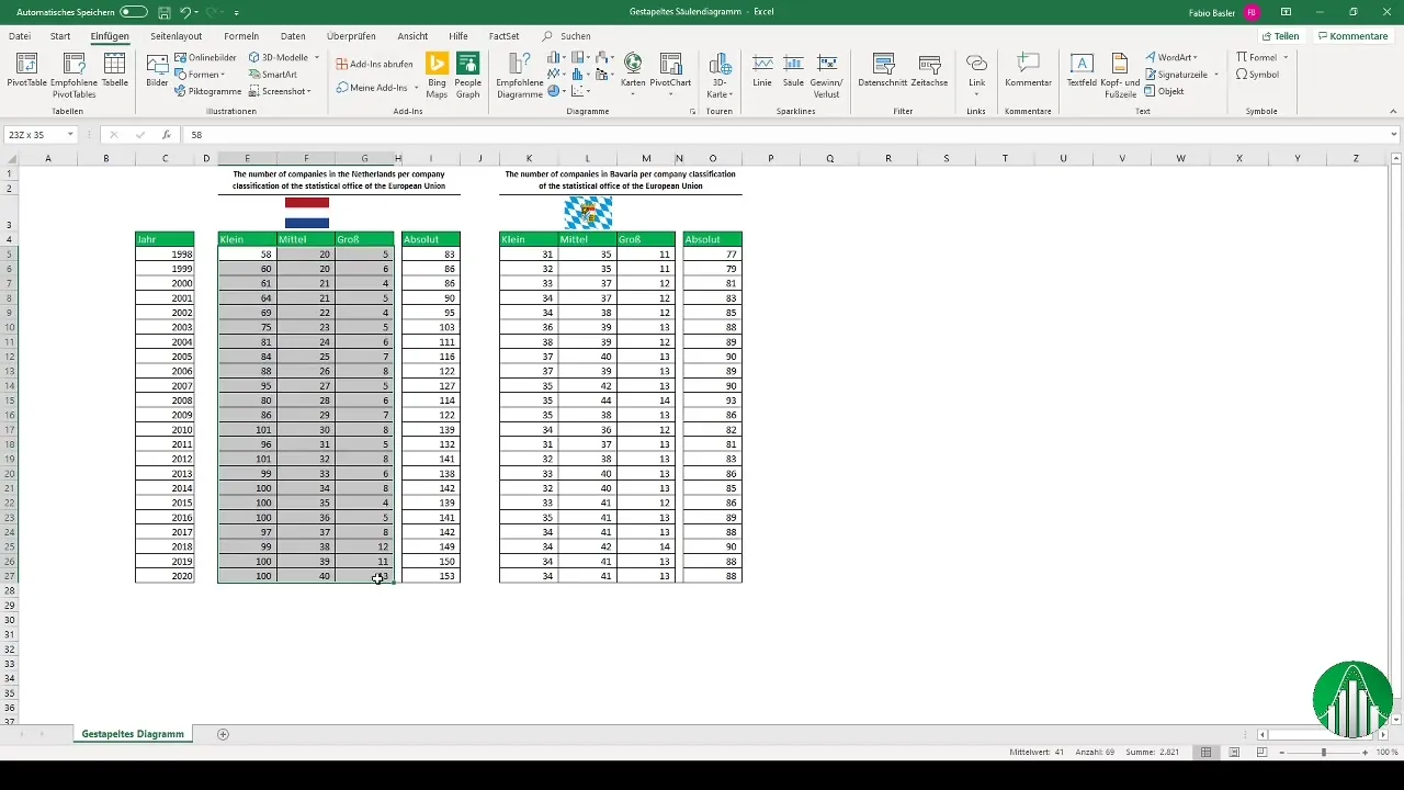
To create your chart, select the data for the Netherlands and go to the "Insert" tab. There, choose the option for stacked column charts. Excel will automatically create the chart and show you an initial visualization of your data.
Adjust Chart
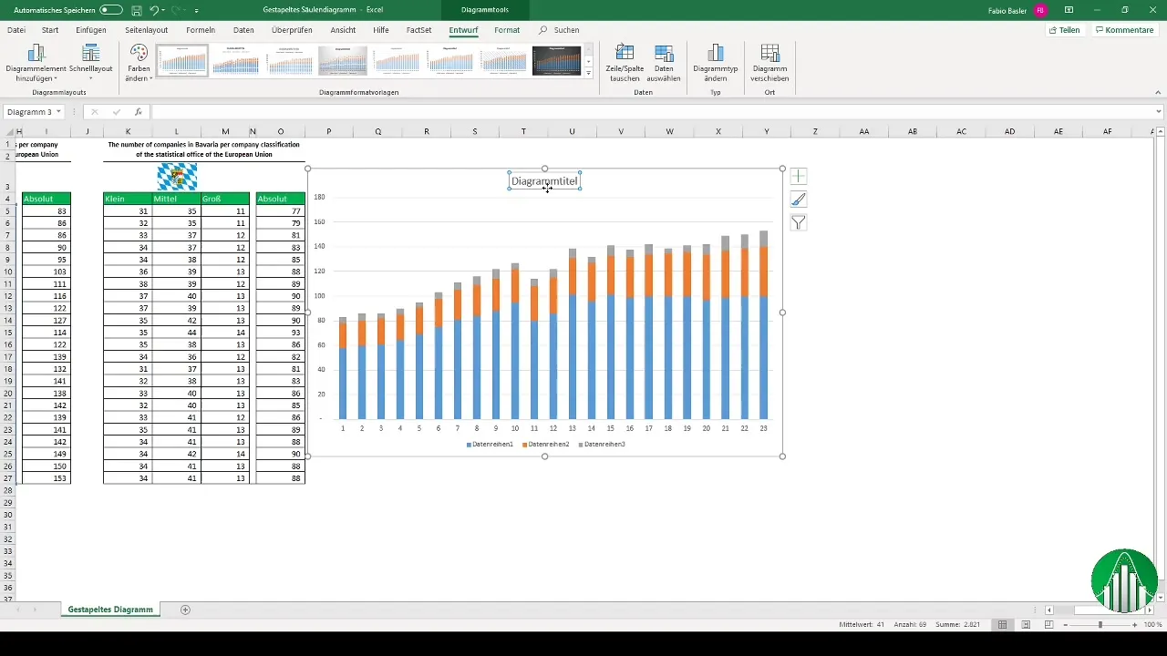
Now that your chart is created, you should give it a name. Click on the chart and add an appropriate title, such as "Number of Companies in the Netherlands". You can further visually customize the chart by adding titles, colors, and other options to make it more appealing.
Link Text Boxes
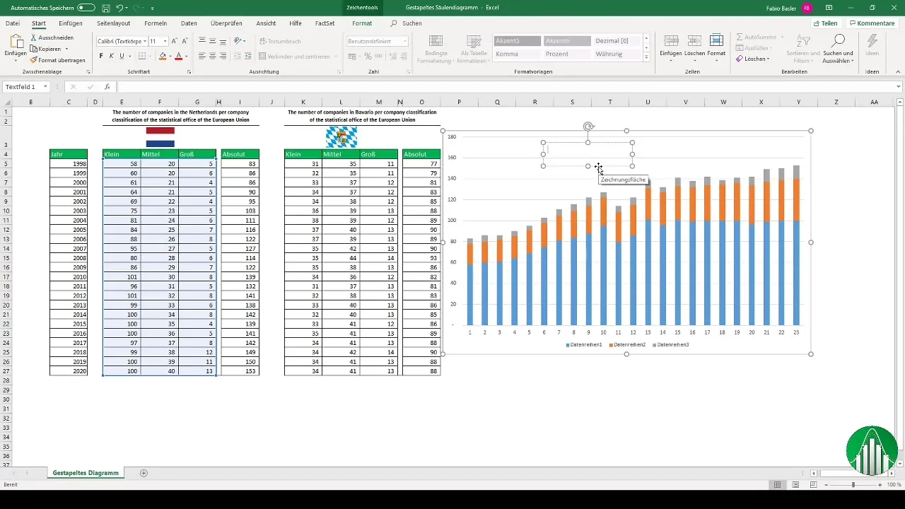
A useful tip is to use text boxes linked to cells in Excel. This allows you to dynamically display important information. Select a text box, click on the border, then on the field shown above, and use the equals sign "=" to link it to the corresponding cell. Press "Enter" to dynamically display the content.
Add Data Labels
To make your chart more informative, consider adding data labels. Right-click on the data series and select "Add Data Labels". Make sure to format the legend accordingly to identify the various company sizes.
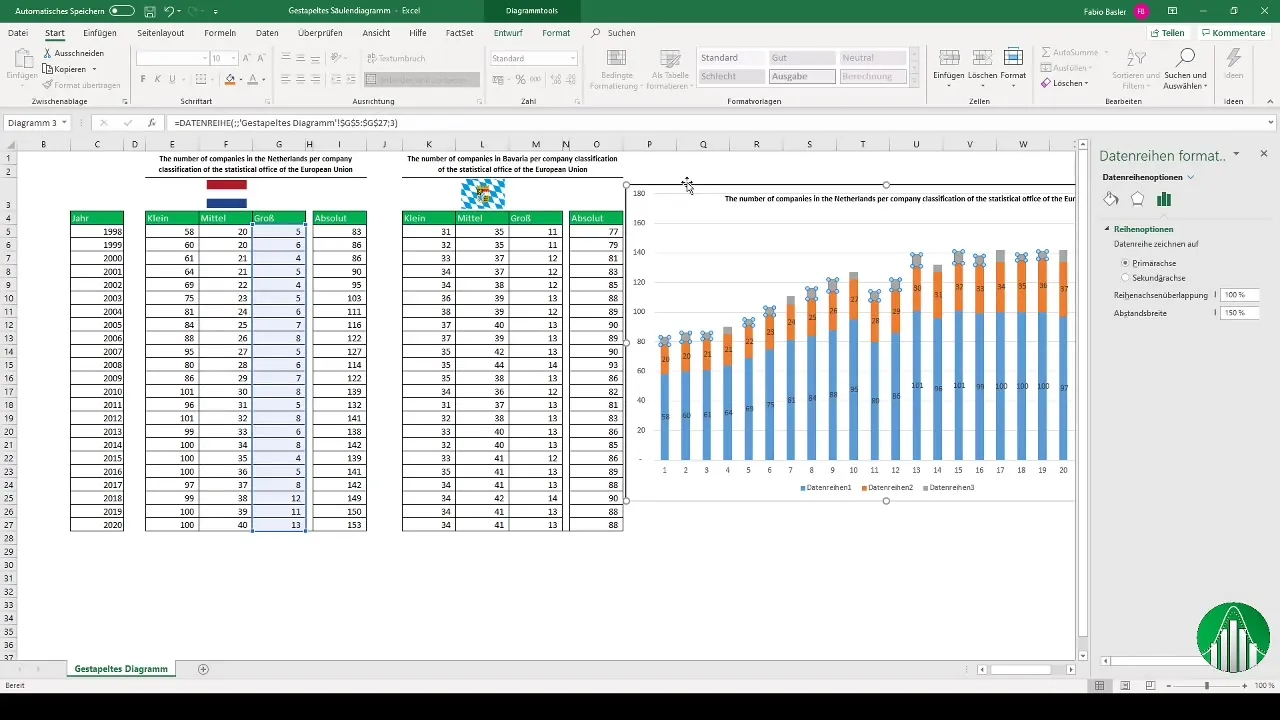
Adjust Chart Color
An appealing color scheme enhances the effectiveness of your chart. You can format the colors of small companies in dark blue and medium and large companies in lighter shades of blue. This adjustment helps viewers to grasp the data more easily.
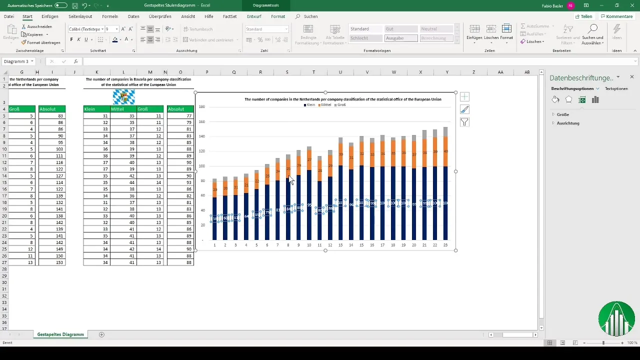
Axis Formatting and Total Display
Don't forget to add the horizontal axis label, representing the years 1998 to 2020. An often overlooked aspect of stacked column charts is the total sum. To display this, add a new data series to your chart and change its representation to a line.
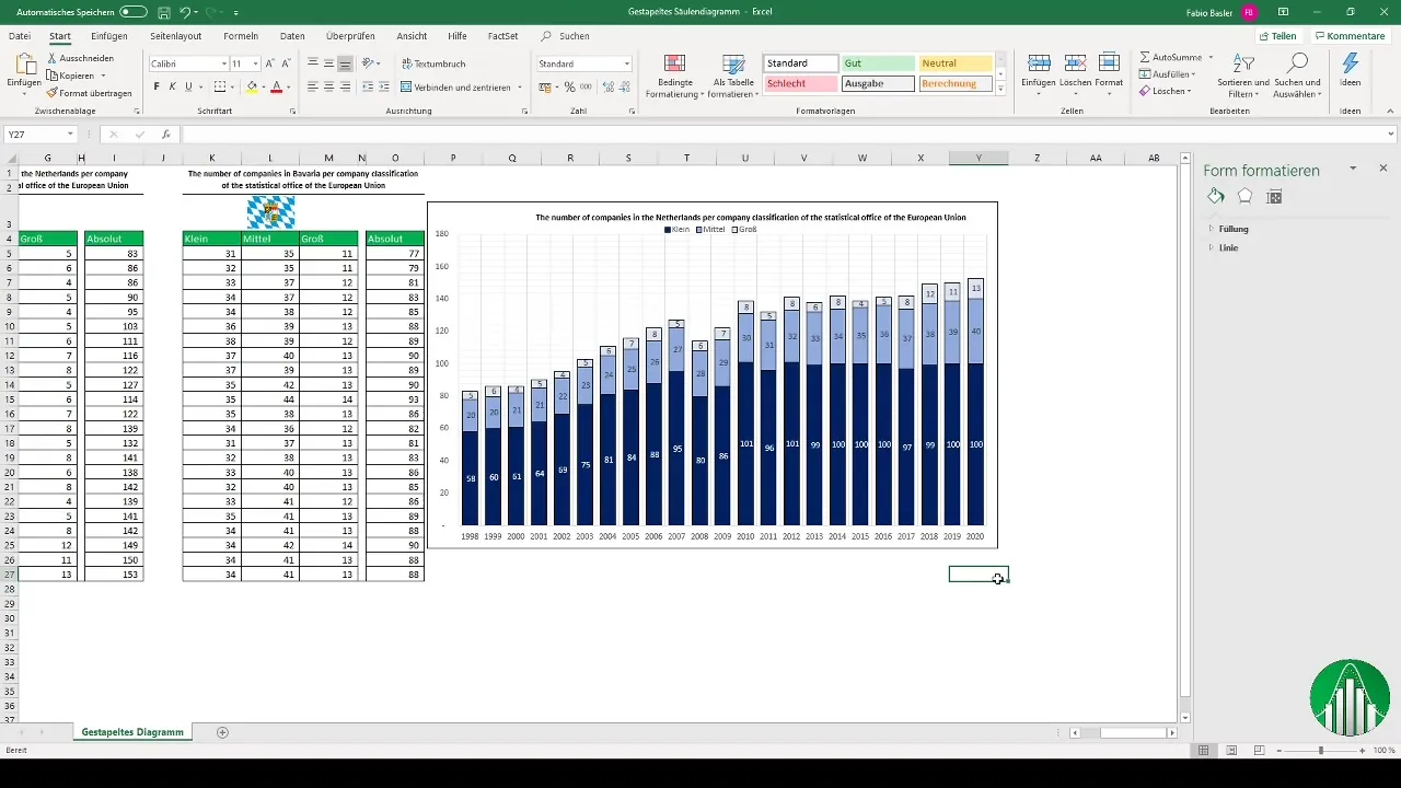
Copy and Adjust Chart for Bavaria
Creating an identical chart for the state of Bavaria is very simple. Copy the already created chart and paste it below the first one. Change the reference of the text box and the data for small, medium, and large companies, inserting the respective values for Bavaria.
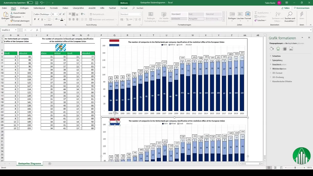
Customizing the Display
Make sure that the format of the chart remains consistent. Adjust colors and fonts to ensure that both charts appear harmonious overall. Adding totals next to the stacked columns increases data integrity.
Combining Charts
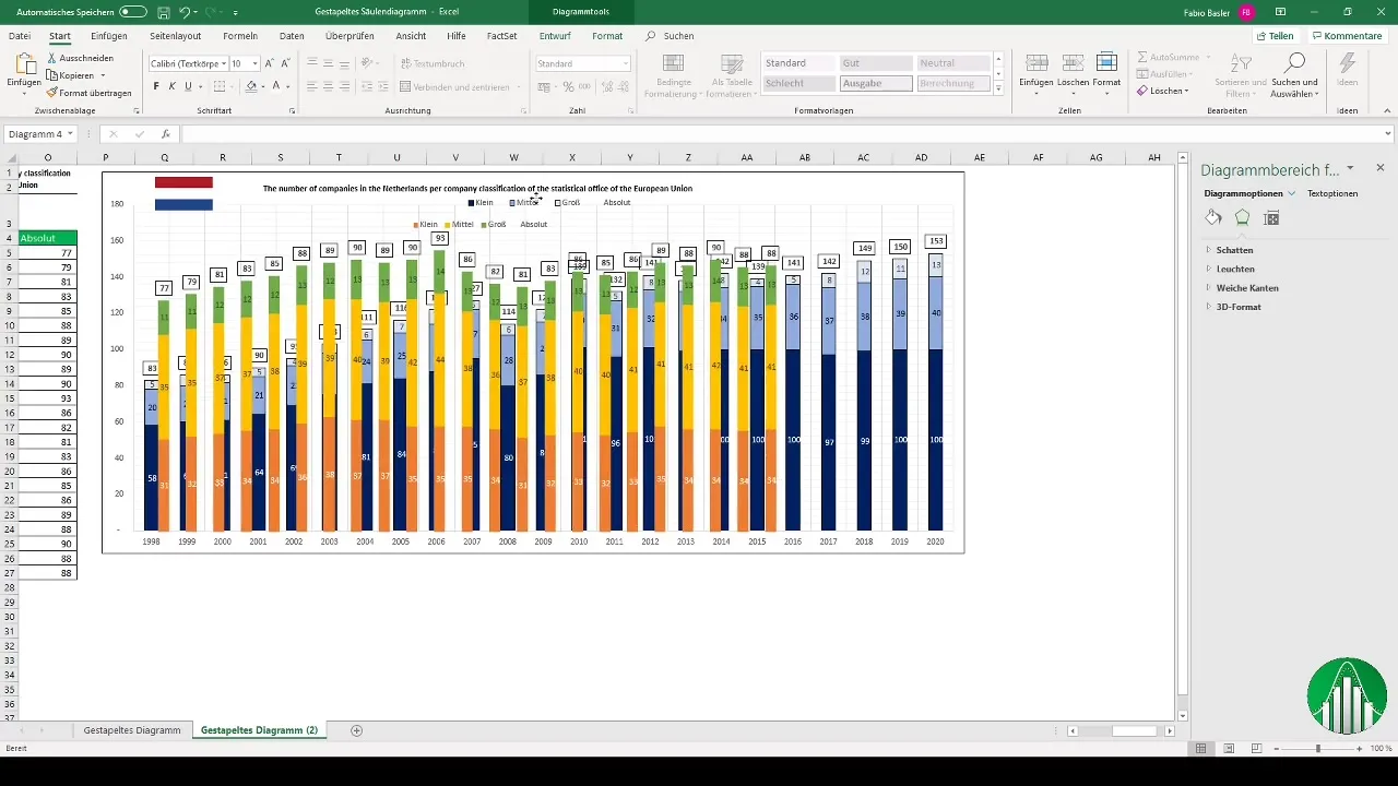
If you want to combine the data from both charts, there is a trick: Either place the two graphics on top of each other or adjust the backgrounds of the charts so that they merge into each other. This can help visually and efficiently compare the data.
Summary
Stacked column charts are a valuable visualization technique for better comparing and presenting data. This guide has shown you how to prepare your data, create appealing charts, and make various adjustments to ensure an effective presentation of your information.
Frequently Asked Questions
How do I add data labels to my chart?Right-click on the data series and choose "Add Data Labels".
Can I customize the colors of my charts in Excel?Yes, you can customize the colors of each data series individually to improve readability.
How can I display totals in my chart?Add a new data series representing the total and change the chart type to a line.
Is it possible to combine two charts?Yes, you can overlay two charts by making the background invisible and grouping the charts.
How can I optimize my chart for a presentation?Make sure to keep colors and fonts consistent, and add explanatory texts or notes if necessary.


